
Chapter 8. Charting with Degrafa
- Introducing the Degrafa drawing library
- Creating a custom PieChart component
- Creating an ItemRenderer for a DataGrid
- Dynamic object creation
Now that your application is secured and communicating with the server side, it’s time to add data visualization components and enable a bird’s-eye view on the data. Adding data visualization components to your application allows people to see at a glance the open project issues and the number of bugs versus the number of feature requests, without having to manually count them in the data grid in the master view. The data could be visualized in many ways—we’ll only scratch the surface in this chapter.
Adobe provides data visualization components, but only when you purchase a license for the professional version of the Flash Builder IDE. Because our goal is to do Flex development using only free and open source technologies, we’ve decided to create our own visualization components—besides, it’s more fun.
8.1. Drawing in Flex
Flex and Flash provide powerful drawing libraries that we could leverage to create our custom graph components, but we’re going to leverage an open source graphics library called Degrafa. Using Degrafa gives us the ability to declaratively build our graphing components rather than having to deal with the complex calculations involved in drawing pie chart slices as illustrated in listing 8.1, which shows an example ActionScript class specifically for drawing a pie chart slice found at http://www.adobe.com/devnet/flash/articles/adv_draw_methods.html. Notice how much trigonometry is involved in creating something as simple as a pie chart slice from scratch.
Listing 8.1. Example of drawing in ActionScript
/*-------------------------------------------------------------
    mc.drawWedge is a method for drawing pie shaped
    wedges. Very useful for creating charts. Special
    thanks to: Robert Penner, Eric Mueller and Michael
    Hurwicz for their contributions.
-------------------------------------------------------------*/
MovieClip.prototype.drawWedge = function(x, y, startAngle, arc, radius, yRadius) {
    ==============
    // mc.drawWedge() - by Ric Ewing ([email protected]) - version 1.3 - 6.12.2002
    //
    // x, y = center point of the wedge.
    // startAngle = starting angle in degrees.
    // arc = sweep of the wedge. Negative values draw clockwise.
    // radius = radius of wedge. If [optional] yRadius is defined, then radius is the x radius.
    // yRadius = [optional] y radius for wedge.
    // ==============
    // Thanks to: Robert Penner, Eric Mueller and Michael Hurwicz for their contributions.
    // ==============
    if (arguments.length<5) {
        return;
    }
    // move to x,y position
    this.moveTo(x, y);
    // if yRadius is undefined, yRadius = radius
    if (yRadius == undefined) {
        yRadius = radius;
    }
    // Init vars
    var segAngle, theta, angle, angleMid, segs, ax, ay, bx, by, cx, cy;
    // limit sweep to reasonable numbers
    if (Math.abs(arc)>360) {
        arc = 360;
    }
    // Flash uses 8 segments per circle, to match that, draw in a maximum
    // of 45 degree segments. First calculate how many segments are needed
    // for our arc.
    segs = Math.ceil(Math.abs(arc)/45);
    // Now calculate the sweep of each segment.
    segAngle = arc/segs;
    // The math requires radians rather than degrees. To convert from degrees
    // use the formula (degrees/180)*Math.PI to get radians.
       theta = -(segAngle/180)*Math.PI;
    // convert angle startAngle to radians
    angle = -(startAngle/180)*Math.PI;
    // draw the curve in segments no larger than 45 degrees.
    if (segs>0) {
        // draw a line from the center to the start of the curve
        ax = x+Math.cos(startAngle/180*Math.PI)*radius;
        ay = y+Math.sin(-startAngle/180*Math.PI)*yRadius;
        this.lineTo(ax, ay);
        // Loop for drawing curve segments
        for (var i = 0; i<segs; i++) {
            angle += theta;
            angleMid = angle-(theta/2);
            bx = x+Math.cos(angle)*radius;
            by = y+Math.sin(angle)*yRadius;
            cx = x+Math.cos(angleMid)*(radius/Math.cos(theta/2));
            cy = y+Math.sin(angleMid)*(yRadius/Math.cos(theta/2));
            this.curveTo(cx, cy, bx, by);
        }
        // close the wedge by drawing a line to the center
        this.lineTo(x, y);
    }
};
Adobe has released the specifications for its declarative graphics library, called FXG. It appears that the Degrafa team has collaborated with the Adobe team to create this specification, but the FXG functionality is only a subset of what is available from the Degrafa library. This may be a library to keep your eye on as it’s being developed.
8.2. Common Degrafa concepts
Before diving into developing the component, let’s familiarize ourselves with some of the terms and concepts that we’ll see as we work through this example.
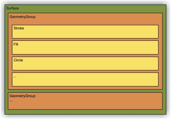
- Surface— This is the base component for everything you’ll do in Degrafa. All other Degrafa components will be composed within a Surface.
- GeometryGroup— After the Surface, this is the next level of composition. The GeometryGroup tag allows you to group Degrafa components to compose an object.
- Stroke— Stroke is the object that is used to define the look of an object’s outline, in terms of color, thickness, and style. Degrafa provides different Stroke objects for your use depending on the style of stroke you want: SolidStroke, LinearGradient, and RadialGradient.
- Fill— Fill refers to the appearance of the bounded area of a graphical component. Degrafa provides the following fills: SolidFill, LinearGradient, RadialGradient, BitmapFill, BlendFill, and ComplexFill.
- Shapes— Degrafa supports drawing many different shapes out of the box, such as Circle, Ellipse, RegularRectangle, RoundedRectangle, Polygon, and more. For irregular shapes, Degrafa also has an extensive library of auto shapes and enables defining any shape you’d like by providing a Scalable Vector Graphics (SVG) path.
- Repeaters— This gives you the ability to repeat a shape any number of times on the surface.
Much like other Flex components, the Degrafa components are considered either container components, meaning they will contain other Degrafa components, or graphical elements. Figure 8.1 shows the relationship of the common components.
Figure 8.1. Relationship of Degrafa components
More than a single chapter would be needed to cover all the features that Degrafa offers, especially when it comes to skinning and the advanced CSS functions you can accomplish with this powerful framework. We’re only going to scratch the surface; to learn more about Degrafa, you can start with the Foundation section of the documentation at http://www.degrafa.org/samples/foundation.html.
8.3. Creating a pie chart for fun and profit
Now that we have some of the basic concepts, let’s get on with the task of creating a custom pie chart component. We were inspired by a blog posting by Derrick Grigg titled appropriately enough Degrafa Pie Chart, which can be found at http://www.dgrigg.com/post.cfm/04/15/2008/Degrafa-PieChart. After we decomposed it and removed some of the extra visual effects such as tweening and gradients, it barely resembles what we started with. Figure 8.2 shows a mock-up of the chart we’ll be developing in this chapter.
Figure 8.2. Mock-up of the Graph View

Recall in chapter 2 you created a separate view to contain your data visualization. For this example you’ll be developing only a single pie chart component, but some of the concepts illustrated here could potentially be applied to creating any number of charting components.
The component you’ll develop is a combination of a pie chart and a data grid, which will serve the purpose of a legend for the pie chart. Without this it may be difficult for someone looking at the chart to differentiate between data points on the graph. The pie chart will consist of the pie chart itself and another component for each of the slices that make up the chart. You’ll also develop a simple custom ItemRenderer for the chart legend to draw a simple box inside one of the cells in the data grid.
You’ll also be adding a label and a combo box to the GraphView to allow the user to change the data the chart shows. By changing the value of the combo box the user can show how many issues there are by project, type, status, or severity.
8.3.1. New custom event
We’re going to create a new custom event for our pie chart. The reason we’re creating a new one rather than continuing to use the UIEvent we created earlier is that if we ever wanted to put more than one pie chart component into our application, we’d need to be able to distinguish which component fired the event.
Listing 8.2. PieChartEvent.as

This event differs from the one created previously in the addition of an id  property. This is done so that the presenter can decide whether or not it needs to react to the event. With the new event
created, you can move on to creating the component itself.
property. This is done so that the presenter can decide whether or not it needs to react to the event. With the new event
created, you can move on to creating the component itself.
8.3.2. PieChart component
First you’ll develop the view that contains the pie chart and legend. You’ll create these view components in a new package, so create a file named PieChart.mxml in the org. foj.components package of your project. The following listing shows the first part of the code for the PieChart view.
Listing 8.3. PieChart.mxml

The code is similar to what you developed in chapter 3 when you created all the MVP components. You set the creationComplete event to call the init method. Next you set the layout of your component to use HorizontalLayout  . Then you declare a couple of private member variables for the data provider and its presenter
  ,
,  . Inside the init method you bootstrap your presenter
  . Last you create a set property
  for the data provider where you create an event to notify the presenter that the data provider was updated. Listing 8.4 shows the rest of your pie chart component.
Listing 8.4. PieChart.mxml

First you added a spacer to the component to put a bit of padding between your pie chart and its surrounding components. Next you added a Degrafa
Surface component and a GeometryGroup to hold the rest of the Degrafa components necessary for the pie chart component. The GeometryGroup is the component to which you’ll add your pie chart slices when you create them. You’ve also added a Drop-ShadowFilter to the GeometryGroup to add a bit of visual flair to the pie chart. Last you defined the DataGrid component for your chart legend, with a custom ItemRenderer to display the color that corresponds to the data in the chart, which you’ll create in a bit.
8.3.3. PieChartSlice
Now that we’ve defined the pie chart component, let’s move on to defining the slices that will make up the pie chart. The pie chart slice is a rather simple component. We probably could have created the pie chart slice programmatically in ActionScript, however this approach allows us to define sensible defaults declaratively in MXML, adding behavior as well.
Listing 8.5. PieChartSlice.mxml

The pie chart slice will extend from GeometryGroup instead of the standard Flex Group component that you extended in chapter 2. Next you define a refresh method to abstract behavior away from your presenter. Last you add an EllipticalArc component to the component and set default values such as its width, height, and most importantly closureType property, which you set to pie.
8.3.4. Custom ItemRenderer
The next component you’re going to create is the custom ItemRenderer for the pie chart legend. This simple component will draw a colored box in the data grid cell to correspond with the colors of the pie chart.
Listing 8.6. PieLegendRenderer.mxml
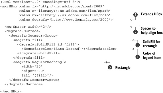
The ItemRenderer is extending HBox because all ItemRenderer objects for the DataGrid component must be halo components. Add a Spacer component to help align the rectangle the way you want it. The SolidFill component defines the fill color for the RegularRectangle . Now that you’ve finished creating all the visual components for the pie chart, let’s move on to creating the Presenter.
An implicitly defined variable is available to the ItemRenderer named data, which corresponds to the item in the dataProvider that you’re rendering. Use this implicit variable to set the color of the Fill object , which is contained in the legend property of the object.
8.3.5. Presenter for the PieChart
Now that all the visual components are created for the pie chart, let’s create the Presenter. The Presenter for the pie chart becomes more involved than any of your previous ones, but it shouldn’t be hard to follow.
Listing 8.7. PieChartPresenter.as

You first define private member variables to hold onto references to the view and the model, the id of the component this Presenter belongs to, and the dataProvider for your pie chart . The constructor for this Presenter not only takes in a reference to the view, but also is used to bootstrap the id for the view component because there may be multiple pie charts contained in the application. You also define an event listener for the
dataProvider being updated in the view component. Next you define a pair of get and set properties for the dataProvider you leverage to update the dataProvider property of the legend data grid whenever the dataProvider for the pie chart is updated.
You then define the event handler method for the event that is fired whenever the dataProvider for the view is updated . Inside this method you check to see if the id of the component firing the event is the same as the id that created this Presenter. That way if there are multiple pie chart components, this method can determine whether or not
it needs to react.
The createSlices method checks to see if the data provider has more elements contained in it than there are pie chart slices in your pie chart.
If there are more elements in the data provider, it will create more pie chart slices. In the setLegendColors method you iterate through the items in the dataProvider and set the legend property of the item to the corresponding color, which you’ll get from the pie chart model class.
After all of that, refresh your pie chart with a call to the redrawSlices  method. This will iterate over the pie chart slices and update the data values, such as the start angle of the slice and
its arc. You iterate over the pie chart slices instead of the data provider because there may be more slices than items in
the dataProvider, and this will draw the extra slices with an arc of 0. There is also a little workaround
method. This will iterate over the pie chart slices and update the data values, such as the start angle of the slice and
its arc. You iterate over the pie chart slices instead of the data provider because there may be more slices than items in
the dataProvider, and this will draw the extra slices with an arc of 0. There is also a little workaround  for when there is only a single slice and its arc is 360, which sets its arc to 359.99 so that it would draw correctly. After
all of the data for the slice is updated, it is passed into the redrawSlice
for when there is only a single slice and its arc is 360, which sets its arc to 359.99 so that it would draw correctly. After
all of the data for the slice is updated, it is passed into the redrawSlice  method to tell the slice to redraw itself.
8.3.6. Model for the PieChart
Now you only have one piece of the MVP triad to complete for your pie chart. Even though the pie chart doesn’t need to call out to any remote services, you’ve still refactored a couple of methods that could be considered business logic rather than presentation logic and have no need to maintain any kind of state. The following listing shows the code for the pie chart model.
Listing 8.8. PieChartModel.as

An array of 10 different hex values corresponds to the colors you want the pie chart to use for its data points. This number could easily be increased should
the need arise for more data points in your graphs; for this example this number should suffice. Next you define a convenience
method for getting the color value for a specific index. The method getAngleForItem takes care of the calculation for determining the size of the angle for an item based on the total number of items contained
within the pie chart and the number of items passed in. The last method you define in your model iterates through the data set passed in and returns back the total number of items for the pie chart.
8.4. Adding your pie chart to the application
That takes care of all of the pieces you need for the pie chart component. Next you’re going to need to make changes to the GraphView components in order to support it. For the example you’ll add only a single instance of this pie chart that you’ll be able to change the data it’s visualizing with a combo box. You could just as easily display each of these visualizations for the data separately. We chose this approach because it’s an easy way to illustrate the event handling working for the pie chart components because the data will be updated for the chart each time you select a different reporting point from the combo box.
8.4.1. Updating the GraphView
To add the pie chart to the application, you’ll first update the GraphView. In chapter 2 you created the GraphView with simple placeholder text; now is the time to implement this view. The following listing shows the updated GraphView component after you made the changes to add the pie chart.
Listing 8.9. GraphView.mxml
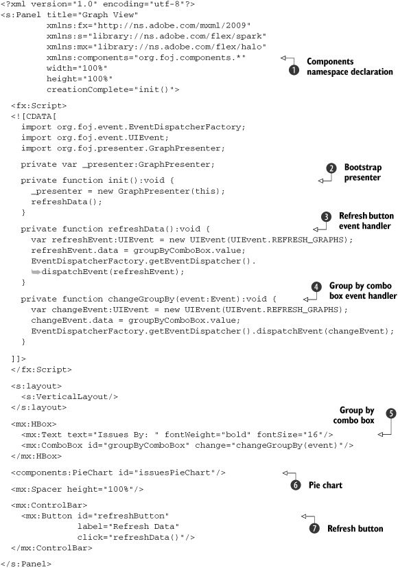
By now this should be almost second nature. You start by declaring the namespace for your pie chart components , and bootstrap the presenter in the init method . Next define a couple of event handler methods for use when the refresh button is clicked and when the group by combo box is updated . Add an HBox to contain a label component as well as the ComboBox to switch data field by which the data is grouped in your pie chart . Last, add a button to trigger a refresh on the data being displayed in the pie chart.
8.4.2. Creating a Presenter for the GraphView
After you’ve updated the view component for the GraphView, you need to create the Presenter to support it.
Listing 8.10. GraphPresenter.as

You start by defining an ArrayCollection of items for the combo box . This is an example of the power of a dynamic language such as ActionScript. Those familiar with JavaScript may recognize
this as JSON notation. ActionScript allows you to create objects like this without any type of Class declaration, which is great for these one off throwaway objects.
Next you define the constructor , which takes as an argument the view component that belongs to this Presenter. Inside this constructor you instantiate an issue model which you use to retrieve
the issues from the server side, as well as an instance of the GraphModel that you’ll create in a moment. You then add an event listener for the REFRESH_GRAPHS event and map it to your handler. The last thing your constructor will do is set the dataProvider property of the group-ByComboBox so that it has the appropriate display values and data values to function correctly.
Note
The two properties you define for the objects being passed to your combo box have special meaning to this component. The label property is what will be displayed to the user in the combo box. The second property, data, will be returned when using the value property for the combo box, which is similar to how HTML drop-down boxes work.
You next define an event handler for when the REFRESH_GRAPHS event is triggered . Inside this handler you make a call to the issue model to fetch the list of issues in the system. In the result event handler for this call you make a call to the graph model to aggregate the data and set the pie chart’s dataProvider property to the result from this call. Last you define a generic error handler as you have in the other Presenters .
8.4.3. Creating the graph model
Now the only thing left to do is implement your GraphModel. This model will contain only one method that is used to aggregate and format the list of issues retrieved from the issue model into a format that your pie chart can understand.
Listing 8.11. GraphModel
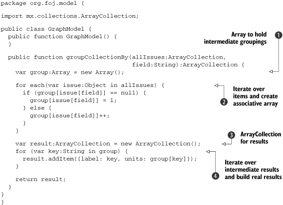
The implementation for this method is fairly simplistic. First you create an array that will be used to help group and count the items passed in by the property name in the field variable. Next you iterate
over the collection of issues . If the array does not contain an entry already with the field name, add it and set its value to 1. Otherwise increment the
value for that field name. Now create an ArrayCollection that will contain the real results that you need to return from this method . Iterate over the intermediate results creating a dynamic object containing the two properties that your pie chart needs to properly display the data: label and units. Last you return the result ArrayCollection.
Note
Concerning dynamically adding properties, recall that in your PieChartPresenter you are setting a property called legend on the results from this function call although you never define the objects being returned as having a legend property. This is another example of how powerful, and sometimes dangerous, a dynamic language such as ActionScript can be. Because you never defined a property named legend, ActionScript interpreted this to mean add a property to this object named legend, which it did, and happily continued on its merry way. If you fat fingered that property name somewhere else in your code it would make for a difficult bug to track down.
With all of the components implemented, build and deploy the RIA module to the local repository by issuing an mvn install command on the command line within this module’s root folder. Then change directories to the web module and run the command mvn jetty:run-war to start up the Jetty container so you can see your hard work in action.
Keep in mind that you may want to add the -Dmaven.test.skip=true option to that command so Maven won’t blow away any issues that you had entered into the database. After Jetty starts up, if you don’t have any issues created in the application, add a few, then click the Graph View button in the upper-right corner and you should see something similar to figure 8.3.
Figure 8.3. The finished GraphView
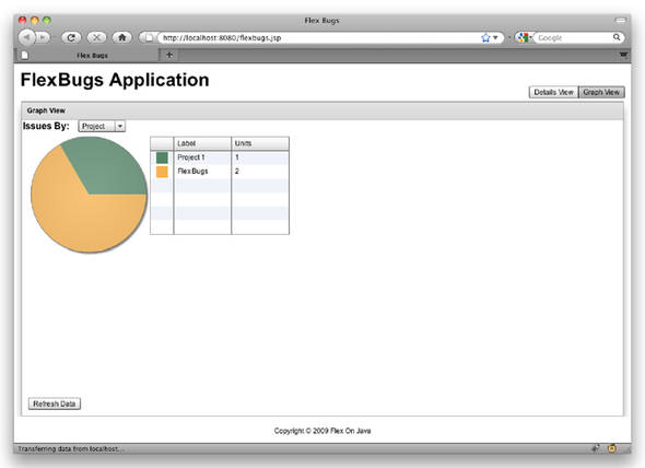
Next change the selected value in the combo box at the top of the page and watch your graph and legend update to display the data grouped by a different data point. If you click back to the DetailsView and add or remove issues you can come back to this view and click the Refresh Data button at the bottom of the screen and it should update your pie chart with the new data from the database.
8.5. Beyond the example
When it comes down to it, there isn’t much that you couldn’t visualize using Degrafa and some ingenuity and imagination. There are great examples of ways to visualize your data at the Degrafa site at http://www.degrafa.org/samples/data-visualization.html—everything from bar charts, to gauges, financial data, Gantt charts, even combining visualization with maps. There was even a recent presentation at 360|Flex Indy (http://www.flexjunk.com/2009/05/30/developing-a-smith-chart-using-axiis-and-degrafa/) on creating a Smith Chart using a data visualization framework called Axiis which is built on Degrafa. Figure 8.4 shows more examples of data visualization components created with Degrafa.
Figure 8.4. More examples of visualization components created with Degrafa

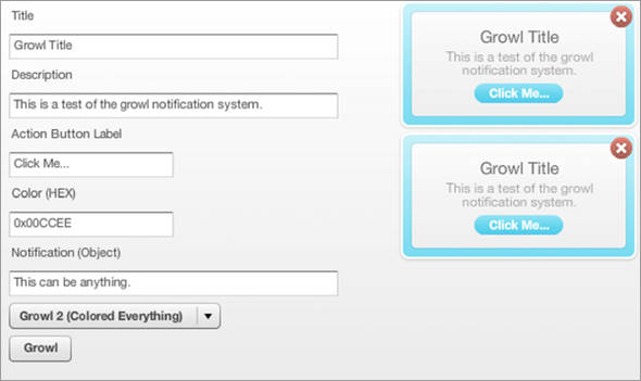
The Degrafa possibilities are endless; in fact someone has even created a Growl like component for use in Flex applications (http://lukesh.wordpress.com/2009/04/04/rawr-flexgrowl-component-available/). Figure 8.5 shows an example of this component.
Figure 8.5. A Growl like component for Flex
You can do amazing things with Degrafa, whether skinning your application and component to look like an iPhone application, or creating a rich user experience such as Autodesk’s Project Dragonfly shown in figure 8.6.
Figure 8.6. Autodesk’s Project Dragonfly interactive home design software
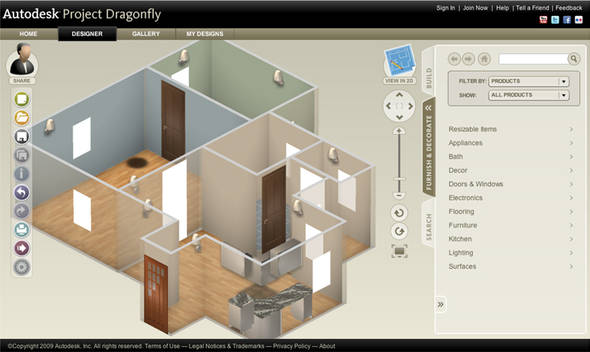
The Autodesk example, which can be found at http://www.homestyler.com/, is one of our favorite examples of what is possible with using the Degrafa library. In the Project Dragonfly app, you can do anything from defining your floor plan to moving furniture, doors, countertops, and other features interactively in either a 2D top-down view or a full 3D view that can be zoomed and rotated. This is a great example of an immersive rich internet experience; the kind of functionality you would never expect to be available from a web application. You’re limited only by your imagination.
8.6. Summary
In this chapter we’ve introduced the Degrafa framework and created a custom pie chart component. We’ve also introduced creating a custom ItemRenderer for displaying something other than simple text inside of a DataGrid cell. And if that weren’t enough we also demonstrated some of the dynamic features of the ActionScript language by creating ad hoc objects on the fly and adding properties to those objects at runtime.
We’ve also built this component in such a way that you could now easily refactor it into a separate reusable library. It wouldn’t take much effort to extract the components you created in this chapter into its own module and add them as a dependency to any project.