
Everything flows and nothing abides, everything gives way and nothing stays fixed.
—Heraclitus (535–475 BCE)
Greek philosopher
Strategy to Professional Status: Part III
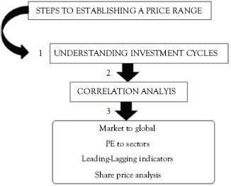
Aim: To establish a solid watch list with estimated price ranges
There are many different complex types of tests that you can conduct to identify which shares meet your preferred strategy. I prefer simple exercises that can be conducted to determine whether a share is actually worth buying. Or, stated differently, whether a company is even worth investigating as a possible trade option. There are simply too many listed companies on world exchanges to waste time analyzing shares that do not meet your specific investment or trading criteria.
The same exercises can also be used to identify a list of shares and to determine a trading price range—even before you start to look at technicals and related signals. One such exercise can tell you at a glance what a share is trading at, and more importantly, what is should not be trading at. All will be explained in this chapter.
This is discussed after an assessment of a brief explanation of investment cycles.
Understanding Cycles
If traders believe that they can ignore investment phases or cycles, they are absolutely and financially wrong. The investment phases of stock markets occur in all time frames and on every technical chart analyzed.
The general principle is that traders should be mainly in cash when the exchange is nearing then bottom of Phase 4 and moving into Phase 1. In Phase 2, traders need to have long-term positions established and entered into. In the following phase the market is starting to peak, and finally, reaches its maximum height. There is no way of assessing when the peak will be—but at this phase, traders should be selling and holding cash. In Phase 4, available cash should be used to enter into short positions.
While the aforementioned may be a simplistic overview, it does assist traders to determine an overall strategy, which will dominate the more specific securities’ entry and exit levels.
These phases tell you whether you should be long, short, or in cash, and obviously, influence your overall portfolio strategy. Once you are able to identify which phase the market is in, you can then trade accordingly to those characteristics. After a while, you will not even have to think about whether your trades should be long, short, or in cash. You will know, without question, exactly what you should be doing daily, weekly, and monthly. The following four phases are briefly set out hereunder.
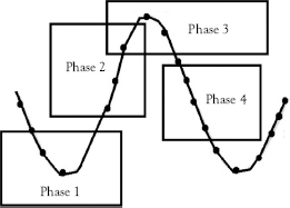
In 2003, I wrote and had a book called Jungle Tactics (Heinemann) published, where the aforementioned was set out in much greater depth and targeted MBA students. Despite the highly complex text of Jungle Tactics, I prefer the simplicity of the preceding diagram, which concentrates and explains the essential characteristics of the four stock market phases.
• Phase 1: This occurs after a prolonged downtrend, where stocks have been falling in what seems too many traders as free fall. The main signal in this phase is that the rate of decline in share prices starts to slow and eventually moves sideways. This is called forming a base and is essentially a movement away from sellers to an increasing amount of buyers. This is also called bargain hunting.
• The latter becomes more aggressive and the cycle moves to Phase 2.
• Phase 2: At this stage, stocks start to move into a bull trend, where the majority of funds are used to buy shares. Prices start to move rapidly up during this phase, despite some fundamentals still being of negative, that is, corporate results are still poor and investor sentiment wavers between optimism and pessimism. It is at this point that professional traders start to accumulate stocks.
• Phase 3: Stocks begins to trade sideways. It is often at this late stage that novice traders suddenly wake up to the fact that the market is in a bull run. They jump in, only to find out that there is little left of the uptrend. The trends in Phase 1 are being repeated at this level, with buyers and sellers moving into net buying and selling equilibrium.
• Phase 4: This is the phase where most traders make serious money—if they are wise, astute, and use various forms of trading tools. While this is the dreaded bear trend, solid fundamentals are still moving the market (or parts of the market) in short bursts. The trader can use shorting techniques or play the market anomalies. Those less wise tend to hold onto stocks in the hope that these will turn around.
I have been asked on many occasions: “How can you tell if the market is moving up into a bull run, down into a bear run, or just moving sideways?” What, in fact, is the early warning and distinguishing features of the aforementioned phases?
Its answer is that, during a consistent uptrend—or bull market—as in Phase 2, the shares are daily displaying a series of higher highs and higher lows. In Phase 4, the series of closing prices turns to being lower highs and lower lows. This is displayed in a series of peaks and troughs on charts that traders can trade quite successfully identify.
The following is an example of the share characteristics explained earlier:

It is also important to note that stocks only move in the above manner between 30 percent and 40 percent of the time. This means that more than half of the market’s movement is in a sideways, or ranging bound, movement. The rest of the time they move sideways in trading ranges.
The following share trend highlights the downtrend, uptrend, and sideways movement.

Which one would you rather trade?
• Stocks in strong uptrends tend to have short reversals (bounces). This gives traders the opportunity to go long.
• Stocks in strong downtrends tend to have short reversals. This gives traders the opportunity to go short.
Using the Four Phases
The best way of understanding the four phases is to see it as a tool to prepare for your trading week. The first step, therefore, is to develop technical triggers of overall markets. I suggest the following main global exchanges or indices, including the Dow Jones Industrial Average, the SP-500, The FT-100, The Cac-40, Hang Seng, Nikkei, and Chinese Shanghai.
Draw a three year chart of each—updated weekly. This way, you are looking at the four phases regularly and keeping abreast of any significant changes in overall trends, which, in turn, influences your, specifically, share selections. Remember to take market abnormalities into account, such as prolonged periods of up or downswings.
Many professional technical traders use the Elliot Wave and Fibonacci to identify major general market movements. These two highly complex indicators are discussed in many books dedicated solely to these charts. In this chapter, therefore, I will set out a brief and basic overview of these two systems. If these peek your interest and you want to know more, contact me on [email protected].
Elliot Wave
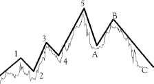
The summary of the Elliot wave theory is:
• Every action is followed by a reaction.
• There are five waves in a main upward trend (1 to 5).
• The upswing is followed by three downward waves (A–C).
• My problem with Elliot wave is that the time these waves take to complete a cycle varies.
There are three main rules in Elliot triggers:
• Wave 3 is never the shortest wave.
• Wave 2 can never go beyond the start of Wave 1.
• Wave 4 can never cross in the same price area as Wave 1.
Another problem I have in using Elliot waves as a general market indicator is that markets seldom move in the same manner twice, that is, patterns do reoccur, but these will often be different in length, time, and volatility. Therefore, it takes skill and experience to identify Elliott waves.
Fibonacci
Experts use Fibonacci triggers to assess and determine when a trend could change. The following steps are used to identify a probable change in market’s direction:
Steps |
Calculate |
1 |
Count the number of days, or price bars, between two peaks or market tops. Use 20 as an example. |
2 |
Multiply the number (as counted earlier) by 0.618, 1.618, and 2.618. • 20 × 0.618 = 12.36 • 20 × 1.618 = 32.36 • 20 × 2.618 = 52.36 |
3 |
Count the calculated number of days from the second price peak to forecast when the trend is expected to change. |
Conclusions
• Price peaks are measured as follows:
![]() Minor peaks to minor peaks.
Minor peaks to minor peaks.
![]() Major peaks to major price peaks.
Major peaks to major price peaks.
• Use any time frame you need.
• Projections are about 70 percent accurate.
• Professional traders use the Fibonacci retracement levels as potential support and resistance levels.
Personally, I look at the indices for changes in share characteristics. That is more than enough for this step in the process to learning how to become a professional trader. I believe that you will be far more successful as a trader when you design your own strategy, rather than simply looking at complex graphs and following someone else’s analysis of those charts.
Prepare for the Trading Week
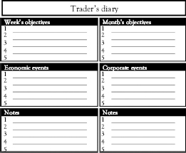
Preparation for the week must be part of the overall strategy you have developed. Understandably, some weeks will be busier than others, given public holidays (markets closed) and the timing of economic and corporate events announcements. Some weeks will be extremely busy, while other will be quiet. However, the serious trader uses quite times to research and analyze markets, sectors, and companies. After all, what is the point of downloading overall charts if you never have time to identify market phases?
Daily and weekly planning gives you a perspective of how you should trade within the overall market phase. At a glance, a trader should be able to see how busy his or her week will be. It does take time and diligence to have a solid plan in place, because the trades have to be precise to take advantage of economic and corporate press releases.
Always look at economic calendars to see what types of reports are coming out that could move sectors and specific shares. The easiest to download is the U.S. economic calendar, called The Beige Book.
Correlation Analysis
Why do you need to undertake any correlation?
What is, in fact, correlation and what do you intend to correlate? In addition to an assessment of risk and return, professional traders state that it is important to assess how securities can be expected to move together or, stated differently, how trades correlate to one another. Today, many traders use this technique for asset classes instead of just individual securities, thus constructing globally diversified portfolios.
Understanding the Basics of Correlation
Correlation is a very simple concept.
If you believe that everything in this world affects (to some extent) everything else, then markets must affect other markets. If global investments move together, there is perfect correlation, and that is assigned a value of +1. Simultaneously, if they always move in opposite directions, there is perfect negative correlation, and that value is −1.
As such, it can be concluded that if you cannot state whether one investment affects another, then these have no correlation or assigned a value of 0. The more difficult correlation is to identify when two investments are not positive or negative, but fall within the +1 to −1 spectrum.
Take, for example, the correlation of two retail companies. Both the companies are affected by the same ratios, that is, interest and inflation rates, cost of labor, and technology. Traders could expect (barring growth from acquisitions) that the share prices of these companies would have a similar movement throughout the market cycle (phases as set out earlier), and therefore, these two shares could be considered to have a strongly correlation.
The same can be said about two markets in different parts of the world.
However, there are factors that can be negative for one industry, but positive for another. In the preceding example, if the price of oil rises, oil multinationals would benefit, but retailers are expected to suffer. As a result, the price of their stocks should move in opposite directions, and these have a low, or negative, correlation.
What does this mean for traders?
Let us assume there are two high-risk, high-return possible trades in different parts of the world. In addition, the second trade has perfect negative correlation with the first. Every time the first share price moves upward, the second will decline, and vice versa. If we put these two trades into a portfolio, will the combined portfolio have high return and zero risk?
Short-term gains in one holding are perfectly offset by losses in the other investment. However, because the underlying trend in both investments is a high return, the combination has a higher potential return. Does this make sense? In reality, it is rare that even professional traders will find two holdings with perfect negative correlation.
Actually, traders do not need to find the perfect correlation.
Anything less than a perfect positive correlation should reduce (not eliminate) your portfolio risk.
Traders have now gained an important lesson: Diversification is good, but the extent of the benefit depends on how the portfolio is constructed. For instance, investors would have a better diversification benefit by including equities in at least three sectors and split between blue chips, mid-caps, and higher-risk securities.
While the classic theory suggests that diversification reduces trading risk, it can also reduce your overall portfolio risk. The intention is to combine high-risk high returns with lower-risk longer-term attractive returns.
Traders’ optimum combination:
Determine your acceptable level of risk and then assess the level of return you can expect, as per the following example:
• Determine potential loss: A trader wants to establish a risk profile where a 10 percent decline in a stock is countered by a 50 percent rise in that stock.
• Determine potential return: The trader can first assess a required rate of return and then assess the least possible risk in acquiring stocks.
These are powerful tools to manage risk and construct portfolios to meet various constraints.
Market to Global
When you become a more experienced trader, you will understand that assessing the market you trade in to global ones is not only for traders who wish to trade across global markets. All markets are affected by one another. A movement in the United States will affect traders in Asia and in Europe, depending on timeframes and the severity of that movement. It is, thus, important to follow a few simple guidelines as to the influence of foreign markets over the market you are trading in.
The easiest way to determine correlation between two indices is to simply divide your preferred index by that of the foreign one. This will tell you what the correlation is.
For instance, if the correlation is 2 percent between the U.S.’s Dow Jones and the French Cac-40 index, then if the Dow Jones rises overnight by 1 percent, it can be assumed that the Cac-40 index will rise by 3 percent. Conversely, if the Dow falls by 4 percent, the Cac-40 index will fall by 6 percent.
The following is a guideline, and experience and skill will help you develop it further. I suggest that you tailor-make it to suit your trading skills. Firstly, the following assumes that the United States, being the largest stock market globally, affects markets around the world.
Take note:
• Use three indices in each market to determine the overall expected move and influence of that market over others.
![]() The United States: The Dow Jones industrial index, SP-500, and the Nasdaq.
The United States: The Dow Jones industrial index, SP-500, and the Nasdaq.
• If there is overall movement in the United States (two of the preceding indices are up or down), then assume that the influence will be negative or positive on the Asian markets.
![]() Asian: China’s Shanghai index, Hong Kong’s Hang Seng, and Japan’s Nikkei.
Asian: China’s Shanghai index, Hong Kong’s Hang Seng, and Japan’s Nikkei.
• Always seek an affirming movement.
![]() If you are trading European or African exchanges, then assess U.S. markets and find confirming indicators in Asian markets.
If you are trading European or African exchanges, then assess U.S. markets and find confirming indicators in Asian markets.
![]() Europe: United Kingdom’s FT-100, French Cac-40, and German Dax.
Europe: United Kingdom’s FT-100, French Cac-40, and German Dax.
![]() Example: If you are trading in the United Kingdom:
Example: If you are trading in the United Kingdom:
![]() If the U.S. markets were up (two indices were positive).
If the U.S. markets were up (two indices were positive).
![]() The Asian markets were up (two indices were positive).
The Asian markets were up (two indices were positive).
![]() You can assume that positive correlation between these markets and the FT-100 will be positive.
You can assume that positive correlation between these markets and the FT-100 will be positive.
![]() As a day trader, you would go long yesterday’s worst performers.
As a day trader, you would go long yesterday’s worst performers.
![]() If the markets were negative, you would short yesterday’s best performers.
If the markets were negative, you would short yesterday’s best performers.
• The preceding depends on your personal strategy and your understanding of how markets move relative to each other.
• The preceding is merely based on assumptions and do not always work. Some traders add a confirming indicator.
Leading versus Lagging Indicators
When trying to establish a price range, a trader needs to understand that some sectors lead others. In other words, when Sector A moves up, Sector B moves down, or vice versa. There is, therefore, a need to fully understand strengths and weaknesses of indicators used to identify whether one security or index leads or lags another.
For instance, if you do not know that the country’s stock market is the leading indicator of economic activity, every action you make as a trader will be premised on incorrect assumptions. Think about that for just one second?
Trader’s Triggers
• Lagging indicators provide signals after trends have started.
• Leading indicators provide signals before trends have started.
It is obvious that traders would, at initial glance, say that they would rather use a leading indicator, because they would then be better placed with each trade. The problems is that leading indicators often provide false signals. A prudent trader would rather use a lagging indicator as confirmation of a trend that has started.
More Information: Leading Indicators
Leading indicators are oscillators, which is any data that moves back and forth between two points. More specifically, an oscillator enables traders to develop entry and exit signals.
Examples: Stochastic and relative strength index are all oscillators and are explained in this volume and are generally used as warning signals that a trend could be changing or reversing.
More Information: Lagging Indicators
Traders use lagging indicators to assess a security’s momentum.
Examples: MACD and moving averages, which are set out in this volume. These indicators are used to identify trends once they have been established. The negative is that traders are entering a position late.
If you are able to identify the type of market you are trading in, you can pinpoint which indicators could give accurate signals and which ones are worthless at that time. So, how do you figure out when to use oscillators or momentum indicators, or both? Both are explained further on in this volume.
So, for now, just understand that, once you are able to identify the type of market you are trading in, you will then know which indicators will give you more accurate signals. In the future sections, we are going to teach you how to correctly identify the environment you are trading in to better use these triggers!
Share Price Analysis
Using the stages of stockbroking phases, traders must run scans to find some potential trades. Specifically, they need to assess for stocks that:
• these need to be in strong bull or bear trends; and
• meet the criteria as set out in this chapter.
Using this trading strategy, traders use the Williams %R (outlined in later text) to assess whether they should go long or short. Once that happens, then you need to run through their watch lists to find potential trades. The ability to establish a solid watch list is important to expedite trades, so establish a set of criteria to identify potential trades. For instance, if you have assessed that the pharmaceutical industry is the one to be in, you need to find companies that fit those criteria. This means finding companies that meet these criteria that are listed in any sector of the exchange you are trading in. This means that you are not just looking at the pharmaceutical sector, but at all sectors. In addition, if you are a global trader, you would be looking for such stocks across world markets.
A method that some traders adopt is to compare the company’s share price, its 12-month high and low and its net asset value. The following table is an example:
Name |
Nature of business |
Share price |
NAV |
Buy–Sell |
||
Price |
12-month high |
12-month low |
||||
Company 1 |
|
|
|
|
|
|
Company 2 |
|
|
|
|
|
|
Company 3 |
|
|
|
|
|
|
Company 4 |
|
|
|
|
|
|
Company 5 |
|
|
|
|
|
|
The benefit of doing the preceding exercise is that—at a glance—you will be able to see and assess a company’s share relative to itself. For instance, if Company A’s share price is 120 cents and this is close to its 12-month high of 130 cents, is the share still worth buying?
Well, if the share price is still below the 160 cents net asset value, it may be? It triggers possible shares in the watch list. Once you have made the trade, stick to your analysis. Use your exit strategy to either take profits or losses, but do not be swayed by market news and innuendo.
The success of this trading strategy relies on ability to find good stocks to trade within reasonable ranges.
Chapter 4 looks at the essential signals developed for technical analysis.