
Time is the wisest counselor of all.
—Pericles (495–429 BCE)
Greek statesman and orator
Good Place to Start
From experience, I have not found a single technical trigger that gives you the correct signal every time you use it. An old colleague once told me: “the aim is not to be right all the time. Just be right more times than you are wrong. That way, you should be successful as a trader.”
Here are some excellent points to remember:
• Use few indicators—no more than six triggers at any one time.
• Ensure that you understand these thoroughly.
• Make sure you use the right timeframes for your trades, that is, short-term triggers for day trading and long-term triggers for long-term investments.
• Ensure that these indicators are used in conjunction with your trading plan.
• If you are going to use triggers, then believe in them and use them—do not panic when you see a sell trigger.
Let us take a look at the three most popular types of charts:
• Line chart.
• Bar chart.
• Candlestick chart.
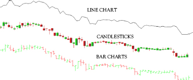
A basic explanation of line and bar charts follows in this chapter. Candlestick chart is outlined in later chapters.
Line Charts
A basic definition of a line chart or graph is simply a line drawn joining one closing share price point to the next closing share price point. Over the weeks, a line will form, outlining the current trend of the share. In essence, a trader can see the general price movement of the share for the period of time he or she has decided on.
The following is an example of a line chart for listed company XYZ Ltd.
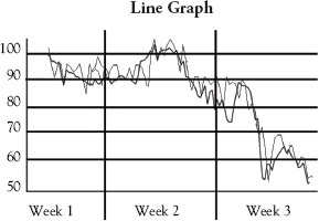
From the preceding line chart, traders can see:
• The share price has fallen from 100 cents in Week 1 to close to 50 cents in Week 3.
• In Week 1, the share fell to 90 cents and seems to stabilize at this level.
• In Week 2, the share returned to 100 cents and briefly broke through this ceiling.
• Between Weeks 2 and 3, the share price bounced before resuming a downtrend.
Bar Charts
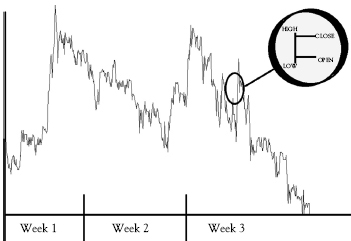
A bar chart is only slightly more defined and shows more than just a closing share price. It indicates and highlights the opening and closing price, as well as the highs and lows achieved by the share at the point taken.
• Bottom of the vertical bar: lowest traded price for that time period.
• Top of the bar indicates the highest price paid.
From an economic perspective, however, it is important to note that the word bar refers to one set or group of information as set out by that data point. Confusion exists in that this one data point can be a week’s information or even a year’s. It depends on the time frame taken for the trader in drawing the bar chart. The following explains the aforementioned magnified portion of the chart.
• Open: Defines the opening price of the share.
• High: Defines the highest price paid for the share at that point in time.
• Low: Defines the lowest price paid for the share at that point in time.
• Close: Defines the closing price for the share.
Chapter 5 looks at methods to identify market trends using technical triggers.