
4 Describing data
After you have cleaned your data, checked for errors and problems and created new variables, it is time to describe your data. Every piece of scientific research, no matter whether it is a seminar paper or a thesis, will include a part where you just describe what you see. No fancy causal analyses or advanced statistical methods are needed here, just reporting means, medians, tables or the distribution of variables, so the reader can get an impression what the data is all about. Furthermore, descriptive parts are also extremely relevant for yourself as a good description always helps in understanding the phenomena you want to explore. In this chapter you will learn how to do this.
The Fre command
In the last chapter you have already encountered the tabulate command, which is used to inspect variables or create crosstabs. While the command is really good for the second task, when it comes to just looking at one variable, there is a better option available. This is the fre command (Jann, 2007) which creates clear and concise information about variables, and offers many useful options. The biggest advantage, in comparison to the standard tabulate command, is the fact that fre always displays numerical values next to the value labels, which is a real boon for recoding. To install, just type
ssc install fre, replace

fre industry

It will be downloaded automatically from the web database, as it is community-contributed software. Throughout the book we will use the tabulate command, as this is the standard, and always available. Yet, I encourage you to compare both commands and see what helps you most in dealing with your own projects.
When you cannot use fre, but still want more comfort with the classical tabulate command, try the following after loading your dataset
numlabel, add

tabulate industry

Stata automatically added numerical labels to all categories. This is quite convenient, yet has the drawback that missing cases are still not shown automatically. Furthermore, the labels will be only added to existing variables, so you have to run the command again after you created new variables. Lastly, the labels added will also show up in the graphics you produce, which can be annoying. To get rid of the labels again type
numlabel, remove
4.1 Summarizing information
By now we have used the tabulate command several times to get an impression of our data, but as variables can contain thousands of different numerical values, this is not a good way to summarize information. This is usually done by employing statistical indicators such as the mean, median or standard deviation. Stata can compute these numbers easily, which of course requires a variable with an inherent metric (remember that you should not summarize nominal or ordinal variables in this fashion, as the results can be meaningless). We will use the same dataset as in the last chapter. A great variable to test this is age, so let’s see this in action
sysuse nlsw88, clear          //Open dataset

summarize age, detail
or click Statistics → Summaries, tables, and tests → Summary and descriptive statistics → Summary statistics. You will receive a table indicating the (arithmetic) mean (39.15), the standard deviation (3.06) and the number of cases used (2,246).

When some persons have missing values for a variable, you would notice it here. The left part of the table computes certain values as percentiles. Remember that the median is the 50% percentile. In our case that means that 50% of all persons are 39 years old or younger, while 50% are older than 39. When you need a percentile that is not listed here, like 33%, try the centile command:
centile age, centile(33)

or click Statistics → Summaries, tables, and tests → Summary and descriptive statistics → Centiles with Cis. The result is 37, meaning that one third of the sample are younger or equal to 37 years old, while two thirds are older than that age. If you want to learn more about the other statistics presented, refer to your statistics textbook.
In a seminar paper, you should report the most basic statistics for relevant dependent and independent variables, like the mean, standard deviation, median and number of observations. Doing this is quite easy and can be done using all variables at the same time, as long as you only include metric, binary or ordinal numbers:
summarize age never_married collgrad union wage

As long as your binary variables are coded in a 0/1 fashion, you can include them as well, as the mean is just the percentage with a value of 1. To export such a table into your text-editor, you can highlight the table in Stata, right-click and copy it directly.
Unfortunately, this will often not yield the desired results. To get nicer results, you can use a user-written script (CCS).
ssc install estout, replace                               //install CCS

estpost summarize age never_married collgrad union wage

esttab using “out.rtf”, cells(“mean sd min max”) noobs

The last command creates a nicely formatted table, in a new .rtf-document, in your current working directory (Figure 4.1). The options in parentheses, after cells, specify which statistics to include. Using this script makes it quite convenient to export tables and use them directly in your publications, with only little adjustments needed afterwards. Make sure to read the official documentation for the command, as it is very powerful and offers many options.19
4.2 Using stored results*
Sometimes you calculate statistics, to further use them in an algorithm or to transform data. For example, you can use the mean and the standard deviation to z- standardize20 a metric variable. By doing so, the transformed variable will have a mean of zero and a standard deviation of one, which is often helpful in regressions. Normally, you would tell Stata to calculate the mean and the standard deviation, write down the values and plug them into a formula to generate the new variable, for example
summarize wage, detail
– output omitted –
You see that the mean is 7.77 and the standard deviation is 5.76. Now you generate the new variable
generate z_wage = (wage-7.77)/5.76
Luckily this can be done faster, as many Stata commands not only display the numbers but also store them internally for other uses. To see what Stata stores, run the command (summarize) again (as only the results of the last command will be stored) and try
return list21

You will see a list of all statistics Stata saves. You can use them directly
quietly summarize wage, detail22     //Do not show output

generate z_wage2 = (wage-r(mean))/r(sd)

summarize z_wage2           //Check result

We see that the overall mean is very close to zero. The difference is only due to rounding.
4.3 Histograms
While central statistics, as discussed above, are important, sometimes you want to show the actual distribution of a variable. Histograms are a good way to do this for metric variables. Try
histogram age

or click Graphics → Histograms. When you are used to working with histograms, the result might disappoint you as white areas between the bars are not common for this kind graphic. The problem here is that, although the variable has an inherent metric, due to the special sample, there are only a few distinct values (from 34 to 46). To get a nicer graph type
histogram age, discrete

or choose the option Data are discrete from the menu.
Another type of graphic, that is related to histograms, are kernel-density plots that offer a smoother view of the distribution:
kdensity age

You will find this graphic under Graphics → Smoothing and densities → Kernel density estimation.
When you want to combine several plots within one graph, you can use the command twoway:
twoway (kdensity wage if collgrad==0) (kdensity wage if collgrad==1)

or click Graphics → Twoway graph and create the subgraphs separately. Note that, although the command is called twoway, you can combine an arbitrary number of plots in one graph. The code for each subplot has to be enclosed in parentheses.
4.4 Boxplots
Another way to create clear and concise graphics for metric variables is via boxplots. Try it by typing
graph box wage

or click Graphics → Box plot.
You see one box with a thick line in it which marks the median (the second quartile). The lower bound of the box is the first quartile, the upper bound is the third quartile. Therefore, the box includes 50% of all observations around the median, and the distance from lower to upper bound is also called the interquartile range. The other two limits, which are connected to the box, are the whiskers of the boxplot. The distance from the box to the end of the whisker is at most 1.5 times the size of the interquartile range. All observations that are outside the whiskers are outliers (per definition) and depicted by dots. Note that the length of the whiskers can be smaller if there are no observations beyond. Thus, in our case, the lower whisker is shorter than the upper (as the smallest value is 1.0).
Boxplots are also very practical for comparing metric values between groups. Try
graph box wage, over(union)

Using histograms or the sum command provides a great opportunity to inspect variables quickly. By doing this, you will notice that outliers are a common problem. Outliers are cases that have extremely small, or large, numerical values on metric variables that are rather uncommon. For example, let’s inspect the variable wage visually, by typing
histogram wage

You will notice that there is a large proportion of the values between 0 and 15, while there are only very few cases beyond that. What you consider an outlier depends on your research question, your data and your personal opinion, as there is no general rule to classify them. Basically you have three options to continue:
- Do nothing. Just leave the variable unchanged and work with it. This can work very well, but sometimes outliers can influence your regression results significantly. You should probably invest some time, and try to find out why there are outliers, as there might be a coding problem or error in the data. If this is not true, and the data is correct, you should have a closer look at the respective cases as there might be an interesting hidden subpopulation for further research.
- Fix them. You can fix outliers to a numerical limit, say 25. So every value that is larger than 25 will be set to this value. You can do this by typing
Pay attention to the part !missing(wage) as otherwise all people with missing values on this variable will also receive this value, which would be a severe mistake. The general problem with this technique is that it reduces the variance of your variable, as the values above the limit, which can be different from each other, will all be set to the same value.replace wage = 25 if wage > 25 & !missing(wage) - Remove them. Sometimes you can exclude any cases from your analysis that are outliers. This means you will not use these observations. Say again, that our limit is 25, so we type
replace wage = . if wage > 25
All cases with larger values will be set to a missing value, and thus not used. This option can introduce bias, as in this case, you remove some special groups from your analyses; namely people with high incomes.
You have to think theoretically, when certain subgroups are not included in your study, as to what this can do to your research question.
Whatever you do, make sure to write about it in your research paper, so the reader knows how you processed the data. And make sure to reload the original dataset if you executed the commands described here, otherwise your results will differ from the ones presented here.
4.5 Simple bar charts
Let’s have a look at the variable industry, which tells us the branches respondents work in. We type
tabulate industry

and receive a table that lists frequencies. Let’s suppose we want to convert this information into a bar chart, so it can be represented visually, and that we want to plot the absolute number of frequencies for each category. Oddly, there is no easy way to do directly this in Stata. One possibility is to use the histogram command with a lot of options, that somehow brings us closer to what we want, but it is complicated and often not exceptionally pretty. Especially, when a variable has many categories and you want to label them all, it gets tricky. Luckily, someone before us noticed this problem and wrote a little command (community-contributed software) that helps us out. Type
ssc install catplot, replace               //install CCS
catplot industry, blabel(bar)             //plot variable

I hope this is roughly what you want. Note that you can customize the command by using options from the graph bar command. When you do not want to show the absolute numbers for each category, just remove the option blabel(bar). In general, Stata offers a variety of different graphs, and many sophisticated options to customize them. While this is a boon to the experienced user, beginners are often deterred from using the many possibilities. It is a good way to start with simple graphs, and use the point-and-click menu to try out different options to see what they do. Over time, you will build a personal preference for certain forms of representing data visually, and you will be able to create them easily. Make sure to always save your commands in a do-file, so you can look them up quickly later. When it comes to documenting how graphs are created, Stata is clearly outstanding.
4.6 Scatterplots
Whenever you want a visual representation of the relation of two metric variables, scatterplots are a good idea. They are used to check whether two variables are somehow related to each other, and whether there is any hint of a correlation visible. To see this in action, we want to plot the relation of wages to total work experience. We assume that people with more experience will earn more on average. We type
scatter wage ttl_exp
or click Graphics → Twoway graph (scatter, line, etc.) and click Create… and enter the x- and y-variable. The first variable (wage) goes on the y-axis, the second one (ttl_exp) on the x-axis. We can see that there seems to be some relation, yet as we have many data points, due to the high number of observations, some kind of thick cloud is created at the bottom making a visual inspection difficult. To account for this, we can try the option jitter

scatter wage ttl_exp, jitter(10)
– output omitted –
This is also extremely helpful when dealing with variables which do not have many distinct values. Basically, it creates a standard scatterplot and moves every data point slightly, and in a random fashion to the side so points are not plotted exactly on top of each other. The numerical value (in our case 10) is a value that tells Stata how strong this random movement should be. Another solution is to use the color option:
scatter wage ttl_exp, color(%20)

The number in parentheses can be between 1 and 100, and lets you adjust the saturation of the dots. When you want to get an even clearer visualization, try the CCS binscatter23 (you need Stata 13 or newer to use this). This command combines data points and, therefore, reduces their number but still recovers the overall tendency of the distribution, and also fits a linear model.
ssc install binscatter, replace           //install CCS

binscatter wage ttl_exp

4.7 Frequency tables
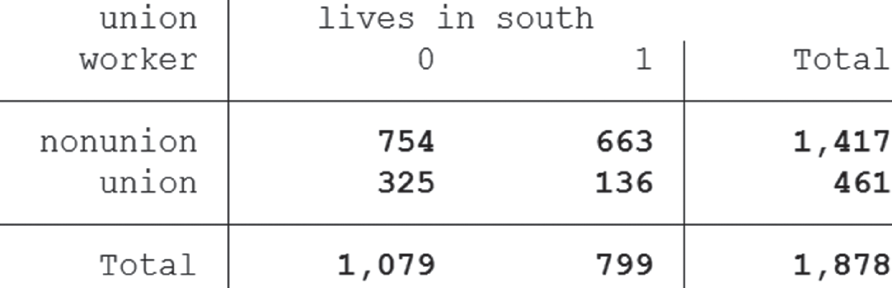
Simple tables are at the heart of science, as they can summarize a great load of information in a few lines. While fancy graphics might be useful in presentations, scientific publications should mostly rely on tables, even when they seem plain or boring. Stata offers a great variety of options for creating customized tables which we will explore in detail. We already know how to inspect the distribution of values, for one variable, using the tabulate command, and how to create crosstabs (see page 33). We want to expand these tables, to gain further insight, and analyze how the variables, union and south, are related, to check whether there are differences between the regions (south vs not south).
tabulate union south
Alternatively, click Statistics → Summaries, tables, and tests → Frequency tables → Two-way table with measures of association.
This yields a simple crosstab with plain frequencies. Often, not absolute numbers but percentages are more interesting, when searching effects. First, note that the variable union defines the rows of your table, and the variable south, the columns. We could summarize by column:
tabulate union south, column

Stata then displays percentages. We can compare relative interests in unions by region. In the south, only 17% are union members, while in other regions, this number is over 30%. We can deduct from this, that unions are much more popular in non-south regions than in the south (assuming that our data is representative of women from the USA). Or to formulate it differently: imagine you are in the south and talk to a randomly chosen woman. The chances that she is a union member would be about 17%.
We can also summarize differently by typing
tabulate union south, row

Stata summarizes, this time by row. Here we have to think in a different manner. Let’s suppose you visit a large convention of union members who are representative of the USA. When you talk to a random union member, the chance that she is from the south is 29.5%. Please take some time to think about the major differences when you summarize by row or column. What you choose must be theoretically justified for your individual research question.
A third option is to show the relative frequency of each cell:
tabulate union south, cell

This enables you to say that in your sample 40.15% of all respondents are not union members and are not from the south. Theoretically, you can also combine all options in one large table:
tabulate union south, column row cell

This is usually not a good idea as this table is very hard to read, and can easily lead to errors. Often it is a better idea to use more tables, than to create a super table with all possible options.
Another less common option I want to discuss here is 3-way-tables. Until now, we have looked at two variables at once, but we can do better. By introducing a third variable we can get even further insight. Imagine we want to assess the influence of the size of the city the respondent lives in. We have a binary variable as we count some cities as central and others not. To test the influence, we type
table union south, by(c_city)

You can create this table by clicking Statistics → Summaries, tables and tests → Other tables → Flexible table of summary statistics. There you enter c_city under Superrow variables, union under Row variable, and south under Column variable. Then click Submit. Another possibility is to use the bysort command to create these kinds of tables (for example: bysort c_city: tabulate union south).
Note that these 3-way-tables are difficult to read and nowadays there are better ways to analyze your data. In the past, when computational power was much lower, these kinds of tables were at the heart of social sciences. You will find them in many older publications.
4.8 Summarizing information by categories
When you have a categorical variable, which is relevant to your research question, it is often a good idea to compare across categories. For example, we could check whether completing college has any effect on your later income. We can use the binary variable collgrad, which tells us whether a respondent finished college. We can summarize the wage by typing
tabulate collgrad, summarize(wage)
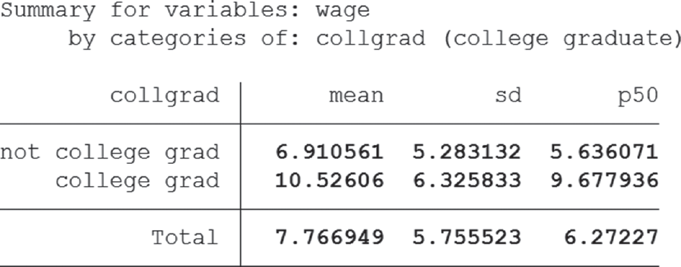
or click Statistics → Summaries, tables, and tests → Other tables → Compact table of summary statistics. Under Variable 1, enter collgrad and under Summarize variable wage, then click Submit. We notice a stark contrast between the means (6.9 VS 10.5) which tells us that, on average, people who finish college earn more.
When you want you can also combine frequency tables and summary statistics and produce detailed information for subgroups. Try
tabulate union south, summarize(wage)

You will receive information about the mean, standard deviation and the absolute frequency, separately for each cell of the table.
When you generally prefer graphs over simple tables, we can easily create a bar chart by typing
graph bar (mean) wage, over(collgrad) blabel(bar)
or clicking Graphics → Bar chart, tick the first line, enter Mean in the first field and wage in the second. Then click Categories, tick Group 1 and enter collgrad. Then click Bars and tick Label with bar height. You can produce more complex graphs by introducing more categorical variables, e.g. south:

graph bar (mean) wage, over(collgrad) over(south) blabel(bar)

Note that these graphs get more and more complex, so be careful that the readability is not lost in the process. If you are not happy with the format of the numbers displayed, you can change this. For example, replace blabel(bar) with blabel(bar, format(%5.2f)). The 5 is the total number of digits displayed and the 2 specifies how many digits should appear after the decimal point. f specifies that the fixed format will be used (alternatives include exponential formats, and many more). Formatting is a quite complex, yet not so popular issue, so I refer you to the help files (type help format). Just remember that the format option displayed here works with many more graphs and tables and will be enough to create nicely formatted graphics easily.
Another option for comparing groups are dot charts. For example, when you want to compare mean wages in different occupations, try
graph dot (mean) wage, over(occupation)

or click Graphics → Dot chart. By comparing both commands, you will notice that the syntax is almost identical, as only the bar is switched to dot. When you work with Stata for some time, you will get a feeling for the basic structure of commands, which are often similar.
4.9 Editing and exporting graphs
Producing graphics using commands, or point-and-click, is quite easy in Stata. This last part about graphs will show you how to finalize and export pretty graphs that could be used for publishing. To begin with an example, we will produce a simple histogram as before
histogram age, discrete
– output omitted –

A new window will open which shows the graph (Figure 4.2). This is fine, but we will add a caption and our sources. In the new window click File → Start Graph Editor.
Another window will open that shows some additional elements. You can now either click the element you want to edit in the graph directly, or click the elements on the right-hand side of the screen. This part of the window lists, in detail, all elements that make up the graph. We could now start to edit these, but we want to record the changes we make. This can be pretty useful, for example, when you want to export several graphs and add the same details to all of them. Then you only need to record your scheme once, and later apply it to all graphs. To do this click Tools → Recorder → Begin. Now we start editing by clicking “note” and enter “Source: NLSW88” and click Submit. Then we click Tool → Recorder → End to finish our recording and give a name for the scheme (nlsw88).24 To later use recorded schemes, we open the desired graph, start the Graph Editor and click Tool → Recorder → Play and choose the desired recording. As we want to keep it that simple, we click File → Save as… and save the file as histogram_age.gph. This is Stata’s own file format and can only be used in Stata. Then we click File → Stop Graph Editor, which closes the Editor window. We can now export the graph, so we can use it in a text editor. We click File → Save as… and save it as “histogram_age.png”. Preferred file formats are .png (which is a good idea when you want to use the graph in text editors or on websites) or as .pdf 25 (which makes upscaling for posters convenient). The corresponding commands are
histogram age, discrete                               //Create

graph save “histogram_age.gph”, replace               //Save

graph export “histogram_age.png”, as(png) replace     //Export
It is usually a good idea to save a graph first in Stata’s own format (.gph). When you notice a mistake later, or want to make a change, this is impossible with an exported file and you have to start from the beginning. Gph-Files make it easy to edit already created graphs, and export them again to any desired format.
4.9.1 Combining graphs
Sometimes you want to show several graphs in a paper to give the reader an overview of the data. You can either produce one graph for each variable or combine several graphs. This is often preferred when it comes to descriptive statistics as space is usually short and compressing information, especially when it is not the most interesting one, is a good idea. The basic idea here is to create each graph separately, give it a name, and later combine them.
First we start by creating the graphs:
histogram age, discrete name(age)

histogram wage, name(wage)
Each command produces a graph and labels it with a name (internally). Even when you now close the graph window, without saving it to your drive, it is still kept in memory as it has been named. When you want to change an already existing graph use the replace option
histogram age, title(Age) discrete name(age, replace)
Now we combine the two graphs into one image and label it as well:
graph combine age wage, name(age_wage)

You can start the Graph Editor, and make changes to each graph individually as all information is saved in the process. Naming graphs is also possible when you use point-and-click. You can find the respective option under the category “Overall”. When you do not name your graphs, the one you created last will be named “Graph” automatically. Note that only the one created most recently will be kept in memory, all other unnamed ones will be lost.
To conclude this very short introduction to graphs, I encourage you to explore the vast possibilities Stata offers when editing graphs, as they cannot be explained here. Actually, there is an entire book about creating and editing graphs in Stata (Mitchell, 2012). Shorter overviews can be found in the provided do-files for this chapter and online26
4.10 Correlations
As you have seen by now, it is quite easy to create helpful graphics out of your data. Sometimes it is a good idea to start with a visual aid, in order to get an idea of how the data is distributed, and switch to a numerical approach that can be reported easily in the text, and helps to pinpoint the strength of their effects. A classical approach is to use correlation, which measures how two variables covary with each other. For example, if we assume that the correlation between wage and total job experience is positive, more job experience will be associated with a higher wage. Basically, you have a positive correlation when one numerical value increases, and the other increases as well. Meanwhile, a negative correlation means that when you increase the value of one variable, the other one will decrease.
We can calculate this formally by typing
pwcorr wage ttl_exp, sig

or click Statistics → Summaries, tables, and tests → Summary and descriptive statistics → Pairwise correlations. Personally, I prefer the pairwise correlations command (pwcorr), as it additionally displays significance levels, whereas, the standard command (correlate) does not. The result tells us that the association is positive, with a value of 0.266 in the medium range.27 How you assess the strength of a correlation depends mostly on your field of study. In finance this value might be viewed as extremely weak, while in the social sciences this seems like an interesting result that requires further investigation. Note that this command calculates Pearson’s R, which is used for two metric variables. Stata also calculates correlations for other scales, like Spearman’s Rho or Kendall’s Rank correlation coefficient (both require at least two ordinally scaled variables), so try
spearman wage grade //Spearman’s Rho

or click Statistics → Nonparametric analysis → Tests of hypotheses → Spearman’s rank correlation.
Stata not only calculates Spearman’s Rho (0.45), but also tests whether the association between the two variables specified is statistically significant. As the displayed result is smaller than 0.05, we know that this is the case. The conclusion is that the correlation coefficient is significantly different from zero.
ktau wage grade //Kendall’s Tau

If you want to use point-and-click, go Statistics → Nonparametric analysis → Tests of hypotheses → Kendall’s rank correlation.
For more information on the different taus consult your statistics textbook. Also bear in mind that the ktau command is compute-intensive, and will take more time with larger datasets.
4.11 Testing for normality
Sometimes you want to know whether the distribution of a metric variable follows the normal distribution. To test this you have several options. The first is to use histograms to visually inspect how close the distribution of your variable of interest resembles a normal distribution (see page 51). By adding the option normal Stata furthermore includes the normal distribution plot to ease comparison.
If this seems a little crude, you can use quantile-quantile plots (Q-Q plots). This graphic plots expected against empirical data points. Just type
qnorm ttl_exp
or click Statistics → Summaries, tables, and tests → Distributional plots and tests → Normal quantile plot. The further the plotted points deviate from the straight line, the less the distribution of your variable follows a normal distribution.
If you prefer statistical tests, you can use the Shapiro-Wilk test (swilk, up to 2,000 cases), the Shapiro-Francia test (sfrancia, up to 5,000 cases) or the Skewness/Kurtosis test (sktest, for even more cases). As we have about 2,200 cases in our data, we will use the Shapiro-Francia test:

sfrancia ttl_exp

or click Statistics → Summaries, tables, and tests → Distributional plots and tests → Shapiro-Francia normality test.
The test result is significant (Prob>z is smaller than 0.05). Therefore, we reject the null-hypothesis (which assumes a normal distribution for your variable) and come to the conclusion that the variable is not normally distributed. Keep in mind that these numerical tests are quite strict, and even small deviations will lead to a rejection of the assumption of normality.
4.12 t-test for groups*
In one of the last sections, we compared the wages of college graduates with those of other workers, and noticed that graduates earned more money on average. Now there are two possibilities: either this difference is completely random and due to our (bad?) sample, or this difference is “real” and we would get the same result if we interviewed the entire population of women in the USA, instead of just our sample of about 2,200 people. To test this statistically, we can use a t-test for mean comparison by groups. The null hypothesis of the test is that both groups have the same mean values, while the alternative hypothesis is that the mean values actually differ (when you do not understand this jargon, please refer to your statistics textbook28).
We can run the t-test by typing
ttest wage, by(collgrad)

or click Statistics → Summaries, tables, and tests → Classical tests of hypotheses → t test (mean-comparison test) and choose Two-sample using groups.
You will receive a large table that summarizes what we have already seen from our own tables, plus some additional information. You can locate our alternative hypothesis (Ha: diff != 0, read: “The difference is not equal to zero”. Note that this hypothesis does not specify a direction and is therefore a two-tailed hypothesis). Below, you can read Pr(|T| > |t|) = 0.0000. This tells us that the calculated p-value is equal to 0.0000, which is very low and indicates that your result is statistically significant.29 Therefore, we conclude that the mean wages of the two groups do actually differ and there is a “real” effect that cannot be explained by chance. Note that this does not tell us why there is a difference or what causes it. It would be incorrect to state that wages differ across groups due to college education, as this correlation might be spurious. Just suppose that the real factor behind the difference is intelligence because intelligent people work smarter. Furthermore, only intelligent people are admitted to college. Even if the causal effect of college-education was zero, we would still find this difference in wages.
When you have more than two groups you cannot use the t-test introduced here to test for group differences but you can use regression models to do so (also have a look at page 89).
4.13 Weighting*
Until now we have assumed that our data is from a simple random sample, that means every unit of the population has the same probability of getting into the sample. In our case, that implies every working woman in the USA in 1988 had the same chance of being interviewed. Sometimes samples are way more complex, and we want want to introduce a slightly more sophisticated yet common example.
Suppose that you interview people in a city and your focus is research on migration. You want to survey the city as a whole, but also get a lot of information about the migrants living there. From the official census data you know that 5% of all inhabitants are migrants. As you plan to interview 1000 people you would normally interview 50 migrants, but you want to have more information about migrants, so you plan to oversample this group by interviewing 100 migrants. That means you only get to interview 900 non-migrants to keep the interviewing costs the same. When you calculate averages for the entire city you introduce a bias, due to oversampling (for example, when migrants are younger on average than non-migrants).
To account for this, you weight your cases. Migrants receive a weight that makes each case “less important”, all other cases will be counted as “more important”. You can calculate weights by dividing the probability of being in the sample when using a random design, by the actual probability, that is in our case (the following code is a made up example and won’t work with the NLSW88 dataset):
Notice that the weight for migrants is below 1 while it is greater than 1 for non-migrants. You create a variable (pw1) which has the numerical value of 0.5 if a respondent is migrant, and 1.056 if a respondent is non-migrant. We can use this variable in combination with other commands, for example
generate pw1 = 0.5 if migrant == 1

replace pw1 = 1.056 if migrant == 0

summarize age [weight=pw1], detail30
The weight is called a design weight as it was created in relation to the design of our sampling process. Refer to help files to check which commands can be used in combination with weighting. Refer to the Stata manual to learn about the svy-commands that were introduced to make weighting for highly complex or clustered samples possible (Hamilton, 2013: 107–122). For a practical guide see Groves et al. (2004): 321–328.
Statistical significance
Researchers are usually quite happy when they find a “significant” result, but what does this mean?31 This term has already popped up a few times and will become even more important in the following chapters. To understand it, one has to remind oneself that the data being used is in almost all cases a (random) sample from a much larger population. Whenever we find an effect in an analysis, so that a coefficient is different from zero, we have to ask: did we get this result because there is a real effect out there in the population, or just because we were lucky and our sample is somewhat special? Stated differently: we have to take the sampling error into account.
As we can never test this rigorously (which would require repeating the analysis using the entire population instead of just the sample), statisticians have developed some tools that help us in deciding whether an effect is real. Remember, there is always a factor of uncertainty left, but a p-value, which indicates whether a result is significant, helps a lot. Usually, we refer to p-values below a value of 0.05 as significant, which is just a convention and not written in stone.
A common interpretation for a p-value, say 0.01, is: assuming that the effect is zero in reality (if you tested the entire population, not just a sample), you would find the test-results you received (or an even more extreme result) in 1% of all repetitions of your study, due to random sampling error. As this error-rate is quite low, most researchers would accept that your findings are real (but there is still a slight chance that you are just really unlucky with your sample, so be careful!).