
Chapter 5 : Creating layouts
Having established what editorial design is, and how an understanding of it and its components is essential to good design and art direction, we come to a key part of the design process itself: creating layouts. Although there is no magic formula for composing the perfect layout, there are certain considerations that condition the design of an editorial publication. Those dealing with roles, branding and the publication’s identity and readership have already been discussed, but others, such as specific factors (space, amount of copy, time, purpose) and required elements (type styles, weights, symmetry, images) play an equally important part. All these elements combine to act as guiding principles for the design. The way in which a designer interprets, applies or sets aside these principles is fundamental to editorial design, as is the ability to look at content and make the constituent parts work within the proportions of a rectangular page on paper or on screen.
Principal components of a layout
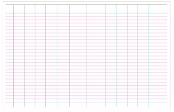
The components of this layout are contained on two single pages, which, together, form a double-page spread (DPS). Some of these components have been defined from a branding and identity point of view in preceding chapters; here, they are examined from a visual and layout-composition perspective. The box opposite shows the component parts, but it also shows the grid substructure, which consists of columns, column gutter, spine gutter, margins, folio line, baseline and trim area (see Chapter 6 for more information on grids).
Templates
For newspapers and news pages of magazines, flexible templates will speed up the layout and production processes, and give the pages and overall design a cohesion that might otherwise be lost in the frantic days and hours before going to press. Templates simplify all aspects of page make-up, but they can also be restrictive in design terms, and care must be taken to ensure that they don’t make pages look too alike. Imagery plays an important part here; subject, crop, scale and tension can all be used to distinguish pages from each other.
Template essentials
The essential elements of a template consist of margins (blue), columns and gutters (green), baseline grid (pink), folio (purple) and bleed area. This template uses a six-column grid, allowing the option of two-, three- or six-column layouts. The sizes of the margins are integral to creating white space on a page – their size is often influenced by advertising revenues as every extra centimetre can be sold. The baseline grid determines the variations in leading, and consequently type size, allowing the possibility for type of varying sizes to align. This baseline grid is founded on 9-point type on 11-point leading, meaning that all other type sizes need to fit on leadings that are multiples of 11. The folio is a guide line to mark the positioning of page numbers and sections.
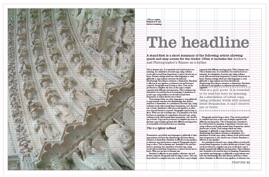
The spread opposite top incorporates some of the principal components of a layout. The image, headline, stand-first and pull quotes help to grab attention and provide easy, instant access to the article. The drop cap and folio help guide the reader, while the caption and credit add interest to both image and article. These components, plus colour and graphic rules, create variety within the layout.
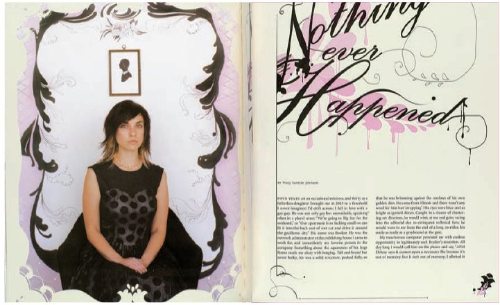
There are many other components that can be included in the design. The spread opposite bottom shows the added use of a subhead, a byline and sign-off. It also demonstrates the flexibility of the same template, using two columns instead of three, and a varying headline size and colour, all of which contribute to creating a different look and feel for this article.


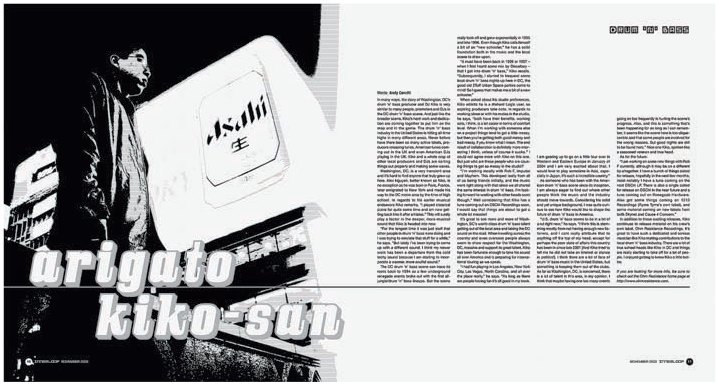
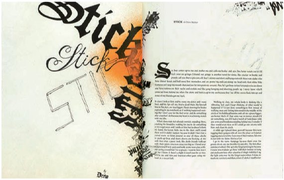
Depending on the size of the other components on the page, impact can be created by using a head that is either huge or small, and by placing the headline in dynamic relationship with other items on the page. Elements such as imagery or the content of a headline can be incorporated into the type to unify the whole layout, as with this spread in The Observer Music Monthly (above). If there is no pictorial image, the headline itself can be used illustratively and visually to create impact and focus. Key to good use of headline type is experimentation. Fishwrap (right) illustrates this well, with a range of decorative fonts that are created by illustrators making type and designers being inventive with letterform and, in some cases, designing original typefaces for the magazine.
This spread from Inner Loop (left) uses an oversize graphical headline as if it were part of the image. This headline contrasts strongly with the neat, ordered columns of text on the facing page. Interestingly, by aligning columns of text to a baseline, the designer has created the silhouette of an urban cityscape that echoes the facing graphic. The bleeding horizontal rule in the bottom third of the spread unifies the pages, drawing the disparate elements together.
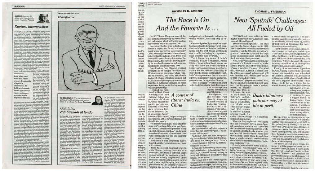
These pages from El País (above) and The New York Times (above right) illustrate different ways of using bylines. Incorporating such different styles into a newspaper signals to the reader the section they are in: news comment columns tend to be dense, with little use of white space, conveying a sense of importance and gravity. In more general comment and debate, bylines can be more engaging through the use of white space and playful pull quotes. The former signals news, the latter opinion.
Headline and heading
The title of the story is usually the largest type size on the layout, as its aim is to stimulate curiosity about the feature and tempt you to read on. A headline written before the story gets to the design stage can be helpful in determining a direction for the layout, but different publications construct layouts in different ways. It may be that the designer dictates the headline space by laying out the feature first, in which case the designer may have an input into the content of the text as well as its design. Either way, the content of the headline and its visual representation are interconnected and should be handled as such.
Cross-heads, paragraph indents, extra leading before a new paragraph, and paragraph breaks are employed to break up text and create smaller, more visually appealing blocks of text than lengthy columns of grey print. However, Janet Froelich, former art director of The New York Times Magazine (top and above), advises designers not to be afraid of such text use: ‘The New York Times Magazine is a reader’s magazine. Its mission is to present both text and images that give our readers a deeper understanding of the cultural and political forces at work in the world. To this end writers’ and photographers’ voices are critical, and the design serves that mission. Large blocks of text have a beauty that our designers respect. When juxtaposed with powerful photography, judicious use of white space and strong headline treatments, they give the reader a varied intellectual experience.’
Stand-first
As with the headline, the stand-first (or sell, intro, sub-deck) will usually be written by the subeditor and is normally around 40 to 50 words in length; any longer and it defeats its purpose, any shorter and it becomes difficult to get the necessary information in and can make the page look unbalanced. It is a good idea to construct a system – or style sheets – for displaying this kind of information rather than applying it on an ad hoc basis, but flexibility and the ability to deviate from the norm when necessary are important, so style sheets should always be used as guiding tools rather than hard-and-fast rules.
Byline
If the name of the author or writer is well known, it often appears alongside a picture of him or her to form a picture byline. Picture bylines are usually popular with readers and they work well in newspaper design, but in a magazine feature there is a danger they will detract from the many other elements on an opening spread.
Body copy
Text as a component of a layout can be handled in a number of ways. Columns of text are either justified (text filling the column width), ranged left with ragged right, or ranged right with ragged left. Left-ranged text is the most common in editorial because text that is centred or ranged right (ragged left) can be tiring on the eyes when reading large quantities of print. Similarly, column widths should be narrow enough to read easily (see Fassett’s theorem of legibility, p.156), but not so narrow as to create rivers of white space, which can occur when gaps between words in adjacent lines form distracting vertical shapes. Lengthy blocks of text can be broken up, making overall readability easier, but also making the page lighter and more attractive to the reader.
Towards the end of the production cycle, when all necessary editing, cutting and changing of copy has been completed, a good designer will manually fine-tune body copy to make it look as appealing as possible. Words may be kerned or lines tracked back to remove a single word at the end of a paragraph (widow) or a single word at the top of a column (orphan), soft returns added to create a better shape in the ragging of the column, words taken over to improve line lengths, and hyphenation inserted in the case of awkward word or line breaks. By looking at the blocks as shapes, designers should be able to use such tweaks to make blocks accessible and appealing. It looks neater to have at least two lines of a paragraph at the top and bottom of a column – more details on type sizes, leading and alignment can be found in Chapter 6.


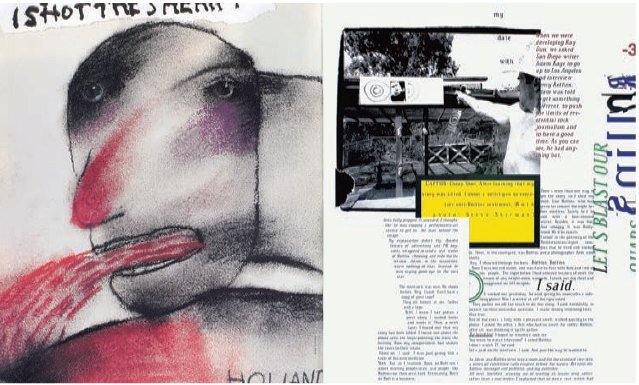
Text can be used as well as images to illustrate a concept. A conversation can be laid out to be oppositional, confrontational, light-hearted or animated. Font use, runarounds, shaping and spacing can all work towards delivering not just letterforms but the tone, content and style of an article. David Carson famously used dingbats to illustrate the irrelevance of a Bryan Ferry interview in a month when very similar interviews with the star had already appeared in dozens of magazines, but Vince Frost in Zembla (top) and Martin Venezky in Speak (right) illustrate more subtle ways of suggesting expression through body-copy layout. Look at concrete poetry and the work of the Dadaists for inspiration.
The initial capital (which is also a partial drop cap) for this spread in Fishwrap deftly echoes the headline, which, set at a diagonal, directs the reader’s eye straight to the first paragraph of text.
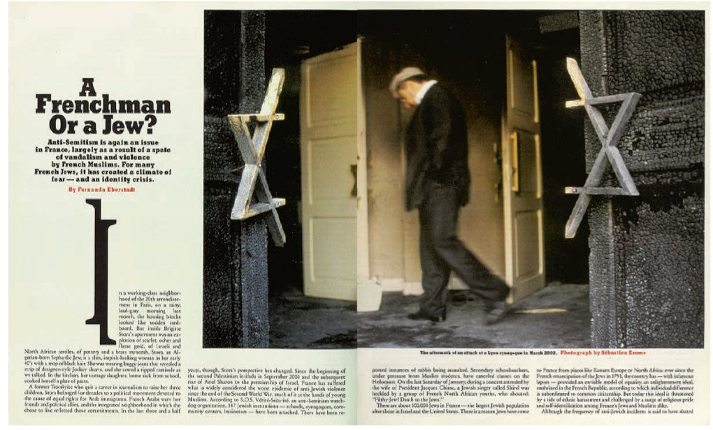
Drop caps can do more than indicate the start of an article, chapter or paragraph. On the New York Times Magazine spread below about the identity crisis among French Jews facing the rise of anti-Semitism, art director Janet Froelich split the drop cap ‘I’ in two and used it to illustrate that crisis, while echoing the split Star of David in the . facing image.
During the 1980s and 1990s it was fashionable to see pages that were built purely around text and typography, and stories that were interpreted through typography. It takes skill and cooperation between the editorial and design departments to do this well, and a very active engagement with the material on the part of the designer. Vince Frost on Zembla went as far as creating shapes to suggest dialogue, and using the language of printing as a visual element – literally, having ‘fun with words’, as the tag-line for the magazine states. He says, ‘There is no point in designing a magazine if you don’t like the subject matter.’
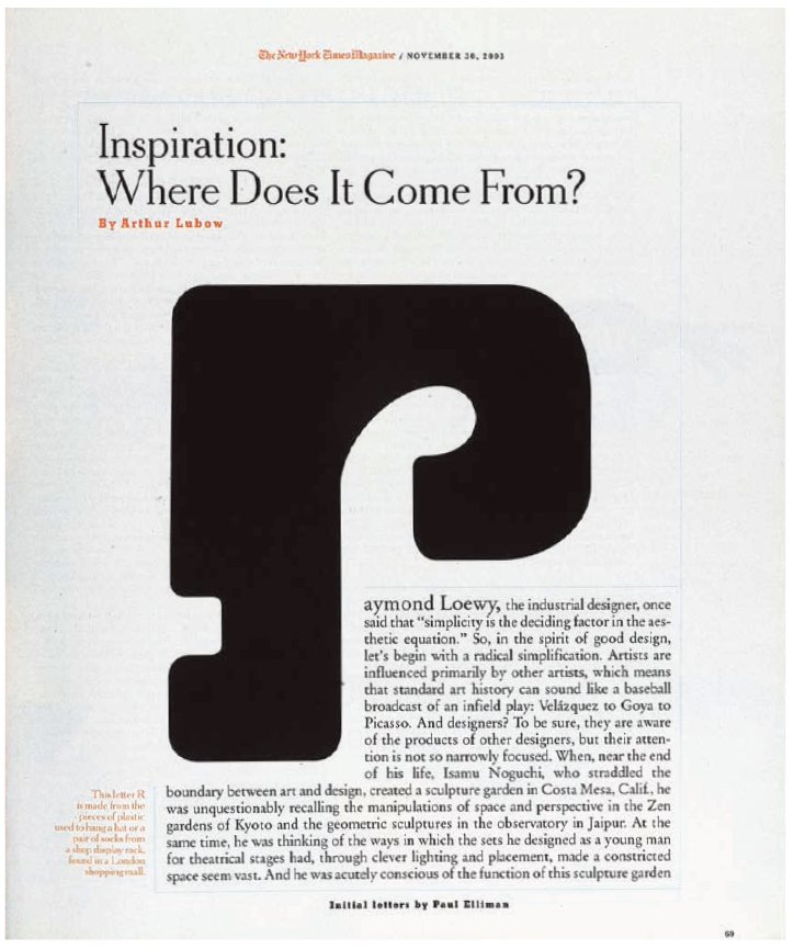
The drop cap in this layout by Janet Froelich from The New York Times Magazine introduces an element of discord into an otherwise harmonious layout.
Drop caps and initial caps
As well as indicating where a story begins, drop caps and initial caps – the former drops below the baseline, the latter sits on it but is bigger than the rest of the body copy – can be put into paragraphs to break up copy and avoid a page of monotonous ‘grey blocks’. Drop caps and initial caps can sit within the body copy or outside; they can be enormous, and whole words or symbols. Thought should be employed when choosing the font for a drop cap or initial cap to complement the rest of the body-copy style; it could be a heavy cut of the body typeface or a completely contrasting typestyle, such as an elaborate italic juxtaposed with a clean, modern sans serif.
Pull quotes can be used in a number of ways, from the standard blown-up text, seen in virtually all editorial, to unique ones that visually enhance the content. More traditionally, quote marks can be run vertically to create energy or dynamic interest on the page, or run in a blank column to enhance white space, as seen below on a spread from Het Parool.
Cross-heads or subheads
These small headings usually sit within the body copy but may be a larger size, bolder, ‘capped-up’ (in upper case), coloured, or set in a different typeface.
Quotes, pull quotes and sound bites
As with most display copy, pull quotes are selected by the subeditor, but the design team should have a say in their number, placement and length. Quote marks form a focal point on a page, and can be used in varying ways to create extra interest. Either single (‘ ’) or double (“ ”) quote marks can be used, as long as usage is consistent. When the quote is taken from the text but has not been made by an interviewee or subject, quote marks are not usually used. Ways of designing pull quotes (with or without quotation marks) might include floating text in a box, running them in a separate column, running them as bands across a whole spread or using them over pictures. In newspapers their use is vital as a device for drawing readers into a news page.
Straplines, section headings and running headlines
These give structure to the various sections of a publication, identifying or emphasizing what that subject matter, section or feature is about. Graphics such as lines or rules, blocks, bars, WOBs (‘white on blacks’) and shapes can be used to give straplines an identity. A running headline is an abbreviated headline that may appear on further pages of an article, especially if the article continues over several pages, thus reminding readers which story they are reading.
Jumplines (or turn arrows) and end icons can be emphasized graphically with a box, bullet or initial from the publication title or other symbol. End icons show the reader the end of the story, and are a good visual guide to the length of an article, as here in Twen, which used whimsical jumplines.

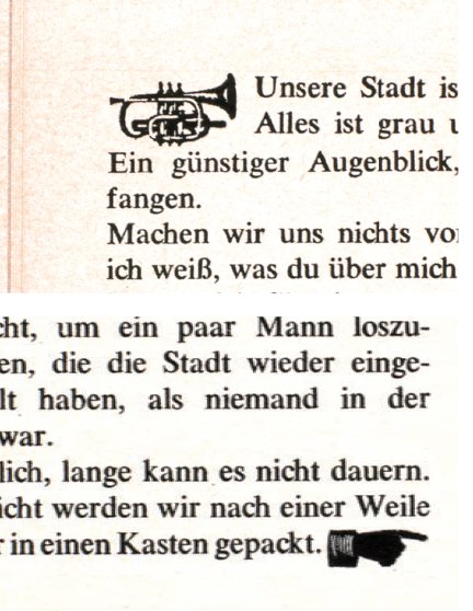
Along with pull quotes, there are many other devices for adding visual interest and alerting readers to particularly interesting text. Twen, for example, used numerous icons, including a little trumpet that announced a newsworthy item in a column (top). The web uses a range of visual indicators that print designers can incorporate into page layouts, including arrows, buttons and rules.
If a story is to continue overleaf or elsewhere in an issue, it is helpful to let the reader know by employing either “continued on” and “continued from” lines or some form of directional arrow. This is called a jumpline, turn arrow or, on a newspaper, a slug. Stories spanning more than one page should break midway through a sentence or paragraph, as a full stop at the end of a page might make readers think they have reached the end of the story. The end of a story should be made clear with an end icon.
Captions
Captions usually appear near to or on an image, giving information about either that picture’s content, or the reason for the image’s presence and its relationship to the story. When there are a large number of images to caption, it can be useful to number each picture and relate it to a list of captions elsewhere on the page. Extended picture captions give additional text information not included in the main body copy. Captions in newspapers are treated as factual matter and rarely stray far from their associated image.
Folios
Folios work as a navigational aid around the issue and so are usually in the same place on each page – either bottom right or middle in order to find and see the number easily. If they are placed near the gutter, flicking through to locate a page can be hard work. Newspapers often put numbers at the top; book folios often incorporate the title and chapter, too. While magazines often drop folios (on full-bleed pictures, full-page ads, etc.), it is vital that a newspaper does not do so (except on ads) in their main news sections. Here, navigation and swift location of stories is key to the reader’s experience, so folios must be easy to read and well placed, enabling the reader to flick to a particular story or to one continuing from the front page.
Picture credits
The credits for images normally run on the same page as their image, either running vertically up the side of the image or in the inside gutter of the page. However, if the photographer is well known, his or her name is likely to be treated as a byline or incorporated into the stand-first.
Boxes, panels and sidebars
Rules, colour tints, borders, different column widths and sans-serif faces (as opposed to the serif faces often used in feature copy) are traditional ways of handling box or panel copy, either related to a story or being laid out as a stand-alone item.
In Fishwrap (above) all individual page credits are listed on an inventive map at the front of the publication. This approach makes finding credits easy and means they do not have to be incorporated on the highly visual spreads that are a trademark of the magazine.
There are numerous ways of designing captions, including the caption map seen opposite in a page from Graphic International.
Images
Images are a key visual element on a page and their relationship to the story is crucial to the design. Either the text is driven by the image or the image illustrates the story; in both cases what is important is to create an interesting dialogue between text and visual. Within these two simple functions there are many different ways to approach image use. Martin Venezky in Speak, for example, ‘used design as a device to open up the interpretation of an article. ... Rather than directly illustrating a story’s content, I might develop a visual metaphor as a companion to the text,’ he explains.
How an image is cropped and scaled, where it is placed in relation to text and other images, and its position on the page or spread all create expression and narrative for the viewer. Faces looking towards the spine create harmony, those looking out draw the eye away from the publication and create tension; if two images face in opposite directions even greater tension is created. A large close-up of a banal image will draw the viewer in, while its contours or shape may create an abstract image that intrigues or surprises.

It is important to know when to use images as straightforward illustrations of the text. Faced with designing a spread on little-known modernist Cuban architect Mario Romanach, Criswell Lappin in Metropolis (above) remembers he was ‘less concerned with the graphic layout reflecting modernism as I was with showing a range of Romanach’s work. He was virtually unknown in the US, and his architecture says more about modernism than my layouts could. The red tint behind some of the images signifies that a building is in danger or is being destroyed.’
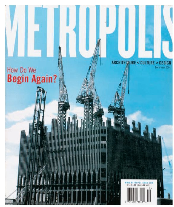
‘For our first issue after 9/11, Sara Barrett, our photo editor, found this shot from the original construction of the north tower in 1972. I tinted the sky blue to give it a little sense of hope, but other than that the image is unretouched. We knew it was a success because of all the reactions it elicited. People attached different meanings to it, many based on their personal experiences, and it really resonated with what people – both architects and the general population – were thinking. The image references the past and questions the future at the same time. From a distance it looks a bit like wreckage, but once you have it in your hands you realize that it is an image of construction, and with the cover line “How Do We Begin Again?” it made readers think and reflect. Even David Carson asked me how I photoshopped the image, but we didn’t do anything to it except add a little cyan – Criswell Lappin, former creative director, Metropolis.
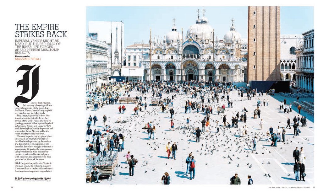
This layout in The New York Times T:Travel Magazine (above) was constructed around a photo to convey the bleached-out white light of Venice. ‘I love the Massimo Vitale photograph – inspired by Canaletto, but utterly contemporary. The same holds true for the typography, with that gorgeous letter “I” in Fraktur. The formal arrangements just feel very satisfying, and the depth of the image, along with the use of white space and the variations in typography, create a very satisfying page,’ says Janet Froelich, former art director.

Tension and movement are conveyed in these spreads from Flaunt. This is achieved through the donkey facing to the left and using the image as a bleed. This draws the eye out and away from the confines of the page, suggesting movement and space.
In the following interview, Jeremy Leslie discusses art direction for print and digital.
Jeremy Leslie worked for Blitz magazine in the 1980s, and then The Guardian, Time Out, M-real and others, always striving to explore the magic of communication through publishing of all kinds. From 1999 to 2009, he was creative director at John Brown Media during a time when customer magazines became some of the most innovative products around.
Leslie is a passionate fan of magazines and started his magCulture blog to accompany his book magCulture, which was published in 2003. The magCulture blog was voted one of the best design blogs of its time and Jeremy is creative director of the associated design studio magCutlure, and also writes for Creative Review. He is a founder member of the British Editorial Design Organisation, and a judge for the Society of Publication Designers in the US. MagCulture is also an editorial content consultancy company and recent work includes Port magazine, for digital. Leslie’s keen interest in publishing itself, no matter the business model or delivery, is reflected in his work as co-curator of Colophon, an independent magazine conference.
Does the designer have control again now we are a few years into the tablet era?
There are still arguments going on in different elements of media about how you should do it. Big publishers are using their in-house design teams to adapt what they do in print, take it and make it work for the web, mobile and tablet.
Is the trend amongst big publishers to want to press a button and have one massive content management system?
It is the theoretical endgame. Whether you like it or not, people are talking about everything we do and make as ‘content’. We might not be comfortable with that but that is what we do now. It is almost a cliché but now editorial designers work with content. Finally technology is catching up with that. The mobile is a good example of that. How do you create an identity so that The Guardian looks different with the small screen space and limitations of font?
The problem with the iPad is that every app appears the same on it – the same size and glossy finish. Tablets are touch-sensitive but anything but tactile. The statement of the obvious is that a tablet is touch sensitive but is anything but tactile. It is brightly lit and shiny. It is either on or off. It doesn’t change depending on where you are. With paper you have the benefits of touch and smell, different size, the ability to easily share and tear a bit out. People are desperately using Twitter for sharing in a similar way. I am not a Luddite but we do have to recognize the differences.
You were known for designing some very successful customer magazines and now 15 years later there has been a shift onto digital platforms.

Customer magazines were creative and became a buzzword; they were fashionable as part of big marketing campaigns. Once their power and reach was understood, and people realized just how successful customer magazines could be for companies, it suddenly got serious. Attempts to do interesting things and ideas got knocked on the head because people were concerned about the risk they were running in terms of cost. ... Companies were prepared to spend money on magazines and wanted a return for that and so the grip of marketing tightened and creativity was lost. I was lucky to be involved in a period when it was possible to make customer publications that challenged what magazines could be.
Did the advances in digital technology increase this change?
It was the digital thing that inspired the change in the first place. With digital tools you can immediately measure success. Customer magazines would create a positive aura around the brand that got media coverage and won awards. It was immeasurable.
Once you start to analyse that then it becomes less creative. As soon as you start to measure it, as soon as you want to know how many clicks there are and oranges or flights you are selling then everything has to connect together. So this in turn created expectations that you could do this with your print magazines as well. The whole focus of the creative magazine changed and there was a shift from a creative business to a business business. Now, there is a different focus. You have people expecting the whole thing.

Is digital technology the tail that wags the dog?
It is a different focus and you can understand why companies are doing it. There are some nice examples around. A lot of the mainstream magazines are functional and they do their job, but the brand voice is more than just selling the product. For me the great thing the magazine can achieve is about creating a world of its own....
People now might buy fewer magazines and less regularly than they used to. When they do, they lose themselves in that world, and this provides a fantastic space to market to people and, in a subtle way, allows you to flesh out your brand. If you do it right you are going to make people feel good about your brand and be able to explain things about your brand often subconsciously that you can’t explain in an advert or a TV ad, where it is much more brash.
In terms of business models, we have seen the big companies invest in custom-built production systems. They have bargaining power. Are you optimistic for the middle-weight consumer magazines?
Tablet magazines have largely failed; several large publishers have invested heavily, if not in capital outlay certainly time and resource. Its still very early in the experiment but despite some very nice creative examples of work there are many major issues facing magazine app sales. One of which is marketing – how do you get readers to find your app? Its simply not the same as spotting a publication on a shop shelf.
But for most independent magazines the app is out of reach. Their business model is tight already. They need other models – Monocle has succesfully ignored apps and invested in a radio studio to create online audio content.
You are not going to make money out of publishing your own ’zine unless you are lucky, apart from a few examples like Anorak who found a niche which is working. There are spin-offs from it, which are businesses based on a spin-off.
Fire and Knives are resolutely undigital. It is based on the idea that nobody gets paid, it covers its costs but everybody gets tons more work because they are involved in the magazine.
What can we learn from looking back at different business models?
The Face, Blitz and i-D. are a generation that we can look back on that people thought, ‘I am going to do this myself’. Nick Logan launched The Face on the kitchen table when he couldn’t get backing for it. Terry Jones left Vogue and started i-D. Blitz was begun as a university magazine. Those magazines stood apart. At the time they were launched, fashion and culture did not feature in mainstream media, unlike now when there are many references to popular culture in everyday media, so that is why they made such a big splash. It is harder now to make a splash since there is so much information everywhere.
Your magCulture blog created a community. Is it growing?
The reach of the blog continues to grow, yes. People like being connected with others who share their interests. Blogs aren’t so different to fan clubs and specialist magazines. They connect people – I grew up with the NME and that played the same role in my teenage years as something like Facebook does for my sons today. It connected me with like-minded people. It’s just faster and easier today.
We’ve go to the point where a magazine like Creative Review is so much more read and shared online that they add a line to every blog post reminding readers they publish a print edition.
The middle-market magazines like Cosmo and Company, for example, now have a huge Twitter following and massive interaction with that following. Editors use their social networks to build on, and to expand into, events and special offers. If you are a magazine without any social network presence then you will have a hard time surviving. Most people who want to engage with magazines aren’t there for the products but to participate in that club.
Have the basic principles of art direction remained the same across print and digital?
The basic principles haven’t changed. There are extra bits. The basic, basic principle is to understand what you are trying to say and whom you are saying it to and then to figure out how you are going to say it. The whole visual language thing has developed and moved on, in the way that English language moves on. The basic premises of the grid are the same, but it is changing and developing visual language that has moved on.
People think that there is such a huge difference between working for print and digital, but there really is not unless you make it that way.
You have to be able to communicate and explain the idea. You have to able to sell, do your research; you have to understand the grid and legibility. Designers can’t get by looking at editorial design as blocks of text. In magazine design you can’t design it without reading it. You have to read the words in order to respond to the words. On top of that you should be experimenting with whatever the latest form of communication is and make it work for you. You have to find out. Moving image is important; if you are doing photography now you will be shooting video. It is part of general graphic design.
What is the potential for digital that you are most excited about?
Digital is turning everything over. The actual potential for new forms of editorial media is proving much harder to realise than many thought, certainly when the iPad first arrived. It’s a slower change than envisaged.
The really exciting thing is the challenges of digital making us all question the basics of what we do. There are some very exciting editorial projects out there in print as a direct result of the flux digital has caused.
Including the time-based element we didn’t have in print?
There is a new space there on devices – it is not a printed magazine, it is not a TV show. People don’t buy an iPad to buy magazines; they are doing so many other things on it. You have to figure out how you are going to make it its own. It can’t be a website TV show, so what is it? What is that space? We are still far away – these are just the first steps.
Determining factors in layout construction
The construction of a layout has no magic formula. Essentially, it is about organization, communication and navigation. It takes in everything from knowing what a planning meeting is for to knowing how much a feature is going to cost, how much time is available for changing layouts, and understanding how the required on-page elements work best together for a particular section’s style. Many of these factors will be outside the designer’s control, such as budget, space allocation, pagination and time constraints. This is part of the challenge of any design – finding ways around the boundaries is what makes you creative.
Planning and timeline
All publications have planning meetings or a series of progress meetings. The purpose of these editorial or production meetings is to establish and inform all the editorial departments as to the content and importance of the features for the issue, and sketch out estimates of the amount of space needed for each item or feature. From this information the art department can start to plan how each feature will be illustrated. Visuals might need to be commissioned or sourced and bought in. At the same time, the editorial departments will begin researching, writing and commissioning articles; the technical or beauty departments will start to call in products for testing and photographing; the fashion department will be getting in outfits and organizing shoots. This process is ongoing and fluid – material is constantly assessed, tweaked or dropped during this period.

Before starting page design
Gather the copy, illustrative material and any information from the editorial team, including the most up-to-date flatplan. As the deadlines approach, this will change frequently as more ads are sold or incoming material is found to need more or less space.
Read the copy so that you understand the article and purpose of the page(s).
Examine all visuals (illustrations, photos and any graphics). Are they good enough quality for publication? Remember, digital photographs have to be 300 dpi (dots per inch) to be of satisfactory quality for print; many digital cameras take photos at 72 dpi. Consequently, in converting them, their optimum print size will be reduced to a quarter of the size.
Make sure you have all the style elements in place, including the template pages of the publication, style sheets, colour palettes and magazine livery.

Gary Cook’s layout for a feature on politician Jonathan Aitken in FT The Business uses the negative space of the underlying grid wittily to convey the religious theme of the article, and tie the text page to the image to unify the spread.

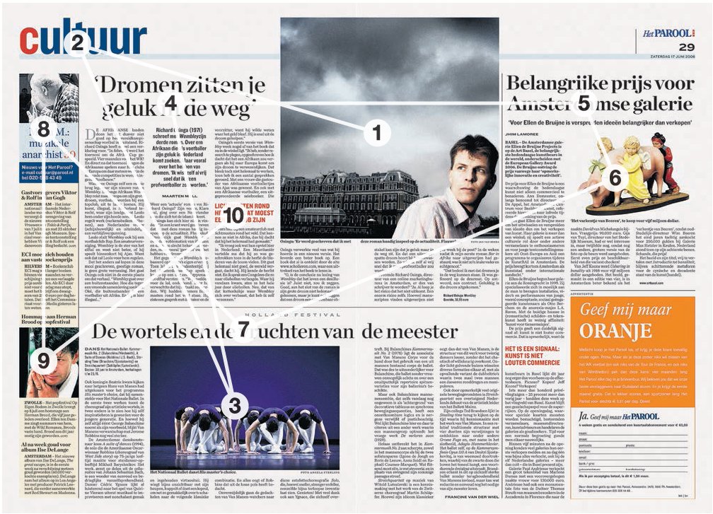
While there are no definitive rules about how any individual will scan a page or spread, the use of visual hooks, whether in the images or text, will often determine where the eye starts its journey. The eye is drawn to the oversized ‘G’ in this layout from Loaded because of its dominant size and colour, then follows the horizontal serif of the letter to footballer Paul Gascoigne’s eye, then finally moves to the smaller stand-first text. In the complex spread from Dutch newspaper Het Parool, the eyeline of the man in the main photograph runs towards the running head, and the reader’s attention then moves through the other elements, often following the vertical and horizontal dominance of the grid.
The production cycle
For the art department, the production cycle begins when editorial, pictures and illustrations start to arrive in the department. At this point the process of laying out pages begins. If there is imagery, it is usual to build the layout around this; if not, a focal point can be created by a strong heading. It is important not to detract from or dilute any impact, so avoid elements fighting with each other. Non-printing areas, or empty space, also create a focus for the eye. Once completed, layouts are passed on to the subs’ desks for cutting (if necessary) and proofing. By now, the sections of the magazine will have been defined for the printer’s schedule. If the publication is large, these sections may have different deadlines and be sent in a particular order to the printer, with the cover often going last. Sections have to be complete, including advertisements, before they can be printed.
Practical factors
The amount of money the art department has to spend on images, special stocks, inks and special effects, such as die-cutting, is set well in advance, but exactly how the art budget is spent is up to the art director, who has to make such decisions early on and adhere to them as much as possible, just as the deadlines agreed by the publication and its printer have to be adhered to if the publication is not to miss printing and publication dates. Such time factors may determine the amount of experimentation possible or whether there is time to change a layout if it is not working to a designer’s satisfaction. Designers have an entirely personal method of coping with the constraints of tight deadlines. Some get the overall design established on the page, then tweak boxes, type and colour until they are entirely happy. Others will keep starting a fresh layout, saving different versions until they are happy or until time runs out. Similarly, the running order of the pages and number of pages available to editorial are set by the publisher and/ or editor, and are usually tied to the advertising sales; pages are sold to advertisers against a particular section or feature, and a publication will have an editorial/ advertising ratio, so if ads are added, dropped or moved, editorial pages are lost, gained or shifted accordingly. Again, this can have a big impact on design if, for example, a five-page feature has to be shrunk into three pages.
Design factors: spatial issues
The demand from contemporary readers is for a publication to be portable in size and format, and flexible and varied in its content – a publication that can be dipped in and out of randomly. This is reflected in the design by the use of imagery, display copy, coloured headings, boxed type, bullet points and lists. A publication that tends to run text-heavy articles will probably use white space to counterbalance the grey effect. All these devices take up space, but a balance of text, images and graphic elements must be achieved. The number of words for an editorial page is usually predetermined. If the story has been massively overwritten and the page becomes impossible to design, the subeditor can usually cut copy to a reasonable length. Occasionally, a feature might need to be designed before the words have been written, or be completely design-led. In this case a word count is decided on and the piece written to length. The format of any illustrative material must also be taken into account. If the illustration is a digital image, it may have to be used at a certain size; some photographs are grainy and any enlargement would emphasize this, which may not suit the magazine’s style. Sometimes when journalists are writing articles they come across information that should be emphasized to make better sense of the copy, or the picture research team may have negotiated to print a picture at no bigger than a couple of columns. This sort of information may well be supplied at the last minute and it will have some degree of impact on the design.
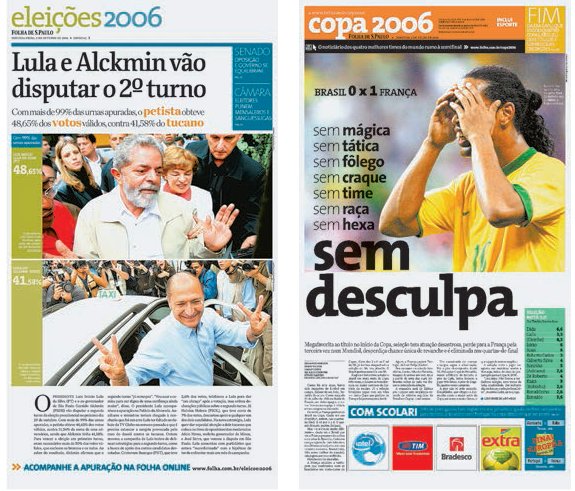
One spatial issue that is particularly relevant to newspapers is that of horizontal and vertical designing. Until the mid-twentieth century, many newspapers were designed with multiple-deck, one-column headlines that created pages with long, thin, ruled columns, which often made legibility very difficult, and also gave the paper a dense and unappealing appearance. Developments such as the growing use of wider columns and margins, along with the rise of tabloid newspapers and other smaller formats, have pushed newspapers to adopt a more horizontal design, which is more appealing visually and also easier to read. Even in the narrow Berliner format, designers can still create horizontal design through the use of headlines and stories spread across multiple columns that lead the viewer across the page rather than up and down. Where vertical designs are being used, it is important to allow enough margin width to ensure good legibility and to lighten the overall look of the page. White space and blank columns can also be added to heighten the sense of space and legibility further.

The front page layout of Swedish daily newspaper Dagens Nyheter (DN) creates impact with a reportage news picture. The horror of the content is slightly softened by the painterly composition and the muted colours. The typography of the masthead and the headline is bold and dramatic. Small teaser stories across the bottom of the page pull the reader further into the paper.
Design factors: the dominance of shape
A large proportion of editorial design is the organization of shapes to support the written word within the confines or parameters of a publication’s style. Mark Porter describes it as ‘being in charge of the distribution of elements in space’, these elements being headlines, text, artwork and white space. The way these shapes are organized creates the difference between a satisfactory and an unsatisfactory layout. Used well, shape distribution can be used to lead the reader’s eye through an article as well as navigate around the page, and create a wide range of feelings and meanings.
If you look at a layout and half shut your eyes, you will see all its elements in the form of shapes. Type blends into grey blocks, illustrations and pictures form rectangles or squares with the occasional irregular shapes of cut-out pictures or decorative type. If you keep your eyes half shut, you begin to see how these shapes work together and connect to form other shapes or strong diagonal lines. White, or non-printing, space also produces shapes. These shapes create balance, harmony or discord. Creating patterns with shapes helps to give a layout flow.
The placement and design of copy can communicate to and influence the reader. Deciding whether to give an article an entire spread or place it amongst two or three others immediately signals its importance to the reader. Here we see one article with a full-bleed image, large headline and stand-first, wide column setting, lists, strong colour and lots of white space – all this attempts to stimulate interest and entice the reader.
In contrast, this layout demonstrates how the same article, designed another way, can send out different signals. Here it is laid out not as a feature but more as a news story. With text filling the spread from top to bottom, smaller headlines, a narrower column measure and less white space, the article is reduced in priority and importance. However pull quotes, boxes, bullet points and colour all help in catching the eye and drawing in the reader.

A newspaper’s selling point is often its front page. For this reason it must be prominent on a news-stand. The size and placement of a masthead, images and headlines are integral to the newspaper’s saleability. The design of a front page is often created in response to having either a great image or a great headline available, and their respective ability to grab attention.
On a page with multiple stories, the positioning of text and other elements guides the reader’s eye around the page. The main story is signalled to the reader by being placed at the top of the page, with the largest headline, image and stand-first and the widest column measure. In contrast the other two articles are across a six-column measure, with no stand-firsts, and both utilize a much smaller space on the page. Hierarchy between these two articles is communicated by the headline size, image and amount of space used.


Establishing a visual dialogue between image and text is an excellent way of creating structure and shape in a spread, as seen on these examples from Inside magazine. On the Zaha Hadid feature (left) Jeffrey Docherty used the shape of the architecture as the layout’s determining factor. ‘I have a true respect for architectural photography. I find myself shying away from the placement of type over an image. I prefer to show images as if they were artworks, framed and unhindered. There are exceptions in which an image or a story can benefit from the combination of the two. In these instances, the type may provide structure or a dynamic twist to the image. However, finding the right spot for text is vital. The obvious spaces can be boring, so finding a dynamic fit of text and image can be challenging. Too often, I observe design blindly giving in to current trends and style. Design is all about finding the proper balance. Learning to exercise restraint is a design quality rarely considered.’
Shapes in a layout have to fulfil two functions. First, all the above shapes have to work together on the page area; second, the contents within the shapes have to work directly with the page layout. Shape organization and coordination are key techniques for creating a satisfactory layout, and, through variation in the shapes, an essential factor in making features distinct from each other. By organizing shapes in this way, the designer can draw the viewer’s eye to a particular point on a page – it might be the largest image, the loudest colour or the oddest shape, and for this reason designers use many tricks with their palette of shapes to create interest.
Design factors: shape as a classical proportion
Whether through custom or an innate sense of balance, convention tends to favour certain classical proportions. The most famous of these in editorial design is the golden section, which is defined by the ratio 1:1.618, or a height of 16.2 and a width of 10. This shape is thought of as pleasing to the eye and can be seen in many layouts.
Design factors: shape through colour
Shape is often used to break up the monotony that might be created by a page that is type-heavy. This can be done with photographs, illustrations, decorative type, white space and blocks of colour, tones or the text itself. Tonal shapes are effective in separating, organizing or pulling elements together, and, psychologically, the text appears easier to read when it is broken into smaller chunks. Colour can add meaning to a layout by linking elements together through coloured headings, borders and rules. The eye is very sophisticated in its ability to make connections by the use of these types of signposts.
Designers should not be afraid to experiment with colour, both in terms of the palette and its use in a publication. As Mario Garcia says, ‘Colour is such a personal issue. We think that readers today like vibrant colours and don’t necessarily equate them to vulgar or downmarket. For example, for years the handbag-maker Louis Vuitton made bags in brown; now LV bags come in yellow, lime green and pink.’ Garcia’s use of bold colours in The Observer newspaper, both as navigation tools and layout elements, has made this Sunday title vibrant, broadening its appeal to a younger audience. ‘In surveys, readers like colour and colour coding, and I do too. It organizes things at a visual and practical level,’ says Garcia. He suggests using one palette for coding and another for the rest of the colours in the publication.


Three different ways of using shape to create pleasing spreads. For the ‘Year In Ideas’ issue of The New York Times Magazine (this page), which was designed to present the best ideas, inventions and schemes in an encyclopaedic fashion, then art director Janet Froelich was inspired by nineteenth-century illustration conventions, and ‘chose the photographer Rodney Smith for his ability to build on those visual ideas to create images that felt like explanations without really being explanatory’. The combination of imagery, white space and indented text intelligently and wittily plays on the encyclopaedic form, and creates a harmonious and delightful spread. For a piece on the new Boeing offices (opposite), Criswell Lappin at Metropolis simply created archetypal plane shapes from image and text boxes to visualize clearly the content, but also to create interest and reader recognition.
Design factors: tension
Tension can be used to great effect in supporting an editorial stance, and is created by the shape of elements and their relationship to each other and to the edges of the page. For example, elements can be positioned to create a diagonal movement, leading the eye to other shapes or to other areas of the page, while bleeding an image or text off the page can create a dynamic effect. Tension can also be created by the use of colour. Images used in conjunction with each other can repel or attract other elements and shapes by their colour or tone.
Design factors: repetition and flow
On many titles a visual continuity or repetition forms the central essence or identity of the publication. In the case of repeated tones or shape, these are usually built on a grid structure or alignment (for more on grids, see Chapter 6) to maintain harmony throughout the publication. Other factors that reinforce repetition and flow are the positioning of typography, visuals and graphic devices, such as sidebars and rules and their respective colours and sizes. All these elements enable the designer to construct a flow of layouts that is consistent but allows for variation and fluidity, as repetition on every page is rarely desirable in any publication (even a phone book is varied with the use and placement of display ads and different weights of fonts).
Design factors: experiments with scale
Scale is used to guide the viewer’s eyes through the article, provide visual interest and dramatize or emphasize the editorial message. One large word in a headline can change or skew the emphasis and meaning of the whole page, an effect that can also be achieved with images. Scale is relative, it creates a hierarchy, and there are many situations where this would be entirely appropriate – for example, in an article that contained both main and subsidiary elements. But it has a visual purpose, too, making the page lively and creating interesting blocks and shapes. The content of the publication plays an important part in sizing and use of visual material. For example, a travel magazine will often use full-bleed pictures to create a feeling of expansiveness and to help fulfil the dream of being in that location. If the picture were smaller, it wouldn’t evoke the same response or desires.
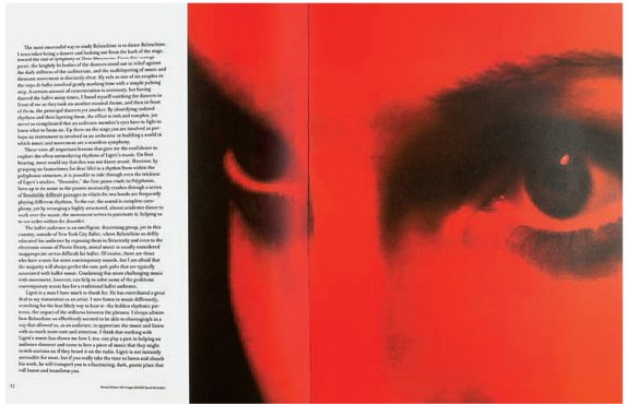
Esopus (above) uses a huge, predominantly red image to create an uneasy, unsettling spread that is gripping and filmic. The New York Times Magazine image (top) illustrates how two figures looking away from each other and out of the spread rather than into the spine create tension.
Design factors: contrast
There are occasions when it is appropriate to illustrate an editorial piece with subtle contrasts in size of the design elements, but this has to be done with caution as it might make the design look tentative and weak. It is more usual to illustrate designs with extreme contrast – one large element balanced against several small ones. Imagery and its sizing are always affected by the relationship to other items on the page or its boundaries. Imagine sizing an image of a tomato slice so that it bleeds off all the edges. It would take on a completely different look if the same image were used in a sidebar the size of a thumbnail.
Design factors: balance
In design terms balance is very important. It can be achieved in a number of ways. Symmetry or an equal number of items are literal examples of balance that are not always successful if they create little or no dynamism, tension or contrast. Experimentation with balance can create a relationship that strengthens the design. For example, balance might be achieved in an asymmetrical way: one large image could be counterbalanced with several smaller ones or a larger, dark picture. Balancing the elements of a layout is individual to the designer, but key to doing so successfully is ensuring that one side of a layout is given equal weight with the other.


I.D. magazine (top) uses rules, scale, colour and typography to ensure that each department and the pages within those departments have their own identity and character. For Metropolis (above), the colour barcodes Criswell Lappin employed as an iconic reference to the retail industry also give the theme of shopping a distinct identity. ‘Since we were covering a variety of shopping environments, we needed a symbol that could represent them all. Each barcode is used to signify the different categories of new retail environments that we covered.’
Design factors: depth
Spatially, working in print is limited to two dimensions, though the illusion of depth can be created through production techniques such as die-cutting, embossing and the use of metallics and fifth colours. But it can also be achieved through the arrangement of the elements on the page. For example, skilful overlapping of the design elements – shape, type and colour, in particular – can make pages stand out or even ‘jump’ out at the reader.
Implied motion
The projection and interpretation of movement on to a two-dimensional page is a substantial challenge. The effect is often created using the photographic techniques of double exposure, multiple printing, blurred motion or the use of multiple sequences of stills in a line.

One image, two extreme crops, show how very different responses, balance and expression can be conveyed through intelligent cropping. Contrasting sizes, colours and scales can produce a very graphic effect, almost becoming a pattern, as is demonstrated on the page of I.D. left, which turns a page on wallpapers into a very graphic form of wallpaper of its own.
Harmony and discord
Depending upon a publication, design can be conservative or cutting-edge. Creating a visual balance or disturbance on a page is often left to the individual instinct, training and experience of the designer, who will make the elements of a layout either complement or compete with each other in order to create harmony or discord. In philosophical terms, the clash between harmony and discord goes beyond mere style and echoes the great divide between the two streams of human history, thought and development – the division between the classical, ordered organizer and the rootless, restless romantic. The competition and compromises between these extremes makes for a creative tension that may never be resolved.
Two different forms of balance on a spread: Flaunt (top) simply balances the two pages on the horizontal diagonally; Dazed & Confused (above) creates a filmic storyboard.
Achieving harmony
Harmony in editorial design can be achieved in several ways. Design purists in the Bauhaus and Swiss movements believed that a harmonious design should feature:
•an even grey, with no superfluous ‘tricksy’ elements such as oversized drop caps to detract from the classical feel of the layout;
•a calm, rigid typographical grid;
•an unfussy sans-serif typeface throughout;
•small body copy;
•leading that strengthens overall visual quality and does not draw attention to itself, but is never so wide that the white space conflicts with the copy;
•headlines set in the same typeface as or in a bolder version of the body copy, at just a few point sizes larger;
•margins wide enough to differentiate text boxes clearly, but not so wide as to appear ostentatious or wasteful;
•any extra material such as running heads or folios following the overriding principles already described;
•photographs anchored by placing them across the column grid at one-, two-, three- or four-column widths exactly, horizontally aligned with other elements;
•white space used carefully to create breathing space and balance.

In Metropolis, Criswell Lappin demonstrated a great way of enlivening a feature on door handles by making their appearance three-dimensional.
On such a layout, the overall feel is one of regularity and evenness, with no jarring elements. This is often seen at its best in book and catalogue design. But as anyone who reads editorial knows, magazines and newspapers rarely follow such a style because they need to highlight content in different ways and to create hierarchies and visual excitement. They do this by marrying harmony with some discord, creating a unity of opposites.
Fusing harmony and discord
Contemporary readers schooled in a visual style derived from television and the internet, as well as from printed matter, respond well to elements of discord in layouts, and many contemporary publications now fuse aspects of both in the same package. Harmony can be achieved by using common elements – a running headline, a distinctive folio, the application of Bauhaus principles to text – and mixing them with the discord created by typefaces that change and clash frequently, or by a conflict of shapes and balance, or by the way text is handled. Text can be hand-produced, scribbled over, cut up and generally distressed and damaged. Text boxes can be angled, oddly shaped or overlaid. Drop caps can be half a page high. Beautifully considered type may be deliberately rendered almost illegible by being printed in yellow over the yellow dress of a model in a photo feature. Whatever mixes are applied, the effect should not be one of anarchy but of excitement, interest and freedom in order to communicate meaning in some way. Such an approach can help give a publication an identity that makes it stand out from the crowd.
Overthrowing harmony
Why do some designers choose to emphasize discord in their layouts? The best reason is because the content and brand are trying to do something different, perhaps propound an alternative lifestyle, offer a radical political agenda, pick up on the disaffection of a cultural zeitgeist. … Generally, great designers on such publications will use design intelligently and inventively to illustrate a new or alternative approach. Neville Brody’s The Face, David Carson’s RayGun and Martin Venezky’s Speak are extreme examples of such ventures that fuse style and content in a non-traditional or unexpected kind of harmony – one that unites the discord of their design with the dissent of their message. Producing such fresh, radical design month after month, however, can quickly drain the resources of even the most committed and inventive designer. Equally, the popular acclaim and commercial success that accrues to a radically designed magazine will blunt its cutting edge, so designers must always remain aware of cultural shifts and their title’s role within them if using discord in this way. It is worth noting that, historically, many experimental and avant-garde titles – including the three hugely lauded titles mentioned above – were short-lived or lost their edge in a market that often diluted their style, but their impact and role as catalysts in print design are undeniable.

Neville Brody’s designs for The Face (above) look tame by comparison with Speak ’s crash-and-burn design approach, but both exhibited an anti-authoritarian design style that was directly connected to the morally and politically stagnant milieu in which the designers were working. In different ways each design replaces harmony with a vital edginess, but remains legible and accessible.
In summary
Harmonious designs are likely to continue to be the norm, being commercially safe and appealing to a corporate mindset. Such design sits comfortably with advertising material and ensures a working environment in which standard templates can be handed on safely to junior designers, and where instructions are clear and readily understood. With these considerations and more, designs of a harmonious type are pleasant, acceptable and easy on the eye, and are unlikely to be challenged seriously. Although kudos and prizes do tend to accrue to innovative layout design, the role of the avant-garde remains as it always has been – the testing ground for new ideas, which may or may not be picked up and incorporated in diluted form by larger-circulation or mainstream publications.
Style – what is it, how do you get it, how do you deliver it?
Style is difficult to verbalize for many designers, most of whom will say it’s instinctive, a gut feeling, something that feels right. But although no rules as such exist for acquiring style, styles and style techniques can be taught and learned from recognition, appreciation, training and exposure to visual media. Knowledge of these things will help the designer create the right style for any particular publication, be it formal or informal, traditional or modern, symmetrical or asymmetrical.
When you are attracted to a publication, whether in print or digital format, what catches your eye first? Is it the colours, the image or the cover lines? When you pick up a printed publication, are you conscious of its weight, how the paper feels? Do you notice anything else – its binding, for example? Does it stand out in some way? Can you say what makes it stand out? If it features a complex die-cut cover or an embossed fifth colour, what does that suggest to you? Style will set the mood for a readership; from the style the reader can make assumptions about content and tone. Once familiar with the clues, a publication becomes like an old friend – the reader knows what to expect, looks forward to the next encounter, enjoys spending time with that ‘friend’. The various style components that make up a brand can be categorized into three main areas: editorial style, design style and advertising style.
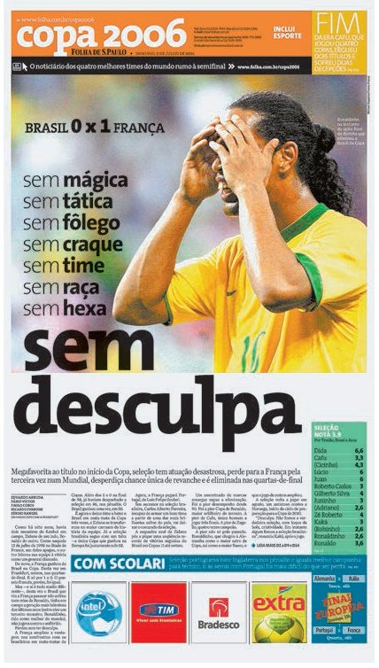
A large part of style consideration in editorial design is cultural. For the redesign of Brazilian newspaper Folha de S.Paulo, Mario Garcia (with Paula Ripoll art-directing for Garcia Media and Massimo Gentile for the paper) looked at everything from bylines and jumplines to inside pages with numerous ads and supplements, in order to arrive at a paper that would appeal to the typical Folha reader, who considered it ‘user-friendly’. ‘The philosophy of the redesign intensifies that relationship with the readers, respecting their different ways of reading a newspaper,’ says Garcia. At the forefront was a lively colour palette and navigation system, which, in Garcia’s opinion, has resulted in ‘a very vibrant, newsy and visually appealing, but not overwhelming, newspaper ... even though this is Brazil’.
The editorial style is the organization or flow of the pages, the expression and tone of the writing and visuals, and the number and variation of the types of articles. Most publications have a framework. For example, both features and interview spreads are longer than other editorial pages and are designed to be read from the beginning of the story to its end. Other pages, such as reviews, news and listings pages, can be scanned or read in short bursts in random order. Approaching the overall organization of the content in such a manner helps to fulfil the reader’s expectations of editorial consistency. This style is generally set by the editor, and the editorial designer must ensure that it is communicated clearly to the reader through the design style.
Design style
The design style of a magazine is how all of the visual elements are presented – a creative counterbalance of typography and image. The design style of a magazine is inextricably linked to its brand and can be subdivided into the following areas: format (size and shape), stock, structure and design elements.
Format: the format or size of the printed publication generally has to take several factors into consideration. When designing, the size, shape and number of pages are dictated by the printing presses and the paper sizes that go on them. The format may need to take into consideration envelope sizes when mailing to subscribers. By conforming to a conventional range of sizes, magazines can be stacked and displayed on regular newsagents’ shelves. There are, of course, magazines that choose not to follow these dictates: UK design magazines Creative Review and M-real make a statement by publishing on a square. Statements, soDA and Visionaire change formats with each issue. These sorts of format decisions are taken on aesthetic grounds but have to be balanced with practical cost considerations. Format decisions should also take functionality and content into account. Printing a glossy, oversize publication to create a feeling of luxury is fine (if predictable!) for a first-class hotel chain, whereas something that needs to be portable – such as a listings magazine – serves its reader better when in a smaller format.
Stock: this, too, plays a part in style and functionality, and the tactile appeal of printed publications should not be underestimated. A publication printed on newsprint will have a more environmentally friendly feeling than a fashion magazine printed on glossy paper, and is therefore better suited to a particular brand message and readership. With magazines and books, the feeling of quality is often transmitted through the paper, weight, binding and finish. The tactile quality of a beautifully produced publication such as soDA (which has used metallics and coloured plastic on its covers), Matador or Statements will deliver a very different feel and message to that of a gossip weekly such as Hello, or a news weekly such as The Economist.
Structure: readers rarely read a periodical from cover to cover, and the traditional pace and structure is built on the assumption that the reader starts at the front before dipping in and out of features and articles that are of interest. However, there is no reason not to experiment with this pace. Regular readers will quickly become familiar with any structure; more important is consistency and a good navigation system to aid new or occasional readers. Criswell Lappin, former creative director of Metropolis, says that the key is ‘varying the design and length of stories in the feature well to alter the pacing and keep people interested. Readers want to turn the page to find out what is next.’
Design elements: many elements make up a design, including visuals, typefaces, colours, panels and graphic elements. Individual use of these and their combinations establishes a style and helps to create a mood. The typefaces you choose and how you use them will ensure a feel that is timeless or trendy, and there are thousands to choose from. For example, Lee Corbin at Flaunt uses type in a number of ways, as he explains:
‘There is a lot of information to organize every month for each issue. We use typography to organize this information so that it is easily navigable by the reader. We also use typography to create visually stimulating compositions, which helps to give our magazine its identity. In each issue of Flaunt we use type that is chosen because of its legibility and type that is chosen because of its character. We look for something that fits the project. Sometimes that’s determined by the content of a single story, or an entire issue. If we feel it’s appropriate to depart from what we are doing typographically in the rest of the issue for one story, then we do. In this case we usually let the title of the story or the images steer us in the right direction.’
Equally, the type of illustration or photograph selected will immediately communicate something to the reader, but, by scaling, cropping and positioning, it can say something completely different. There are no rules as to how you should use these design elements, provided that, together, they express the identity of the publication in general and the specific content in particular. This is true for both newspapers and magazines – as Mario Garcia says, ‘Both magazine and newspaper designers have to work hard to make sure that design is there to enhance content and to make it accessible. There are different techniques in terms of the look and feel, but the effort and logistics are the same.’
Advertising style
A publication often has to accept advertising and advertorials in order to cover the cost of publishing. Advertisers wield a lot of power and can be instrumental in determining pagination and the number of spreads available to editorial. As a condition of purchase they may request particular spreads or slots facing editorial pages and, because the first third of a publication is so desirable, this results in fewer spreads in this section being available to the designers. Moreover, right-hand pages are more expensive than left-hand ones because they are more visible, so a title may be forced to sell more of these, resulting in whole sections consisting predominantly of left-hand pages only. In such a case, designers have to make these layouts work hard. If they know what the advertisement is, they can design the editorial page to stand out against it, but they can also create an aesthetically pleasing spread that works in harmony with the ad as well as with the magazine as a whole. Either way, through its shapes, contrast and tones, designers will need to design the page as an element in its own right, as well as a strong aspect of a feature that may span a wide range of pages.
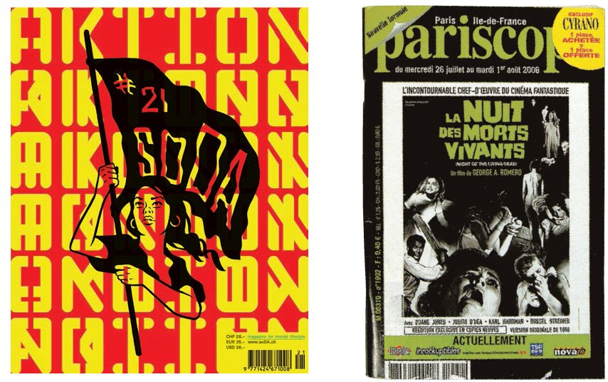
Jeremy Leslie uses stock to confound expectations on the Virgin Atlantic first-class fanzine Carlos (opposite), which manages to feel like a high-quality, luxury product, in part ‘due to a matter of context’. ‘Twenty years ago, in a world of magazines that were not all full-colour, Carlos would have looked cheap because it didn’t make use of what was then an expensive commodity: full-colour. It would have looked like many magazines – one- or two-colour. Today, full-colour is the norm, and anything that’s different to that stands out and looks rare and “expensive”,’ explains Leslie. Swiss magazine soDA (above) changes format and stocks with each issue, a luxury afforded by its once-a-year publication, which renders familiarity with its format irrelevant. Pariscope (above right), a weekly listings title for Paris, is small enough to fit into a bag or pocket and has remained consistently profitable, with sales in the region of 103,000 each week.
Simon Esterson’s work is characterized as bold, striking and journalistically proud. An unassuming character, and modest in profile, he now operates out of London as Esterson Associates. In 1993, he was part of the team, with Deyan Sudjic and Peter Murray, which started Blueprint, a large-format architecture magazine, known for its striking stencil masthead and thick page rules. Most notably Esterson took over The Guardian newspaper in 1995 from David Hillman and carried on the bold look that characterized the paper’s modern attitude to print. Esterson Associates have redesigned many newspapers including NZZ in Zurich and Publico in Lisbon (with Mark Porter). He has also worked in Italy as creative director of Italian architecture title Domus, and as design consultant to Tate Publishing in London.
In 2008, Esterson jointly purchased Eye magazine with editor John L. Walters and publisher Hannah Tyson. Together they brought Eye back to life, returning it to its independent roots. By using the web and social media, they have ensured that the print version can thrive again due to its large fan base, some of whom may never handle the actual print version.
Esterson comments that, ‘the website and blog are absolutely vital for Eye’s survival. The website because it is an archive of what we publish and if you Google something about graphic design then Eye will come up on the first page. The blog is vital as we only publish four times a year so we want to be in people’s consciousness. For us we are not just making a print magazine. John L. Walters, the editor, is using Twitter and Flickr too. It is not a matter of making things on as many platforms as possible. We already have a quarterly magazine in print. By definition you are around for longer. You play the cards you are given.’

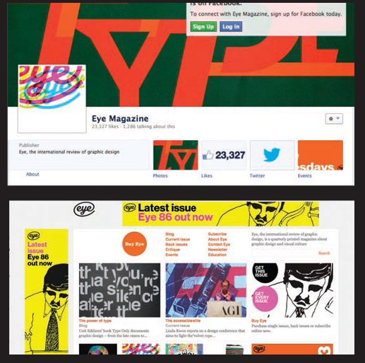
The printed version of Eye magazine has an elegant design following a modest grid, which allows the storytelling to come through. The high-quality visuals add to the branding with their authority and quiet admiration for the field of design and its practitioners. The varied design content means that the Eye blog is a rich resource for practitioners and students. In 2012 the blog had 488,621 followers, proving that Eye could reach many more readers through Twitter than was possible when it was a print-only product with a limited print circulation.

Simon Esterson’s passion for design led him to design the start-up architecture magazine Blueprint in 1983. The stencil masthead became a trademark for this provocative publication. The aesthetic was bold and blocky, shown here by the simple strong coverline justified to the width of the page. Instead of a building on the cover, each issue featured the human face of the business – a portrait of an architect.
How to convert inspiration into a layout
The search for inspiration when trying to arrive at an interesting, dynamic and relevant layout concept can be difficult for any designer at any point. Sitting and staring at a computer screen is quite possibly the least creative action that a designer can perform, but what can you do about it? Move away from your work environment. Going to art galleries, street markets, the movies, shops, funfairs or just sitting in a park and looking at the skyline can often spark an inspirational idea by allowing you to look at things from a totally unexpected perspective. On the following page are a number of creative exercises that can help, too. Where else can a designer turn for inspiration?
All creatives struggle at some point with the search for inspiration, and all find ways out of the impasse. These can include:
Architecture: referencing architectural structures is a rich source of visual inspiration. Many buildings are based on a grid structure, which, when translated to a layout, can give exciting and useful divisions of space. The great American designer Saul Bass realized this and incorporated the grid structures of buildings into some of his most successful screen-credit sequences, in which his elegant typography slid effortlessly across the perspective lines of office-block windows.
Nature: the hugely magnified images of butterfly wings, insect eyes, fish scales and the exoskeletons of arthropods can offer excellent ideas for scale, shape, contrast and structure. Crystal Palace in London, for example, was based on the ribs of a lily leaf.
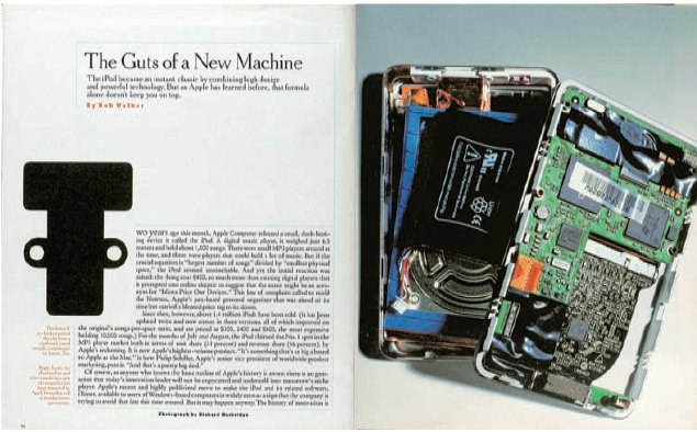
Industrial design: images gleaned from industrial design can be a source of inspiring imagery. Being man-made and designed, industrial objects can often be easily translated into text and picture boxes. Sleek ocean liners, streamlined trains, the understated, elegant lines of Ken Grange’s Parker Pens and the work of Jonathan Ive at Apple Computer are the result of a skilfully crafted application of solid design principles – the very same principles that you can apply to your own layouts.

‘Don’t follow what other graphic designers are doing. Find your inspiration in other places, such as art, film, fashion or history.’
Eric Roinestad, art director, Flaunt
Look around you: look at your virtual and physical desktops. However they appear to those unfamiliar with them, you will probably know where and what everything is, and this is central to design thinking; all you have to do is make the underlying structure apparent to others. The things you collect, the way in which these things are displayed – all of this is design. On Speak, designer Martin Venezky would begin by reading the manuscript:
‘After that, I’d enumerate the relationships and imagery that stuck with me. With that fresh in my mind, I would begin sifting through piles of pictures, books, type and so on, pulling out things that struck me either directly or indirectly. I make a point of not organizing my files, which keeps the element of surprise always in play. While looking for one kind of image, another one might slide into view that is more exciting and unexpected. I often refer to the “poetic gap” as the space between a direct illustration of the text and its more eccentric interpretation.’
Get away from your desk: ideas arrive most easily to a mind that is allowed to wander. Your subconscious carries a myriad of images and concepts – the trick is to unlock and make use of these. Play games, stare out the window, go for a walk, and always carry a small design notebook with you. Sometimes a quick sketch dashed off in a local park can be translated into a dynamic, powerful and unique layout, headline treatment, logotype or page design.
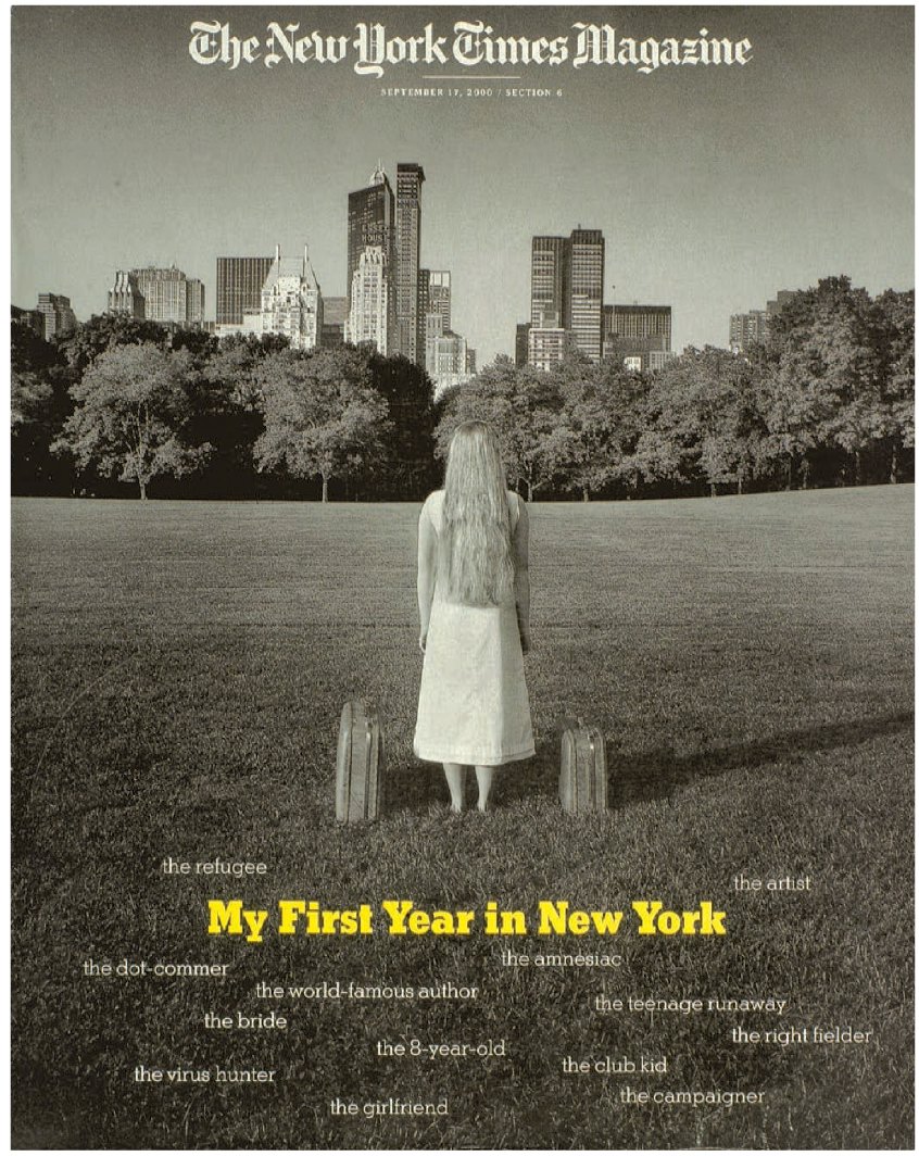
‘The theme of this issue was the classic “coming to New York” story. We spent a year with each of the subjects, from the moment of their arrival through their first year in the city. The cover had to convey that sense of wonder, anticipation and fear. We were inspired by one of Cindy Sherman’s untitled film stills, the one with the hitchhiker on the road, suitcase by her side. We scouted locations and came up with the great lawn in Central Park, where the buildings in the skyline feel timeless, and the stretch of lawn unfolds with both possibility and anxiety. We shot it in black-and-white because it felt like the spirit of the city, and used yellow as a spot because it’s so very New York. Black-and-white and yellow for taxis – very simple.’ – Janet Froelich, former art director, The New York Times Magazine.
AIM
To create a series of double-page layout features for your magazine.
THE BRIEF
Include the following elements on the layouts for your magazine: headline, lead image and other images, introductory text (about 30 words) plus some body text. You can find placeholder text in InDesign or you can generate your own text by typing in one paragraph with normal-length words and then stepping and repeating the paragraph.
•Draw your own grid following the example given earlier on pages 110-11. Use InDesign if you can, otherwise use a similar DTP program.
•Create the content by writing the headline yourself and the introductory copy. Include a byline. Also write the picture captions and include any small text that states the origin of your images (credit line). For example, if you created the photographs then give yourself a picture credit. If you are showcasing a friend’s work then identify him or her by using a caption. If you are using images from the internet then check you are using a free source. Even in dummy layouts it is important not to take credit for anyone else’s work. In terms of fonts, use your body text fonts from Brief Three.
•Save your first layout attempt and then try another version, working until the pages have a sense of balance and drama. Use the scale of the different elements to create a dynamic spread design. Print out your layouts so that you can see the actual size of the elements. Stick the pages together on the back with tape and trim them so that you can see how the layout works within the actual page size.
•When you have done this a couple of times and got it right, print out the layouts in colour and trim them for your portfolio.

Joseph Marshall created the images for this college magazine project as part of a pitch. The vertical emphasis of the columns is offset by the horizontal axis – a common visual device for balancing elements of a layout.
Marshall stripped back his typographic layouts to show his custom-drawn grid, which displays a combination of a four-column grid and a text box for the page. This is a tabloid size; larger than A4 and smaller than A3. Marshall wanted to create white space so that he could then surprise the reader with a complete contrast.


This project has a simple three-column grid. The tabloid size gives the designers plenty of white space to play with. This is a simple way to start and is in contrast to Marshall’s complex template. The student team of Stefan Abrahams, Jasmine Jones, Rebecca Duff-Smith and Hudson Shively agreed the grid at the start, so as to complement the digital version, which was also planned using a simple grid. Choose a grid that reflects the ethos of your magazine content.