
Chapter 7 : Looking back, looking forward
All designers benefit from an awareness of trends, cultural shifts and the contemporary zeitgeist, and this is doubly so for editorial designers, many of whom have to ensure that they are in the vanguard of visual fashion and culture. For this reason, we look at broad cultural and design trends and delivery media. But editorial designers can also gain huge insight into their craft – not to mention ideas and inspirations – by looking at work from the past, especially those designers and publications that were particularly influential, innovative or ground-breaking. Whether through an understanding of print techniques, a style of cropping, a certain grid or structure, a use of typography and symbols as a means of expression, or the ability to exploit the latest print technologies, designers over the last 80 years have created graphic ephemera that stand shoulder to shoulder with fine art in their ability to inspire visual delight and express cultural concerns in conceptual form. The designers who have done so are numerous, but in this chapter are gathered a handful of the best. In studying the work of these past masters, contemporary designers should focus on the following:
•motivating and underlying principles;
•reasons why a particular design works in a specific context (in any given period);
•how the past plays a part in mapping out future trends and directions.
Looking back – motivating and underlying principles
All designers look at other design work, but many focus exclusively on contemporary work. This is important in terms of being aware of cultural shifts and changing and emerging trends in typography, illustration, photography, stock and so on; but it is equally important to look at work that has gone before. What should you look for? Ideas and directions certainly, but you won’t understand them unless you understand the principles underpinning them, which in the past were often closely aligned to movements in art and culture, which, in turn, were contextualized both politically and socially. So, for example, the ideas around mechanization and functionality, which formed part of the Bauhaus principles of the 1930s, reflected the industrialization of Western society and the rise of socialism in eastern Europe. When Neville Brody appropriated the typographical and geometrical styles of Russian constructivism in the mid-1970s, it was a cultural gesture that drew on the spirit of overthrowing oppression. An understanding and exploration of such principles, and how they relate to and reflect their cultural and political milieu, will give contemporary editorial designers a set of tools with which to develop their own cultural responses and connections, which are needed to acquire a true understanding of their publication’s readership. So, study from the past often – not to copy great designers, but to understand their work.
Understanding why a particular design works in a specific context
Understanding how designers work involves an understanding of why a design works in its particular context. This means examining the broad picture—the underlying and motivating principles of a publication as outlined above – then focusing on individual layouts and understanding why they work for the publication in question and its readership. How do the layouts work to communicate the principles? Find out by deconstructing the layout, then looking at how the individual elements work alone and together. Using The Face as an example, Neville Brody understood that, in principle, a publication about alternative culture could draw on influences and styles outside its own cultural milieu, and give them a contemporary forward-looking twist to communicate its cool outsider status. But which styles to choose? He intelligently opted for an appropriate visual style with roots and connections that were abundantly clear to a youthful readership, whose political integrity was untainted and whose cultural cachet was assured. He conveyed these principles through layouts composed predominantly of type, shapes and geometrical elements – rules, blocks and scale. The effect was startling: new, bold, irreverent and absolutely right for the readership.
Exploring the past to map future trends and directions
It is clear from the influential designers and publications listed here that the intellectual, moral and cultural climates of an era play a part in creating key design movements, which in turn influence the styles of editorial design. Such movements and styles do not exist in a vacuum, and do not become meaningless or irrelevant as the zeitgeist shifts. They may go out of fashion, but through an understanding of their principles they always have something to offer.
The one key difference between the past and present is that inspirational design can now be shared more easily. Today, we have fast and reliable access to the vast array of images that exist in the digital cloud. More importantly, designers continue to use social media, such as Twitter, Facebook and blogs, as a sharing tool, giving everyone the opportunity to learn from highlyskilled practitioners. The generous spirit of editorial designers and art directors means that the design community is fuelled daily by news of good practice, talks and events. In the following section, we select some modern pioneers who are worth following, alongside the many figures from the past who have inspired generations of designers. These people form a ‘Hall of Fame’, each one providing a different source of inspiration.
Hall of Fame – designers and publications
M.F. Agha
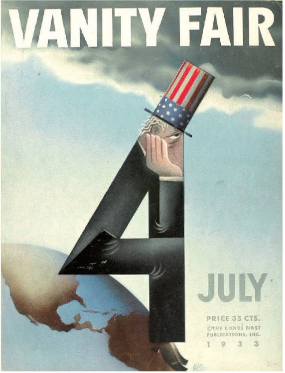
Dr Mehemed Fehmy Agha (known as M.F. Agha) was one of the first ‘art directors’. A Russian–Turkish constructivist working on German Vogue, he was discovered by Condé Nast, who was trawling Europe looking for designers to introduce the modern (European) style to his publications. In 1929, Agha took over the flagship Condé Nast title, American Vogue, and lived up to expectations; control of Vanity Fair (right) and House & Garden followed. What he brought to these titles was fresh, new and vital art direction. He pioneered the use of sans-serif typefaces and emerging print and photographic techniques such as montage, duotones and full-colour photographs, choosing photography over fashion illustrations wherever possible. He experimented successfully with photographic layouts, exploiting double-page spreads to take images across gutters and using full-bleeds to create an exciting sense of space and scale. His use of leading photographers, including Cecil Beaton and Edward Weston, was matched by his employment of artists such as Matisse and Picasso years before any other American magazine.
On Vanity Fair M.F. Agha adapted the stylistic tenets of European modernism to a US title and its market. He achieved this by simplifying and systemizing type use, recognizing the spread as a palette on which the various design elements – gutters, margins, headlines and white space – could be endlessly expanded and manipulated to create vibrant and varied spreads. He understood that by playing with the position and size of his design tools, such as floating small headlines on white space at the bottom of the page, he could create impact and energy – something hitherto unseen in editorial design. Hence, traditional decorative elements were pushed off the page in favour of sparse layouts in which scale and shape became the primary means of decoration.
Even at the height of the Depression, Agha was creating bold but elegant designs that communicated their message with humour and clarity.
Alexey Brodovitch
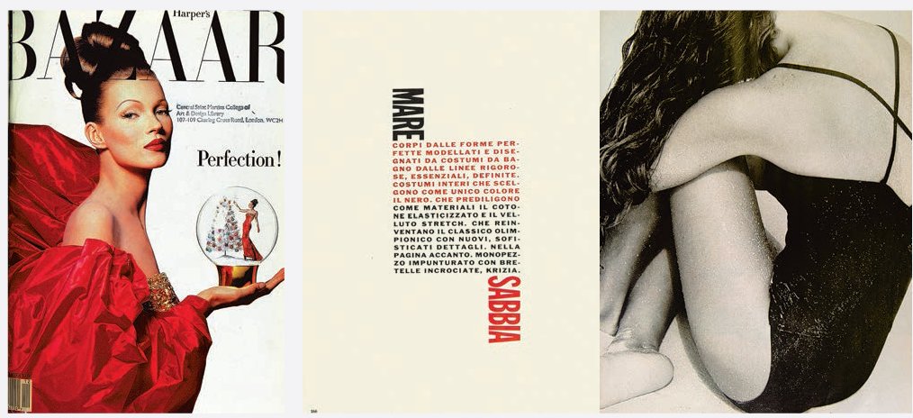
Russian émigré Alexey Brodovitch was art director at Harper’s Bazaar from 1934 to 1958, and in that period initiated techniques that have set standards of art direction ever since. Indeed, he pioneered the notion of art direction as conceiving and commissioning visual material rather than simply laying out pages. In terms of style, Brodovitch introduced asymmetrical layouts, movement, stripped-down simplicity and dynamic imagery to magazines (and US editorial design in general), which had previously been dominated by static pages filled with decorative but irrelevant clutter. These innovations were based on the simple ‘modern’ graphic style he had helped develop in Europe in the 1920s, which, in turn, was based on an amalgam of modernist movements and styles in art and design – notably Dada and constructivism. Obsessed with change and new ideas, including early abstract expressionism, Brodovitch developed a style that by the 1950s was a byword for elegance, largely achieved through white space and understated colour, along with contrasts of scale, precise, restrained typography (often Bodoni), and photo shoots and spreads invested with lively drama.
Part of Brodovitch’s skill lay in his ability to discover and nurture new photographic talent, including Irving Penn and Richard Avedon. He introduced the work of avant-garde European photographers and artists such as A.M. Cassandre, Salvador Dalí, Henri Cartier-Bresson and Man Ray to the American public. He used this photography as the backbone of spreads that were light, spacious, full of movement and, above all, expressionistic – something we take for granted today. To achieve this, he took shoots outside the studio, and made the models – what they were doing, where and why – as important as the clothes they wore.

A desire to innovate and experiment lay at the heart of Brodovitch’s work: a very instinctive approach based on eschewing the rational and the dogmatic for the constant pursuit of change and modernity.
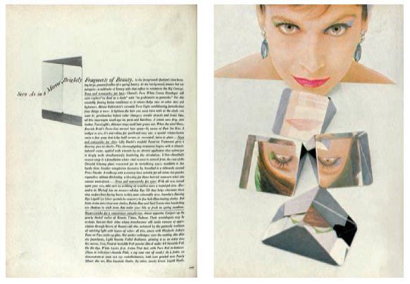
Nowadays, it is a given that photographers, illustrators, artists and editorial designers are allowed to interpret a story personally; indeed, it’s a practice that virtually guarantees a result that, whether conceptual, impressionistic, expressionistic or literal, will be original and unexpected. Its invention was the brainchild of Cipe Pineles, who in 1946 initiated the practice on Seventeen magazine when she began commissioning visuals for fiction.
Pineles began her career under M.F. Agha at Condé Nast, where in five years she learned enough to take her to Glamour in 1942 as the first autonomous female art director. Here, she took fashion shoots into galleries and open spaces, bled images off spreads, cleverly guided readers from four-colour to two-colour images, introduced drama and scale to photographs, and gave a personal twist to editorial design by integrating modernist principles of structure and abstraction with playful use of visuals and type. But it was on Seventeen (above), the first magazine aimed at teenage girls, that she really came into her own.
Both Pineles and Seventeen’s founder and editor Helen Valentine viewed their readers as serious, intelligent young adults, and gave them serious, intelligent content. Pineles did so by introducing them to some of the most thought-provoking art of the time: the radical politics of Seymour Chwast and Ben Shahn, among others. She also introduced a system for the use of type to define and shape individual sections, and brought American figurative typography into the fashion and editorial spreads, replacing type with objects to create visual puns, and manipulating and interacting with letterforms (scratching, tearing, hand-lettering and so forth) to add meaning and expression to a story. In this sense her work echoed what was happening in the American art world, where expression was moving away from the figurative to explore directions such as conceptualism and abstract art with the use of wildly varying media.
Pineles expanded her experimentation and intervention with type on Charm magazine in 1950. Once again, here was a thoughtful, intelligent publication, bearing the strapline ‘for women who work’, which consciously and firmly located its readers in the context of a working and changing world in which women played a vital part. Pineles responded to the magazine’s remit with a modern realism that was refreshing and new. Fashion shoots were conducted against city backdrops and freeways to reflect the country’s industrial revolution, vernacular type expressed the two-dimensional realism of urban space, and typography was used to give impact and emphasis. Above all, it was Pineles’s ability to find and work with artists and photographers, treating them as friends as well as professionals, that marks her as one of the great art directors. She won every major design award possible during her lifetime, illustrating the importance of strong productive relationships with contributors and the ability to communicate effectively.

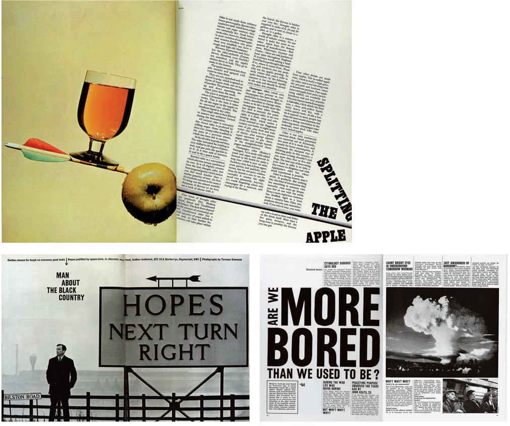
Many of the big names of modernist design are Europeans who fled their homes to forge new careers and lives in America. A notable exception is Englishman Tom Wolsey, whose extraordinary art direction on tailor’s magazine Man About Town (later About Town, then Town) during the early 1960s brought Swiss modernist ideals to the previously ornate, classical taste of English periodical publishing. His work was typified by the use of slab serifs and modern sans serifs such as Haas Grotesk – he aggressively combined the brute force of these faces with equally uncompromising, startling illustrations and set the two onto grid-free layouts that were all about horizontals and angles. The result was a form of design that had immediate and forceful impact but was never monotonous, thanks to Wolsey’s rejection of the grid, occasional playful integration of display fonts, masterly use of picture placement, unerring ability to create movement and dynamism, and instinctive knowledge of good photography. He commissioned some of the best photographers of the decade, among them Don McCullin and Terence Donovan, and employed excellent print production to reproduce their work, setting the standards and styles for magazine design in the 1960s and on.
Austrian émigré Henry Wolf, who was art director of Esquire from 1952 to 1958, completely overhauled the design of this up-and-coming literary magazine, giving it a sophisticated and innovative style. In 1958, he became art director at Harper’s Bazaar, succeeding Alexey Brodovitch. He remained there for three years, leaving in 1961 to start his own magazine, Show.
Wolf saw his task on all these titles as being to express their contents visually by integrating rigorous typography with expressive, eye-catching layouts. On Harper’s Bazaar, where he inherited Alexey Brodovitch’s stable of outstanding visual talent, Wolf built on this legacy, introducing simple, streamlined fonts and calm, spare compositions, which invested the layouts (illustrated left), and the magazine as a whole, with a measured pacing and flow. This was unusual for a designer who was more comfortable with opening spreads and covers than with the hard graft of lengthy features and their attendant problems of continuity and sustaining interest.
Not surprisingly, given his success in advertising, Wolf reigned supreme in creating the concept cover, often best seen in his work on Show, where he designed surrealist covers that were clever, witty and always original. Famous for the belief that ‘a magazine should not only reflect a trend, it should help start it’, Wolf was an intuitive designer who was instrumental in introducing Americans of the 1950s to European modernism.

German designer Willy Fleckhaus is noted for his work on just two publications, but Twen (illustrated here) and Frankfurter Allgemeine Magazin (FAZ) are widely regarded as among the most influential titles in post-war editorial design. Fleckhaus’s genius was to take the International Style, which dominated post-war graphic design, and give it an explosive 1960s energy created by the use of huge, tightly cropped pictures anchored to a rigid, grid-ruled approach to design. The resulting spreads offered a formal simplicity that he carried through to Frankfurter Allgemeine Magazin ten years after leaving Twen. This news magazine experimented and played with illustration in much the same way that Twen had done with photography, and retained the simple formalism of the earlier title, which was copied throughout Europe. In his book designs for publishing houses such as Suhrkamp, Fleckhaus’s work shows as much aplomb and understated panache as that used in his magazines.
Twen
Twen launched in 1959 as a provocative youth title that combined erotic photography with thoughtful, intelligent articles. Its aim was to attract a new readership that demanded to be seen as distinct from its parents, an audience that was finding a language and style of its own: the emerging youth culture that was sweeping the West. This culture demanded a new graphic style, and designer Willy Fleckhaus provided it by combining elements of Swiss formalism –the rationalism of the grid and simple typography – with the witty and bold visual aesthetic of American publishing. To achieve this, he devised a 12-unit modular grid for the publication’s large-scale format (265 x 335mm [10.4 x 13.2in]). The importance of this grid lay in its ability to combine units in a seemingly endless number of ways, enabling the use of two, three, four, or six columns, while horizontal units could be used to break down the columns into chunky blocks. What Fleckhaus put in place was a series of versatile coordinates on which to anchor his layouts – a brilliant solution that stood out from every other publication. Into this grid Fleckhaus then dropped some of the most striking imagery of the time, cropping and manipulating compositions to produce strange shapes and massive close-ups that looked like weird landscapes, surreal portraits … anything went as long as it was dramatic, visually subversive and different. Combining the large format with distinctive black pages, minimal type (though a trained journalist, Fleckhaus didn’t like writing and believed that visual storytelling had more impact) and some of the most eye-popping visual reportage of the day, Twen offered a dramatic shock-of-the-new publication that perfectly reflected its social and cultural milieu.
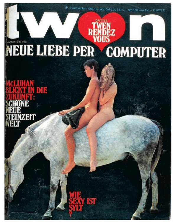
Combining the large format with distinctive black pages, minimal type (though a trained journalist Fleckhaus didn’t like writing and believed that visual storytelling had more impact) and some of the most eye-popping visual reportage of the day, Twen offered a dramatic shock-of-the-new publication that perfectly relected its social and cultural milieu.
Founded in the UK in 1965, the radical women’s monthly Nova saw its remit from the outset as being a women’s version of a men’s magazine – a title that would offer its readers intelligent conceptual content that went far beyond fashion and make-up. Art director Harri Peccinotti and editor Dennis Hackett were united in their determination to design a magazine that reflected this forward-looking stance, and drew on the American expressionist style developed by M.F. Agha and Alexey Brodovitch in the 1950s to do so. Covers, in particular, used a combination of unexpected image, space and text to reflect confrontational and often explosive topics such as racism, abuse, sex and politics. Photography was stark and expressive, both in content and cropping. But type was also innovative: stand-firsts in Times font covered half a page and demanded as much attention as the images. The legacy that Peccinotti left for David Hillman, who worked on Nova from 1969 until its demise in 1975, was ideal for documenting and exploring a period of intense social, sexual and political upheaval through bold, in-your-face visual elements (in particular photography, which he was highly skilled at using as reportage).
Hillman’s ability to take design beyond defining a publication’s identity to expressing its content, tone and stance was honed on Nova, highlighting the importance of being involved in all aspects of editorial. Acting as both deputy editor and art director, he was able both to interpret the magazine’s identity as an uncompromising, individualistic title, breaking boundaries and taking risks, and to look at individual stories. Crucially, he believed photographs could tell stories, and commissioned many such ‘stories’ from photographers with different perspectives and even opposing stances. As a result, the magazine consistently broke new ground, but always in a way that was entirely appropriate to its identity and content.

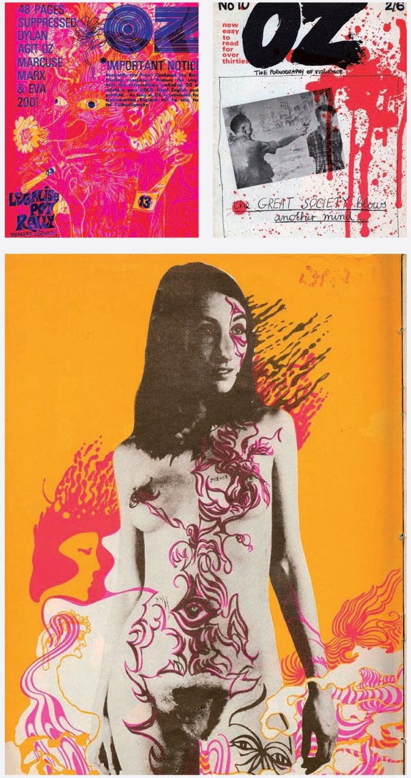
Radical psychedelic magazine Oz was first published in Sydney, Australia, as a satirical publication edited by Richard Neville and co-edited by Richard Walsh and, crucially, artist, cartoonist, songwriter and filmmaker Martin Sharp. It was Sharp who drove the design direction of the magazine in its second incarnation as a London hippy magazine (from 1967 to 1973), where it garnered artistic kudos in equal measure with establishment opprobrium, and in 1970 a prosecution that would result in (at the time) the longest obscenity trial in British legal history. For the London issues of Oz, Sharp was able to take advantage of new advances in printing, stock and inks to design or show some of the most experimental and adventurous covers ever seen in editorial; many editions of the magazine included dazzling wraparound covers or pull-out posters and were printed in metallic inks or on foil. With these covers and materials Sharp was pushing at the boundaries of print technology and offering a rich metaphor for Oz’s content, which was extending the limits of what was permissible by exploring accepted notions of pornography, libertarianism, obscenity and radical thinking.
Formats and sizes changed frequently, with Sharp as happy to explore the possibilities of landscape formats as he was portrait ones, but what remained constant was the ability of Oz to reflect and express brilliantly a subculture’s shift from anti-authoritarian, drug-fuelled anarchy and experimentalism to dilution and eventual absorption in the establishment it had raged so hard against. It did this not just through its covers, but also through its design by Jon Goodchild. Working often with Sharp and other contributors, Goodchild turned the art room into ‘a theatre of experiment’, happily using paste-up to create collages and loose typographic layouts that moved editorial design away from the rigours and constraints of the prevailing Swiss style, with a lasting impact on graphic design.
Neville Brody joined The Face in 1981, and immediately established a design aesthetic rooted in, but not aping, the work of the twentieth-century art movements Constructivism, Dada and Expressionism. Here, once again, was typographic symbolism: playful experimentation that looked back to the mechanization of print and the opportunities it afforded the visual communicator, and utilized the expressionism inherent in stark, bold, geometric shapes and symbols. This was visual culture affiliated to political rebellion, which had a particular appeal for the overtly political designer. The Face’s anti-authoritarian, post-punk political and visual identity was a perfect match for Brody’s experimental, individualistic approach to design because they shared the same rebellious spirit and helped define the look and feel of their time. Brody’s main contribution to this youth-culture magazine was to break with traditional methods of type construction and establish it as a versatile, malleable design element that was barely distinguishable from imagery and could act as a vehicle for meaning.
The Face
Neville Brody’s design of 1980s counter-culture magazine The Face revolutionized the editorial role of type and would have a lasting impact on graphic design. Brody’s strength lay in using type to express meaning: by employing different faces within words to suggest nonconformity, positioning and angling type to echo the radical edginess introduced by Russian constructivism, and using graphic devices and symbols as page furniture to unify spreads and create visual cohesion. He also took a bold approach to images, cropping and framing to emphasize content visually. Full bleeds with just a portion of an image visible underlined the title’s identity as anachronistic, anarchistic and thoroughly individual. As the magazine matured, so, too, did Brody’s use of type and image, remaining in step with the readers, but always offering innovative and skilful design solutions. He was less successful in applying these same styles to other publications such as City Limits and Per Lui, but his work on The Face continues to stand out as a defining piece of editorial design.


For Fabien Baron, art direction runs in the family. After just one year of art school at the École des Arts Appliqués in Paris, he started work with his father, who art-directed a number of French newspapers (including Jean-Paul Sartre’s radical left-wing newspaper Libération), later moving to Self, and then to GQ in the US. But it was on Italian Vogue in 1988, and then on Harper’s Bazaar with Liz Tilberis, that he carved a reputation for strong, distinctive art direction that broke all the rules, including commercial ones. On Italian Vogue, for example, he simply ignored the accepted diktat of close-up figurative cover shots, and commissioned photographers such as Albert Watson to shoot arresting abstract portraits by reducing shapes to strong graphic devices that had real impact on the news-stand.
Baron’s trademark style of bold graphic solutions was developed by minimizing the elements of design, as well as the range within those elements, drawing his colour palette from primary colours used sparingly and to startling effect with big blocks of black. Similarly, his illustration style is reduced to a few select artists (on Italian Vogue he only ever used illustrator Mats Gustafson, who created Interview magazine’s logo) and his photos are mostly black-and-white images cropped in unusual ways to create striking results.
Above all, it is his use of typography as a constructive architectural element that Baron is famed for. On Italian Vogue, his use of huge full-page headlines to open a feature, combined with a minimalist style and large amounts of white space, created a new modern aesthetic. His letterforms echoed elements of an image; scale combined with a shape, a curve or a colour would act as the cornerstone on which to build a typographic solution. These became visual responses and connections that were perfectly adjusted to the magazine. On Interview he used this approach to strengthen textual portraits of interviewees, constructing type to express a sense of the person visually. In both cases, Baron presented the reader with visual solutions that were always coherent and exuberant pieces of editorial design. More than a decade later, his work on Vogue Paris (above) continues to do this, playing with image, text, space and scale to express the movement, action and vitality of fashion in a new century.
Mark Porter
Mark Porter was art director at Colors magazine, followed by the Evening Standard’s ES Magazine, and the first two issues of Wired in the UK. He is best known for his spectacular redesign of The Guardian newspaper during his time there as creative director there from 1996 to 2010. The redesign of that paper won a Design and Art Direction association Black Pencil award and a Society of Publication Designers design award, and was significant at the time as newspapers sought to break out of their old model into new formats. During his time at The Guardian, Porter also art directed the Weekend magazine and redesigned it six times with the assistance of Richard Turley.
Porter’s passion for detail, and keen eye for a good image, has made his work very popular. He is a visual journalist first and foremost, reflecting his background as a language graduate. He now runs his own studio and recent work includes Publico and Financiele Dagblad. Publico is a Portuguese daily full colour newspaper, which has been praised for its very simple and bold design. The publication is graphic and features images throughout. Its smaller size makes it a modern version of a colour newspaper – almost a daily news magazine.
Financiele Dagblad is a daily financial paper produced in Amsterdam. It is designed first for print, but also appears in a website format and in a version for tablet. Porter has had to consider how the overall design format can be adapted for each different output.
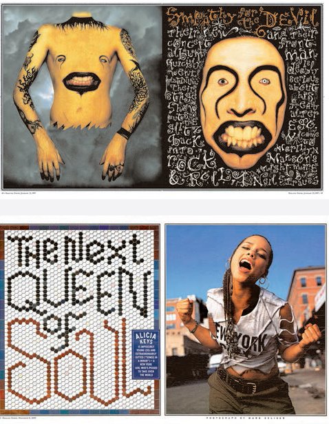
Gail Anderson is one of the most prolific unsung design heroes and her work is a lasting inspiration to editorial designers. Born in the Bronx to Jamaican parents, she started at Random House after leaving the School of Visual Arts and then worked for the Boston Globe newspaper. However, it is for her years at Rolling Stone (1987–2002) that she is best known. Although she worked in a partnership with the esteemed Fred Woodward, it was Anderson who explored decorative letterforms and came up with double-page spreads that were good enough to be album covers in their own right. In his interview with her when she was awarded the 2008 AIGA MEDAL, Steve Heller calls this ‘typographic eclecticism’. Her style at Rolling Stone shows a painstaking, craft-based attention to detail in densely designed pages, many featuring illustration that she had commissioned. Despite winning many awards for SPD and AIGA, she is a modest and quietly diligent person, and generous in crediting her influences as Paula Scher and Fred Woodward.
After Rolling Stone, Anderson joined the entertainment advertising agency SpotCo, where she designed stunning theatre posters for the entertainment industry. Her playful images combined great ideas, illustrative solutions and typographic play to create memorable images, some that have branded entire shows or plays on and off Broadway, such as the Avenue Q puppet. She designed a postage stamp for the US Postal Service as well as being on the Stamp Advisory Committee. The common thread in her work is good, strong ideas and skillful, attentive delivery, using both new and old letterforms in a contemporary mix-up. She describes the skill of having many ideas during her time at SpotCo to Steve Heller, her co-author on various books:
‘You approach each project searching for a dozen great ideas, not just one or two,’ Anderson explains how her work competes for the attention (and dollars) of theatregoers. ‘After about seven designs, you realize there really are infinite ways to look at a problem. I now completely enjoy the process, though I’m keenly aware that all but one of those great ideas will eventually be killed off. It’s strangely liberating.’
Anderson now teaches on the design programmes at the School of Visual Arts, New York and has her own boutique design firm.
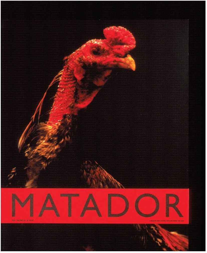
Everyone associates Benetton’s Colors magazine with its original creators Oliviero Toscani and Tibor Kalman, but it is also very much the product of Fernando Gutiérrez, who became its creative director in 2000, adopting Kalman’s original concept of visual reportage as honest, stark storytelling. A versatile designer, Gutiérrez has worked on everything, including book publishing, communications campaigns and editorial design, all produced by his own company within just seven years of graduating from the London College of Printing. Since then he has been quietly reshaping the landscape of editorial design in Spain and beyond, first on a governmentdepartment youth magazine, for which he created a format based on a double grid, but most notably on the Spanish fashion magazines Vanidad and Matador – a literary and a photography journal respectively – and on the newspaper El País. He has designed and art-directed a full range of daily sections and supplements for El País, including the youth-oriented Tentaciones (left and ‘Conexión’ spread opposite) and the Sunday EPS, which has a nationwide readership of 1.2 million. These are printed on low-grade newsprint, yet play to the strengths of the format and stock but are not confined by them. Gutiérrez was keen to design them as stand-alone magazines rather than as newspaper supplements, and the dynamism and panache with which he achieved this goal saw sales rocket.
On all these publications what is evident is Gutiérrez’s ability to use design elements to express the title’s identity and give readers an appropriate experience. Moreover, his work is infused with a cultural and national identity, which makes these magazines stand out from the crowd. On Matador, for which Gutiérrez plans to produce 29 issues by 2022 (each annual issue being ‘numbered’ with one letter from the Spanish alphabet, representing a homage to a different typeface), the key design elements are the high-quality stock, large-scale format and the printing. These combine with a formalism in the layout (see below) to create a dramatic and distinctly unique publication. Themes focusing on identity are overtly about nationality, but other less obvious topics also keep the title’s Spanish parentage in evidence.

No designer since David Carson has used type in editorial as expressively as Vince Frost. The results could hardly be more different, but what unites the two is an inherent understanding of the need for editorial design – and particularly typography – to express the content and identity of a publication visually. For both designers, this has resulted in accusations of pointless obstruction in their visual solutions, but set against this is Frost’s constant desire to intrigue and engage the reader through vibrant, exciting design.
Along with art-directing The Independent on Saturday newspaper’s magazine in the UK during the mid-1990s, Frost devised the design for the Financial Times’s weekend magazine FT The Business. Both reveal a delight in intelligent conceptual design. Frost favours simplification and ‘tidy’ designs, which may explain his extraordinary ability to work with letterpress and woodblock typography as decorative elements that are always wholly related to content – though perhaps not always appropriate to its tone and style. By reducing the number of design tools in his palette, Frost is able to focus on making each element work extra hard to arrive at clean, bold solutions. On Big magazine (below), an alternative style title printed in Spanish and English, he worked with letterpress guru Alan Kitching to produce type that he employed playfully as skyscrapers, speech bubbles, a mask and various other objects, all responding to the stunning accompanying photography, which in turn echoed the work of seminal New York photographer William Klein. And on the UK magazine Zembla, a literary magazine that wanted us to ‘have fun with words’, Frost literally interpreted that fun on every page, with bright, energetic, irreverent and playfully unpredictable designs centred in most cases on type as decoration.
Frost’s skill goes beyond individual page solutions, however, to incorporate another, equally important aspect of editorial design: the ability to handle the flow of a publication so that the whole product is an exciting, constantly unexpected experience for the user. Nowhere is this more evident than on Zembla, where stunning photography, much of it black-and-white, was combined with letterpress to surprising and delightful effect, and where the regular editorial department—letters, reviews, news and so on – was given as much attention as feature pages.

Janet Froelich is well known for her strong art direction for The New York Times Magazine and Real Simple, and for her passion for photography and design. Over her long career, her ability to work with diverse creative partners has helped her strive for the best images and the best ideas. Froelich began her career as a painter, and studied fine art at Cooper Union and at Yale University.
Froelich was art director of The New York Times Magazine from 1986 to 2004, becoming creative director in 2004, and has won over 60 design awards from the Society of Publication Designers, the Art Directors Club and the Society of Newspaper Designers. Under her direction, The New York Times Magazine won the Society of Publication Designers “Magazine of the Year” award in 2007. In 2004, she became the founding creative director of T: The New York Times Style Magazine, an award-winning publication filled with beautiful fashion and design content which she helped develop. In 2006, she also became founding creative director for Play: The New York Times Sports Magazine and Key: The New York Times Real Estate Magazine. As we go to press, Froelich is the creative director of Real Simple magazine where she heads the creative team on this lifestyle, food and home title for Time Inc. She oversees design for print and tablet, mobile and web, as well as product packaging, all of which benefit from her clear vision of design and commitment to excellence in photography and typography. The images in Real Simple are beautiful and striking, and often succeed in telling a whole story in a single image, even when it is downsized into an icon for mobile media.
In 2006, Froelich received the Art Directors Club Hall of Fame award, and she has inspired many young designers through her work, and through teaching at the School of Visual Arts, New York. She has served on the boards of the Society of Publication Designers and the Art Directors Club, and was the president of the New York chapter of the American Institute of Graphic Arts (AIGA), organizations that each help to raise the profile of design.

Froelich’s passion for fine art has informed many of the choices she has made, and has helped her to collaborate with artists and designers to make memorable images.

Originally from Texas, Scott Dadich worked on the beautifully crafted Texas Monthly before arriving at Wired magazine in 2006. After winning many awards for groundbreaking design, characterized by his can-do attitude to the magazine format and innovative engagement with the readership, Dadich became one of the pioneers of good magazine design during the transitional period from print to iPad. He initiated the concept of the Wired app and led the entire team in its development. Wired was the very first app built in the framework that would become DPS. He also designed the second app, which was for The New Yorker, and in 2012 this app became one of the most successful in terms of sales in the entire industry. With the backing of the renowned Condé Nast publishing company, Dadich’s team also launched The New Yorker for iPhone in 2012.
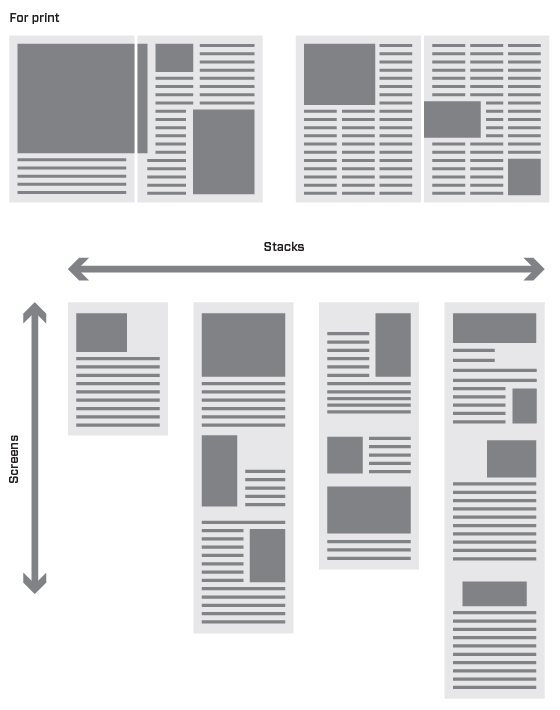
Dadich investigated the transition from flipping through magazine pages as linear PDFs in early apps to include digital pages too. He called it the ‘stack’ system where pages of both digital and print are arranged as if on a clothesline. With the investment of Condé Nast behind his team of designers and developers, he explored the format when it was still in its infancy.
Dadich’s thirst for innovation continues to drive him on in his role as Vice President, Editorial Platforms & Design at Condé Nast. His passion and eloquence for the medium, and his generosity in sharing has made him an outstanding contributor to the design community as it moves through the greatest transition since the invention of the printing press.

Suzanne Sykes is a British art director known for her work in reinventing fashion magazines. She was the launch designer for Marie Claire UK in 1989 with editor Glenda Bailey. Her various D&AD design awards came for her work on Grazia, which took the glamorous fashion monthly aesthetic and translated it into a fast-paced, newsy weekly formula. At the time this was a revolutionary approach to top-selling fashion brands. The look was dramatic and divided opinion, but changed the fashion magazine landscape with its layered pages and coloured panels.
After a stint in New York as art director of Marie Claire US (2007–12), Suzanne tackled an ambitious redesign of Elle UK, which had its heyday in the supermodeldominated ’80s. Sykes recognized the need to respond to a changing readership, now less likely to buy glossy magazines, but keen to use social media for their fashion advice. With art director Mark Leeds she created a publication both online and in print that directly connected both platforms – unlike the competition, which produced sibling versions from the master print title.
Talking about digital and print in March 2013 she said: ‘Print is the hero brand. We set our stall in print, driving readers to the digital arena.’ In 2013, Elle sold 177,094 copies in print; website readership was 450,000 unique users per month. Elle was the first UK women’s mag to have 1.13 million Facebook followers. Sykes says that with editor Lorraine Candy she is ‘aiming for the reader to be able to buy directly from the page’.
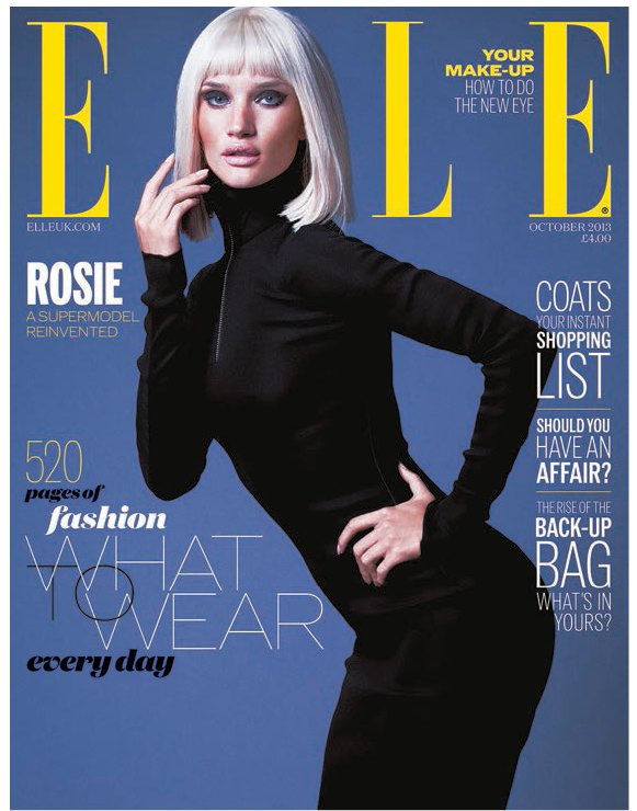

Suzanne’s design follows the bold mother brand but expands to the enhanced app version, (elle.com page). Here, the cover model Rosie Huntington appears in a video on ElleTV, giving the reader a variety of ways of exploring and sharing content.
While it is almost impossible and perhaps foolish to try and predict emerging trends in design, it is useful to touch on technological and other changes which are affecting design practice. All the figures listed above have benefited from the new technologies of their era, be that the increased availability of colour printing or the flexibility of phototypesetting. Today, the Apple computer on the desk of every editorial designer enables them to be a true multi-disciplinarian: part printer, part art director, part image-maker, part coder, part editor, part blogger, part marketer … but he or she must be more than the sum of all these parts. Designers must be aware of economic, cultural and technological shifts in different media, and be ever-ready to adapt to new technologies in order to survive.
In this section, we look at the challenges that may be coming up in the near future and reveal insights from industry experts.

Technological shifts
The tablet magazine
As we go to press, the biggest challenge to the editorial design industry is the variety of channels that magazines face across print, tablets and social media. The 2010 launch of the Apple iPad triggered a race to make app versions of print magazines in the hope that these would be the answer to monetizing digital content. Adobe, Woodwing, Mag+ and others quickly developed plug-ins for InDesign that allowed print designers to adapt their layouts for the iPad and other tablets. Overnight, a whole new stage in the editorial workflow was introduced. The print edition completed, the design team would adapt the final pages to the smaller tablet screen, reformatting everything and adding interactive elements – animation, video, audio. It remains to be seen how genuinely successful such apps might become, but the production process has led editorial designers to add interactive skills to their ever-increasing list of responsibilities.
Responsive design
Initially developed to cope with the multiple screen sizes on which a website might be viewed (desktop, tablet, phone), responsive design means the width of the browser window triggers an algorithmic change of layout to suit each environment. The broad multi-column screen design for desktop browsing automatically changes to single-column design for the smartphone.
To help the designer cope with the changes in the workflow discussed above, it has been proposed that a similar algorithm-based responsivity might be developed to account not only for the change between print design and tablet design, but also to account for the more subtly varied tablet screen sizes and formats.
Automated content
With RSS feeds, the automatic magazine is a reality with algorithms (calculation/problem-solving processes performed by a computer) working out the content the reader wants and delivering it via application software to different mobile devices. In 2012, the most popular provider of aggregated content was Flipboard, which was founded in the US two years previously by Mike McCue and Evan Doll. Flipboard is a digital social magazine that aggregates content from social media such as Facebook and Twitter and displays the content in magazine format on an iPad or Android mobile device. Users can also “flip” through feeds from websites that have partnered with the company, for example, subscribers of The New York Times can now read the publication’s content on Flipboard. As Jeremy Leslie, creative director of magCulture, notes:
‘There is no art director in that sense, there is an algorithm. Flipboard is the first that has brought some sense of scale and space. I use it on my phone for my social network feeds. Twitter is a great example and it works well with Flipboard. The way the pages turn on Flipboard is also worth a mention. Traditionally page turning on devices was an unhappy aesthetic between purpose and function, looking very uncomfortable. The way that Flipboard splits the iPad screen down the middle is very clever, it refers to a magazine without directly mimicking it.’
Combining print and digital
Another algorithm-based project demonstrates one of the most interesting recent themes in publishing, the combining of traditional print and new digital technologies. The Newspaper Club developed from its founders desire to open up print production to non-designers. They developed a bespoke software called Arthr and negotiated good rates with printers based on using their press downtime. The result was a service where anyone could upload words and text, have the software lay it out as pages, and order a small run of newspapers (design-literate users could upload their own designs as PDFs).
A more personal form of print-digital crossover came with Little Printer, developed by London-based studio Berg. Rejecting the traditional publishing model that you print editorial, distribute it and hope somebody buys it, Little Printer offers a selection of material to choose from via a web dashboard. The content arrives via WiFi to be printed on receipt paper by the Little Printer (see pp.232–33). Bearing some similarities to Flipboard, it is a typically playful experiment from Berg. Principal Jack Schulze, explains:
‘Little Printer is a product that has a couple of qualities to it and behaviours that are very different from Flipboard. One is that everything is archived in the cloud. It has a history of its behaviours if you want to look at it. Second it schedules a release of small poignant personal data and information for you. You ought to be able to access it with just a single point of interaction. Some of this output is usual content e.g. puzzles, weather, some is social media content, plus a mix of broadcasters and big publishers like The Guardian. It is just junk being sent around in pixels. The point is that it is at 8.15am and it is my friends. The Big M media and the small media all come out in the same language. Little Printer does not differentiate.’
Finite publishing
A recent focus of interest has been the notion of presenting digital content – usually endless in its open, linked, internet guise – within a finite boundary to echo the way a printed publication is limited by the number of pages. Instead of an infinite quantity of website content, a website or app might flaunt an exact finiteness. One such experiment is The Magazine, an iPhone app launched by Marco Arment (founder of reading app Instapaper) that presents four technology-orientated pieces of writing to subscribers every two weeks. Available exclusively via Apple’s Newsstand and not in print, there are no visuals or decoration, simply readable text delivered in small volumes with a clear end, or ‘edge’.
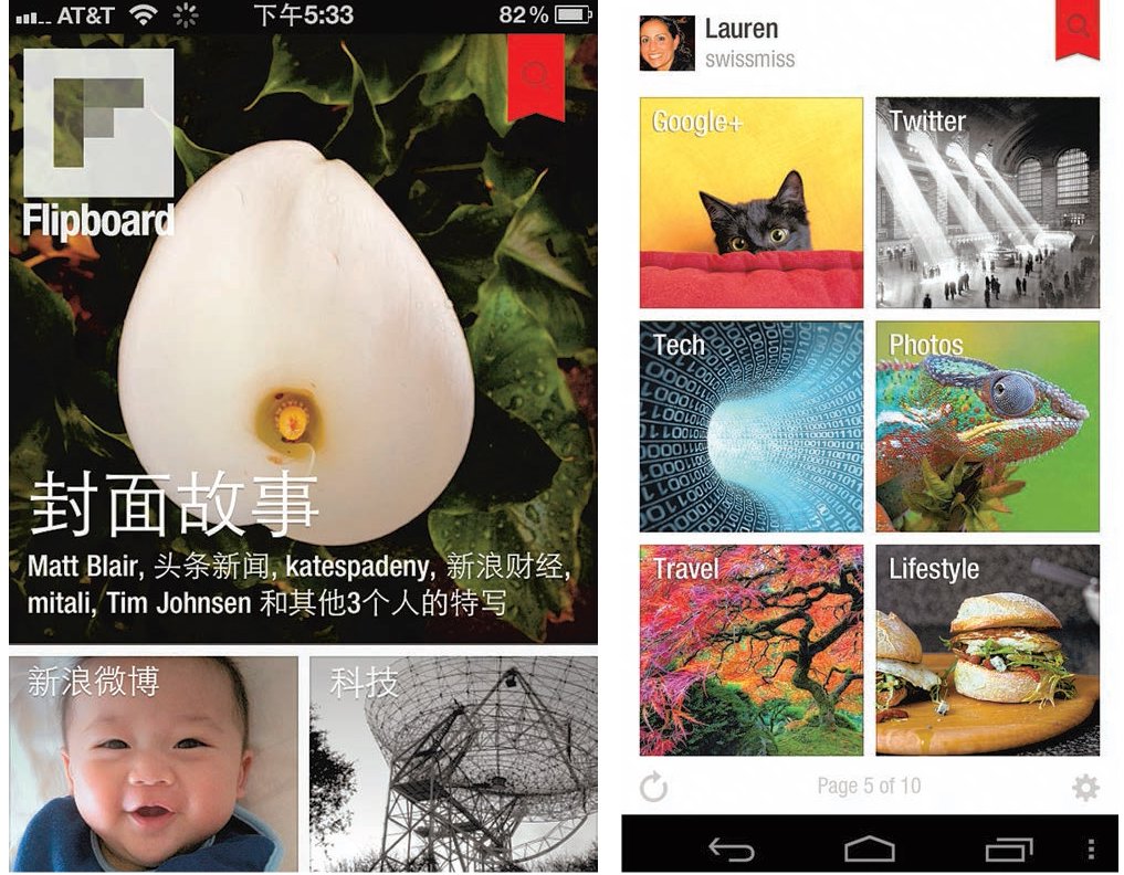
Available on both Apple and Android devices, the automatically produced content of Flipboard has a magazine-like feel, with sharp black text appearing on a clean white background along with images and links, and clean white text appearing over images as shown here.
Another start-up, Aeon Magazine (aeonmagazine.com), publishes one original long form essay every weekday, again concentrating on the quality of content rather than quantity. The material is highly progressive, thought-provoking and written by specialists, the aim being that readers focus on this daily serving of valuable content rather than drown in endless ‘must reads’. Aeon essays are published daily on the web, as well as being available via a subscription email on a daily or weekly basis, and aadapt respnsively to desktop, iPad and smart phone screens.
Availability of data Many companies, such as The Times newspaper, can use increased data availability to their advantage. Jon Hill, design editor at The Times, says:
‘..new developments in data availability can be pushed further, of which GPS is just one part of what we can do. The other exciting thing is that we can contextualize stories and show picture galleries using our archive, which goes back 225 years, in an interesting way. This project has great potential for an organization like The Times .... We have a lot of feedback now for the editions too, telling us how much time the readers spend. There is now microdata on our work, with analysis showing which infographics people spent time looking at. Before, if you put it out and if people looked at it then that was great, but now we have detailed feedback telling us what was actually successful.’
Changing business models The sharing of ideas and editorial opinions used to be person-to-person, but is now done via social media networks such as Twitter and Tumblr. These tools help to bring audiences back to print and are part of the multi-channel network of support systems that publications use to share their content.
News media companies like NewsCorp are working on how to sustain their large organizations via a mix of multi-channel products and services. Some of these prove to be lucrative business models, while others consist of more traditional and historic parts that don’t generate high income. As Jon Hill says:
‘...the big thing is with the paywall and the digital editions. We have to look at our workflow at The Times and see how we produce these things efficiently and make sure the design team are having proper input. We are working hard to try to sustain all the different platforms at once, 24 hours a day. We can’t make bespoke editions for every single new tablet or mobile platform that comes up so we will prioritize our design efforts. We want to make a difference to the design of each part of the output.’
So can magazines survive just in print? Simon Esterson, co-publisher of Eye magazine answers:
‘ … too hard to generalize. Smaller publishing companies have been cleared out as supermarkets take over distribution of a selection of titles. Small newsagents are no longer able to compete. At one end you have got big publishing in print and at the other you have got a fertile area of self-publishing.
… The difference the web makes is that you can actually purchase back copies and subscriptions from abroad and have them delivered to your home. Instead of schlepping to specialist collectors, you can find them online. Small publishers like Eye, can keep in touch with readers once they find us and let them know about events and new issues. For small publishers, their titles may not be in the shops but that’s not a problem.”
It appears that the iPad is really loved by many of its users as a unique object. However, it cannot be assumed that this tablet or other cheaper Android tablets will continue to have the same appeal to consumers in the future, or that these or any new devices will remove paper from our lives.
While Jack Schulze has one foot in the future, he also has an interest in designing beautiful aesthetic work, influenced by his passion for typography and respect for a good idea. His work for Mag+ showed a simple way of navigating through different types of content within a magazine app.
The idea of new software and exploring different deliveries for editorial continues to interest BERG, a company founded by Schulze and Matt Webb in London in 2005 (they were later joined by Matt Jones).
In February 2012, Fast Company ranked BERG one of the ‘World’s 50 most innovative companies’. This annual guide to companies whose innovations have made an impact in technology and culture, applauded BERG for ‘wildly imagining the marriage of physical and digital’. Through its playful and off-the-wall thinking, BERG helps companies to realize their potential with digital technologies and offers innovative products, such as Little Printer, as an alternative to usual publishing thinking.
In the following interview, Schulze puts forward his views on the role of big media companies and what might happen in the future.
How can the big media companies stay agile and keep in touch with what consumers want?
They need to become software companies. Steve Jobs and Amazon have changed the rules of the relationship with consumers. There are two big games in town: one is experience, the other is data. Basically media companies need to be making software, it is not enough to be making content.
Where does this leave the big media companies?
Those big media companies do still have value. Alan Rusbridger (editor of The Guardian), for instance, is clever and understands collaboration. However, Big Media are in trouble. Historically if you are a successful media company you want to be the largest. Media is used to owning stuff (assets) and having a lot of output and reach into TV, into hotel rooms, etc. In the software sector you want to be three dudes in a basement. What you want to be is small.
What those businesses rely on is the value of their infrastructure. If you are a broadcaster you own many buildings and on the top of hills you have 40-foot (12 metre) antennas scooping up electricity and signals and beaming out TV and radio. It was enough when there wasn’t any other alternative, but now we can just check Facebook. Broadcasters have all that huge hardware and business just for mundane content. If you are a news company and let’s then say you own buildings and all these printing presses. You would also have trucks that drive the newspapers and distribute them, just in case someone might happen to want to spend 90 pence on a fixed piece of paper that they then have to carry home and read cover-to-cover. It is a very expensive way to do things. When there was no alternative it was fine. Now it seems ridiculous and a waste of energy and money.
How does Little Printer work?
When I need to configure it then I go online to subscribe to one of the publishing streams. I say these are the things that I want and it delivers them once a day. For me, for instance, I want it delivered in the morning. On the top is a button. If a delivery is sent, the light gently flashes, a bit like an answering machine. If you don’t print it out and the next delivery comes, then you just get one, not two. If you go away for a couple of days then on your return you don’t get everything, just the new delivery, but the rest is still stored on the cloud.
Take this for example: the content stream How many people are in space right now? tells you that there are six people in space right now. If you subscribe to this stream then you get news only when it changes. You only need to know an update when there are seven people in space. Daily newspapers have to come out every day. They always have to fill space with their columnists, even on a slow news day, and rely on habits of readers. Here we can create content only when it matters. Some days there is not much to say. There are ways of creating publishing only when there is something to publish. Why not publish something only when something happens because that is when it matters. Why publish every day? Media companies don’t work like that.
What is your prediction for the future?
This ubiquitous cheap Android tablet device made in China is going to look like the USB key or a CD in a few years time. They will be giving them away with a film on it or a book on it. It will be in your fruit bowl at home and when you want to check your email you won’t go to your computer but will be picking up one of these.
It is literally a cheap factory-made tablet device. Google make Android as an open system so that Samsung, Nokia and Apple could use the Android system on their hardware. Apple matters because people want it. The difference is that people want the Apple product.

The thermal printer reduces all the different subscribing feeds to a single thermal printout. This is your own personal data, designed in a friendly device connected to your home broadband.
Cultural and behavioural shifts
The boundaries between what is marketing, publishing, broadcasting and advertising have blurred. People now consume more media in their daily lives; often using mobile and television, or web and music, at the same time. Global web traffic statistics from marketing data services, such as Neilson BookData, show that consumers seem to be hungry for more.
Journalists can share their ideas on social media. Editors no longer have control over the journey that the reader once took when a magazine or newspaper was a more linear experience. Increasingly editors need to look for more ways for their publication to stand out.
The blurring of print and digital outputs also continues. Jeremy Leslie says:
‘We are at the stage of print and digital where you can say what is the difference? You have to just understand the difference between making a pamphlet of your own, having a Twitter feed, a blog or a magazine. Ask yourself how does your voice decrease or diminish in different worlds? Now it is all publishing, it is communicating opinion.’
One example of this is the travel and culture magazine Monocle, known for its innovative approach to magazines and the blurring of boundaries between advertising and editorial. In 2011, editor Tyler Brûlé launched a television show on Bloomberg network and an internet radio station, Monocle 24. Both of these channels seek to broadcast an intimate experience for the magazine’s jet-setting readership and reflect Brûlé’s keen understanding of his readership, borne out by 2.5 million downloads a month. Radio adds an intimate touch and nostalgic quality to the brand using a faintly BBC World Service style of broadcasting.
Economic shifts and new world markets
While the emerging ‘BRIC’ markets (Brazil, Russia, India and China) were thought to offer the big media (Big M) companies new markets, we have seen evidence that the freedom of the press is not what it was in the US or the UK. This affects news organizations such as The New York Times and the BBC as they struggle to make their services pay.
As Jack Schulze from BERG observes:
‘American Big M media is interested in the Chinese market. The difference in the market is scale. If they can get 5 per cent of that market, it would be significant and a way to sustain their business model back in the US. There is nothing unique or sensible about trying to launch a media platform in China. (It is just desperation in my view). Likewise, The Guardian is interested in the US because it prolongs their UK-based business model … In Africa SMS is significant because any kind of connectivity be it social or whatever can be exploited for social and economic gain. Stef Magdalinski runs businesses in Africa and runs a Yellow Pages service via SMS, which is very popular. He is one to watch as he aims to bring information and data to many people.’
The use of a simple solar panel device can bring electricity to populations who do not have power to charge a computer or a mobile device. However, the network coverage available in remote, poorer regions is insufficient to enable publishing to be downloaded, so there is still a cap on the expansion until mobile networks catch up. The networks need to see a financial reward for their investment in infrastructure before they will bring network availability to remote areas.
Real benefits of using social media
The next generation of publishing talent will still need to tell the stories which need to be told, but will use their natural ease with social media as part of their output tools. At the point of writing, it is a myth that there is a singular ‘next big thing’ which will replace print. Instead, editors and designers are now telling stories in every medium that readers can consume in. Janet Froelich, creative director at Real Simple, relates one example of this:
‘Real Simple was the first magazine to gain over 100k followers on Pinterest. Most of our images are re-posted on readers’ blogs and on personal favorites pages. Our photo and art teams have been shooting what they find visually stimulating, and posting these images on Instagram. We often get hundreds of “likes” on each of them. Those photographs expand our audience, keep the dialogue going, and showcase the vision and talent of our team. We are always working to create a more seamless integration of print, digital and social media.’

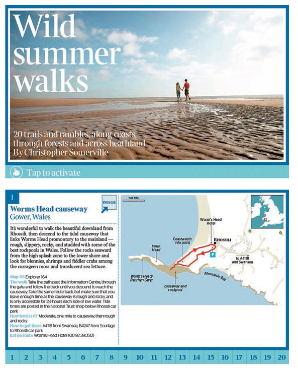
Readers are no longer static while they read. They are more likely to be on the move or doing two things at once. In the ‘Wild Summer Walks’ feature (opposite) from The Times, interactive content is provided in App form. The reader can use the content to guide their walk, as here on the Welsh coastline, for example, where the reader will use the location to enhance their interaction with the content.
Real Simple magazine is often used in the kitchen on the iPad, as the user follows recipes. Content is interactive, and can be used to follow step-by-step instructions. Other media may often be consumed at the same time – TV, email, social media. The way we enjoy magazines is constantly evolving.