
Chapter 3 : Covers

Who can ignore the impulse to pick up a copy of a magazine with a compelling image and masthead? If you can get a viewer to interact with your printed cover, then you have a potential reader. The digital cover goes further, functioning as a portal to the content. The reader engages through the touch of a button and is transported to the editorial content and moving and interactive elements. The cover also provides a vital means of establishing the brand message, and we begin this chapter by considering the importance of branding for any new publication.
On a new publication the first thing that has to be established is the brand message, or the identity, expression and feel of the publication. This is best explained as the editor and designer working together to construct a strong bridge across which the client – the publisher (or self-publisher) – can deliver the brand and its values to the customer – the reader. Once this has been done, the actual construction of the publication can begin, as detailed in Chapters 4, 5 and 6. The graphic design elements of a brand will consist of logos, colour palettes, typefaces, photography and illustration. There will also be a set of rules that govern their use. These elements come together to form the visual identity that represents a particular brand. With each issue, the visual identity must be reviewed so that it is kept fresh and vibrant, retaining the values and identity of the core brand without simply adopting a formulaic approach. It is not sufficient to copy the same look across to different outputs. Each extension of the identity must be relevant to the format. Key to doing this successfully is the ability to keep a recognizable style to the publication, while making each issue sufficiently different from the last one that it is instantly recognized by the reader or the potential reader as a new issue of a familiar, loved object.,
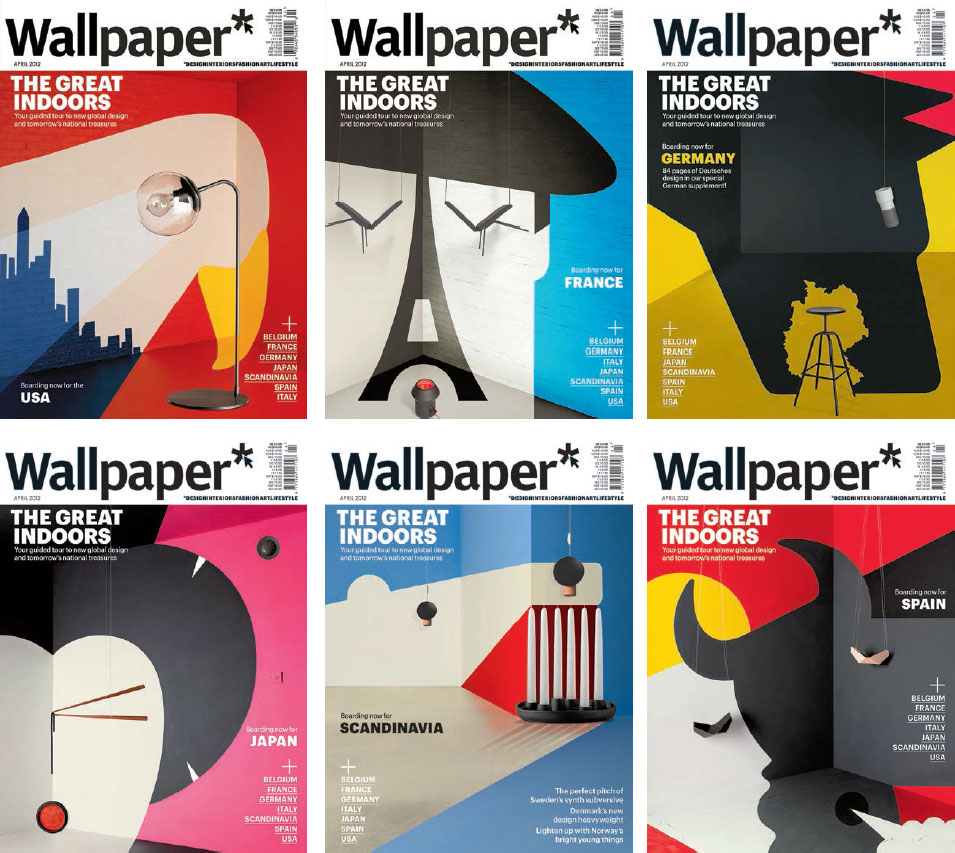
These curious images by artist Noma Bar were commissioned by Wallpaper* to create eight global editions, so that wherever you were in the world a ‘local’ cover appeared on your issue. At first they each appear conventionally drawn, but a closer look reveals these are actually 3D room sets, painted full-size and incorporating props such as furniture and lamps. The final series of images had a fine-art allure and created a memorable image campaign, playing with scale and negative space. Their iconic nature reinforces the brand, playing on its underlying ideas about the ease of travelling and working within different countries.
The first and most important part of any publication on which to stamp the brand and its values is the cover. This is the part of the printed magazine that will work tirelessly for the publisher, both on the news-stand, where it must get its feel across and stand out from the competition and where, after purchase, it will continue to sell the brand values on a more intimate scale to both the owner and other readers. For digital editions, the cover serves to reinforce the brand but also acts as an entry point to the content, part of the navigational toolkit. The same cover image will appear on the print edition, on the website, for tablet and for any app, depending on the preferred formats. An art director needs to create a cover, therefore, with this variety of formats in mind. The cover of any publication has an enormous task – it must be many things to many people. The publisher has to believe it will deliver sales. It has to be striking and stand out from the crowd, drawing the reader to it rather than to its competitors. If it is a periodical, it has to be familiar to regular readers but look sufficiently different from its predecessor so that those readers recognize it as being a new issue. It has to appeal to potential new readers without alienating existing readers. It has to express the publication’s character as well as its content. It then has to entice potential readers to look inside. So it’s no wonder that many publishers and designers spend almost as much time, money and energy on this one page as on the rest of the publication. If it is digital, it will likely pop up on Facebook or in a blog, so the cover must be iconic and work even at thumbnail size. The power of the cover needs to draw unique users each month.
News no longer sells newspapers. The internet and mobile media have made newspapers redundant as the preferred media for breaking news, and newspapers have had to reposition themselves accordingly. ‘The old definition was: news is what I find out today that I did not know about yesterday. My definition of news today, which I share with my clients, is this: news is what I understood today, which I found out about yesterday,’ explains Mario Garcia, design consultant on a global range of newspapers. Consequently, the early years of the twenty-first century have seen a great number of newspaper redesigns, and this is apparent, above all, on the front page where, for publications across the board, the desire for impact has become all-consuming. As Mario Garcia says, newspapers have to offer readers ‘good stories that surprise, with photos that have not been shown on television and the net for the last 24 hours. It’s all about redefining news, offering surprises and not just reaffirmation.’

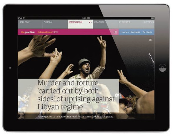
Newspaper covers still rely on eye-catching images and gut-clenching headlines as here in The Guardian. However, the modern newspaper selling on the news-stand has to show a spread of its stories so as to attract attention. In El País we see there are many teasers for articles which continue on the inside in the coloured horizontal banner and also in the vertical column. Even the main story about Syria only runs for 17 lines, so as to squeeze in an advertisement too.
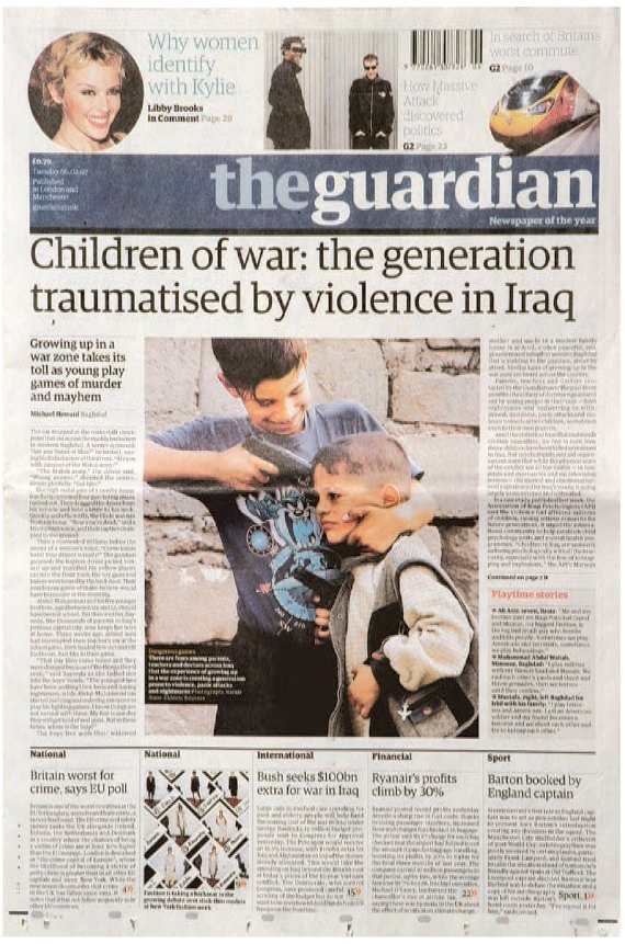
Similarly The Guardian strips four or five ‘turns’ across the bottom of the page. The designer must find a balance, which should be predicated on the brand: a quality newspaper, in particular, will always want to present a number of stories on its cover. As Mark Porter says, ‘Turns enable us to get a presence for a wide range of stories on the front page, which is essential for a newspaper that aims to give a broad and balanced view of the day’s news.’
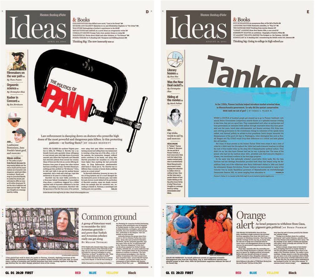
Newspaper designers, who lack luxuries such as huge images, colour or glossy stock, have to make a title appealing in a very different way to magazine designers, as these examples from the Boston Sunday Globe show. ‘Typography is the key to look and feel – what readers perceive in the first ten seconds when their eyes land on a page. It is through the feel of typography that one conveys seriousness, youthfulness, playfulness and so on. The colour palette is the second important criterion. We react instantly to the combination of type and colour on a page, and, as a result, white space and its allocation within the architecture of the page play the third most important role,’ says Mario Garcia.
Publishers now see the potential of a cover as an entry point to a landscape where the editor and advertiser can interact with the reader. The digital screen format will alter the nature of the cover image: an image on a smartphone, for example, will be much smaller in size than the same image on a printed cover. When designing digital covers, the two basic principles of cover design remain the same: a strong iconic image and cover type that excites and attracts the reader. Covers on tablets can, of course, allude to the traditional print heritage, as for example with The New York Times, which uses a small icon of the paper for fun, part of the reassurance to the reader that the digital version can deliver as much as the paper one. The experience of actually choosing a magazine or newspaper to read on a screen on mobile media is different to choosing to read a physical publication. There are many entry points that lead to a cover – via a website, an app or a link a friend has sent to you. The designer has to work around this and remember to keep the masthead and the brand identity reassuringly simple.
On a touch screen, the cover becomes a visual to swipe or touch to enter the page. The reader buys a digital version by getting the package as a subscription; often the tablet version and apps come ‘free’ when you subscribe to the print version.
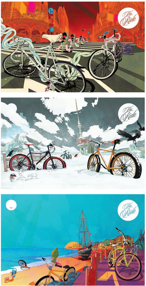
Art director of The Ride Journal, Andy Diprose has spread the cover image right across the front and back pages. Being an independent publication, The Ride has few of the constraints of the conventional magazine, such as cover lines and barcodes.
Self-published covers and zines
There are now many opportunities for small companies to set up their own publications. Selfpublishing can bypass the constraints of printing and distribution by using technology that prints to order. As a result, waste is reduced and costs are low. The independent magazine sector is thriving creatively and dedicated individuals are producing editorial to satisfy new niche markets and their fan bases. Social media also enables publishers to spread the word about their titles without paying for advertising. The organization Stack Magazines, for example, runs an independent magazine group in London. Set up by Steve Watson, it features titles like Oh Comely, Anorak, RiDE, Port and Huck. The covers of these magazines look different to news-stand titles for the obvious reason that they don’t require so many cover lines and, therefore, have a cleaner look.
Zines are also part of the independent publishing sector. A zine is a small-circulation ‘fanzine’, which has minority interest and is usually reproduced on a photocopier. Historically they were black-and-white pamphlets produced firmly outside the mainstream, often with content that would have been deemed inappropriate, subversive or slightly obsessive. Both Dazed & Confused and i-D magazine started as zines. They were noticed as cultural hotbeds of ideas before they became magazines. In the 1990s, the New York Riot Girl scene triggered the production of a number of homemade and politically challenging zines. They became a famous barometer of feminist anger and through word of mouth helped that movement to gain publicity.
The theory that a zine should be freely available to all was helped by the arrival of cheap photocopying, followed by the availability of home digital printing in the 1990s. Now zine fairs are held around the world and there is a thriving collectors market. Zines survive by promoting these niche interests via social media and blogging.

Fire & Knives, a foodie magazine, looks like a fanzine and is in A5 format. The covers use illustration instead of food photography, indicating that this title is unlike any other foodie magazine. The magazine has little advertising and exudes a literary air, with a zealous and critical take on the food industry. Produced largely by hand by art director Rob Lowe, some of the pages are drawn and then scanned directly, avoiding the use of conventional design publishing software. This keeps the cost down and the small size of operation avoids the use of distributors.
These silkscreened zines are produced in Sydney and use mono colour. They are created by Neil Edwards, formerly of i-D magazine. Edwards says, ‘They are like the little photocopied books I made at Saint Martins College, each one is different as I try to keep the imperfections.’
Custom-made covers
In 2010, Wallpaper* invited readers to custom make their covers using an online app, choosing from some limited elements created by artists and designers Nigel Robinson, James Joyce, Kam Tang, Hort and Anthony Burrill. Readers submitted their own creations using a template and then received their printed copy in the post. As art director Meirion Pritchard explains:
‘The first time we did The Handmade Issue it was to get manufacturers and designers together and to get our readers involved as well. We made an app that allowed readers to combine some elements that our designers had created. We printed every different unique design. We had to find a printer who could produce a good print product. We wanted to push the print quality. Each reader received a unique cover of his or her own design. We printed 21,000, each one different.’
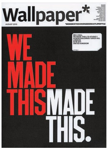
Alistair Hall at We Made This designed a cover and posted the image on their blog. http://wemadethis.typepad.com/we_madethis/2010/06/we-made-this-wallpaper-cover.html
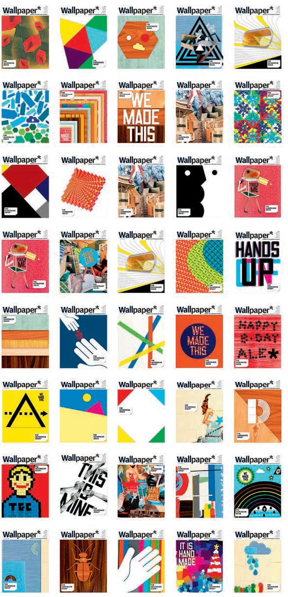
The design awards judges at the Design and Art Direction association awarded this a Yellow Pencil in 2011. http://www.dandad.org/awards/professional/2011/categories/mags/magazine-newspaper-design/18602/wallpaper-custom-covers
The development of covers from 1940 to the present day
1940 – 1950
During the 1940s, magazines in the UK were usually printed in black-and-white with perhaps colour covers. Some still resembled 1930s listing magazines, typeset by hand in metal type. This process restricted the use of fonts and what advertisers could do. Film magazines were early examples of specialist titles responding to the popularity of the cinema. They were cheap, although during the World War II there was a paper shortage in the UK and some magazines had to stall production.
In the US, Esquire magazine (launched in 1933) introduced features written by prominent authors such as F. Scott Fitzgerald and Ernest Hemingway. Magazines began using colour on their covers to stand out on the news-stand. The war also had an impact as creative talent fled Europe and headed for America, such as Austrian émigré Henry Wolf (see p.211). Post-war some of these talented designers, such as Alexey Brodovitch (see p.208) at Harper’s Bazaar, introduced European artists like Salvador Dalí and A.M. Cassandre to the American public. Alexander Liebermann became art director at American Vogue in 1943, and went on to inspire art directors all over the US, and in the UK and Europe, with his flair for art direction and his modern attitude towards photography, art and the medium of print.
As women returned to the home after the war effort, women’s magazines, such as Good Housekeeping and Better Homes and Gardens appeared. The cover images were important to attract the reader’s attention.
1950 – 1960
The 1950s heralded the birth of modern advertising – magazines carried adverts for products and services with a readymade audience of women who stayed at home after the war effort. Women’s fashion magazines benefitted from the influx of emigrant talent to the US, designers escaping from the aftermath of the World War II. Alexander Leiberman worked at Condé Nast and brought a whiff of European glamour.
Collaborators included Man Ray and Lee Miller. Esquire magazine started to print in colour and soon attracted advertisers. Britain’s recovery after the war was slower than that of the US, but there was a crossing over of talent between London and New York. Magazine covers during this period featured news items, and reportage photography exposed the shocking images of war.

George Lois at Esquire used simple iconic photographs and collage to communicate stories. The beauty of his style is that the text and image spark off one another. This style has been an inspiration to many art directors looking for an eye-catching idea to attract the reader.
A great example of visual confidence in the brand that might be misplaced if the brand was not well known. Harper’s Bazaar or Vogue would still be recognized with barely any of its logo showing; a less well-known magazine would not be.
1960 - 1970
The use of composition and double-page spreads in The Sunday Times Magazine set the tone in the UK, with David King heading a team of young designers and talent spotting photographers like David Bailey. Magazine covers of the 1960s reflected the radical changes taking place in society. Covers dealt with political issues such as the Vietnam War and the sexual revolution. The stalwart work at Life magazine brought news photos into the home of the average American even before televisions became widely available. Illustrated News did the same in the UK. The magazine cover became an important visual window onto the outside world. Colour printing became more widely available and advertisements in the US and UK reflected changes in lifestyle. The 1960s also gave us the pop icon as a cover image. Celebrity photographers, such as David Bailey, Richard Avedon and Norman Parkinson, contributed to memorable covers that still look striking today.
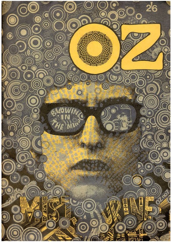
The seventh issue of Oz magazine is one of the publication’s most famous, thanks to its iconic Bob Dylan cover by Martin Sharp. Sharp exploited new printing techniques to create an image that expressed the experimental, druggy mood, music and culture of the time.
1970 – 1980
The 1970s was a decade of burgeoning cultural change, reflected in editorial design, with magazines like Rolling Stone and Nova setting exciting new standards. In the US, Rolling Stone began making its mark with its political coverage and focus on music and popular culture. The British magazine Nova was a woman’s magazine with a politically liberal bias. As the German magazine Twen had achieved a decade earlier, these magazines reflected the society around them with bold cover photography aimed at a restless, enquiring and youthful readership. In Europe, political unrest gave rise to perfect opportunities for photojournalism and in Germany Der Speigel brought political issues onto their graphic covers.
Designers explored the double-page spread format with gusto. Elle magazine developed a strong use of the diagonal, reflecting a departure from the upright fashion photograph of the 1960s glossies. Magazines were suddenly a dynamic format, with Interview magazine using scale to full advantage on its celebrity cover models. Italian Vogue used Fabien Baron’s strong sense of art direction, and Neville Brody (see p.216) brought a typographic flair to his magazines and gave other designers confidence to explore the grid and push it further. The specification of type was a skill that moved from specialist typesetters in type shops to the in-house Apple Mac (introduced in 1984), giving birth to the designer being the producer as well.
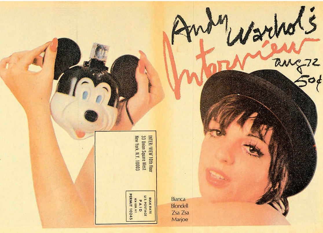
On Interview magazine, Andy Warhol often employed both front and back covers to present a portrait in full frame. On the front it would look like the traditional star close-up, but the back gave readers greater insight into the shoot and the subject.

This Annie Leibovitz cover photo of John Lennon and Yoko Ono helped establish Rolling Stone as one of the must-have magazines of its time. A beautiful cover image, full of symbolism, it captured the spirit of the time perfectly. Published by Rolling Stone as a tribute to the former Beatle, this picture was taken only five hours before John Lennon was shot dead outside the Dakota building in Manhattan in December 1980.
In the early 1970s, in production terms, magazines used black-and-white sections and restricted colour to certain sections, such as covers and features. As print technology advanced during the decade, colour printing on four-colour presses became cheaper and the use of colour became more widespread. Publications also began to print on gloss papers and experiment with different sizes and formats.
1980 – 1990
At the beginning of the 1980s, there were a few great fashion magazines and a handful of men’s titles. The magazines published by newspapers (supplements) were an experimental place for fashion and almost the last bastion of proper reportage photography in print. Their covers basked in the glory of iconic photography with few cover lines. In the UK, style magazines like i-D and The Face really captured the fashion mood. In the US, interest in technology was triggered as people became computer owners. There was an interest in computer-related magazines, such as MacUser which launched in 1984. In magazine publishing, designers could play with early digital fonts and designed entire publications on a screen for the first time. In California, Emigre designers were experimenting typographically as they played with the pixel as a design element. David Carson applied his deconstructed approach to Beach Culture and RayGun. In the UK, Neville Brody, Vaughan Oliver and Vince Frost showed a bold approach to the medium.
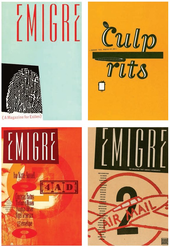
In 1984 Emigre captured the changing mood in San Francisco as Dutch designer Rudy VanderLans and his Czech-born wife Zuzana Licko created an innovative magazine using Zuzana’s fonts and Macintosh computers. They used their magazine to experiment with digitized type and layout forms. Looking back, it was a real turning point, as desktop publishing enabled designers to create their own fonts out of mere pixels and bend the established rules.

Dave King’s bold covers for City Limits, the London listings magazine, used some of the techniques of political posters. Here the crowd scene is repeated in three different tones while the magazine’s title is featured as a cut-out. King often used the City Limits name in different sizes and in a different position in each issue but kept to the same font, thus ensuring maximum flexibility while maintaining a strong identity.

Clever placement of the photograph in this Blitz cover from 1989 makes it appear as though the singer Madonna is looking fondly at the magazine’s title, creating dynamic interplay between image and text.
Fashion publications benefitted from the rise of fashion designer superstars and showcased their collections every season, producing fat issues in spring and autumn. These issues were beloved by advertisers, who in turn employed the same photographers to produce their advertising pages. The fashion industry boomed along with the economy, and luxury goods become more available to ordinary people. By the end of the 1980s in the US and the UK, magazines were enjoying a golden age of inspired collaborations and a respect for the specialist skills of designing editorial and visual journalism.
1990 – 2000
The rise of the celebrity cover seemed to dominate the style of this decade. Appearing on the front of a magazine launched the career of some celebrities, actors and musicians, and also helped to keep the medium fresh and vibrant. Magazine covers reflected the cultural appetite of their audiences. Consumer magazines were joined in the marketplace by customer magazines, which became more interesting with the development of brand building and innovations in cheaper digital print technology. Instead of customer magazines having to be printed on large-scale litho print presses, designers were able to go to smaller digital printers and produce shorter runs. Digital printing used simpler technologies, including inkjet, and there was no need for pre-press processes such as plate making, thus saving time and proving more cost effective.
Newspapers also had to rethink their traditional dominance of the news market and saw advertising sales fall. As the publishing arena became more crowded, competition increased. News websites were launched for free at first, but paywalls were soon introduced. The arrival of digital print technology and the improvement in its quality also changed the way newspapers were produced. Old presses were abandoned and broadsheets downsized. The lower cost of sending digital pages straight to the print press without the need for plates or colour proofs, meant that digital print became more widely available to all companies – not just to designers.
Fashion publications used celebrities on their covers as the trend for featuring supermodels waned due to cost. Editors tried introducing variety to increase their audiences. Lifestyle magazines appeared and the news-stand became crowded with titles. Some closed as the dot-com bubble burst in March 2000 and advertisers and publishers pulled in their belts.
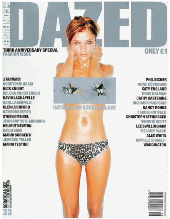
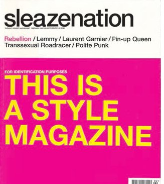
Metallic embossing adds an unusual dimension to this Dazed & Confused cover. Sleazenation’s attention-grabbing typographic cover (bottom) is actually very simple and appears to state the obvious, but also plays on the ironic, knowing personality of the magazine’s brand.
2000 – 2010
In the ‘noughties’, before the iPad launched and other tablets arrived, magazines were in a strong position. Large publishing companies took their print titles onto the internet, designing web and mobile versions of them. Apps were soon to emerge for familiar titles such as The New Yorker and Wired in 2009 and The Guardian in 2011. The internet became the biggest threat to the advertising model and news organizations were forced to rethink. The integrity of the press was challenged by the WikiLeaks case and in the UK by the phone hacking scandal. Respect for the established press proprietors was in decline. In the US, jobs were lost as age-old newspapers reshaped their staff, for example at the Boston Globe when it shifted from print to digital in 2009. Print-trained designers had to retrain, learning to code and adapt their skills to interactive digital. Younger ‘digital natives’ found no problem designing across different platforms.
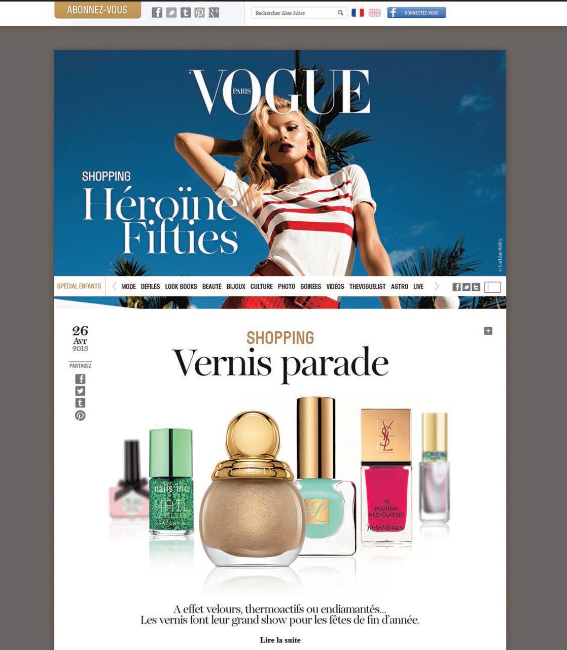
Vogue is a good example of a publisher who covers all bases, with different editions being created for different platforms. The magazine enlisted the help of a website to expand its readership and give its advertisers a platform to reach readers in another way.
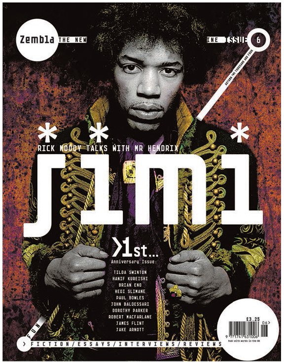
Literary culture magazine Zembla was designed by Vince Frost, who adopted a frenetic, in-your-face approach to typography and a bold, structural format.
The arrival of the iPad in 2010 meant that publishers and designers could include interactivity in their box of design tools. The lightweight, touch-screen tablet design made the iPad accessible to fans of the iPhone and other Apple technology. It appeared as a class above the other developing tablets, which had to adapt fast to catch up. Other tablet devices followed featuring new operating systems, such as the Android one by Google, which was developed on an open source model. Designers developed a visual navigational format to take advantage of the touch-sensitive screens and enhanced moving-image content of tablets and phones. Covers for the tablet editions of many consumer titles looked grown up, and became interactive for the first time. The design elements on the cover became entry points, allowing readers to move through the pages using a simple finger swipe.
Aggregated content was designed to flow into the reader’s choice of format, whether tablet or mobile. The idea was that the reader’s history of internet searches and data profile generated content pulled from various sources that was just right for him or her. The absence of an actual editor was daunting for some and liberating for others. The very nature of the editor/art director/publisher role changed to include developers as well. The idea that an individual could have his or her own version of a magazine flowing into a personal device also became a reality. Content publishers, such as Flipboard, emerged as publishers strived to bring targeted content to subscribers. Through a downloadable app, Flipboard are able to transform content from social feeds, websites and blogs into beautiful digital magazines for millions of readers to flip through.
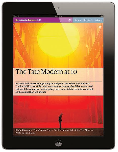
Navigating through magazines is no longer linear. As this example from The Guardian iPad version shows, the designer’s task is to guide the reader using the visual identity, and avoid putting any hurdles in the way.

Flipboard flows digital content into your phone for free, making updated content always available from a variety of news sources. The viewer swipes to flip the pages, and can share pages instantly using social media. Inspired by the beauty and ease of print media, Flipboard describes itself as ‘the world’s first social magazine’.
The different ways of designing covers
There are many different approaches to cover design, but broadly speaking, covers can be categorized under three headings: figurative, abstract and text-based. The latter are rare now as editors shy away from text-dominated covers and graphic puns, but the very fact that they are rare creates its own impact.

Quaterly Canadian magazine Adbusters (above) – subtitled ‘the magazine of the culture-jamming revolution’ – is an excellent example of the relationship that a special-interest publications can develop with its target audience. Each issue deals with one theme and is treated as a mini-book, enabling a compeltely different look each quarter.
Figurative covers
The traditional face or figure shot can be made more engaging by approaching it with some element of originality. For example, the smiling face shot can be replaced with a face displaying an emotion such as anger, fear or elation. The degree to which this kind of treatment can be attempted depends on the conformity of the publication’s readership: readers of anti-consumerist magazine Adbusters, for instance, are unlikely to be repelled by a negative figure image, while the readers of a weekly women’s magazine probably would be. Wit and humour can often attract readers, and an action shot with a sense of adventure invites us to join in the fun. Even a regular face shot can be made interesting: style magazine i-D has always shown its cover faces winking, aping the ‘winking face’ created by its logo. With full-figure shots there is a greater flexibility, a fact that Dazed & Confused plays with inventively. Carlos magazine uses illustration to depict cover figures, enhanced by a striking splash of metallic ink.
Fashion magazines can use illustration effectively, too; an illustration of a garment can convey an emotional sense of the material, rather than the literal representation of photography. And illustration has the advantage of enabling words to be incorporated in a way that is different from photography’s clear boundaries, which make it distinct from any surrounding or superimposed text. Montage is an old device that can bring another dimension – that of metaphor – to figurative covers, and can be used most effectively to make incisive comments.
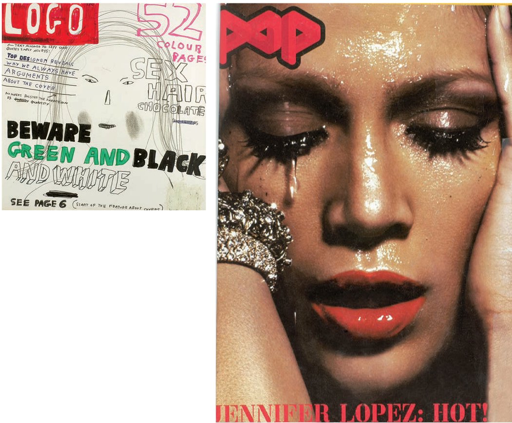
Two very different interpretations of the usual close-up head shot. On M-real (above), creative director Jeremy Leslie playfully undermined the idea of the close-up female head shot making eye contact. Pop (right) did the same thing with a Jennifer Lopez cover, using a very different technique. Again, there is no eye contact with the viewer and Lopez’s emotive and expressive state, as opposed to a passive, non-specific one, marks the image out from its competitors.


There is a simple guiding rule to cover design: appeal to the reader’s interest. The image is the first point at which design does this, but it is by no means the only element of the cover that does so. Covers are, in fact, made up of four elements:
•format – size, shape and design characteristics;
•logo or title and other regular page furniture (tag-line, date and barcode);
•image(s);
•cover lines and headlines.
In the 1990s, ‘lad mag’ Loaded used all of these to great effect. Targeting its readership with a tag-line that read ‘for men who should know better’, its design and editorial approach was an exuberant ‘we’re off our heads’ one that was completely in tune with the sex-, lager- and drug-fuelled, frenzied lifestyles its readers were – or wanted to be – living. Editor James Brown said at the time that it was ‘for the man who believes he can do anything, if only he wasn’t hung-over’. In design terms this attitude was successfully interpreted through art director Steve Read’s clever devising of a style that looked undesigned but was full of energy and motion, with its excellent use of colour, typefaces, images and layout construction. Cover lines and headlines were big, bold, active and funny.
Concept covers can be particularly arresting. Pearce Marchbank at Time Out (above right) in the 1970s used such covers to great effect, skilfully employing photography, illustration, collage and typography to ‘sell’ difficult concepts such as Dadaism and ‘Envy’. Vince Frost achieved equally striking results with his covers for The Independent on Saturday newspaper magazine supplement (right). These used abstract cut-out photography on white backgrounds with wit and elegance to intrigue readers and suggest a broad concept of a story, rather than explaining it literally. Both these designers knew that the key issue in designing a cover is to approach it as a poster, as that is, in effect, what it is. First and foremost, it has to be striking and draw in the viewer.

A figurative cover can be inventive and original if a publication’s designer, editor and publisher have the courage to counteract the perceived notion of what is acceptable, popular or sellable, as seen in these examples from Adbusters (far left) and French magazine WAD (left). Adbusters, in particular, slyly undermines traditional notions of a cover’s saleability by showing a traditional head shot of an attractive blonde woman in a very confrontational and unconventional way.
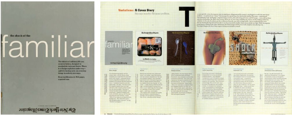
‘This was our first “design special” issue, and we treated it as a primer, an advance-guard explanation to our readers of all the places where they would find good design. We decided to involve them slightly in the process, and made the cover into a graphic-design competition in which we invited six great graphic designers from varied backgrounds to create a concept. We printed all six solutions (above right). When we opened Jennifer Morla’s contribution (above), we knew right away it was the winner – it was so simple. “The Shock of the Familiar” was in bold, simple Helvetica, like signage, on a plain silver background. But The New York Times Magazine logo was upside down and at the bottom. It made you turn the cover upside down, and [be] aware of the cover as an object. And the shock factor was there as well. Its absolute clarity was riveting. It was also fun to read about the other five solutions inside, and begin to understand the way designers think and how they go about solving problems.’ – Janet Froelich, former art director, The New York Times Magazine .
Abstract covers
Abstract covers are rare in publications that rely heavily on news-stand sales, but feature regularly in special-interest and subscription-only publications, news weeklies or newspaper supplements. These often have the luxury of minimal or no cover lines, and the freedom to place the logo wherever it best suits the design, since shelf visibility isn’t an issue. This can result in highly original designs, but it is important to remember that the brand and its message must be maintained through a clear design direction and approach. Wired has always been particularly skilful at doing this (see p.68). From the magazine’s inception, its designers John Plunkett and Barbara Kuhr made frequent use of abstract cover illustrations in order to communicate complex concepts in simple ways. Adbusters also uses this method, while Tentaciones, the El País supplement designed by Fernando Gutiérrez (see p.220), moves the logo around the white space of the cover at will, unrestrained by anything other than the fact that, because the magazine is printed on newspaper presses, it cannot use full-bleed photos, so instead floats images on white backgrounds to give the illusion of bleeds.

The directness of text has an appeal and impact that sometimes simply cannot be conveyed by an image, as in this Esquire cover (below left) by George Lois. It can also work well as a conceptual tool, as in this New York Times Magazine cover (below right) for the ‘Ideas’ issue, the annual end-of-year compendium of the year’s best. ‘Our approach was to present the best ideas, inventions and schemes in an encyclopaedic fashion, using the alphabet as a construction device. To that end, we created a template that resembled both a dictionary and an encyclopaedia, in its use of thumb index, the illusion of thick pages, the wide columns, the little drawings in the margins and the somewhat stuffy, dictionarystyle typographic conventions. The cover was designed as an old-fashioned book cover, with the texture of fabric and embossed gold lettering. It was then photographed in three dimensions, with the depth of the pages on the right forcing the image into a slightly narrower format,’ says Janet Froelich. Scott King’s use of words on youth-culture magazine Sleazenation (opposite) took its cue from a T-shirt design and was a direct, witty joke, slyly poking fun at its readers, magazines and fashion.
Text-based covers
Text-based covers are rare in contemporary periodicals, but many designers, including George Lois on Esquire, Herb Lubalin on Fact, and Scott King on Sleazenation, have used text-based covers to brilliant effect. Pearce Marchbank often took this option for his Time Out covers in the 1970s, for instance eschewing photography for an issue on Japanese movies, choosing instead a graphic treatment of a bleeding Japanese flag with a single, pithy cover line. A more recent issue, featuring an Amsterdam guide, opted for a typographic approach because, as its art director at the time Jeremy Leslie explains, ‘Amsterdam lacks an iconic location, building or event, so a typographic solution was used to express the buzz of the city.’
There is no doubt that text-based covers work, but in a culture that is now so visually orientated their use is minimal – which, of course, can be useful for the editor and designer who are looking to make an impact or stand out: hence their use when tragedy strikes or a famous person dies.
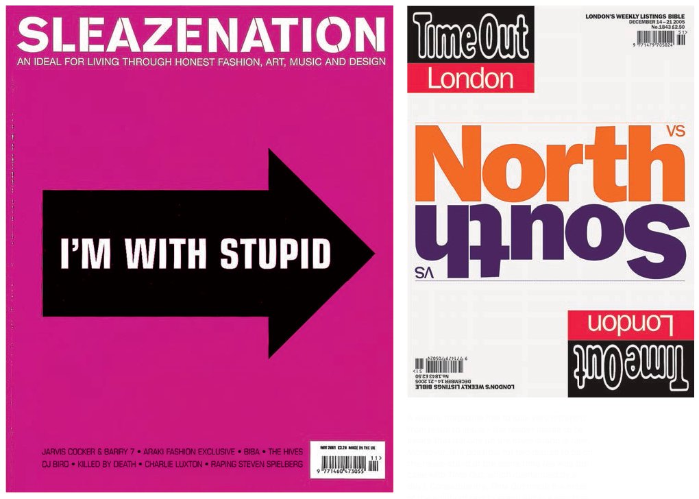
A weekly magazine has to look very different from issue to issue – the reader needs to be aware that the one on the news-stand is new. Moreover, it is possible for two issues to be on the news-stand at the same time (as was the case with Time Out, which overlapped by a day). Consequently, Time Out made the most of the ability of text to stand out in a way that a succession of images can’t. For this cover (above), it’s hard to imagine anything working as well as the type does. Micha Weidmann’s solution to an issue on whether North or South London is better was innovative and original; rather than simply show a photo or illustration of the Thames River, he devised two covers: depending on which side of the river you bought your copy, either ‘North’ was the right way up or ‘South’ was – an ingenious and simple solution to a difficult concept.
WIRED magazine, launched in San Francisco in 1993, is that rare thing in print publishing: a magazine whose design is perfectly attuned to its times and subject matter. As a general-interest magazine that specialized in the rise of technology as a cultural force, it replaced traditional, technology-related severity in design and visual expression with a layout, structure and aesthetic that challenged readers with their frenetic pace, and an inventive and web-inspired content and design format. It made eye-popping use of colour, which, through the placement of tinted text on a background of the same colour, often frustrated as much as it excited. In giving readers a very real sense of how amazing this emerging medium and technology were, and of their potentiality, it demanded much of them. An intelligent, knowledgeable readership understood, however, the connections immediately and responded enthusiastically as circulation soared. When the internet bust came, most magazines folded, but WIRED slimmed down and survived. Overall creative direction, design and typography for WIRED’s first five years were by John Plunkett, and his partner Barbara Kuhr of Plunkett+Kuhr. Their designers included Tricia McGillis, Thomas Schneider and Eric Courtemanche.
In 2010, WIRED led the way forward when Scott Dadich presented a video to the Society of Publication Designers in New York about redesigning the magazine for the iPad. He demonstrated the new features of WIRED designed for the iPad and the choices that readers could expect from the magazine in the future. Speaking in 2010, Dadich explained they wanted ‘to offer more choice to our readers and advertisers and move beyond the static notion of a magazine.’
In 2012, the Nieman Journalism Lab asked Dadich about reinventing magazines for the iPad. Justin Ellis wrote that ‘there are some things, old-school things, that don’t change whether you’re dealing with print or tablet.’ Dadich, then Condé Nast’s vice president of digital magazine development, said, ‘The cover. As magazine makers, we see the cover as the one and only ad we have for your purchase and your time. It’s an inducement to pick it up and give us your time.’
The term ‘cover’ comprises the outside front cover (or OFC), the inside front cover (IFC), the outside back cover (OBC) and the inside back cover (IBC). In most periodicals all but the OFC will be given over to lucrative advertising, but if they are not, it’s worth remembering that these pages are infinitely more valuable than any other available pages, apart from the main cover. The publication’s logo – the graphical representation of its title (sometimes referred to as a ‘masthead’) – is the first and often most important element of its cover. Cover lines, which indicate content, are also a vital component of any periodical cover.
The logo
While the publication’s title may be as important as the way it looks, for the majority of designers this is something that will already have been decided. A logo is intended to capture and impart the publication’s character, subject, stance and attitude to its intended readership, often in a subliminal way. While its primary function is to appear on the cover of the publication, it also needs to work on all of the brand’s representations. Thus, it will appear in print and on digital editions for various platforms, and on promotional and marketing material, including the website. All these uses need to be considered when designing a logo. If a publication is successful, then its logo will be around for a very long time and its treatment, manipulation and positioning, along with any obscuring it, become significant.


Style magazine Flaunt’s covers are always highly original in both production and design terms, and always include an inside and outside front cover. This one features a teasing twopart cover that has an unrecognizable colourby-numbers front (top). Only when readers turn the page do they see that it’s Reese Witherspoon (bottom). ‘Where other magazines would use a simple card cover, Flaunt always goes the extra distance. Cover ideas are discussed with the photographers many times prior to shooting the inside cover, but the majority of the time we find a particular artist who has a gallery show opening, or recently opened, or just someone whose work we like, and let him or her run with it. It’s also great when you find an art director/ designer/illustrator group all-in-one situation to work on the cover – that’s only happened a couple of times.’ – Jim Turner, creative director, Flaunt.
Playing with the logo
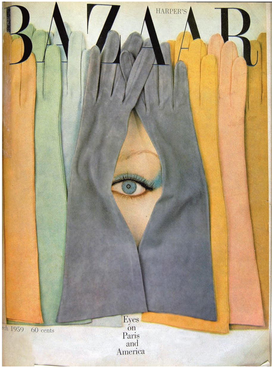
A logo is a publication’s calling card and should therefore be visible. Publishers are not happy with the logo of their title being obscured (by a photo or an illustration), but there have been many examples of a title being covered or partially covered and still selling very well; the trick is to show just enough of the title to make it instantly recognizable. There are many instances when obscuring a logo strengthens a concept that would otherwise be weakened if the logo had to be visible in its entirety: Henry Wolf’s cover for the March 1959 issue of Harper’s Bazaar (see p.51) interwove gloves with the magazine’s title to create a riveting cover that looked three-dimensional and offered a seamless, completely integrated image.
Nest, the American interior design magazine, changed both the design and position of its logo for a while, as did David Carson for RayGun. This conceit was copied by sister title Blah Blah Blah, designed by Substance UK. FT The Business magazine (see p.101) also played decorative and visual tricks with its logo each week, treating it as a moveable graphic element that was an integrated and witty part of the image and stood out boldly from it. Other publications stuck with a good thing. Nova, with its elegant logo set in an old wood type, Windsor, worked brilliantly with just the logo and an expressive single theme on each cover, using just one cover line to sell it (see p.214). Interview, too, with its hand-drawn logo by illustrator Mats Gustafson, rarely played around with the logo or cover lines, which remained minimal. It played to its strengths – a large format, a unique logo and a visual style of tight, harsh crops of celebrities that was all its own.

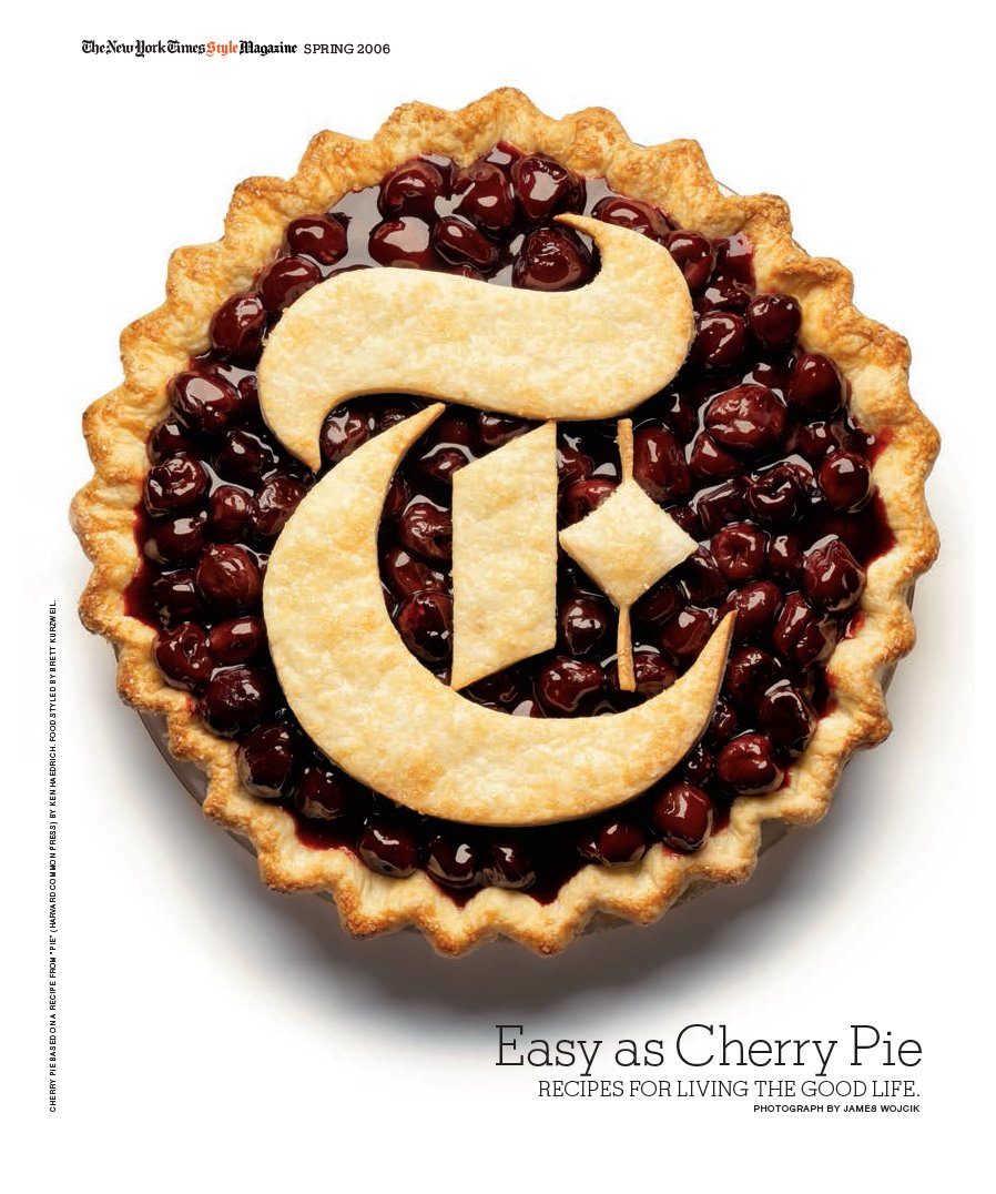
The team at T Magazine – the Style section of The New York Times Magazine – use the logo as a playful and engaging element of their visual toolkit. Readers were included in the visual jokery as the gothic letter ‘T’ was made out of neon, fur and cherry pie and almost unrecognizably morphed into a Constructivist cover. Art director Janet Froelich paid attention to the tiny detailing of these still-life images to give an overall sense of craft and confidence in the masthead.
The choice of colour or colours on a cover is important. Green logos and blue backgrounds don’t sell. Red sells. Blondes on a cover sell better than brunettes. Yellow is often seen as an unpopular cover colour choice. All these are accepted conventions in magazine design, but hard evidence for these beliefs is hard to come by, and designers and editors would do well to follow their gut instinct, which will often be based on colour and its emotional impact. Remember, any colour can be used to emphasize and highlight, and specific colours can be used symbolically or to trigger emotions and memories, but trying to use colour to sell a publication is unlikely to work, largely because colour is so personal, and associations with it are dependent on so many different factors.
Colour use
While there is little hard evidence for many conventions that have grown around colour use in publications, there is one area in which colour use does follow hard-and-fast rules: cultural colour psychology. The high visibility of red might make it appealing in the West, but in South Africa, where it is associated with mourning, it would be seen on a cover about as often as black would be in the West. Blue is generally appealing to all of us irrespective of culture because of its calming influence, but is a turn-off when used for food. It’s all about context. So while it is simply useless to tell you how to use colour, here’s a helpful guide on how NOT to use it.
Black is complex; it can be sexy, authoritative, powerful, menacing, intriguing, rich, depressing, dull, glossy, textural, timeless ... on many occasions it will be at least two of these at the same time. Avoid using black on the cover, where it is too widely associated with death and tragedy, but on the inside pages of a magazine its use can be striking. In colour psychology, many people think that it implies submission.
White is almost as complex as black: innocence, cleanliness, wealth and purity are some of the associations we make with white, but it can also be sterile and neutral to the point of blandness.
Red The extreme vibrancy of red has both good and bad points: it is confrontational and can render other elements on a page almost invisible. But it will definitely attract the eye and has been proved to create a strong emotional response in a viewer, stimulating faster heartbeats and breathing.
Blue Peaceful and tranquil, blue causes the body to produce calming chemicals, but choose it carefully – it can also be cold and depressing.
Green is the easiest colour on the eye and is calming and refreshing. As the colour of nature, most associations viewers make are positive ones. Additionally, dark green implies wealth and power.
Yellow is the most difficult colour for the eye to take in, thus is potentially overpowering – possibly why it’s seen as an unpopular colour choice for covers.
Purple Used in the right way, purple has associations of luxury, wealth, romance and sophistication, but it can also appear overly feminine or gauche.
Orange Our associations with orange are good ones: exciting, vibrant and joyous. But it can be a difficult colour to use – too red and it can overpower; too yellow and it can appear washed out.
Brown Another ‘nature’ colour with good associations: light brown implies genuineness, while dark brown suggests wood or leather. The combination of these makes them appealing for men’s subjects.
Cover lines
These apply exclusively to periodicals. News-stand titles will usually display a mass of these in a bid to show they have more and better content than the competition. The largest cover line, if the publication is using size to distinguish order of ‘importance’, is nearly always related to the cover image. The content, use and placement of cover lines in such titles as Vogue, GQ, Vanity Fair and Marie Claire are generally decided by the editor and art director, but marketing and competition considerations drive this process (they often appear on the left third of the cover, as this is most likely to be visible on the newsagents’ shelves). But the look and tone of the cover lines – their colour, how they stand out against competitors and each other, what their number, length and words say about the magazine and its personality – are very much the responsibility of the designer. In newspapers, too, designers have started to use the space above the banner for cover lines that highlight featured articles inside the paper and its supplements.
Spines
While book designers know the value of spines as a design area, this little band of space is generally ignored by periodical publishers, beyond using it to show the title and publication date. This is a shame for two reasons: first, the spine has excellent sales value as, when stacked, it is more visible than the cover, and, second, because this strip is an excellent place in which to reinforce the brand and style of the title, a fact not lost on the designers of titles such as Arena, Loaded, Vanidad and Wallpaper*. Rather than simply list title information, the first two of these use the spines to build up arresting narratives that make readers feel they are buying part of a series and not just a single issue, thereby encouraging loyalty and the desire to build up a whole set. Wallpaper* uses it to carry a list of key contents, an excellent indexing feature. Separating what’s important from what’s not can be achieved by using different weights and sizes of fonts: the title logo and date should attract from a distance, drawing the potential reader closer to finding further, more detailed information.
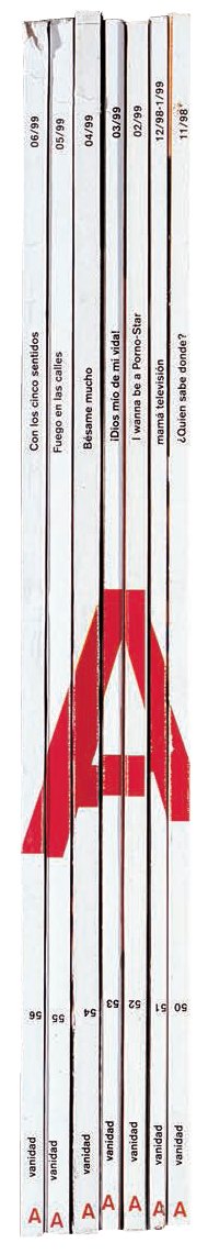
The separate spines of Fernando Gutiérrez’s design for Vanidad combine to form the crossed-through ‘V’ of the title, or upside down (as here) forms a perfect ‘A’.
AIM
To design a masthead and three covers for an imaginary pitch of your magazine concept.
THE BRIEF
Take your magazine mood board from Brief One (see p.38) and use it to develop three covers. Use the typography of your masthead (logo) to reflect the visual philosophy of your magazine. Find a suitable font or draw your own. Decide whether the masthead should dominate the page or be more demure. Who is your magazine aimed at? Think about the clarity of communication in the visual language that you are using.
Now create visual layouts for your covers using a digital page template. Choose a format for your magazine. Avoid A4 if you can as the page will be a little bit too tall and not quite right for page turning. Magazines tend to be slightly wider than A4 and slightly shorter. To start, scan images in or, better still, shoot or create your own imagery. Think about how the typography you use on the cover will reflect the visual identity of the whole magazine. Should it be serif or sans serif? Light or bold?
Imagine that your first cover is for the launch issue and the other two for following monthly or quarterly editions. If you imagine your publication to be A5 size then produce your covers at 100%. If your publication is tabloid size, however, you may need to tile your layouts using the tiling settings in the printout menu and tape them together on the back. It is very important to get each cover off the screen and output it in actual size. Trim your covers to actual page size if necessary.
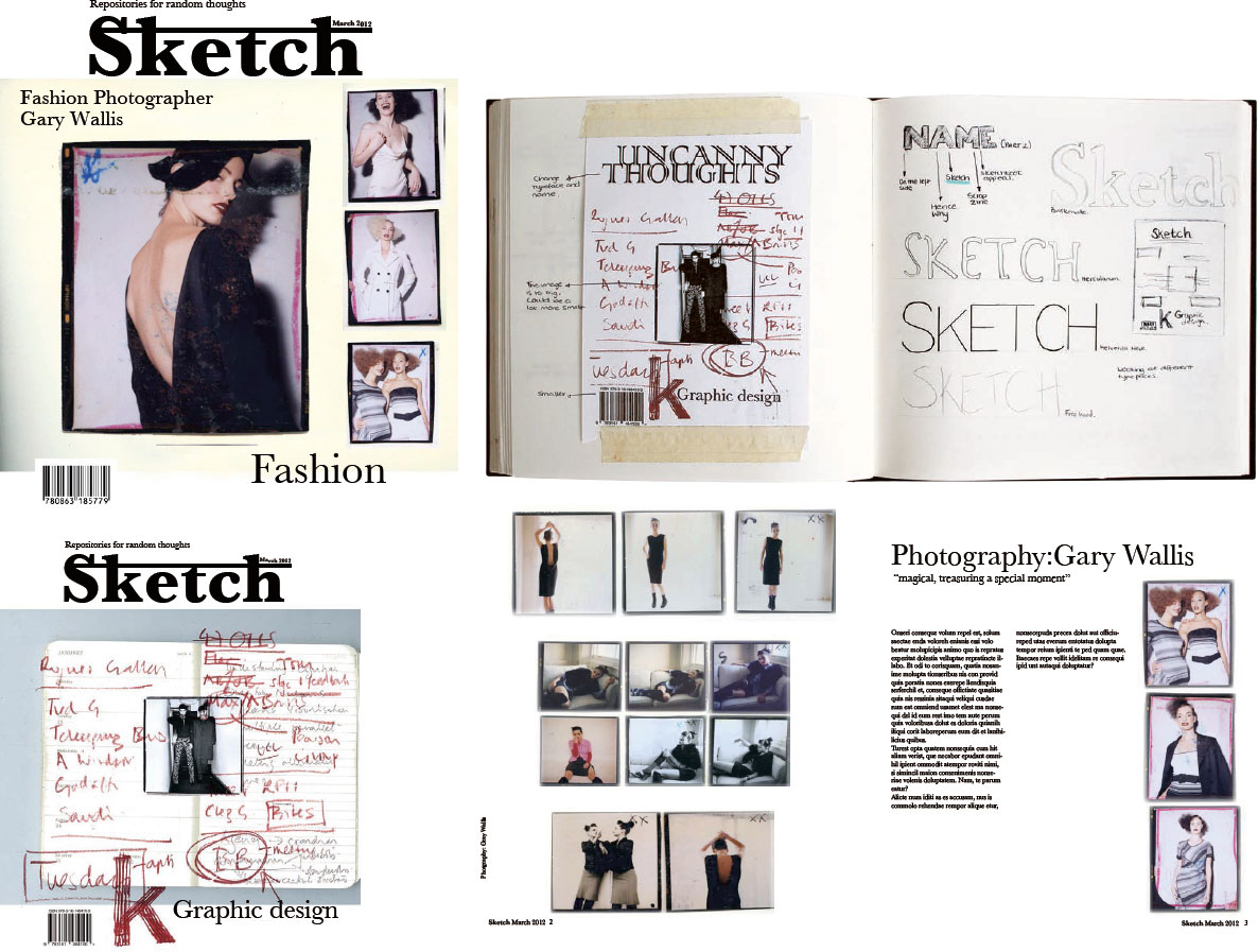
Pictured here are layouts for an imaginary student project. The first is Sketch, a magazine about sketchbooks by Central Saint Martins College BA graphics student Jetmire Dvorani. The masthead is strong and becomes an icon in itself. Shown here are pages from the sketchbooks for the development of t he masthead. First the name is simple and used in a satisfying thick black font, with an underline, a bit like an extended doodle. If you use another photographer’s image, make sure you get permission.