Painting Techniques—

“Oh my dearest one. It has been a fortnight since I have seen the sun. I seek garden sheds and bus stops for shelter against the rain, yet have managed only the merest of scribbles. In desperation, I took a window at the pub hoping to find a view worthy of attention only to be moved by the landlord for obstructing the right of way. Tomorrow I give my leave of Rothesay in hopes that Glasgow will afford me fairer climes.” —A Scottish painter’s lament
On Practice
Let’s discuss in-studio techniques that you can practice to aid your experience working outside. For example, if you stand when working plein air, you should spend a good amount of time standing when working in your studio. Not only will you experience the difference of standing as opposed to sitting while working, you will create a habit.
I am also a strong proponent of warming up prior to working. Whether inside or outside, I do some sketching to help activate the dialogue between mind and hand. The subject doesn’t matter, but I tend to favor something I’m struggling with or wish to explore further.
The same can be said for painting. The idea that we must create a proper painting every time we put brush to paper is a bad habit. The real exploration occurs when trying out new techniques with no expectations. Exploring in this way, you can teach yourself techniques that you would otherwise be too hesitant to try.
Get to know your palette. Each painter will have a different idea about what constitutes a well-rounded palette. I tend to favor earth tones with some pure accents of color. I use the same palette whether inside or outside my studio, so there is never a time when I have to actively look for a color. My hand automatically goes to the correct spot. This is an incredibly important aspect of changing where you work—keep the conditions you can control as similar as possible.

Morning Warm-up

This exercise has gone through many iterations, but it has become one of my students’ favorite rituals. It is also one of the best ways to explore how colors react with one another. You will need two water containers; do your best to keep one for clean water and one for mixing.
Mix three or four pure puddles of color in your palette. They can vary in strength, but I suggest going for strong mixes of equal consistency. Tape a quarter-sized sheet of paper to your board and section it vertically in the middle with tape.
Angle your board about 10 degrees. Using a clean brush, paint a portion of the paper with one of the mixtures. Then, using another clean brush, choose another mix and either begin painting into the first or close enough to allow them to touch. Repeat this process until you have used all four mixes. Begin to roll the paint around the board taking note of how the colors mingle. Look at the areas where the mixes actually touch one another.
Drop some water directly on the paper or look for that moment when the shine just begins to go off the wet paper; reintroduce thick, pure color from your palette. Splatter the paint. Try using extremely thick paint in areas where the paper is drying. Drop in table salt when an area is semi-dry, or use your spray bottle to thickly mist the paper. Most of all, watch your edges. See how one color mixes into another without interference. Look for areas where colors finger out like tentacles into other mixtures.
Don’t cover the entire thing over and over—just give it one pass and then watch the results. Watercolor is a truly beautiful medium because it remains “alive” as it dries. It continues to evolve and change: some colors dull, others remain quite lively. The areas where two or three colors come together will continue to blend without you doing a thing. Once completely dry, take a moment to look at the results. Don’t judge the entire thing—look for the hidden gems where watercolor does what it does best.
Once you have filled one side of the sheet, choose an entirely different set of colors. This time, perhaps, think about creating a harmonious color palette using two sets of complementary colors. Think about what colors are sedimentary and have the ability to granulate or warm, as opposed to cool mixtures. No need to worry about results, just play!
I have found that the more I use this exercise the more engaged students become. There are exclamations of surprise or groans when someone thinks they’ve ruined their efforts. The most surprising thing is when I ask the students to display their work for the class to see. Invariably some notice things others do not. They become fully engaged and point out areas they find interesting. Fairly quickly, the whole class is talking at the same time about what they are seeing. It is not a critique, but rather a fantastic lesson on:
- How color behaves and reacts to other hues.
- How interfering in an active wash can achieve different results.
- How to create different “edge conditions.”
- How thick and thin paint react to one another at different levels of drying.
These are the lessons that begin to make your work stand out. Now I ask the students to look for places they find interesting and try to recreate them. This is where things get fun. Think about the conditions when a certain reaction occurred—you may have to do it 10 to 15 times. These are the exercises that begin to enlarge your arsenal and where advanced, painterly techniques are born.
Wash Techniques
Painting outside can be an extraordinary experience. In the early days, I only worked in my sketchbook, as it is the lightest setup and quickly movable.
Still, there are certain techniques you can only achieve on proper watercolor paper. I start most of my workshops with a simple exercise to reinforce basic techniques. As happens so often, techniques that should be second nature are, in fact, exceedingly difficult if you are not accustomed to using them. If you are used to painting objects by themselves or leaving holes in your washes for objects, then these techniques may require repeated practice.
One thing I cannot stress enough is that I do not paint objects—I paint form and light. I may be working on a passage that includes a car or a group of people, but my only goal is to convey how light, color, and dark passages intertwine to create a scene. I do not paint around anything except for my lightest lights, preferring to create the atmosphere from the beginning. I do not use masking fluid. In my work, I would rather try and save the light from the beginning so I can see how it interacts with the painting throughout the process.
I always mix more paint than I think I will need to complete any passage. This benefits me in two ways: I do not have to stop a wash midway to try and mix more color. This interrupts the flow of the wash and creates unintentional results. Also, the leftover color mixtures allow me to use them again to help create a color harmony within the piece.
“When you are in the process of painting, imagine you are a millionaire. You cannot be concerned with how much your materials cost. Worry about that later.”
—Rowland Hilder
The ability to rely on technique is at the heart of painting with confidence. There are two main washes I use in all of my paintings: the graded wash and the variegated wash.
The graded wash

Graded wash
The goal here is to create a seamless wash over the entire page that moves from one value to clear water and back again to a stronger value. It should be completed in one continuous effort. For this exercise, I typically paint at about a 30-degree angle. Do not attempt this exercise with a flat board.
The trick is to control the color on the page by using water to help mix as you paint down the paper. To do this, I work with the most important device I have— the bead. The “bead” is the collected water on a sloped watercolor board that allows control of how the pigment flows down the page.
For this demonstration, I used a semi-light mixture of New Gamboge and Burnt Sienna. Fill two wells with different strengths of color—the lighter for the upper portion, and the stronger for the lower. Try to work in a continuous manner at the same speed, using the same amount of water on your brush. I use a round for all washes, but you can also use flat brushes.
Tape a 5” x 7” sheet of paper to your board. Starting at the top of the page, paint two horizontal strokes of the lighter mixture, one over the other. Take a moment and let the bead develop at the bottom of the second brushstroke. Moving down, reload your brush and take another pass, allowing the brush to mingle with the bead. Clean the brush, and using clear water, begin to paint with the water. The mixture will lighten as it combines with the paint on the paper. Now quickly lift a portion of the bead with a dry brush. Clean the brush, and then begin painting with clear water again, repeating until you are painting with no pigment—just clear water.
Once you have established the area you want to leave uncolored, add the light mixture first and then the darker mixture to create a strengthening grade. Then add a little more Burnt Sienna to the darker mixture and continue working. As you approach the bottom of the paper, begin to add Imperial Purple to the darker mixture. Continue to darken the mixture until it is fairly thick and you have reached the bottom of the paper. Dry your brush and lift any pigment that collects at the bottom of the page. Repeat until the page is close to dry. Watercolor will continue to run down the page, and allowing wet paint to reach a dry edge will result in a bloom. Practice this technique using different colors and strengths.
TIP
- If you get striations, you are most likely painting too slowly or without sufficient water.
- If the paint melts down the page, you are using too much water or not enough pigment.
- Never try to correct a wash. You get what you get. Any attempt to correct it or paint over it will result in a muddy finish.
The variegated wash
I find this to be one of the most useful wash techniques. The idea is to create a wash that incorporates at least two colors and differing strengths of value to make a wash that has no “found edges”—only a seamless mingling of color on the paper from one color or value to another. This is a straightforward technique but can be surprisingly difficult to master. Your job is not to control watercolor, but to allow it to do what it’s meant to.
For this sky wash, use three mixtures. Mix together one well of Cobalt Blue with a hint of Burnt Sienna; the overall hue should look blue. Mix a second well with some Burnt Sienna, a touch of Cobalt Blue, and a hint of Alizarin Crimson; this should produce a warm gray. In the third well, create a fairly strong mix of pure Cobalt Blue.
Start at the upper left-hand corner (reverse it if you are left-handed), and begin painting with clear water. Move quickly into the light cobalt mixture and resume using the clear water. Notice how the paint mingles. There shouldn’t be an exact point where the blue begins and the clear paper ends; it should be seamless. Continue adding more of the first cobalt mix. Take note of how the paper looks when wet. If you paint quickly enough, you can still work wet-into- wet if you see a sheen on the paper.
Using some of the strong cobalt mixture, drop it in wet-into-wet on the upper portion of the wash. Note how it holds its shape but still does not have a definable edge. Continue in the lower portion of the page, mixing in some of the warm gray mixture and using your clear water to create another gradient approaching the white of the paper, as before in the graded wash. Allow to dry.
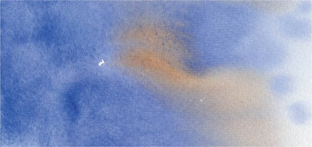
Variegated wash
Secondary & tertiary washes
Use the study techniques to create secondary and tertiary washes. Remember to strengthen the washes as you go, but always look for ways to allow the white of the paper and the original wash to show through. This helps create a sense of depth within your painting.
Go to places you know well to try out these studies. Break the norm on what colors you use. A sky needn’t be blue nor a sunset yellow. Play, explore, learn!
Making the most out of practice
Practice can be dull. We all know this. In the following examples, I have taken the practice washes and created small paintings with them. I have a few rules involving this “extended practice.” First, never draw on your paper beforehand. Try and visualize the wash and where you want the light. This will keep you from being protective. Second, do not overwork these. Keep them as loose and as close to a sketch as possible. Once you have done the wash you can draw the scene to suit your lighting situation. I spend five minutes on the drawings and 15 minutes on the paintings.
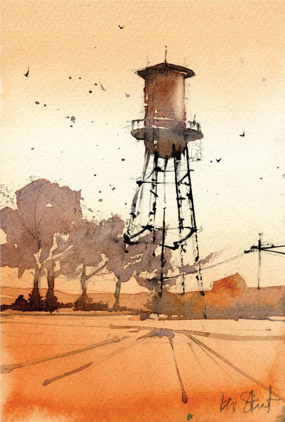
Here, I have taken the graded wash practice and begun to overlay stronger values to paint a water tower. Notice the area with little or no value. I did this without saving any white of the paper; I just painted with clear water. Understanding that a stronger value will “push” a lighter value back is essential in making the connection that value drives depth. It give a two-dimensional surface the feeling of three-dimensional space.
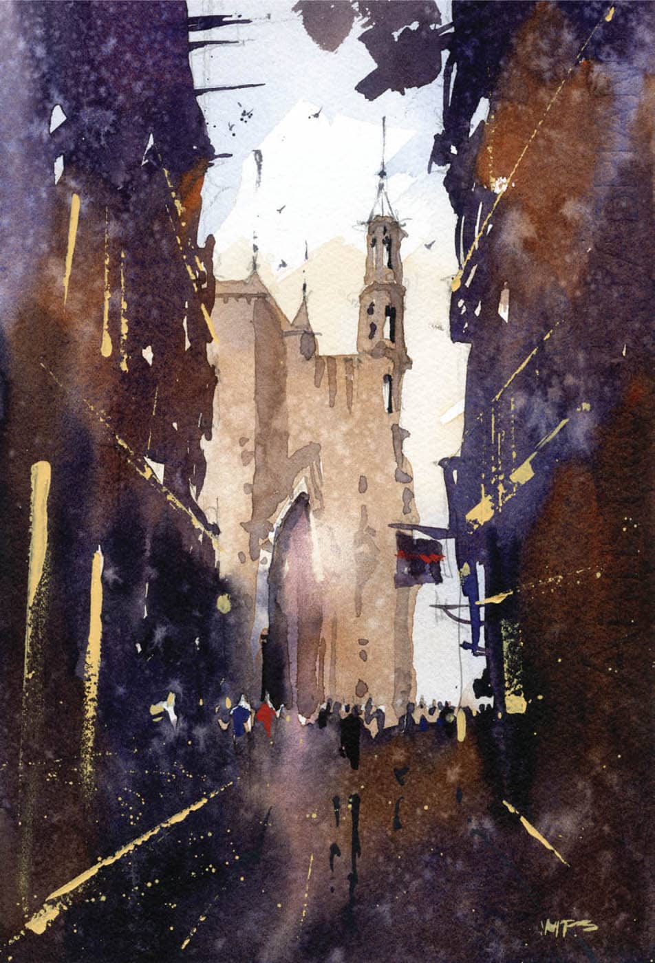
Here, I layered stronger variegated washes on top of one another to create a more complex scene. It’s not about just getting the drawing right. It is important that you allow your washes to have life. Most of my washes don’t have a “screen print” look to them. They vary in tone, and I am careful to create areas of cool and warm hues within the shadows. I call this “allowing your darks to breathe.”
Never let reality get in the way of a good painting.
You’ll find many different approaches to painting onsite. I try to keep things simple and do most of the work in three steps. I am always interested in how light and its effect on color establish mood. From the very start, my goal is to create the feeling of “being there.” Light changes quickly. One way to preserve the light is to create your layout, sketch, and final drawing in advance. This way you can be sure that you have as much time as possible onsite with “good” light. Whenever I paint anywhere, I make sure I know when sunset and sunrise occur and make a habit of being there to see them. This gives me the chance to take photographs and prepare sketches for an afternoon or evening painting session. Step 1. Set the mood. In most paintings, after the first wash you’ll know quickly if you need to make adjustments or if you need to start again. Once you’ve practiced the graded and variegated washes and can achieve the results you want, you are ready to take the next step. Beginning at the top with mixture A (Cobalt Blue, plus a hint of Burnt Sienna), create a graded wash moving from a warm blue to the warm orange of the horizon. Create this color—mixture B—in two strengths of Winsor Orange, Alizarin Crimson, and a hint of New Gamboge. When using the latter, it is easy to create a unbelievable sky, so go easy. Move down the paper, adding more mixture B. At the same time, watch the top and wait for the right moment to add some stronger cobalt wet-into-wet to add depth. Don’t be overly cautious as you move among the buildings with a nice mix of the orange and blue. As you near the horizon, begin to paint around the light, not the objects in the scene—in other words, the areas of reflected light on car hoods and the like. These small areas of untouched paper are the parts that will pop later in the painting. As you pass among the cars, use water to lighten the wash and begin to create another graded wash of the orange and mixture C (Imperial Purple and Burnt Sienna). This gives the painting some strength toward the bottom. Keep watching the water on the paper and the moisture content. Just as the sheen begins to fade, add mixture B with a bit more strength for the trees. Continue to drop in color and try to force a bloom here and there when underpainting the trees. Note how the green and purple-grays hint at foliage without having to think about the overall tree shape. As the wash dries, spritz it with water or spray water into your hands and flick clear water onto the paper for added texture. Allow the entire paper to dry to a cool touch, at which point you can begin working on the buildings. Step 2. Create the big shapes by simplifying your subject: defining the keyhole(s), horizon, and major action lines. Carve them out using slightly darker (less viscous) versions of the previous mixtures. Don’t get too fussy with this step; retain the simplicity of the first wash and allow it to show through where you can. The same goes for the saved white areas. First, use a very light cobalt mixture with some Burnt Sienna to make a very light gray for the Empire State Building, and then paint an adjacent graded wash to clear water through the foreground buildings as an underlayer, knowing that you will cover it with the next washes. Next, use a graded wash starting from clear water at the cars. Moving quickly into mixture C, create the crosswalk and deepen the foreground. Now there are two areas of the painting that are actively drying. Move directly to the main buildings, while being careful not to drag your hand through the foreground. Use a variegated wash, moving from different strengths of the previous mixes, which begin to solidify the area of interest at street level. Use some Cadmium Red Light wet-into-wet, adding some color to awnings, street signs, and the like. It’s these pops of red along with the greens of the trees that begin to harmonize the lower area. As you paint through the cars, move around some of the previous wash to define secondary highlights, and be careful not to paint over saved whites. The street is wet in this scene, so finish by using simple, elongated reflections, but don’t be too heavy handed. The more places you paint, the less light you have. It’s your job to protect that light. TIP The crosswalk in my painting does not follow the vanishing point. I’ve allowed myself some liberty here to create a graphic to aid in “grounding” the painting. This is a good lesson in learning where to let go. Step 3. The most important lesson here is how to use value to create a sense of depth. Using mixture D (Alizarin Crimson with Cobalt Blue, and pure Burnt Sienna), and mixture E (a strong mix of Alizarin Crimson with Undersea Green), use variegated washes to define the action lines of the secondary (slightly darker) buildings in the distance and solidify the action line at the horizon—despite painting through the people and cars. Now begin adding some Neutral Tint to some of the mixtures to add detail in the people, cars, and general detritus of the city. Paint both positively and negatively to give the trees some texture and shape. Start testing the darker values needed to make the painting “pop.” The underpainting of mixed grays and blues should balance the orange of the traffic cones and the highlights on the cars. Don’t worry about things looking too polished just yet. Continue to bring value forward as a whole, rather than get too involved with the details. It is important to notice that you have been building slowly to the final details and washes. Begin to move out of the midtones, but reserve the final darks and details. Allow the painting a bit of time. Step away, do something else, give your eyes a rest, and then envision the next step. Step 4. By now you should have some nice dirty colors in your wells. You’ll need a good brick color, as well as a stone mixture for the parapet and cornice. Mix Raw Sienna with some Imperial Purple, and then Cadmium Red Light, light red, a touch of Cobalt, and Neutral Tint (mixture F). You’ll also need to work on the shadows and trees, so mix some Undersea Green with Burnt Sienna, and some Imperial Purple (mixture G). It’s worth noting that by working without cleaning your wells, the bits of remaining color left from the first wash make these mixes unique to— but harmonious with—the rest of the painting. Starting with the foreground buildings and working into the trees, pull them closer by adding more tone. Use clear water to transition from the brick color—or in some cases, a dirty Imperial Purple. Think about shaping the trees by creating shadows. Start to paint negative shapes around some branches and use a fairly dry brush to make small strokes at the outer limbs to define them. It’s important to practice these brushstrokes before attempting them on a painting that matters. Find the correct thickness of paint and dryness of brush to work with conviction. As the brick layer begins to dry, use some more blues to bring the midground buildings forward, while making sure they do not compete with the foreground. Use simple shapes. Add detail only where you want to direct the viewer’s eye. As it dries, add some more light red to mixture F and start to get the middle value and darkest value ready by mixing light red, Burnt Sienna, and a touch of Neutral Tint (mixture H). Allowing the previous wash to show through in some areas, add the final details on the street, figures, and storefronts. Everything is a little too neat for me. I want to use light to impact my darks. Taking an old worn-out brush, dip it in clear water and begin to lift out the headlights of the cars, making sure to rotate the paper as you pick up the color. Do this here and there, but don’t overdo it. Next, using clear water, lift out the background to suggest steam coming from a grate, and notice how the angle counters the color change in the sky. Take your lift brush and make a bold stroke across the painting near the bottom of the cars. Go through the people, cars—everything. The goal is to obscure some detail, while allowing other areas to become more impactful. The lift also gives a sense of “wet street” that I use quite often. Finish with another shorter stroke in the foreground. By now the voices in your head should be saying, “Stop. Listen. Step back. Give it some time.” Remember, there are things you can do later in the studio to give the painting more polish. Note how the initial wash is still visible in the foreground buildings and the gradual value steps add a sense of distance. Figures, cars, and storefronts are all suggested rather than exact. Note the negative painting around the branch system of the trees. Utilize lifts to bring light back into the painting and obscure some detail. So much can be said with very simple brush strokes. Again we see the first wash as a “halo” around some of the figures and objects to make them more visually present.5th Avenue, New York Step-by-Step


