
Chapter 4. Use CSS3 in applications
The use of cascading style sheets (CSS) is not a new concept. However, the functional capabilities of CSS3 have advanced tremendously. In this chapter, you review the capabilities of CSS3 and how they can be leveraged into your HTML5 web applications to provide end users with the desired experience.
Note: Varying Results
You might see slightly different results in some of the code samples. Not all features work in all browsers. Internet Explorer 11 and Chrome v35+ were used to validate the examples throughout this chapter.
Objectives in this chapter:
 Objective 4.1: Style HTML text properties
Objective 4.2: Style HTML box properties
Objective 4.3: Create a flexible content layout
Objective 4.4: Create an animated and adaptive UI
Objective 4.5: Find elements by using CSS selectors and jQuery
Objective 4.6: Structure a CSS file by using CSS selectors
Objective 4.1: Style HTML text properties
Text is the basis for all web applications. Some web applications have more text than others. Ultimately, the viewer of the website will read the content of the website that is in text. CSS provides many capabilities to customize the appearance of the text in order to provide your own unique look and feel to your web application. Throughout this objective, you will explore the various ways to style text.
Apply styles to text appearance
Apply styles to text font
Apply styles to text alignment, spacing, and indentation
Apply styles to text hyphenation
Apply styles for a text drop shadow
Apply styles to text appearance
Applying styles such as color, bold, or italic makes certain text stand out on a webpage. Any of these styling techniques can be applied in combination or individually.
Applying color to text
The color of text can be changed by specifying the color property to the CSS element. CSS3 accepts the color value in any of the following three methods.
Hexadecimal value: Specify the color as a hexadecimal value, for example as #00FF00 to display the text in green. The first two digits (base 16) are the value for Red, the second two digits are the value for Green, and the last two digits are the value for Blue. This is commonly referred to as the RGB code.
Color name: Use a word to specify the color value, such as green to display the text in green.
RGB function: Specify the color value using the RGB function, which takes three parameters, each representing a color spectrum bit value from 0 to 255. For example, rgb(0,255,0) specifies green as the text color.
The following code demonstrates each method in use.
<style>
h1{
color:#00FF00;
}
h2 {
color: green;
}
h3{
color: rgb(0,255,0);
}
</style>
The output in Figure 4-1 shows the result of applying these styles to a page.
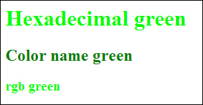
With this code, each of the h1 through h3 headers have a CSS style applied to change the color to green, each using a different method. Using the hexadecimal or RGB method gives you more granular control over the color then using the color name as was done on the <h2> element. There are just far more colors that exist then could be named. The hexadecimal and RGB methods allow you to access the full range of colors.
Note: Default Styles
In Figure 4-1, you see that even though all three text items are set to pure green, one is darker than the others. It is important to know that some elements, such as the various header elements, have default styles already applied to them. In this case, the style for the element defaults to a bolder type.
Applying bold to text
CSS also provides access to other properties of the text display via the font object. The font object provides the ability to make text bold or italic . The following code demonstrates changing the text to bold for all <p> elements:
p {
font-weight: bold;
}
The above styles produce the output shown in Figure 4-2.
The font-weight CSS property accepts the following values to specify how bold you would like the text to be: lighter, normal, bold, and bolder. In addition, the numeric values 100 (lighter) to 900 (darker) are supported. The values increase by 100, providing nine values in total to control the weight of the text.
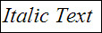
Applying italic style to text
Through the font object, you can also make specific text italic. This is done by specifying the font-style for the text. The following code demonstrates applying the italic style to all <p> elements on the webpage:
p{
font-style:italic;
}
Applying the italic style to a text element produces the output shown in Figure 4-3.
Apply styles to text font
The font CSS object contains other properties to allow you to control how text is rendered on your pages. You can change the font typeface and control the size of the text. You can control the font typeface in a few different ways. The first method is to simply rely on the fonts that are installed on the system rendering the webpage. This is achieved using the font-family as shown in the following code:
p{
font-family:Arial,'Times New Roman',Webdings;
}
This CSS code renders the fonts in order from left to right until it finds one that is available on the client computer. If the font name contains spaces, it must be contained within quotes. If none of the specified fonts are available, the text falls back to the browser’s default font. In the previous example, the client looks first for the Arial font. If that is not installed, it then looks for the Times New Roman font, and so on. This is a simple approach, but many people prefer to use fonts that are not available on the system. There are many custom fonts available on the Internet for inclusion in your web applications. These fonts are known as WOFF (Web Open Font Format). To use these fonts in your webpage, you define a font family using the special keyword @font-face.
 Exam Tip
Be aware that certain font types will work in some browsers but not others. It is important to declare each font type by using @font-face so that the browser has access to the one it needs.
The following code defines a @font-face for a webpage and implements it for the <p> elements of the page:
@font-face {
font-family: "My Nicer Font";
src: url('fonts/my_woff_font.eot'),
src: url('fonts/my_woff_font.woff'),
}
p {
font-family: 'My Nicer Font';
}
First, you add the @font-face keyword to the page, then you give it a name by specifying the font-family property. Next, you specify where the font can be loaded from. This could be from the local web server if you downloaded the fonts to it or from an Internet source. In the previous declaration, both eot and woff types are specified.
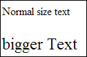
After you have decided on a font for your web application, you might decide to resize the text for different scenarios as you see fit. Of course, the <h1> through <h6> elements provide some default formatting, but you would not want to use those elements throughout a website to control the size of the text. Instead you can use the font-size property. The font-size property accepts relative values that when rendered are relative to the default text size in the browser. The available values are: xx-small, x-small, small, smaller, medium, larger, large, x-large, xx-large. The following code demonstrates setting the font-size for the <p> elements:
p{
font-size: x-large;
}
The application of the size attribute to the font results in the text rendering as shown in Figure 4-4.The first line of text shows the default size while the bigger text shows the x-large size.
Applying styles to text alignment, spacing, and indentation
CSS3 can also be used to alter text alignment, spacing, and indentation. This provides great control over positioning text within parent containers.
Text alignment
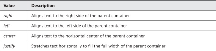
To control the alignment of text within a container, you specify the text-align attribute. The text-align attribute supports the values outlined in Table 4-1.
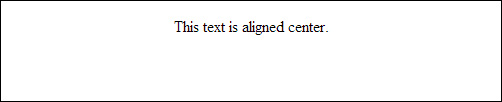
The following code sample demonstrates the use of the text-align attribute, and Figure 4-5 displays the results within the boundaries of a defined div element.
p {
text-align: center;
}
Text indentation
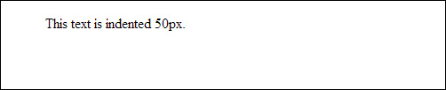
Text indentation is configured using the text-indent attribute. The text-indent attribute accepts an integer value to indicate how much to indent. The following code sample illustrates how to indent the text from the left border of the parent div element. Figure 4-6 shows the results of this code.
p {
text-indent: 50px;
}
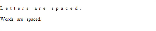
Text spacing
There are two ways to control the spacing of text. This can be done by specifying the spacing between each character in the text or by specifying the spacing between each word in the text. The following CSS code demonstrates both examples. Figure 4-7 shows the output of this code.
p {
letter-spacing: 8px;
}
p {
word-spacing: 8px;
}
Applying styles to text hyphenation
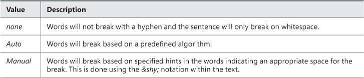
Applying styles to text hyphenation allows you to control how a sentence or word wraps or breaks at the end of the line. The hyphen attribute can be specified to control this behavior. The values available for the hyphen attribute are defined in Table 4-2.
The following code demonstrates using the none value, and the results are shown in Figure 4-8.
div {
hyphens: none;
}
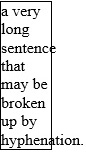
In Figure 4-8, the browser is not hyphenating any of the text and is letting it overflow beyond the boundaries of the container. To force hyphenation, specify auto for the value of the hyphen attribute. The output of this change is shown in Figure 4-9.
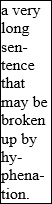
When auto is specified, the browser calculates where to hyphenate the words based on its own rules so that the text does not go outside the bounds of the container. The manual option behaves much the same way except that you can specify an external rule set to use and also supply hints by using the ­ (soft hyphen) notation.
Applying styles for a text drop shadow
You’ll find information about applying styles for a text drop shadow in the next section. Microsoft uses the phrase “text drop shadow” but you’ll note that it has been shortened to “text shadow” in this book.
Objective summary
CSS3 provides the ability to style the appearance of text in the following ways:
Changing the color with the color property
Changing the text to bold with the font-weight property
Changing the text to italics with the font-style property
Changing the font type with the font-family property
Changing the size of the text with the font-size property
CSS3 provides the ability to style the alignment of text with the text-align property.
CSS3 provides the ability to alter text indentation with the text-indent property.
CSS3 provides the ability to alter the spacing between letters and the spacing between words with the letter-spacing and word-spacing properties.
CSS3 allows you to control how text hyphenates when the text needs to wrap within the boundaries of its container.
Objective review
Answer the following questions to test your knowledge of the information in this objective. You can find the answers to these questions and explanations of why each answer choice is correct or incorrect in the “Answers” section at the end of this chapter.
1. Which of the following CSS would not change the appearance of text?
A. font-style: italic;
B. font-weight: heavy;
C. font: bolder 12px arial;
D. color: green;
2. Which of the following aligns text to the full width of the available box?
A. right
B. full
C. center
D. justify
3. Which of the following is a way to configure the amount of space between words?
A. word-margin
B. letter-margin
C. word-spacing
D. word-padding
Objective 4.2: Style HTML box properties
Every HTML element has box properties. These are the properties that control how the element is spaced on the page and control the position of the box contents. In addition, the graphic effects can be applied to the box of an element.
This objective covers how to:
Apply styles to alter appearance attributes
Apply styles to alter graphic effects
Apply styles to establish and change an element’s position
Applying styles to alter appearance attributes
There are a variety of ways to alter the appearance of a box as it applies to an HTML element. This section demonstrates how to alter the appearance by changing the attributes related to size, bordering, outlining, padding, and margin.
Altering the size
The size of any element is controlled by its height and width properties. These can be set on any object or class in CSS. By default, an object will size itself to be able to display its contents. So, a div element with some text inside it will have a width and height that is sufficient to display the text. The size can be changed by setting a value for the width and/or height. The width and height can be specified as a measurement in pixels (px) or centimeters (cm) or can be specified as a percentage of its parent element. For example, the following code will set the width of a table to be 50 percent of its parent container, which in this case is just the window object.
table {
height: 50%;
width: 50%;
}
In another example, the size of a <div> element can be set to a specific value as in this case:
div {
width: 200px;
height: 100px;
}
Bordering
CSS provides very granular control over the styles of the borders of any HTML element. The name of the root CSS property to do this is the border property. With the use of the border property, you can control the style, spacing, color, and width of the border.
The first thing that you need to set on the border is the style. This will essentially bring the border into existence. There are a variety of border styles that exists. These include, solid border, dashed border, dotted line border, grooved line border, and so on. The border is set by specifying the border-style property:
p {
border-style: solid;
}
The color of the border can be changed by specifying the border-color property. This is demonstrated with the following code:
p {
border-style: solid;
border-color: black;
}
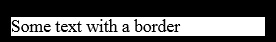
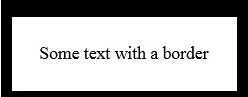
All the <p> elements will now be displayed with a solid black border. This is demonstrated in Figure 4-10.
Note: Setting border-style
Note that the border needs to exist before it can have any visible changes done to it. This is why in the above example, the border-style is set first.
Border-spacing is used to set the amount of space desired between adjacent elements. The following CSS will provide 250 px border spacing to all paragraph elements on the page:
p {
border-style: solid ;
border-color: black;
border-spacing: 250px;
}
Another border property that can be controlled with CSS is the border’s width. The border-width is a property that is set using a fixed measurement, in pixels for example. The following code sets the width of the border to 5 px:
p {
border-style: solid ;
border-color: black;
border-spacing: 250px;
border-width: 5px;
}
Figure 4-11 demonstrates the new width set on the paragraph element.
So far, you have been setting each of the properties of the border as individual lines in the style sheet. The border CSS property supports a shorthand technique where you can specify the key properties in a single line. The following code demonstrates this concept:
p {
border: 5px solid black;
}
In this case, the border is set to a 5-px width with a solid line and the color black.
Exam Tip
The border element supports many variants in its ability to set properties in a single line. Take some time to experiment with all the possible combinations so you will be able to read them and identify them easily on the exam.
In addition to being able to set all the properties discussed so far in a single line, the border element allows even more granular control. The properties discussed can also be set to different values specific to each side of the box. For example, the following code produces the output shown in Figure 4-12:
p {
border-top: 15px solid black;
border-left: 10px solid black;
border-right: 10px solid black;
border-bottom: 5px solid black;
}
Padding and margin
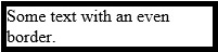
Padding and margin are additional methods to create space around an HTML element. In essence, there are three layers around an HTML element. As you look from the inside to the outside of the element there is the padding, the border, and the margin. If you take a look again at the sample in Figure 4-12, the text is squished quite close to the border. The border width has been set, but the padding (the space between the text and the border) has its default value of 0 px. In order to create space between the text and the border, you must increase the padding as shown in the following code sample. The results are shown in Figure 4-13.
p {
border-top: 15px solid black;
border-left: 10px solid black;
border-right: 10px solid black;
border-bottom: 5px solid black;
padding: 25px;
}
In this code, the padding is set to 25 px. With only a single value specified, it is assumed that this value is applied to all four sides of the box. However, the padding can be specified as different values for all four sides. The above code is in effect the same as saying:
padding: 25px 25px 25px 25px;
or
padding-top: 25px;
padding-bottom: 25px;
padding-left: 25px;
padding-right: 25px;
The next area where you can create spacing for your HTML elements is in the margin. The margin is the space between the border of your element and the surrounding elements. The browser provides a default margin based on the HTML element that is used. Figure 4-14 shows the default margin for the paragraph element. Figure 4-15 shows the effect of increasing the size of the margin. The margin can be controlled in exactly the same ways as the padding. You can specify a single value to be applied equally to all four sides, specify individual values in a single line, or specify each side of the box individually. The following code demonstrates increasing the margin of the paragraph element and the results are shown in Figure 4-15:
p {
border-top: 15px solid black;
border-left: 10px solid black;
border-right: 10px solid black;
border-bottom: 5px solid black;
padding-top: 25px;
padding-bottom: 25px;
padding-left: 25px;
padding-right: 25px;
margin: 40px;
}
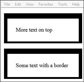
You can see in Figure 4-15 that not only did the margin create space between the two paragraph elements, but it also created space between the top of the window and the top of the first paragraph element.
Applying styles to alter graphic effects
There are a variety of options in applying graphic effects to a box to provide a unique display to end users. This section demonstrates setting transparency, opacity, a background image, gradients, shadows, and clipping.
Applying transparency/opacity
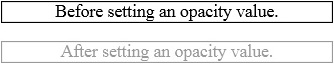
Setting the opacity (also known as transparency) of an element in CSS provides the ability to make the element effectively see through. The value used in setting the opacity is a ratio from 0 to 1.0. A setting of 0 indicates that the element is fully transparent, essentially invisible. A value of 1.0 indicates that the element is fully opaque, the default when no opacity value is specified. The following code sets an opacity level of 0.4 to a text element:
p {
opacity: 0.4;
}
Figure 4-16 demonstrates the output of applying this effect to the text element. The output without the opacity specified is also provided for a comparison.
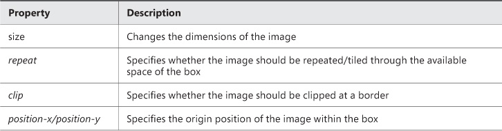
Applying a background image
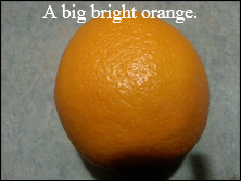
Any HTML element can also contain a background image. This is achieved by specifying the background-image property. The background property itself has many other options to control its size and repeating pattern. However, to simply set a background image, you need only specify the image to the backround-image property. The following code demonstrates the use of this property to assign a background image:
p {
background-image: url('orange.jpg'),
color: white;
}
Figure 4-17 shows the output of this code. The text color is changed to white to make it more visible over the image. Table 4-3 explains more of the options available for formatting the background image.
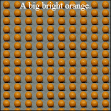
All the properties are prefixed with the token background-.The following example demonstrates using the repeat property and the size property. It specifies that the image should be smaller and repeat. This example specifies to repeat continuously, both horizontally and vertically. However, you can specify repeat-x or repeat-y to repeat only in the specified direction.
p {
background-image: url('orange.jpg'),
background-size: 20px;
background-repeat: repeat;
width: 200px;
height: 200px;
text-align: center;
color: white;
}
This previous code produces the output in Figure 4-18.
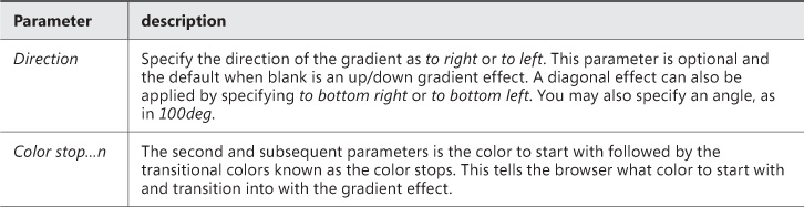
Applying gradients
A gradient effect changes the color of an object gradually from one spectrum to another. There are two types of gradient effects supported. The first is a linear gradient where the color changes in a line across the object in any direction. The other gradient is a radial gradient where the color starts in the center and changes toward the outer edges. The gradient can be applied to the background of the element in the following way:
background:linear-gradient(black,gray);
The linear-gradient function takes a few parameters. The parameters are outlined in Table 4-4.
Applying a shadow effect
Shadow effects allow you to apply a shadow to your HTML element’s box or to the text. There are two CSS3 properties to control the shadow effect: box-shadow and text-shadow. The box-shadow controls the shadow effect surrounding the box of the HTML element. The text-shadow property controls the shadow of text.
The box-shadow property supports the parameters outlined in Table 4-5. The first two parameters are required to create the shadow effect. The blur and spread parameters are optional effects that can be applied to the box-shadow.
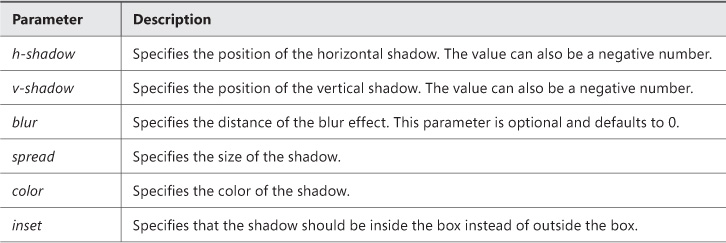
In its simplest form, the box-shadow property requires only that h-shadow and v-shadow are specified. The following code shows a basic shadow applied to a div element:
div{
position: absolute;
left: 50px;top: 50px;
width: 100px;
height: 100px;
border: solid 1px black;
box-shadow: 10px 10px;
}
The div element is rendered with a shadow as shown in Figure 4-19.

The shadow effect in Figure 4-19 is a solid box shadow. To provide an effect where the shadow fades out gradually, you will need to specify the blur parameter. By adding the blur parameter, you can create the effect shown in Figure 4-20. The following code adds the blur parameter:
div{
position: absolute;
left: 50px;top: 50px;
width: 100px;
height: 100px;
border: solid 1px black;
box-shadow: 10px 10px 10px;
}
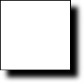
The next parameter that adds a special effect to the shadow is the spread parameter. This parameter specifies the size of the shadow. The following code specifies a spread value to increase the size of the shadow:
div{
position: absolute;
left: 50px;top: 50px;
width: 100px;
height: 100px;
border: solid 1px black;
box-shadow: 10px 10px 10px 20px;
}
This code produces the output in Figure 4-21.
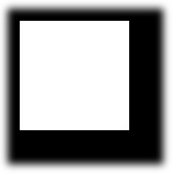
FIGURE 4-21 A box-shadow effect with addition of the spread parameter to increase the shadow’s size.
Figure 4-21 shows the output of the previous code with the addition of the spread parameter. The spread parameter specifies the size of the shadow. In the context of real-world objects and their shadows, the spread is like indicating how close a light source is to an object. The closer the light source, the larger the shadow it produces. The spread parameter can be used to elicit this type of effect on the HTML element. In Figure 4-21, the shadow was intentionally created to be larger than the HTML box itself. This was done to demonstrate an additional concept of the shadow effects. The shadow itself is a full-size box. In this case, the shadow was made to be larger than the original box so it is visible around all four sides of the box. Normally, for a box where the spread is not specified to be larger, the shadow is only visible on the two axes specified by the first two parameters. This is because the shadow box is offset from center of the HTML element it is shadowing. The rest of the shadow is still behind the HTML element being shadowed. You can demonstrate this by setting the position of the shadow to be completely away from the HTML element. This is achieved by specifying the position to be a greater number value then the size of the HTML element. The following code demonstrates this:
div{
position: absolute;
left: 50px;top: 50px;
width: 100px;
height: 100px;
border: solid 1px black;
box-shadow: 100px 100px 10px;
}
In this code, the position of the box shadow is set to be 100 px along the horizontal axis and 100 px along the vertical axis, which will place the shadow to the bottom right corner of the div element, as shown in Figure 4-22.
FIGURE 4-22 The entire shadow of an element displayed by specifying the position to be greater then the size of the HTML element
Another parameter for the box-shadow is the inset parameter. If omitted, this parameter creates the shadow on the outside of the box. If inset is specified, the shadow is then created on the inside of the box. This is demonstrated in the following code:
div{
position: absolute;
left: 50px;top: 50px;
width: 100px;
height: 100px;
border: solid 1px black;
box-shadow: 10px 10px inset;
}
This code produces the output shown in Figure 4-23. The shadow is now displayed on the inside of the box instead of the outside of the box.
The color property accepts values as a hex code, rgb(), or literal color. This property changes the color of the shadow. Since the book is printed in black and white, demonstrating the use of this parameter will not present well. So, in your own code, change the color of the shadow to see what effect it has—the color should change.
Note: Understanding h-shadow and v-shadow Parameters
h-shadow and v-shadow parameters can accept negative values. To place the shadow on the left side of the box instead of the right, specify a negative value for the h-shadow. To place the shadow on top of the box instead of the bottom, specify a negative value for the v-shadow parameter.
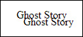
Text shadows can be created in the same way as box shadows. The CSS property to apply a shadow to text is called text-shadow. The text-shadow property has parameters similar to those of the box-shadow property. The parameters are described in Table 4-6.
All of the text-shadow parameters are familiar. They all have the same effect as their counterparts in the box-shadow element. The following code demonstrates applying a shadow effect to text on an HTML page:
p {
position: absolute;
left: 250px;
top: 250px;
text-shadow: -10px -10px;
}
In this example, negative numbers are supplied to the h-shadow and v-shadow parameters in order to place the shadow to the top left of the text. The output of this code is shown in Figure 4-24.
Applying clipping
The clip property allows you to specify what portion of an element is visible. The clip property takes only one parameter, the shape to clip to. Currently, the only shape supported is a rectangle, so the only parameter value that will yield any results is the rect() function. For example, the following code is the valid syntax to specify a clip property:
img{
position: absolute;
clip: rect(25px, 50px, 50px, 25px);
}
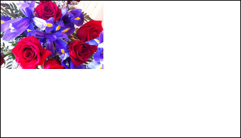
In the above code sample, the clip region is set to be a rectangle. The first two parameters of the rect function build the coordinates for what part of the image will be clipped. The parameters run in clockwise order as top, right, bottom, and left sides of the rectangle. In addition, all measurements are taken from the left of the top edge of the source box being clipped. So, in the above code sample, a region of the image is defined as 25 px from the top to form the top edge of the clipped region, 50 px from the left to form the right edge of the clipped region, 50 px from the top to form the bottom edge of the clipped region, and 25 px from the left to form the right edge of the clipped region. This essentially creates a rectangle starting from the point (25px, 25px) and with a height and width of 25px. Figure 4-25 shows an image before and after being clipped with these values.
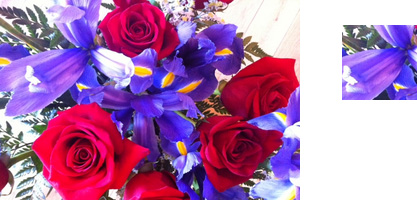
FIGURE 4-25 The image on the left is the full image of a floral arrangement. The image on the right is a clipped version of the same image.
In Figure 2-25, you can see the full image on the left. On the right, the image is clipped. Only the section of the source image as specified in the rect function assigned to the clip property is visible. The following is the full code:
<html>
<head>
<style>
.clipper{
position: fixed;
left: 325px;
clip: rect(25px, 100px, 100px, 25px);
}
</style>
</head>
<body>
<img src="flowers.jpg" style="height: 200px;width: 300px;"/>
<img class="clipper" src="flowers.jpg" style="height: 200px;width:300px;"/>
</body>
</html>
Note: Understanding the clip Property
The clip property works only on elements whose position is set as fixed or absolute.
Apply styles to establish and change an element’s position
The browser provides a coordinate system for how to lay out elements on a page. The default behavior is essentially a layout where the elements, without any other position attributes specified, will simply lay out on the page in a default flow. In this context, the base coordinate is the top left corner of the window which can be understood as (x,y) coordinate (0,0). This is called static layout. CSS provides some mechanisms where you can override the default layout of the page. This is achieved by specifying the desired position behavior with the position property. Once the position property is set, other CSS properties such as top, left, bottom, or right are set. In a static layout, the elements will not respond to the top, left, bottom, or right properties. The positioning type must be specified.
Exam Tip
For the exam, be sure you understand that each HTML element is a box and each box begins its own new coordinate system. If you place a div element on the page at (50px,50px), any elements placed inside it are not placed at a coordinate starting at (50px, 50px) just because that is where the div element is. The child elements inside the div start at coordinate (0,0), which is the top left corner of the div itself. All child elements are positioned relative to the container in which they are placed.
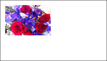
The position property allows you to specify one of three different options: fixed, relative, or absolute. With fixed positioning, elements are placed relative to the browser window. With relative positioning, elements are positioned relative to their position in normal flow. With absolute positioning, the element is positioned relative to its first parent element. You will start with an image placed on a page inside a div element. Figure 4-26 shows this element in static flow.
Exam Tip
The left and right properties start their measurements from the outer-most edge of the box. For the exam, keep in mind that if there are margins or padding specified, this will influence the position of the object as well.
By applying the following style to the image, you are able to reposition the image inside the div element. The output of this is shown in Figure 4-27.
img {
position: fixed;
left: 25px;
top: 25px;
}
Using relative positioning, you can adjust the layout of elements relative to where they would be in the normal static flow. To demonstrate this, you will copy the image element many times to show the flower picture many times inside the div. This is shown in static flow in Figure 4-28.
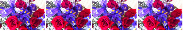
Now, you will move all the images to the left by 25 px. This will be done by specifying relative positioning and -25 px for the left property. As this demonstrates, you can specify negative numbers for the left or top properties. Figure 4-29 shows the output of the following code:
img:nth-child(1n+0) {
position: relative;
left: -25px;
top: 25px;
}
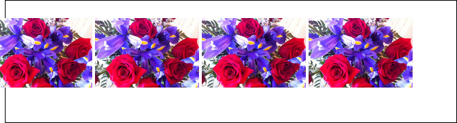
As shown in Figure 4-29, all image elements have moved to the left by 25 px. Using relative positioning, you can actually make your HTML elements overlap. While the above code moves all the images over by 25 px, if you were to modify the code such that each element was moved proportionately more to make them overlap, you can create some nice effects. Recall that the elements are moved based on where they would have been in normal flow. Since the images at center are 100 px from each other, you will need to move the second image, third, and further image by the same amount as its neighbor moved, plus the amount of the desired overlap. The following code shows this:
img:nth-child(2) {
position: relative;
left: -25px;
}
img:nth-child(3) {
position: relative;
left: -50px;
}
img:nth-child(4) {
position: relative;
left: -75px;
}
This code produces the output in Figure 4-30. Each element after the first is moved over enough so that it overlaps its left-side neighbor by 25 px. Notice that the left property value is incrementally larger to account for the fact that its neighbor has moved as well.
Using absolute positioning allows you to specify the location of an element such that it is removed from the normal flow of the page. That is to say that the rest of the page flows as if this element does not exist. The element can be considered to be hovering over or under the content that is in the normal flow of the page. With this approach, it is also possible to overlap elements.
Exam Tip
When overlapping elements using absolute positioning, CSS provides a z-index property. This allows you to specify in what order the elements should stack on the page along the z-axis (the third dimension!).
The following code demonstrates using absolute positioning of an image over a block of text. The text underneath the image renders in its normal flow. The image does not impact anything in the normal flow of the document. The output of this code is shown in Figure 4-31.
img {
position: absolute;
left: 215px;
top: 100px;
height: 50px;
width:50px;
}
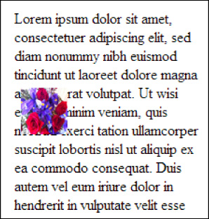
The final property available to use for positioning elements is the float property. The float property automatically moves an element to the left or right of surrounding content. This is most commonly used to place images in line with text to force the text to wrap around the image. Building on the sample above, you will move the img element in line with the text as shown here:
<p style="width: 200px;margin-left: 200px;">
Lorem ipsum dolor sit amet,<img src="flowers.jpg"/> consectetuer adipiscing elit, sed
diam nonummy nibh euismod tincidunt ut laoreet dolore magna aliquam erat volutpat. Ut
wisi enim<img src="orange.jpg"/> ad minim veniam, quis nostrud exerci tation ullamcorper
suscipit lobortis nisl ut aliquip ex ea commodo consequat. Duis autem vel eum iriure
dolor in hendrerit in vulputate velit esse molestie consequat, vel illum dolore eu
feugiat nulla facilisis at vero eros et accumsan et iusto odio...</p>
In this paragraph element, there are two images in line with the text. An image put in this way will push the text out of the way to make room for itself. This is shown in Figure 4-32.
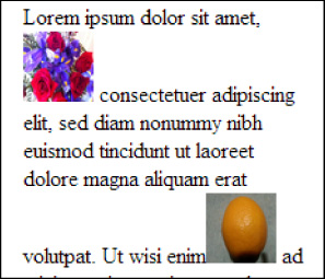
The float property allows you to specify how you want the element to lay out amongst the other elements around it. You can specify to float: left or to float: right. This will move the image element to the left or the right, respectively, and allow the text to flow around it smoothly. The following code demonstrates how to specify this:
img.flower {
float: left;
left: 215px;
top: 100px;
height: 50px;
width: 50px;
}
img.orange {
float: right;
left: 215px;
top: 100px;
height: 50px;
width: 50px;
}
The output of the above code is shown in Figure 4-33.
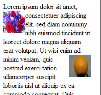
Now, with the float property specified, the text is flowing smoothly around the images.
Objective summary
Every HTML element is a box and has the properties of a box such as height and width.
CSS3 allows you to change the size of a box by specifying a new height and width.
CSS3 allows you to style box properties in the following ways:
The border-style property allows you to specify a solid or dashed line for the border.
The border-color property allows you to specify the color of the border.
The border-spacing property allows you to specify the amount of space between adjacent elements.
The border-width property allows you to specify a thickness for the border.
Each side of the box can by styled differently.
CSS3 provides a way to define the padding and margin that a box should have relative to adjacent elements. This can be configured differently for each side of the box.
An element can be made transparent or partially transparent by setting the opacity property.
An element can contain a background image by setting its background-image property.
CSS3 provides the ability to create shadow effects by specifying the box-shadow property.
CSS3 provides the ability to clip images using the clip property to show only a portion of an image.
CSS3 can be used to establish an element’s position as either fixed, absolute, or relative.
The left and top CSS properties can be used to alter an element’s position.
Objective review
Answer the following questions to test your knowledge of the information in this objective. You can find the answers to these questions and explanations of why each answer choice is correct or incorrect in the “Answers” section at the end of this chapter.
1. Which of the following is not a valid way to alter the size of an element?
A. div{height: 50px; width: 50%;}
B. div{height: 50px; width: 50px;}
C. div{height: 50cm; width: 50px;
D. div{height: 50ft; width: 50ft;}
2. Which of the following will successfully style the border of a div element?
A. border-top: 5px dotted blue;
border-right: 5px solid green;
border-left: 3px dashed red;
border-bottom: 10px double black;
B. border-sides: 5px solid green;
C. border-all: 1px solid black;
D. border: full red;
3. When looking from the outside edge of an HTML element and moving to the inside edge, what order does the padding, margin, and border occur in?
A. padding, border, margin
B. margin, border, padding
C. border, padding, margin
D. margin, padding, border
4. Which of the following statements will apply a box shadow to the right and bottom edge of a div element?
A. box-shadow: gray 5px 5px;
B. box-shadow: gray -5px 5px;
C. box-shadow: gray 5px -5px;
D. box-shadow: gray -5px -5px;
5. Which of the following will place an element relative to the browser window?
A. absolute
B. fixed
C. relative
Objective 4.3: Create a flexible content layout
Organizing content on the page has always been a challenge in webpage design. The concept of design patterns to separate layout from content/logic has existed for a long time in other development spaces. However, it has been less readily and easily available in the HTML space. CSS3 introduces new concepts such as the grid layout and flexbox layout that provide mechanisms to achieve this proper separation.
This objective covers how to:
Implement a layout using a flexible box model
Implement a layout using multi-column
Implement a layout using position, floating, and exclusions
Implement a layout using grid alignment
Implement a layout using regions, grouping, and nesting
Implement a layout using a flexible box model
The flexbox is a CSS3 construct that provides a way to lay out elements that flow. Flow means that the elements will flow from either left to right, also known as horizontal, or up and down, also known as vertical. In order to begin with a flexbox, you need to create a container element and give it a name. Use a <div> element and name it as shown in this code:
<div id="flexbox1">
</div>
With this code block, you have the beginnings of a flexbox. All that is left to do is to create the CSS to indicate that the container is indeed a flexbox. The following CSS achieves this:
#flexbox1 {
display: flexbox;
border: 1px solid black;
margin-top: 100px;
min-height: 15px;
}
With that HTML and CSS in place, you can run the page and see a container specified to have a flexbox layout. The output is shown in Figure 4-34.
All the elements within a flexbox are called flexbox items. You can specify that the flexbox layout runs horizontally or vertically. You will need to be familiar with some of the key styles that can be applied to a flexbox and how the browser will interpret them. Table 4-7 outlines the important styles related to the flow of the child elements.
The flexbox is oriented based on the flex direction. The flex direction is based on the layout axis. If the layout of the flexbox is column, the layout axis is vertical. If the flexbox layout is row, the layout axis is horizontal. For the exam, this is important to understand in order to know how other properties on the flex grid will be rendered.
Now add some child elements to your flexbox layout:
<div id="flexbox1">
<div></div>
<div></div>
<div></div>
</div>
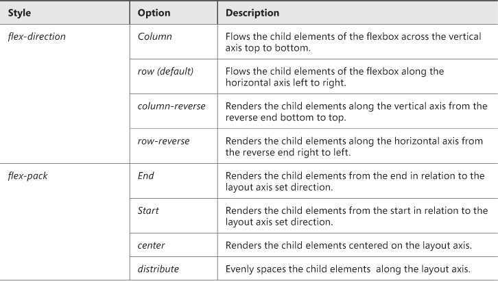
Just adding empty <div> elements will not be enough to show content. You also need to add some styles so that the flexbox layout will show your child elements. Here are the styles to add:
#flexbox1 > div {
min-width: 80px;
min-height: 80px;
border: 1px solid black;
margin: 5px;
}
#flexbox1 > div:nth-child(1) {
background-color: green;
}
#flexbox1 > div:nth-child(2) {
background-color: yellow;
}
#flexbox1 > div:nth-child(3) {
background-color: red;
}
This code produces the output in Figure 4-35.
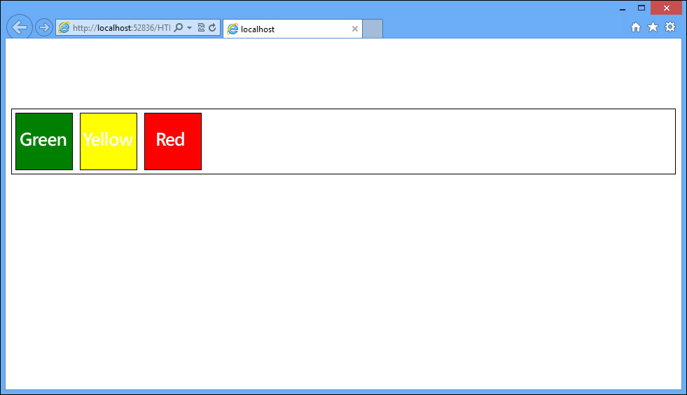
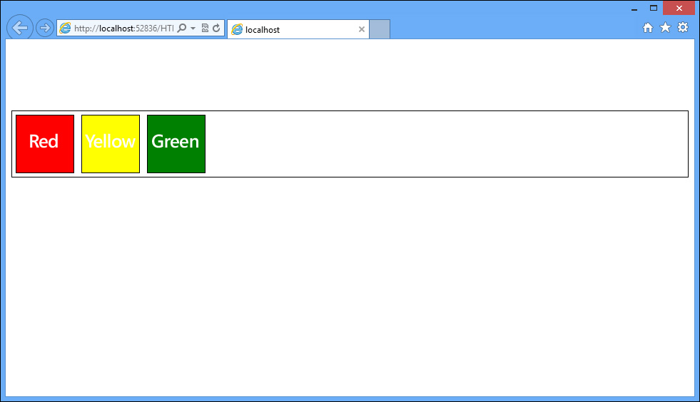
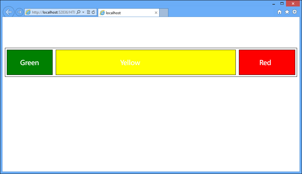
The default flow inside the flexbox is to display the elements left to right starting from the left edge. You can experiment with manipulating the properties to display the colored boxes in a different order. For example, what if you wanted to display the boxes in the same spot on the layout axis, but in reverse order? You could do something like this:
#flexbox1 {
display: flexbox;
flex-direction:row-reverse;
border: 1px solid black;
margin-top: 100px;
min-height: 15px;
}
The output from this code is shown in Figure 4-36.
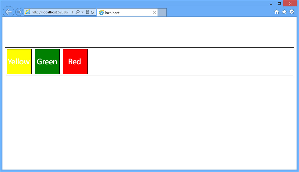
Here you have changed the direction to row-reverse. This changes the order of the boxes. When you run this, you see that it has not only reversed the order of the boxes, but also moved them to the right end. This is because the flex direction controls what is considered the origin points on the layout axis. By reversing the direction, you have indicated that the layout start is now at the right end and the layout end is at the left end. In order to prevent reversing the order, you will need to specify the flex-pack property to indicate the end of the layout axis:
#flexbox1 {
display: flexbox;
flex-flow:row-reverse;
flex-pack:end;
border: 1px solid black;
margin-top: 100px;
min-height: 15px;
}
With this update, the boxes are now showing in the same order (red, yellow, green) but aligned left as intended. The output is demonstrated in Figure 4-37.
There is also some additional functionality that provides the ability for each child element to flex itself to take up the amount of space that is specified. If you wanted one box to take up 15 percent of the space, another to take up 25 percent and the last one to take up whatever space is left without leaving in blank space between, you would implement the flex property. The flex property is specified on each of the children elements to designate the amount of space each should occupy.
You will first need to change the properties of the layout container to look as follows:
#flexbox1 {
display: flexbox;
border: 1px solid black;
margin-top: 100px;
min-height: 15px;
}
#flexbox1 > div {
min-width: 80px;
min-height: 80px;
border: 1px solid black;
margin: 5px;
}
#flexbox1 > div:nth-child(1) {
background-color: green;
flex: 2;
}
#flexbox1 > div:nth-child(2) {
background-color: yellow;
flex: 15;
}
#flexbox1 > div:nth-child(3){
background-color: red;
flex:3;
}
In the updated CSS code, the flex property is added to each of the children elements. The flex property takes a parameter that is a relative value. This is not a hardcoded measurement in pixels or inches. It is relative to the value as specified among all the children elements. In this case, the first element will hold 10 percent of the space, the last element will hold 15 percent of the space, and the middle element will hold whatever space is left. To do this, you need to calculate the relative values that would be necessary to generate those proportions. The rest of the calculations to render the output will be handled by the browser.
Because we are talking about percentages, it stands to reason that the entire width of the space is 100 percent. The easy way to show this is to put into each element its respective percentage since the relative size would be what you are looking for. To illustrate the point, you can factor the units into something smaller by dividing by 20. This would make 10 percent equal 2 parts of 100 percent and 15 percent equal 3 parts of 100 percent. The remaining section will use 15 parts, or 75 percent of 100 percent. Figure 4-38 shows the output with these values.
The order of the flexbox items can also be explicitly specified by using the order property on the flexbox items. An example of this is listed here:
#flexbox1 > div:nth-child(1) {
background-color: green;
flex-order: 2;
}
#flexbox1 > div:nth-child(2) {
background-color: yellow;
flex-order: 1;
}
#flexbox1 > div:nth-child(3) {
background-color: red;
flex-order: 3;
}
Figure 4-39 demonstrates that the flexbox items are displayed in the order you specified instead of the default order, which would have just been in the order the items are listed in the HTML.
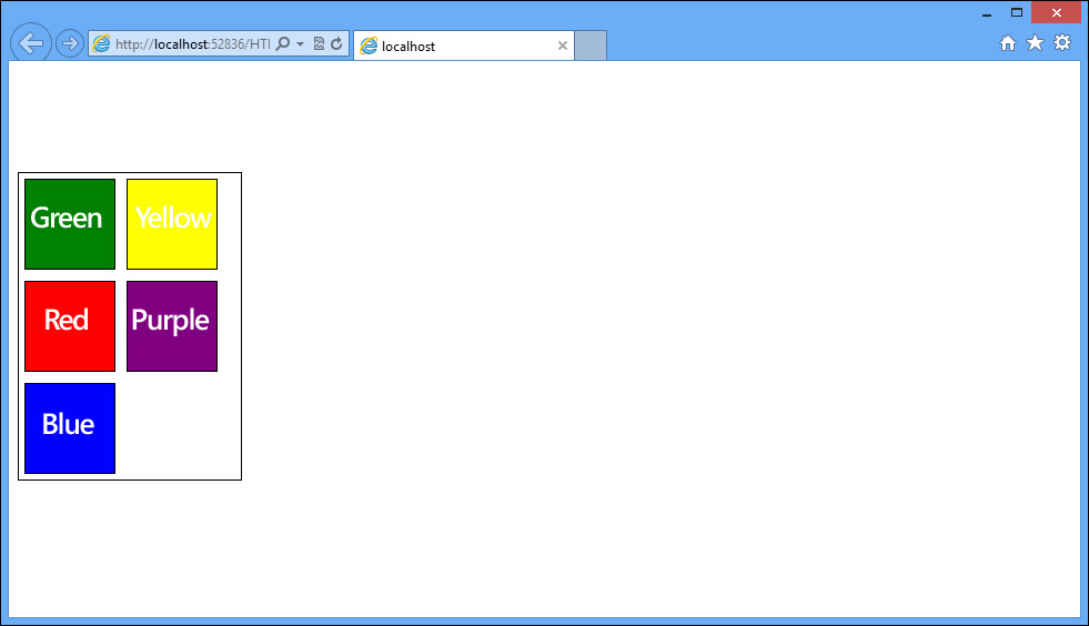
Another property that is important to understand is the wrapping option. Just as with text wrapping, flex-wrap provides the ability to specify what the browser should do in the event that the content within the flexbox exceeds the available space of the flexbox itself. In this case, you can specify that the flexbox should wrap or not wrap. An example of wrapping is shown next. First update your flexbox to have a fixed width and then add the flexbox wrap property:
#flexbox1 {
display: flexbox;
flex-flow: row;
flex-wrap: wrap;
border: 1px solid black;
margin-top: 100px;
min-height: 15px;
width: 200px;
}
To demonstrate the wrapping functionality, you need to add a couple more flexbox items so that they will overflow the flexbox:
<div id="flexbox1">
<div></div>
<div></div>
<div></div>
<div></div>
<div></div>
</div>
Add these additional styles to set background colors for the extra flexbox items:
#flexbox1 > div:nth-child(1) {
background-color: green;
}
#flexbox1 > div:nth-child(2) {
background-color: yellow;
}
#flexbox1 > div:nth-child(3) {
background-color: red;
}
#flexbox1 > div:nth-child(4) {
background-color: purple;
}
#flexbox1 > div:nth-child(5) {
background-color: blue;
}
Figure 4-40 demonstrates the wrapping functionality of the flexbox.
Exam Tip
On the exam, you might see the shorthand version of what you have just done with the wrapping. The flex-flow property supports specifying the wrap style as the second parameter: flex-flow: row wrap.
Implementing a layout using multi-column
CSS3 provides the ability to create a layout using columns. This provides a look and feel to the content like what you might see in a newspaper article where the content wraps up to the next column. As with the other layout techniques, the multi-column technique starts with specifying a container to hold the columns. In this case, an article element will be used. The following markup is added to the page:
<html>
<head>
<style>
#c_lo {
width:80%;
height: 400px;
border: 1px solid black;
column-count: 5;
column-rule-color: black;
column-rule-style: dashed;
column-rule-width: 2px;
column-gap: 5px;
}
</style>
</head>
<body>
<article id="c_lo">
</article>
</body>
</html>
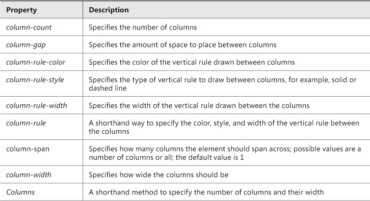
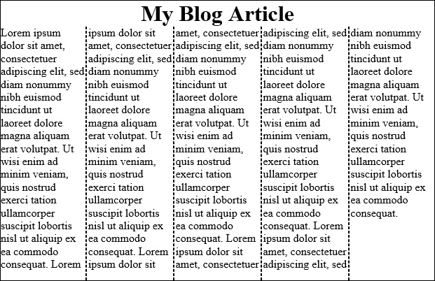
This HTML page contains a style block to set up the multi-column layout. The body contains an article element that will be set up to handle the multiple columns. Some multi-column properties are already set on the article element. Table 4-8 details the multi-column properties.
Whenever you see a property with the same name prefix as with the column-rule property, you can know that there is a shorthand mechanism to specify the most common properties in one line.
After reviewing Table 4-8, you now know that the article element in the previous code block is set up to have five columns, each 5 px apart. The vertical rule between columns will use a dashed line that is black and 2-px wide. It is common for articles to have a title. Usually the title will span across all the columns of the article. To achieve this effect, you need to use the column-span property on an element to indicate that it should render across multiple columns. To achieve this, add the following code to the CSS:
<html>
<head>
<style>
#c_lo {
width: 80%;
height: 400px;
border: 1px solid black;
column-count: 5;
column-rule-color: black;
column-rule-style: dashed;
column-rule-width: 2px;
column-gap: 5px;
}
hgroup {
column-span: all;
text-align:center;
}
</style>
</head>
<body>
<article id="c_lo">
<hgroup>
<h1>My Blog Article</h1>
</hgroup>
<p>
...
</p>
</article>
</body>
</html>
You have added an hgroup element, added style elements to specify that the hgroup text should be centered, and specified the all value for the column-span property.
This markup produces the output shown in Figure 4-41.
Implementing a layout using position, floating, and exclusions
Using position and float to position elements was discussed in the Objective 4.3 section titled, “Apply styles to establish and change an element’s position.” In this section, you will examine how these can be used in overall layout. Float is a mechanism by which the surrounding content will flow smoothly around the element with its float property specified to either float: left or float: right. Left and right are the only two options available for the float property. Exclusions provide a way to overcome this limitation with float. Exclusions are achieved by specifying the CSS3 property wrap-flow.
Important: Internet Explorer Version Requirements
At this time, the wrap-flow property is only implemented in Internet Explorer 10+. Therefore, this element requires the –ms prefix be applied to it.
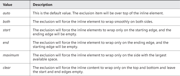
The wrap-flow property supports a variety of options. These options are outlined in Table 4-9. You will use most of these options in the following examples.
With the understanding of the values provided by the previous table, you can now apply these concepts to your pages. The code below will demonstrate the effect of setting the wrap-flow property to both:
<html>
<head>
<style>
p {
width: 80%;
padding-left: 50px;
}
img {
position: absolute;
height: 100px;
width: 150px;
-ms-wrap-flow: both;
}
</style>
</head>
<body>
<p>
Lorem ipsum dolor sit ...
debitis.<img src="flowers.jpg"/> Modus elaboraret temporibus no sit. At invidunt
splendide qui, ut pro choro iisque democritum. Partem timeam graecis ea vis, utamur
feugiat ...
</p>
</body>
</html>
This code produces the output in Figure 4-42.
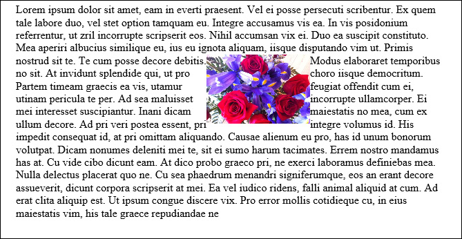
FIGURE 4-42 Setting the wrap-flow property to the value of both to make the inline text wrap on both sides of the image
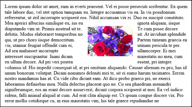
The inline text wraps nicely around both the start (left edge of the image) and the end (right edge of the image). The text is quite close to the image. The wrap-margin property can be specified to provide a margin around the image. Add this property to your CSS code as follows:
img {
position: absolute;
height: 100px;
width: 150px;
-ms-wrap-flow: both;
-ms-wrap-margin: 15px;
}
The output of this code is shown in Figure 4-43.
In the case where you want to have the inline content wrap only on the left or the right, you will specify either start or end respectively as the value for the wrap-flow property. Figure 4-44 demonstrates the output if you change the value to start. Setting the value to end will have the opposite effect.
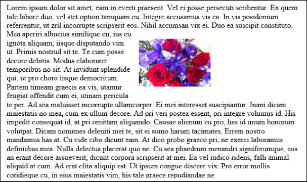
FIGURE 4-44 Setting the wrap-flow property to the value start to have the content wrap only on the left
Figure 4-45 shows the effect if the wrap-flow property is set to clear. Both sides of the exclusion object are cleared and the text wraps only along the top and the bottom.
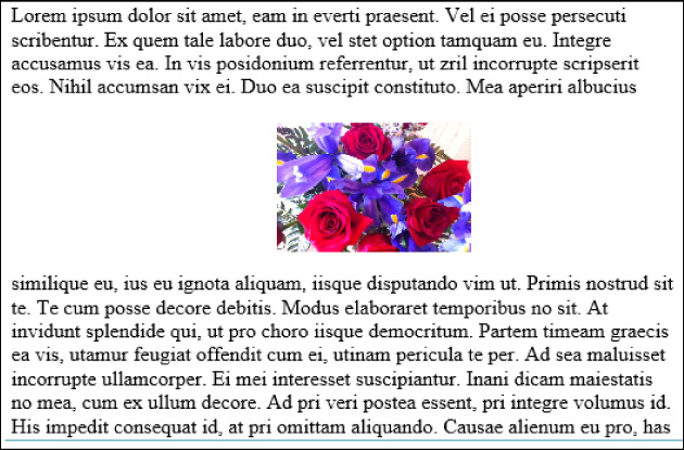
FIGURE 4-45 Setting the wrap-flow property to the value clear to have the content wrap only along the top and bottom
Implementing a layout using grid alignment
The grid layout capability of CSS3 provides a way to lay out the content of the webpage much like an HTML table but using only CSS to achieve the results. This provides more flexibility and more maintainable code.
To demonstrate the capability of the grid layout with CSS3, you will build a webpage layout that looks like the one in Figure 4-46.
Traditionally, to achieve this layout, you would have likely created an HTML markup such as the following code:
<table border="1" style="width:100%; height: 85%">
<tr>
<td colspan="3">
</td>
</tr>
<tr>
<td rowspan="3">
</td>
<td rowspan="3">
</td>
<td>
</td>
</tr>
<tr>
<td>
</td>
</tr>
<tr>
<td>
</td>
</tr>
<tr>
<td colspan="3">
</td>
</tr>
</table>
Using an HTML table works and has worked for a very long time. However, best practices today suggest separating content from layout. This is seen in many other spaces of software development and design in the context of design patterns. In this example, the layout is right in the HTML. You will reconstruct the page such that the content can be provided independent of layout and all the layout will be defined in the CSS code.
The grid layout is fully defined in CSS. To create the grid, CSS properties will need to be applied to the HTML elements. Just as with the flexbox, the grid is based on a having the display specified for a container. You will use simple div element for your grid container. Create the following div and apply the styles as indicated:
<style>
#mainGrid {
display: grid;
}
</style>
<div id="mainGrid">
</div>
You have designated your div with the id of mainGrid to be the container for a grid layout by specifying its display to be grid. However, running this in the browser will not yield much of a result. You need to define the structure of the grid. In this example, you will create a simple four-by-two grid layout. Add the child elements to the div as shown and update the styles as shown to supply information to the container about how you would like it to render the child cells.
#mainGrid {
display: grid;
grid-columns: 150px 150px 150px 150px;
grid-rows: 75px 75px;
}
<div id="mainGrid">
<div></div>
<div></div>
<div></div>
<div></div>
<div></div>
<div></div>
<div></div>
<div></div>
</div>
Some great shorthand is available for specifying rows and columns in a case where you have patterns. In the example in this section, the following CSS provides the same instructions:
#blogPage {
display: grid;
grid-columns: 15% 1fr 25%;
grid-rows: (20%)[5];
width: 90%;
height: 95%;
border: 1px dotted black;
margin: auto;
}
You have added two additional CSS properties to mainGrid. These properties are rather self-explanatory. As their name suggests, the grid-columns property allows you to specify how many columns are in your grid. The grid-rows property allows you to specify how many rows are in your grid. The property values accepted are size attributes separated by spaces. The renderer will interpret each value as a new column or row.
If you run this HTML in the browser, the output will be less than exciting. One reason is that the div elements are empty. Go ahead and put some text in each div and examine the output that you get in the browser. If all goes as expected, your div elements will display all on top of each other. They are, for all intents and purposes, ignoring your previous CSS instructions provided to the container to layout in a four-by-two style. Well, they are not really ignoring the instructions. Recall, the instructions were to the container mainGrid regarding how you wanted it to lay out its child elements. You still need to give each child element its own identity within the grid. That is, the container knows it needs to set up a four-by-two grid, but it does not know which element goes where within that four-by-two grid. It just floats them all on top of each other. You will now specify to the grid elements where they should live in the relative space available within the grid. You will apply some background colors so that the rendered page will easily demonstrate the concepts.
#mainGrid > div:nth-child(1){
grid-column: 1;
grid-row:1;
background-color: blue;
}
#mainGrid > div:nth-child(2){
grid-column:2;
grid-row:1;
background-color: aqua;
}
#mainGrid > div:nth-child(3){
grid-column: 3;
grid-row:1;
background-color: red;
}
#mainGrid > div:nth-child(4){
grid-column: 4;
grid-row:1;
background-color: green;
}
#mainGrid > div:nth-child(5){
grid-column: 1;
grid-row:2;
background-color: magenta;
}
#mainGrid > div:nth-child(6){
grid-column: 2;
grid-row:2;
background-color: yellow;
}
#mainGrid > div:nth-child(7){
grid-column: 3;
grid-row:2;
background-color: orange;
}
#mainGrid > div:nth-child(8){
grid-column: 4;
grid-row:2;
background-color: olive;
}
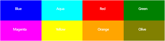
With this code, you have instructed the elements where they should be positioned within the grid. When the renderer processes these elements, it will now know by asking each element where it should go and how to place them. Now the page displayed in the browser looks like Figure 4-47. Each element is placed according to the column and row position specified for it: blue, aqua, red, and green elements respectively in columns 1 through 4, row 1; magenta, yellow, orange, and olive elements respectively in columns 1 through 4, row 2.
Now with the foundation in place, you can take this a step further to create a grid that will correspond with the table layout specified earlier. To do this, you need only a couple more CSS properties that will provide the equivalent functionality as the colspan and the rowspan. In addition, your styles will provide some sizing properties to ensure that the grid expands on the page as you would like it to. This is optional of course in the real world. You may want to have content force the sizing of your grid or you may want to explicitly specify the size.
The full code listing is specified here:
html, body {
height: 100%;
width: 100% ;
}
#blogPage {
display: grid;
columns: 15% 1fr 25%;
grid-rows: 20% 20% 20% 20% 20%;
width: 90%;
height: 95%;
border: 1px dotted black;
margin: auto;
}
#blogPage > header {
grid-column: 1;
grid-column-span: 3;
grid-row: 1;
border: 1px dotted black;
}
#blogPage > footer {
grid-column: 1;
grid-row: 5;
grid-column-span: 3;
border: 1px dotted black;
}
#blogPage > article {
grid-column: 2;
grid-row: 2;
grid-row-span: 3;
border: 1px dotted black;
}
#blogPage > #calendar {
grid-column: 3;
grid-row: 3;
border: 1px dotted black;
}
#blogPage > #blogRoll {
grid-column: 3;
grid-row: 4;
border: 1px dotted black;
}
#blogPage > #aboutMe {
grid-column: 1;
grid-row: 2;
grid-row-span: 3;
border: 1px dotted black;
}
#blogPage > #bloghistory {
grid-column: 3;
grid-row: 2;
border: 1px dotted black;
}
</style>
<body>
<div id="blogPage">
<header>My Blog Header</header>
<article>My Blog's Main Body</article>
<footer>My Blog Footer</footer>
<aside id="calendar">A calendar</aside>
<aside id="blogRoll">My favorite blogs</aside>
<aside id="aboutMe">Who am I?</aside>
<aside id="bloghistory">My blog history</aside>
</div>
</body>
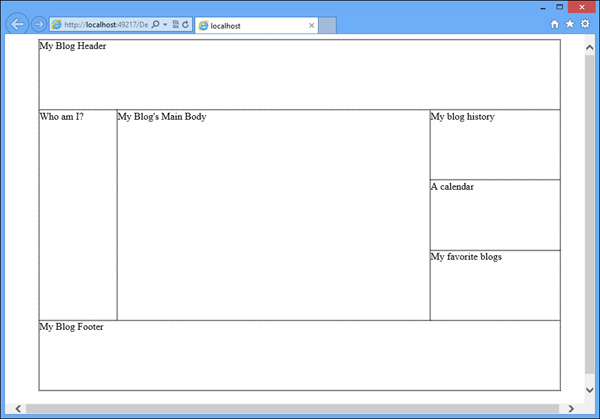
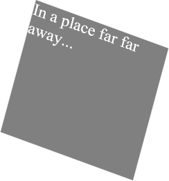
Since you are producing a real webpage that will hold real content, the appropriate semantic tags are being used. You can see from looking at the HTML portion of the code that there is no indication to layout. You have defined only a series of sections for the page to display. All the layout implementation happens in the CSS. You will notice the addition of two CSS properties to your repertoire: grid-row-span and grid-column-span. As their names suggest, you can expect them to behave the same way as the HTML attributes colspan and rowspan. They tell the browser to lay out the column or the row such that it spans the specified number of columns or rows. When you run this code in the browser you will get the output displayed in Figure 4-48.
Implementing a layout using regions, grouping, and nesting
Regions is a new CSS3 construct that allows you to have content flow through various regions in a webpage. This could provide some very interesting scenarios. To get started, you will need an HTML page with regions defined in it. The following HTML provides the starting point for establishing regions.
<body>
<div class="regionLayout">
<div id="region1"></div>c
<div id="region2"></div>
<div id="region3"></div>
...
<div id="region-n"></div>
</div>
</body>
Note: Browser Support for Regions
Regions are currently in the experimental and development phase. There is limited browser support at this time. This section highlights only the key design goals of this feature.
Layout of a webpage using regions requires two things: a content source and the regions that will be the content destination. The HTML above outlines the regions. The content can come from another page via an iframe or another element on the page itself (though this currently does not work in any browser). By adding an iframe to the page, you can set the iframe src to the content that will be rendered in the regions:
<iframe src="content_source.html"/>
With the content source established in the HTML, there are now only two things that need to occur. CSS is used to control the functionality of the content from the source to the destination. The new CSS properties called flow-into and flow-from are used to assign the role of the HTML elements in the region layout. The flow-into property is assigned a value to hold the content. This value can be anything such as in this example:
.content_source{
flow-into: myflow;
}
Then the destination of the content is defined in a class like this:
.content_regions{
flow-from: myflow;
}
As long as the same name is used in the flow-into and the flow-from, they will work together. This is called a named flow. All the elements forming the regions to display the content source in the same named flow is called a region chain. You can have multiple sources and multiple region chains. The name assigned to the flow-* properties are used to coordinate which content source goes into which regions.
Exam Tip
Since the regions feature is still experimental, the exam is not likely to cover this topic. However, this is only at the time of writing and could change at any time. Be familiar and keep checking on updates with respect to the readiness of this CSS construct in the real world.
 Thought experiment: Combining layouts
Objective summary
Flexbox allows you to lay out elements in a flow-like fashion.
Multi-column layout allows you to separate content into a fixed number of columns, like a newspaper layout.
The flow of text around elements like images can be controlled using wrap-flow layouts.
The grid layout provides the best way to separate the layout from the content by specifying explicitly in CSS where each element should be displayed within a predefined grid.
Objective review
Answer the following questions to test your knowledge of the information in this objective. You can find the answers to these questions and explanations of why each answer choice is correct or incorrect in the “Answers” section at the end of this chapter.
1. Which of the following layouts is based on columns and rows?
A. flexbox
B. multi-column
C. grid layout
D. exclusions
2. Which of the following is false about a flexbox layout?
A. The direction of the elements in a flexbox can be controlled with the flex-direction property.
B. The elements layout can be configured along the layout axis using the flex-pack property.
C. Elements in a flexbox are called flexbox items.
D. Elements in a flexbox can be set into rows and columns.
3. Which of the following property values for wrap-flow will allow the text to wrap along both sides of an element?
A. both
B. all
C. left and right
D. cross
Objective 4.4: Create an animated and adaptive UI
The modern day website is an interactive experience for the end user. CSS3 provides many mechanisms to apply a professional touch to the end-user interaction. This is achieved through the ability to animate and transform objects. By adding these rich features to your webpages, you really bring the experience to the next level. In addition, there is an opportunity to create a responsive user interface. A responsive user interface is one that can adapt itself automatically based on the size of the screen that is available. Finally, the ability to hide and disable controls provides you with the ability to further customize the user interface with CSS.
Animate objects by applying CSS transitions
Apply 3-D and 2-D transformations
Adjust UI based on media queries
Hide or disable controls
Animating objects by applying CSS transitions
Transitions provide a mechanism to alter the style of an object such that the change occurs in a visible gradual fashion. You have the ability to control which style property gets altered and how long it takes to complete its transition from one style to the other. A transition starts when the specified property is changed. In its simplest form, the following code transitions two properties of a div element: the margin-left and the background-color. The transition is to take one second. The transition will occur when the mouse is hovering over the div element.
Note: See it for Yourself
Since this is a book and transitions are visual effects that involve the changing of properties gradually, screen shots do not demonstrate the functionality very well. You should try the code in your own webpages to get familiar with the outcomes of the styles and scripts.
The visual effect is that this div, which starts off with a gray background, will fade out of sight to the right. The following code demonstrates this:
<html>
<head>
<style>
div {
width: 100px;
height: 100px;
background-color: gray;
margin-left: 250px;
margin-top:250px;
transition: background-color 1s, margin-left 1s ;
}
div:hover {
margin-left: 350px;
background-color: white;
}
</style>
</head>
<body>
<div>
</div>
</body>
</html>
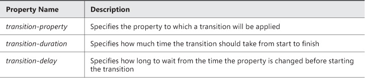
With this CSS code in place, when the user moves the mouse over the div element, it will move to the right and its background color will change to white. Since the background of the webpage is also white, it provides the effect of disappearing. You need to understand what properties are being used to achieve this effect. In this particular code, you are using a shorthand property called transition that allows you to specify a comma-separated list of CSS properties and a length of time for the transition of the specified property to take place. These properties could also be indicated separately using the various CSS properties in Table 4-9.
Exam Tip
When using the individual transition-* properties, you can specify only one property to transition. With the transition shorthand, you are able to specify a comma-separated list.
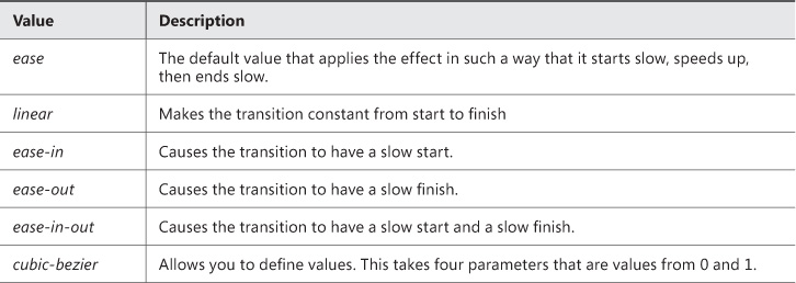
Another property that exists to control the speed of the transitions is transition-timing-function. This property allows you to have a bit more control over the speed of the transition. With the transition-timing-function property, you can specify some different effects to the timing of the transition. The possible values are specified in Table 4-10.
Applying 3-D and 2-D transformations
Using CSS you are also able to apply transformations to elements on your webpage. In this section, you will review how to apply three dimensional transforms to your elements. Following with the same div from the previous section, you will apply the three-dimensional (3-D) transformations listed in Table 4-11. Two-dimensional (2-D) transforms are covered in Objective 1.3, “Apply transforms.”
As you can see, the 3-D transforms are the same property values as the 2-D transforms. The addition is that each property now allows you to invoke the transform across the z-axis instead of just the x-axis and y-axis. In addition, there are shorthand properties available such as translate3d and rotate3d.
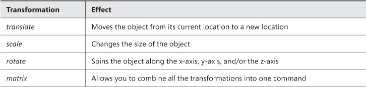
To demonstrate the use of a 3-D transform, you will look at the rotate transformation. The following code applies a 3-D rotation of the div element.
div {
transform: rotateX(30deg) rotateY(30deg) rotateZ(30deg);
}
When the page loads, all div elements on the page will be rotated 30 degrees along each axis. The above transform could be expressed in this way as well:
transform: rotate3d(1,1,1, 30deg);
In this case, rotate3d takes the first parameters to specify on which axis to rotate. A value of zero indicates to no rotation on that axis whereas a value of 1 indicates a rotation on that axis. The parameters are in order of x-axis, y-axis, z-axis. The last parameter specifies the number of degrees to rotate.
When the page loads, you will see the output in Figure 4-49.
You can experiment with each transformation. The output is similar to that of the 2-D with the exception that the effects are applied along the z-axis as well. In addition, you can see that you can still use the 3-D functions to achieve 2-D effects. It all depends which parameters you specify.
Adjusting UI based on media queries
In the modern world, screen size is a variable you now have to contend with when building webpages. With many people accessing the Internet from different devices such as smart phones, tablets, and desktops, there is no guarantee that your page will fit nicely on the screen, and as a result, it may not be user friendly. This is where the concept of media queries is able to help. With the use of media queries you can create a responsive user interface that will adjust automatically as the size of the available rendered webpage changes. By using information from the browser, you are able to determine how to present your content so that it provides a user-friendly experience on any device.
The media query syntax is as simple as adding the following to your CSS file:
@media screen and (max-width: 800px){
}
This code will apply all the styles within the media query to the page when the width of the screen is not wider than 800 px. To achieve a different layout for different screen sizes or devices, you need to specify a media query for the different size ranges. To explore this, use the blog layout that was created in Objective 4.3 using a grid layout. The default layout of the blog is shown in Figure 4-48. However, as the screen size gets smaller, the blog gets compacted to the point that it might not be readable or, depending on the amount of content, will require awkward scrolling on a device. To accommodate the different screen sizes, update your CSS code to include media queries. The following code adds a media query to apply the default layout to larger screens such as desktops or laptops:
@media screen and (min-width: 1200px) {
#blogPage {
display: -ms-grid;
grid-columns: 15% 1fr 25%;
grid-rows: (20%)[5];
width: 90%;
height: 95%;
border: 1px dotted black;
margin: auto;
}
#blogPage > header {
grid-column: 1;
grid-column-span: 3;
grid-row: 1;
border: 1px dotted black;
}
#blogPage > footer {
grid-column: 1;
grid-row: 5;
grid-column-span: 3;
border: 1px dotted black;
}
#blogPage > article {
grid-column: 2;
grid-row: 2;
grid-row-span: 3;
border: 1px dotted black;
}
#blogPage > #calendar {
grid-column: 3;
grid-row: 3;
border: 1px dotted black;
}
#blogPage > #blogRoll {
grid-column: 3;
grid-row: 4;
border: 1px dotted black;
}
#blogPage > #aboutMe {
grid-column: 1;
grid-row: 2;
grid-row-span: 3;
border: 1px dotted black;
}
#blogPage > #bloghistory {
grid-column: 3;
grid-row: 2;
border: 1px dotted black;
}
}
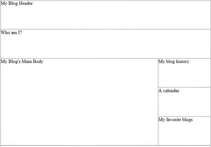
This produces the output in Figure 4-48. As long as the screen is at least 1,200 px wide, this layout will be applied. However, as the screen gets smaller, on a tablet for example, the user interface starts to get less user friendly. To accommodate a tablet screen, you can adjust the layout a bit by adding the following CSS code to the page:
@media screen and (max-width: 1199px) and (min-width: 401px) {
#blogPage {
display: -ms-grid;
grid-columns: 75% 1fr;
grid-rows: (20%)[6];
width: 90%;
height: 95%;
border: 1px dotted black;
margin: auto;
}
#blogPage > header {
grid-column: 1;
grid-column-span: 2;
grid-row: 1;
border: 1px dotted black;
}
#blogPage > footer {
grid-column: 1;
grid-row: 6;
grid-column-span: 2;
border: 1px dotted black;
}
#blogPage > article {
grid-column: 1;
grid-row: 3;
grid-row-span: 3;
border: 1px dotted black;
}
#blogPage > #calendar {
grid-column: 2;
grid-row: 4;
border: 1px dotted black;
}
#blogPage > #blogRoll {
grid-column: 2;
grid-row: 5;
border: 1px dotted black;
}
#blogPage > #aboutMe {
grid-column: 1;
grid-row: 2;
grid-column-span: 2;
border: 1px dotted black;
}
#blogPage > #bloghistory {
grid-column: 2;
grid-row: 3;
border: 1px dotted black;
}
}
With this code, you can restructure the layout of the grid based on the different screen size. The output of this code produces a user interface shown in Figure 4-50.
Now you have the desktop-size screen and tablet-size screen looking good. The next one to account for is the smaller smart phone screen. Add the following code to your CSS to place a media query for the smaller screen size:
@media screen and (max-width: 400px) {
#blogPage {
display: grid;
grid-columns: 50% 50%;
grid-rows: 15% 15% 1fr 15% 15%;
width: 90%;
height: 95%;
border: 1px dotted black;
margin: auto;
}
#blogPage > header {
grid-column: 1;
grid-column-span: 2;
grid-row: 1;
border: 1px dotted black;
}
#blogPage > footer {
grid-column: 1;
grid-row: 5;
grid-column-span: 2;
border: 1px dotted black;
}
#blogPage > article {
grid-column: 1;
grid-row: 3;
grid-column-span: 2;
border: 1px dotted black;
}
#blogPage > #calendar {
grid-column: 2;
grid-row: 2;
border: 1px dotted black;
}
#blogPage > #blogRoll {
grid-column: 1;
grid-row: 4;
border: 1px dotted black;
}
#blogPage > #aboutMe {
grid-column: 1;
grid-row: 2;
border: 1px dotted black;
}
#blogPage > #bloghistory {
grid-column: 2;
grid-row: 4;
border: 1px dotted black;
}
}
As the screen size gets to be as small as it would be on a smart phone, the user interface will be rendered as shown in Figure 4-51.
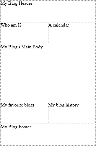
The media query does not require that a smart phone or tablet be in use, only that the view port of the page is within the query parameters. To test this code, simply resize your browser window beyond the defined sizes to see the page change its layout dynamically.
So far the CSS is working great. The only problem is you have a lot of CSS code in a single page. Typically, a website has multiple pages with styles shared across different pages. As a result, you will likely be linking an external CSS file to your HTML page. The link element supports media queries as well, which in turn lets you share a CSS file across multiple pages. For example, you might want to change the font-size of the text throughout your site based on the view port size. To achieve this, move the CSS from each media query into its own CSS file and link in your CSS files in the following way:
<link rel="stylesheet" media="screen and (min-width: 1200px)" href="Desktop.css"/>
<link rel="stylesheet" media="screen and (max-width: 1199px) and (min-width: 401px)"
ref="tablet.css"/>
<link rel="stylesheet" media="screen and (max-width: 400px)" href="phone.css"/>
With the CSS linked in this fashion, you can add and modify the styles for the different view ports centrally for your entire website.
Hiding or disabling controls
The ability to modify the user interface positioning using media queries as shown in the last section is very useful. In addition, some layouts might just not work in some view ports. In this case, you might want to complete hide controls or disable controls. HTML elements are visible by default. However, they can be made invisible by setting the visibility CSS property as shown in the following code:
.myhiddenelements {
visibility:hidden;
}
By setting the visibility to hidden, the control is not visible to the end user of the webpage. When hiding an element using the visibility property, the overall layout still behaves as though the element is there. If you prefer to have the element hidden and the layout behave as though it is not there, the display property should be used as shown in the following code:
.myhiddenelements {
display: none;
}
With the display property, the element is not visible and the layout is not affected by it.
If you do not want to hide the element but only make it disabled such that the user can see it but cannot perform any action on it, you need to add the attribute directly to the HTML element. As such, you can define a CSS class that you can apply to any elements that you want to have disabled:
.disableIt
Now that you have a CSS class called .disableIt, you can apply this class to any elements that you want to disable. In this case, you want to disable a button element, so apply the class to the button element as shown here:
<button id="myButton" class="disableIt" >My Button</button>
The last step is to create some JavaScript that finds all the controls with this class assigned to it and adds the disabled attribute to them. The following code demonstrates this:
<script>
$("document").ready(function (e) {
$(".disableIt").attr("disabled", "disabled");
});
</script>
This script has the same net effect as putting the attribute directly on the button element as shown here:
<button id="myButton" disabled="disabled">My Button</button>
When you have many elements that you would like to disable, it is much easier to create a CSS class, apply it to the elements, then by using jQuery, apply the disabled attribute to them all.
Thought experiment: Combining effects
Objective summary
HTML elements can be manipulated with transitions using the transition-property, transition-duration, and transition-delay CSS properties.
Elements can be manipulated in 2-D and 3-D space with effects such as translate, scale, rotate, and matrix.
Media queries allow you to have a dynamic, responsive user interface based on the view port size and type.
The visibility property hides a control but keeps its position in the overall layout. Using the display property to hide a control removes it from the layout as well.
Objective review
Answer the following questions to test your knowledge of the information in this objective. You can find the answers to these questions and explanations of why each answer choice is correct or incorrect in the “Answers” section at the end of this chapter.
1. Which of the following statements will hide an element but keep its space in the overall flow?
A. display: none;
B. visibility: hidden;
C. display: inline;
D. visibility: visible;
2. Media queries are best suited for what purpose?
A. Setting the priority of style sheet references in a webpage
B. Creating a responsive user interface based on the screen size of the view port
C. Modifying the view port to properly fit the content of the page
D. Connecting to third-party style sheets to alter the layout
3. Which of the following transition-timing-function properties makes the transition start slow, speed up, then end slow?
A. ease
B. ease-in
C. ease-out
D. ease-in-out
Objective 4.5: Find elements using CSS selectors and jQuery
Objective 1.2, “Write code that interacts with UI controls,” covered the use of document selectors to find HTML elements by their unique name. In this section, you explore more advanced techniques to find elements through the use of CSS selectors and jQuery.
This objective covers how to:
Define element, style, and attribute selectors
Choose the correct selector to reference an element
Find elements by using pseudo-elements and pseudo-classes
Defining element, style, and attribute selectors
CSS uses selectors that you define in a CSS file or style block to identify which elements in a webpage the defined styles should be applied to. This can be done by specifying the element itself as the selector. For example, the following CSS is an element selector for the div element:
div{
...
}
Any div within scope of the declaration will have the styles applied to it. Another possible selector is a class selector. To use a class selector, you define a custom class name in the CSS file. This can be any name prefixed with a period. Then, any element that has that class assigned to it via the class attribute will have the defined styles applied. For example:
.mycustomclass{
....
}
Another way to use CSS to select specific elements on the page is to use attribute selection. This is achieved by specifying an element type followed by a specific attribute. For example if you have a web form that needs to be filled in, you may attribute required fields with a red border around the textboxes. The following code achieves this for any elements that have the required attribute specified:
input[required] {
border: 1px red solid;
}
There are other possibilities for the use of attribute selectors. These are outlined in Table 4-12.
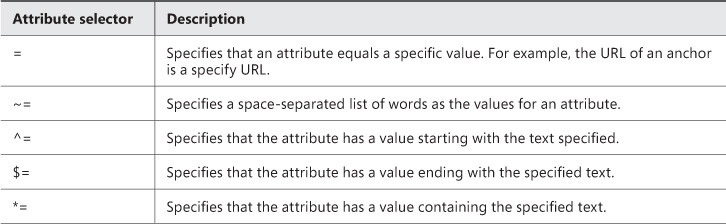
Choosing the correct selector to reference an element
Choosing the correct selector to reference an element is an important consideration. You need to ensure that you organize your selectors and your elements such that only the desired elements are impacted by the defined styles. For example, the following style affects all article elements:
article{
border-color: 1px solid red;
}
If you do not want to affect all articles but only the newest article, you must distinguish them, perhaps by adding a custom CSS class to the definition and assigning this to only the newest article:
article.newest{
border-color: 1px solid red;
}
By specifying it this way, you are assured that not every article on the page is impacted by the style. This topic is covered in more detail in Objective 4.6 in the section “Referencing elements correctly.”
Finding elements by using pseudo-elements and pseudo-classes
Pseudo-classes and pseudo-elements provide some very powerful ways to add styles to elements. Pseudo-classes allow you to apply styles to an element based on its state, its interaction with the user, or its position in the document. Pseudo-elements allow you to insert content into the page in locations relative to the elements that the CSS is being applied to. You will examine each of the common pseudo-classes and pseudo-elements in this section.
:link, :visited, and :hover
These are the most commonly used pseudo-classes, used most frequently with the anchor element, providing a clickable link for the user of the webpage. With these pseudo-classes, you can control what styles are applied to a hyperlink in the different states. For example, the following CSS changes the color of the link based on its state:
a:link {
color: green;
}
a:hover {
color: red;
}
a:visited {
color: black;
}
In this example, the link by default will be green. When a user moves the mouse over the link, the color of the link will change to red. If the user does not click the link and then moves off of it, the link will go back to green. However, if the user clicks the link, it becomes a visited link and will change to black.
:checked
The :checked pseudo-class lets you apply styles to elements that are in a checked state. Elements that support this pseudo-class are check boxes and radio buttons. The amount of styling you can apply to the default elements is minimal. However, there are ample resources to customize these elements using CSS. The following example shows how to hide a check box when a user clicks it.
input[type="checkbox"]:checked {
display: none;
}
:required
The :required pseudo-class lets you apply styles to any elements on the page that have the required attribute. This is a convenient way to highlight required fields on a form. The following CSS demonstrates applying styles to all required input controls:
input:required {
border: 2px solid red;
}
All required input controls will now have a red border to highlight this to the user.
:enabled and :disabled
The :enabled and :disabled pseudo-classes allow you to style controls based on their enabled or disabled state. By default, disabled controls typically are light gray. With these pseudo classes, you can control how the element displays in either state. The following code demonstrates this:
input:disabled {
background-color: blue;
}
input:enabled {
background-color: white;
}
If a control is enabled, the background will be white; otherwise disabled controls will be blue.
:first-child
The :first-child pseudo-element applies the specified styles to the first instance of the element that occurs in a list, for example, the first paragraph element in this HTML:
<div>
<p>Lorem Ipsum ...</p>
<p>Lorem Ipsum ...</p>
<p>Lorem Ipsum ...</p>
<p>Lorem Ipsum ...</p>
</div>
The following CSS will change the text color to green in the first paragraph element:
p:first-child {
color:green;
}
:first-letter
The :first-letter pseudo-element will alter the style of the first letter in the specified element. Continuing with the example HTML above, the following CSS will increase the size of the first letter in each paragraph element:
p::first-letter {
font-size: xx-large;
}
:before and :after
The :before and :after pseudo-elements will add the specified content in front of or after the indicated element selector. So, the following code would add ** to the front and end of the paragraph element:
p::before {
content: '**';
}
p::after {
content: '**';
}
:first-line
The :first-line pseudo-element alters the styles of the first line of a text element. The following CSS will make the first line of the text inside the paragraph element green and larger:
p::first-line {
color:green;
font-size: x-large;
}
Thought experiment: Using jQuery with pseudo-classes
Objective summary
Pseudo-elements and pseudo-classes provide an advanced mechanism for searching HTML elements in a page and applying styles.
Using pseudo-elements and pseudo-classes you can change the style of an element based on user actions.
Using pseudo-elements and pseudo-classes you can gain granular control over parts of the text in a text block.
Objective review
Answer the following questions to test your knowledge of the information in this objective. You can find the answers to these questions and explanations of why each answer choice is correct or incorrect in the “Answers” section at the end of this chapter.
1. Which one of the following is a CSS class selector?
A. .code
B. #code
C. div[code]
D. :code
2. Which one of the following is an attribute selector?
A. .required
B. #required
C. input[required]
D. :required
3. Which of the following statements would alter the style of an anchor element when the mouse is moved over it?
A. a:link
B. a:mouseover
C. a:beforeclick
D. a:hover
Objective 4.6: Structure a CSS file by using CSS selectors
CSS files can become large and complex. Structuring them in an organized fashion will make them easier to maintain and also to know what selectors are best suited to be used to reference the HTML on your page.
This objective covers how to:
Reference elements correctly
Implement inheritance
Override inheritance using !important
Style an element based on pseudo-elements and pseudo-classes
Referencing elements correctly
CSS is used to apply styles to elements in an HTML page. To do so, the CSS has to know which elements to apply the styles to. There are a few ways to reference elements from CSS. This is known as the selector syntax. This has been demonstrated throughout the chapter. This section will explain specifically how to reference elements from CSS. The key consideration is to ensure that you reference elements such that the styles affect only the elements you want affected. In large complex CSS, it can get complicated.
Elements can be referenced from CSS by their element name. For example:
p{...}
article{...}
div{...}
In this code, styles are applied to all paragraph elements, article elements, and div elements.
The next method to select elements is through the use of classes as shown here:
.bold{...}
.largeTitle{...}
In this code, the styles are applied only to HTML elements that have their class attribute assigned these class names. Element names and classes can be combined to narrow the selector even further:
p.largeTitle{...}
This code applies the styles only to paragraph elements that have the class largeTitle assigned to the class attribute.
The most granular method to reference HTML elements from CSS is by using the id or name of the element:
#nameBox{...}
This code applies the specified styles only to the single element on the page with the specified name.
In some cases, you might want to apply the same style to many elements of different types. In this case, you can group them and define the styles only once:
p, H1, H2 {...}
In this sample, all three of the HTML elements noted will have the defined styles applied to them.
Implementing inheritance
Some styles applied to a parent element are automatically inherited by children elements. For example, if a series of paragraph elements are inside an article element, and font and text styles are applied to the article, all the paragraph elements will automatically inherit the font and text styles as well. The following code demonstrates this concept:
<style>
div {
font-family: sans-serif;
color: green;
}
</style>
And with the following HTML:
<div>
hello div world.
<p>
Hello paragraph world.
</p>
</div>
Both the div and the paragraph will have the font and color styles applied to them because the paragraph element does not have any of its own styles defined. If you assign styles to the paragraph element to override the div styles you would be able to prevent the inheritance of the styles, as shown here:
<style>
div {
font-family: sans-serif;
color: green;
}
p {
font-family: serif;
color: blue;
}
</style>
Overriding inheritance using !important
CSS for large websites can be complicated. Large websites may have CSS coming from different sources. It could be on each page and referenced externally. External libraries are more and more common as experts throughout the community have created themes that can be imported into your web applications. With all this styling coming from different sources, inheritance of styles can be tricky. In some cases you may just need to override all other competing styles completely with your own desired style. This is where the !important keyword comes in. Consider the following simple CSS example:
p {
font-family: serif;
color: blue;
}
p {
color: purple;
}
p{
color: yellow;
}
In this CSS code, you have three competing styles for the paragraph element. How the browser renders this is based on the last style it reads for an element it applies to. So in this case, the text in all the paragraphs will be yellow. However, if you want to override this behavior and force the paragraph elements on the page to be purple, you simply add the !important keyword to the style you want to have applied:
p{
font-family: serif;
color: blue;
}
p{
color: purple !important;
}
p{
color: yellow;
}
The paragraph elements will render purple and not yellow. The !important notation tells the parser to give that style priority. This is a simplistic example, but the concept is the same whether the styles are in a single page such as this or if they come from a variety of external sources with conflicting styles.
Styling an element based on pseudo-elements and pseudo-classes
The Objective 4.5 section, “Finding elements by using pseudo-elements and pseudo-classes” demonstrated the use of pseudo-elements and pseudo-classes as selectors. In addition, that section can be referenced for how to apply styles to elements based on the use of the pseudo-class and pseudo-element selectors.
Objective summary
Referencing elements correctly takes careful consideration of how you will structure your CSS and your HTML elements.
Selectors can be nested and joined together to get more specific.
HTML elements inherit styles automatically from their parent elements.
CSS is processed from the top down, so that last style processed wins if it conflicts with other style declarations.
!important can be used to ensure that the desired style is rendered when there is a competing CSS declaration.
Objective review
Answer the following questions to test your knowledge of the information in this objective. You can find the answers to these questions and explanations of why each answer choice is correct or incorrect in the “Answers” section at the end of this chapter.
The review questions use the following HTML listing (line numbers are for reference only):
1. <html>
2. <body>
3. <div>
4. <hgroup>
5. <h1></h1>
6. <h2></h2>
7. </hgroup>
8. </div>
9. <div>
10. <section>
11. <article>
12. <h1></h1>
13. <p></p>
14. <p></p>
15. </article>
16. <article>
17. <h1></h1>
18. <p></p>
19. <aside></aside>
20. <p></p>
21. </article>
22. </section>
23. </div>
24. <div>
25. <footer>
26. <p></p>
27. <p></p>
28. </footer>
29. </div>
30.</body>
31.</html>
1. Referencing the HTML listing, how would you style only the first paragraph inside the footer element to have a smaller font size?
A.
footer p:first-child {
font-size: x-small;
}
B.
footer p.first-child {
font-size: x-small;
}
C.
Footer:p:first-child {
font-size: x-small;
}
D.
Footer=>p,first-child {
font-size: x-small;
}
2. Referencing the HTML listing, how would you apply a new font to all the H1 elements? In addition, the <h1> elements in an article should be italic.
A.
h1 {
font-family: 'Courier New';
article h1 {
font-style:italic;
}
}
B.
h1 {
font-family: 'Courier New';
}
article h1 {
font-style:italic;
}
C.
h1 {
font-family: 'Courier New';
font-style:italic;
}
article h1 {
font-style:italic;
}
D.
h1 {
font-family: 'Courier New';
}
article, h1 {
font-style:italic;
}
3. Referencing the preceding HTML listing, write the CSS code to apply a border to the aside element that is 100 pixels high and 50 pixels wide. In addition, provide a shadow effect and slightly skew the element to the right 5 degrees.
Answers
This section contains the solutions to the thought experiments and answers to the objective review questions in this chapter.
Objective 4.1: Thought experiment
jQuery is the easiest way to achieve changing CSS styles dynamically. JavaScript will do the trick as well. All the CSS properties that have been looked at are available to be changed dynamically. So for example, in the following code, the color of the button is changed to green when it is clicked:
<html>
<head>
<script src="jquery-2.0.3.min.js" type="text/javascript"></script>
<script>
$("document").ready(function () {
$("#changeStyle").click(function () {
$(this).css("color", "green");
});
});
</script>
</head>
<body>
<button id="changeStyle">Change Style</button>
</body>
</html>
Objective 4.1: Review
1. Correct answer: B
A. Incorrect: font-style: italic will display the text with italics.
B. Correct: font-weight: heavy; heavy is not a valid option for font-weight.
C. Incorrect: font: bolder 12px arial; is a valid shorthand for setting font attributes.
D. Incorrect: color: green; is a valid way to change the color of the text to green.
2. Correct answer: D
A. Incorrect: Right will align all the text to the right side of the box.
B. Incorrect: Full is not a valid option.
C. Incorrect: Center will align the text along the center of the box.
D. Correct: Justify will align the text such that each line takes up the width of the box.
3. Correct answer: C
A. Incorrect: word-margin is not a valid option.
B. Incorrect: letter-margin is not a valid option.
C. Correct: word-spacing will set the amount of space between words.
D. Incorrect: word-padding is not a valid option.
Objective 4.2: Thought experiment
The following code demonstrates how to alter an element’s position using jQuery.
<html>
<head>
<script src="jquery-2.0.3.min.js" type="text/javascript"></script>
<style>
p {
position:fixed;
left: 1px;
}
</style>
<script>
var pos = 1;
$("document").ready(function () {
setInterval(function () {
var newPos = (pos + 1) + "px";
$("#scrollMe").css("left", newPos);
pos += 1;
}, 20);
});
</script>
</head>
<body>
<p id="scrollMe">This text moves accross the screen.</p>
</body>
</html>
Objective 4.2: Review
1. Correct answer: D
A. Incorrect: div{height: 50px; width: 50%;} is valid.
B. Incorrect: div{height: 50px; width: 50px;} is valid.
C. Incorrect: div{height: 50cm; width: 50px; is valid.
D. Correct: div{height: 50ft; width: 50ft;} ft is not a valid unit of measurement.
2. Correct answer: A
A. Correct: Each side will be styled differently and the syntax is correct.
B. Incorrect: border-sides is not a valid property.
C. Incorrect: border-all is not a valid property.
D. Incorrect: The syntax is not correct to set the border properties with the shorthand. Full is not a valid value.
3. Correct answer: B
A. Incorrect: This is not the correct sequence.
B. Correct: Margin, border, padding is the correct sequence.
C. Incorrect: This is not the correct sequence.
D. Incorrect: This is not the correct sequence.
4. Correct answer: A
A. Correct: box-shadow: gray 5px 5px; will apply a box shadow to the right and bottom edge of a div element.
B. Incorrect: The shadow will be on the left and bottom.
C. Incorrect: The shadow will be on the top and right.
D. Incorrect: The shadow will be the top and left.
5. Correct Answer: B
A. Incorrect: Absolute positioning is relative to the parent.
B. Correct: Fixed positioning is the correct answer.
C. Incorrect: Relative positioning is relative to the elements in normal flow.
Objective 4.3: Thought experiment
The following listing shows the code for the blog page with the addition of a column layout for the main content section. The additional CSS is highlighted in bold.
<html>
<head>
<style>
html, body {
height: 100%;
width: 100%;
}
#blogPage {
display: grid;
grid-columns: 15% 1fr 25%;
grid-rows: (20%)[5];
width: 90%;
height: 95%;
border: 1px dotted black;
margin: auto;
}
#blogPage > header {
grid-column: 1;
grid-column-span: 3;
grid-row: 1;
border: 1px dotted black;
}
#blogPage > footer {
grid-column: 1;
grid-row: 5;
grid-column-span: 3;
border: 1px dotted black;
}
#blogPage > article {
grid-column: 2;
grid-row: 2;
grid-row-span: 3;
border: 1px dotted black;
}
#blogPage > #calendar {
grid-column: 3;
grid-row: 3;
border: 1px dotted black;
}
#blogPage > #blogRoll {
grid-column: 3;
grid-row: 4;
border: 1px dotted black;
}
#blogPage > #aboutMe {
grid-column: 1;
grid-row: 2;
grid-row-span: 3;
border: 1px dotted black;
}
#blogPage > #bloghistory {
grid-column: 3;
grid-row: 2;
border: 1px dotted black;
}
#cols {
width: 80%;
height: 100%;
border: 1px solid black;
column-count: 3;
column-rule-color: black;
column-rule-style: dashed;
column-rule-width: 2px;
column-gap: 5px;
}
hgroup {
column-span: all;
text-align: center;
}
</style>
</head>
<body>
<div id="blogPage">
<header>My Blog Header</header>
<article id="cols">
<hgroup>
<h1>My Blog's Main Body</h1>
</hgroup>
<p>
Lorem ipsum dolor sit amet, consectetuer adipiscing
elit, sed diam nonummy nibh euismod tincidunt ut laoreet dolore magna
liquam
...
</p>
</article>
<footer>My Blog Footer</footer>
<aside id="calendar">A calendar</aside>
<aside id="blogRoll">My favorite blogs</aside>
<aside id="aboutMe">Who am I?</aside>
<aside id="bloghistory">My blog history</aside>
</div>
</body>
</html>
Objective 4.3: Review
1. Correct answer: C
A. Incorrect: Flexbox lays elements out in a flow direction.
B. Incorrect: Multi-column lays elements out only in columns.
C. Correct: Grid layout allows layout in rows and columns.
D. Incorrect: Exclusions do not deal with the layout in rows and columns.
2. Correct answer: D
A. Incorrect: This is a true statement.
B. Incorrect: This is a true statement.
C. Incorrect: This is a true statement.
D. Correct: Grid layouts can be set into rows and columns.
3. Correct answer: A
A. Correct: both will allow the text to wrap along both sides of an element.
B. Incorrect: all is not a valid value.
C. Incorrect: left and right is not a valid value.
D. Incorrect: cross is not a valid value.
Objective 4.4: Thought experiment
By combining the transition with the transform, you are able to create effects that you otherwise would not be able to create. For example, if you want to create the effect of a box spinning or rotating, you can apply a transform: rotate(360deg); to the box. However, this happens so fast that you cannot see that the box rotated. Alternatively, by applying a transform effect with a longer duration, you actually can see the box rotate. Look at the following code, which demonstrates this effect on a series of div boxes:
<html>
<head>
<style>
div {
margin: 10px 10px 10px 10px;
height: 50px;
width: 50px;
background-color: red;
transition: transform 3s;
}
div:hover {
transform: rotate(360deg);
}
</style>
</head>
<body>
<div></div>
<div></div>
<div></div>
<div></div>
<div></div>
<div></div>
</body>
</html>
Objective 4.4: Review
1. Correct answer: A
A. Correct: display:none; will hide an element but keep its space in the overall flow.
B. Incorrect: visibility: hidden; will maintain the element in the normal flow.
C. Incorrect: display: inline; will show the element in the normal flow.
D. Incorrect: visibility: visible; will show the element in the normal flow.
2. Correct answer: B
A. Incorrect: Media queries are not best suited for setting the priority of style sheet references in a webpage.
B. Correct: Media queries are best suited for creating a responsive user interface based on the screen size of the view port.
C. Incorrect: Media queries are not best suited for modifying the view port to properly fit the content of the page.
D. Incorrect: Media queries are not best suited for connecting to third-party style sheets to alter the layout.
3. Correct answer: A
A. Correct: ease will start slow, speed up and end slow. This is also the default value.
B. Incorrect: ease-in will start slow and speed up.
C. Incorrect: ease-out will slow near the end.
D. Incorrect: ease-in-out will slow at the beginning and at the end.
Objective 4.5: Thought experiment
What is interesting about this thought experiment is recognizing that not all pseudo-class or pseudo-element selectors are supported by jQuery. For example, inserting content via pseudo selectors does not work in this way. However, some things can be done via jQuery. In this example, the following code shows how the pseudo-element selector works in a jQuery selector:
<script>
$("document").ready(function () {
$("p:first-child").css("color", "green");
});
</script>
Objective 4.5: Review
1. Correct answer: A
A. Correct: .code is a CSS class selector.
B. Incorrect: #code is an ID selector.
C. Incorrect: div[code] is an attribute selector.
D. Incorrect: :code is not a valid statement.
2. Correct answer: C
A. Incorrect: .required is a class selector.
B. Incorrect: #required is an ID selector.
C. Correct: input[required] is an attribute selector.
D. Incorrect: :required is a pseudo-class that would be combined with an element selector.
3. Correct answer: D
A. Incorrect: a:link would specify the styles for an unvisited hyperlink.
B. Incorrect: a:mouseover is not a valid pseudo-class.
C. Incorrect: a:beforeclick is not a valid pseudo-class.
D. Correct: a:hover will change the style when the user moves the mouse over the link.
Objective 4.6: Thought experiment
When you want to achieve specific formatting on complex webpages, you need to account for the hierarchy of your page and ensure that you understand how the inheritance is going to impact the nested HTML elements’ styles. The more specific your selectors, the more CSS you need to write but have more control. The following code will demonstrate a specific selector that will alter only the first character of the first paragraph when a user hovers over it:
p:first-child:hover:first-letter {
font-size: xx-large;
}
This code does not seem like much, but it is very specific. It will override default inheritance and any other styles defined for that same element. Consider the following CSS:
p:first-child:first-letter {
font-size: xx-small;
}
p:first-child:hover:first-letter {
font-size: xx-large;
}
The first selector will default the size of the first letter to xx-small but the hover class will override this. This is where it may be desirable to use the !important keyword to force the xx-small font. In this example, the two styles purely conflict. You would need to choose one over the other.
Objective 4.6: Review
1. Correct answer: A
A. Correct: This is the correct syntax specifying the first paragraph child of the footer element to have a smaller font.
B. Incorrect: The p.firstchild is not the correct syntax. It would need to be p:first-child.
C. Incorrect: The colon after the footer is not correct syntax.
D. Incorrect: The => notation is not the correct syntax.
2. Correct answer: B
A. Incorrect: Styles cannot be nested inside each other in this way.
B. Correct: It is correct to first specify the H1 style, then specify the H1 styles for H1 elements that are beneath an article element.
C. Incorrect: This will make all H1 elements italic.
D. Incorrect: This will make all H1 elements italic as the comma after article creates a list of elements to apply the styles to.
3. Correct Answer:
aside {
height:100px;
width:50px;
border: 2px solid black;
transform: skew(-5deg);
box-shadow: 5px 5px;
}