
Flex applications are constructed as a collection of components. Each component fulfills a specific function, be it displaying a particular aspect of the visual interface of the application or performing some specific programming task.
You can use Catalyst to convert your primary interface elements into components.
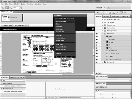
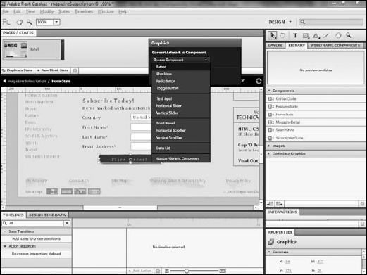
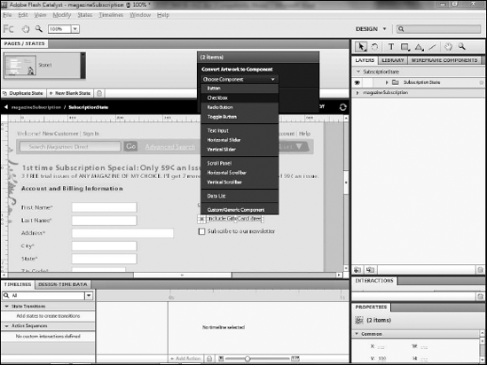
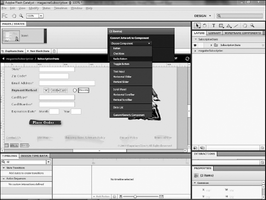
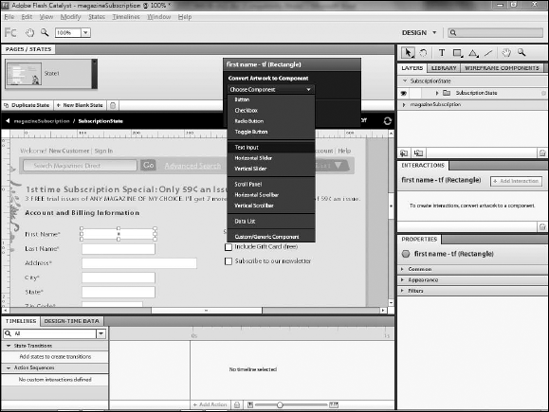
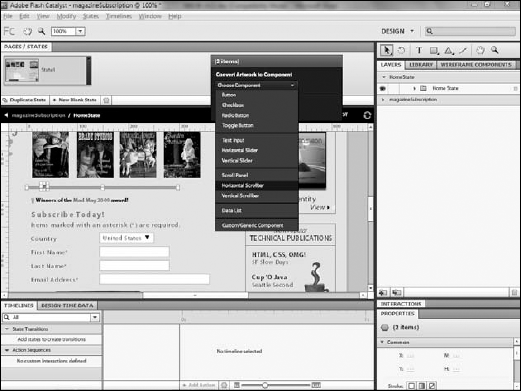
Catalyst includes the ability to convert artwork into one of 11 common Flex user interface components. They are:
Button
Checkbox
Radio Button
Toggle Button
Text Input
Horizontal Slider
Vertical Slider
Scroll Panel
Horizontal Scrollbar
Vertical Scrollbar
Data List
While those provide important building blocks for your application, most of your assets will in fact end up becoming custom components. Any element, or more often, any group of elements, that does not fit into one of the 11 existing component types will become a custom component.
More frequently, you will simply want to convert any group of related assets as a component. For example, the collection of elements that is designed to make up a view state should be converted to a custom component.
You can create a custom component by selecting the assets you want to convert, then use the heads-up display (HUD) to convert to a custom/generic component.
Note
If you have not completed the exercises in the prior chapters, you can download a version of the application for this chapter from the book's Web site (www.wiley.com/go/flashcatalystbible).
Click the Select tool.
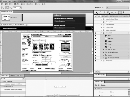
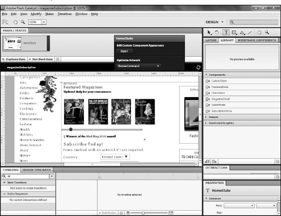
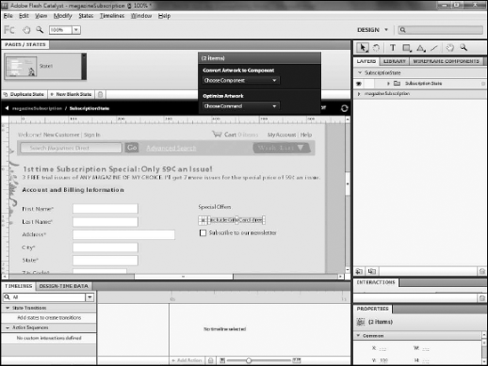
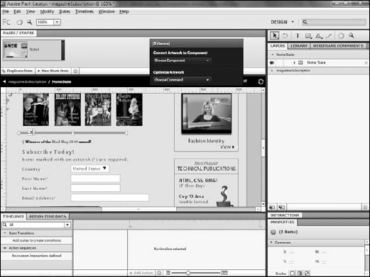
Select all of the assets that will be converted to a custom component. You can press and hold the Shift key to select multiple items. If all of the assets to be converted are in the same layer, you can simply select the layer in the Layers panel to select all of the items on that layer. In this case, click the Home State layer (see Figure 22.1).
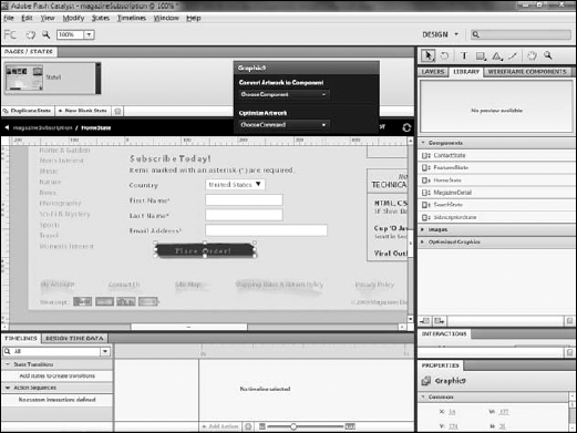
From the HUD, choose Convert Artwork to Component

Warning
Do not confuse the layer name and the component name. When you convert a layer to a component, its icon in the Layers panel changes to indicate that its only content is a component. While there is no particular harm in renaming the layer, be aware that renaming the layer will not rename the component. You must use the Library panel to rename the component.
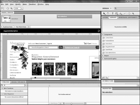
Once the artwork is converted, name your component. Components can be found in the Library under the Custom Components category. If you convert a layer to a component, Catalyst automatically names the component by appending CustomComponent to the layer name. Spaces are not allowed in component names, so they are removed. For example, the Contact State layer will become HomeStateCustomComponent.
If you do not like this potentially cumbersome name, you can change it by double-clicking the component in the Library panel and typing a new name. Component names should be reflective of their purpose.
Repeat Steps 1 through 3 to convert the contents of each state layer to a custom component. When complete, go to the Library panel, double-click each component, and rename it (see Figure 22.3).
Tip
All existing components in the Flex framework begin with a capital letter, and capitalize the first letter of each additional word in the name. Examples include TextInput and DataGrid. Because both MXML and ActionScript (the two languages in which Flex applications are written) are case sensitive, you should maintain consistency with this existing format for component names; thus, you should name the component created above something like ContactState or ContactStateComponent. The actual name is not terribly important, so long as it continues to reflect the purpose of the component.
Custom components function in a way like symbols in Flash Professional, Illustrator, or Fireworks. Just as with those other programs, Catalyst stores a single copy of the component as a part of the application and allows as many instances of it to be placed on the artboard as you want. Certain properties, such as the width, height, and position, can be changed for each instance, but most properties of the component are stored in the component itself and are only changeable by editing the component.
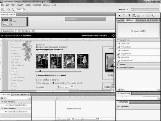
You can edit a component by double-clicking an instance of it on the artboard. The view will change to display the component itself. The Pages/States panel will display the states defined within the component. The Layers panel will update to show the layers contained within the component. While the rest of the application is still visible, any elements on the page that are not a part of the component will be grayed out. The individual artwork and assets that make up the component will be individually selectable and editable.
Warning
Any changes you make to a component while editing it will affect every instance of the component throughout the application.
Click the Select tool.
Double-click the component instance on the artboard (Figure 22.4).
Use the navigation bar below the Pages/States panel to return to the application (Figure 22.5).
Most components can be nested within most other components, which allows you to maximize their reusability. Almost any aspect of your application that you need to reuse can be made into a component, and then you can nest it within any other component in which it needs to appear.
User interface components such as buttons, radio buttons, check boxes, and scroll bars will likely be nested within custom components. In the remaining exercises in this chapter, you will nest user-interface components within custom ones.
You can nest them by simply ensuring that you are editing a component when you create a new one. For example, a button will be created within a custom component if you edit that custom component when you create the button. The navigation bar just under the Pages/States panel displays the name of the component you are currently editing.
You can also nest components by copying and pasting their instances into other components or by dragging them from the library while in the editing mode of another component.
One of the most commonly used interface components in an application is a button. Whether it submits a form, takes a user to another state, or even another Web site, buttons provide core functionality that few applications can do without.
The standard Flex button is a simple gray rectangle with a label. Prior versions of the Flex framework allowed users to skin or change the appearance of buttons, but it was a fairly complex process.
Catalyst simplifies this process by enabling you to take any set of artwork from Illustrator and convert it to a button. In this way, your application's buttons can look like almost anything you want.
Note
The following exercises modify the Subscription custom component of the application. If you have not completed the exercises in Chapter 21 for importing this into the project, you can download a version that has this component from the book's Web site (www.wiley.com/go/flashcatalystbible).
If necessary, double-click the HomeState custom component to ensure that the button will be nested within the custom component.
Click the Select tool.
Click the artwork that will make up the button (see Figure 22.6). You can hold the Shift key to select multiple pieces of artwork. Alternately, you can Shift+click the layers that contain the artwork.
Note
While the examples presented here all include buttons with text labels, your buttons are not required to contain text. Obviously, they need something to make their purpose clear to the user, but carefully designed icons can be as useful as labels.
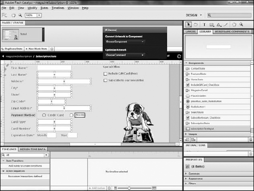
On the HUD, choose Convert Artwork to Component
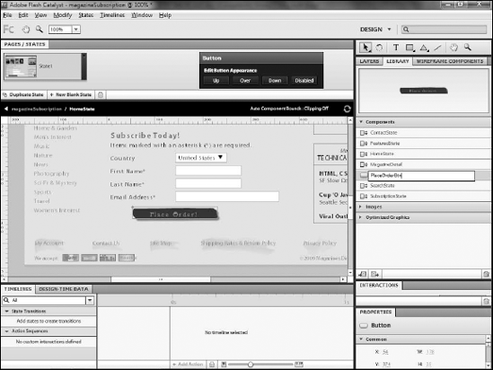
As with custom components, you will likely want to give the button a more logical and memorable name than the one automatically generated by Catalyst. Renaming a button follows the same procedure as renaming custom components.
Click Library.
If necessary, expand the Custom Components section.
Double-click the button's name.
Type a new name (see Figure 22.8).
Check boxes and radio buttons allow users to select from a group of options. Check boxes are most often used when you want your user to select zero or more options from a set of choices, while radio buttons present a set of mutually exclusive options. For example, an e-commerce site might present a set of special offers as additional purchases, and you will likely want your user to be able to select more than one of these offers, so you would present them with check boxes. Conversely, the customer can only logically select a single credit card type, so you would use radio buttons for that.
Note
The following exercises modify the Subscription custom component of the application. If you have not completed the exercises in Chapter 21 for importing this into the project, you can download a version that has it from the book's Web site (www.wiley.com/go/flashcatalystbible).
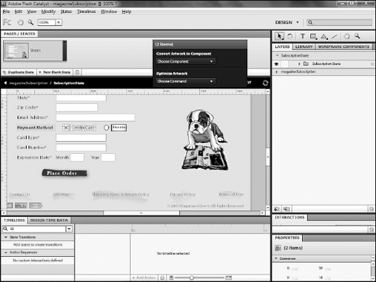
If necessary, show the SubscritionState layer and double-click its custom component.
Click the first small square that represents a check box on the form.
Shift+click the text next to the check box (see Figure 22.9).
On the HUD, choose Convert Artwork to Component
Repeat Steps 1 through 4 to convert any additional check boxes.
Radio buttons provide a set of mutually exclusive options. An order form will likely use radio buttons to allow the user to select which type of credit card he will use or to select the length of a subscription.
Note
The following exercises modify the Subscription custom component of the application. If you have not completed the exercises in Chapter 21 for importing this into the project, you can download a version that has it from the book's Web site (www.wiley.com/go/flashcatalystbible).
If necessary, double-click the
Subscriptioncustom component.With the Select tool, click the circle that will represent the radio button.
Shift+click the label next to the button (see Figure 22.11).
On the HUD, choose Convert Artwork to Component
Repeat Steps 1 through 4 to create any additional radio buttons.
You must combine radio buttons into groups so that Flash Player, when running the application, knows which sets of buttons should be handled together and limited to a single selection.
You can define a group by typing a group name in the Properties panel (any radio buttons with the same name are treated as a group). Catalyst assigns a default group name for buttons, but you should change it to something more descriptive of the group's purpose and to ensure that buttons are properly grouped.
Click one of the radio button components.
From the Properties panel, expand the Component section.
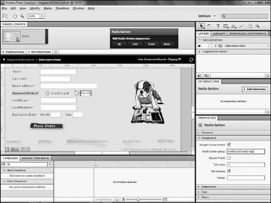
Change the Radio Button Group name (see Figure 22.13).
Note
Radio button group names must begin with a letter and can contain only letters, numbers, and underscore characters. Do not use spaces. It is recommended, but not required, that you use a lowercase letter for the first character and capitalize the first letter of any additional words in the group name. For example, a group of buttons for selecting the type of credit card might be named creditCardType.
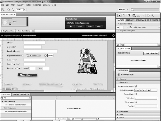
Repeat Steps 1 through 3 for the remaining radio buttons. Be sure that the names of grouped buttons match exactly, including case (see Figure 22.14).
Forms, where your users can provide information such as their name, address, and e-mail address, are likely going to be made up primarily of text fields. Text fields are likely to be drawn in Illustrator as simple rectangles, although you can actually use any shape.
Note
The following exercises modify the Subscription custom component of the application. If you have not completed the exercises in Chapter 21 for importing this into the project, you can download a version that has it from the book's Web site (www.wiley.com/go/flashcatalystbible).
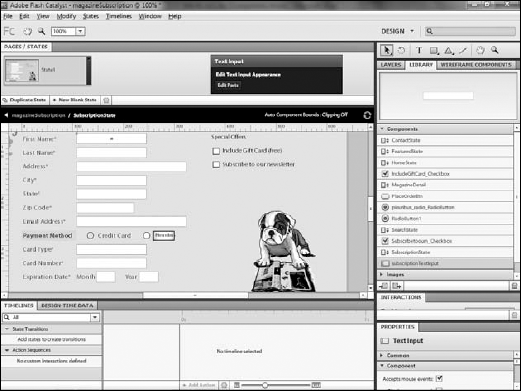
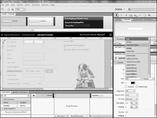
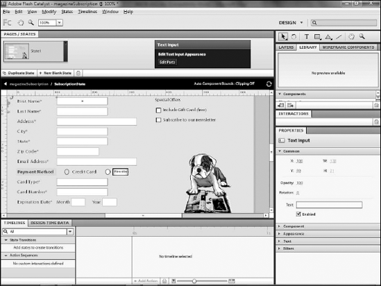
Once you've created the text input component, you can configure it. Of particular interest is the ability to configure the font properties so that you can control the appearance of the text as your user types in the field.
Select a text input component.
On the HUD, choose Edit Parts (see Figure 22.16).
Click (Text).
On the Properties panel, select the desired font settings, as shown in Figure 22.17.
Click the name of the project to return to the main editing view. In this example, you will click magazineSubscription (see Figure 22.18).
One of the primary advantages of creating components is that you can reuse them. A form, for example, does not need individual components to be defined for each field. Instead, all of the text fields can and should be instances of the same text input component.
To reuse a component, delete the artwork that represents the duplicate instances. Drag the component from the Library to the artboard.
In the Library, rename the text input component to something more generic.
Select the artwork representing each duplicate text input field (see Figure 22.19).
Press Delete on your keyboard.
Click Library.
Drag the TextInput component to the artboard. Position it as needed.
Repeat Steps 3 and 4 to re-create the remaining text fields (see Figure 22.20).
You can add scrollbars to any component that will require that the user scroll to see more content; most often, however, you will add them to data lists. As with other components, scrollbars can be created based on any artwork.
Scrollbars require at least two pieces:
Optionally, you can add two additional pieces, arrows that exist at the ends of the scroll bar that the user can click to scroll. You can create scroll bars to be either horizontal or vertical.
Note
Unlike the other exercises in this chapter, the following steps are not done within the Subscription custom component.
If necessary, click the name of the project from the navigation bar to return to the main project. Show or hide layers as necessary to view the HomeState assets. Double-click the component on that layer.
Select the art that will represent the thumb.
Shift+click the art that will represent the track (see Figure 22.21). If you have artwork representing left and right or top and bottom arrows, Shift+click that artwork as well.
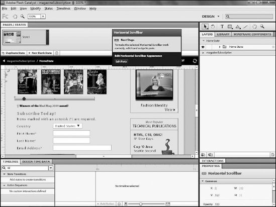
On the HUD, choose Convert Artwork to Component
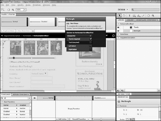
Many components will be ready to use as soon as you convert the artwork. Scrollbars, however, require an additional configuration step: You must specify which piece of artwork represents which part of the component.
Click the new scroll bar component.
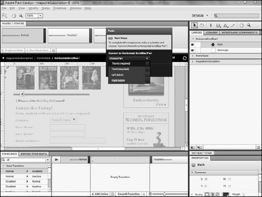
On the HUD, click Edit Parts (see Figure 22.23).
Select the artwork that represents the thumb. You can use Shift+clicking if the thumb will actually be comprised of more than one asset.
On the HUD, choose Choose Part
Select the artwork that will make up the track. You can Shift+click to select multiple pieces of artwork if necessary.
On the HUD, choose Choose Part
Click the name of the project to return to the main editing window. The thumb automatically moves to the far-left side of the track, as shown in Figure 22.26.
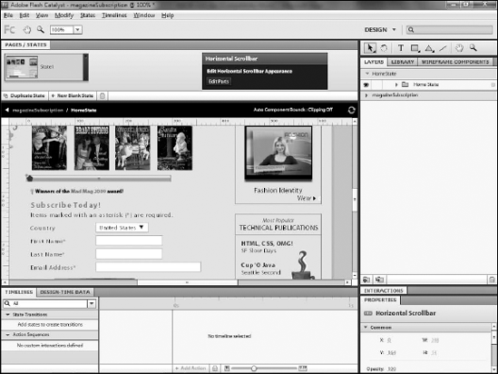
If you have artwork for the left, right, top, or bottom button, you can select it, click Choose Part, select the appropriate option for the button, and then repeat for the other button.
In this chapter, you completed the process of converting the primary pieces of the application into components. You learned how to:
Convert artwork into a custom component
Create buttons, check boxes, and radio buttons
Convert artwork to text input fields and configure the fields' font properties
Create and configure a scroll bar