
View states in a Flex application are roughly equivalent to pages in a traditional Web application. Anytime you need to change the appearance of either your entire application, or just a portion of it, you can use view states. Setting up view states in the application requires nothing more than creating a new state and then modifying its contents.
Components can contain states as well; custom components have states created in the same manner as the application, while many user interface components come with a set of pre-defined view states.
The Pages/States panel in Catalyst allows you to create and manage view states. A new application will have a single state, but the panel allows you to create as many additional states as you want. States can either be created as duplicates of an existing state or as new blank states.
Catalyst gives each state a default name of Page1, Page2, and so forth. You should give each state a logical name descriptive of its contents or purpose in the application. State names can contain only letters, numbers and underscores; you cannot use spaces.
Note
The exercises in this chapter build on the application as of the end of Chapter 22. If you have not yet completed that chapter, you can download a version of the project that you can use for this chapter from the book's Web site (www.wiley.com/go/flashcatalystbible).
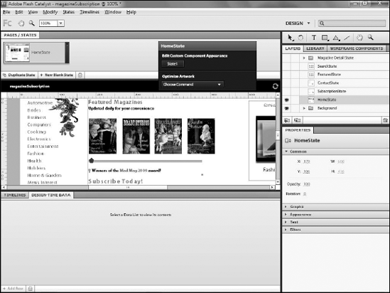
Type HomeState, as shown in Figure 23.1.
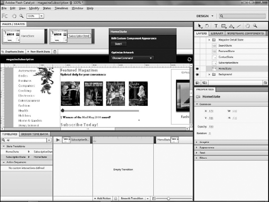
Click Duplicate State.
Double-click Page2.
Type SubscriptionState, as shown in Figure 23.2.
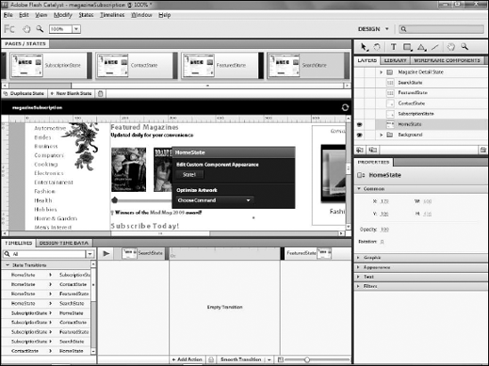
Repeat Steps 3 through 5 to add any additional states (see Figure 23.3). In this example, you will want a total of five states:
HomeState
SubscriptionState
ContactState
FeaturedState
SearchState
Note
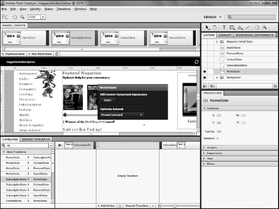
The order in which you create states is for the most part irrelevant. In the example in this chapter, each state is a duplicate of the last, so they are all the same at this point and their order does not matter. Catalyst does not have a means by which states can be reordered in the Pages/States panel, so if you prefer to have them in a particular order for organizational purposes, make sure you create them in that order.
Each state's contents can be modified at will without affecting other states. Often, modifications to states will simply involve either deleting components that you do not want in a state or hiding their layers and then either adding new components from the library or showing their layers.
Note
See Chapter 22 for details on creating components, and Chapter 9 for a discussion on the differences between hiding layers and deleting components in states. The following example hides the layer to enable animation, rather than deleting its assets which is covered later in this chapter.
Note
The exercises in this chapter build on the application as of the end of Chapter 22. If you have not yet completed that chapter, you can download a version of the project that you can use for this chapter from the book's Web site (www.wiley.com/go/flashcatalystbible).
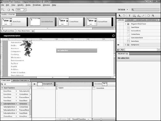
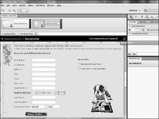
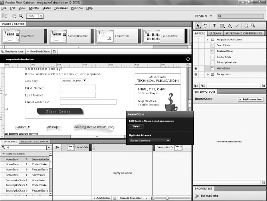
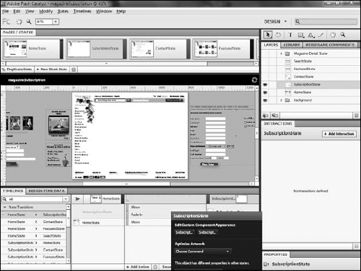
On the Pages/States panel, click the SubscriptionState (see Figure 23.4).
On the Layers panel, hide the HomeState component's layer (see Figure 23.5).
Click the eyeball icon next to the layer that contains the assets you wish to display on the state. This will display the subscription assets on the state, so that the home state and subscription state show different information (see Figure 23.6).
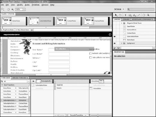
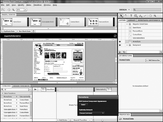
Repeat Step 3 for each additional state (see Figure 23.7). You will want to hide the assets currently on the state and then show the assets for the new state.
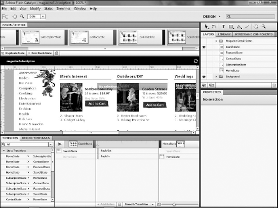
The application will now contain a set of states that display the appropriate assets for the state. Later in this chapter, you will learn how to add interactions so that your user can move between the states.
Just as the main application can contain multiple states to represent different aspects of it, components can likewise contain multiple states. For example, if you have a subscription or order form that spans multiple pages, you would likely encapsulate the form in a custom component, and then have the component contain multiple states to represent the pages of the application.
Note
See Chapter 22 for a step-by-step tutorial on creating custom components.
Note
The exercises in this chapter build on the application as of the end of Chapter 22. If you have not yet completed that chapter, you can download a version of the project that you can use for this chapter from the book's Web site (www.wiley.com/go/flashcatalystbible).
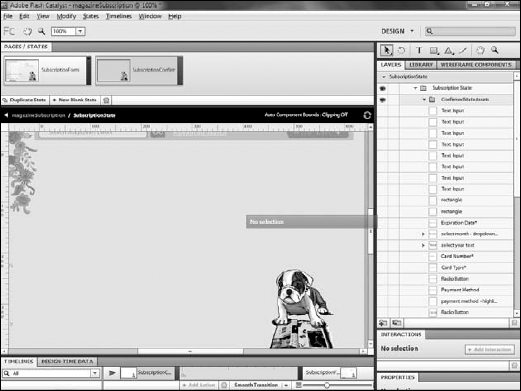
On the Pages/States panel, select the SubscriptionState.
Double-click the SubscriptionState component on the artboard (see Figure 23.8).
Rename Page1 as SubscriptionForm.
Click Duplicate State.
Rename the new state SubscriptionConfirm (see Figure 23.9).
On the Layers panel, hide the layers that contain the form elements.
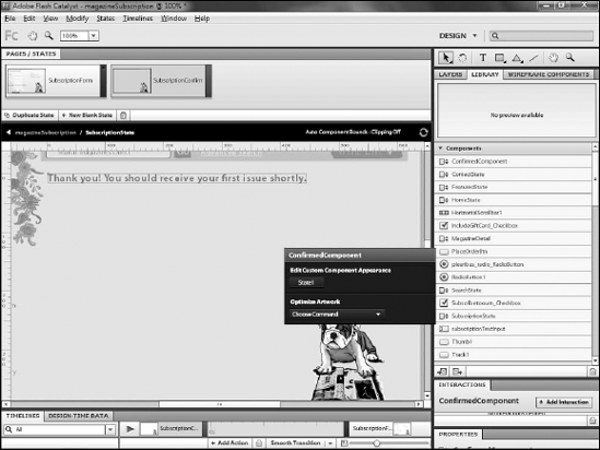
Create a new sublayer named ConfirmedStateAssets (see Figure 23.10)
On the Library panel, drag the ConfirmedComponent to the artboard. (See the Figure 23.11).
Note
If your application does not have a ConfirmedComponent, you can download it from the book's Web site (
www.wiley.com/go/flashcatalystbible).Click the main application's name on the navigation bar to exit editing the component.
You have now created a state within a component. States within components serve the same purpose as states in the main application, allowing you to display different information to your users based on their actions.
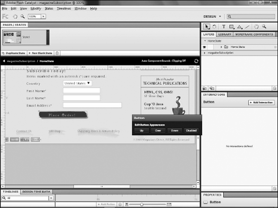
Many of the standard user interface components have default view states. Buttons, for example, have the following states:
Up
Over
Down
Disabled
Radio buttons have these states:
Up
Over
Down
Disabled
Selected Up
Selected Over
Selected Down
Selected Disabled.
These states define the appearance of the component during various expected user interactions. View state changes within these components are automatic; you need not specifically add the ability for a button to change from the Up to the Over state when the user interacts with it.
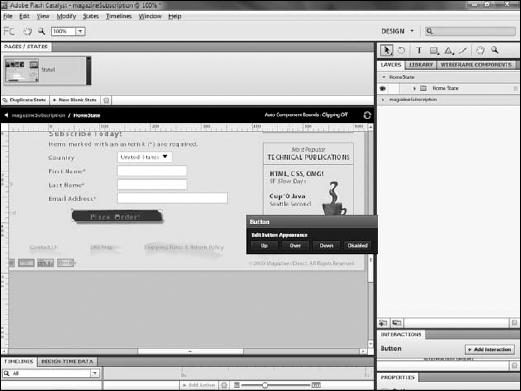
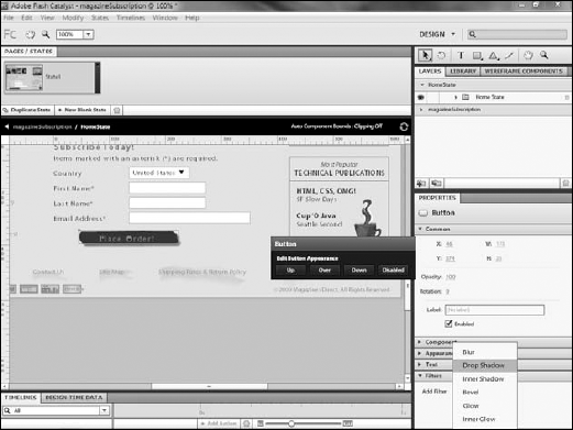
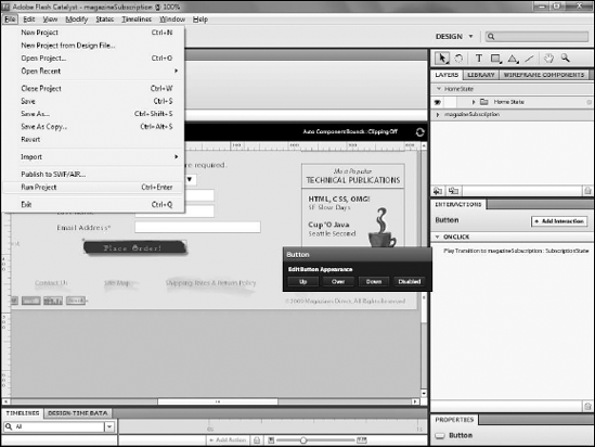
Click a button component.
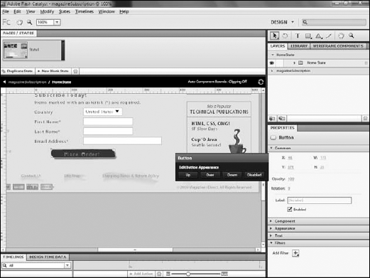
From the HUD, click either Up, Over, Down, or Disabled. Regardless of which button you click, you will switch to editing mode for the component. The state that is initially selected depends on which button in the HUD you click, but you can always simply select a different state in the Pages/States panel (see Figure 23.12).
Edit the appearance of the button as desired. In this example, a drop shadow is being added to the button in the Over state (see Figure 23.13).
Click the name of the application in the navigation bar to exit editing mode on the button.
You now have a button component that provides visual clues to the user during interaction, an important aspect of usability. If you wish, you can test the project at this point by pressing Ctrl-Enter on your keyboard. While the button will not actually do anything, you will be able to see that its appearance changes when you mouse over it.
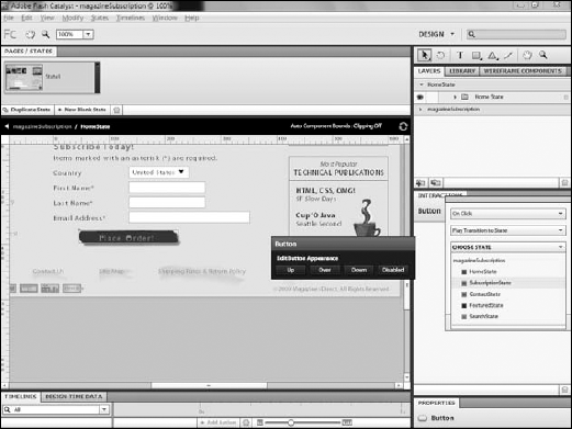
In order to allow your user to move from one state to the next, you need to add an interaction to an element in the application. Almost any component can be used for this interaction, but the most commonly used one will be a button.
Creating the interaction on a button is very straight-forward, as buttons are designed for interaction. In the following steps, you will add the ability for the user to click the Place Order button in the Home State to be taken to the Subscription State.
In the main application's HomeState, double click the component on the page and then click the Place Order button (see Figure 23.14).
If necessary, expand the Interactions panel by double-clicking its tab (see Figure 23.15).
Click Add Interaction.
Ensure that the first drop-down list is set to On Click, and the second to Play Transition to State.
From the Choose State menu, select SubscriptionState (see Figure 23.16).
Click OK. The interaction has now been added to the button (see Figure 23.17). When run through Flash Player, the application will allow users to click the button and trigger the state change.

After you create an interaction to trigger a state change, you can test it by running the project. Follow these steps:
Choose File

Click File
Click the Purchase Now button. The project will change to show the Subscription state. The transition to the state will be instantaneous.
Later in this chapter, I will discuss adding animation to the state change. Also, keep in mind that there is nothing in this application to validate that the form on the home page be filled out before moving to the subscription state.
In a real application, you would want to add the necessary code to implement validation. You would need to add this code in Flash Builder; however, that is not something currently supported by Catalyst.
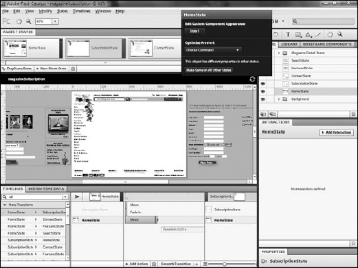
Transitions between states can be animated. Catalyst includes a set of pre-built animation effects that can be used in transitions. After you add an interaction to trigger a state change, the effected states appear on the Timelines panel. You can increase or decrease the time each transition takes and choose the effect to be played.
By default, most effects trigger instantly, which generally prevents users from seeing animation. Using the Timeline panel, you can adjust this timing to create smoother effects.
Note
Consider what types of animation effects you want to apply to components when you set up your view states. If you want to have components animate in or out of a state, you need to be sure to merely hide that component's layer, rather than deleting the component altogether.
If necessary, expand the Timeline panel by double-clicking its tab. The Timelines panel is at the bottom of the screen, as shown in Figure 23.19. If you are still editing a component, you will want to click the name of the application in the navigation bar.
On the Pages/States panel, click SubscriptionState.
On the Layers panel, click the eyeball icon to show the HomeState's assets, and the eyeball to hide the SubscriptionState's assets. You want each to slide in on the transition, so you need to show the HomeState's assets to move them off the artboard.
Double-click the Hand tool to zoom out to see the entire application (see Figure 23.20).
Click the Select tool. While pressing and holding the Shift key, drag the HomeState's component so that it is completely off the left edge of the artboard (see Figure 23.21)
On the Library panel, click the eyeball icon to show the SubscriptionState's assets.
While pressing and holding the Shift key, drag the SubscriptionState's assets off the right edge of the artboard (see Figure 23.22).
On the right side of the Timeline panel, choose the first transition, HomeState
Mouse over the bar representing the HomeState. A small half-circle appears at the edge of the bar.
Drag this half-circle to the right to expand the time over which the component appears (see Figure 23.24).
Note
The timeline is measured in fractions of seconds. A slider along the bottom of the panel allows you to zoom in or out on the timeline.
Repeat Step 3 for the SubscriptionState's Move action.
Set it to the same amount of time as the other state.
Set the Fade In action to the same timing (see Figure 23.25).
Drag both the FadeIn and Move effects for the Subscription state so that they begin when the HomeState's transition ends (see Figure 23.26).


Now that you have established the timing of the effects, users will see the Home State's assets slide off to the left, to be replaced by the Subscription State's assets sliding in from the right while also fading in.
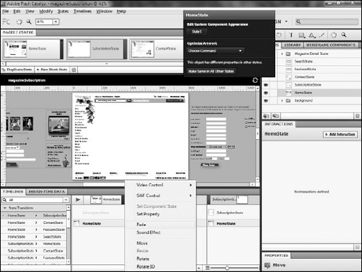
Catalyst automatically adds a Fade In effect to components being added to a state. If you reposition a component, a Move action will be applied. You can, however, add additional effects. In the following steps, a FadeOut effect isadded to the HomeState.
On the Timeline, click HomeState.
Click Add Action.
Click Fade (see Figure 23.27).
Adjust the timing of the new effect as needed (see Figure 23.28).

The animation of the Home State now matches that of the Subscription State, as both fade while they move.
This chapter demonstrated the process of creating and working with states. In it, you learned:
How to create new view states in the main application and within components
Modify components in states
Use the built-in states of certain components
Use buttons to trigger state changes
Apply animation to state transitions