
AlertDialogs are widgets that you use to give feedback or to ask for some information from your user. It is a small window that stays on top of the current screen, and only covers part of the user interface. Some use cases include asking for confirmation before deleting an item (Are you sure?), or giving some information to the user (Order completed!). In our code, we'll show our user the contact information of the Hello World Travel company.
Showing an AlertDialog widget requires a few steps:
- Calling the showDialog() method
- Setting context
- Setting builder
- Returning the AlertDialog property
- Setting the AlertDialog properties
Let's write a new method, called contactUs, at the end of the MyApp class:
void contactUs(BuildContext context) {
  showDialog(
    context: context,
    builder: (BuildContext context) {
      return AlertDialog(
        title: Text('Contact Us'),
        content: Text('Mail us at [email protected]'),
        actions: <Widget>[
          FlatButton(
            child: Text('Close'),
            onPressed: () => Navigator.of(context).pop(),
          )
        ],
      );
    },
  );
}
We are creating a contactUs method, that takes a context parameter. We then call the showDialog() function, which is required in order to show a message to the user. The showDialog function has a few properties that we need to set. The first one is context, which is basically where the dialog should be shown. This is passed to our method through the context parameter.
Next, we need to set the builder property. This requires a function, so we need to create a function that accepts a single argument of the BuildContext type, and returns a widget—in our example, AlertDialog, as shown here:
builder: (BuildContext context) {
      return AlertDialog(
An AlertDialog widget has several properties that set the behavior of the message that you show to the user. The three properties that we are using in this example are title, content, and actions. In the following screenshot, you can see the result of using those properties:
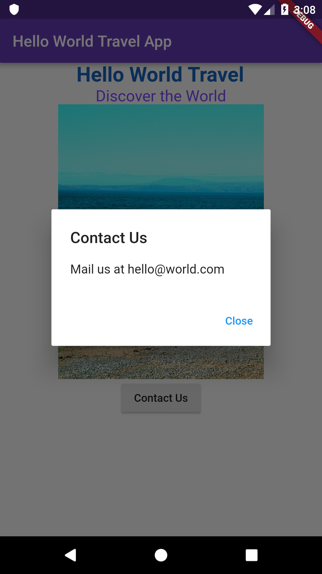
You can see the Contact Us title, the Mail us at [email protected] content, and the actions—the Close button. In the actions, when you have more than one choice, you can place more than one button.
In the following excerpt of the code, the pop() method of the Navigator class will close AlertDialog. We'll talk more about screens and navigation in Flutter in the other projects in this book:
 return AlertDialog(
        title: Text('Contact Us'),
        content: Text('Mail us at [email protected]'),
        actions: <Widget>[
          FlatButton(
            child: Text('Close'),
            onPressed: () => Navigator.of(context).pop(),
          )
        ],
Our AlertDialog is not showing yet. We need to make a couple of changes before you can use it. The first change is that we need to call the contactUs function that we have just created. We'll do that in the onPressed property of the RaisedButton widget:
onPressed: () => contactUs(context),
The second change that we need to perform is enclosing the Center widget in the body of the Scaffold widget in a Builder widget. This allows us to take the context of the Scaffold so that we can pass it to the showDialog method, as shown here:
body: Builder(builder: (context)=>Center(
For your reference, here is the final code that we have written so far:
import 'package:flutter/material.dart';

void main() => runApp(MyApp());

class MyApp extends StatelessWidget {
  @override
  Widget build(BuildContext context) {
    return MaterialApp(
        title: "Hello World Travel Title",
        home: Scaffold(
            appBar: AppBar(
              title: Text("Hello World Travel App"),
              backgroundColor: Colors.deepPurple,
            ),
            body: Builder(builder: (context)=>Center(
                child: Column(children: [
              Text(
                'Hello World Travel',
                style: TextStyle(
                    fontSize: 26,
                    fontWeight: FontWeight.bold,
                    color: Colors.blue[800]),
              ),
              Text(
                'Discover the World',
                style: TextStyle(fontSize: 20, color:
                 Colors.deepPurpleAccent),
              ),
              Image.network('https://images.freeimages.com/
               images/large-previews/eaa/the-beach-1464354.jpg',
                height: 350,
              ),
              RaisedButton(
                child: Text('Contact Us'),
                onPressed: () => contactUs(context),
              ),
            ])))));
  }

  void contactUs(BuildContext context) {
    showDialog(
      context: context,
      builder: (BuildContext context) {
        return AlertDialog(
          title: Text('Contact Us'),
          content: Text('Mail us at [email protected]'),
          actions: <Widget>[
            FlatButton(
              child: Text('Close'),
              onPressed: () => Navigator.of(context).pop(),
            )
          ],
        );
      },
    );
  }
}
Note that, should you get lost when writing your code while following any project in this book, you can always check the final version of the app at the GitHub repository. In particular, the project for this chapter is available at https://github.com/PacktPublishing/Google-Flutter-Projects.
In the next section, let's see how to use padding to add some space to our app.