
Let's now complete the UI of our app. The final result is shown in the following screenshot:
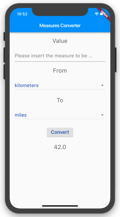
We actually need to show eight widgets on screen:
- Text containing Value
- TextField for the start value
- Text containing From
- A DropdownButton widget for the start measure
- Another Text containing To
- A DropdownButton widget for the measure of the conversion
- RaisedButton to call the method that will convert the value.
- Text for the result of the conversion
Each element of the Column should also be spaced and styled.
Let's begin by creating two TextStyle widgets. The advantage of this approach is that we can use them several times without needing to specify the styling details for each widget:
- At the top of the build() method, let's first create a TextStyle widget, which we'll use for TextFields, DropDownButtons, and Button. We'll call it inputStyle:
final TextStyle inputStyle = TextStyle(
    fontSize: 20,
    color: Colors.blue[900],
);
- Then, let's create a second TextStyle widget, which we'll use for the Text widgets in the column. We'll call it labelStyle:
final TextStyle labelStyle = TextStyle(
    fontSize: 24,
    color: Colors.grey[700],
);
- We also want Column to take some distance from the horizontal device borders. So, instead of returning a Center widget, we can return Container, which takes a padding of 20 logical pixels. EdgeInsets.symmetric allows you to specify a value for the horizontal or vertical padding:
body: Container(
   padding: EdgeInsets.symmetric(horizontal: 20),
   child: Column(
- And speaking of spacing, we want to create some space between the widgets in the column. A simple way of achieving this is using the Spacer widget: Spacer creates an empty space that can be used to set spacing between widgets in a flexible container, such as the Column in our interface. A Spacer widget has a flex property, whose default value is 1, which determines how much space we want to use. For instance, if you have two Spacer widgets, one with a flex property of 1, and another with a flex property of 2, the second will take double the space of the first. At the top of the Column let's add an initial Spacer widget:
child: Column(
   children: [
      Spacer(),
- Under the Spacer widget, add the first text in the Column containing the 'Value' string. We'll also apply labelStyle to this widget, and under Text we will place another Spacer:
Text(
   'Value',
   style: labelStyle,
),
Spacer(),
- Under the Text that contains 'Value' and its Spacer, we need to place the TextField that we previously created, to allow the user to input the number that they want to convert. Let's edit TextField so that it takes the inputStyle TextStyle. We'll also set the decoration property of the TextField.
The decoration property of a TextField takes an InputDecoration object. InputDecoration allows you to specify the border, labels, icons, and styles that will be used to decorate a text field.
- hintText is a piece of text that is shown when TextField is empty, to suggest which kind of input is expected from the user. In this case, add "Please insert the measure to be converted" as a hintText prompt for our TextField:
TextField(
   style: inputStyle,
   decoration: InputDecoration(
      hintText: "Please insert the measure to be converted",
   ),
   onChanged: (text) {
      var rv = double.tryParse(text);
      if (rv != null) {
         setState(() {
            _numberFrom = rv;
         });
     }
  },
),
- Under TextField, place another Spacer(), then a Text with 'From' and the labelStyle style:
Spacer(),
   Text(
      'From',
      style: labelStyle,
   ),
- Under the 'From' Text, place the DropDownButton widget, whose value is _startMeasure, which you wrote in the previous section:
DropdownButton(
   isExpanded: true,
   items: _measures.map((String value) {
      return DropdownMenuItem<String>(
         value: value,
         child: Text(value),
      );
   }).toList(),
   onChanged: (value) {
      setState(() {
         _startMeasure = value;
      });
   },
   value: _startMeasure,
),
- Next, add another Text for the second dropdown: in this case, the Text will contain 'To', and the style will be labelStyle, as before:
Spacer(),
Text(
   'To',
   style: labelStyle,
),
- Under the 'To' Text we need to place the second DropdownButton widget, and this requires another class member: the first DropdownButton widget used _startMeasure for its value; this new one will use _convertedMeasure. At the top of the MyAppState class, add the following declaration:
String _convertedMeasure;
- Now, we are ready to add the second DropDownButton widget: this will contain the same measures list as the previous one. The only difference here is that it will reference the _convertedMeasure variable. As usual, don't forget to add a Spacer() before the widget:
Spacer(),
DropdownButton(
   isExpanded: true,
   style: inputStyle,
   items: _measures.map((String value) {
      return DropdownMenuItem<String>(
         value: value,
         child: Text(
            value,
            style: inputStyle,
         ),
       );
      }).toList(),
   onChanged: (value) {
      setState(() {
         _convertedMeasure = value;
      });
   },
   value: _convertedMeasure,
),
- Next, add the button that will apply the conversion: it will be a RaisedButton with a Text of 'Convert', and the style of inputStyle. At this time, the onPressed event will do nothing, as we don't have the logic of the app ready yet. Before and after the button we'll place a Spacer, but this time, we will also set its flex property to 2. This way, the space between the button and the other widgets on screen will be twice the amount of the other spacers:
Spacer(flex: 2,),
   RaisedButton(
      child: Text('Convert', style: inputStyle),
      onPressed: () => true,
   ),
   Spacer(flex: 2,),
- Finally, we'll add the Text for the result of the conversion. For now, let's just leave the _numberFrom value as Text; we'll change that in the next section. At the end of the result, we'll add the largest Spacer of this screen, with a flex value of 8, in order to leave some space at the end of the screen:
Text((_numberFrom == null) ? '' : _numberFrom.toString(),
   style: labelStyle),
Spacer(flex: 8,),
- There's one very last step that we need to perform before we complete the UI. On some devices, the UI that we have designed may be bigger than the available screen when the keyboard appears on screen. This may cause an error in your app. In order to solve this issue, there's a simple solution, which I recommend that you always use when designing your layouts with Flutter. You should put the Column widget into a scrollable widget, in this case, SingleChileScrollView. What this will do is make the widgets on the screen scroll if they take more space than is available on screen. So just enclose Column into a SingleChildScrollView widget like in the following example:
body: Container(
    padding: EdgeInsets.symmetric(horizontal: 20),
    child: SingleChildScrollView(
        child: Column(
            ...
        ),
    ),
If you try the app now, you should see the final look of the app, but other than for choosing values from the DropdownButton widgets, and adding some text to TextField, the screen doesn't do anything useful. Let's add the logic of the app next.