6
FOR THE LOVE OF COLOR

WE’RE VERY EXCITED TO SHARE this chapter with you because it’s all about one of our greatest loves—color!
For years, we’ve jokingly called ourselves chromasapiens because we find color to be one of the most endlessly fascinating parts of life and art. We love how color brings art to life, and we also love the many ways we can infuse our lives with color.
From the way we dress, decorate, accessorize, cook, create, beautify, garden, and move through the world, we’re constantly making choices about color whether it’s conscious or not. Those choices, in turn, have the power to uplift, soothe, stir, unite, and either set us apart from or blend us into a crowd.
While color is a part of almost every aspect of our life experience, it’s also something that can easily go unnoticed. In this chapter, we’ll take the time to notice, collect, experiment with, and get to know colors through a variety of exercises and prompts. Through this process of befriending color, we’ll naturally discover a great deal about our personal color preferences, which will support the development of our painting style. The reason we’re dedicating an entire chapter just to color is because we believe color is one of the most vital aspects of any painting process, and it’s also a telltale sign of creative style. The way we mix, mute, pop, and combine color has the power to create an entire mood, and how we do this is an adventure all on its own. Remember, there is no right or wrong way to work with color, and that’s really the point when it comes to developing a signature style. This chapter is all about creating a very personal and intuitive relationship with color that is meaningful to you, not one that is prescribed by a book about color theory or dictated by the Pantone Color of the Year. Let’s leave all those “shoulds” behind, shall we? If you’ve ever felt overwhelmed or confused by the wide, wonderful world of color, we understand. It can be incredibly technical, or it can simply be felt and responded to. In this chapter, we’re asking you to feel and to trust. Your way with color is the right way.CREATING A RELATIONSHIP WITH COLOR

To begin, let’s explore some of the ways you currently relate to colors with this freeform Writing Inquiry. Blue makes me feel ____________ . When I look around my house, I see a lot of these colors: ________________________ . Yellow makes me feel ____________ . One of my favorite places, ____________ , is full of these colors: ________________________ . Red makes me feel ____________ . When I look in my closet, I see a lot of these colors: ________________________ . Green makes me feel ____________ . I generally avoid this color: ____________ . Orange makes me feel ____________ . When I was a kid, my favorite color was ____________ . Purple makes me feel ____________ . Currently, my favorite color combination is ________________________ . White makes me feel ____________ . When I close my eyes right now, I see ____________ . Black makes me feel ____________ . If I had to choose a color for my name, it would be ____________ . Metallic colors make me feel ____________ . People probably associate me with this color: ____________ .WRITING INQUIRY: Your World of Colors
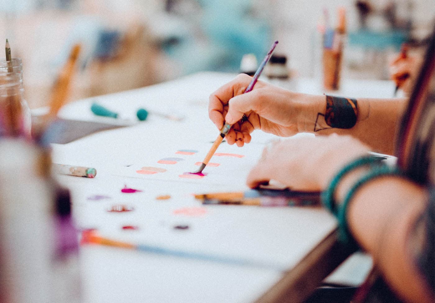
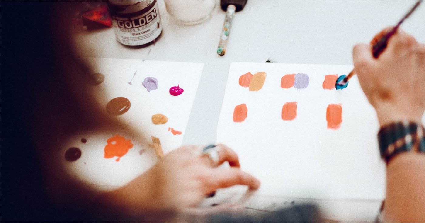
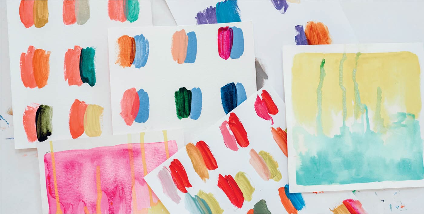
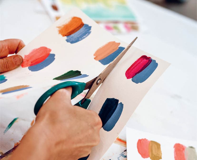
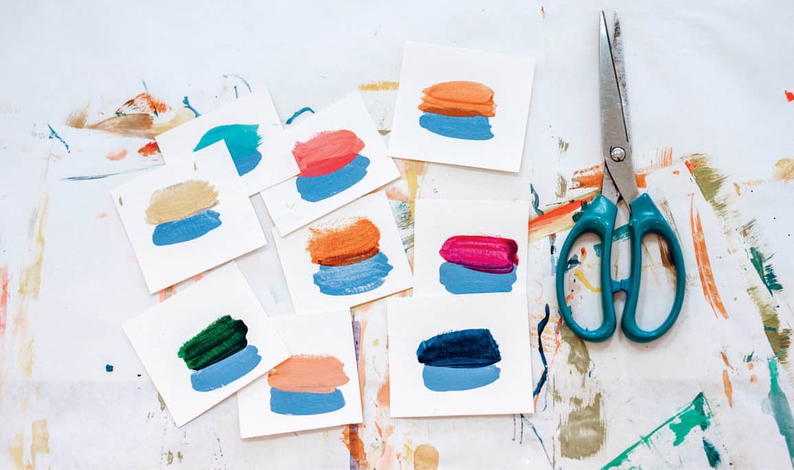
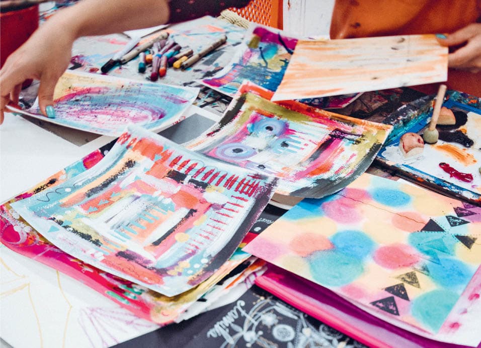
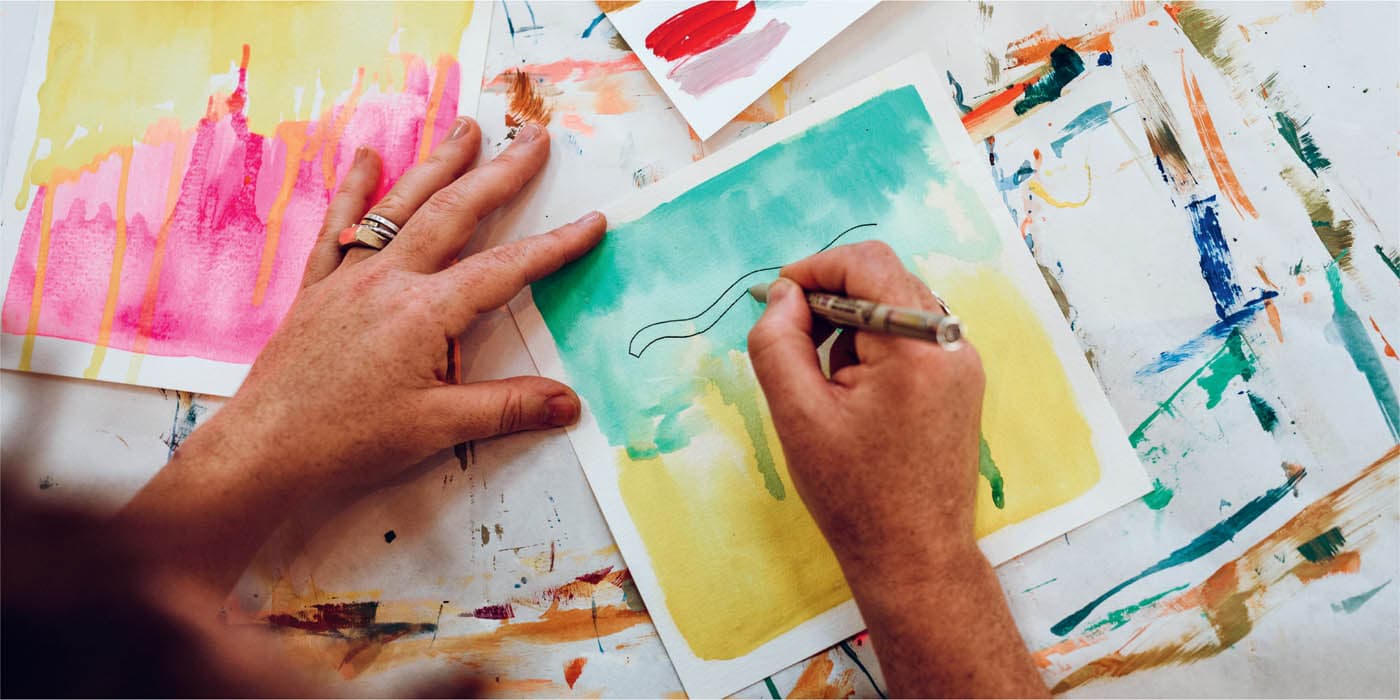
Color pairing is all about exploring the relationships between various colors—one of our favorite pastimes! We like to think of colors as “friends”—friends who we have the pleasure of getting to know more and more over time. In fact, we believe spending time and experimenting with a color is really the only way to develop a personal and deep understanding of its intricacies. The more you work with a color, the more you learn about how it behaves next to other colors, what happens when you mix it with other colors, and so on. Over time, certain colors will begin to feel like old comfortable friends you know so well, while other colors will still feel new and maybe even a little intimidating at first. That’s perfect. What’s important is to keep deepening your understanding of familiar colors while continuing to forge fresh relationships with new ones. To ensure you’re continually expanding your color family, consider buying one new paint color or brand every time you go to the art supply store while also mixing the colors you already have. Pushing your color boundaries in new directions is a great way to keep your work feeling f resh and your style evolving. A common question we hear is, “What’s your favorite color?” This question is always a bit tricky to answer because the way we think about color is less about a singular favorite and more about the dialogue different colors have with one another. For example, a teal paired with an orange is going to invite a dramatic spark of contrast because these two colors are complementary, meaning they are found opposite from one another on the color wheel. However, a teal paired with an earthy brown will have a much more subdued effect. In this exercise, we invite you to dive deep into your understanding of individual colors and the infinite possibilities each color holds in relationship to other hues. By exploring one color at a time, you’ll not only gain more information about your personal preferences, but you’ll also deepen your understanding of the way in which that color relates to the rest of the rainbow—all vital guideposts on your journey towards finding your own unique style. Color pairing is simple, fun, and intuitive. You can play with them on your watercolor paper and allow your pairings to serve as a departure point for new or in-progress paintings or, if you’d like to refer to your color pairings in the future, you can keep them separate and create an archive of pairings to reference later. You can also cut them up and make a pairing deck. To begin, choose one color to explore. We’ll call this your “starting color.” Your starting color can be a color you know and love already, a color you are less familiar with, one you tend to avoid (we highly recommend trying this), or one you mix up on the spot. “We hope you’ll love this exercise so much that you’ll be inspired to try it out with many different “starting colors.” Once you’ve selected your starting color, add five to ten swatches of it onto your paper. You can lay the color down any way you want. For example, your color swatches might be circles, fingerprints, or quick foam brush marks. They might be wild and free or tidy and organized. How the paint is applied is not important here; what’s important is what happens next. Once you have your starting color swatches on the paper, begin to ask yourself “What color am I craving next to this color?” Try not to overthink this, but rather embrace it and let it be personal. When you have a color craving, add a swatch of that color next to your starting color so you can see the two colors next to each other. After you’ve added a swatch of color, move onto the next swatch and ask yourself the same question: “What color am I craving next to this swatch?” Another guiding question you can play with is, “How can I create contrast here?” Contrast might look like adding the complement of red next to green, light next to dark, muted next to vibrant, and so on. Continue to add different colors and notice how each pairing creates a different effect. As you move across your paper, adding swatches as you go, allow your old friends to mingle with new friends and pay keen attention to what feels exciting along the way. When you’ve completed a pairing, you can begin again with a new starting color on a fresh sheet. If you’d like to create a pairing deck, simply cut up each pairing to create a stack to refer to later on. Also be sure to check out the “Integrate and Create” section for more ideas about how to play with color pairing moving forward. Remember, you might not end up liking every pairing, but exploring with a sense of curiosity is exactly how you learn more about your preferences, while discovering new things along the way. Some combinations might not turn out the way you’d hoped, but you may feel pleasantly surprised by others you hadn’t previously considered. This kind of experimentation, in turn, leads to greater clarity and confidence—two important ingredients in finding your own style.COLOR PAIRING
Befriending Colors
It’s All About the Combos
How to Color Pair


We hope the “Color Pairing” exercise helped you to connect to your intuitive sensibilities and personal cravings around color while providing new color combination inspiration for you to play with in your paintings. In the “Mini Abstract Paintings” exercise, we’ll keep exploring the idea of connecting to intuitive cravings, but this time, we’ll do it with more than two colors at a time. If you’d like to reference these color studies later, feel free to work on clean sheets of paper and set them aside when you’re done. You can also work directly onto your stack of watercolor papers to create first layers or continue working on paintings in progress. Who knows, you might even create a mini abstract painting you love with just one single layer of color craving. The practice is simple and freeing. To begin, choose one color you feel drawn to and add a little bit of that color to your page in a way that feels expressive and painterly. Next, take a look at that color and ask yourself, “What color am I craving next?” or “How can I create contrast here?” Follow your intuition and curiosity as you add the color you’re craving next to the first color. Continue this practice of adding more colors until you feel content with the number of colors in your color family. If your mini abstract painting is feeling a bit chaotic, add more of one of the colors to create more unity and cohesion. Notice how emphasizing one color changes everything. We love this exercise because it takes the emphasis off things like mark making, shape finding, and composition and allows us to simply focus on one thing: color. We find this kind of focus or restraint often leads to more freedom and unexpected breakthroughs, and often the results are quite interesting and different than what we’re used to creating when we’re trying so hard to “make a painting.” We hope you enjoy this little exploration and continue to return to it again and again any time you need a little color inspiration.MINI ABSTRACT PAINTINGS
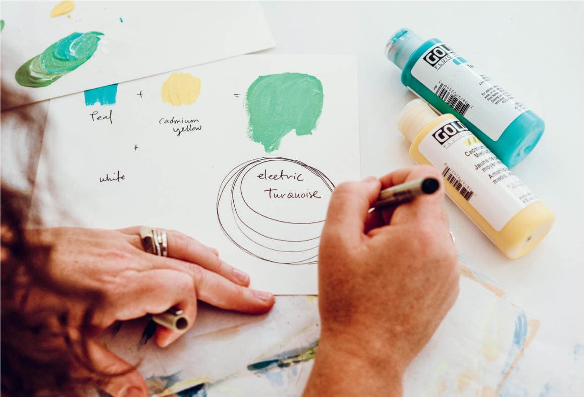
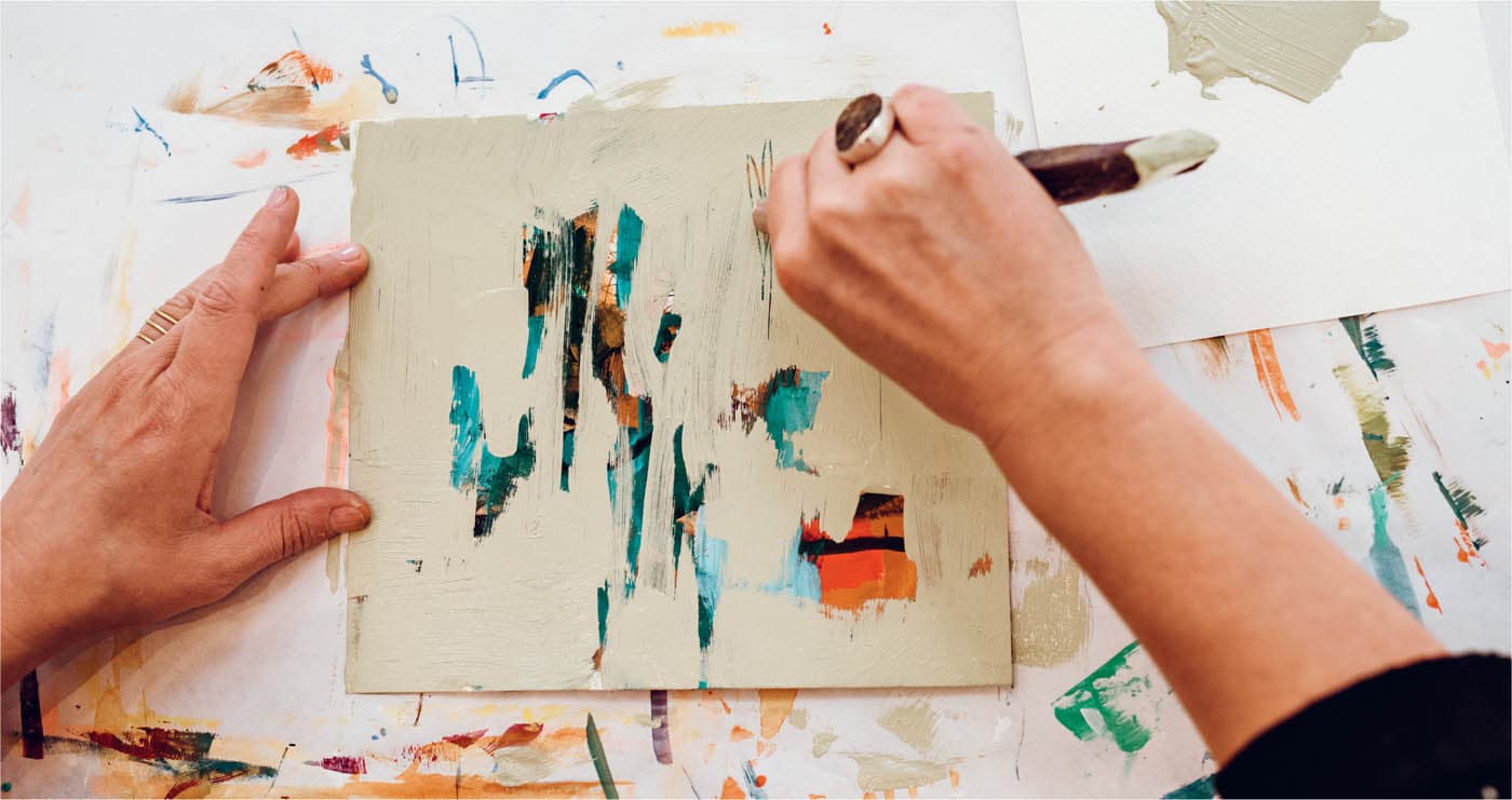
Mixing up your own colors with a playful and curious spirit is a powerful way to create a unique feel in your artwork, and that’s what this exercise is all about. We hope you’ll let go of needing to follow someone else’s rules or recipes and simply let yourself get lost in the process of experimentation. This is all about improvisation and staying on your color-mixing toes. To begin, put any version of blue, yellow, and red you feel drawn to on your palette or paper. With a fresh brush, mix any two of these colors and notice what begins to emerge as you swirl the colors together—it’s like magic, and you’re the magician! You’ll likely find that it doesn’t take very much of the darker value to radically change the lighter value, so be aware of that. For instance, if you’re mixing blue and yellow to make green, begin by adding just a small amount of the blue to the yellow. You can always add more of the darker value, but it’s tough to go the other way if it starts to overpower the lighter value. We also suggest experimenting with adding white, black, and any other colors you want to explore in your color-mixing adventures. Think mad scientist and go for it. If you find it helpful, you can write out the recipes and choose your own names for the unique colors you create. For example, you might write: 2 parts medium yellow + 1 part teal + 1 part titanium white = Soft Moss. You can write this recipe right next to the color you created. If you’ve ever wanted to be the person who names the colors at the paint store, this is your chance! Have fun with it.COLOR MIXING AND RECIPE NAMING
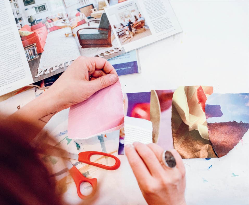
Color is truly everywhere when you really start to notice it, and that’s what this exercise is all about. By recognizing color and paying attention to what draws you to different hues and combinations, you tune yourself into the world of color. This kind of mindfulness fills your basket of inspiration, and helps you develop a sophisticated and personal color sensibility. Some of these prompts will invite you to gather color in different ways and others will simply ask you to notice it. Either way, we hope these exercises inspire you to start experiencing color in new ways. We’ve also included different ways to incorporate what you gather and notice into your paintings in the “Integrate and Create” section below.COLOR SEEKING AND FINDING
Well, this is an exciting moment. With all the color studies you just did, you’re likely full of color inspiration and ready to start adding it to your paintings. As always, you can circle back and add new layers to in-progress paintings, or you can begin new fresh paintings . . . or both. Below, you’ll find some ideas to get you going, but this is your time to play and experiment in whatever way you choose. If you’re feeling stuck, you can always ask yourself, “What color am I craving?” or “How can I create contrast?” Other questions that might be helpful are: “What’s my next baby step?”, “How can I create cohesion?”, or “What am I willing to let go of?” If you’re feeling unsure about how to begin, here are a few prompts to get you going:INTEGRATE AND CREATE
Jumping-Off Points
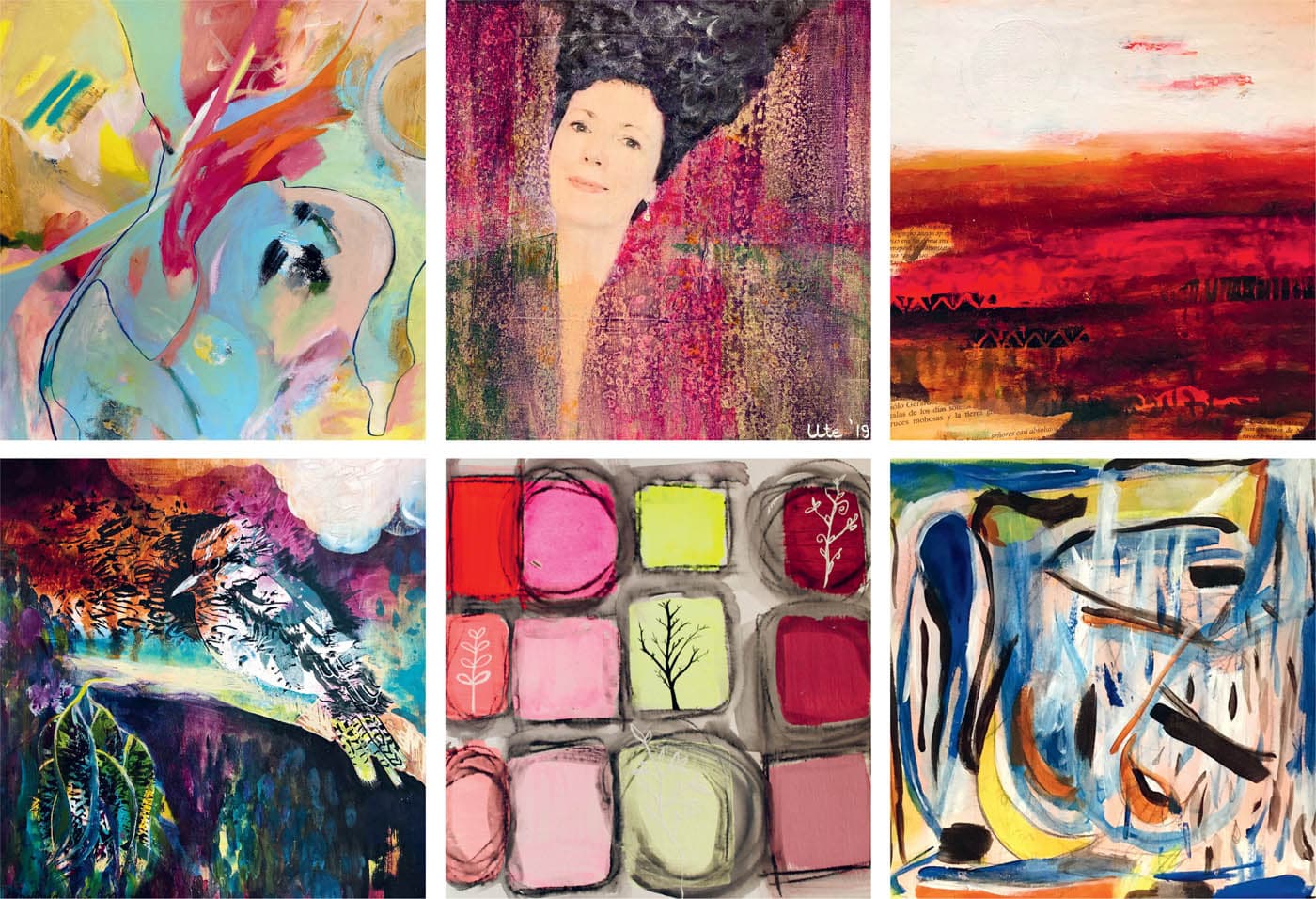
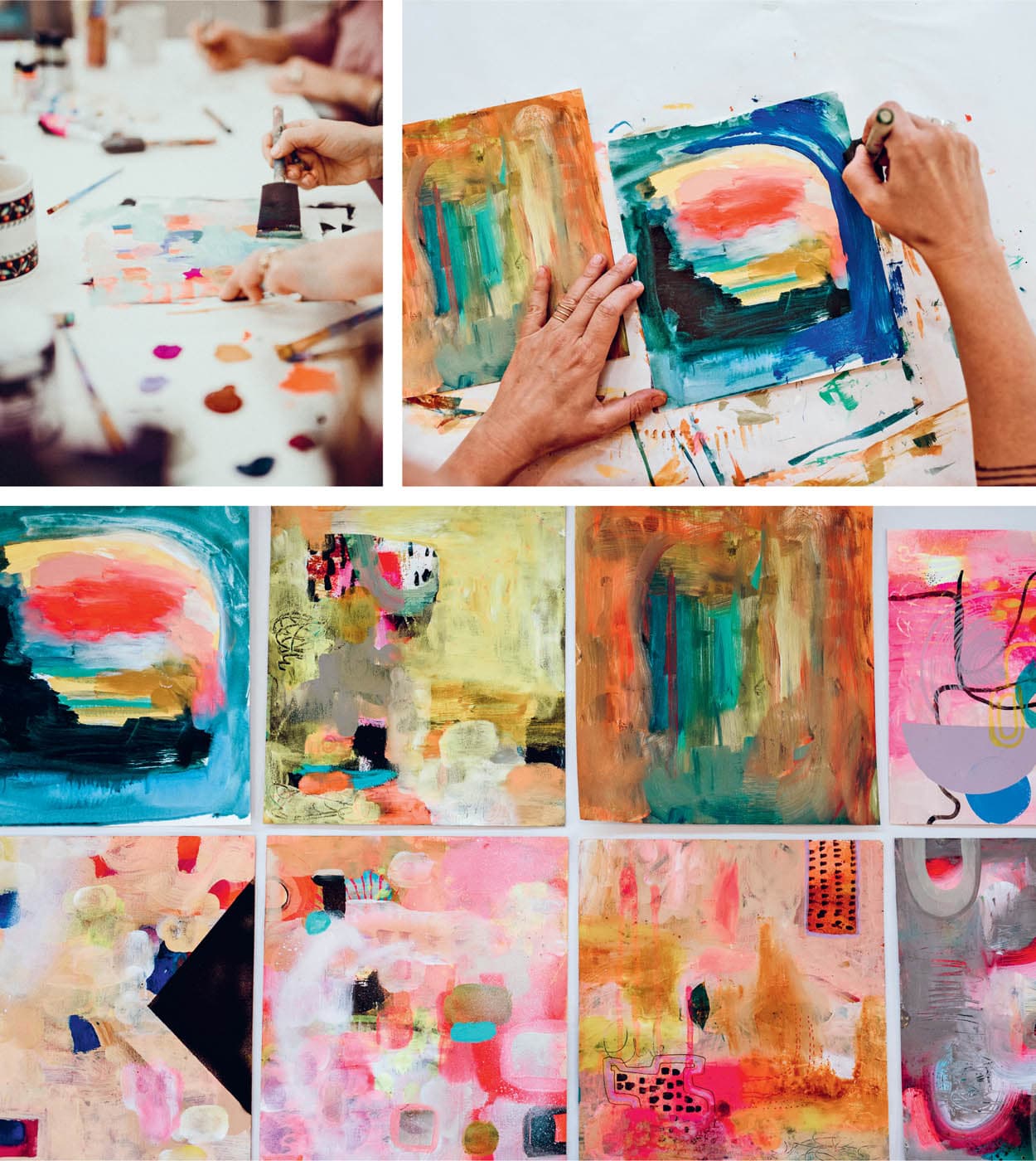
This is a sampling of paintings completed by Fresh Paint E-Course participants.
TOP ROW, FROM LEFT: BOTTOM ROW, FROM LEFT:STUDENT GALLERY
For the Love of Color