
You have seen display styles specifying the properties block and inline.
Inline elements, like the thumbnail items in your newly scrolling list, are laid out next to one another, while
block elements occupy their own horizontal line.
Another way to think of this is that block elements flow from top to bottom and inline elements flow from left to right (Figure 4.6).

The display property tells the browser how an element should flow
in the layout. For blogs or online encyclopedias, the inline
and block values work well. But for application-style layouts like web-based email and social media
sites,
there is a new CSS specification that allows elements to flow more dynamically.
This is the flexible box model, or flexbox.
Flexbox CSS properties can ensure that thumbnail and detail areas fill the screen and maintain their proportions relative to one another. This is exactly what you need for Ottergram. You can also use flexbox properties to center the contents of the detail area both horizontally and vertically, a task which is notoriously difficult using standard box model properties.
Before you add your first flexbox property, set your <html> and <body> elements
to height: 100% in styles.css.
The <html> element is the root element of your DOM tree, with the <body> as a child element drawn inside of it.
Setting the height to 100% for both of them allows the content to fill the browser or device window.
@font-face {
  ...
}

html, body {
  height: 100%;
}

body {
  font-size: 10px;
  background: rgb(149, 194, 215);
}
...
Notice that you have grouped two selectors, separated by a comma, in this styling rule. Selectors of any type can be combined in this way to set common styles.
Notice also that you now have two styling rules with the body element selector.
When the browser sees additional styling declarations for a selector, it simply adds to its
existing styling information for that selector.
In this case, it first sees that the <body>
should have a height of 100% and stores that information.
When it reads the next styling rule for the <body>, it stores
the background and font-size information
along with the height style.
Now you are ready to create your first flex container. When an element is a flex container, it can control how its child elements (its flex items) are laid out. Inside a flex container, the size and placement of flex items occurs along the main axis and the cross axis (Figure 4.7).

Make your <body> element a flex container by adding a display: flex declaration to its styling rule in styles.css.
...
body {
  display: flex;

  font-size: 10px;
  background: rgb(149, 194, 215);
}
...
If you saved now, your browser would display a rather sad-looking
Ottergram, as in Figure 4.8.
This is because the main axis goes from left to right, laying the
flex items (all the children of the <body>) out in a row.

However, you can see that the individual items shrink to accommodate the space, instead of wrapping. That is the first piece of good news. The second piece of good news is that you can fix the layout with just one style. (Well, almost.)
To fix the layout, set the <body> element’s flex-direction
to column in styles.css:
...
body {
  display: flex;
  flex-direction: column;

  font-size: 10px;
  background: rgb(149, 194, 215);
}
...
This swaps the main and cross axes for the flex container, as illustrated in Figure 4.9.

After changing the flex-direction to column, Ottergram
is back to normal – almost. There is a visual bug in the layout when the browser window
is a lot wider than it is tall, shown in Figure 4.10.

You will remedy this by adding a wrapper element and applying new flexbox properties.
The <body> has three flex items: the <header>, the .thumbnail-list,
and the .detail-image-container.
No matter what happens during the development (and use) of Ottergram, the <header> is not likely to change much in its layout or complexity.
It is going to be at the top of the page, displaying text. That is about it.
On the other hand, as you develop Ottergram the .thumbnail-list and
.detail-image-container and their contents may very well change in layout and complexity.
Also, changes to one of these items are likely to affect the other.
For these reasons, you are going to group the .thumbnail-list
and the .detail-image-container in their own flex container.
To do this, you will wrap them in a <main> tag with a class name of .main-content
(Figure 4.11).

Make it so in index.html: Give the <header> element the class main-header,
then wrap the .thumbnail-list (<ul>) and the
.detail-image-container (<div>) in a <main> element with the class main-content.
...
  <body>
    <header>
    <header class="main-header">
      <h1 class="logo-text">ottergram</h1>
    </header>
    <main class="main-content">
      <ul class="thumbnail-list">
      ...
      </ul>

      <div class="detail-image-container">
        <img class="detail-image" src="img/otter1.jpg" alt="">
        <span class="detail-image-title">Stayin' Alive</span>
      </div>
    </main>
...
.main-header and .main-content are now the two flex items inside the <body>.
By wrapping the .thumbnail-list and .detail-image-container in the .main-content
element, you are now free to declare a height for the <header>, leaving the rest of the <body>’s
vertical space for the .main-content to occupy. That way, the space inside of .main-content
can be distributed to .thumbnail-list and .detail-image-container without
affecting the header.
Save index.html.
Now that you have the markup for the two flex items inside the body,
you can set their sizes relative to one another using the flex
property.
A flex container distributes its space to the flex items inside of it. If the flex items do not specify their size along the main axis, then the container distributes the space evenly based on the number of flex items, with each flex item getting the same share of space along the main axis. This is the default, illustrated in Figure 4.12.

But imagine that one of the three flex items in Figure 4.12 is a bit greedier than the others and claims two shares of the total space. In that case, the flex container divides the space along the main axis into four shares. The greedy item occupies two of them (half the space) and the other items get one share each (Figure 4.13).

In Ottergram, you want the .main-content element to be the
greedy element, taking up as much space along the main axis
as possible. The .main-header, on the other hand, should
take up as little space as possible.
The flex property lets your flex items specify how
much of the available space they will take up. It is
a shorthand property, as shown in Figure 4.14.

We strongly recommend that you use
flex instead of the individual properties it
represents. It protects you from inadvertently leaving a property out and getting unexpected results.
The first value is the one to focus on right now, as it determines
how much the flex item can grow. By default flex items do
not grow at all. You want that default behavior for your .main-header, but not your .main-content.
In styles.css, add a declaration block for the .main-header class selector,
specifying a flex shorthand property with default values: 0 1 auto.
...
a {
  text-decoration: none;
}

.main-header {
  flex: 0 1 auto;
}

.logo-text {
  background: white;
  ...
The value 0 1 auto can be read as, “I do not want to grow
any larger; I will shrink as needed; please calculate my size for me.”
The end result will be that the .main-header will take up only
as much space as it needs, and no more.
Next, add a declaration block for .main-content, setting its
flex to 1 1 auto.
...
.logo-text {
  ...
}

.main-content {
  flex: 1 1 auto;
}

.thumbnail-item + .thumbnail-item {
  ...
The first value in .main-content’s flex declaration
corresponds to the flex-grow property.
A value of 1 tells the container,
“I would like to grow as much as possible.” Because its only sibling has
declared that it will not grow, the .main-content
element will grow to take up all the space not needed for the .main-header.
The <body>’s two flex items, the .main-header
and the .main-content elements, occupy the flexible
space according to their needs. Now it is time to adjust the
layout of the .main-content element.
Flexbox also allows you to subdivide flex items into
flex containers. This technique lets you focus on the layers.
In a moment, you are going to make your .main-content
a flex container.
Working with nested flex containers is an exception to the atomic styling approach to creating the look and feel of visual components. Instead of styling the smallest, innermost elements first and then working your way out to the largest elements, when working on a layout with flexbox it is more useful to start with the outermost elements and work your way in.
Here is what you will tackle next.
You will change the .main-content to a flex container with a
vertical main axis. Also, you will specify the flex
properties for .main-content’s flex items so that
the .thumbnail-list takes the default amount of space and
.detail-image-container grows to fill the space left over.
Finally, you will move the .thumbnail-list below the .detail-image-container (Figure 4.15).

Make these changes in styles.css by adding display: flex and
flex-direction: column to .main-content’s declaration block, adding flex
properties to .thumbnail-list’s declaration block, and writing a new declaration block for the .detail-image-container class.
...
.main-content {
  flex: 1 1 auto;
  display: flex;
  flex-direction: column;
}

...

.thumbnail-list {
  flex: 0 1 auto;
  list-style: none;
  padding: 0;

  white-space: nowrap;
  overflow-x: auto;
}

...

.thumbnail-title {
  ...
}

.detail-image-container {
  flex: 1 1 auto;
}

.detail-image {
  ...
You might be wondering why you are not defining the heights of the
.thumbnail-list and .detail-image-container
boxes with percentages, the way you defined the width of the .detail-image.
Setting the height of the .thumbnail-list at, for example, 25% and the
.detail-image-wrapper at 75% seems logical – but it would not work the way
you intend. The interaction with the width property of the
.detail-image would result in the .detail-image-container being
much too large, and the .thumbnail-list would end up either too small or too
large, depending on the window size.
In short, using the flex property to set the flex items’ sizes in conjunction with
the one fixed size you care about – the width of the .detail-image – is the way to
go.
Now to move the thumbnail list below the detail image. By default, flex items are drawn in the order that they appear in the HTML. This is known as source order and is the main way that developers control the order in which elements are drawn.
One option for moving the detail image up would be to cut and
paste the markup for the detail image so that it came before
the markup for the .thumbnail-list – to change the source order.
However, it can also be done using a new flexbox property.
To change the order using flexbox,
add an order declaration to the .thumbnail-list
selector in styles.css.
...
.thumbnail-list {
  flex: 0 1 auto;
  order: 2;
  list-style: none;
  padding: 0;

  white-space: nowrap;
  overflow-x: auto;
}
...
The order property can be assigned any integer value.
The default value is 0, which tells
the browser to use the source order. Any other values, including negative numbers,
tell the browser to draw a flex item before or after other flex items.
Giving .thumbnail-list the declaration
order: 2 tells the browser to draw it after
any of its siblings that have a lower value for order – such as
.detail-image-container, which is using the default.
Save styles.css and switch to Chrome. You will see that the thumbnails are rendered along the bottom of the page (Figure 4.16).

Next, you will continue to apply display: flex as you work on
the layout of the Ottergram UI. So far, you have worked with flex containers
that hold only a couple of flex items. Make the .thumbnail-list a
flex container so that you can further explore what flexbox can offer you.
...
.thumbnail-list {
  flex: 0 1 auto;
  order: 2;
  display: flex;
  list-style: none;
  padding: 0;

  white-space: nowrap;
  overflow-x: auto;
}
...
Do not panic if you save your changes and see that the thumbnails are rendered oddly, as in Figure 4.17.

To fix this, replace the .thumbnail-item’s width
declaration with a pair of declarations, one for min-width and another
for max-width. This will remove the variations in size that are causing
the strange layout.
You can also remove the declaration block that sets the margin-top for
.thumbnail-item + .thumbnail-item elements. It is no longer needed for this
layout.
....thumbnail-item + .thumbnail-item {margin-top: 10px;}.thumbnail-item { display: inline-block;width: 120px;min-width: 120px; max-width: 120px; border: 1px solid rgb(100%, 100%, 100%); border: 1px solid rgba(100%, 100%, 100%, 0.8); } ...
Next, you will work with the spacing of the
flex items inside of .thumbnail-list.
In styles.css, add
a declaration for justify-content
to the .thumbnail-list selector.
...
.thumbnail-list {
  flex: 0 1 auto;
  order: 2;
  display: flex;
  justify-content: space-between;
  list-style: none;
  padding: 0;

  white-space: nowrap;
  overflow-x: auto;
}
...
The justify-content property
lets a flex container control how flex items
are drawn on the main axis. You used
space-between as the value
to make sure there is an even amount of
spacing around each individual flex item.
There are five different values you can specify
for justify-content. Figure 4.18
illustrates how each of these values works.

You have tackled the layout of the .thumbnail-list.
Next, you will work with the
.detail-image-container and its contents.
The detail image should be Ottergram’s main focus. It should be front and center to make sure that the user is admiring the majesty of the otter. It should also be adorned with a snazzy title.
To center the detail image, you will first
wrap the image and its title in a container, then center the
wrapper inside
the .detail-image-container. This idea is
illustrated in Figure 4.19.
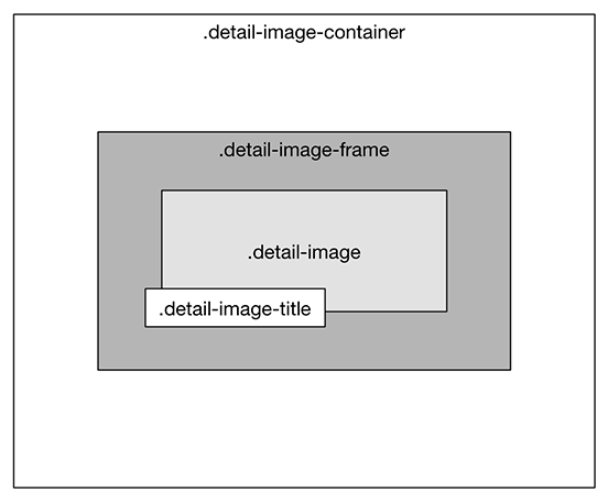
While you could center the .detail-image itself
inside the .detail-image-container, it would be
difficult to correctly offset the .detail-image-title,
because both the .detail-image and the .detail-image-container
are dynamically resizing.
An intermediary wrapper element is a useful technique for
this situation. It will constrain the size of the .detail-image
and serve as a reference for positioning
the .detail-image-title.
In index.html, begin by adding a <div>
with the class name detail-image-frame:
...
      </ul>

      <div class="detail-image-container">
        <div class="detail-image-frame">
          <img class="detail-image" src="img/otter1.jpg" alt="">
          <span class="detail-image-title">Stayin' Alive</span>
        </div>
      </div>
    </main>
  </body>
</html>
Save index.html.
Now, in styles.css, add a declaration block for
.detail-image-frame with a single
style declaration: text-align: center.
This is one way to center content without flexbox, but note that it only works horizontally.
...
.detail-image-container {
  flex: 1 1 auto;
}

.detail-image-frame {
  text-align: center;
}

.detail-image {
  width: 90%;
}
Next, to center the .detail-image-frame
inside the .detail-image-container,
update styles.css
to make .detail-image-container a flex
container. Draw its flex items in the center of the main
axis (in this case, horizontally – the default) with justify-content: center, and
add a new flexbox property, align-items: center,
to draw its flex items in the center of the cross axis (vertically).
...
.detail-image-container {
  flex: 1 1 auto;
  display: flex;
  justify-content: center;
  align-items: center;
}
...
Save your changes and enjoy the proud otter,
nobly centered in the .detail-image-container
(Figure 4.20).
