
Add a <section> tag, two <div>s, and a <form> to index.html, below
the <header> element you just created.
...
    <header>
      <h1>CoffeeRun</h1>
    </header>
    <section>
      <div class="panel panel-default">
        <div class="panel-body">
          <form data-coffee-order="form">
            <!-- Input elements will go here -->
          </form>
        </div>
      </div>
    </section>
    <script src="scripts/datastore.js" charset="utf-8"></script>
...
The <form> tag is going to be where all the
important stuff happens. You gave it a
data-coffee-order attribute with the value
form. In CoffeeRun, you will use data attributes for
accessing DOM elements from JavaScript, just as you did in
Ottergram.
For layout, you added two <div> tags. It is
not important that you use <div> tags,
specifically. What is important is that you are applying the
panel, panel-default, and
panel-body classes to them. These are Bootstrap classes that will trigger styles for you.
Remember, <div>s are just general-purpose
block-level containers for other markup. They take up
as much horizontal space as provided by their containing parent element.
They will be used often in CoffeeRun, and
you will see them throughout the examples in the Bootstrap documentation.
You may be wondering why the <section> tag wraps
around your <div> and <form>
tags. <div>s have no semantic meaning.
<section>s do: they logically
group other markup. This one will house the UI for the form.
You could easily have another
<section> of the page that is for some other
piece of the UI.
The main piece of information that you care about is the coffee order itself. If you have been in a coffee shop in the last decade, you know how complicated orders can get. For now, you will use a single-line text field to represent an order. Later you will add more fields to capture more information about the order.
When you use Bootstrap for your forms, you add extra
<div> elements that are solely for applying styles
defined in the Bootstrap library.
Add another <div> to index.html with the class
form-group. The form-group
Bootstrap class provides consistent vertical spacing for form
elements. Then add <label> and <input>
elements.
...
      <div class="panel panel-default">
        <div class="panel-body">
          <form data-coffee-order="form">
            <!-- Input elements will go here -->
            <div class="form-group">
              <label>Coffee Order</label>
              <input class="form-control" name="coffee">
            </div>
          </form>
        </div>
      </div>
...
The form-control class is another
one defined by Bootstrap. It provides layout and typography
styling for your form elements.
Save index.html and check the results in the browser (Figure 9.4).

Your <input> element defaults to a single-line text field.
Other than its form-control class, it has one attribute:
name. When a form is submitted,
the data will be sent to a server, and the name
attribute will be sent with that data. If you think about form data
as a key/value pair, then the name attribute is the
key and the data that the user types in the field is the value.
<label> tags are important usability
enhancements for your form elements. You tell a
<label> what form element it is labeling by setting
its for attribute to match the
id attribute of the form element.
In index.html, add for and id attributes
to your <label> and <input> form elements,
respectively. Give both attributes the same coffeeOrder value.
...
      <div class="panel panel-default">
        <div class="panel-body">
          <form data-coffee-order="form">
            <div class="form-group">
              <label for="coffeeOrder">Coffee Order</label>
              <input class="form-control" name="coffee" id="coffeeOrder">
            </div>
          </form>
        </div>
      </div>
...
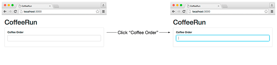
When a <label> is linked to a form element, you can click
the <label>’s text on the page and it will make the
linked form element active. You should always link your <label>s
to their form elements.
To see this in action, save index.html,
switch to the browser,
and click the Coffee Order label text.
The <input> should gain focus,
ready for you to start typing (Figure 9.5).
Because this is the first field on the screen, you want the user to be able to enter text in it as soon as the page loads, instead of having to click.
To achieve this, add an
autofocus attribute to the <input> in index.html.
...
            <div class="form-group">
              <label for="coffeeOrder">Coffee Order</label>
              <input class="form-control" name="coffee" id="coffeeOrder" autofocus>
            </div>
...
Save your changes to index.html and return to the browser. You will see that the text input field has a cursor and a highlight as soon as the page loads (Figure 9.6).

Notice that the autofocus attribute does not have a value.
It does not need one. The mere presence of the autofocus
attribute in an <input> tag tells the browser to activate that field.
The autofocus attribute is a Boolean attribute,
which means that its only possible values are true and false.
You only need to add the attribute name to the tag in order to set its
value. When it is present, it has the value true.
When it is not present, the attribute is considered false.
When you created your Truck and DataStore
modules, you tracked orders by the customer’s email address.
Now you will capture that information using another <input>
element.
Add another .form-group element to index.html with
a <label> and an <input>.
For the <input> element, set the
type as email, the name
to emailAddress, and the id to emailInput.
Also, add a value attribute, set to an
empty string. This ensures that this field is blank when
the page loads. Finally, link the <input>
and the <label> using the id.
...
          <form data-coffee-order="form">
            <div class="form-group">
              <label for="coffeeOrder">Coffee Order</label>
              <input class="form-control" name="coffee" id="coffeeOrder" autofocus>
            </div>
            <div class="form-group">
              <label for="emailInput">Email</label>
              <input class="form-control" type="email" name="emailAddress"
                id="emailInput" value="">
            </div>
          </form>
...
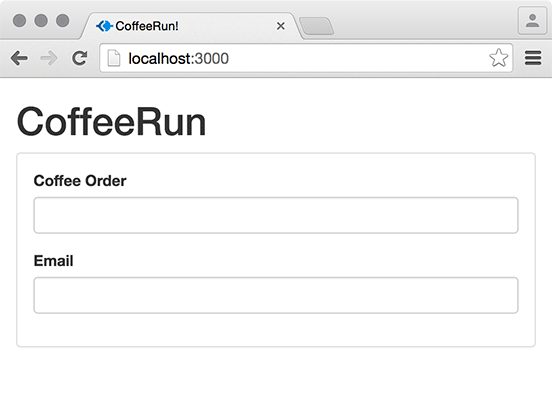
Save index.html and check the browser to see your new form field (Figure 9.7).
Sometimes users appreciate a suggestion about what they
should enter into a text field. To create example text, use the
placeholder attribute.
Add a placeholder attribute to your new <input> element in index.html.
...
            <div class="form-group">
              <label for="emailInput">Email</label>
              <input class="form-control" type="email" name="emailAddress"
                id="emailInput" value="" placeholder="[email protected]">
            </div>
...
Save your file. The result will look like Figure 9.8.

The value of the placeholder attribute appears
in the text field until the user enters some text, at which
point it disappears. If the user deletes all of the text in
the field, the placeholder text appears again.
Next, you want the user to be able to specify the size of their coffee
drink. They should be able to choose between short,
tall, and grande – and they should not
be able to choose more than one size. For this kind of data input, you can use
<input> fields whose type
attribute is set to radio.
The markup for your radio buttons will be different from
your other <input> fields. Each radio button
will have an <input> field, wrapped
by a <label> element. The <label>
will be wrapped in a <div> whose class
is also radio.
The <label> elements will not need the for
attribute that you added to the <label>s for the coffee order and email. Because
the <input> is wrapped with the <label>, they are
automatically linked.
In case you are wondering why the HTML is different for radio buttons, it is because Bootstrap styles them differently from the other form elements.
When writing your own code, you can choose to wrap an <input> element
in a <label> or to use the for attribute –
both are correct.
But, when you use Bootstrap, you must
follow its patterns and conventions for the styles to work as expected.
Refer to the Bootstrap documentation for
examples of how to structure your HTML (getbootstrap.com/css/#forms).
In index.html, add the markup for
your radio buttons just after the email <input>.
...
              <div class="form-group">
                <label for="emailInput">Email</label>
                <input class="form-control" type="email" name="emailAddress"
                  id="emailInput" value="" placeholder="[email protected]">
              </div>
              <div class="radio">
                <label>
                  <input type="radio" name="size" value="short">
                  Short
                </label>
              </div>
              <div class="radio">
                <label>
                  <input type="radio" name="size" value="tall" checked>
                  Tall
                </label>
              </div>
              <div class="radio">
                <label>
                  <input type="radio" name="size" value="grande">
                  Grande
                </label>
              </div>
            </form>
...
You gave all three of your radio inputs the same value for the
name attribute (size). This tells the browser that
only one of them can be selected (or “checked”) at a
time. You gave the Tall radio button a Boolean
attribute named checked. This
works the same way that
autofocus does: When it is
present, the value of the attribute is true
and when it is absent it is false.
Save index.html and take a look at your new radio buttons (Figure 9.9).

Try clicking either a radio button or the text next to it. Either way, that radio button should indicate that it was selected.
Some folks are crazy for flavored coffee. You want to give them the option to choose from a few different flavors. By default, no flavor shot will be added.
You could use a set of radio buttons for this, but you might add many more flavors to the list. To make sure that the flavor choices do not clutter up the UI, you will use a dropdown menu.
To create a dropdown menu styled with Bootstrap,
add a <div> to index.html with the class
form-group. Create a <select>
element with the class form-control.
Bootstrap will style this element as a dropdown.
Link it to its <label> with the id flavorShot.
Inside of the <select>, add an <option>
element for each of the menu items you want to display, giving
each of them a matching value.
...
            <div class="radio">
              <label>
                <input type="radio" name="size" value="grande">
                Grande
              </label>
            </div>
            <div class="form-group">
              <label for="flavorShot">Flavor Shot</label>
              <select id="flavorShot" class="form-control" name="flavor">
                <option value="">None</option>
                <option value="caramel">Caramel</option>
                <option value="almond">Almond</option>
                <option value="mocha">Mocha</option>
              </select>
            </div>
          </form>
        </div>
      </div>
...
Each of the <option> elements provides one of the
possible values, while the <select>
element specifies the name.
Save index.html and check that your
dropdown is displayed with all of the options
you added (Figure 9.10).

By default, the first <option> element is
selected. You can also add the
selected Boolean attribute to an
option element, if you want one other than the first to be selected automatically.
You set the value attribute to an empty string
for the first dropdown item.
If you left off the value attribute completely,
the browser would have used the string "None" as the
value. It is best to set the value attribute, as
you should never assume that browsers will do what you
expect.
Not everyone wants a killer coffee buzz. You want to let users choose a value between 0 and 100 for the strength of their coffee. On the other hand, you do not want them to have to type in an exact value.
For this, add an <input> element in index.html whose
type is range. This creates a range slider. The <input>
and <label> should be linked and wrapped in a <div>
with the form-group class. Go easy on your coffee customers and
provide a default value of 30.
...
                <option value="mocha">Mocha</option>
              </select>
            </div>
            <div class="form-group">
              <label for="strengthLevel">Caffeine Rating</label>
              <input name="strength" id="strengthLevel" type="range" value="30">
            </div>
          </form>
...
Save index.html and try out your new slider in the browser. It will look like Figure 9.11.

The last thing to do in the markup is to add a Submit button. As a usability convenience, you should also add a Reset button to clear the form, in case the user wants to start over.
Normally, Submit buttons are just an <input> element
whose type is submit. Likewise, Reset buttons are
<input> elements whose type is reset.
However, to take advantage of Bootstrap’s CSS, you will use a
<button> element instead.
In index.html, add two <button>
elements with the class names btn btn-default.
Set the type of the first one to submit,
and set the type of the second one to reset.
In between the opening and closing tags, put Submit and Reset
as descriptive text.
...
            <div class="form-group">
              <label for="strengthLevel">Caffeine Rating</label>
              <input name="strength" id="strengthLevel" type="range" value="30">
            </div>
            <button type="submit" class="btn btn-default">Submit</button>
            <button type="reset" class="btn btn-default">Reset</button>
          </form>
...
When you save your changes, your browser will add the buttons at the bottom of the form (Figure 9.12).

Your Submit button will not do anything yet. That is coming in the next chapter. However, your Reset button will reset the values to their defaults.
These buttons have a pair of classes that might seem redundant. This
is a convention of Bootstrap and is purely for styling. The
btn class provides all of the standard visual
properties of a Bootstrap button. This includes rounded corners
and padding. The btn-default class adds a
white background color.
You have used the Bootstrap UI framework to style your CoffeeRun app. By applying Bootstrap’s pattern of markup and class names, your app will have a consistent look and feel for a variety of screen sizes and browser versions.
To learn more about what Bootstrap has to offer, look through the excellent documentation at getbootstrap.com/css.
Bootstrap is particularly good for quickly styling an app while you focus on the application logic. In the next chapters, you will do just that.