KNOWLEDGE
On Paper
Despite the rise of up-to-the-minute, largely free content sprouting continuously online since early 2000, design journals and magazines have maintained their relevance even when the trend was to pronounce their imminent death. Since the mid-twentieth century, design publications have maintained graphic designers informed, engaged, and challenged through an evolving stream of content that covers the most relevant practices and representatives in graphic design through the deft guidance of their editors and cadre of willing writers.
Love them or hate them, graphic design books provide comprehensive insight into the myriad subjects they cover, from exhaustive monographs to helpful how-to manuals to inspirational compendiums to educational resources to any number of other specialty topics. Proudly displayed on designers’ bookshelves around the world, graphic design books form a large library that chronicles the history and practice of the profession—lovingly designed, to boot. The selections here are only indicative of the numerous books found in each category; a visit to the bookstore is highly encouraged to discover the rest.
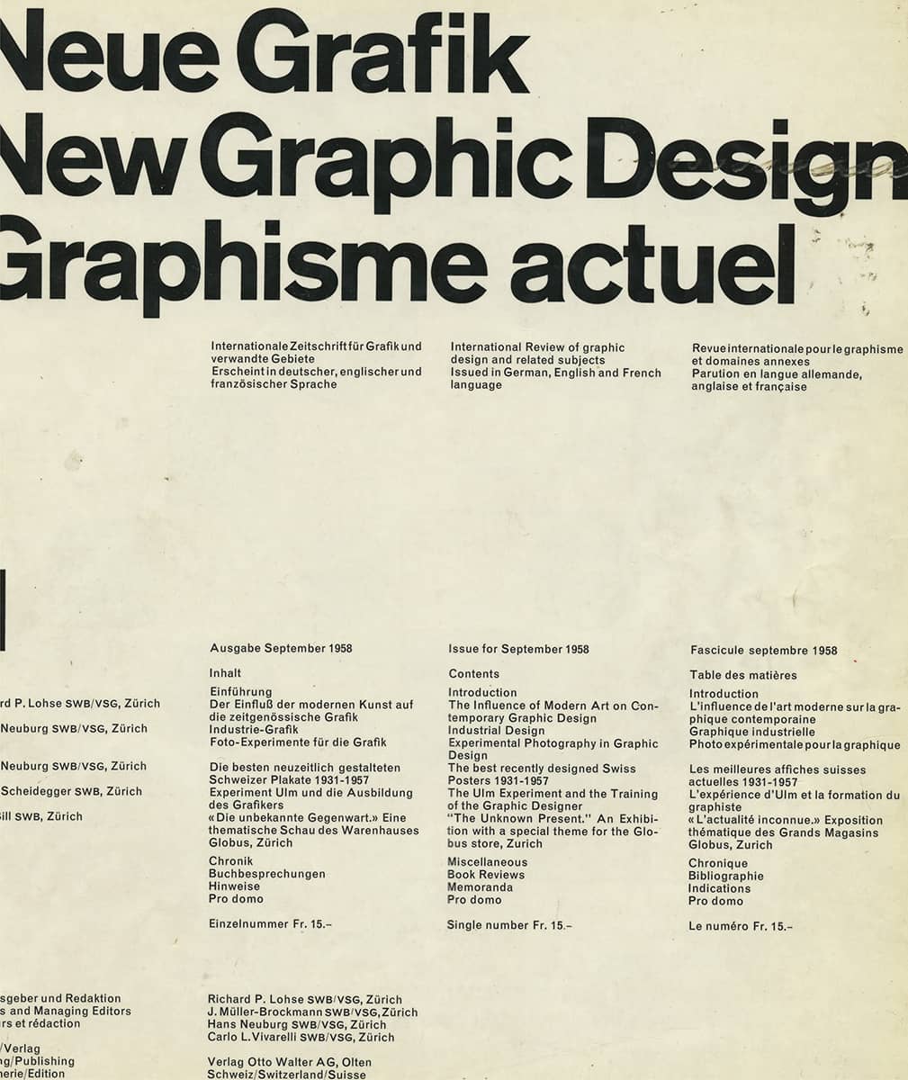
Detail of NEUE GRAFIK, ISSUE 1 / Carlo L. Vivarelli / Switzerland, 1958–1960 / From the collection of Joe Kraal
As the earliest American design publication, first published in 1940, Print was originally a technical journal for professionals in the printing and publishing industries, and it slowly grew into a general graphic design magazine. Its focus and ambition changed dramatically when Martin Fox, an aspiring playwright and hesitant design aficionado, became editor in 1963. Under Fox’s editorship, Print chronicled the burgeoning field of graphic design as it came of age in the 1960s and 1970s, publishing with equal fervor American designers and their European counterparts while establishing a precedent for design criticism with its introduction of the column “A Cold Eye” in the late 1980s. After Fox’s 40-year stay, Joyce Rutter Kaye took the helm of the magazine in 2003, where she has continued the international bent of the magazine. She also delved into touchier subjects—like sex, with a full issue devoted to the subject in 2004, the best-selling issue of that year, of course. Print is a four-time winner (1994, 2002, 2005, and 2008) and ten-time nominee in the General Excellence category of the Ellie Awards, presented by the American Society of Magazine Editors.
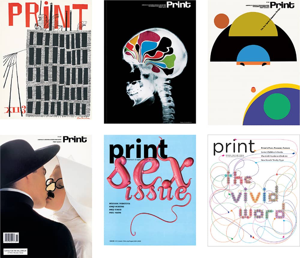
PRINT MAGAZINE / 1940–2008
Graphis
Under the selective direction of its founding editor and designer, Walter Herdeg, Graphis quickly established itself as a commanding arbiter of taste after its first issue was published in 1944. Based in Zurich, Herdeg compiled issues with exhaustive profiles of designers and illustrators from around the world, establishing a truly international publication that exposed work seldom seen by professionals in their respective continents. Beyond its periodic publication, Graphis has published numerous annuals—the first in 1952, becoming one of the most revered compendia of work—as well as individual volumes devoted to a single discipline or topic. In 1986, seasoned graphic designer B. Martin Pedersen acquired Graphis from Herdeg and moved its headquarters to New York. In the two decades since, Pedersen has maintained the thoroughness of the magazine and produced luscious annuals and compendia that continue to flank the walls of designers’ libraries around the world.

GRAPHIS MAGAZINE / USA
Typographica
In contrast to the seemingly narrow range of topics its name implies, the British publication Typographica was one of the most eclectic design publications of its time. It blended serious observations about the practice of typography and graphic design in modernism and the New Typography with photographic essays and adventurous assessments and collections of found typography, graphic ephemera, and other varied creative outlets that interested its founder, editor and designer Herbert Spencer. In 1949, at the young age of 25 and with publishing and printing support from Lund Humphries and its chairman, Peter Gregory, Spencer published the first issue of Typographica. He continued to do so for 18 years and 32 issues, which were divided in two groups, the Old Series and the New Series, each one starting at number one. The design of the magazine itself—typically laden with different papers and tactile production methods—reflected Spencer’s paradoxical interests, adding to the allure of the publication. Typographica remains an object of obsession today: The starting price for an auction of a collection of issues 1–16 on eBay is US$4,000.
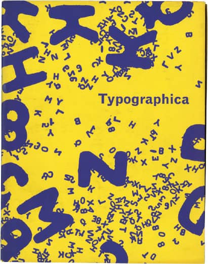
NEW SERIES, NO. 1 / UK, 1960
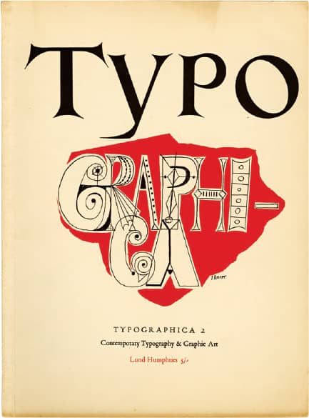
OLD SERIES, NO. 2 / UK, 1950
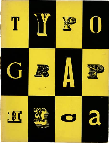
OLD SERIES, NO. 3 / UK, 1950
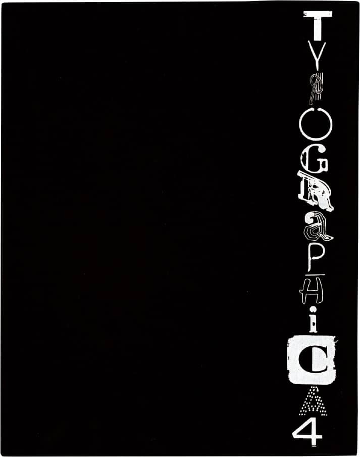
NEW SERIES, NO. 4 / UK, 1961
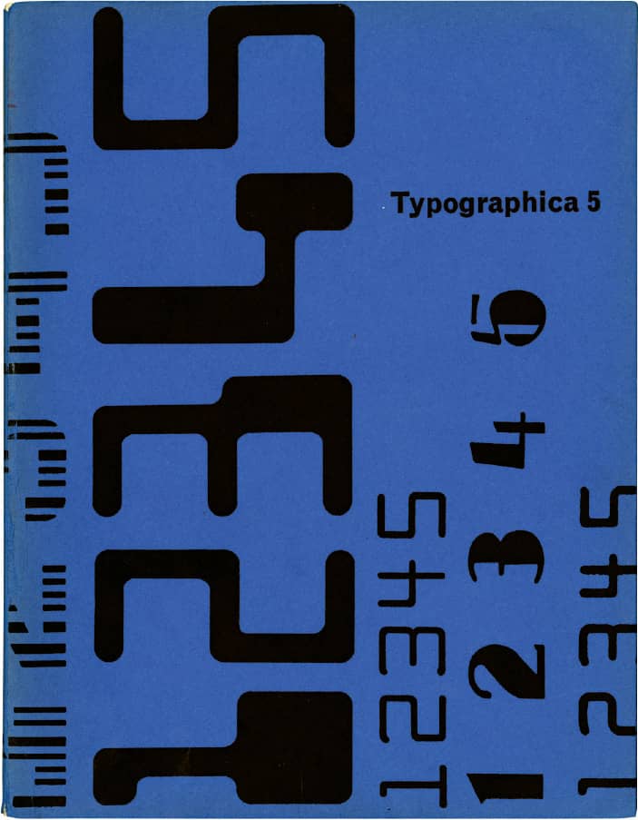
NEW SERIES, NO. 5 / UK, 1962
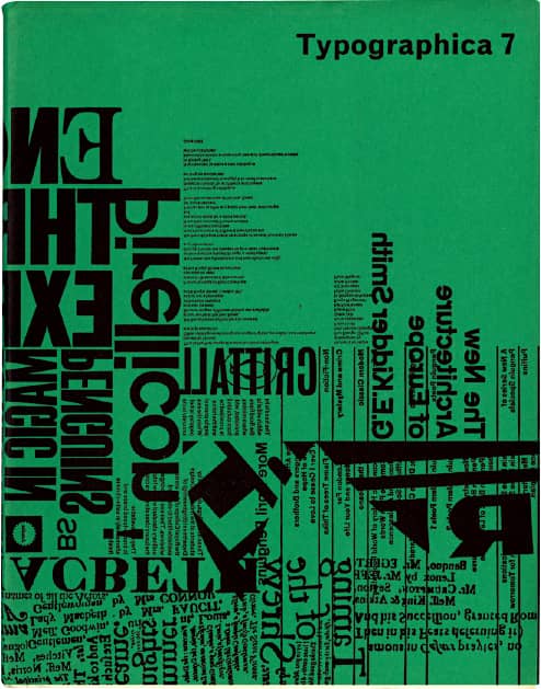
NEW SERIES, NO. 7 / UK, 1963

OLD SERIES, NO. 13 / UK, 1957
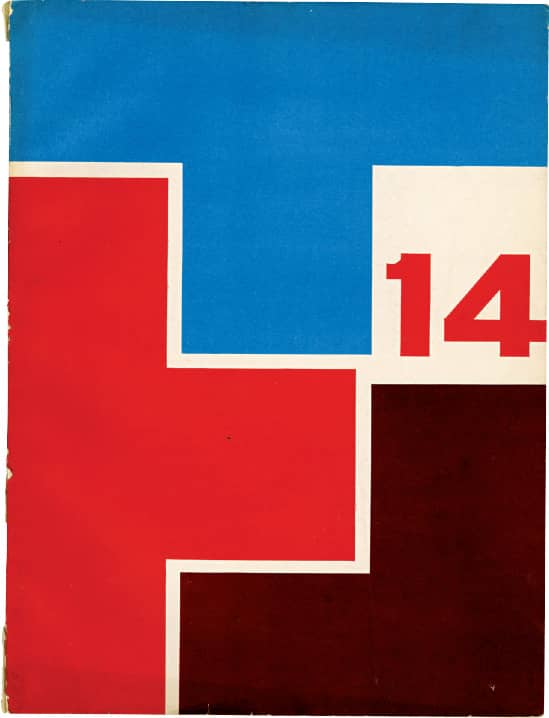
OLD SERIES, NO. 14 / UK, 1958
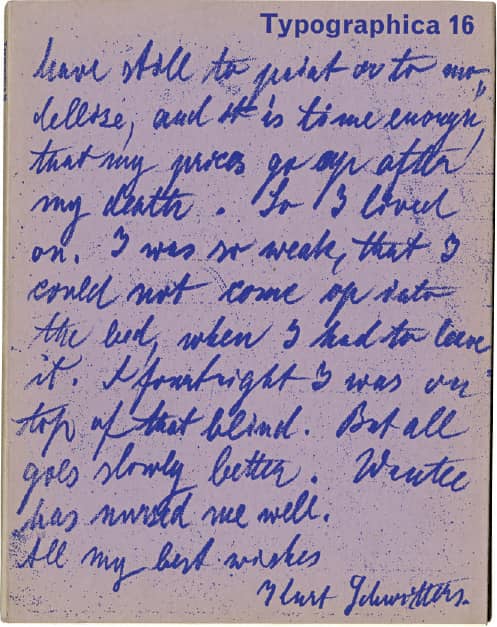
NEW SERIES, NO. 16 / UK, 1967
Communication Arts
Beckoning from within the white covers of Communication Arts since 1959, when it was launched by Richard Coyne and his partner, Bob Blanchard (it garnered an initial circulation of 5,000 in its first six months and now has an audited paid circulation over 63,000), is a consistent torrent of work produced in the fields of graphic design, advertising, photography, and illustration presented in a flatteringly austere format that continually puts the work front and center. Richard Coyne’s wife, Jean Coyne, later joined the magazine full-time, and, in 1986, their son Patrick Coyne joined the staff; both remain as editors of the magazine and continue the legacy of Richard Coyne, who passed away in 1990. Communication Arts is perhaps best known for its brutally competitive and widely browsed design annuals. The first annual, in 1960, received 5,000 entries; today it receives more than 8,000 entries and requires three days and nine judges to narrow the list down to fewer than 200 winners. Besides bragging rights, the winners look great against white.
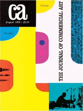
PREMIER ISSUE / design, Lloyd Price / USA, August 1959
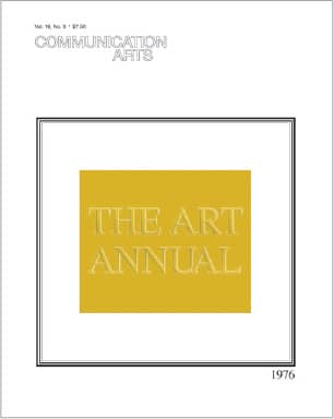
THE ART ANNUAL / design, Jean Coyne / USA, 1976
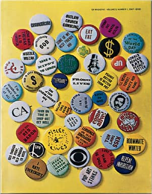
Design, Jean Coyne; photography, William Arbogast / USA, 1967

Design, Richard Coyne; photography, William Arbogast / USA, 1968
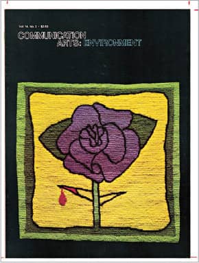
Design, Dugald Sterner; photography, William Arbogast / USA, 1972
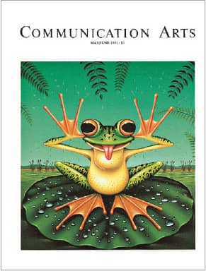
Illustration, James Marsh / USA, May/June 1991
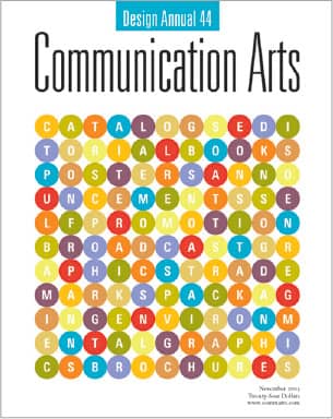
DESIGN ANNUAL / design, Patrick Coyne / USA, November 2003
COMMUNICATION ARTS MAGAZINE / USA
Industrial Design (I.D.)
In 1954, publisher Charles Whitney launched Industrial Design to cover its namesake growing field, with Jane Fisk and Deborah Allen, staff members from another Whitney publication, Interiors, acting as editors. The debut featured some of the last art direction and design by Alvin Lustig › 144, who succumbed to diabetes the following year. Over its existence, the magazine has experienced multiple changes, with different owners taking responsibility as well as different editors taking the magazine in varied directions—notable among them Ralph Caplan › 238 in the 1960s, Steven Holt and Chee Pearlman in the 1990s, and, most recently, Julie Lasky. The very name of the publication was changed—to International Design in 1988—to reflect the broadening interest and coverage of the magazine. Through it all, I.D. has surfaced as a thoughtful publication covering the numerous fields and professionals that fall under the label of design, always through a global scope. With their annual “I.D. 40” special issue, the magazine brings together some of the most influential designers in diverse industries and locations, demonstrating the richness and variety of design.
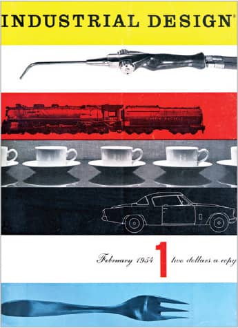
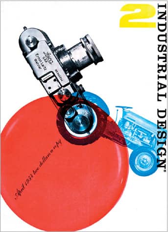

I.D. MAGAZINE, ISSUES 1–3 / Alvin Lustig / USA, 1954
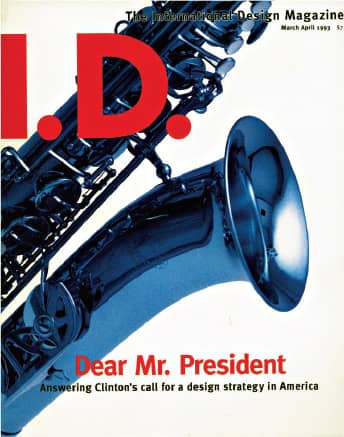
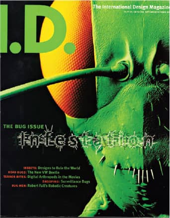
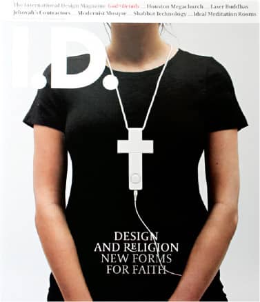
I.D. MAGAZINE / USA, 1993–2007
Neue Grafik
Officially and plainly titled, in its English translation, as New Graphic Design: International Review of Graphic Design and Related Subjects Issued in German, English, and French language, Neue Grafik was first published in 1958 by its Zurich-based editors and active proponents of the International Typographic Style, Richard Paul Lohse, Josef Müller-Brockmann › 152, Hans Neuburg, and Carlo L. Vivarelli. The latter designed the iconic four-column cover as well as the page layout, all set in Akzidenz Grotesk › 369, which came to represent the strict philosophy of Swiss design.
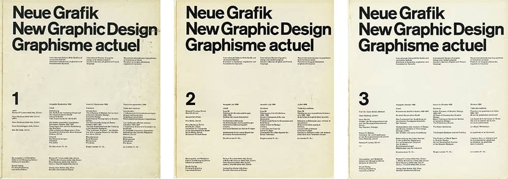
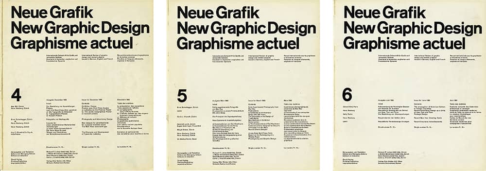
NEUE GRAFIK, ISSUES 1–6 / Carlo L. Vivarelli / Switzerland, 1958–1960 / From the collection of Joe Kraal
U&lc
At the forefront of phototypesetting was the International Typeface Corporation (ITC) › 220, started by Herb Lubalin › 167, Aaron Burns, and Ed Rondthaler in 1970, an ever-growing collection of expressive typeface designs aimed squarely at advertising agencies and the burgeoning graphic design profession. To promote its typefaces, instead of simply advertising in trade publications or mailing type samplers, ITC introduced in 1973 U&lc (Upper & lowercase), a free tabloid magazine printed in one color, on newsprint, designed exclusively with ITC typefaces, and content developed solely for this quarterly publication. In its first eight years and until his death in 1981, Lubalin edited and designed the magazine, offering dramatic and energetic layouts that showcased ITC’s products. Edward Gottschall, the editorial successor, maintained this formula until 1990. With Margaret Richardson as editor, each issue was guest-designed by lucky designers given a free hand.
The amalgam of exuberant design and relevant content that combined work from designers, illustrators, and typographers with playful collections of ephemera and typographic experiments made U&lc one of the most widely circulated and ogled design publications in the 1980s and 1990s. At its peak, the magazine’s circulation reached 200,000, and it even came to include advertising from related businesses very much aware of its reach and influence.
In the mid-1990s, things started to change as the typeface industry was revolutionized by digital production and distribution—a new environment that ITC quickly embraced. With new editor John D. Berry, ITC launched U&lc Online in 1998, a companion to the magazine that was about to undergo a radical transformation. Celebrating its twenty-fifth anniversary, the first issue of 1998 was redesigned as a glossy and measly (by comparison) letter-sized magazine, and the following issue introduced a new logo and layout designed by Mark van Bronkhorst that abruptly distanced itself from its original incarnation. Needless to say, the change was not welcome. In the fall of 1999, U&lc published its last issue. Today, designers hold on to the brittleness of its newsprint heyday.
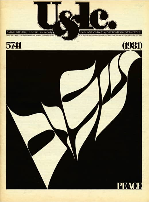
VOL. 3, NO. 2 / USA, July 1976
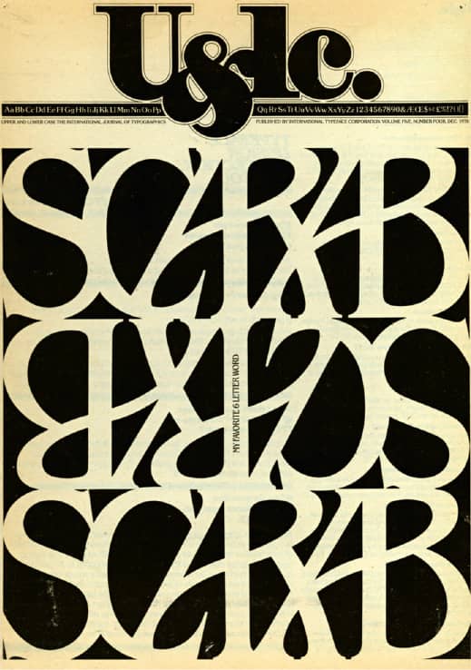
VOL. 5, NO. 3 / USA, September 1978
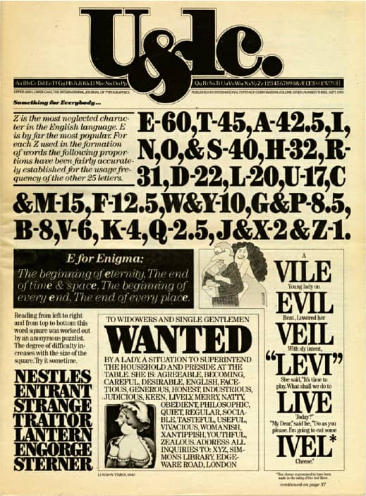
VOL. 5, NO. 4 / USA, December 1978
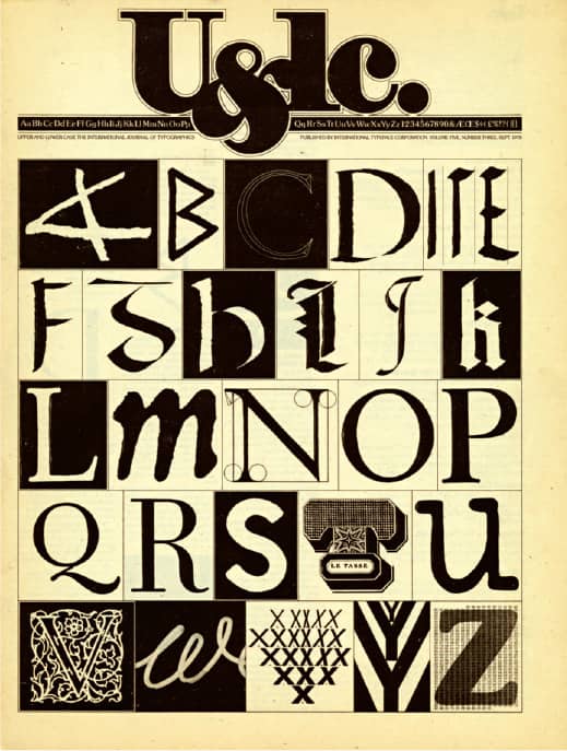
VOL. 7, NO. 4 / USA, December 1980
U&LC: THE INTERNATIONAL JOURNAL OF TYPOGRAPHICS / International Typeface Corporation / design, Herb Lubalin
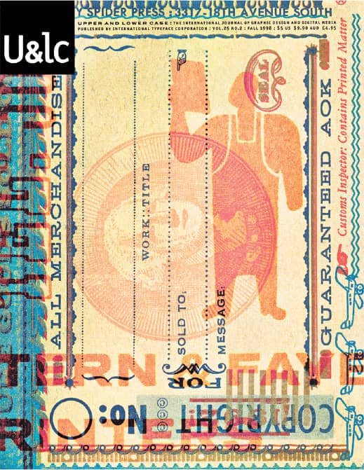
VOL. 25, NO. 1 / USA, Summer 1998
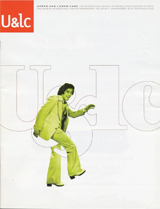
VOL. 25, NO. 2 / USA, Fall 1998

VOL. 25, NO. 3 / USA, Winter 1998
U&LC: THE INTERNATIONAL JOURNAL OF GRAPHIC DESIGN AND DIGITAL MEDIA / International Typeface Corporation / design, Mark van Bronkhorst
Baseline
First published in London in 1979 by TSI (Typographic Systems International Ltd.), a member of the Letraset Group of Companies, and founded by Mike Daines, Baseline—produced irregularly, only when material and time were available—served initially as a vehicle to promote new typeface designs. After years of inconsistent yet fulfilling publication and Letraset’s increasing business problems, Daines and Hans Dieter Reichert, who was appointed art director in 1993, purchased the magazine from Letraset in 1995. Since then, Bradbourne Publishing Limited, formed by Daines and Reichert, has published Baseline independently. Baseline has been financed, edited, designed, and produced through Reichert’s London-based design firm, HDR Visual Communication, three times a year amid the rest of their client work. In January 2007, Daines resigned from Baseline and Bradbourne Publishing Ltd. Since spring of that year, HDR Visual Communication is solely responsible for the content and the design and production of the magazine.

BASELINE MAGAZINE LOGOS / 1993–2007, 2007–present
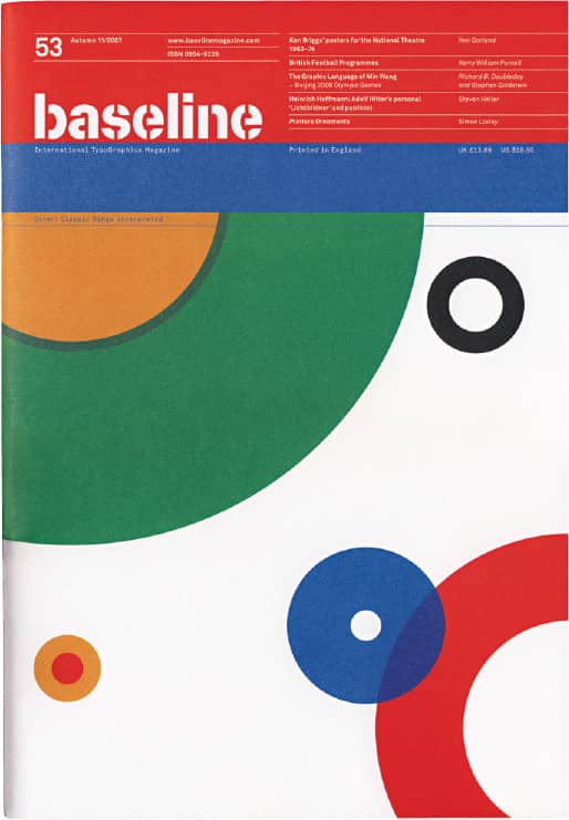
BASELINE ISSUES BASELINE MAGAZINE ISSUE 53 / Autumn 2007

BASELINE ISSUES
HDR Visual Communication / UK
Creative Review
Creative Review was launched as a quarterly in London in 1980. Its owner, Centaur, was already publishing Marketing Week and saw an opportunity for a magazine aimed at the growing community of creative professionals. Creative Review soon developed into a monthly, its readership drawn chiefly from the graphic design and advertising industries and supplemented by crafts such as photography, illustration, and commercials production. As these fields have grown and diversified, so has the magazine’s scope—in the hands of Patrick Burgoyne, editor since 1999, and, previously, Lewis Blackwell › 239, who held the position for ten years—so it now encompasses all forms of visual communication, whether commercially produced or self-initiated. Its geographical reach has also widened, with subscribers in over 80 countries and, through the CR Blog, readers in 190 countries and counting. Since 1990, Creative Review has supported the growth of young designers with their annual celebration of “Creative Futures”: designers under the age of 28 who will one day take your clients and jobs.
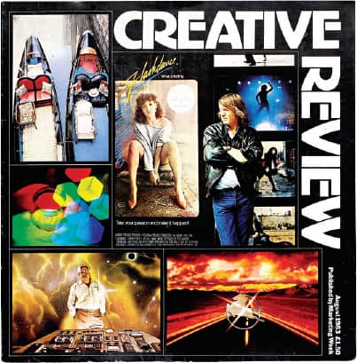
Art direction, Gary Cook; design, Substance / August 1983
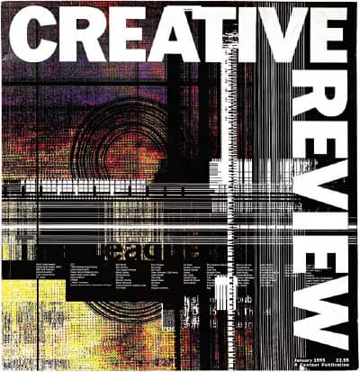
Art direction, Gary Cook; design, Substance / January 1995
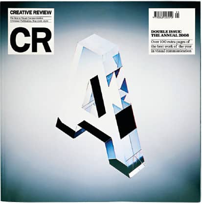
Art direction, Nathan Gale; photography, Jenny van Sommers / March 2002
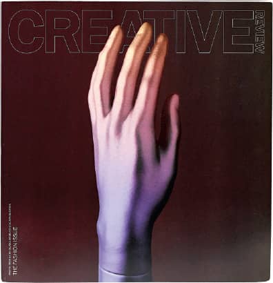
Art direction, Paul Pensom; photography, Andy Barter / March 2002
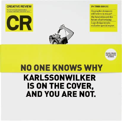
Art direction, Paul Pensom; design, Karlsson Wilker / June 2008
CREATIVE REVIEW MAGAZINE / UK / Photos: PSC Photography
Emigre
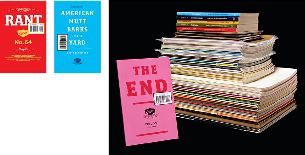
The first and subsequent handful of issues of Emigre in 1984 were not the cathartic design publication it would eventually become in the hands of its founder, editor, and designer, Rudy VanderLans. It was first conceived—by VanderLans, with fellow Dutch natives and California residents Marc Susan and Menno Meyjes—as a publication to showcase the work of photographers, writers, designers, and artists who live, or had lived, outside their countries of origin: émigrés. Three issues in, Meyjes and Susan pursued their own interests—the former wrote Indiana Jones and the Last Crusade—and VanderLans found himself with a magazine all his own that he could mold as desired. It was the right time and place for a groundbreaking publication. Just as the Macintosh was introduced and the majority of designers shied away from its potential, Emigre exploited its early quirks and limitations to produce a new design language that was out of the ordinary.
Replacing the typewriter bodies of text used in the first two issues of Emigre were coarse, bitmap digital typefaces created by Zuzana Licko › 225, VanderLans’ wife, setting a precedent for the magazine to be designed exclusively in the dozens of typefaces that Emigre Fonts › 224—the duo’s digital type foundry—would develop over the next three decades. As Emigre gained notoriety for its design and the work it showcased—like a full issue in 1988 devoted to the album covers designed by Vaughan Oliver for London-based music label 4AD › 301—it began its deep and tumultuous affiliation with the design industry. It aligned itself, perhaps unconsciously, with a fledgling cadre of students, teachers, writers, and practitioners who consistently challenged, through writing and practice, the existing tenets of graphic design, at the same time the profession was polarized by the Macintosh and experienced momentous shifts.
The first collaboration between Emigre and Cranbrook Academy of Art › 130 was in 1988, with issue 10 being fully edited, designed, and produced by the students—among them future collaborators like Ed Fella › 185, Andrew Blauvelt, Allen Hori, and Jeffery Keedy. Over the magazine’s lifespan, Emigre and Cranbrook sinuously came together regularly, as other members like Katherine McCoy › 185, Lorraine Wild, Laurie Haycock Makela, P. Scott Makela, and Elliot Earls contributed to the canon of design with their writing, typeface designs, or both. As Wild, Keedy, and Fella became teachers at CalArts › 131, that institution also became part of the unofficial fold. What these institutions and Emigre had in common—in retrospect, a sense of giddy exploration—manifested on the surface as a visually wild aesthetic that made many of their contemporaries uncomfortable. In the pages of Print › 94 in 1992, Massimo Vignelli › 160 described Emigre as “a national calamity” and “an aberration of culture,” while Steven Heller › 238 deemed it nothing more than a “blip in the continuum” in the 1993 essay “Cult of the Ugly” in Eye › 103. Even David Carson › 186 had an ongoing spat with the magazine. Despite the unpleasantness, accompanied by the ongoing challenge of self-publishing a magazine, VanderLans’s mettle carried Emigre as it continually evolved.
Unlike that seen in other design magazines, VanderLans’ editing approach allowed for extensive interviews, exhaustive profiles, reprints of older texts, and the publication of lengthy essays packaged in designs that changed completely from issue to issue, all while parading the growing collection of exclusive typefaces—sometimes to an extreme, like 1991’s issue 19, set solely in Barry Deck’s Template Gothic › 382. Until 1997 and issue 41, Emigre was produced as a tabloid, making it expensive to print and ship, even at small quantities of 3,000 to 5,000. With issue 42, the magazine underwent one of its biggest transformations: It shrank to letter size, upped its circulation to 43,000, and was distributed free. The change was drastic, but so was the increased readership and attention Emigre received—including the legendary letters to the editor, titled “Dear Emigre,” which ranged from brief, expletive-filled missives to essay-length submissions that ran unedited and generated heated back-and-forths between writers and readers. It continued in this form, publishing central writings and eclectic collections of material—from VanderLans’ own photographs of the California desert to Experimental Jetset’s pictographic ode to lost formats like cassette tapes—until 2001, when issue 60 was an audio CD, and so were the following three issues, with the exception of issue 62, which contained Earls’ confounding Catfish DVD. In a final iteration, now with only 6,000 units, Emigre was co-published with Princeton Architectural Press, and focused completely on writing. The first in this pocket book format, issue 64, Rant, was an acknowledged provocation to challenge young designers and writers “to develop a critical attitude toward their own work and the design scene in general.” It worked. Lengthy discussions on blogs like Speak Up › 113, representing the new generation, and retorts from young and previously unpublished designers and writers printed in the following issues of Emigre demonstrated there was indeed a fire to be lit. Despite this resurgence of engagement with design criticism and writing, Emigre ceased publication in 2005 with issue 69, boldly titled The End.
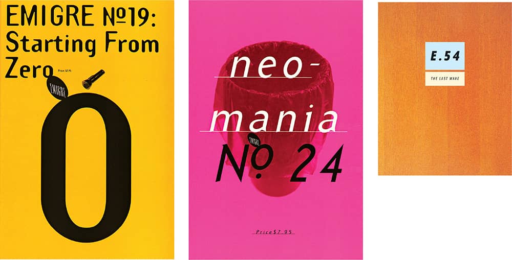
EMIGRE MAGAZINE / Emigre design, Rudy VanderLans / USA
HOW
Conceived as an offshoot of Print › 94 in 1985, HOW was originally billed as “The Magazine of Ideas and Technique in Graphic Design,” and its primary focus was how-to articles. In 1989, when it was purchased by Cincinnati-based F + W Publications and Laurel Harper became editor, the magazine shifted to a more general focus on business and creativity. Since then—and with a change of the editorial guard in 1998 to Bryn Mooth, who had been a staff member since 1990—HOW has established itself as a lively resource for business and career advice as well as some of the most energetic work from the United States. It has been able to extend that attitude and persona to the popular Design, Mind Your Own Business, and In-HOWse Designer conferences.

HOW MAGAZINE / cover art direction, Tricia Bateman / Photos: Hal Barkan
STEP inside design
With more than six years in its second incarnation as STEP inside design, it might be easy to forget that, from 1985, when it was first published, to 2002, it was called Step-by-Step Graphics, and its content was primarily a literal interpretation of its name, highlighting the skills and techniques of graphic design. Originally intended to serve designers looking to embrace desktop publishing and the possibilities of the computer, the scope of content became less relevant as the industry matured, leading to changes in name, design, and editorial approach to cover the creativity behind the design and the professionals who make it happen. Overseeing this transition was Emily Potts, the magazine’s editor from 1998 to 2006; she established a dynamic publication later headed by Tom Biederbeck. One of the magazine’s most popular and unique issues was the “STEP 100 Design Annual,” a selective compendium chosen from up to 3,000 entries. In 2009 STEP ceased publication.
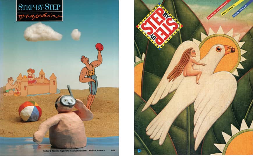
STEP-BY-STEP GRAPHICS MAGAZINE / USA, 1990, 1999
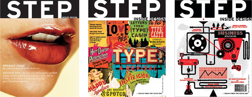
STEP INSIDE DESIGN MAGAZINE / USA, 2002, 2008, 2008
@Issue
Around 1986, writer Delphine Hirasuna and Pentagram › 162 partner Kit Hinrichs attempted to find a publisher for a proposed magazine. They envisioned a bridge between designers and corporate clients, addressing the ever-present perception that neither party clearly understands what each other contributes to their intended collaboration. Not until 1994, when Hinrichs mentioned the idea to the new marketing manager of Potlatch papers, did they find someone to underwrite the project. The Corporate Design Foundation, founded in 1985, got involved as the official publisher of @Issue: Journal of Business and Design. Since 1995, with Hirasuna as editor and Hinrichs as creative director, @Issue has been publishing real-life case studies that bring to life the original concept with incisive interviews and overviews of designers and clients working together. Offered by subscription only, its circulation is a remarkable 100,000 as of its latest issue. With the success of the magazine, a spinoff conference was started in 2006, with designers and clients speaking jointly about specific projects and further cementing the relationship between business and design.
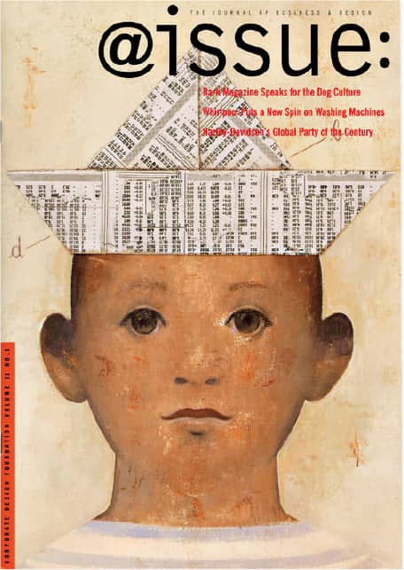
Illustration, Gerard DuBois / 2005
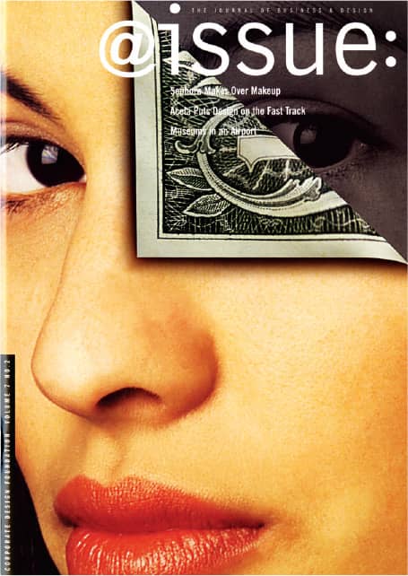
Photography, Gerald Bybee / 2001
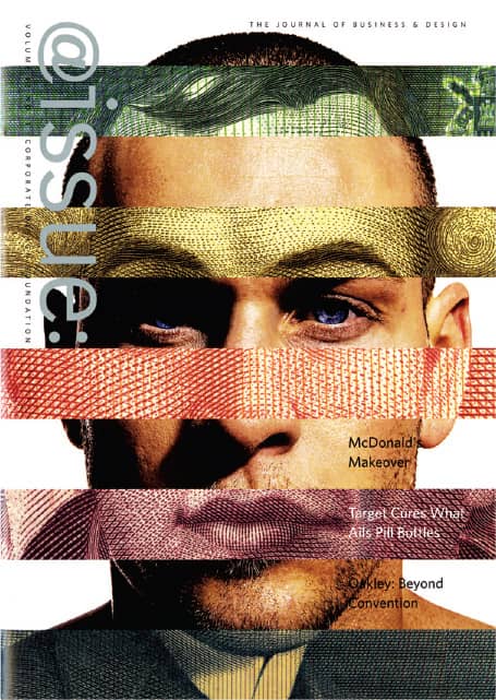
Photography, Stephen Smith / 2006
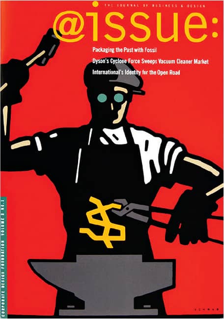
Illustration, Michael Schwab / 2002
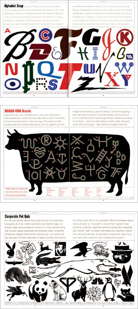
Illustration, John Hersey / 1998
@ISSUE MAGAZINE / Pentagram: Kit Hinrichs / USA
Eye
Through two decades of publishing, starting with its founding in 1990 by British writer and critic Rick Poynor › 237, Eye has established itself as one of the most diverse design publications. It continually delves deeply into the past, present, and future of graphic design with incisive, critical, and challenging writing from a multitude of writers around the world. In 1997, Dutch writer and editor Max Bruinsma › 237 took on the editorial responsibilities, and in 1999, music industry writer John Walters became the editor. Comparable in attitude to its writing, the design of the magazine has rarely settled for conventions, with a unique editorial design approach developed quite boldly between 1997 and 2005 by creative director Nick Bell and now extended by art director Simon Esterson. In 2008, Walters purchased the magazine from Haymarket Brand Media, the latest of four publishers and owners of the magazine, now self-publishing through Eye Magazine Ltd, a new company established with Esterson and business director Hannah Tyson.
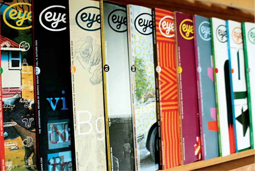
EYE MAGAZINE / UK
Critique
“The charter of Critique,” wrote Marty Neumeier in its inaugural Summer 1996 issue, “is simply this: to share insight of the craft’s greatest practitioners, so that nothing is lost on the journey forward.” For five years, Neumeier Design Team designed, edited, and financed a finely crafted design publication, offered quarterly, that kept pace with the immense changes the design profession faced in the late 1990s and into the 2000s—perhaps too closely. After 18 issues, Critique folded in 2001, due to financial reasons: the economic climate, the lack of subscribers, and the limited amount of paid advertising in the magazine. Despite its short run, Critique left an indelible mark in its readers, who mourn its absence.
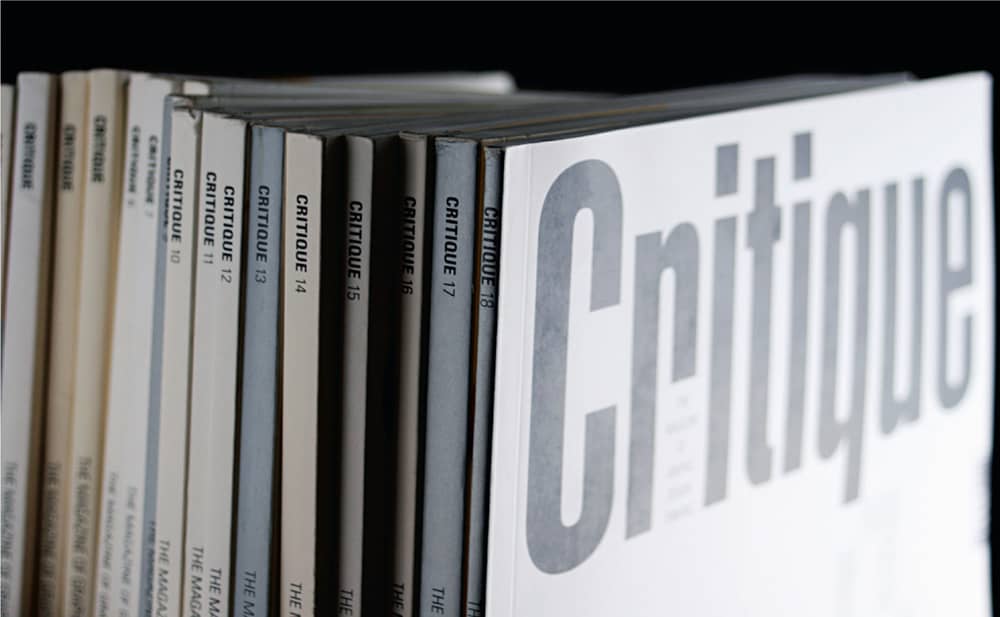
CRITIQUE MAGAZINE / Published by Marty Neumeier / USA, 1996–2001
Dot Dot Dot
As an independent magazine, published and financed by its two Amsterdam-based founding editors, Stuart Bailey and Peter Bilak, Dot Dot Dot has remarkably persevered since 2000 with a publication that feels completely different from issue to issue—and from anything else on the market—with content that straddles every fine (and not so fine) line between art, design, architecture, music, and literature. With a proudly loose editorial and aesthetic approach that serves the magazine’s title, Dot Dot Dot is, as noted in the pilot issue, “a magazine in flux” and “ready to adjust itself to content.” Perhaps what makes this publication so remarkable is that it is only one project among many the editors undertake, allowing a fluctuation of interests without being occupied with Dot Dot Dot full time. Bilak, based in The Hague, Netherlands, is a typeface designer with the large family Fedra to his credit, while Bailey, who moved to New York in 2006, operates Dexter Sinister, a “Just-In-Time Workshop and Occasional Bookstore” with designer and writer David Reinfurt. Like their magazine, their careers are open-ended.
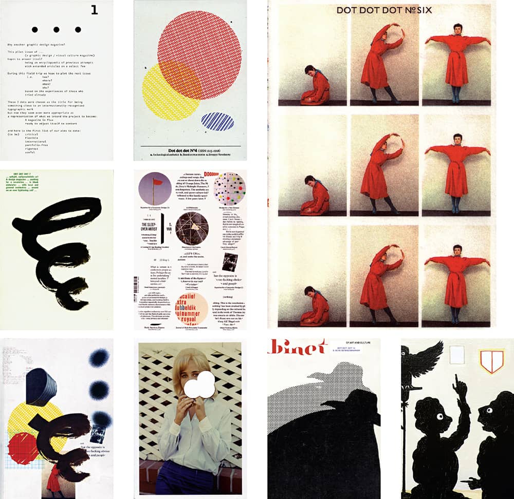
DOT DOT DOT MAGAZINE / USA, 2000–2008
AIGA Journal of Graphic Design
Between the early 1920s and World War II, the American Institute of Graphic Arts (AIGA), founded in 1914, published a newsletter (called News-Letter) that resurfaced in 1947 as the A.I.G.A. Journal. Over the next six decades the journal was published regularly, adapting to different editors, volunteers, staff, and board members and changing its name to Journal of AIGA in 1965 and then to AIGA Journal of Graphic Design in 1982. The journal had its greatest impact during the late 1980s and the 1990s. Steven Heller › 238, its editor since 1985, gathered insightful and provocative essays from practitioners around the industry chronicling the profession’s ongoing evolution. In this form, the journal’s last issue was published in 2000. The following year, a followup effort, Trace: AIGA Journal of Design, was published for four issues, and in 2004 the journal took its latest form as VOICE: AIGA Journal of Design › 113, an online publication edited by Heller and enhanced by reader comments.
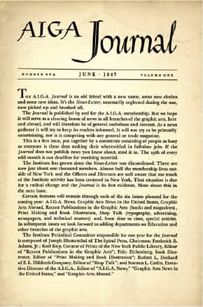
AIGA JOURNAL 1, NO. 1 / masthead illustration, Reynard Biemiller / USA, June 1947
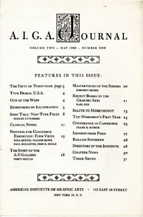
AIGA JOURNAL 2, NO. 1 / decorative initials, Mr. Valenti Angelo / USA, May 1949
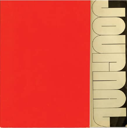
JOURNAL OF THE AMERICAN INSTITUTE OF GRAPHIC ARTS, NO. 19 / design, Antupit & Others / USA, 1971
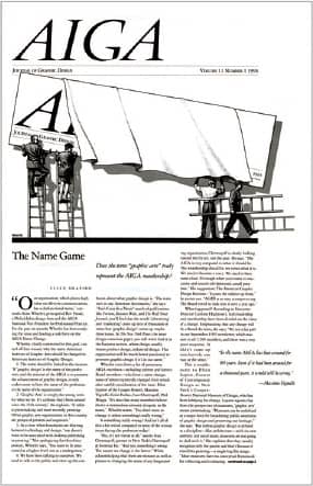
AIGA JOURNAL OF GRAPHIC DESIGN 11, NO. 1 / illustration, Mirko Ilic / USA, 1993
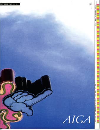
JOURNAL OF GRAPHIC DESIGN, CULT AND CULTURE ISSUE: POP GOES THE CULTURE 17, NO. 2 / writing, Ken Garland / USA, 1999
IDEA
Founded by Kikumatsu Ogawa in 1912, the publishing house of Seibundo Shinkosha created publications on themes as diverse as popular science and gardening. One of its magazines was Koukoku to Chinretsu (Advertising and Display), first published in 1926 and covering the world of advertising in Japan, ceasing publication in 1941 due to World War II. A successor came in 1953—IDEA, headed by editor-in-chief Takashi Miyayama and art director Hiroshi Ohchi—with an editorial policy to bridge Japan and the world in the context of modern graphic design. Miyayama and Ohchi established IDEA’s exhaustive and authoritative display of work, with whole issues devoted to single designers from around the world. The two founders left in 1964 and 1974 respectively. IDEA remains active today under the leadership of Kiyonori Muroga and Toshiaki Koga.
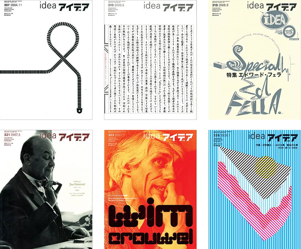
IDEA MAGAZINE IN RECENT YEARS / Japan
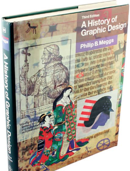
A HISTORY OF GRAPHIC DESIGN, By Philip B. Meggs / John Wiley & Sons, 1983 (1st ed.), 1992 (2nd ed.), 1998 (3rd ed.), 2005 (4th ed.)
Now that it is in its fourth edition (2005), with translations into Chinese, Hebrew, Japanese, Korean, and Spanish, it’s safe to say that Philip B. Meggs’ detailed and exhaustive narrative of graphic design is perhaps the most influential tract on the impressively broad history of the profession and the numerous social, cultural, political, and economical shifts that have contributed to its development since humans first drew a horse on a cave’s wall. While it’s not a book to sit with next to a fireplace on a rainy weekend, Meggs should be found on the bookshelf of every designer for continued reference.
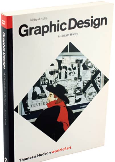
GRAPHIC DESIGN: A CONCISE HISTORY, By Richard Hollis / Thames & Hudson, 1994 (1st ed.), 2001 (2nd ed.)
Written as a narrative, where characters intertwine and one event leads to the other, Richard Hollis’ take on design history is brisk and detailed. As its title suggests, the scope is smaller than that of A History of Graphic Design. Hollis begins in the late nineteenth century, and as the decades and book progress, he moves swiftly between countries to establish the areas of greatest influence at any given time. The book is peppered with small, mostly black and white illustrations that aid the story and pique the taste of readers for further research.
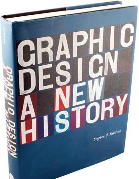
GRAPHIC DESIGN: A NEW HISTORY, By Stephen J. Eskilson / Yale University Press, 2007
Also beginning at the end of the nineteenth century is the lusciously illustrated book by Stephen J. Eskilson, the latest entry in the historical survey category—a fact that allows the author to weave the developments of the late 1990s and the beginning of the twenty-first century more organically than his predecessors, who made amendments with each edition. Eskilson’s book came under heavy criticism for factual errors—none that cannot be easily and understandably corrected in a second edition—and received subjective complaints about its approach and selection criteria, but its positive value to an increasingly authoritative design history is undeniable.
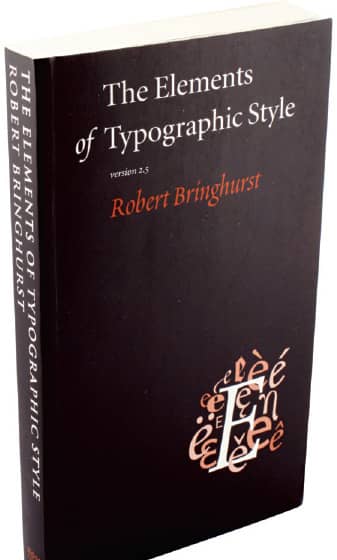
THE ELEMENTS OF TYPOGRAPHIC STYLE, By Robert Bringhurst / Hartley and Marks Publishers, 1992 (1st ed.), 1996 (2nd ed.), 2002 (3rd ed.)
The subjective question of what constitutes good typography has always concerned designers, and as a subjective point of discussion it’s best to start with an objective question: What constitutes proper typography? Canadian typographer, book designer, and poet Robert Bringhurst provides a passionate and elucidating rulebook with this industry-anointed bible, establishing an etiquette for the use of typography. With florid language and a vast knowledge of historical material, tying together digital typography with its origins, Bringhurst explains everything from how to space dashes to the placement of quotation marks. Typography can be good or bad, but it should always be proper.
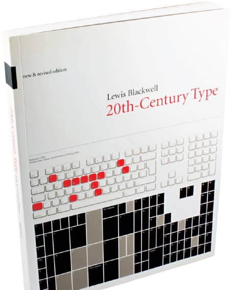
TWENTIETH-CENTURY TYPE, By Lewis Blackwell / Rizzoli, 1992 (1st ed.); Gingko Press, 1999 (remix ed.), Laurence King Publishing, 1998 (2nd ed.); Yale University Press, 2004 (3rd ed.)
The history and development of graphic design is intimately tied to the evolution of typography, and Lewis Blackwell engagingly traces this symbiosis. Decade by decade, Blackwell presents the defining typefaces, their designers, and their implications for and repercussions in the aesthetics of visual communication. A concise and clear glossary, classification system, and anatomy analysis complement the rest of the content.
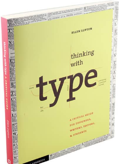
THINKING WITH TYPE, By Ellen Lupton / Princeton Architectural Press, 2004
If one does not know typography (and all the term implies), Ellen Lupton’s book is an ideal place to start learning. Divided into three chapters—“Letter,” “Text,” and “Grid”—this book gives readers the tools to understand what typefaces are, how they function, and how they operate in context. Lupton offers clear diagrams, enticing examples from print and interactive design, and accessible language. Deployed throughout the book are “Type Crimes” that gleefully illustrate common pitfalls in typography; the appendix of “helpful hints” and “dire warnings” alone is worth the price of the book.

LOOKING CLOSER: CRITICAL WRITINGS ON GRAPHIC DESIGN 1–5, Edited by Michael Bierut (1–5), William Drenttel (1–2, 4–5), Jessica Helfand (3), Steven Heller (1–5), DK Holland (1–2), and Rick Poynor (3) / Allworth Press, 1994 (1), 1997 (2), 1999 (3), 2002 (4), 2007 (5)
A book about graphic design with a resounding zero number of images and a lot (a lot) of text sounds far-fetched, but that was the scope for the first Looking Closer in 1994, an anthology of design writing and criticism that had been slowly and vehemently emerging over the years in trade magazines and journals. Now with five volumes and comprising 254 essays by 165 writers, Looking Closer presents a clear sampling of the kind of criticism art and architecture have enjoyed for a long time, arguably cementing their importance—and now it’s graphic design’s turn.
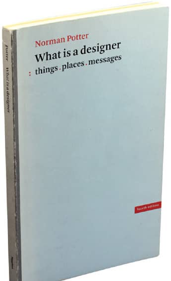
WHAT IS A DESIGNER? THINGS, PLACES, MESSAGES, By Norman Potter / Studio Vista, 1969 (1st ed.); Hyphen Press, 1980 (2nd ed.), 1989 (3rd ed.), 2002 (4th ed.)
It may seem surprising that some of the soundest advice and most grounded descriptions of what a designer is and does originated in the late 1960s with a cabinetmaker. Of course, that is not to belittle Norman Potter’s professional underpinnings or to gloss over his success as a teacher and writer but rather to emphasize that the fields of architecture, graphic, interior, and product design, and, yes, even cabinetmaking share a set of ethical, practical, and intellectual principles that govern its practitioners—all sternly and vividly presented in this book.
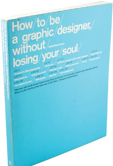
HOW TO BE A GRAPHIC DESIGNER WITHOUT LOSING YOUR SOUL, By Adrian Shaughnessy / Princeton Architectural Press, 2005
Although there is no bullet list on how to hold on to the proverbial designer soul, Adrian Shaughnessy, drawing from two decades of running his own design firm, exposes all the less glamorous aspects of becoming a graphic designer, and staying one. Without sugarcoating, Shaughnessy writes about going on interviews, delving into a freelance career, setting up a new studio, running said studio, acquiring clients, and the wobbly act of self-promotion. Supported by interviews with a cadre of international designers, this book may be as significant as a bachelor’s degree in the education of graphic designers.
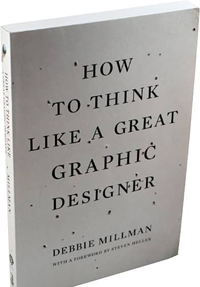
HOW TO THINK LIKE A GREAT GRAPHIC DESIGNER, By Debbie Millman / Allworth Press, 2007
This isn’t really a how-to book, as the title would have you think—and, perhaps, using almost all of the same words in a different order, How Great Graphic Designers Like to Think would be a better one. Inside, Debbie Millman offers rare insight into the lives, minds, fears, dreams, and processes of some of the profession’s most successful practitioners. She interviews her subjects with an empathy that extracts answers about the realities of being a graphic designer, moving beyond their achievements or aesthetics to reveal the people behind the work.
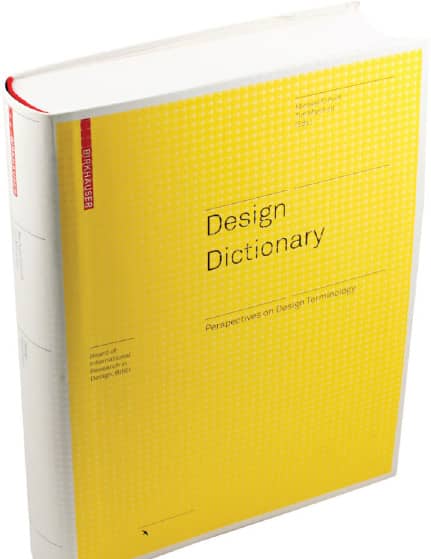
DESIGN DICTIONARY, Edited by Michael Erlhoff, Timothy Marshall / Birkhäuser, 2008
As its name implies and as its subtitle, Perspectives on Design Terminology, elaborates, the Design Dictionary is a comprehensive tome covering more than 250 definitions extracted from the world of design, each written by one of 110 contributors from around the globe. Relentless, the book covers extremely specific terms like flyer, gimmick, and intellectual property as well as boundlessly broad subjects like design process, look and feel, and responsibility. Excluding arrows and little decorative birds, the book is a dense 472 pages’ worth of definitions. Sometimes a thousands words is worth more than an image.
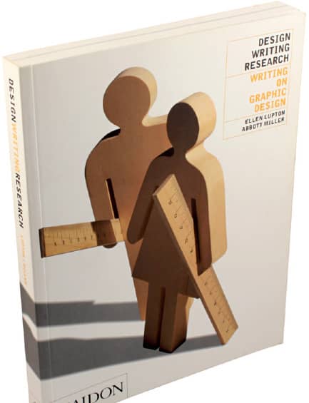
DESIGN WRITING RESEARCH, By Ellen Lupton, Abbott Miller / Kiosk, 1996; Phaidon 1999
Named for the eponymous firm established by Ellen Lupton and Abbott Miller in 1985, Design Writing Research is a collection of essays on a head-spinning range of topics like deconstruction, iconography, Andy Warhol, and stock photography—lucidly written and designed. It also includes an unconventional timeline of design history. In addition to its enthusiastic content, the book demonstrates the effectiveness of the designer-as-author model, where both text and layout benefit from a parallel and combined point of view.
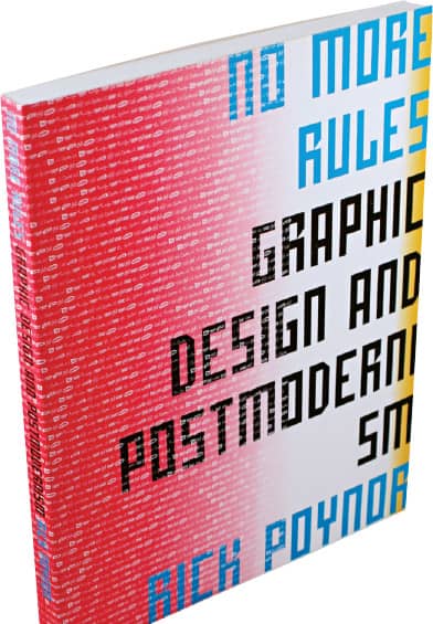
NO MORE RULES: GRAPHIC DESIGN AND POSTMODERNISM, By Rick Poynor / Laurence King Publishing, Yale University Press, 2003
As one of the most recent isms in graphic design history, postmodernism lacks the clarity of a conventional and agreed-upon definition that other isms now enjoy. With No More Rules, Rick Poynor wades through the deconstructed and the theorized to find the common, or perhaps uncommon, thread that ties the tumultuous years of the mid-1980s and mid-1990s. But rather than taking a chronological view of the subject, Poynor addresses it by looking at its defining characteristics: deconstruction, appropriation, technology, authorship, and opposition. Illustrated with some of the most polarizing work of the period, No More Rules is a critical snapshot of this time.
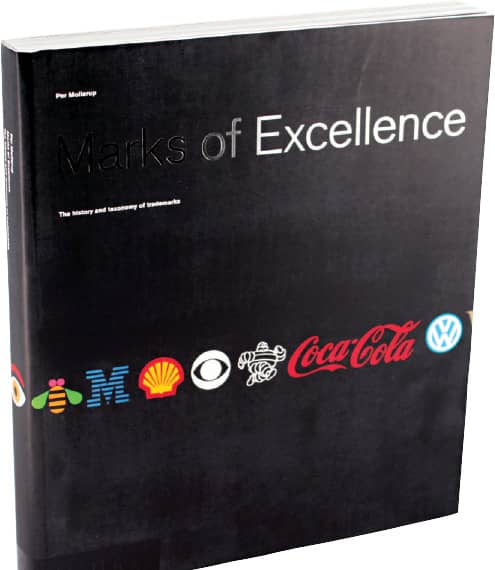
MARKS OF EXCELLENCE, By Per Mollerup / Phaidon, 1997
The memorable simplicity of most logos belies the complexity of their creation as well the infinite possible directions in which any given logo can be developed. Per Mollerup’s analytical book celebrates the power of this simplicity while presenting an assertive taxonomy, providing a solid ground for designers’ discussion of logo design. After establishing historic background, Mollerup organizes some of the world’s most recognized logos according to motif—animals, hearts, mythology, waves, and so on—yielding a comprehensive view of the rich practice of corporate and brand identity design.
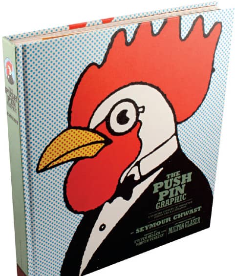
THE PUSH PIN GRAPHIC, By Seymour Chwast, edited by Steven Heller and Martin Venezky / Chronicle Books, 2004
For many designers, particularly those who began practicing at the dawn of the 1980s and after, the eclectic Push Pin Graphic, published by Push Pin Studios from 1957 to 1980, is a collection of legendary and influential status—and mostly impossible to experience in person anymore. In this 256-page ode to the periodical, all 86 issues are represented through their covers and some of the most memorable spreads, allowing new generations to relish on the successful mixture of illustration, design, writing, and editing that made the Push Pin Graphic such a coveted publication.
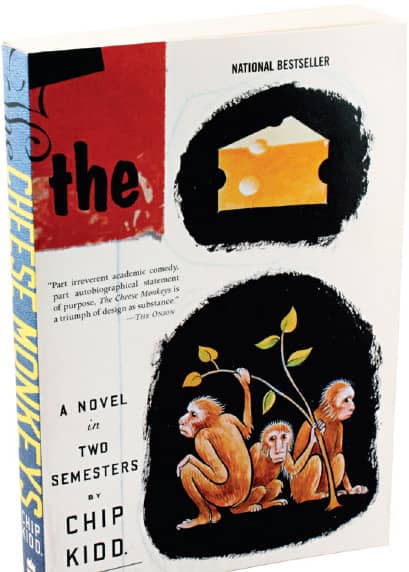
THE CHEESE MONKEYS, By Chip Kidd / Scribner, 2001; Perennial, 2002; Harper Perennial, 2008
As a source of information—especially in contrast to the monographs, surveys, and anthologies gathered in this section—a novel might not seem an appropriate selection, yet the world Chip Kidd created around his main character, Happy, and his experience attending art school at a state university in the late 1950s is a vicarious thrill as he and his fellow students suffer the whims of the tyrannical commercial art teacher, Winter Sorbeck, and the loony tendencies of the drawing teacher, Dorothy Spang. The anxiety-laden critiques in Sorbeck’s class should bring back memories and give goosebumps to any designer.
Monographs focusing on the work of a single graphic designer or design firm suffer from a love-hate relationship with readers—and nonreaders. At extreme ends of the appreciation spectrum, monographs can be considered insightful or self-congratulatory, comprehensive or self-indulgent, and, basically, necessary or unnecessary. Regardless of personal feelings, monographs, if done well, are carefully edited collections of work that exemplify the best a designer or design firm has to offer while providing insight into the process and confirming the need for their publication.

TIBOR KALMAN, PERVERSE OPTIMIST, Edited by Peter Hall and Michael Bierut / Booth-Clibborn Editions, Princeton Architectural Press, 1998
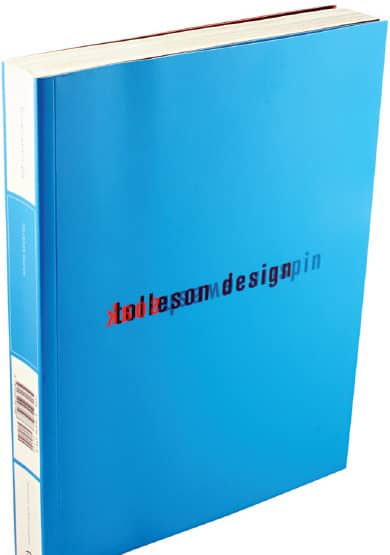
SOAK WASH RINSE SPIN, By Tolleson Design / Princeton Architectural Press, 2000

PAUL RAND, By Steven Heller / Phaidon Press, 2000
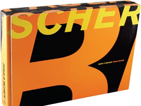
MAKE IT BIGGER, By Paula Scher / Princeton Architectural Press, 2002
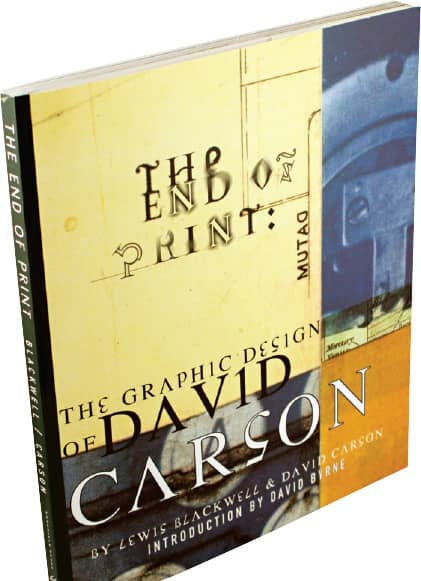
THE END OF PRINT, By Lewis Blackwell and David Carson / Chronicle Books, 1995 (1st ed.), 2000 (2nd ed.)
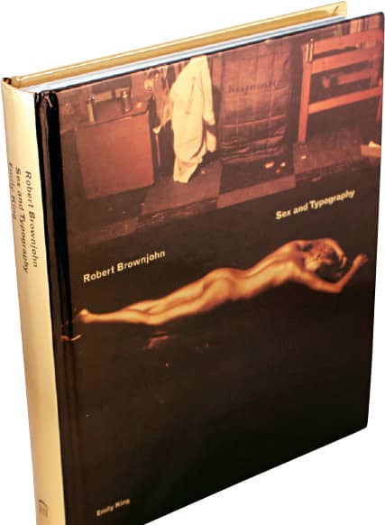
ROBERT BROWNJOHN: SEX AND TYPOGRAPHY, By Emily King / Laurence King Publishing, Princeton Architectural Press, 2005
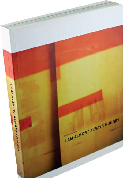
I AM ALMOST ALWAYS HUNGRY, By Cahan & Associates / Princeton Architectural Press, 1999
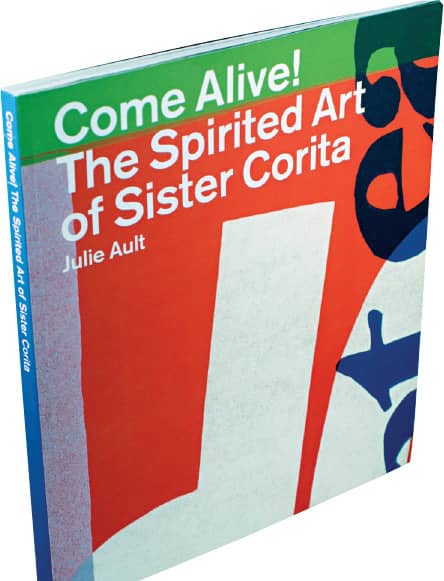
COME ALIVE! THE SPIRITED ART OF SISTER CORITA, By Julie Ault / Four Corners Books, 2007
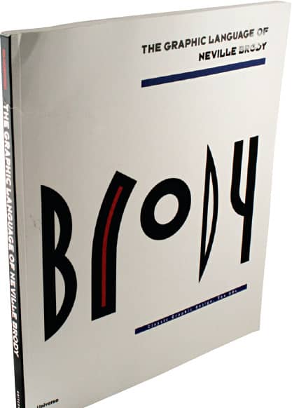
THE GRAPHIC LANGUAGE OF NEVILLE BRODY, By Jon Wozencroft / Universe, 1988

HOUSE INDUSTRIES, By House Industries / Die Gestalten Verlag, 2003
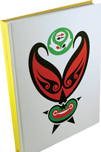
EMOTION AS PROMOTION, By Rick Valicenti / Monacelli, 2005

DESIGNED BY PETER SAVILLE, By Peter Saville, Edited by Emily King / Princeton Architectural Press, 2003
