PRACTICE
On Newsstands
A well-designed magazine is a unique amalgam of disciplines: The cover must have a recognizable logotype; the photography and illustration, from cover to cover, must be ingeniously and creatively art directed; the typography must be at once rigid and structured in the body copy as well as evocative and playful in the headlines, almost as if typesetting a novel and designing a poster on the same page; the pacing must allow the reader to jump back and forth and navigate to their favorite destinations; and it must balance the design of the front and back of the book with the editorial features by creating a consistent yet flexible feel throughout. The evolution of the magazine could probably be documented through the epidemic growth of cover lines, and while these bursts of text on the cover may represent the decline of mainstream editorial design, various designers and publishers have managed to create engaging publications within the industry’s standards and expectations for their time.
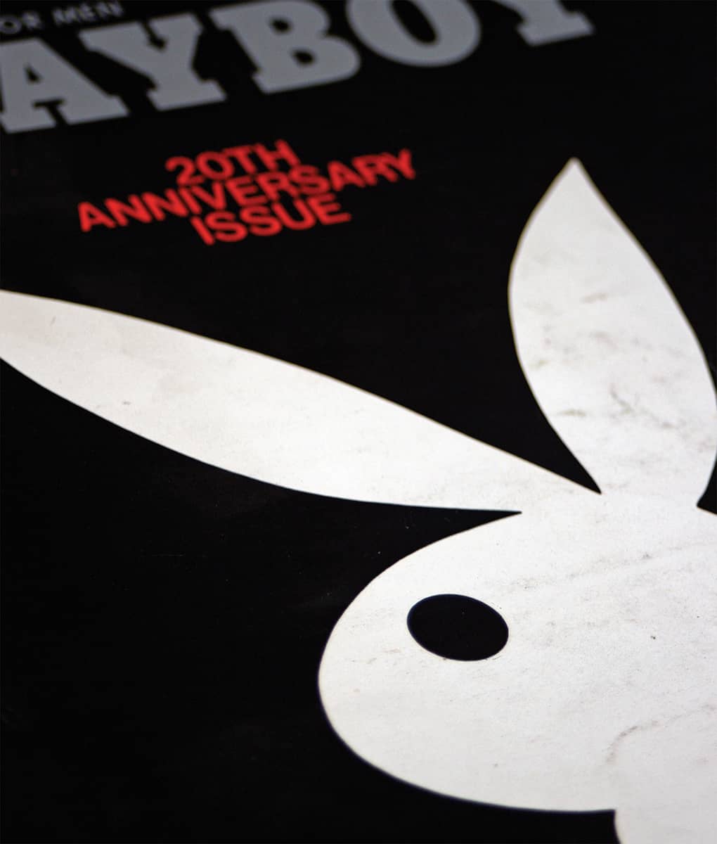
Detail of PLAYBOY 21, NO. 1 / art direction, Art Paul; photography, Dwight Hooker / USA, January 1974
Eros, Fact:, Avant Garde
Through an influential partnership between Ralph Ginzburg and Herb Lubalin › 167, three distinct magazines were published in the 1960s: Eros, Fact:, and Avant Garde. Ginzburg, who had worked as an editor at Esquire › 326 and had also published several books, began working with Lubalin in 1962 to design his first quarterly magazine, Eros, named after the Greek god of love and desire, and devoted to eroticism, love, and sex through history, politics, art, and literature. Lubalin was given free reign in the design, and with a variety of display typefaces driven by the content, tasteful photography, and bold layouts, Eros published four issues, as the fifth installment never made it past the production table. While no expense seems to have been spared in the hardbound 96-page magazine, its legal woes led to its demise as the original promotional letter seeking charter subscribers, received by millions of individuals, made its way into court. After years of legal proceedings, the wording of the letter, not the magazine itself, was ruled obscene, and Ginzburg was sentenced to three years in prison.
Ginzburg and Lubalin partnered a second time in a political journal named Fact: that, as its name implies, sought to set the record straight and expose hidden truths. First published in 1964, Fact:’s design approach was directly related to budgetary constraints; they often commissioned a single illustrator for all of the articles in one issue for a flat fee. With the use of limited colors and bold headlines, often set in serif typefaces, a minimalist elegance was accomplished that stood apart from the competing publications of the time. In its first year, Ginzburg was sued for defamation by then Republican presidential candidate Barry Goldwater, a conflict he lost after several years. Ginzburg’s financial payout forced him to cease publication of Fact:, but his determination was not entirely dampened.
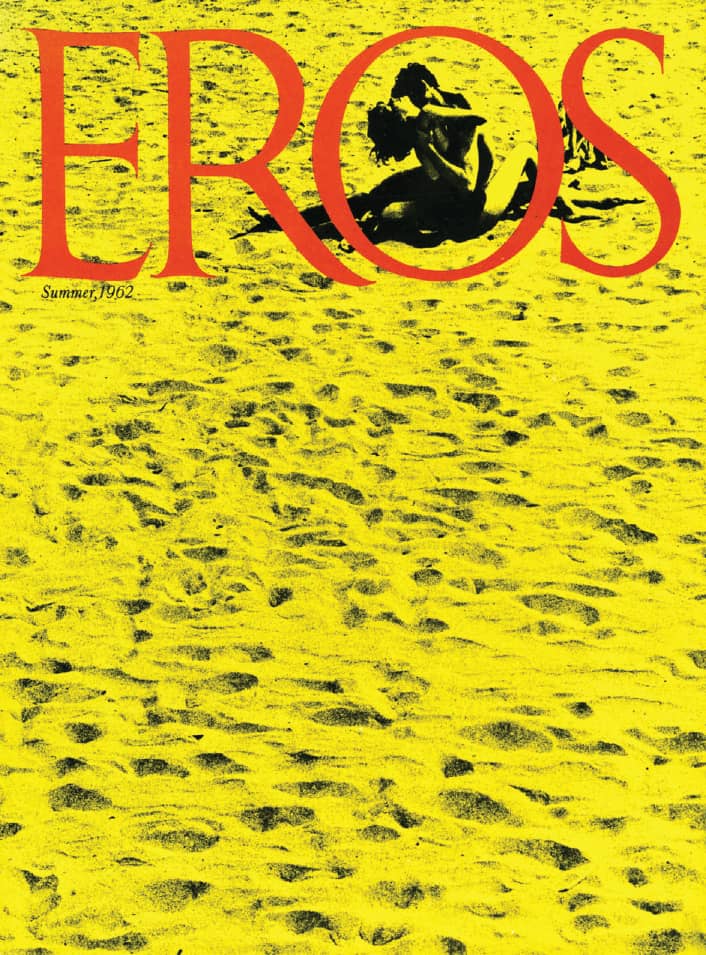
EROS MAGAZINE NO. 2 / Herb Lubalin; photography, Donald Snyder / USA, Summer 1962
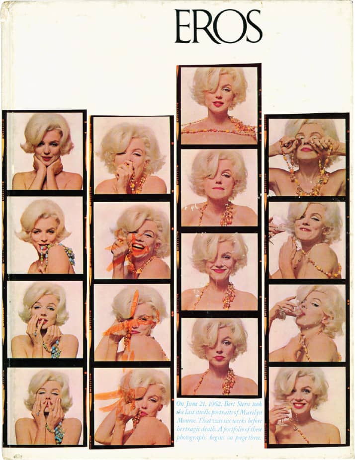
EROS MAGAZINE NO. 3 / Herb Lubalin; photography, Bert Stern / USA, Autumn 1962
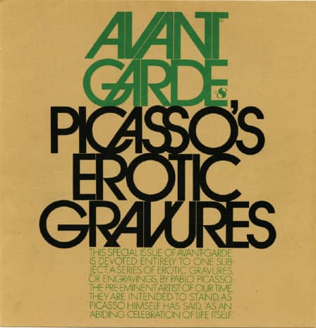
AVANT GARDE #8: PICASSO’S EROTIC GRAVURES / Herb Lubalin / USA, September 1969
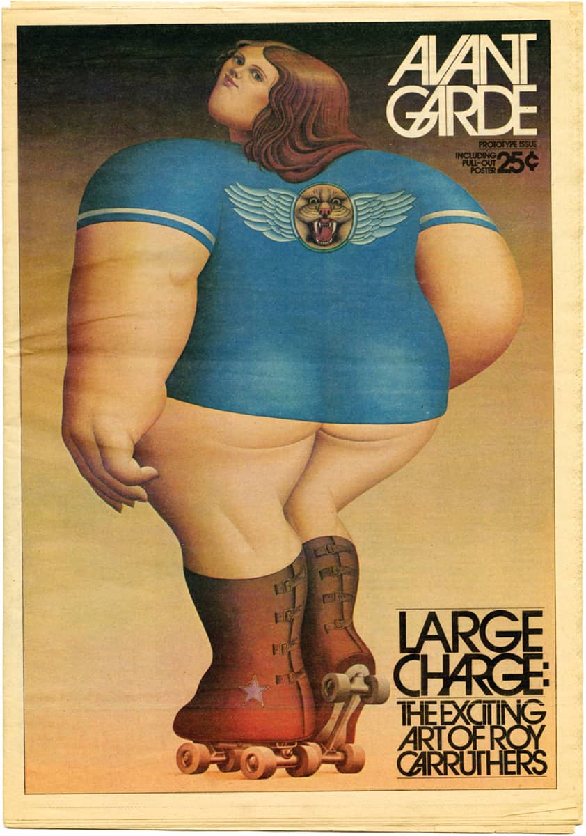
AVANT GARDE PROTOTYPE ISSUE / Herb Lubalin / USA, 1974
Images: Courtesy of The Herb Lubalin Study Center of Design and Typography at the Cooper Union School of Art
Avant Garde, launched in 1968, was a magazine that also challenged the social status quo, although less abrasively than its predecessors, by including essays, reportage, and fiction covering politics, art, and culture. Lubalin established a highly geometric structure in the publication, most readily noted in the masthead, lettered by Tom Carnase, where perfect circles, straight lines, multiple ligatures, and minimal kerning space were a custom precedent for the subsequently developed typeface › 374. After 16 issues, Avant Garde’s final issue was published as Ginzburg began serving a reduced sentence of eight months in prison. Although a revival was attempted upon his release, Ginzburg’s financial situation was not equal to the task.
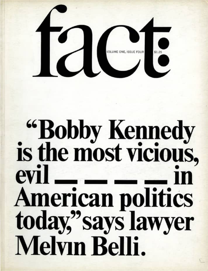
FACT: / Herb Lubalin / USA, July/August 1964
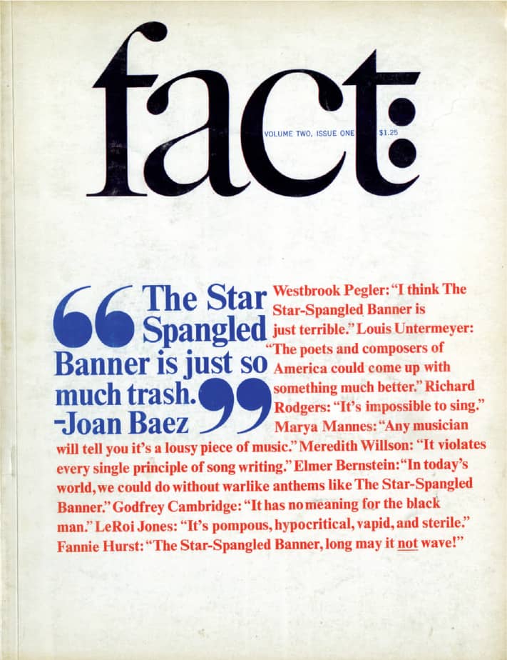
FACT: / Herb Lubalin / USA, January/February 1965
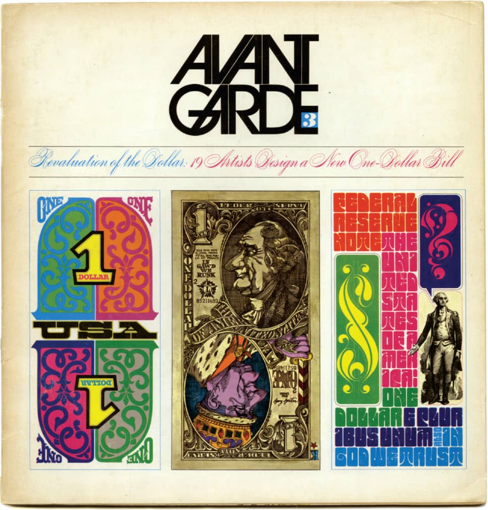
AVANT GARDE #3: REVALUATION OF THE DOLLAR / Herb Lubalin; cover dollar illustrations, Tom Carnase / USA, May 1968
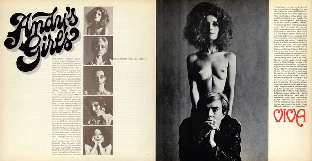
ANDY’S GIRLS SPREAD FROM AVANT GARDE #3 / Herb Lubalin / USA, May 1968
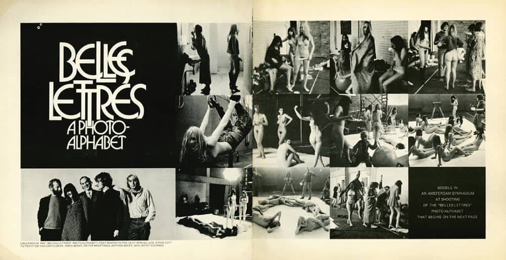
BELLES LETTRES: A PHOTO ALPHABET SPREAD FROM AVANT GARDE #14 / Herb Lubalin; Ed Van Der Elsken, Anna Beeke / USA, Summer 1971
Playboy
After graduating from the University of Illinois, Hugh Hefner held various jobs in publishing companies before working for Esquire › 326, then considered one of the most sexually charged publications for men, in part because of Alberto Vargas’s pin-up girls. In 1953, while employed at Children’s Activities magazine, Hefner began assembling a new kind of magazine for men, one defined by an elusive lifestyle of both cultural and material sophistication and riches that also celebrated sex as an everyday occurrence and not the taboo it was considered; the title was Stag Party. Working with cartoonist Arv Miller, who created the layouts and a stag mascot, Hefner’s initial dummy was unsatisfying; it was Art Paul, a Chicago designer and illustrator educated at László Moholy-Nagy’s Institute of Design, who lay the foundation for the next 30 years.
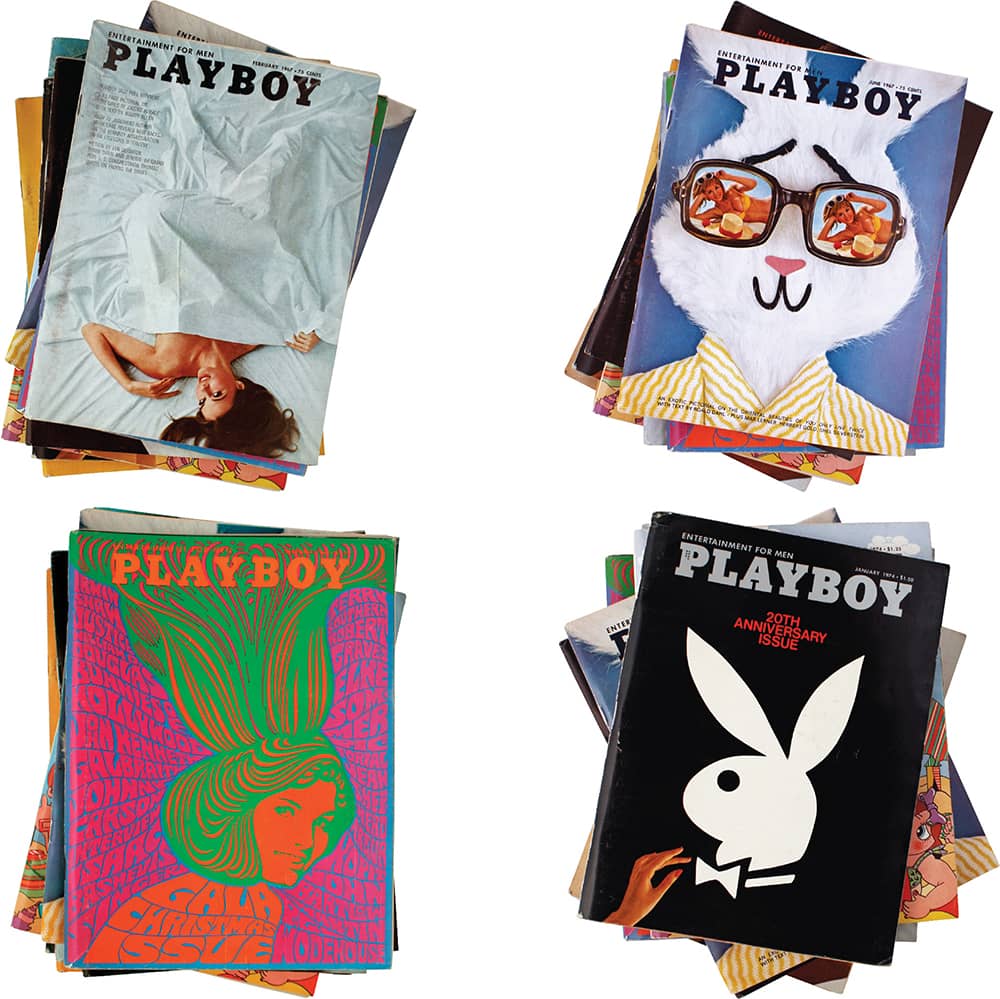
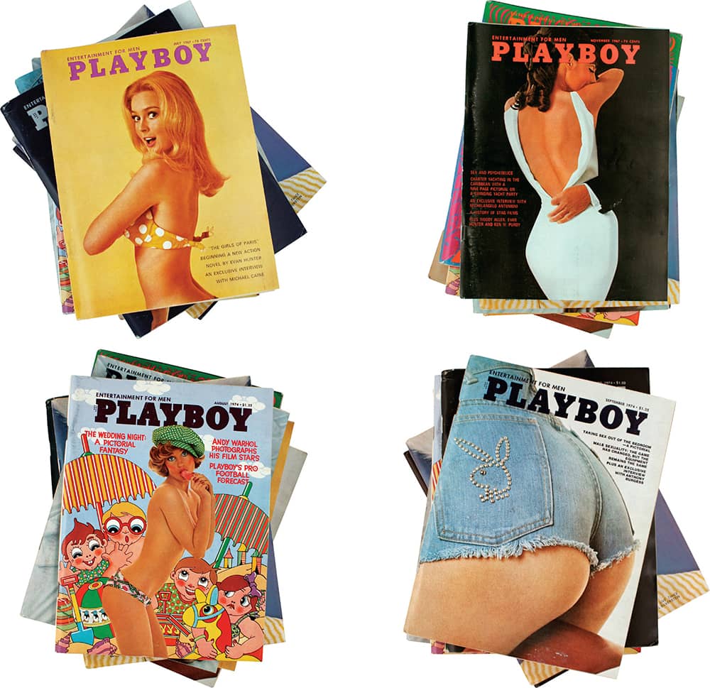
PLAYBOY MAGAZINE / art direction, Arthur Paul / USA, 1967 and 1974
One of Paul’s first objections was the name. Given, in addition, a threat from a hunting magazine named Stag, Hefner selected Playboy as the title and a bunny as its mascot. Miller’s stag was kept, his head replaced. The now famous icon of the bunny profile, drawn by Paul, made its debut in the third issue, and from that moment on it became Paul’s visual quiz for Playboy’s readers: Find the bunny in the sophisticated, witty, and conceptual covers of the 1960s and 1970s—a far cry from today’s blunt displays of cleavage. Inside, Paul complemented the erudite articles and interviews with a simple yet frolicsome layout that allowed for typographic play and the integration of illustrations from some of the most respected fine artists and commercial illustrators of the time. Whether people purchased Playboy for the articles or the nudes, for 30 years their favored content was always beautifully presented.
Esquire
With no publication for men comparable to Vogue or Harper’s Bazaar › 327, in 1933 publisher David A. Smart and editor Arnold Gingrich launched Esquire, a magazine combining fiction, sports, humor, poetry, fashion, and other elements of a lush lifestyle targeted at men. Publishing the work of writers like Ernest Hemingway and F. Scott Fitzgerald gave Esquire a proper reputation, but the pin-up girls drawn by Alberto Vargas and George Petty drew the wrong kind of attention when the Postmaster General attempted to revoke its second-class mailing privileges for its “obscene” content, culminating in the Supreme Court ruling in favor of Esquire in 1946. Over the years, especially in the roaring 1960s, the magazine gained notoriety for its journalism and content, fiercely embodied by the covers created by advertising giant George Lois.
Esquire’s art direction is richly storied, with many notable figures appearing in its masthead, including Paul Rand › 159 in the mid 1930s, Henry Wolf in the 1950s, Sam Antupit in the 1960s, Milton Glaser › 170 in the 1970s, and Roger Black in the 1990s, but it’s the covers of Lois that are most deeply embedded in American visual culture. After leaving ad agency Doyle Dane Bernbach, he established Papert Koenig Lois in 1960 and took his first commission from Esquire in 1962—where, boldly (or foolishly), he showed a picture of Lloyd Patterson (well, someone posing as him) defeated at the hands of Sonny Liston . . . before the fight had occurred. Through poignant and visionary images (regularly photographed by Carl Fischer) and cover lines usually reserved for print ads, Lois’s covers for the next ten years arguably helped Esquire climb out of economic and editorial troubles. More important, they reflected a tempestuous era ripe for visual commentary.
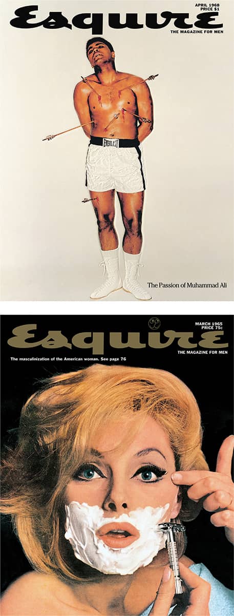

ESQUIRE MAGAZINE / George Lois; photography, Carl Fischer / USA, 1965–1969
Harper’s Bazaar
Harper and Brothers, a growing print and publishing house, established Harper’s Bazaar in 1867 as an early vehicle for Victorian fashion. It was purchased in 1912 by William Randolph Hearst, and it is a property of Hearst Corporation to this day. While Harper’s Bazaar has long been an arbiter of fashion and has remained relevant through its content, it has also served as an exemplar of editorial design on more than one occasion. The first was in the 1930s, when newly appointed editor-in-chief Carmel Snow began to assemble a team to help revolutionize the notion of magazine design and photography. The team included Martin Munkacsi, who freed fashion shoots from the studio and into the world, and Alexey Brodovitch › 143, who freed the page to take pleasure in white space and the finely tuned pacing of text and image.
Brodovitch commissioned European artists like Man Ray, Salvador Dali, and A.M. Cassandre and fostered the work of American photographers like Lisette Model, Diane Arbus, and Richard Avedon, who spent 20 years as a staff photographer until 1965. Upon Brodovitch’s departure in 1958, Henry Wolf assumed the role of art director and infused the magazine with his own acuity and typographic sensibilities. His tenure ended in 1961 and was followed by the collaborative art direction of Ruth Ansel and Bea Feitler. Another significant editorial and creative gust came when Liz Tilberis became editor-in-chief in 1992, appointing Fabien Baron—reeling from successful turns at Italian Vogue and Andy Warhol’s Interview—as the creative director. With a fresh cut of the magazine’s Didot type family by Hoefler & Frere-Jones › 230, Baron introduced an assertive balance of sculptured typography and vibrant photography to create an assertive publication. Tilberis passed away in 1999, and Baron left that same year.
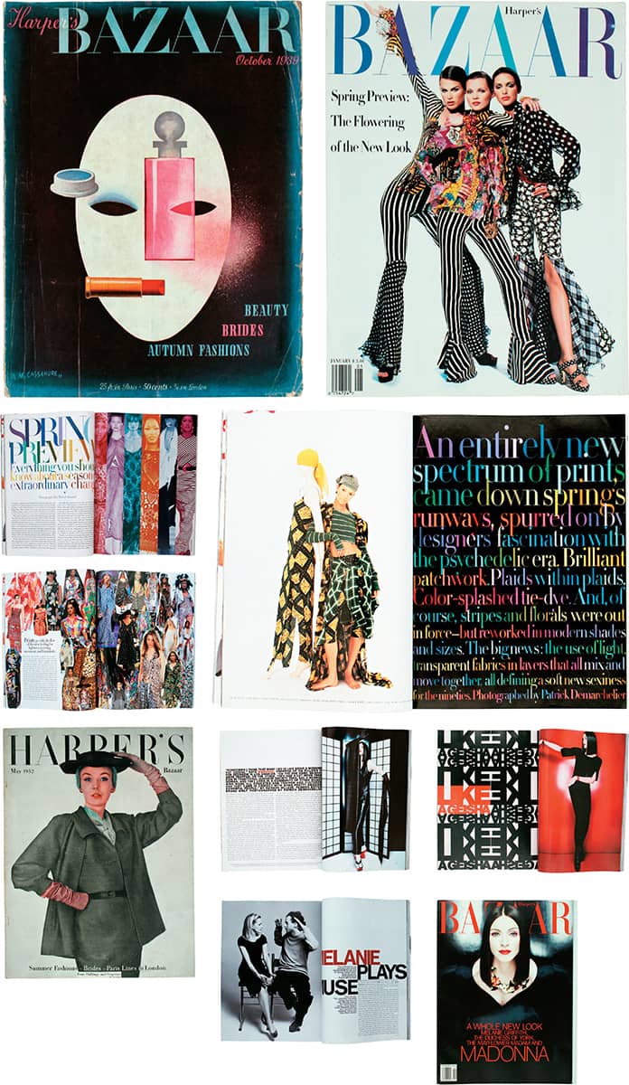
HARPER’S BAZAAR MAGAZINE / USA, 1933–1999
Rolling Stone
In 1967, amid the social, political, and cultural upheaval of the time and the accompanying surge of the underground press, music critic Ralph J. Gleason and 21-year-old rock-and-roll aficionado Jann S. Wenner launched Rolling Stone, a publication with music as its journalistic epicenter. Rolling Stone deftly established itself as an influential publication for a new generation not just of readers but of writers like Hunter S. Thompson and Cameron Crowe and photographers like Annie Leibovitz, and it fostered the contributions of numerous art directors. Initially art directed by John Williams for one year, then Robert Kingsbury until 1974, two distinctive elements were the logo, drawn by psychedelic poster designer Rick Griffith, and the Oxford (or Scotch) Rule, a double thick-and-thin-stroke border, perhaps the simplest visual device but a defining one for Rolling Stone.
Following Mike Salisbury and Tony Lane, Roger Black introduced a more cohesive system in 1976, hiring lettering artist Jim Parkinson to redesign the logo and create a sturdy serif type family based on Griffith’s work, giving the magazine a distinctive look and feel. Black left in 1978 and, through the 1980s, Rolling Stone gradually veered away from this design, ending in layouts dominated by sans serif typography. In 1987, Fred Woodward, who had gingerly risen as art director in other magazines, joined, and for the next 14 years he infused the layouts with unbridled typographic play that gave feature stories their own unique flavor, while a four-part type family, code-named The Proteus Project, designed by Hoefler & Frere-Jones › 230, brought some consistency, aided by the reintroduction of the Oxford Rule. With fellow art director Gail Anderson, Rolling Stone offered some the most venturesome double-page spreads of the 1990s.
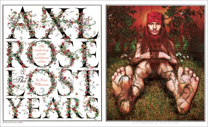
AXL ROSE LOST YEARS, Rolling Stone magazine / art direction, Fred Woodward; design, Fred Woodward, Gail Anderson; illustration, Alex Ostroy / USA, May 11, 2000
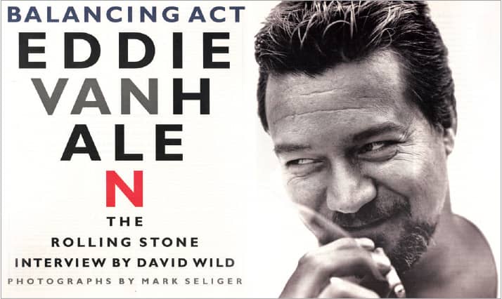
BALANCING ACT: EDDIE VAN HALEN, Rolling Stone magazine / art direction, Fred Woodward; design, Geraldine Hessler; photography, Mark Seliger / USA, April 6, 1955
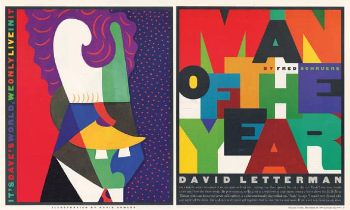
MAN OF THE YEAR: DAVID LETTERMAN, Rolling Stone magazine / art direction, Fred Woodward; design, Fred Woodward, Geraldine Hessler; illustration, David Cowles / USA, January 12, 1995
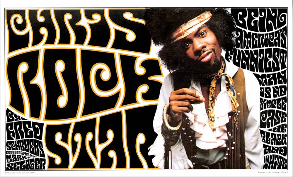
CHRIS ROCK STAR, Rolling Stone magazine / art direction, Fred Woodward; design, Fred Woodward, Gail Anderson; photography, Mark Seliger / USA, October 2, 1997
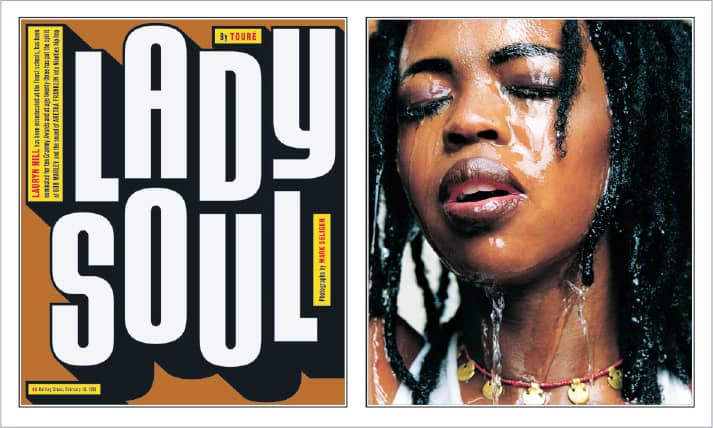
LADY SOUL, Rolling Stone magazine / art direction, Fred Woodward; design, Siung Tjia; photography, Mark Seliger / USA, February 18, 1999
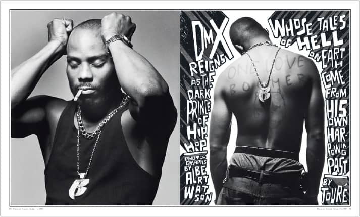
DMX REIGNS AS THE DARK PRINCE OF HIP-HOP, Rolling Stone magazine / art direction, Fred Woodward; photography; Albert Watson / USA, April 13, 2000
Spy
For more than two years, before its first issue hit newsstands in October 1986, Spy magazine was an impalpable alternative to the New York publishing industry, inhabited by magazines like New York › 336, the New Yorker, and the Village Voice, in the minds of Kurt Andersen and E. Graydon Carter, then architecture critic for Time and writer for Life, respectively, and spurred by the business savvy of Tom Phillips, an investment banker. This alternative was perhaps best described in a preemptive direct mail piece calling for subscribers: “Spy is the funny, fearless, fast-paced magazine for smart New Yorkers. . . . Spy is polished and satirical, sophisticated yet mischievous, well-dressed but slightly ill-mannered, literate, urbane—and just a little dangerous.”
Spy launched an onslaught on the social, economical, political, and cultural layers of the city and its most public figures through a mix of irreverence, snark, and even meanness, presented through a design brimming with typography, charts, graphs, dingbats, and floating heads. In retrospect, Donald Trump and white space suffered most in the hands of Spy. The prototype and early issues were designed by Drenttel Doyle Partners, and in 1987 Alexander Isley, previously employed at M&Co. › 183, became art director, taking Spy into an even more nuanced and mannered visual direction that reveled in satirical diagrams and infographics while maximizing the ridiculing impact of less than stellar black and white photography. Isley left less than two years later and was succeeded by B. W. Honeycutt. Spy consistently struggled to secure advertisers, finally breaking even three years in, only to be met by a recession; it was sold in 1991 and eventually folded in 1998. Today, the design and journalistic voice of Spy are apparent, and missed, in all media.
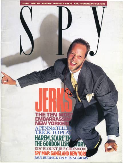
Drenttel Doyle Partners: art direction, Stephen Doyle / October 1986
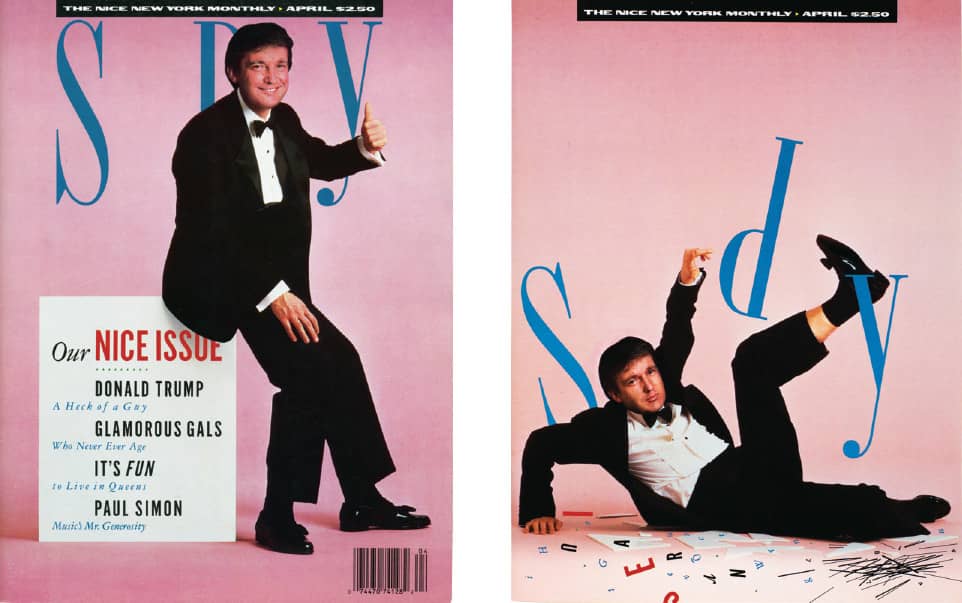
Art direction and design, Alexander Isley; photography, Deborah Feingold / April 1989
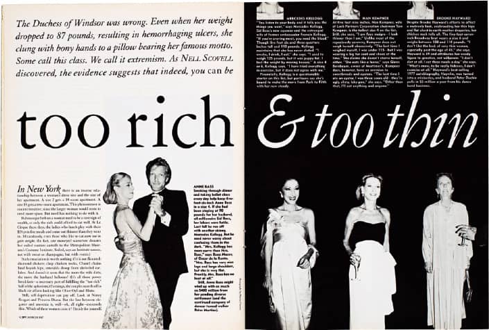
Art direction and design, Alexander Isley / March 1987
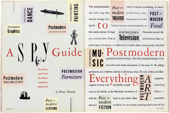
Art direction and design, Alexander Isley / April 1988
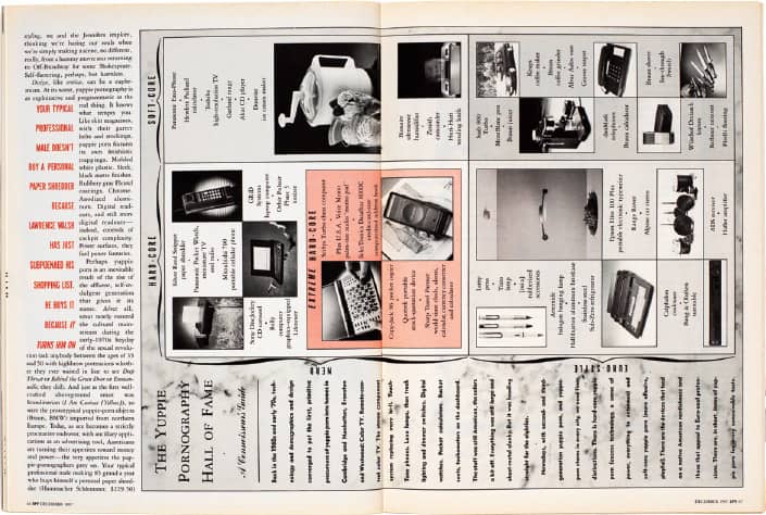
Art direction, Alexander Isley / December 1987
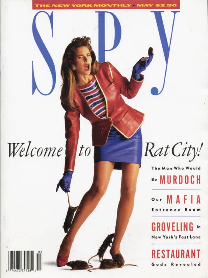
Art direction and design, Alexander Isley; photography, Neil Selkirk / May 1988
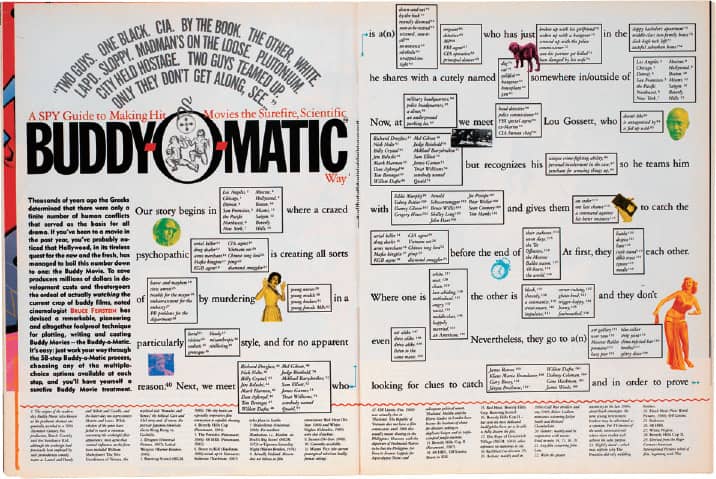
Art direction, B.W. Honeycutt / February 1993
SPY MAGAZINE / USA
Ray Gun
Looking to start a new kind of publication hinging on style and attitude that would cover the changing face of music in the throes of grunge and other evolving musical styles not covered by MTV › 352, Rolling Stone › 328, or Spin, Marvin Scott Jarrett, who had previously run Creem magazine, turned to David Carson › 186, based on his work at the short-lived Beach Culture, to be the inaugural art director. While still working at Surfer magazine, Carson put together the first issue at night and on weekends, and in 1992 Ray Gun was launched—epitomizing Carson’s rule-bending design approach and giving his style a relatively mainstream audience. Unlike typical relationships between editor and art director, Carson and Jarrett worked in different cities, rarely if ever discussing the design direction of the content other than the covers. Jarrett granted Carson unlimited freedom, and the results ignited pyrotechnics of praise and scorn from the music, publishing, and design industries—and engendered endless imitation.
At the core of Carson’s technique was the vigorous dismantling of typography; he distorted letterforms, separated words, squeezed paragraphs, and disfigured layouts—sometimes for the benefit of a story, other times not. At their most commendable, Ray Gun’s pages were kinetic and engaging, and at their most disruptive, a story would be rendered in Zapf Dingbats. Perhaps lost in the midst of Carson’s designs was his role as art director; aptly commissioning work from energetic new photographers, illustrators, and type designers, generously crediting their contributions in the magazine. GarageFonts, a digital type foundry, was established in 1993 to distribute and nurture the typefaces used in Ray Gun. Carson and Jarrett ended their collaboration in 1995 after 30 issues. The magazine pursued different design directions with various art directors before it folded in 2000.
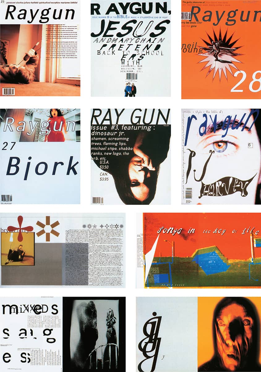
RAY GUN MAGAZINE / David Carson / USA, 1992–1995
Colors
Three individuals played a major role in the creation of Colors magazine: Luciano Benetton, founder of the Italian clothing company Benetton; photographer Oliviero Toscani, in charge of Benetton’s advertising; and designer Tibor Kalman › 183. In 1991, Toscani approached Kalman about developing a multicultural magazine, sponsored solely by Benetton, that would appeal to the somewhat dissatisfied and politicized younger generation—a platform both men relished. Available throughout the world in five different bilingual versions (French/English, Spanish/English, etc.), the magazine found its global approach when it adopted thematic issues, beginning with Race in the fourth issue. Two years into the project, Kalman closed his New York studio, M&Co., and moved to Rome to devote his full energy to Colors.
Kalman directed a unique magazine whose lack of decorative elements and visual devices and limited use of sans-serif typefaces allowed the photography and content to speak more loudly than the design; the content managed to both enthrall and enrage, often shocking people into starting a conversation, which is just what Colors set out to do. In 1995 Kalman completed his final issue, number 13, as a wordless publication inspired by Charles and Ray Eames’s film Power of Ten. After his departure, Fernando Gutierrez, who had worked with Kalman on his last issue, took charge of the magazine, redesigning it to follow a more journalistic and in-depth approach. As the magazine progressed, Benetton’s communication research center, Fabrica, in Treviso, Italy, took over the magazine. In 2004 Number 17, the design firm of Emily Oberman (who designed the original Colors logo while employed at M&Co.) and Bonnie Siegler, designed the magazine alongside then editor Kurt Andersen for a brief period. Colors is currently again under the supervision of Fabrica.
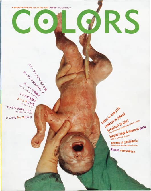
COLORS NO. 1 / M&Co.: design, Emily Oberman; cover photography, Oliviero Toscani / 1991
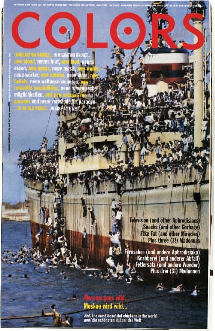
COLORS NO. 2 / M&Co.: design, Gary Koepke; cover photography, Associated Press / Spring 1992
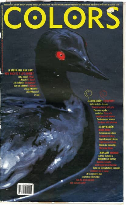
COLORS NO. 3 / M&Co.: design, Paul Ritter; cover photography, Steve McCurry / Fall 1992
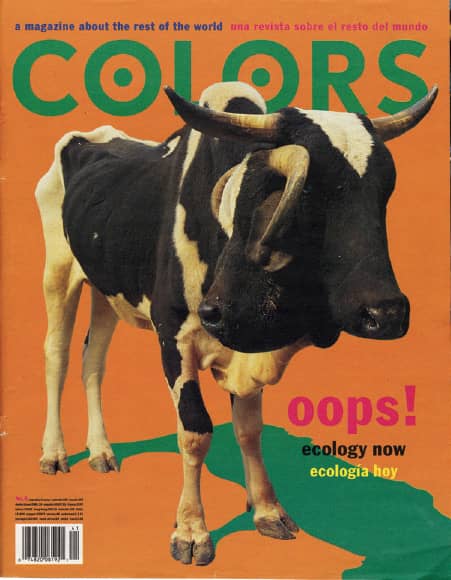
COLORS NO. 6: ECOLOGY / M&Co.: design, Scott Stowell; cover photography, Marcus Muzi / March 1994
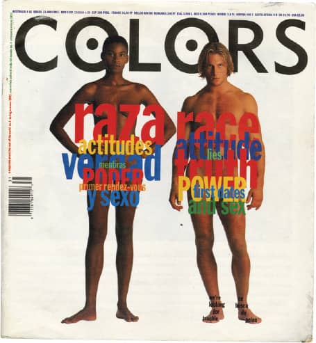
Above and Right COLORS NO. 4: RACE / M&Co.: design, Paul Ritter; cover photography, Oliviero Toscani / Spring, 1993
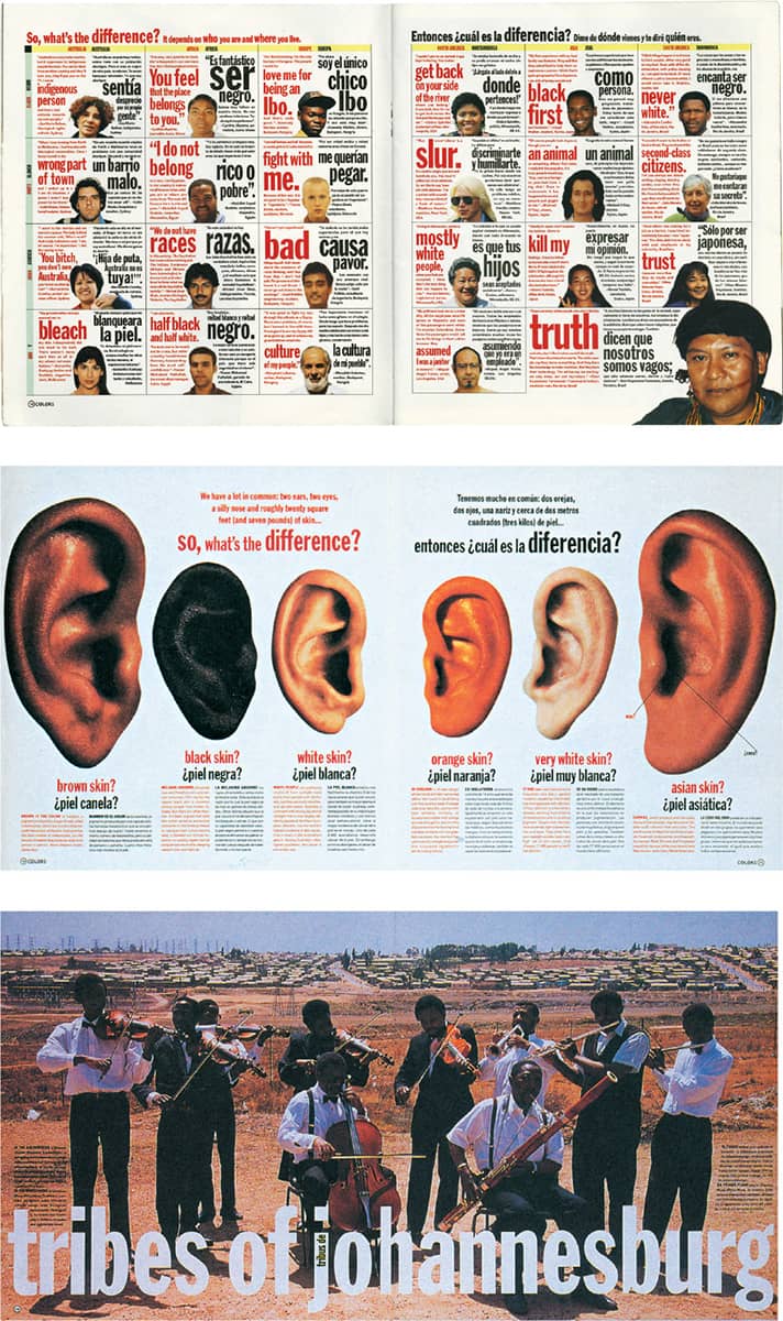
COLORS MAGAZINE / Editor in Chief, Tibor Kalman / USA, Italy, 1991–1995
The Face
Focusing on the changing face of fashion at the outset of the decade, editor and publisher Nick Logan launched The Face in 1980 with a minimal budget, a limitation that perhaps gave it its edge. The Face quickly became a popular style manual of low-budget street culture and fashion that eventually, like other subversive fads, was coopted by commercialism and advertising—a snag also faced by its art director, Neville Brody. His tenure began in 1981, after two years of working for independent record labels. At first, the design felt almost tentative, using commercial typefaces in relatively simple layouts. Slowly, The Face morphed into a kinetic playground for typographic exploration and the graphic flotsam and jetsam it left in its path.
By 1984, Brody had instituted a highly expressive design and other magazines had begun mimicking the style of The Face. Brody introduced the first custom typeface with issue number 50, establishing a daringly unique aesthetic. In the subsequent 25-plus issues, new typefaces would appear as soon as the reader had become familiar with the previous ones. Brody also began to contort letterforms, creating an endlessly mutable range of typographic solutions for headlines and story leads while leaving the body text highly accessible. He also played with the continuity afforded by the magazine, gradually deconstructing or morphing a section’s title to its most abstract possibilities. Typography was mixed with graphic symbols and devices, sometimes to the point of blurring the line between text and object, creating a new visual vocabulary. Brody kept the magazine evolving, introducing computer-condensed and extended typography in 1985 and then more classic layouts toward 1986, the year he left The Face. Logan and Brody worked together again on Arena from 1987 to 1990.
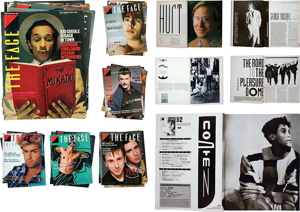
THE FACE MAGAZINE / creative direction, Neville Brody / UK
Speak
Speak magazine’s first issue was published in 1995 by editor Dan Rolleri, who set out to develop a quarterly package of thoughtful writing on culture, loosely covering music, fashion, literature, and art. Two years prior, Rolleri hired Martin Venezky as he finished graduate school at Cranbrook Academy of Art › 130, giving him the task of designing Speak’s media kit; the proposed design led editor and designer to court as they fought over design, content, wages, and, ultimately, pride. Venezky was called back when another designer failed to deliver, and he completed the media kit as well as the first issue. For the ensuing edition, however, Venezky was replaced with David Carson › 186.
Back as art director for the third issue, Venezky proceeded to establish an almost accidental aesthetic within Speak that stemmed from his connection to and investment in each spread as well as the minimal budget available for photography and illustration, which led to the use of found materials and hand-drawn elements. With vast detailing, methodical layering, and unexpected yet thoughtful elements, each page slowly revealed its contents by engaging the reader. Similarly, the relationship between Rolleri and Venezky proved detailed and layered as they grew and matured alongside the magazine, steering each issue into a more intellectual realm with conscious disregard for advertisers and profits. While Speak was acclaimed in the design community, it failed to promote itself in the editorial world, and while its loyal readers appreciated the content, the lack of advertising funds eventually led to its demise in 2001 after publishing 21 issues.
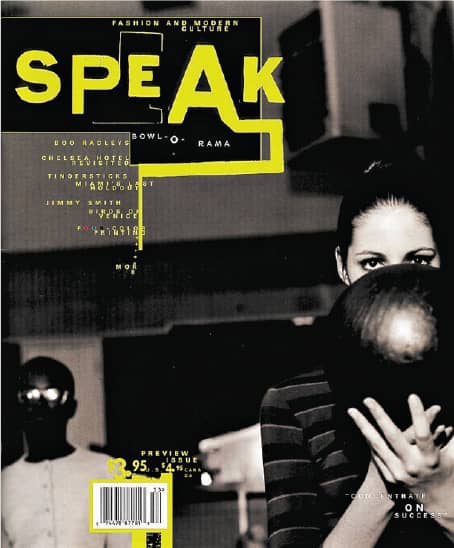
NO. 1 / Preview issue / Fall 1995
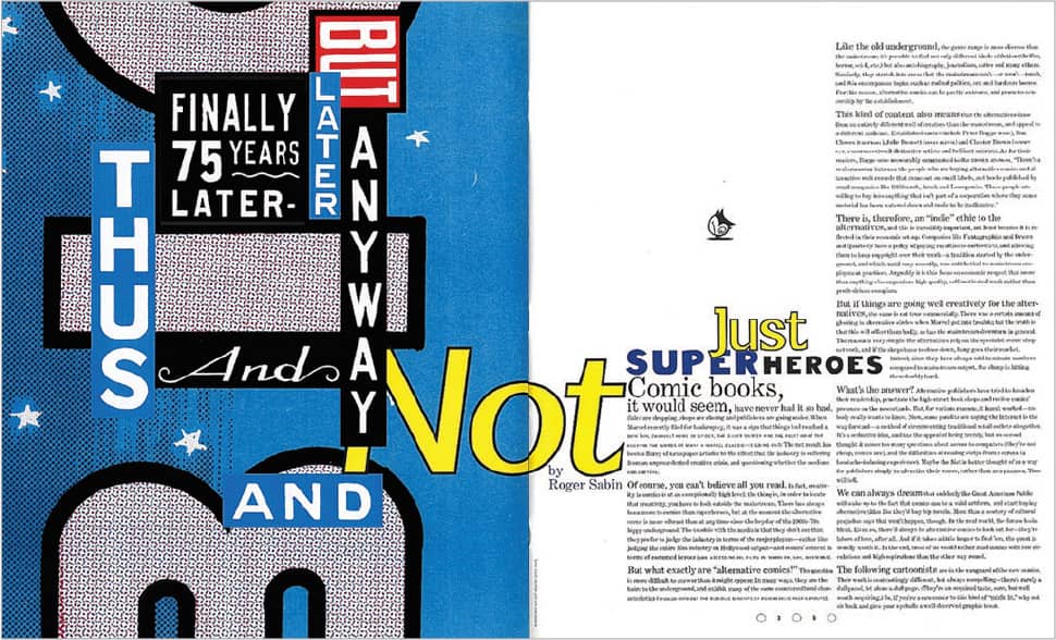
NO. 6 / Summer 1997
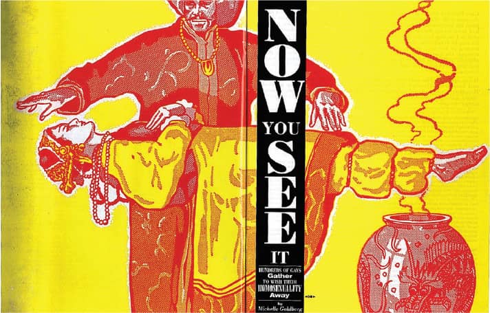
NO. 20 / Martin Venezky / USA, Fall 2000

NO. 9 / USA, April/May 1998
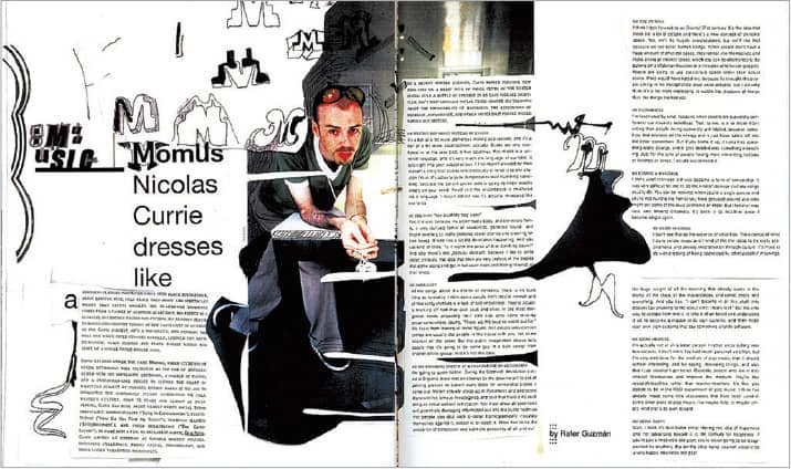
NO. 21 / Final issue / USA, 2000
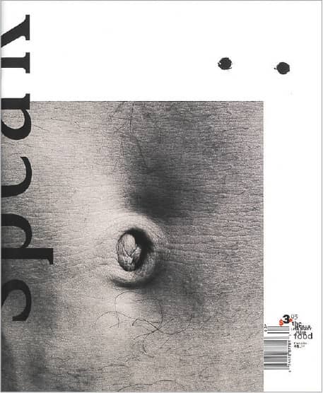
NO. 10 / June/July 1998
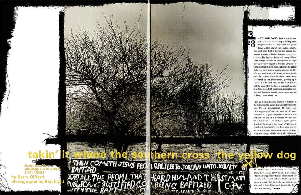
NO. 3 / Fall 1996
SPEAK MAGAZINE / Martin Venezky / USA
Nest
From an experience working with a photographer on a book and an incandescent passion for interior decoration—he spent five years decorating his Baltimore apartment—Joseph Holtzman launched his own magazine focusing on interiors but, as the subsequent 24 issues proved, that would merely begin to describe the content of Nest. With no publishing experience, no design know-how, and certainly no defined target audience, Holtzman rented an apartment adjacent to his own in New York and with his own money created the first issue in 1997. As a testament to the controlled eccentricity that became the clarion call of Nest, the first cover and its related feature story showed a room wallpapered by an avid fan with fashion magazine covers of Farrah Fawcett. Whether the subject was the interiors of a submarine, an apartment covered in silver foil, or a house built out of beer cans, Nest’s content shared not just shock value but displays of the unique living shelters individuals create for themselves—an endless parade of individuality that Nest reveled in.
The magazine itself was anything but traditional, and Holtzman took pride in that he constructed every page, even though he could barely operate a computer. With graphic designer (and saxophonist) Tom Beckham as his “graphics director,” Holtzman created a design aesthetic revolving around ornaments and patterns framing its extensive photography, with the typography receding to a secondary role. Physically, Nest changed every issue; it featured complex and costly die-cuts, trims, and production tricks that made the magazine an object of affection itself. Further establishing his own rules, Holtzman took few advertisers and relegated them to the front and back of the book, leaving the feature stories intact—and he did not hesitate to drill four holes or a cross through the whole magazine, ads included. Despite comparatively low circulation, distribution, and promotion, Nest enjoyed much critical acclaim. It ceased publication in 2004.
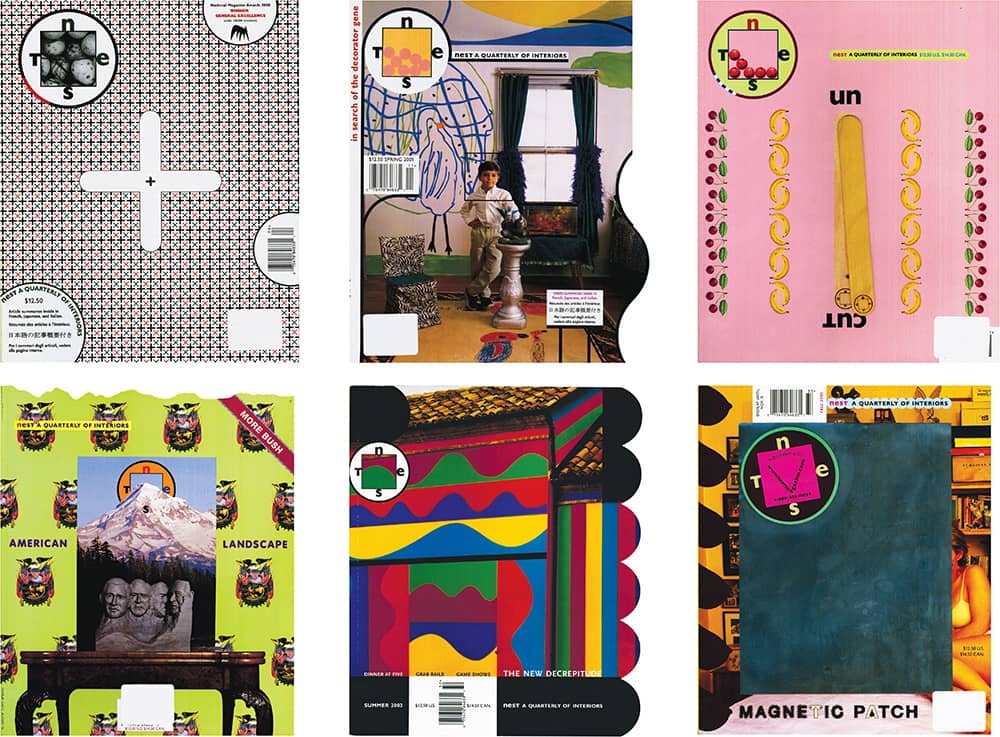
NEST MAGAZINE / Joseph Holtzman / USA, 2000–2003
Martha Stewart Living
Following a preliminary career as a stockbroker, Martha Stewart began a successful catering business that led to her first book, published in 1982 by Clarkson Potter (and designed by Roger Black). Entertaining catalogued the menus and decorations of various dinner parties and receptions, effectively launching Martha’s domestic design career. With the success of Entertaining and the growth of Clarkson Potter, its editor hired Gael Towey as art director, who worked on many books, among them Stewart’s. In 1990, through a deal with Time, Inc., Stewart began developing her flagship magazine, Martha Stewart Living (MSL), and hired Towey as the art director. The inaugural issue launched by the end of the year. Through its focus on beautiful photography that elicited deep yearning from any still life, whether an ear of corn or a napkin ring, and its presentation in simple and clear layouts colored in a distinctive range of pastels that never became cloying, MSL became irresistibly successful through the 1990s.
With success comes imitation, and when many magazines began mimicking MSL’s style, it was necessary to redesign. In 2000, Towey approached book cover designer Barbara deWilde to undertake the task. For the next two years, DeWilde and her design team reworked every detail of the magazine, from recipe charts to feature stories. Two of the most distinctive introductions were Archer and Surveyor, proprietary type families designed by Hoefler & Frere-Jones › 230 that, along with the photography, became the hallmark of the magazine. The redesign began to be implemented on October 2002, and it served as a balanced and nuanced purveyor for the numerous recipes, decorations, and products that dozens of stylists, editors, photographers, and art directors develop from the ground up. MSL is now part of a vast empire, Martha Stewart Living Omnimedia, of which its production values and philosophy permeate every single aspect, in part because of the leadership of Towey, its chief creative officer since 2005.
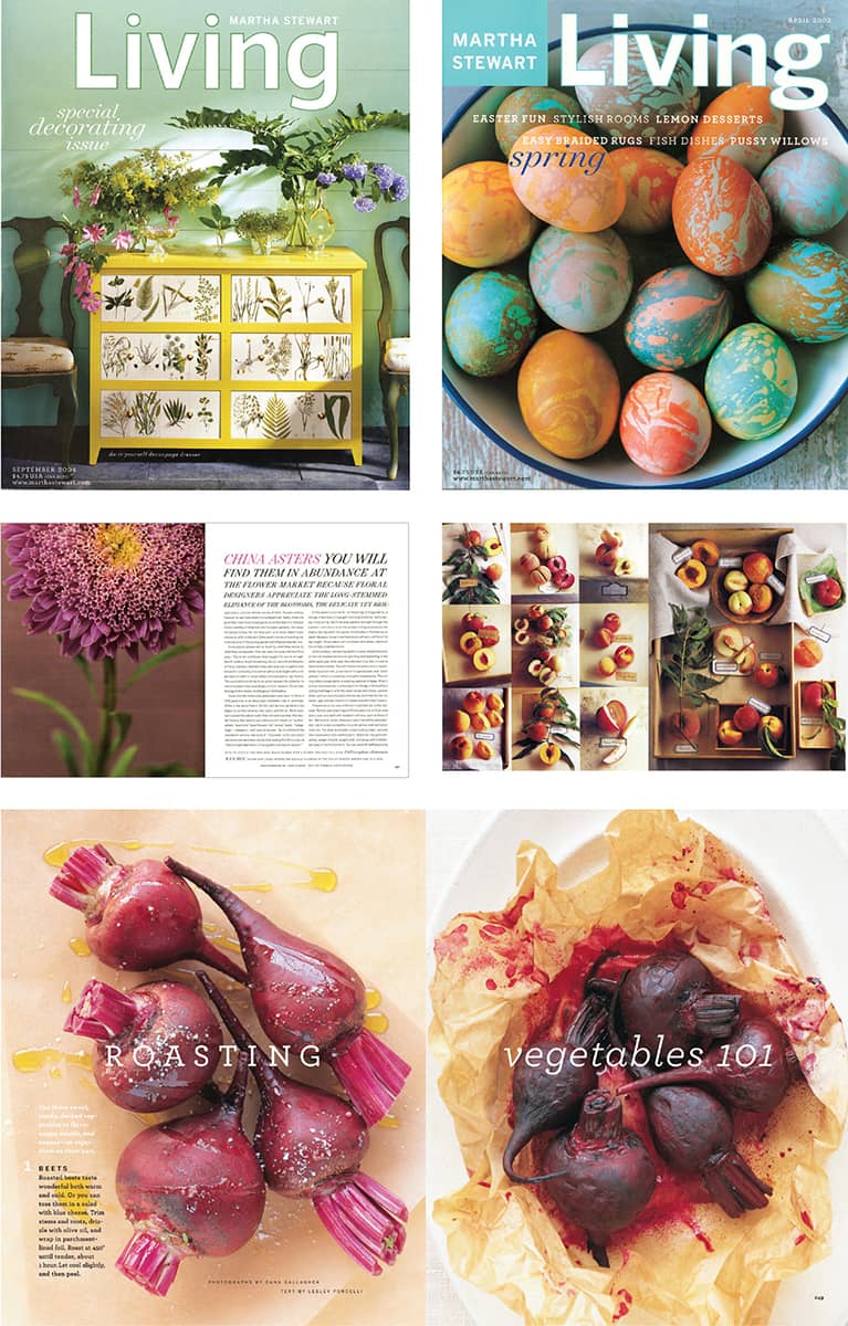
MARTHA STEWART LIVING MAGAZINE / USA, 1995–2003
New York
Originally published as the Sunday supplement of the New York Herald Tribune newspaper in 1964, New York had two of the most galvanizing personalities in New York’s publishing industry, its editor, Clay Felker, and staff writer Tom Wolfe. When the Herald Tribune closed in 1968, Felker and prior collaborator Milton Glaser › 170 decided to extend the life of New York as a weekly magazine covering every perspective—real estate, finance, dining, fashion, politics, shopping, everything—of living, working, and playing in the city. With Felker as editor and Glaser as design director, the first issue was launched in April 1968. It rode an ascendant wave of attention and acclaim until media mogul Rupert Murdoch snatched away the publication in 1977. New York continued, but it was not the same without Felker, Glaser, or its art director of nine years, Walter Bernard.
Beginning in 2004, the magazine underwent big changes, hiring editor Adam Moss and design director Luke Hayman. Together they went back to New York’s editorial and visual origins to create a new interpretation. The result was a tightly packed magazine that managed to feel both traditional and contemporary through the combination of various ingredients: several typefaces (including the original slab serif), mixed and matched freely; Oxford (or Scotch) rules as active framing devices; dynamic charts and diagrams; bold photography; and a redrawn logo by Ed Benguiat that ties together more than 40 years of publication. Since Hayman’s departure in 2006 to join Pentagram › 162, Chris Dixon has continued the evolution of New York as a vibrant representation of the city and the practice of editorial design.
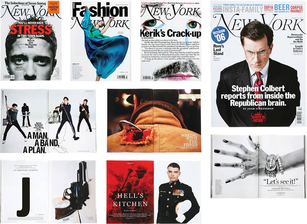
NEW YORK MAGAZINE / Pentagram: Luke Hayman / USA, 2005–2006
The New York Times Magazine
On September 6, 1896, the first printed photographs from the New York Times appeared in its inaugural issue of the Sunday supplement, The New York Times Magazine, and for more than a century it has literally supplemented the news with expanded views of the moment’s most pressing matters. In the late 1970s and early 1980s, under the art direction of Louis Silverstein, the New York Times newspaper underwent a significant redesign, introducing the six-column format, creating new sections, and revising older ones. Silverstein hired Ruth Ansel as art director for the magazine, after she left Harper’s Bazaar › 327, and while her interest wasn’t explicitly in the inside spreads and typography, she did create striking covers. She brought assorted voices to the magazine by commissioning work from photographers like Mary Ellen Mark, Gilles Peress, and Bill King, and, from her own acquaintances, by using illustration and artwork from local up-and-comers like Andy Warhol, Roy Lichtenstein, and James Rosenquist.
Ansel left in 1981 and Roger Black, previously at Rolling Stone › 328, took over in 1982; he gave the magazine structure and consistency while maintaining the gravitas of the covers. Beginning in 1994, with the art direction of Janet Froelich, who had previously worked at the weekend magazine of the Daily News, the Times Magazine began to introduce a sophisticated use of white space, inventive execution of typography, and commissioned stately photography and illustration. Perhaps a representative of the magazine’s astute blending of word and image is William Safire’s column, “On Language,” introduced in 1979. Every week Safire explores the grammar, usage, and etymology of words like warrior, epicenter, and nuance, and every week a designer or illustrator visualizes the word, making evident the communicative potential of writing and design, together.
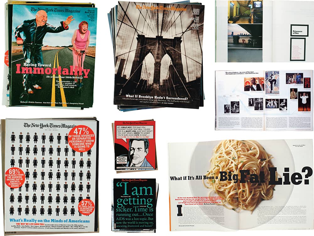
THE NEW YORK TIMES MAGAZINE / USA
