Lesson 37
Responsive Web Design
Web users now expect every website they access to be available not only on a desktop or laptop, but also on tablets and mobile phones. Although the browsers on mobile phones and tablets support most of the features examined in this book, it is not always easy to write HTML and CSS that provide an optimal experience on all devices because of their obvious differences in screen resolution.
This lesson will investigate a series of techniques and technologies that can be leveraged in order to create truly cross-device web pages. These techniques and technologies are often grouped under the umbrella term responsive web design, or RWD for short.
Responsive web design encourages designers to create a single set of resources for all devices, rather than creating specialized websites for different devices. This is becoming increasingly important as screen sizes diverge even within the same class of devices.
Responsive web design addresses the screen resolution problem from three angles:
- The techniques that can be used to construct HTML that automatically adjusts to different screen resolutions and creates the best possible user experience regardless of the screen resolution. These techniques present all the same information regardless of the screen resolution, but the manner in which content is sized and placed on screen will differ depending on resolution.
- The use of flexibly sized images and video that takes into account the overall width and height of the screen. This means ensuring that a resource does not use more space than that allocated by the design, ensuring it scales appropriately, and also ensuring that other elements adapt to the space taken by the resource as the screen resolution changes.
- The technologies that can be used for changing the content displayed on a web page based on screen resolution. For instance, it may be necessary to hide specific elements on small resolution devices. This can be achieved via a version of the CSS3 media queries you encountered earlier in the book.
Testing Screen Resolution
It is usually possible to test the way in which your design will react to changes in screen resolution by simply resizing the browser window. You can then determine the resolution of the browser window (or viewport) using the JavaScript commands window.innerWidth and window.innerHeight.
As you change the browser size, the web page will automatically adjust the content to adapt to the new screen resolution. This is the same basic process that is performed by the browser when the DOM is manipulated and involves calculating the position and size of each element.
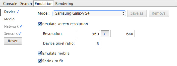
Chrome also provides a helpful utility for emulating other devices. Selecting the mobile phone icon in the developer tools will activate this.
Once enabled, you can choose from a variety of devices, or enter a custom screen resolution, as shown in Figure 37.1.
This allows you to see how a web page will render with various different screen resolutions.
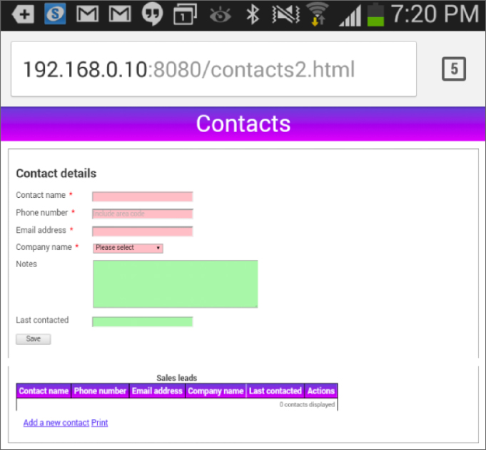
Although useful, unfortunately the emulator does not always accurately reflect the user experience. This is primarily because mobile browsers have adapted to the fact that websites are not mobile friendly and use numerous techniques to adjust. The emulator, by comparison, does not do this. For instance, when viewed on the phone itself the web page displays very differently than the emulator suggests. Figure 37.2 shows that an actual Galaxy S4 will resize elements so that they all fit on screen:
Although this is generally a useful feature, if you are building a truly responsive website, you generally want to disable this feature. This feature can be disabled via the following meta tag in the head section of the web page:
<meta name="viewport" content="width=device-width, initial-scale=1">This tells the browser that it should not try to scale the website; it should just assume it has been designed for the default width of the browser viewport. With this set, the Chrome emulator will accurately reflect the actual user experience for each screen resolution.
Flexible Grids
Responsive web design encourages the use of flexible (or fluid) grids for laying out components. Before beginning the exercise of converting the web application to use a flexible grid, let's comment out the table section. This element is naturally too wide for many devices, so we will address it separately in the next section when you look at media queries. To comment out the table, add the following to the opening table tag:
<!--table>and this to the closing tag:
</table-->This will leave the table in the markup, but it will be treated as an HTML comment and not displayed.
The current design of the CRM website uses fixed width elements. For instance:
input {
    width:200px;
}
label {
    width:150px;
    display: inline-block;
    vertical-align: top;
}
Although it is very easy to lay out components with fixed widths and sizes, this can make it impossible for some devices to render them. For instance, the combined width of the label and input fields in the preceding code is 350 pixels. Once margins, paddings, and borders are taken into account, the total width of the label and input field is more than many devices support.
It is generally only advisable to use pixel-based sizing if you are targeting a single screen resolution, and, as outlined earlier, such a move would go against the principles of responsive web design.
A flexible grid layout is capable of adapting automatically to changes and differences in screen resolution. The grids themselves are created with flexible units, such as percentages and em units, and avoid fixed-width units such as pixels.
Your design will be based on grid cells that occupy either half or one-quarter of the available width:
.grid_quarter {
    display:inline-block;
    vertical-align: top;
    width:23%;
    min-width:15em;
    max-width:25em;
}
.grid_half {
    display:inline-block;
    vertical-align: top;
    width:47%;
    min-width:15em;
    max-width:50em;
}
A minimum and maximum size for grid cells is also specified. This ensures that grid cells remain within sensible bounds.
The width properties have also be reduced slightly to allow for margins and borders. This means that four grid_quarter elements should be able to be placed side by side—assuming the screen resolution is greater than 60em.
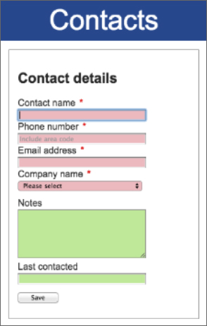
You can now place your input fields and labels inside these grids, using the most appropriate grid size for each element:
<form method="post">
    <div class="formRow">
        <div class="grid_quarter">
            <label for="contactName">Contact name</label>
            <input required autofocus autocomplete="off" name="contactName" type="text" class="validated" id="contactName" pattern=".{5,100}"/>
        </div>
        <div class="grid_quarter">
            <label for="phoneNumber">Phone number</label>
            <input required pattern="[0-9() ]{5,15}" placeholder="Include area code" name="phoneNumber" type="tel"   id="phoneNumber" class="validated" />
        </div>
        <div class="grid_quarter">
            <label for="emailAddress">Email address</label>
            <input required name="emailAddress" id="emailAddress" type="email" class="validated"/>
        </div>
        <div class="grid_quarter">
            <label for="companyName">Company name</label>
            <select required name="companyName" class="validated">
                <option value="">Please select</option>
                <option value="1">ABC Incorporated</option>
                <option value="2">XZY Ltd</option>
                <option value="3">ACME International</option>
            </select>
        </div>
    </div>
    <div class="formRow">
        <div class="grid_half">
            <label for="notes">Notes</label>
            <textarea cols="40" rows="6" name="notes" class="validated" maxlength="1000"></textarea>
            <div class="textCount"></div>
        </div>
        <div class="grid_quarter">
            <label for="lastContacted">Last contacted</label>
            <input name="lastContacted" type="text" class="validated"/>
        </div>
    </div>
    <div class="formRow">
        <input style="width:70px" type="submit" title="Save" value="Save"/>
    </div>
</form>
Notice that this design places each pairing of label and input field in its own grid element. These grid elements are then placed within your existing formRow elements.
This design will also rearrange the way labels and input fields are positioned in relation to one another. With a grid-based design, it is often advisable to place labels above input fields to prevent large discrepancies in size between the label and input field. To achieve this, the CSS rules associated with these elements have been changed as follows:
input, select, textarea {
width:90%;
}
label {
display: block;
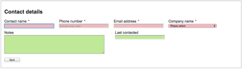
}With this in place, you can examine how the web page adjusts to changes in screen resolution. On a display with high resolution, the form appears as you see in Figure 37.3.
As the resolution is decreased, the grid elements naturally flow onto new lines, as you will see if you slowly reduce the width of the browser. Once the screen resolution is decreased to that of a typical mobile phone, it appears as you see in Figure 37.4.
This design is taking advantage of the manner in which inline elements (the grid elements) flow within a block element (the form rows). You can imagine them flowing exactly the same as text does within a paragraph: When the text reaches the edge of the screen, it simply wraps onto the next line.
It is also worth examining the percentages that have been used on input fields. These have been set to 90 percent, which may sound unusual. Percentages are always specified in relation to the total space allocated to the containing element. Therefore, if an input is placed inside a grid_quarter element, it will use 90 percent of the 23 percent of the screen allocated to the grid cell, or approximately 20 percent of the total width.
I have also changed header and footer elements to use em units to control their height:
header {
       background: #3056A0;
       color: white;
       text-align:center;
       line-height: 2em;
       font-size: 3em;
}
footer {
       line-height:2em;
       background: #3056A0;
       color: white;
       text-align:center;
       font-size: 0.8em;
}
You will notice that although both header and footer are set to a line-height of 2em, the two elements have very different heights. This seeming discrepancy exists because the em unit type expresses sizes in relation to the font size of the element itself, not the default font size of the entire page. Because the header font is 3em, the height of the header is over three times higher than the footer, which has a font size of 0.8em.
Most of the other changes made to the design involve changing pixels to em units and ensuring that elements always have appropriate minimum widths. For instance, the following two rules eliminate fixed sizes entirely:
#fileImport, #serverImport, #chooseTheme {
    margin: 2em;
    border: 1px solid #999999;
    border-radius: 1em;
    width: 50%;
    min-width:12em;
    padding: 1em 1em 0 1em;
    background: #DAECFF;
}
.theme {
    width: 1.5em;
    height: 1.5em;
    display: inline-block;
    border: 1px solid #999999;
    border-radius: 0.2em;
}
The one exception where pixel sizing is retained is with border sizes. This is usually considered acceptable because it is common to need finer control over the size of borders to stop them from becoming overpowering.
If you look through contacts.css on the book's website, you will see a number of other minor changes. The end result is that the web page can adjust to screen widths as low as 275 pixels, and it would be trivial to change it to function on even smaller screen resolutions.
Media Queries
Using a flexible grid should always be your starting point when creating a responsive design, but often it is not sufficient for all your needs. Sometimes changes to screen resolution mean that you need to make fundamental changes to your design.
This section will demonstrate how media queries can be used to detect screen resolution and will provide specific rules to suit this resolution.
Before beginning, uncomment the table in contacts.html because you will investigate how this can be modified with media queries to ensure it displays appropriately at all screen devices.
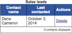
The table in the contactList section is a problem: There is no way that a six-column table will render on a small screen device such as a mobile phone. Although it is possible to add horizontal scrolling, this typically annoys users. You will therefore change the CSS to dynamically hide columns as the screen width shrinks.
Begin by adding three rules to contacts.css:
@media (max-width: 600px) {
  .medium-suppressed {
    display: none;
  }
}
@media (max-width: 450px) {
  .small-suppressed {
    display: none;
  }
}
@media (max-width: 300px) {
  .tiny-suppressed {
    display: none;
  }
}
These rules specify three new classes:
medium-suppressed: Can be used to hide elements on screens smaller than 600 pixelssmall-suppressed: Can be used to hide elements on screens smaller than 450 pixelstiny-suppressed: Can be used to hide elements on screens smaller than 300 pixels
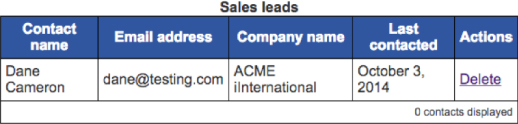
These classes can then be applied to cells in the table header:
<thead>
    <th>Contact name</th>
    <th class="medium-suppressed">Phone number</th>
    <th class="small-suppressed">Email address</th>
    <th class="small-suppressed">Company name</th>
    <th class="tiny-suppressed">Last contacted</th>
    <th class="noprint">Actions</th>
</thead>
and in the template that creates table rows:
<template id="contactRow">
    <td data-property-name="contactName"></td>
    <td class="medium-suppressed" data-property-name="phoneNumber"></td>
    <td class="small-suppressed" data-property-name="emailAddress"></td>
    <td class="small-suppressed" data-property-name="companyName"></td>
    <td class="tiny-suppressed">
        <time data-property-name="lastContacted"></time>
        <div data-property-name="notes" class="overlay">
        </div>
    </td>
    <td class="noprint"><a href="#" data-delete-button>Delete</a></td>
</template>
If you now reload contacts.html, and progressively shrink the screen resolution, columns will automatically disappear. For instance, at a width of 600 pixels, the web page appears as you see in Figure 37.5.
If the user turns his or her phone into landscape mode (with a screen width of 640 pixels), however, the web page automatically adjusts as you can see in Figure 37.6.
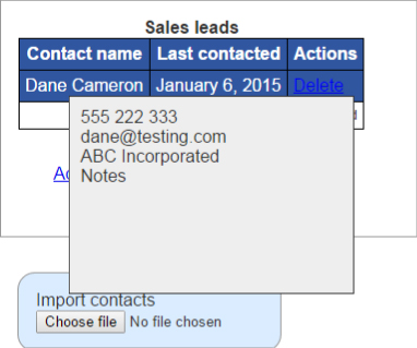
You now need an alternative approach for displaying the information that has been suppressed. For the sake of the example here, you will take advantage of the overlay that already displays notes.
Start by defining three classes that are the inverse of those created earlier: They hide elements as the screen resolution reaches a minimum width. This is achieved with the min-width property:
@media (min-width: 650px) {
  .medium-displayed {
    display:none;
  }
}
@media (min-width: 450px) {
  .small-displayed {
    display:none;
  }
}
@media (min-width: 300px) {
  .tiny-displayed {
    display:none;
  }
}
You can now rearrange the overlay so that it includes the various columns that may be hidden:
<div class="overlay">
    <div class="medium-displayed" data-property-name="phoneNumber"></div>
    <div class="small-displayed" data-property-name="emailAddress"></div>
    <div class="small-displayed" data-property-name="companyName"></div>
    <div data-property-name="notes"></div>
</div>
Finally, you will tidy up the overlay class in contacts.css so that it uses relative sizing:
.overlay {
    position: fixed;
    height: 60%;
    max-height:10em;
    width: 70%;
    max-width:15em;
    margin-left:-5em;
    border: 1px solid #333;
    background: #eee;
    display: none;
    z-index:1;
    padding:10px;
    color: #333333 !important;
}
If you use the overlay feature on a small screen device, it will now display as you see in Figure 37.7.
Along with min-width and max-width, media queries can also utilize the following properties:
min-height: The same asmin-widthbut is based on the height of the screen resolutionmax-height: The same asmax-widthbut is based on the height of the screen resolutionorientation: Accepts two values,portraitandlandscape, and matches when the device is using that orientation
The height and width selectors have companion selectors based on the device width—for instance, min-device-width. These match on the overall resolution of the device, rather than the resolution of the browser (or viewport). These should be avoided because the resolution of the browser should always form the basis of your design decisions, not the theoretical resolution available to the user.
Try It
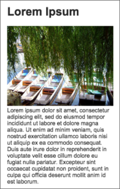
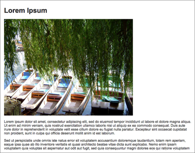
This Try It addresses the way resources, such as images and videos, should be sized in a responsive design. This will involve modifying a fixed-width design so that it displays on a variety of screen resolutions. You will start with a web page that displays as you see in Figure 37.8.
You will then modify this in a number of ways:
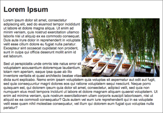
- Make the text wrap around the image.
- Make the image adjust to the size of the screen, ensuring that some text always wraps to its left until it reaches a very low resolution: At this point, the image will occupy 100 percent of the width.
- Ensure that the text never displays more than approximately 70 characters on a line because it can become difficult to read beyond this width.
Lesson Requirements
In this lesson, you will need the tryit.html page, which can be downloaded from the book's website, along with the image (photo1.jpg) used within the page. You will need a text editor and Chrome to complete this Try It.
Step-by-Step
- Open
tryit.htmlin your text editor and in Chrome. - Add a
metaattribute instructing theviewportnot to scale the website, but to assume it is tailored for the device width. - The web page contains three logical units: a header, an image, and a block of text set over four paragraphs. In order to clearly delineate these boundaries, place a
spanaround the image and another around the text, and assign these the class namesimageHolderand textHolderrespectively. - You always want the image to display on the right of the screen; therefore, add a
floatproperty toimageHolderto specify this. - The
imgelement has awidthattribute specifying it should use 600 pixels of horizontal space. Because you do not want to use absolute sizes, remove this attribute. - Without the
widthattribute, the image will expand to its natural resolution. However, you want the image to use at most 50 percent of the available width. Start by specifying that the width ofimageHolderis 50 percent. - The image is not scaled in relation to the width of its parent. The easiest way to scale the image is to add a rule that matches
.imageHolder img, and specify that it has amax-widthof100%. Essentially this is specifying that the maximum width of the image is the space available to it, ensuring that it scales both the height and width accordingly. - It can be difficult to read text if the line width is too short or too long so add a rule that matches
.textHolder p, and specify a maximum width of45emand a minimum width of15em. - A final problem with the web page is that the image becomes too small to see when the resolution drops below a certain resolution. In order to overcome this, add a media query that matches when the width is a maximum of 450 pixels. Add a rule to this specifying that
imageHolderhas a width of 100 percent.
When the web page is displayed, it should appear as you see in Figure 37.9 for resolutions over 450 pixels in width.
On a small screen device, such as a smart phone browser, the web page will display as shown in Figure 37.10.