Lesson 39
jQuery Mobile: Part I
I began this section of the book by looking at how a web application can be designed for mobile devices using the techniques and technologies associated with responsive web design. Responsive web design encourages the use of a single set of resources while ensuring the content dynamically adjusts to all relevant screen resolutions.
Although responsive web design is increasingly popular, there is an alternative school of thought that says large-screen devices and small-screen devices are fundamentally different, and their respective needs can only be met by creating two different web applications.
The following are the main arguments in favor of mobile-specific versions of web applications:
- Mobile devices support a different set of events from traditional desktop devices. This stems primarily from the fact that the user is holding the device in her hands, meaning it is possible to respond to touch- and motion-based events, such as the user swiping the screen, tapping and holding, or rotating the screen.
- Mobile applications typically approach navigation in a different manner than desktop applications. Rather than providing a single page with a diverse set of information, they provide information in bite-sized pages, and make it possible to quickly navigate from one page to another.
- Users of web applications on desktops and laptops, by comparison, typically become frustrated by websites that require excessive navigation, even though this is a popular technique used to increase advertising revenue on many sites.
- Mobile devices are often connected to slower connections than networked devices such as desktops, and users typically pay far more money for their mobile data. The fact that a typical home page on a website is now over 1MB in size, and can be far larger, can have a major impact on usability for mobile users, both in terms of time and money.
- A mobile-specific web application will therefore ensure that a minimal set of resources is downloaded on page load and that subsequent resources are loaded on-demand.
The next two lessons will look at how the jQuery Mobile library can be used to create a mobile-specific web application. This will involve creating a new set of resources for the CRM web application while retaining the majority of the JavaScript code.
This lesson will focus on the way in which a mobile web application can be structured into a set of pages and the manner in which the user can navigate between these pages. The next lesson will then focus on mobile-specific UI components and mobile-specific events.
Understanding jQuery Mobile
Despite the fact that it has jQuery in its name, jQuery mobile encourages a very different form of programming from what you have seen up until this point in the book.
jQuery Mobile is a framework for developing mobile web applications. In order to use jQuery Mobile, you are responsible for describing the style and behavior of each element, but jQuery Mobile—for the most part—is responsible for implementing this.
For example, consider the following hyperlink, which will form part of your web application:
<a href="#settingsPage" data-role="button" data-icon="gear" class="ui-btn-right" data-transition="slideup">Settings</a>As you can see, this hyperlink contains three data attributes and a class, all of which have special meaning to jQuery Mobile. Some of these describe the way the hyperlink should appear:
- It should be styled as a button.
- It should appear on the right side of its container.
- It has an icon provided by jQuery Mobile called “gear.”
Other data attributes describe the behaviors of this hyperlink when clicked; for example, it transitions using a “slide-up” effect.
With these attributes and classes in place, simply importing the jQuery Mobile library and style sheet is sufficient to create the button shown in Figure 39.1 and provide its “click” functionality:

jQuery Mobile supports well over a hundred data attributes, all with their own specific purpose and set of values. Although this lesson focuses on only a small number of these, once you understand the basic approach, it is straightforward to discover a whole world of functionality by browsing the demos and APIs at jquerymobile.com.
Importing jQuery Mobile
To begin your mobile web application, create a file called mobile_contacts.html in the same folder as contacts.html.
You will use version 1.4.4 of jQuery Mobile in this lesson. As with most JavaScript libraries, you have the choice of using a CDN-hosted version or downloading and hosting your own copy of this library. In this lesson, you will host your own version of the library.
jQuery Mobile can be downloaded from the jQuery Mobile website at jquerymobile.com, or it is available on the book's website. The download consists of a zip file containing a set of JavaScript files, CSS files, and images.
Once downloaded, extract the zip file into the folder containing mobile_contacts.html, creating a sub-folder called jquery.mobile. You should then import the relevant resources in the head section of mobile_contacts.html (ensuring that the jQuery Mobile library is imported after the main jQuery library). Your HTML page should begin like this:
<!DOCTYPE html>
<html lang="en">
    <head>
        <meta charset="utf-8">
        <meta name="viewport" content="width=device-width, initial-scale=1">
        <title>Contacts</title>
        <script src="jquery-2.1.1.js"></script>
        <script src="jquery-ui.js"></script>
        <script src="contacts.js"></script>
        <script src="jquery-time.js"></script>
        <script src="jquery-tables.js"></script>
        <script src="find.contacts.js"></script>
        <link rel="stylesheet" type="text/css" href="jquery-ui.css">
        <link rel="stylesheet" href="jquery.mobile/jquery.mobile-1.4.4.min.css" />
        <script src="jquery.mobile/jquery.mobile-1.4.4.min.js"></script>
    </head>
    <body>
        <main id="contactScreen">
        </main>
    </body>
</html>
Notice that you also set the viewport width and initial-scale, and that you have imported any other relevant files such as contacts.js. You do not import contacts.css, however, because jQuery Mobile includes its own style sheets, and these will meet most of your needs.
Mobile Design
Your first task in designing your web application is to determine the pages that will make up the web application, and the flow a user will follow as he navigates from one page to another.
This web application will consist of four logical pages:
- A page containing a list of saved contacts. This will be the default page presented to users when the web application loads.
- A page for entering details for a new contact. Users can navigate to or from this page via the list page.
- A page for viewing details and any notes relating to a contact: This has been implemented as an overlay in the current web application but makes sense to implement as a page in your mobile web application. This user will navigate to this page from the list view.
- A page for any settings or utilities such as file upload and server download functions. This user will navigate to this page from the list view.
JQUERY Mobile Pages
A page in a jQuery Mobile web application does not need to be realized by an HTML file. Instead, it is possible to group together many mobile pages in the same HTML page, and use jQuery Mobile to navigate from one page to another.
jQuery Mobile achieves this via DOM manipulation: It simply hides the logical pages that are not visible and transitions from one page to another through a combination of DOM manipulation and animated transitions.
In order to indicate that an element in the web page represents a logical page, you tag it with the attribute data-role=”page”, and provide an id to uniquely identify the page.
Although it is common to use div elements as the container for pages, it is possible to use any block-based element, such as a section. For instance, the following represents a page for displaying a list of contacts. Read through the code first, and I will then walk you through each relevant element and attribute:
<section id="contactListPage" data-role="page">
    <div data-role="header">
        <h1>Contact list</h1>
        <a href="#settingsPage" data-role="button" data-icon="gear" class="ui-btn-right" data-transition="slideup">Settings</a>
    </div>
    <div data-role="content">
        <table data-role="table" data-mode="columntoggle"
            class="ui-responsive ui-table">
            <thead>
                <tr>
                    <th data-priority="1">Contact name</th>
                    <th data-priority="1">Phone number</th>
                    <th data-priority="1">Actions</th>
                </tr>
            </thead>
            <tfoot>
                <tr>
                    <td colspan="3">0 contacts displayed</td>
                </tr>
            </tfoot>
            <tbody>
            </tbody>
        </table>
    </div>
    <div data-role="footer" class="ui-bar" data-position="fixed">
        <a href="#contactDetailsPage" id="addContact" data-role="button" data-transition="slide" data-icon="plus">Add</a>
    </div>
</section>
The page itself has been broken into three sections, each of which consists of a div with a data-role attribute:
- The top
divdefines the header of the page; in mobile web applications, it is typical for this to describe the content of the web page and to offer navigation links to other pages. - The middle
divcontains an area for the main content of the page. - The bottom
divcontains the footer of the page. It is conventional for this area to contain a toolbar for invoking actions on the page. - In this particular example, the footer has a property
data-position=”fixed”: This will ensure that the footer always appears fixed at the bottom of the screen, even if the table contains a large number of contacts and requires scroll bars.
Within this basic structure, you begin adding content. For instance, the content area of the screen contains the table of contacts. You will notice that this table has been defined with the following attributes: data-role=”table” data-mode=”columntoggle”.
The first of these attributes is used to tell jQuery Mobile that it needs to customize this table for mobile devices, while the second attribute tells it what strategy to use for this customization.
jQuery Mobile supports two basic modes or strategy of table. These two modes are both intended to allow the table to respond to varying screen resolutions, but each does so in its own unique way.
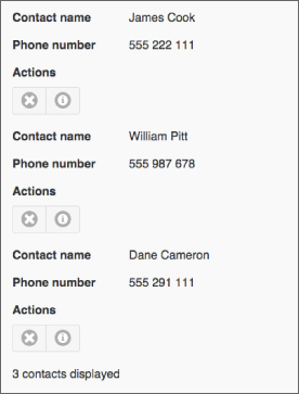
The default table mode is reflow: In this mode, the table is displayed in a conventional manner where space permits, but when the resolution becomes too low, the columns are displayed vertically rather than horizontally, as Figure 39.2 shows.
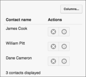
For the example here, you will use the columntoggle mode. This mode will mean that a button is automatically added to the screen to allow users to hide or show columns as required. In addition, this mode allows th cells to be marked with the data-priority attribute: If the table contains too many columns to fit the screen resolution, jQuery Mobile will start excluding columns that have the lowest priority (the highest number). In this particular case, it will mean hiding the phone number column. This produces the table shown in Figure 39.3.
You will continue to use a template to add contacts to the web page so add the following to the web page before the closing main tag. It is not necessary to add the data-priority attribute to the cells in the body of the table:
<template id="contactRow">
    <td data-property-name="contactName"></td>
    <td data-property-name="phoneNumber"></td>
    <td>
        <div data-role="controlgroup" data-type="horizontal" class="ui-mini">
            <a href="#" data-role="button" data-icon="delete" data-iconpos="notext" style="height: 18px;" data-delete-button></a>
            <a href="#" data-role="button" data-icon="info" data-iconpos="notext" style="height: 18px;" data-notes-button></a>
        </div>
    </td>
</template>
This is essentially the same as the template in contacts.html, except it contains fewer columns and one additional button for displaying the notes for the contacts.
Because two buttons are being displayed side-by-side in single columns, they have been contained within a div defined with data-role=”controlgroup”: This control can be used wherever buttons need to be grouped together, such as a menu. In this example, you have also specified that the buttons should be displayed horizontally, while the class ui-mini ensures that small icons are used.
You will also notice that you are taking advantage of more jQuery Mobile icons for these buttons: delete and info. jQuery Mobile provides approximately 50 icons that will meet most of your development needs; these are documented fully on the jQuery Mobile website.
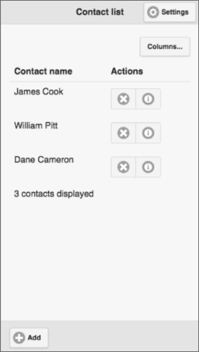
Once you have contacts loaded into the mobile web application, it will display as you see in Figure 39.4.
Notice that you did not invoke a single line of JavaScript or define a single CSS rule, yet jQuery Mobile has constructed a mobile website conforming to the conventions of mobile applications.
Form-Based Pages
You can now add the second page to your web application: This will be used for capturing information about a new contact. To create this page, add the following code, immediately after the page created earlier.
<section data-role="page" id="contactDetailsPage">
    <form method="post">
        <div data-role="header">
            <h1>Enter details</h1>
             <a href="#contactListPage" data-role="button" data-icon="home" class="ui-btn-right">Home</a>
        </div>
        <div data-role="content">
            <div class="ui-field-contain">
                <label for="contactName">Contact name</label>
                <input required autofocus autocomplete="off"
                    name="contactName" type="text"class="validated"
                    id="contactName" pattern=".{5,100}" />
            </div>
            <div class="ui-field-contain">
                <label for="phoneNumber">Phone number</label>
                <input required pattern="[0-9() ]{5,15}"
                        placeholder="Include area code"
                        name="phoneNumber" type="tel"
                        id="phoneNumber" class="validated" />
            </div>
            <div class="ui-field-contain">
                <label for="emailAddress">Email address</label>
                <input required name="emailAddress" id="emailAddress"
                        type="email" class="validated" />
            </div>
            <div class="ui-field-contain">
                <label for="companyName">Company name</label>
                <select required name="companyName" class="validated">
                    <option value="">Please select</option>
                    <option value="1">ABC Incorporated</option>
                    <option value="2">XZY Ltd</option>
                    <option value="3">ACME iInternational</option>
                 </select>
            </div>
            <div class="ui-field-contain">
                <label for="notes">Notes</label>
                <textarea cols="40" rows="6" name="notes" class="validated"
                    maxlength="1000"></textarea>
                <div class="textCount"></div>
            </div>
            <div class="ui-field-contain">
                <label for="lastContacted">Last contacted</label>
                <input name="lastContacted" type="text" class="validated" />
            </div>
        </div>
        <div data-role="footer" class="ui-bar" data-position="fixed">
            <input data-role="button" class="ui-btn-right"
                  data-inline="true" data-icon="check" type="submit"
                  title="Save" value="Save" />
        </div>
    </form>
</section>
The basic structure of this page is exactly the same as the contact list page; it contains header, footer, and content sections. The most interesting aspect of the form, however, is that each label/form field pair is placed inside the following construct:
<div class="ui-field-contain">The ui-field-contain class is responsible for determining the best way to lay out a label alongside a form field. If space allows, the label will be placed to the left of the form field; otherwise, it will be placed above it. This means that you can simply add fields without concerning yourself with how they will be displayed.
When a jQuery Mobile web application is loaded, the first page defined in the HTML will be displayed by default. In order to display the Create contact page, you therefore need to define a transition. This was already provided in the footer of the Contacts list page:
<a href="#contactDetailsPage" id="addContact" data-role="button" data-transition="slide" data-icon="plus">Add</a>Notice that the href contains a hash and then the ID of the page that is being transitioned to? When clicked, this link will request the resource mobile_contacts.html#contactDetailsPage. The hash character has special meaning within a hyperlink: It is called a fragment identifier, and indicates that the browser should navigate to a specific location defined within the page—in this case, a specific location within mobile_contacts.html.
This is typically achieved by adding a link with a name attribute within the web page:
<a name="section1"></a>These are referred to as named anchors. It is then possible to link directly to this position with either relative or absolute URLs—for instance:
<a href="#section2">Go to section 2</a>or
<a href="http://page1.html#section2">Go to section 2</a>With jQuery Mobile, you are only responsible for ensuring that the text after the hash matches the id of a page: jQuery Mobile will take care of the rest.
Also notice that it is possible to define transitions using the data-transition attribute: In this case, we have defined a “slide” transition from one page to the other. Other supported transitions are slideup, slidedown, pop, fade, or flip. It is also possible to reverse the direction of a transition with data-direction=”reverse”.
Although the jQuery Mobile CSS files meet most of your needs, you will also add a small number of styles at this point for specific functionality required by your web application. These can simply be added in a style tag in the head section:
<style>
thead th {
  border-bottom: 1px solid #dedede;
}
.validated:invalid {
       background:#FAC3C9;
}
.validated:valid {
       background:#BDF0A8;
}
.requiredMarker {
       color: red;
       padding-left:0.3em;
}
</style>
If you reload the web page and click the Add button in the footer, you should see the page shown in Figure 39.5 displayed.

JavaScript
The final change you need to make is to ensure that the relevant code in contacts.js is initialized. This presents a minor problem because you do not need some of the functionality in contacts.js, but you want to reuse 90 percent of the code.
In order to deal with this, you will pass a parameter to the contact's controller indicating whether this is a mobile web application; therefore, you should add the following to the end of the web page:
<script>
    $('[name="lastContacted"]').datepicker({
        minDate : "-6m",
        maxDate : 0
    });
    $(document).ready(function(evt) {
        var mainElement = document.getElementById('contactScreen'),
        var screen = contactsScreen(mainElement, true);
        screen.init();
    });
</script>
A version of contacts.js that implements the necessary changes is available from the book's website. This version of the code has also reverted to the web storage API as opposed to Indexed DB. This is primarily because mobile browser support of APIs is typically behind desktop browsers, and IndexedDB is not as widely supported.
Try It
In this Try It, you will enhance the mobile web application by adding the capability to view notes for a contact.
Lesson Requirements
In this lesson, you will need the mobile_contacts.html page, which can be downloaded from the book's website if you have not followed along with this lesson. You should also download contacts.js from the book's website.
Step-by-Step
- Open
mobile_contacts.htmlin your text editor and in Chrome. - Start by adding a new page to the web application. This should have an
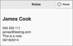
idofcontactNotePage. - Add a header to the page, and include in this a description of the page (for example, “Contact notes”), and a home button for returning to the List contacts page.
- Add a content section to the page.
- Within the contact section, add an
h2element for the contact name. You will use thebindmethod to populate this (and the other fields that you will add) to add adata-property-nameattribute with the valuecontactName. - Add four more
divelements withdata-property-nameattributes forphoneNumber,emailAddress,notes, andlastContacted. - The buttons the user will press to view the notes have the data attribute
data-notes-button. Withincontacts.js, add click listeners for these buttons. - The click listener first needs to determine the contact that has been clicked on by finding the parent
trelement, and thecontactIddata attribute that has been set on this (if you need a hint, look at what you did with the delete functionality). - Find the relevant contact in
localStoragebased on the ID found in Step 8. This will involve parsing the contacts into an array and looping through until you find the contact with the matching ID. - Invoke the
bindfunction, passing it a reference to thecontactNotePageand the contact found in Step 9. This will populate the fields in the page with the appropriate values. - You now need to programmatically change pages. In order to do this, you first find the page container using
$(”:mobile-pagecontainer”); in our case this will return themainelement because that is the parent of all the pages. Thepagecontainermethod can then be invoked on this element and passed three parameters:”change”: Indicates that the page should be changed.”#contactNotePage”: This is the page that should be displayed.{transition: ‘slide'}: This object accepts any optional parameters; for your purposes here, you only need to specify the transition effect.- You should now be able to reload the web application and click the information button next to any contact to display the notes recorded, as shown in Figure 39.6.