Chapter 12
CSS3: New Styling Techniques
Every chapter up to this point has been about HTML5. However, each chapter has included pieces of CSS code along with the HTML. You cannot learn HTML without touching CSS.
In this chapter, we will explore some of the new properties and functionality that CSS3 provides to web developers. CSS3 offers nearly 200 new properties and enhancements to CSS2. In many cases, the improvements solve problems developers have encountered in the past. Some of the additions make your CSS code easier to read. Other enhancements are purely visual candy. The difficult part of writing this chapter was determining what to leave out.
CSS3 is divided into many different modules. Each module is tasked with one portion of web design. The modules include backgrounds, font, transformations, animation, and user interface improvements. I think that even the most experienced CSS developer will believe that CSS3 is awesome.
CSS3 Modules
Like the new tags in HTML5, not everything in CSS3 works in all browsers. However, the majority of the new properties will work in both current and older browsers. Support in older browsers requires the use of a browser prefix. Table 12-1 lists the prefixes and versions for each browser.
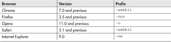
Table 12-1 Browsers and Associated Vendor Prefixes
The prefixes arose from browser developers implementing their own competing CSS standards prior to the acceptance of CSS3. However, some of the accepted properties still require the prefixes. Table 12-1 gives a guide as to when the prefix is necessary. As a rule, I include all prefixes in my CSS, just to make sure. I know that it is overkill, but I want to ensure that my CSS works in as many browsers as possible. Unlike HTML5, most of these new properties will work in both modern and older Internet Explorer windows.
Web Fonts
One of the things that my design students hate about designing web pages is the limited choice of fonts available. I am forever discussing the use of web-safe fonts with the students. Students always say, “The page font worked at home, but not here at school.” Thankfully, W3C has solved this problem for web developers. Designers can now use any font they legally own. CSS3 has included a new rule called @font-face.
The @font-face property will instruct your browser to download the specified font. Thus, there is no more need to discuss web-safe fonts. With just a little work, all fonts are web-safe.
CAUTION
Using fonts on a web page is tricky from a legal standpoint. Font licenses often allow you to install them on a computer or network and print any document with them. Adding them to a web page will require downloading the font to the client computer. This may be a violation of the user license. For now, stick with fonts that are freeware or have an end-user license agreement (EULA) that supports web use.
CSS3 Rules for Fonts
CSS3 rules are a departure from traditional CSS thinking, which is that CSS properties are used to format a single element. In contrast, the rules apply to other CSS values. You can think of them as programmed defined constants. Once you create and name the @font-face rule, you can use it wherever you want in the CSS document.
CAUTION
Downloading large font files can take time. Be sure you truly need the font before uploading a large font file.
You need to set up the rule before you can use it. For @font-face, you need to create a new @font-face section within your CSS document. Within this section are the properties of your desired font. You need a src entry to describe the location of the font. The src property can take many parameters. Typically, you list one URL per version of the font you have. The font files should reside on the same web site as the CSS document. If you are using a common font, such as those included with an operating system, the local() function can also be added to the src entry. In the event that your user already has the font, then the browser does not need to download another copy.
Your @font-face section will also need a font family name. This is the name used within your CSS document to apply your font.
In addition to the source and font family, you can specify a font weight and a font style. These optional parameters have been available in CSS for quite some time. The font-weight property sets bold or normal font. The font-style property applies italics, underline, or strike-through. You’ll see an example of a @font-face section in Code Listing 12-1, coming up soon.
Font Formats
Unfortunately, there are many different formats for fonts. The old standby in the publishing world is TrueType Fonts (TTF). All browsers, except Internet Explorer, support TTF fonts.
Internet Explorer 9 and earlier versions support the proprietary Embedded OpenType (EOT) fonts. Thus, to support all browsers, you need to upload at least two font files to your site: a TTF file and an EOT file.
To add confusion to the mix, many other forms of fonts exist. Table 12-2 shows the matrix of fonts and browser support. To be safe, you should upload all versions of the font to your web site. If you want to use italics or other special versions of the font, you will need to upload those files as well.
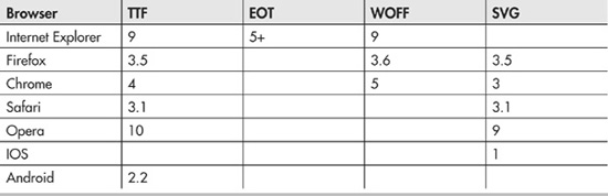
Table 12-2 Font and Browser Support Matrix
TIP
To generate your font files, visit www.fontsquirrel.com/fontface/generator. This site will convert your files for free and provide the valid CSS to use the fonts.
Using Fonts on a Web Site
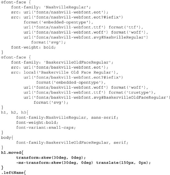
Code Listing 12-1 shows the CSS code needed to use the Nashville and Baskerville Old Face Regular fonts on a web site. Nashville is a freeware font acquired from www.fontspace.com. Baskerville is a Microsoft Office font, which is likely to be on a user’s machine. The CSS code was generated by FontSquirrel.com and modified for my web structure. The complete code for this and the other examples in this chapter is available on www.webbingways.com or www.mhprofessional.com/computingdownload.
Code Listing 12-1 The CSS to declare and use a web font
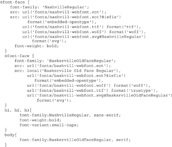
Code Listing 12-1 shows the creation of the @font-face section and the usage within the code. Notice that I list a default font, even though I am downloading the font to the user.
In Internet Explorer, this resulted in a temporary rendering of my font while the Nashville font downloaded. On machines that do not support downloading, you still have some control over the visual effect. Figure 12-1 shows the fonts working in Internet Explorer 9.
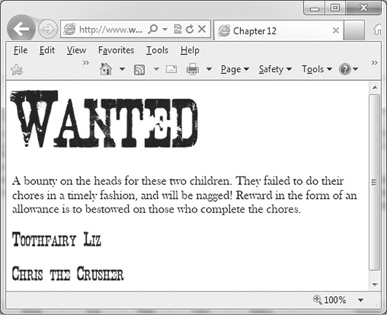
Figure 12-1 Web fonts in Internet Explorer 9
Fonts embedded within CSS are not entirely new. Internet Explorer supported embedded fonts as far back as version 4. It was not widely implemented for a number of reasons. Many of the problems that plagued Internet Explorer’s embedded fonts still exist today:
 The legal issue is very important. Be entirely sure that you have permission to use the font on the web site.
The user’s computer may refuse your font. You need to include a default font.
Really large files can take a long time to download, especially on mobile devices. Include a font only if it is essential to your page, and then limit its use to logos, headers, or other small amounts of text.
Embedded fonts may not scale well. They will probably look fine at 12 points, but once you start adjusting the size, pixelation will occur. In many cases, it might be better to simply build images of what you wanted rendered in a different font.
Embedded fonts often do not respond to other CSS formatting. For example, setting color or transforms on embedded fonts may not work.
TIP
Microsoft provides a free utility titled Microsoft Web Embedded Font Tool (WEFT). This tool will convert local font files into web-embedded fonts and upload them directly to your web server. Despite being built for Windows 98, the tool still runs well on modern operating systems.
Backgrounds
Backgrounds have been around since HTML version 2. CSS3 gives you a little better control over where the background image appears on the page, and even how many different images are in the background.
Multiple Backgrounds
The use of multiple backgrounds is easy to implement, but it is hard to implement well. Using the traditional background-image: property, you simply need to list two (or more) url functions to background images.
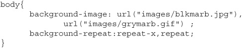
Code Listing 12-2 shows the use of two backgrounds: one a black-marbled tiled pattern as a top border, and the rest of the page light marble. Prior to CSS3, you would need to z-index stack a div on top of the background to achieve this effect. CSS3 will automatically set the z-index for each background you list. The first listed background is on the top, the next is below the previous one. The background-repeat property creates a top border without requiring you use divs for the background.
Code Listing 12-2 Multiple backgrounds in CSS
Background Placement
In addition to stacking backgrounds, CSS3 allows you to decide where in the CSS box model the background starts. Recall that the box model has three components: the border box, the padding box, and the content box. CSS3 backgrounds now allow you to specify which of the three boxes will have the background. The new property that controls which part of the box model has the background is background-clip.
The background-clip property takes one of three values:
The content-clip value places the background behind the content box only, and not behind the padding box.
The padding-clip value renders the background behind the padding area, completely enclosed within the border. This setting is useful only if you specify a padding value for the cell.
The border-box value will extend the background to behind the border. This effect is visible only if you have a border with transparent portions.
Code Listing 12-3 shows the CSS to view the background-clip effect. Notice that I included –moz-background-clip. This provides compatibility with Firefox browsers 3.6 and earlier.
Code Listing 12-3 Using background-clip
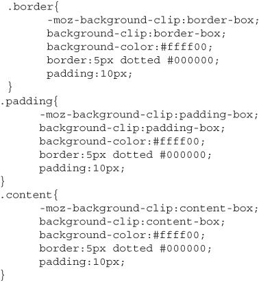
Code Listing 12-3 creates three classes, named border, padding, and content. Each is the same except for the background-clip property. The first div shows background-clip, which renders the background color between the dots. Using padding-clip does not place the background color between the dots. Finally, content-clip does not fill the entire box, as the padding does not have the background. I applied each class in an HTML document with three div tags. Figure 12-2 shows the page when viewed in Internet Explorer.
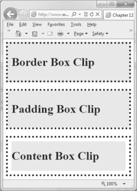
Figure 12-2 The border-clip property applied
Borders
Borders in CSS have received several improvements, primarily designed to simplify a task that is difficult in CSS. Here, we’ll look at how to create borders with rounded corners, shadows, and images.
Borders with Rounded Corners and Shadows
The new border-radius property creates a rounded corner on a border. Prior to the introduction of this property, creating a rounded border required many CSS classes. The border-radius property requires one parameter: the radius of the corner, in pixels. When setting border-radius, remember that the larger the radius, the bigger the circles on the corners. For older Firefox browsers, attach the prefix –moz. If desired, you can set a different radius for each corner.
TIP
border-radius is a shortcut property. If desired, you can set each corner border individually with the border-bottom-right-radius, border-top-right-radius, border-bottom-left-radius, and border-top-left-radius properties.
Another improvement is the box-shadow property, which creates a shadow behind a border box. Creating shadows in CSS2 took a number of properties.
The box-shadow property accepts several parameters:
The x-offset and y-offset values are required. These pixel measurements are the distances from the box to the shadow. By default, the shadow appears below and to the right of the box. Using negative values can place the shadow above and to the left.
The color value of the shadow must be specified.
The optional blur-radius parameter converts the shadow from having a clearly defined edge to an edge that dissolves into the background.
The spread-radius parameter can make the shadow a different size than the object.
The optional inset parameter will convert the shadow to be inside the box. By default, the inset will be on the top left of the box. Using negative numbers will move to the opposite side.
The following is the full syntax for box-shadow:
For complete compatibility with older browsers, you need to include three properties: box-shadow, -moz-box-shadow, and –webkit-box-shadow.
Code Listing 12-4 contains the CSS code to create borders with rounded corners, a box shadow, and an inset shadow. Figure 12-3 displays the results in Internet Explorer.
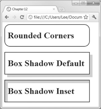
Figure 12-3 Rounded corners and shadows
Code Listing 12-4 CSS to create borders and box shadows
Images as Borders
The border-image property allows you to select an image for the border of a section. Using a border image is not necessarily easy. It takes a little work.
NOTE
Unfortunately, at the time of this writing, the incredible border-image property is not yet supported in Internet Explorer.
First, you need to obtain your border image. The best images are those that have a clearly defined corner element and a repeatable element between the corners. For example, I saw a page with flowers on the corner and ivy vines between the corners. For my example, I created a 30-pixel-wide purple diamond for the corners, and 30-pixel-wide gray diamonds for the repeated image. My image was 90 × 90 pixels. Figure 12-4 shows the border as well as the image I used to generate it.
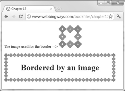
Figure 12-4 The border-image property applied
TIP
The size of the elements is crucial. These will become the parameters to your border-image property.
Once the image is created, you need to build your CSS. Start by creating a standard CSS border. In particular, be sure that you set the width of the border. Your browser will scale your image to this size. Once this border works, enter the border-image property. Your code will be similar to the following:
The element size and width are the size of the elements in your image. Remember that the example uses a 30 × 30 diamond, generating a 90 × 90 image. Since I used 30-pixel diamonds, I tell CSS to slice the top 30 × 90 pixels from the image. The first 30 × 30 image becomes the top-left corner. The last 30 × 30 image in the slice becomes the top-right corner. The middle 30 × 30 image is repeated across the div. This process is repeated for the bottom line, except the bottom 30 × 90 slice is repeated across the bottom. To generate the sides, the middle 30 × 90 image is repeated down until the entire area is bordered.
TIP
One of the uses for the border-image property is to create a dynamically sized button. Draw a rectangle with rounded corners in a paint program and save it as a PNG. Add the code to build a border image, and you have a custom button.
Code Listing 12-5 shows the CSS that produced Figure 12-4. Notice that it includes the vendor prefixes for compatibility with older browsers. If this page is viewed in Internet Explorer, the border will be a dotted gray.
Code Listing 12-5 Using border-image around a div tag
This example builds a border image by repeating elements in the image. Replacing the value repeat with stretch will make the image stretch to fit the border. This effect works well with a predrawn border, like a picture frame. Later in the chapter, Code Listing 12-7 demonstrates this technique.
Transformations
A transformation is a change in an object. CSS3 makes it possible to rotate, skew, or otherwise change how an object is rendered. You can create parallelograms, or twisted or mirrored sections on the page.
CSS3 offers both 2D and 3D transformations. The 2D transformations are supported in all modern browsers. Currently, only Chrome and Safari support the 3D transformations.
Table 12-3 lists the transformation functions to use with transform. When calling the transform functions, you need to specify the units. For example, when calling the skew method, you need to code transform:skew(20deg, 15deg). The deg tells skew that the unit is in degrees. Similarly, for functions that take pixels, be sure to specify pixels.
Table 12-3 Transformation Functions and Parameters
CAUTION
Be careful using these transformations. Too many transformations can make your page look bad.
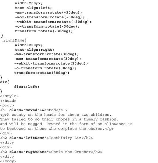
Code Listing 12-6 adds transformations to the wanted poster created earlier in Code Listing 12-1. It implements the skew, translate, and rotate methods. I used skew on the header, creating a backward italics effect. I translated the header 150 pixels to the right of the line. Finally, the rotate method angles the names in text, creating a taped-on effect. Figure 12-5 shows the results in Internet Explorer.
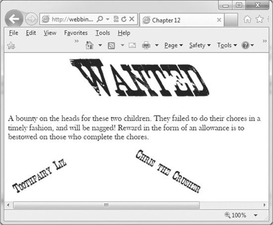
Figure 12-5 The transform function working in Internet Explorer
NOTE
Some odd interactions between dynamic fonts using @font-face and CSS transformations were observed in browsers at the time of writing. Check your browser for display quirks.
Code Listing 12-6 Transformations added to the wanted poster
Transitions
CSS3 makes it easier for the developer to create animations on a web page without needing to use JavaScript or Flash. This is a very important development. Owners of the iPhone, iPod touch, and iPad are quite aware that their devices currently cannot play Flash, and may never play Flash if Apple keeps its current position. With a few lines of CSS code, really neat effects are possible.
The transition allows you to specify how an object changes over time. Prior versions of CSS made changes happen immediately. Table 12-4 lists the values for the transition-timing-function property. The change is typically triggered by one of the three dynamic action pseudo classes: hover, active, or focus. You need to specify what happens, over how much time, and the delay before the transition starts.
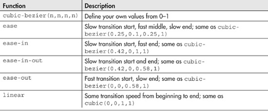
Table 12-4 Transition Timing Functions
Table 12-5 lists the CSS properties that can be part of a transition. Unfortunately, you cannot animate the background image with a URL. You can change only the gradient.
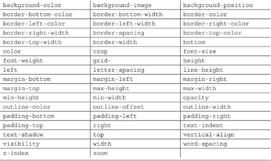
Table 12-5 Properties That Can Be Used in Transitions or Animations
Transitions are applied to divisions or other sections on your page. Start building the transition by creating the div style, in the manner it appears before the transition. In particular, you need to specify the original value of the properties you are going to transition. The next step is to define the transition properties. For simple transitions consisting of just a property change and duration, the shortcut will work fine. For complex transitions that modify multiple properties, you will need to specify each property explicitly.
After you specify this transition, you need to build another style for the div event. The three events are hover, focus, and active. Inside this style, you specify the value for the property after the transaction. Finally, you can specify code for the transitionEnd event, which calls a programmer-specified JavaScript function whenever the transition is finished.
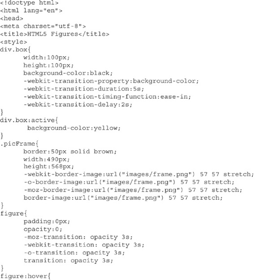
Code Listing 12-7 is a complex chunk of code. It creates two transitions and another border image. The border image takes the image of a picture frame I drew in Photoshop and extends it around the image of the all-stars athletes page from Chapter 10.
The first transition creates a div.box that when clicked and held will eventually reveal directions for the picture frame. Clicking and holding an object makes it active. The directions are revealed simply by changing the background color.
The second transition slowly displays the figure within the frame. The figure:hover setting slowly sets the opacity to 0, making the figure visible. The second transition also demonstrates the transitionEnd event, which fires when a transition finished. The event is set up in the onload event of the page. The text above the picture changes when the transition is complete. Visit www.webbingways.com or www.mhprofessional.com/computingdownload to view the full effects.
Code Listing 12-7 Specifying the transitions
Animations
The animation properties allow you to create a simple animation directly in HTML. You can change multiple animation properties at a time. The animation will be smooth. Changes in color will happen gradually, rather than abruptly. Moving objects across the screen will result in motion, rather than jumping from one place to another place.
TIP
Transitions and animations are similar. In the transition, the object will remain in the final state. In animations, by default, the object will return to its original state.
Building an Animation
Building an animation requires a few steps:
1. Select the object and properties to animate. Not all properties can be animated. Table 12-5 lists the CSS properties that can be animated. In CSS, set the initial values for the properties. If you are going to move the object, you should use position:absolute. Although not required, creating a CSS class for the animated object will make it easier for you to test and debug the animation.
2. Create the animation properties. You need to set the name of the animation and its duration. The other properties are optional. The shortcut property is quite useful with animations. It takes what could be many CSS properties and rolls them into one property. For complete compatibility, you need to use the animation, -webkit-animation, and -moz-animation properties.
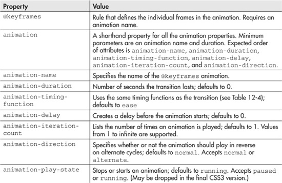
3. Build the @keyframes rule. This is the most complicated part. The keyframes rule will have a name, which matches the animation name you specified in the CSS properties for your object. Inside the rule, you create several lines. Each line describes the value of your animated properties after a percentage of your duration has elapsed. For complete browser compatibility, include 0% and 100% in your lines. 0% will match your object’s initial values. 100% will contain the values for the end of your animation.
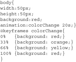
Code Listing 12-8 shows a simple animation. This code will change the color of a body from red to yellow to orange, and then back to red. I set a 20-second duration and specified keyframe rules for 0%, 33%, 66%, and 100%. The body background color starts at red. This is reflected both in the body element and the 0% keyframe. After 6 seconds, or 33% of the time, has elapsed, the body is orange. Between 6 and 12 seconds, the body will slowly change from orange to yellow. By the end of the 20 seconds, the page will become red. For clarity, I left out the compatibility webkit and moz vendor prefixes here.
Code Listing 12-8 A sample animation
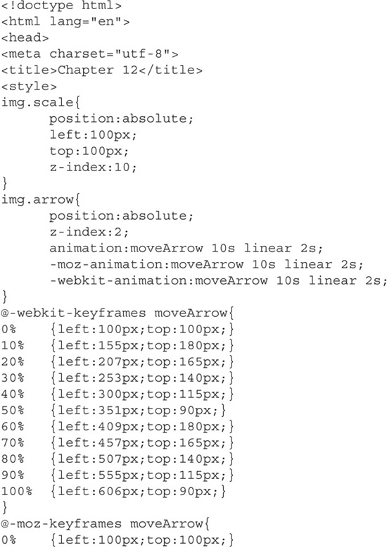
Code Listing 12-8 is neither overly exciting nor unique. Nearly every page on the Internet that describes animation changes an object’s color. Code Listing 12-9 provides a better example. It displays two classic EGBDF music scales. I animated an arrow moving from one note to another as an indication for which note to play. Since the five notes are repeated, the entire animation will take ten seconds. There is a two-second delay on the animation to allow the musician time to get ready.
Code Listing 12-9 Animating an image’s position on the screen
Multiple Animations
The examples in Code Listings 12-8 and 12-9 have one keyframe, animating one item at a time. CSS animations can support multiple keyframes and many simultaneous animations. Unfortunately, too many animations are difficult to track in your code. Additionally, it is unclear how well browsers will handle many animations at one time.
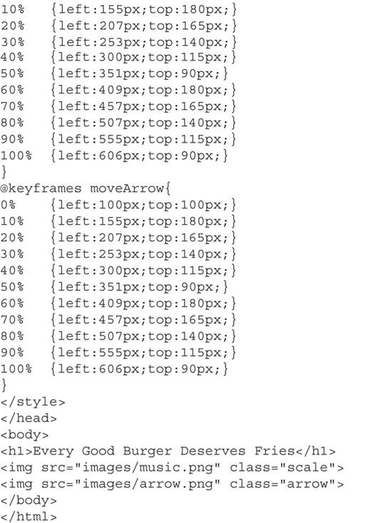
Code Listing 12-10 provides a sing-along example for a song I sang when I was a kid. One lyric line at a time is displayed on the screen. The current sung word is rendered in red. While the animation is rendering, music is playing. The lyrics are synchronized to the music. Code Listing 12-10 shows the two keyframe rules and two simultaneous animations.
Code Listing 12-10 Multiple animations
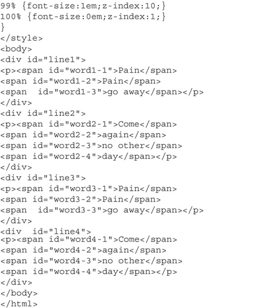
Code Listing 12-10 is rather complicated. It shows that multiple animations on multiple elements can occur at one time. The code was abbreviated for publication (the entire code is available from www.webbingways.com or www.mhprofessional.com/computingdownload). I removed the additional vendor-prefixed keyframe rules and each individual word’s style. Given the amount of code, I am unsure whether CSS is strong enough to handle complicated animations.
CSS Animation Caveats
The future of CSS animations is unclear. It looks like they will be in the final standard. It is not clear whether they will replace JavaScript and Flash as the animation tools of choice. It took me several hours to get this animation right, using only tools freely available online. I repeated the same exercise in Flash, and it took less than an hour. In the absence of CSS animation tools, Flash and JavaScript will remain the preferred animators.
In addition to the complexity, there is some doubt whether CSS actually should handle animations. W3C prefers separating content from format and functionality. It is not clear if animation is format or functionality. If animation is defined as functionality, then it should not be in CSS at all.
My recommendation on this point is to use CSS animations for small animations. Changing a color and moving an object are good candidates. For more advanced animations, such as the one in Code Listing 12-10, it’s better to use other tools.
Summary
This chapter covered many different emerging CSS properties. I tried to emphasize those properties I feel will best benefit the multimedia developer. We explored the user-interface enhancements in the previous chapter. This coverage is by no means complete. Other properties exist. Multicolumn support and modifiable boxes are other areas you could explore. An entire book could be written about CSS3 (hmm, perhaps my editor will be generous?).
CSS3 has made great strides. Borders and boxes have become simpler to implement. An unlimited number of fonts are now at your disposal. Animation of screen objects no longer requires Flash or JavaScript. In general, you have many more tools at your disposal. I look forward to seeing what the community does with the new tools.