
The following chart shows time series for the NASDAQ stock index and industrial production for the 30 years through 2017 in original form, as well as the transformed versions after applying the logarithm and subsequently applying first and seasonal differences (at lag 12), respectively. The charts also display the ADF p-value, which allows us to reject the hypothesis of unit-root non-stationarity after all transformations in both cases:

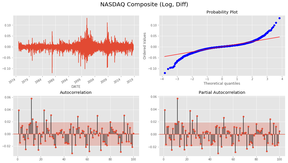
We can further analyze the relevant time series characteristics for the transformed series using a Q-Q plot that compares the quantiles of the distribution of the time series observation to the quantiles of the normal distribution and the correlograms based on the ACF and PACF.
For the NASDAQ plot, we notice that while there is no trend, the variance is not constant but rather shows clustered spikes around periods of market turmoil in the late 1980s, 2001, and 2008. The Q-Q plot highlights the fat tails of the distribution with extreme values more frequent than the normal distribution would suggest. The ACF and the PACF show similar patterns with autocorrelation at several lags appearing significant:
For the monthly time series on industrial manufacturing production, we notice a large negative outlier following the 2008 crisis as well as the corresponding skew in the Q-Q plot. The autocorrelation is much higher than for the NASDAQ returns and declines smoothly. The PACF shows distinct positive autocorrelation patterns at lag 1 and 13, and significant negative coefficients at lags 3 and 4:
