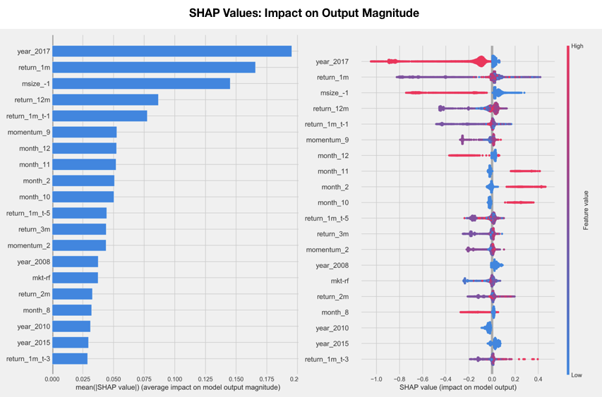
To get a high-level overview of the feature importance across a number of samples, there are two ways to plot the SHAP values: a simple average across all samples that resembles the global feature-importance measures computed previously (as shown in the left-hand panel of the following screenshot), or a scatter graph to display the impact of every feature for every sample (as shown in the right-hand panel of the following screenshot). They are very straightforward to produce using a trained model of a compatible library and matching input data, as shown in the following code:
# load JS visualization code to notebook
shap.initjs()

# explain the model's predictions using SHAP values
explainer = shap.TreeExplainer(model)
shap_values = explainer.shap_values(X_test)

shap.summary_plot(shap_values, X_test, show=False)
The scatter plot on the right of the following screenshot sorts features by their total SHAP values across all samples, and then shows how each feature impacts the model output as measured by the SHAP value as a function of the feature's value, represented by its color, where red represents high and blue represents low values relative to the feature's range: