
In our next application, we will be using the fantastic Accord.NET machine learning framework to provide you with a tool with which you can enter data, watch it being plotted, and learn about false positives and negatives. We will be able to enter data for objects that exist in our data space and categorize them as either being green or blue. We will be able to change that data and see how it is classified and, more importantly, visually represented. Our objective is to learn which set new cases fall into as they arrive; they are either green or blue. In addition, we want to track false positives and false negatives. Naive Bayes will do this for us based upon the data that exists within our data space. Remember, after we train our Naive Bayes classifier, the end goal is that it can recognize new objects from data it has previously never seen. If it cannot, then we need to circle back to the training stage.
We briefly discussed truth tables, and now it's time to go back and put a bit more formality behind that definition. More concretely, let's talk in terms of a confusion matrix. In machine learning, a confusion matrix (error matrix or matching matrix) is a table layout that lets you visualize the performance of an algorithm. Each row represents predicted class instances, while each column represents actual class instances. It's called a confusion matrix because the visualization makes it easy to see whether you are confusing one with the other.
An abstract view of a truth table would look something like this:
|
X present |
X absent |
||
|
Test positive |
True positive |
False positive |
Total positive |
|
Test negative |
False negative |
True negative |
Total negative |
|
Total with X |
Total without X |
Grand total |
A more visual view of the same truth table would look something like this:

And finally, a more formal view of a true confusion matrix:

In the field of machine learning, the truth table/confusion matrix allows you to visually assess the performance of your algorithm. As you will see in our following application, every time you add or change data, you will be able to see whether any of these false or negative conditions occur.
Currently, the test data we will start out with is split evenly between green and blue objects, so there's no reasonable probability that any new case is more likely to be one versus the other. This reasonable probability, sometimes called a belief, is more formally known as the prior probability (there's that word again!). Prior probabilities are based upon prior experience with what we've seen with the data and, in many cases, this information is used to predict outcomes prior to them happening. Given a prior probability or belief, we will formulate a conclusion which then becomes our posterior belief.
In our case, we are looking at:
- The prior probability of green objects being the total number of green objects/the total number of objects in our data space
- The prior probability of blue objects being the total number of blue objects/the total number of objects in our data space
Let's look a little bit further into what's happening.
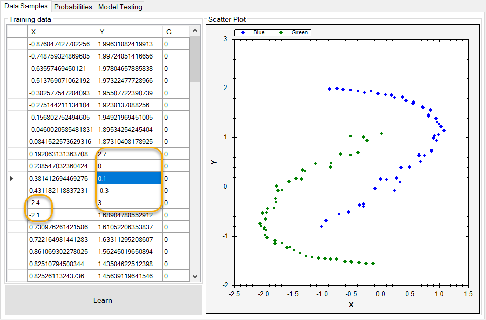
You can see what our data looks like in the following screenshot. The X and Y columns indicate coordinates in our data space along an x and y axis, and the G column is a label as to whether or not the object is green. Remember, supervised learning should give us the objective we are trying to arrive at, and Naive Bayes should make it easy to see whether that's true.

If we take the preceding data and create a scatter plot of it, it will look like the following screenshot. As you can see, all the points in our data space are plotted, and the ones with our G column having a value of 0 are plotted as blue, while those having a value of 1 are plotted as green.
Each data point is plotted against its X/Y location in our data space, represented by the x/y axis:

But what happens when we add new objects to our data space that the Naive Bayes classifier cannot correctly classify? We end up with what is known as false negatives and false positives, as follows:

As we have only two categories of data (green and blue), we need to determine how these new data objects will be correctly classified. As you can see, we have 14 new data points, and the color coding shows where they align to the x and y axis.
Now let's view our application in its full form. The following is a screenshot of our main screen. Under the Data Samples tab on the left-hand side of the screen, we can see that we have our data space loaded. On the right-hand side of the screen, we can see that we have a scatter plot visual diagram that helps us visualize that data space. As you can see, all the data points have been plotted and color-coded correctly:

If we take a look at how the probabilities are classified and plotted, you can see that the data presents itself almost in two enclosed but overlapping clusters:

When a data point in our space overlaps a different data point of a different color, that's where we need Naive Bayes to do its job for us.
If we switch to our Model Testing tab, we can see the new data points we added.
Next, let's modify some of the data points that we have added in order to show how any one data point can become a false negative or a false positive. Note that we start this exercise with seven false negatives and seven false positives.
The data modifications we made previously result in the following plot. As you can see, we have additional false positives now:

I will leave it up to you to experiment with the data and continue your Naive Bayes learning!