
Chapter 4. Constraint Layouts Put Things in Their Place

Let’s face it, you need to know how to create great layouts. If you’re building apps you want people to use, you need to make sure they look exactly the way you want. So far you’ve seen how to use linear and frame layouts, but what if your design is more complex? To deal with this, we’ll introduce you to Android’s new constraint layout, a type of layout you build visually using a blueprint. We’ll show you how constraints let you position and size your views, irrespective of screen size and orientation. Finally, you’ll find out how to save time by making Android Studio infer and add constraints on your behalf.
Nested layouts revisited
In the previous chapter, you learned how to build simple user interfaces using linear or frame layouts, and how you can nest layouts to produce something a little more complex. The following code, for example, uses nested linear layouts to display a text view and edit text in a horizontal row, and an edit text below them:
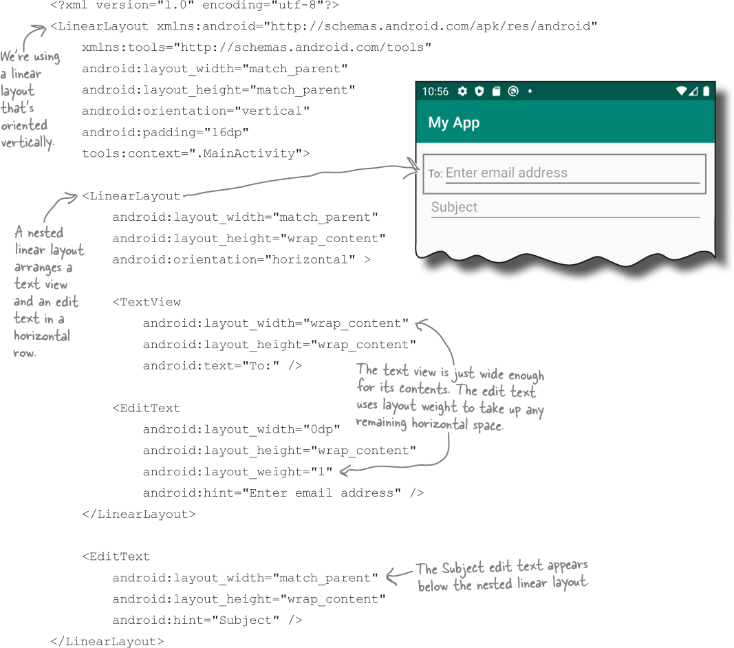
Nested layouts can be inefficient
The down side to this approach, however, is that building complex layouts in this way can be inefficient. They can make your code harder to read and maintain, and they can also slow down your app.
When Android displays a layout on the device screen, it first checks the structure of the layout file, and uses this to build a hierarchy of views. For the nested layout shown on the previous page, for example, it builds a hierarchy of views that contains two linear layouts, two edit texts and a text view:
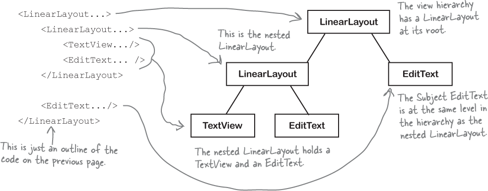
Android uses the view hierarchy to help it figure out where each view should be placed on the device screen. Each view needs to be measured, laid out and drawn on the screen, and Android uses the hierarchy to help it do this. It needs to make sure, for example, that each view has enough space for its contents, and that any weights are taken into account.
If the layout contains nested layouts, the view hierarchy is more complex, and Android may need to make multiple passes through it in order to figure out how views need to be arranged. If the layouts are deeply nested, this can lead to bottlenecks in your code, as well as leaving you with a mass of code that’s difficult to read and maintain.
If you have a more complex UI, an alternative to using nested layouts is to use a different type of layout: a constraint layout.
Note
Each view in the layout needs to be initialized, measured, laid out and drawn. In deeply nested layouts, this can slow down your app.
Introducing the constraint layout
A constraint layout is more complex than a linear or frame layout, but it’s a lot more flexible. It’s also much more efficient for complex UIs as it gives you a flatter view hierarchy, which means that Android has less processing to do at runtime.
You design constraint layouts VISUALLY
Another advantage of using constraint layouts is that they’re specifically designed to work with Android Studio’s design editor. Unlike linear and frame layouts where you usually hack direct in XML, you build constraint layouts visually. You drag and drop GUI components onto the design editor’s blueprint tool, and give it instructions for how each view should be displayed.
To see this in action, we’re going to take you on a tour of using a constraint layout, then build the following UI:
We’ll start by creating a new project.
Create a new project
Create a new Android Studio project using the same steps you used in the previous chapters. Choose the Empty Activity option, enter a name of “My Constraint Layout”, a package name of “com.hfad. myconstraintlayout” and accept the default save location. Make sure that the language is set to Kotlin, and that the minimum API level is API 19 so that it will run on most Android devices.
Add the String resources to strings.xml
Each of the views in our layout will display text values or hints, so we’ll add these as String resources, just as we did in Chapter 2. Add the String values below to strings.xml:
...
   <string name="to_label">To:</string>
   <string name="email_hint">Enter email address</string>
   <string name="subject_hint">Subject</string>
   <string name="message_hint">Message</string>
   <string name="send_button">Send</string>
...
Now that we’ve added our String resources, we’ll update the layout.
Make activity_main.xml use a constraint layout
We’re going to use a constraint layout. To do this make sure that your code in activity_main.xml to match the code below:
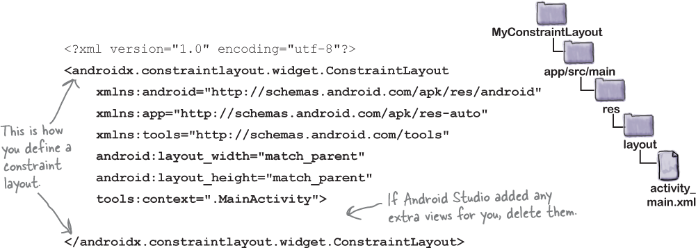
This defines a constraint layout to which we can add views. We’ll do this using the design editor’s blueprint tool.
Use the blueprint tool
To use the blueprint tool, first switch to the design view of your layout code by clicking on the Design tab. Then click on the Show Blueprint button in the design editor’s toolbar to display the blueprint. Finally, drag a Button widget from the design editor’s palette to the blueprint. This adds a button to your layout:

Position views using constraints
With a constraint layout, you don’t specify where views should be positioned by dropping them on the blueprint in a particular place. Instead, you specify placement by defining constraints. A constraint is a connection or attachment that tells the layout where the view should be positioned. For example, you can use a constraint to attach a view to the start edge of the layout, or underneath another view.
We’ll add a horizontal constraint to the button
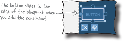
To see how this works, let’s add a constraint to attach our button to the left edge of the layout.
First, make sure the button’s selected by clicking it. When you select a view, a bounding box is drawn around it, and handles are added to its corners and sides. The square handles in the corners let you resize the view, and the round handles on the sides let you add constraints:

To add a constraint, you click on one of the view’s constraint handles and drag it to whatever you want to attach it to. In our case, we’re going to attach the left edge of the button to the left edge of the layout, so click on the left constraint handle and drag it to the left edge of the blueprint:

This adds the constraint, and pulls the button over to the left:
That’s how you add a horizontal constraint. We’ll add a vertical constraint to the button next.
Add a vertical constraint
Let’s add a second constraint to the button to attach it to the top of the layout. To do this, click on the button’s top constraint handle, and drag it to the top of the blueprint’s main area. This adds the second constraint, and the button slides to the top of the main area.
Each view in a constraint layout must have at least two constraints—a horizontal constraint and a vertical one—in order to specify where it should be positioned. If you omit the horizontal constraint, the view is displayed next to the start edge of the layout at runtime. If you omit the vertical constraint, the view is displayed at the top of the layout. This is irrespective of where the view is positioned in the blueprint.

Changing the view’s margins
When you add a constraint to a view, the design editor automatically adds a margin on the same edge as the constraint. You can set the size of the default margin in the design editor’s toolbar by changing the number in the Default Margin box:

Changing the size of the default margin specifies the size of any new margins that get added. The size of any existing margins remain unchanged, but you can change these using the property window.
The property window is displayed in a separate panel at the side of the design editor. When you select a view, it displays a diagram featuring the view’s constraints and the size of its margins. To change the size of a margin, you change the number next to the relevant side of the view.
You can also change the size of a view’s margins by clicking and dragging the view in the blueprint. This technique has the same effect as changing the size of the margin in the property window, but it’s harder to be precise.
Try changing the size of both margins using each method before looking at the next page.

Changes to the blueprint are reflected in the XML
When you add views to the blueprint and specify constraints, these changes are reflected in the layout’s underlying XML. To see this, switch to the text view of your code. Your code should look something like this (but don’t worry if it’s slightly different):
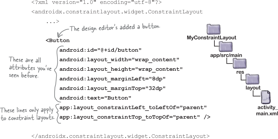
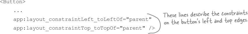
As you can see, our XML now includes a button. Most of the code for the button should look familiar to you, as it’s material we covered in Chapter 3. The button’s width, height, and margins are specified in exactly the same way as before. The only unfamiliar code is the two lines that specify the view’s constraints on its left and top edges:
Similar code is generated if you add constraints to the button’s remaining edges.
Next, switch your code back to design view, and we’ll look at other techniques for positioning your views in a constraint layout.
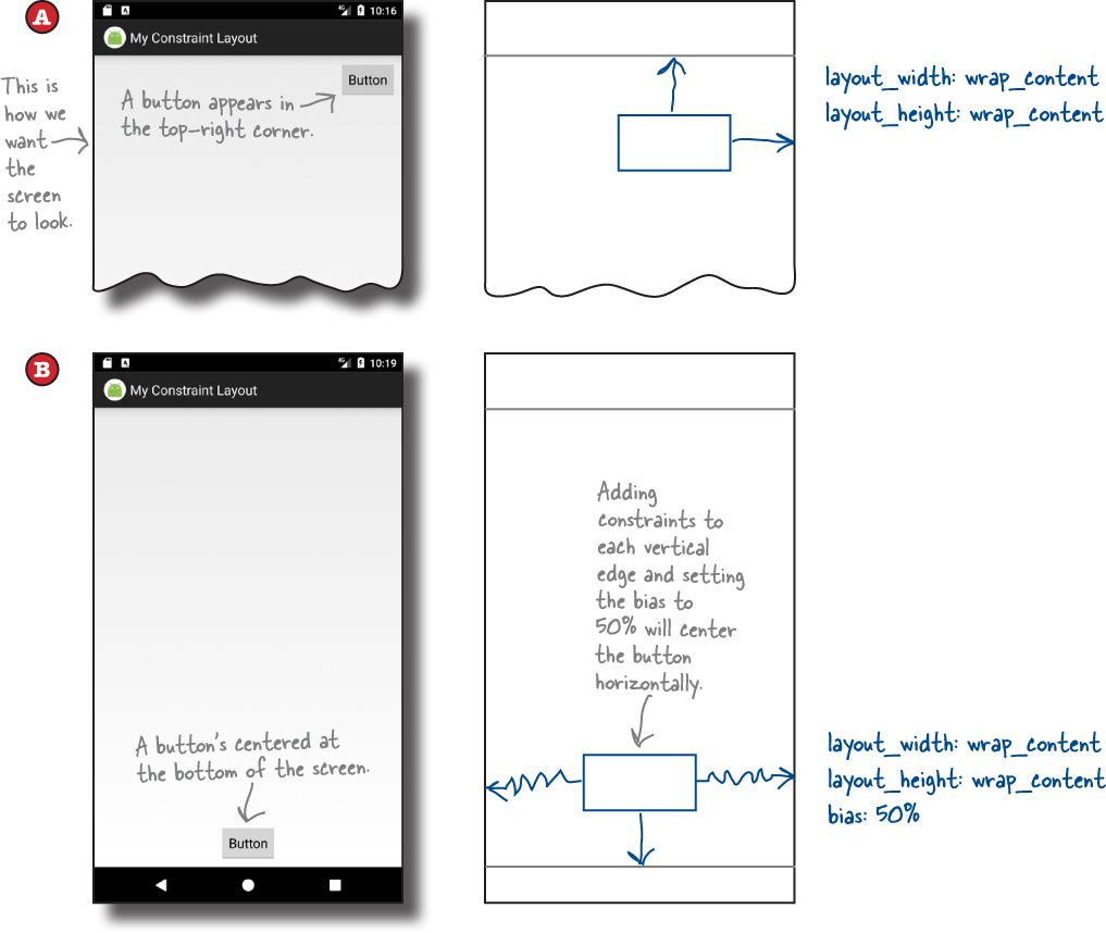
How to center views
So far you’ve seen how you can use constraints to attach a view to the edge of its layout. This works well if you want to position a view in the top-left corner, for example, but what if you want to position it in the center?
To position views in the center of its layout, you add constraints to opposite sides of the view. Let’s see how this works by centering our button horizontally.
Make sure the button is selected, then click on the constraint handle on its right edge, and drag it to the right edge of the layout:
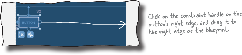
This adds a constraint to the view’s right edge. As the button now has two horizontal constraints, one on each side, the button is pulled to the center, and the two opposing constraints are displayed in the blueprint as springs:

As the button is now attached to both sides of the layout, it’s displayed in the center irrespective of screen size or orientation. You can experiment with this by running the app, or changing the size of the blueprint by dragging the blueprint’s bottom-right corner:

Adjust a view’s position by updating its bias
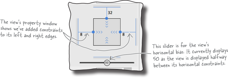
Once you’ve added constraints to opposite sides of your view, you can control where it should be positioned relative to each side by changing its bias. This tells Android what the proportionate length of the constraint should be on either side of the view.
To see this in action, let’s change our button’s horizontal bias so that it’s positioned off-center. First, make sure the button’s selected, then look in the view’s property window. Underneath the diagram of the view, you should see a slider with a number in it. This represents the view’s horizontal bias as a percentage:
To change the value of the bias, simply move the slider. If you move the slider to the left, for example, it moves the button in the blueprint to the left too:
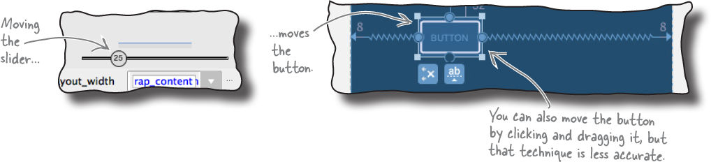
The view maintains this relative position irrespective of screen size and orientation.
When you add a bias to a view in the design editor, this is reflected in the underlying XML. If you change the horizontal bias of your view to 25%, for example, the following code gets added to the view’s XML:
app:layout_constraintHorizontal_bias="0.25"
Now that you know how bias works, let’s look at how you specify a view’s size.
How to change a view’s size
With a constraint layout, you have several different options for specifying a view’s size:
Make it a fixed size by specifying a specific width and height.
Use
wrap_contentto make the view just big enough to display its contents.Tell it to match the size of its constraints (if you’ve added constraints to opposite sides of the view).
Specify a ratio for the width and height so that, for example, the view’s width is twice the size of its height.
We’ll go through these options one-by-one.
1. Make the view a fixed size
There are a couple of ways of using the design editor to make the view a fixed size. One way is to simply resize the view in the blueprint by clicking and dragging the square resizing handles on its corners. The other way is to type values into the layout_width and layout_height fields in the properties window:

In general, making your view a fixed size is a bad idea, as it means the view can’t grow or shrink to fit the size of its contents or the size of the screen.
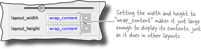
2. Make it just big enough
To make the view just large enough to display its contents, change the view’s layout_width and layout_height properties to wrap_content. You do this in the view’s property window as shown here:
3. Match the view’s constraints
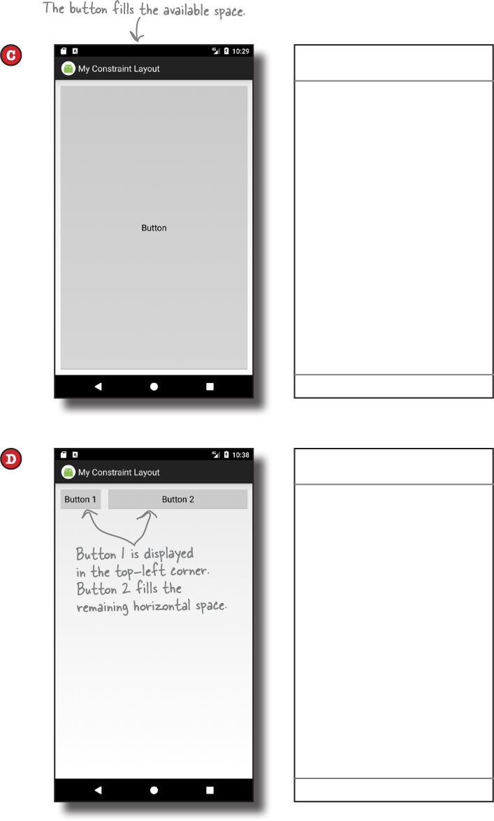
If you’ve added constraints to opposite sides of your view, you can make the view as wide as its constraints. You do this by setting its width and/or height to 0dp: set its width to 0dp to get the view to match the size of its horizontal constraints, and set its height to 0dp to get it to match the size of its vertical constraints.
In our case, we’ve added constraints to the left and right sides of our button, so we can get the button to match the size of these constraints. To do this, go to the view’s property window, and change the layout_width property to 0dp. In the blueprint, the button should expand to fill the available horizontal space (allowing for any margins):

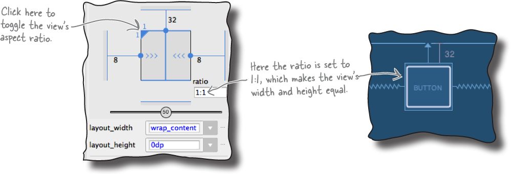
4. Specify the width:height ratio
Finally, you can specify an aspect ratio for the view’s width and height. To do this, change the view’s layout_width or layout_height to 0dp as you did above, then click in the top-left corner of the view diagram that’s displayed in the property window. This should display a ratio field, which you can then update:
Now that you’ve seen how to resize a view, try experimenting with the different techniques before having a go at the exercise on the next page.
BE the Constraint
Your job is to play like you’re the constraint layout and draw the constraints that are needed to produce each layout. You also need to specify the layout_width, layout_height, and bias (when needed) for each view. We’ve completed the first one for you.


BE the Constraint Solution
Your job is to play like you’re the constraint layout and draw the constraints that are needed to produce each layout. You also need to specify the layout_width, layout_height, and bias (when needed) for each view. We’ve completed the first one for you.


How to align views
So far you’ve seen how to position and size a single view. Next, let’s examine how you align it with another view.
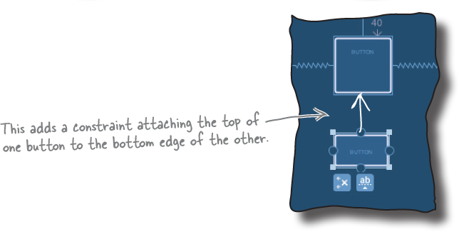
First, click on the Show Constraints button in the design edit toolbar to display all the constraints in the blueprint (not just the ones for the selected view). Then drag a second button from the palette to the blueprint, and place it underneath the first:


To display the second button underneath the first when the app runs, we need to add a constraint to the second button’s top edge, and attach it to the first button’s bottom edge. To do this, select the second button, and draw a constraint from its top edge to the bottom edge of the other button:
To align the left edges of both buttons, select both buttons by holding down the Shift key when you select each one, then click on the Align Left Edges button in the design editor toolbar:
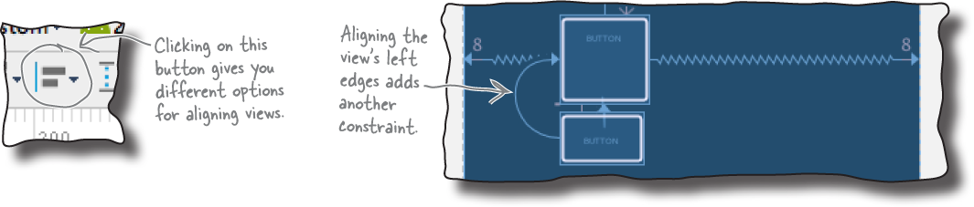
This adds a constraint from the left edge of the second button to the left edge of the first, and this constraint aligns the view’s edges.
Let’s build a real layout
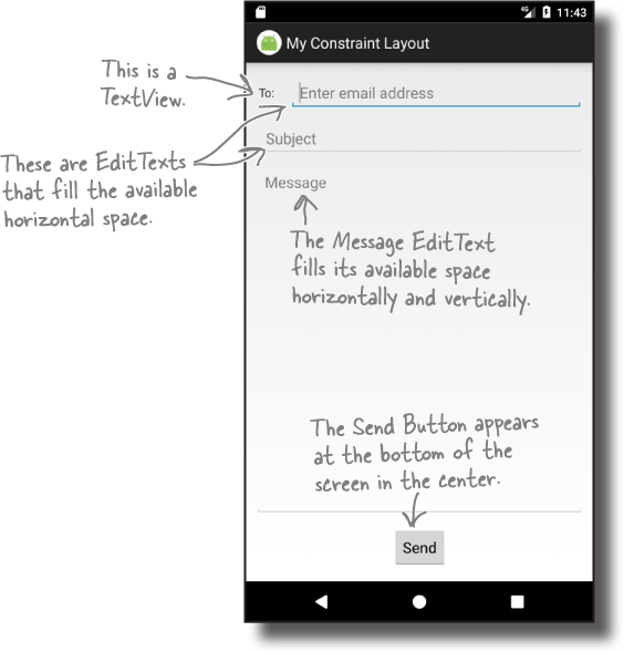
You now know enough about constraint layouts to start building a real one. Here’s the layout we’re going to create:

We’ll build it from scratch in activity_main.xml, so before we get started, delete any views that are already in the layout so that the blueprint’s empty, and make sure your activity_main.xml code looks like this:
<?xml version="1.0" encoding="utf-8"?>
<androidx.constraintlayout.widget.ConstraintLayout
    xmlns:android="http://schemas.android.com/apk/res/android"
    xmlns:app="http://schemas.android.com/apk/res-auto"
    xmlns:tools="http://schemas.android.com/tools"
    android:layout_width="match_parent"
    android:layout_height="match_parent"
    tools:context=".MainActivity">

</androidx.constraintlayout.widget.ConstraintLayout>
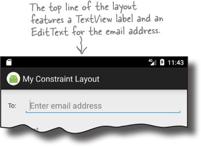
First, add the top line of views
We’re going to start by adding the views we want to appear at the top of the layout: a text view and an edit text.
To do this, switch to the design editor if you haven’t already done so, then drag a TextView from the palette to the top-left corner of the blueprint. Next, drag an E-mail component to the blueprint so it’s positioned to the right of the text view. This is an edit text that uses Android’s email keyboard for data entry. Manually resize the E-mail component so that it lines up with the text view and fills any remaining horizontal space:

Notice that we haven’t added any constraints to either view yet, and we’ve positioned them where we want them to appear when the layout’s displayed on a device. There’s a good reason for this: to save us some work, we’re going to get the design editor to figure out the constraints.
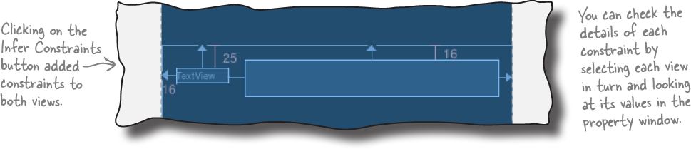
Get the design editor to infer the constraints
As you already know, a constraint layout uses constraints to determine where its views should be positioned. The great news is that the design editor has an Infer Constraints button that’s designed to work out what it thinks the constraints should be, and add them. To use this feature, simply click on the Infer Constraints button in the design editor’s toolbar:

The Infer Constraints feature guesses which constraints to add
When you click on the Infer Constraints button, the design editor tries to figure out what the constraints should be and adds them for you. It’s not completely foolproof, as it can’t read your mind (as far as we know) to determine how you want the layout to behave on a real device. It simply guesses based on each view’s position in the blueprint.
Here are the changes the design editor made for us when we clicked on the Infer Constraints button (yours may look different if you positioned your views differently):
If you don’t like what the Infer Constraints feature has done, you can undo the changes it’s made by choosing Undo Infer Constraints from the Edit menu, or adjust individual constraints.
We’re going to tweak our views before adding more items to the blueprint. First, select the text view in the blueprint, then edit its properties in the properties panel to give it an ID of to_label and a text value of "@string/to_label". This does the same thing as adding the following lines of code to the <TextView> element in the XML:
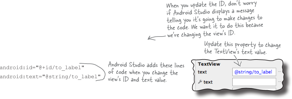
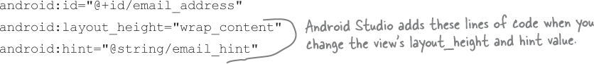
Next, select the E-mail component EditText, and change its ID to email_address, its layout_height to "wrap_content", and its hint to "@string/email_hint". This does the same thing as adding these lines to the <EditText> element in the XML:
Now that we’ve added the first line of views to the blueprint, let’s add some more.
Add the next line to the blueprint...
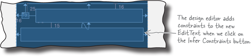
The next row of the layout contains an edit text for the message subject. Drag a Plain Text component from the palette to the blueprint, and position it underneath the two items we’ve already added. This adds an EditText to the blueprint. Then change the component’s size and position so that it lines up with the other views and fills the horizontal space:


Then click on the Infer Constraints button again. The design editor adds more constraints, this time positioning the new component:
Select the new view in the blueprint, and then change its ID to subject, its layout_height to "wrap_content", and its hint to "@string/subject_hint", and delete any text in the text property that the design editor may have added. Change the button’s ID to send_button and its text to "@string/send_button".
...and then add the button
Next, we’ll add a button to the bottom of the layout. Drag a Button component to the bottom of the blueprint and center it horizontally. When you click on the Infer Constraints button this time, the design editor adds these constraints to it:
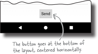

Change the button’s ID to send_button and its text to "@string/send_button".
Finally, add a view for the message
We have one more view to add to our layout, an edit text that we want to be able to grow to fill any remaining space. Drag a Plain Text component from the palette to the middle of the blueprint, change its size so that it fills the entire area, and then click on the Infer Constraints button:


Note
Note that we could have added all these views in one go, and clicked the Infer Constraints button when we reached the end. We’ve found, however, that building it up step-by-step gives the best results. Why not experiment and try this out for yourself?
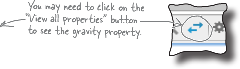
Select the new component in the blueprint, then change its ID to message, its hint to "@string/message_hint", and its gravity to top, and delete any text in the text property that the design editor may have added.
Let’s take the app for a test drive and see what the layout looks like.
Test drive

When we run the app, MainActivity’s layout looks how we want it to. The Email and Subject edit texts expand to fill the available horizontal space, the Send button is centered horizontally at the bottom of the screen, and the Message edit text expands to fill the remaining area. The layout maintains these proportions irrespective of screen size and device orientation:

You’ve now learned how to use a constraint layout to create a flexible UI that avoids nested layouts.
Remember that your layout may look and behave differently than ours depending on what constraints the design editor added when you clicked on the Infer Constraints button. The feature isn’t perfect, but it usually takes you most of the way there, and you can undo or update any changes it makes.
Note
We suggest you test your constraint layouts on a variety of device sizes and orientations to make sure that it behaves the way you want.
Your Android Toolbox

You’ve got Chapter 4 under your belt and now you’ve added constraint layouts to your toolbox.
