
Chapter 5. Halo Flex 4: Using DataGrid, Navigator Containers, and Popups
Way back in Session 5 we discussed that there was a namepsace (library://ns.adobe.com/flex/halo) full of the old Halo components that were used in Flex 1 through Flex 3. I showed an example of an app built using only Halo components. It was simple, featuring containers like HBox and Panel and controls like List and Button. Since they’re in a different namespace, these Panel, List, and Button classes are different from the Spark ones. This separate namespace is a bit awkward at first but is far preferable to the original idea, which was to use a horrible Fx prefix on the new Spark components.

We left Halo at that point and we haven’t revisited it—until now. In this chapter we’ll take a tour of some of the Halo components that are still relevant to you as a Flex 4 developer. By still relevant, I mean that they either don’t have Spark equivalents or that they’re more functional in some important way than their current Spark equivalents. Although you can read a lot of articles about this topic, one masterful article stands out as far superior to the others: Joan Lafferty’s “Differences between Flex 3 and Flex 4 beta.”[1] Joan is the Flex SDK Quality Lead, and that article is not only authoritative but also extremely readable.
1www.adobe.com/devnet/flex/articles/flex3and4_differences_print.html
Anyway, regarding the tour of Halo components we’re taking in this chapter: we’ll be hitting the highlights only. So it isn’t an exhaustive tour; it’s more like a “Halo in a Day” kind of tour. We’ll be skipping Halo components like the AdvancedDataGrid, which are too, ahem, advanced for a “Hello” book. We’ll also be skipping components like Tree, Menu, and MenuBar, which are used less often and also are well documented in the online API docs.[2]
2 See http://livedocs.adobe.com/flex/gumbo/langref/mx/controls/Tree.html, http://livedocs.adobe.com/flex/gumbo/langref/mx/controls/Menu.html, and http://livedocs.adobe.com/flex/gumbo/langref/mx/controls/MenuBar.html for the LiveDocs for these classes.
So, what are we going to cover? First, we’ll explore classes such as DataGrid that have no Spark equivalents and that are still essential tools in the Flex 4 developer’s tool belt. Next, we’ll cover the Halo navigator containers, since they’re still very handy and simple to use in cases where you don’t mind your Flex app looking like a Flex app. (Also, there’s a lot of Flex 2 and Flex 3 code in existence, so even if you’re not going to use these navigator containers in new code you should understand how they work.) Finally, we’ll describe how to create pop-up windows using the PopUpManager, and we’ll see how to use the Alert class.
By the end of this chapter, you should know what Halo options are available to you if the Spark solution isn’t working out the way you want it to. Also, you’ll understand how to use the Halo navigator containers. This is a short chapter, since I’m not trying to reproduce the API docs in this book and since the new Spark components are the preferred way of building most new components. However, at least until Flex 5, Halo should remain an important tool in your proverbial tool belt, so it’s worth knowing.
Flex 4 is Evolving
This book was written using the Beta 1 version of Flex 4. However, we delayed going to press until the Beta 2 version was released in October 2009, so that we could update any code that changed. (It’s a good thing too, or there would have been s:SimpleText everywhere instead of s:Label, and the code would not have compiled!) Adobe has improved Spark for Beta 2, and presumably will continue to improve Spark before the final release of Flex 4. However, this chapter is still essential reading: most Flex developers will encounter Flex 3 (and earlier) code in their career, so understanding Halo is essential to being a skilled Flex developer. You can check manning.com/armstrong3 and helloflex4.com for updates to the book code once the final version of Flex 4 is released (estimated Q1 2010).
Session 22. List and DataGrid
In this workshop session, you’ll learn how to use the Halo List and DataGrid classes. The Halo DataGrid class is an extremely useful way of displaying multiple-column data, as shown in the accompanying figure. Furthermore, the Halo DataGrid is without a Spark equivalent—so if you have any tabular data in your application, you need to know how to use it.

But why are we looking at the Halo List? Yes, there’s a Spark List, but the Halo List is still useful since (in this Flex 4 beta version, anyway) the Spark List doesn’t do word wrapping automatically, so there are cases where it’s a lot easier to just use a Halo List.
First, we’re going to create a Task model object to display in our Halo List and DataGrid classes.
sessionX/src/model/Task.as

I’m introducing something new here, and marking the Task class itself as Bindable  , instead of the individual properties. Using this annotation on the class makes all of the properties in the class Bindable. Why didn’t I show you this before? Simple: it’s too tempting to abuse, since it saves typing. Since Bindable properties have considerable runtime overhead, you need to really use this annotation sparingly. Furthermore, even if it
makes sense for the properties you have on a class, the maintenance programmer who inherits your class may very well add properties
that should not be Bindable. If this happens, will he or she really remove the annotation and add it to all the individual properties?
, instead of the individual properties. Using this annotation on the class makes all of the properties in the class Bindable. Why didn’t I show you this before? Simple: it’s too tempting to abuse, since it saves typing. Since Bindable properties have considerable runtime overhead, you need to really use this annotation sparingly. Furthermore, even if it
makes sense for the properties you have on a class, the maintenance programmer who inherits your class may very well add properties
that should not be Bindable. If this happens, will he or she really remove the annotation and add it to all the individual properties?
So: don’t use [Bindable] on a class as a lazy shortcut in anything but the smallest of apps!
The Task class has a constructor that sets all the properties with any of the optional parameters  passed in. By now, this code should be straightforward.
Next, we create a Tester app that illustrates the use of the Halo List and DataGrid, as promised. Our app looks like this:

Note that the List on the left has nice alternating row colors, rows that have variable height and word wrapping. The DataGrid on the right has nicely formatted dates and sortable columns (just click on their headers). Be advised that sorting the DataGrid sorts the underlying ArrayCollection, which affects the List as well. If you want sortability without affecting the ArrayCollection, you can wrap its source Array in a ListCollectionView object (or in another ArrayCollection), so sorting will apply to that new ArrayCollection and not to this ArrayCollection.
Anyway, let’s look at the code.
sessionX/src/Tester.mxml
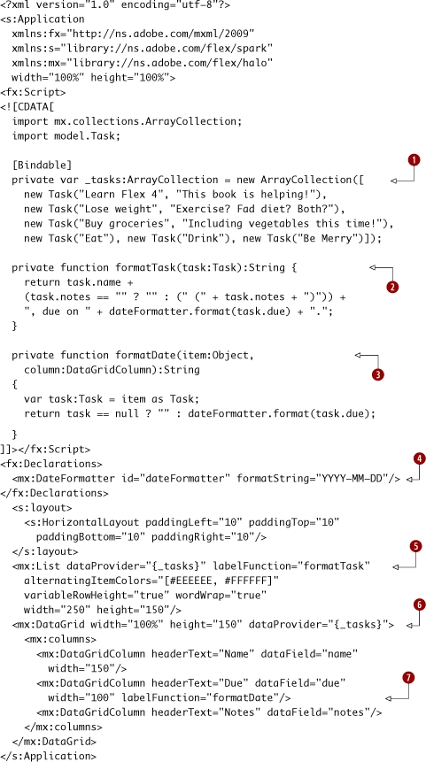
This code creates an ArrayCollection of Tasks and assigns it to _tasks. This ArrayCollection is used by both the Halo List  and DataGrid
  classes, so changes to its sort (made when clicking on the DataGrid header) affect both views. Next, we create formatTask and formatDate
  functions, which are the labelFunctions of the List , and the Due column
  of the DataGrid respectively. These functions are responsible for formatting whatever data from the individual row in the data provider is
desired into a string that will be presented in the DataGrid column or List. Finally, note the use of a DateFormatter
of the DataGrid respectively. These functions are responsible for formatting whatever data from the individual row in the data provider is
desired into a string that will be presented in the DataGrid column or List. Finally, note the use of a DateFormatter  to format dates—and that it uses the unambiguous YYYY-MM-DD format, not the MM/DD/YYYY format, which is mistakable for DD/MM/YYYY.
The next chapter covers formatters at great length, so for now just know that formatters are useful components that simplify
the task of formatting data.
to format dates—and that it uses the unambiguous YYYY-MM-DD format, not the MM/DD/YYYY format, which is mistakable for DD/MM/YYYY.
The next chapter covers formatters at great length, so for now just know that formatters are useful components that simplify
the task of formatting data.
That’s it! We’ve seen how to use the Halo List and DataGrid. Given what the DataGrid class in particular accomplishes, there’s remarkably little code to write.
Key points
- The Halo List is still useful, since out of the box it’s nicer than the Spark List for common cases where you just want to display text nicely. (It’s less customizable, however, and will probably eventually be obsolete.)
- The Halo DataGrid is an extremely useful way of showing multicolumn data. Actually, since there’s no Spark equivalent, it’s the only way.
- Both the List and DataGridColumns can have labelFunctions that can format their data nicely. Note the different method signatures required, however.
Session 23. TabNavigator, ViewStack, and Accordion
In this workshop session, we’ll continue our tour of Halo. Having discussed some of the most useful Halo controls, let’s now switch gears and take a tour of the Halo navigator containers. As of Flex 4 Beta 1, there are no direct Spark equivalents for these either, and frankly, I miss them. Presumably this is because the new improved view state syntax means that view states are a lot more usable now than they were, so you can just roll your own. In many ways, it’s a shame there’s no Spark equivalent for these containers (even one implemented using view states), since many times you don’t care about being funky and custom and you just want some tabs.
So, in this section you’ll learn what’s arguably the most straightforward way to rapidly create the layout and navigational flow of a Flex 4 application: using Halo navigator containers. As you read the code, you’ll probably be struck by how simple and elegant it is. If only tabs were allowed to always look like tabs...
Keep in mind that using these Halo containers is less customizable by your designer than just using Spark throughout, so using these Halo containers may not always be appropriate. Furthermore, they’ll presumably be deprecated in some future version of Flex, so choose wisely.
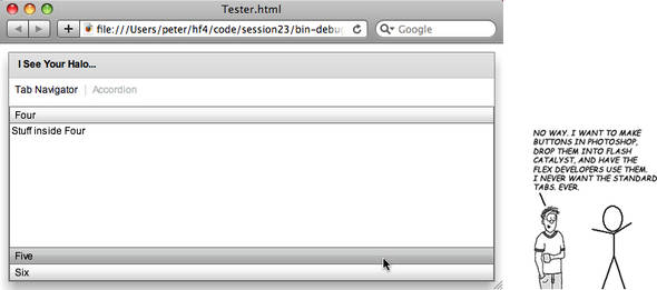
Anyway, what we’re building looks like the following screen:
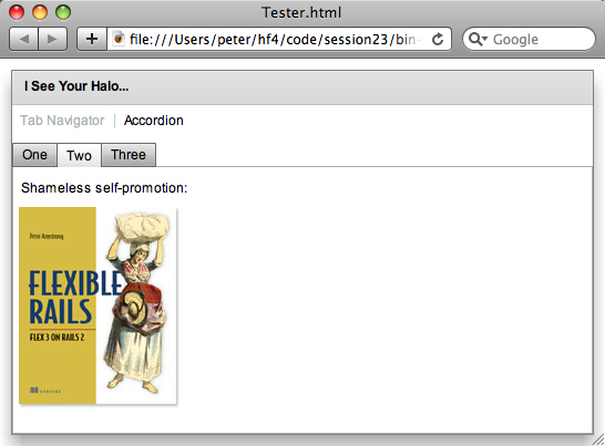
Clicking the Accordion button in the LinkBar selects the Accordion child of the ViewStack, shown here. An Accordion is like the Microsoft Outlook bar, which shows one child at a time, has a vertical orientation, and shows a nice smooth animated transition when switching between children. The cool factor makes up for the slight waste of space, but the Accordion shouldn’t have too many children or there’s no space for the actual content of each.
And without further ado, let’s see the code.
session23/src/Tester.mxml

The LinkBar has its dataProvider set to the ViewStack , meaning that the LinkButtons are created based on the label attributes of the TabNavigator and Accordion children of the ViewStack . Finally, note that the mx:Image can have its source be a URL, even an external site on the internet.
Warning
The Halo TabNavigator and Accordion contained VBox children. There’s actually an underlying requirement here: Halo navigator containers (like ViewStack, TabNavigator, and Accordion) can only contain Halo container children (like VBox, HBox, Box, or Canvas). You can’t stick a Spark Group directly inside one of them, just like you can’t stick a Spark or Halo TextInput directly inside one of them.
We’ve seen how the Halo navigator containers are useful and simple to use. However, they require Halo container children, which is worth keeping in mind. That, along with the fact that they’re harder to skin, means that for applications where visual design is important and where “looks like a Flex app” is a bug instead of a feature, the Spark view states and Groups are probably a safer bet in the long run despite the added effort. Still, it’s good to know how to use the Halo navigator components: sometimes a tab is just a tab.
Key points
- The ViewStack, TabNavigator, and Accordion containers each show only one of their children at a time. The difference is the way you navigate between them, hence “navigator” containers.
- The labels shown in the ViewStack, TabNavigator, and Accordion containers are derived from the label property of the Halo containers they contain.
- Using a LinkBar in conjunction with a ViewStack is typical. A LinkBar can have a direction of either horizontal (the default) or vertical.
Session 24. Alert.show and the PopupManager
In this workshop session, you’ll learn how to use the PopUpManager to show TitleWindows. When a TitleWindow is used with its modal property set to true, the combination gives your application the equivalent of the “lightbox” effect you see Web 2.0 applications using in JavaScript, in which the underlying UI is dimmed and disabled. (Of course, the ironic thing is that those applications are imitating a desktop UI paradigm.)

Continuing the modal goodness, we’ll see how to use Alert.show to display short modal messages to the user. Alert.show is the refuge of both UI scoundrels and developers who can’t be bothered to learn how to use either the debugger or trace statements.
As an added bonus, I’ll show you the Halo RichTextEditor, since it’s an efficient way of editing rich text and since there’s no Spark equivalent. (Of course, the HTML code that it outputs leaves a lot to be desired; to fix this, you can subclass it and override this behavior using an approach found at http://code.google.com/p/flex-richtexteditor-html-utils/.)
In this workshop session, we’re going to build an Application that has two Buttons. The first one shows an Alert box; the second one shows a TitleWindow, as you can see here:
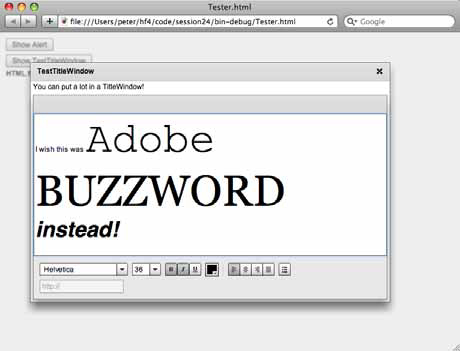
Closing the TitleWindow by clicking on the X will set the text of a RichEditableText Spark control (I chose it for variety; we could’ve used a Label) to the HTML produced by the RichTextEditor. You can see this in the following screenshot:
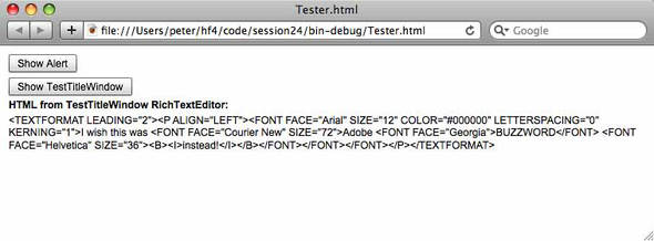
Finally, when clicked the Show Alert button shows an Alert dialog:
Enough talking! Let’s see the code.

session24/src/Tester.mxml
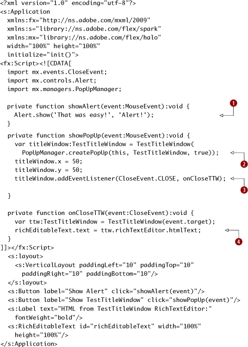
|
|
Alert.show takes parameters for the text, title, and other values. |
|
|
PopUpManager.createPopUp shows a TitleWindow and returns a reference to the new instance. The third constructor parameter specifies whether it’s modal. Note that the popup doesn’t get displayed right away—you can add the event listeners and position things, all without worrying that there will be display artifacts. This is unique to the Flex/Flash architecture and may surprise you if you have a background in other UI frameworks. |
|
|
We add the onCloseTTW function as an EventListener for the CloseEvent, which is triggered when the user clicks the close box on the window frame. |
|
|
We set the text property of the richEditableText to the htmlText property of the RichTextEditor. |
Note that while Alert.show is quick and easy, using PopUpManager.createPopUp requires having a subclass of TitleWindow to show. Also, note that as a habit we cast the instance that’s returned by createPopUp to the specific class—in our case TestTitleWindow—because then we can set its properties easier. (The createPopUp method returns an IFlexDisplayObject, which may not have the properties you need to set.) The onCloseTTW function is added as an EventListener for the CloseEvent that’s triggered when the window frame close button (the little X in the topright corner) is clicked.

Finally, we create the TestTitleWindow subclass of TitleWindow.
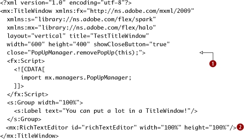
sessionX/src/TestTitleWindow.mxml
|
|
Set showCloseButton to get the window frame close button, and handle the close Event to close the TitleWindow. Since all I want to do is call the PopUpManager.removePopUp method, I just put the method call as the value of the close attribute, and the appropriate handler is created. (Yes, that’s cool. My copy editor couldn’t believe I was handling the event either.) |
|
The RichTextEditor is nice, but if you work with it for a while you’ll wish it was nicer (like, say, Buzzword). |
The TestTitleWindow uses the PopUpManager.removePopUp method to close itself when the window frame close button is clicked. The RichTextEditor instance sticks around when closed, so we can get its htmlText .
As you’ve seen, dropping in a RichTextEditor requires very little code. Also, note that we can use Spark Groups as well as Halo components inside the TitleWindow container.
Key points
- The PopUpManager can show TitleWindow subclasses, which you typically define in MXML.
- Alert.show is a quick and easy way to show modal dialog messages.
What’s next?
This was a quick tour through the most important Halo components that have no Spark equivalents. If you work in a company that employs a lot of designers, it could very well be that the only Halo component you use regularly is the DataGrid. Most of the other Halo components we’ve seen in this chapter have Spark alternatives, but for displaying tabular data in Flex the DataGrid is the only viable option. However, if you’re building apps that are allowed to look like Flex apps (especially internal apps for, say, company intranets), you’ll find that the Halo navigator containers are a good choice for the navigation within your Flex 4 apps.
In the next chapter, we’ll switch gears a bit and cover Flex forms, including how to use formatters and validators. Like it or not, almost everyone building Flex applications ends up building a lot of forms, so understanding how formatters and validators work is essential. Furthermore, the way that Flex forms are laid out is still done using two specialized Halo layout containers that we didn’t discuss in this chapter: Form and FormItem. So, in chapter 6 we’ll describe how to use those as well, and Halo’s relevance lives on...