
Perceptual Design for High Dynamic Range Systems
T. Kunkel; S. Daly; S. Miller; J. Froehlich Dolby Laboratories, Inc., San Francisco, CA, United States
Abstract
Establishing a design process for a high dynamic range and wide color gamut signal representation that is based on perceptual limits, as opposed to image capture or display hardware restrictions, is beneficial from a fidelity, efficiency, and economic point of view. Such a signal representation will enable displays and cameras, as well as systems for image synthesis, manipulation, and transport, to improve without having their development hindered by limits imposed by the signal representation, as occurs today. This chapter describes the perceptual behavior of the human visual system and how this knowledge can be efficiently aligned with engineering concepts in order to design a perceptually accurate imaging pipeline. Key concepts that are discussed cover spatial and temporal perception, and how it affects quantization of dynamic range and, when combined with chromatic components, the extent and behavior of a system’s color volume.
Keywords
High dynamic range; Perceptual quantization; Wide color gamut; Contrast sensitivity function; Specular highlights; Emissive colors; Diffuse maximum; Light adaptation; Chromatic adaptation; High dynamic range signal format; Viewer preferences
15.1 Introduction
Traditional imaging, which includes image capture, processing, storage, transport, manipulation, and display, is limited to a dynamic range lower than the human visual system (HVS) is capable of perceiving. This is due to factors such as the historic evolution of imaging systems and technical and economic limitations (computational power, cost, manufacturing processes, etc.). In addition to the luminance dynamic range limitations, traditional imaging is also overly constrained in its extent of color rendering capabilities compared with what is perceivable.
Traditional imaging achieved maximum dynamic ranges of three orders of magnitude (OoM), or density ranges of 3.0, or contrast ratios (CRs) of 1000:1, to use terminology from the scientific, hard copy, and direct view display applications, respectively. Ranges between 1.5 and 2.0 OoM were more common. Over time, the limitations of traditional image processing became apparent. In the late 1980s to early 1990s, investigations into image processing beyond the capabilities of the traditional lower dynamic range intensified, beyond the usual incremental improvements of the annual slight increase of film stock density or display contrast. Those approaches and techniques are generally collected under the term “high dynamic range (HDR) imaging.” Theoretically, such HDR systems aim to describe any luminance from absolute zero, having no photons, up to infinite luminance levels, which in turn leads to theoretically infinite contrast. For practical reasons, even with HDR systems, the luminance levels are limited, usually by the encoding approach of digital systems. Nevertheless, this still means that HDR imaging systems can be designed to describe extreme luminance levels that are, for example, encountered in astronomy. Even though this sounds enticing, the capture, processing, and especially display of excess dynamic range that cannot be utilized by the HVS is both computationally and economically counterproductive.
This leads to the important question of how much dynamic range is required in HDR imaging systems to neither encode more than can be utilized by human perception nor to deliver insufficient contrast to the HVS, thereby having an impact on image fidelity. Ideally, we want to handle just the right amount of dynamic range to satisfy the viewer’s preference, presumably by convincing the HVS that its perceiving contrast levels that are comparable with those in the real world (or a world created by a visual artist).1
After an attempt to cover the dynamic range of the HVS, another important element is to model the smallest dynamic range interval the HVS is able distinguish before two levels of gray appear to be identical, or any possible luminance modulation is detectable. This interval is called a “just noticeable difference” (JND). As this interval is not constant from dark to bright light levels, the response curve of the HVS needs to be taken into account as well.
The concept of small dynamic range intervals is crucially important in digital systems, because of quantization. It determines how many unique intervals can be addressed between the darkest and lightest extremes — black and white (eg, 256 unique intervals in an 8-bit integer system). The distribution of those intervals is called the “quantization curve,” and is related to the response curve of the HVS.2 Again, as with the dynamic range described above, the design goal of an imaging system is neither to assign too many quantization steps indistinguishable by the HVS nor to assign too few. A lack leads to quantization steps that are too large, manifesting themselves as contouring or banding artifacts. If the quantization curve does not complement the response curve of the HVS, images may contain both contouring due to few quantization steps in some regions and waste through overquantization in others. Both of these effects can happen in the same image. Therefore, a well-designed imaging system offers quantization intervals and a tone curve that are both well balanced.
Having an accurate complement between the imaging system and HVS along the intensity axis is an integral aspect for image fidelity. Table 15.1 summarizes the fundamental aspects of an HDR system from an achromatic point of view and brings it into context of the HVS. Nevertheless, imaging is rarely achromatic, and therefore color imaging is an equally important aspect to understand and model accurately. To extend the HDR concepts to color imaging, additional dimensions next to the dynamic range have to be considered, such as color gamut and color volume.
Table 15.1
The Key Elements of Human Visual Perception in Relation to HDR Imaging
| HVS | Imaging System | Description |
| Perceived black | Minimum luminance | Darkest absolute value possible across all scenes |
| Perceived highlight | Maximum luminance | Lightest absolute value possible across all scenes |
| Contrast | Dynamic range | Ratio between minimum and maximum luminance |
| JND | Quantization step | Interval between two consecutive luminance or color values |
| Response curve | Quantization curve | Distribution of quantization steps over the full dynamic range |
| (eg, a digital gamma curve) |
Extending imaging to color adds complexity to a system, especially when one is attempting to efficiently match the capabilities of human color perception. Due to historic reasons, colors visible to the HVS portrayed as 2D color wheels. Ignoring intensity simplified the visualization of the concept of color. The colors an imaging system can represent are defined in a 2D space called a chromaticity or color gamut.
However, our everyday color perception does not fully disentangle intensity from chromaticity. We perceive all hues and levels of saturation in combination with all the shades of intensity visible to the HVS. Therefore, to design a highly performing yet efficient system, it is essential to be able to model human color perception both accurately and efficiently. Thus, it is important to address the intensity dimension in conjunction with chromaticity, which leads to a color volume, of which the intensity dynamic range is a subset. Similarly to finding the “perfect” dynamic range for the HVS, it is desirable to find the right color volume to avoid underrepresenting or overrepresenting colors. Table 15.2 extends Table 15.1 and summarizes the fundamental aspects of an HDR system from a chromatic point of view.
Table 15.2
The Key Components of Human Visual Perception When Color Is Added to HDR Imaging
| HVS | Imaging System | Description |
| Visible color wheel | Chromaticity or color gamut | 2D representation of color, usually |
| ignoring intensity | ||
| All shades, hues, and levels | Color volume | All colors visible to the HVS under |
| of saturation visible to the | the given environment. This | |
| HVS | representation is 3D because it | |
| includes intensity |
In this chapter, we will identify the aspects of the HVS that determine the dynamic range, quantization, and tone curve requirements. These aspects are then extended into the full color volume, providing guidance for the design and development of both perceptually accurate and at the same time efficient imaging systems.
15.2 Luminance and Contrast Perception of the HVS
With the advent of HDR capture, transport, and display devices, a range of fundamental questions have appeared regarding the design of those imaging pipeline elements. For instance, viewer preferences regarding overall luminance levels as well as contrast were determined previously (Seetzen et al., 2006), as were design criteria for displays used under low ambient light levels (Mantiuk et al., 2009). Further, recent studies have revealed viewer preferences for HDR imagery displayed on HDR displays (Akyüz et al., 2007), and have assessed video viewing preferences for HDR displays under different ambient illuminations (Rempel et al., 2009).
Especially in the context of display devices, it is important to know how high the dynamic range of a display should be. An implicit goal is that a good display should be able to accommodate a dynamic range that is somewhat larger than the simultaneous dynamic range afforded by human vision, possibly also taking into account the average room illumination as well as short-term temporal adaptive effects. More advanced engineering approaches would try to identify a peak dynamic range so that further physical improvements do not result in diminishing returns.
15.2.1 Real-World Luminance and the HVS
The lower end of luminance levels in the real world is at 0 cd/m2, which is the absence of any photons (see Fig. 15.1A). The top of the luminance range is open-ended but one of the everyday objects with the highest luminance levels is the sun disk, with approximately 1.6 × 10⁹ cd/m2 (Halstead, 1993).

A human can perceive approximately 14 log10 units,3 by converting light incident on the eye into nerve impulses using photoreceptors (see Fig. 15.1B). These photoreceptors can be structurally and functionally divided into two broad categories, which are known as rods and cones, each having a different visual function (Fairchild, 2013; Hubel, 1995). Rod photoreceptors are extremely sensitive to light to facilitate vision in dark environments such as at night. The dynamic range over which the rods can operate ranges from 10−6 to 10 cd/m2. This includes the “scotopic” range when cones are inactive, and the “mesopic” range when rods and cones are both active. The cone photoreceptors are less sensitive than the rods and operate under daylight conditions, forming photopic vision (in these luminance ranges, the rods are effectively saturated). The cones can be stimulated by light ranging from luminance levels of approximately 0.03 to 108 cd/m2 (Ferwerda et al., 1996; Reinhard et al., 2010). The mesopic range extends from about 0.03 to 3 cd/m2, above which the rods are inactive, and the range above 3 cd/m2 is referred to as “photopic.”
This extensive dynamic range facilitated by the photoreceptors allows us to see objects under faint starlight as well as scenery lit by the midday sun, under which some scene elements can reach luminance levels of millions of candelas per square meter. However, at any moment of time, human vision is able to operate over only a fraction of this enormous range. To reach the full 14 log10 units of dynamic range (approximately 46.5 f-stops), the HVS shifts this dynamic range subset to an appropriate light sensitivity using various mechanical, photochemical, and neuronal adaptive processes (Ferwerda, 2001), so that under any lighting conditions the effectiveness of human vision is maximized.
Three sensitivity-regulating mechanisms are thought to be present in cones that facilitate this process — namely, response compression, cellular adaptation, and pigment bleaching (Valeton and van Norren, 1983). The first mechanism accounts for nonlinear range compression, therefore leading to the instantaneous nonlinearity, which is called the “simultaneous dynamic range” or “steady-state dynamic range” (SSDR). The latter two mechanisms are considered true adaptation mechanisms (Baylor et al., 1974). These true adaptation mechanisms can be classified into light adaptation and chromatic adaptation (Fairchild, 2013),4 which enable the HVS to adjust to a wide range of illumination conditions. The concept of light adaptation is shown in Fig. 15.1C.
“Light adaptation” refers to the ability of the HVS to adjust its visual sensitivity to the prevailing level of illumination so that it is capable of creating a meaningful visual response (eg, in a dark room or on a sunny day). It achieves this by changing the sensitivity of the photoreceptors as illustrated in Fig. 15.2A. Although light and dark adaptation seem to belong to the same adaptation mechanism, there are differences reflected by the time course of these two processes, which is on the order of 5 min for complete light adaptation. The time course for dark adaptation is twofold, leveling out for the cones after 10 min and reaching full dark adaptation after 30 min (Boynton and Whitten, 1970; Davson, 1990). Nevertheless, the adaptation to small changes of environment luminance levels occurs relatively fast (hundreds of milliseconds to seconds) and impact the perceived dynamic range in typical viewing environments.

Chromatic adaptation is another of the major adaptation processes (Fairchild, 2013). It uses physiological mechanisms similar to those used by light adaptation, but is capable of adjusting the sensitivity of each cone individually, which is illustrated in Fig. 15.2B (the peak of each of the responses can change individually). This process enables the HVS to adapt to various types of illumination so that, for example, white objects retain their white appearance.
Another light-controlling aspect is pupil dilation, which — similarly to an aperture of a camera — controls the amount of light entering the eye (Watson and Yellot, 2012). The effect of pupil dilation is small (approximately 1/16 times) compared with the much more impactful overall adaptation processes (approximately a million times), so it is often ignored in most engineering models of vision.5 However, secondary effects, such as increased depth of focus and less glare with the decreased pupil size, are relevant for 3D displays and HDR displays, respectively.
15.2.2 Steady-State Dynamic Range
Vision science has investigated the SSDR of the HVS through flash stimulus experiments, photoreceptor signal-to-noise ratio and bleaching assessment, and detection psychophysics studies (Baylor et al., 1974; Davson, 1990; Kunkel and Reinhard, 2010; Valeton and van Norren, 1983). The term “steady state” defines a very brief temporal interval that is usually much less than 500 ms, because there are some relatively fast components of light adaptation.
The earliest impact on the SSDR is caused by the optical properties of the eye: before light is transduced into nerve impulses by the photoreceptors in the retina and particularly the fovea, it enters the HVS at the cornea and then continues to be transported through several optical elements of the eye, such as the aqueous humor, lens, and vitreous humor. This involves changes of refractive indices and transmissivity, which in turn leads to absorption and scattering processes (Hubel, 1995; Wandell, 1995).
On the photoreceptor level, the nonlinear response function of a cone cell can be described by the Naka-Rushton equation (Naka and Rushton, 1966; Peirce, 2007), which was developed from measurements in fish retinas. It was, in turn, modeled on the basis of the Michaelis-Menten equation (Michaelis and Menten, 1913) for enzyme kinetics, giving rise to a sigmoidal response function for the photoreceptors, which can be described by
where V is the signal response, ![]() is the maximum signal response, L is the input luminance, σ is the semisaturation constant, and the exponent n influences the steepness of the slope of the sigmoidal function.6 It was later found to also describe the behavior of many other animal photoreceptors, including those of monkeys and humans. Later work (Normann and Baxter, 1983) elaborated on the parameter σ in the denominator on the basis of the eye’s point spread function and eye movements, and used the model to fit the results of various disk detection psychophysical experiments. One consequence was increased understanding that the state of light adaptation varies locally on the retina, albeit below the resolution of the cone array.
is the maximum signal response, L is the input luminance, σ is the semisaturation constant, and the exponent n influences the steepness of the slope of the sigmoidal function.6 It was later found to also describe the behavior of many other animal photoreceptors, including those of monkeys and humans. Later work (Normann and Baxter, 1983) elaborated on the parameter σ in the denominator on the basis of the eye’s point spread function and eye movements, and used the model to fit the results of various disk detection psychophysical experiments. One consequence was increased understanding that the state of light adaptation varies locally on the retina, albeit below the resolution of the cone array.
The SSDR has been found to be between 3 and 4 OoM from flicker and flash detection experiments using disk stimuli (Valeton and van Norren, 1983). Using a more rigorous psychophysical study using Gabor gratings, which are considered to be the most detectable stimulus (Watson et al., 1983), and using a 1/f noise field for an interstimulus interval to aid in accommodation to the display screen surface as well as matching image statistics, Kunkel and Reinhard (2010) identified an SSDR of 3.6 OoM for stimuli presented for 200 ms (onset to offset). Fig. 15.3 shows the test points used to establish the SSDR, as well as an image of the stimulus and background. The basic assumption is that the contrast of the Gabor grating forms a constant luminance interval. When this interval is shifted away from the semisaturation constant (toward lighter or darker on the x-axis), it remains constant on a log luminance axis (ΔL1 = ΔL2). However, the relative cone response interval (y-axis) decreases because of the sigmoidal nature of the function, leading to ΔV1 > ΔV2. The dynamic range threshold lies at the point where the HVS cannot distinguish the amplitude changes of the Gabor pattern.

We have now established that the SSDR defines the typical lower dynamic range boundary of the HVS, while adaptive processes can extend the perceivable dynamic range from 10−6 to 108, albeit not at the same time.
However, another outcome of Kunkel and Reinhard’s (2010) experiment is that the SSDR also depends on the stimulus duration, which is illustrated in Fig. 15.4. The shortest duration can be understood as determining the physiological SDDR, and the increase in SSDR (ie, the lower luminance goes lower, and the higher luminance goes higher, giving an increased perceptible dynamic range) with longer durations indicates that rapid temporal light adaptation occurs in the visual system.

Sometimes, the SSDR is misinterpreted as being what is needed for the presentation of a single image, but this ignores the fact that the retina can have varying adaptation states (local adaptation) as a function of position, and hence as a function of image region being viewed. This means that the eye angling to focus on a certain image region will cause different parts of the retina to be in different image-dependent light adaptation states. Or, as one uses eye movements to focus on different parts of the image, the adaptation will change despite the image being static. For the case of video, even more variations of light adaption can occur, as the scenes’ mean levels can change substantially, and the retina will adapt accordingly. Therefore, the necessary dynamic range is somewhere in between the SSDR and long-term-adaptation dynamic range.
Our application of interest is in media viewing, as opposed to medical or scientific visualization applications. While this can encompass content ranging from serious news and documentaries to cinematic movies, we refer to this as the “entertainment dynamic range” (EDR). Further, these applications require a certain level of cost-consciousness that is less pressing in scientific display applications. Video and moving picture applications that use EDR are unlikely to allow for full adaptation processes because of cost and most likely do not require them to occur either. Thus, use of a 14 log10 dynamic range that encompasses complete long-term light adaptation is unrealistic. Nevertheless, they do have strong temporal aspects where the adaptation luminance fluctuates.
To illustrate the necessity of EDR being larger than SSDR, Fig. 15.5 compares common viewing situations (single or multiple viewers) with theater or home viewing settings that address adaptation. In this example, the still image shown can be regarded as a frame in a movie sequence. The dark alley dominates the image area, yet has a bright region in the distance as the alley opens up to a wider street. Depending on where a viewer might look, the overall adaptation level will be different. In Fig. 15.5A, showing a single viewer, the viewer may look from interest area 1 to area 2 in the course of the scene, and that viewer’s light adaptation would change accordingly from a lower state to a higher state of light adaptation. Thus, the use of the SSDR would underestimate the need for the dynamic range of this image, because some temporal light adaptation would occur, thereby expanding the needed dynamic range. One could theoretically design a system with an eye tracker to determine where the viewer is looking at any point in time, and estimate the light adaptation level, combining the tracker position with the known image pixel values. The viewer’s resulting SSDR could theoretically be determined from this.

However, in the image in Fig. 15.5B, multiple viewers are shown, each looking at different regions. Different light adaptation states will occur for each viewer, and thus a single SSDR cannot be used. Even the use of eye trackers will not allow the use of a single SSDR in this case. Having more viewers would compound this problem, of course, and is a common scenario. Therefore, a usable dynamic range for moving/temporal imaging applications (eg, EDR) lies between the SSDR and the long-term dynamic range that the HVS is able to perceive via adaptive processes.
One approach to determine the upper end of the EDR would be to identify light levels where phototoxicity occurs (the general concepts are well summarized in Youssef et al. (2011). A specific engineering study of phototoxicity (Pattanaik et al., 1998) was made to investigate the blue light hazard of white LEDs. The latter is a problem because the visual system does not have a strong “look away” reflex to the short-wavelength spectral regions of white LEDs (because they consist of a strong blue LED with a yellow phosphor). The results show that effects of phototoxicity occur at 160,000 cd/m2 and higher. Rather than actual damage, another factor to consider for the upper end is discomfort, which is usually understood to begin at 30,000 cd/m2 (Halstead, 1993). Well-known snow blindness lies in between these two ranges. Rather than use criteria based on damage or discomfort, another approach is to base the upper luminance level on preferences related to quality factors, which would be lower still than the levels associated with discomfort.7
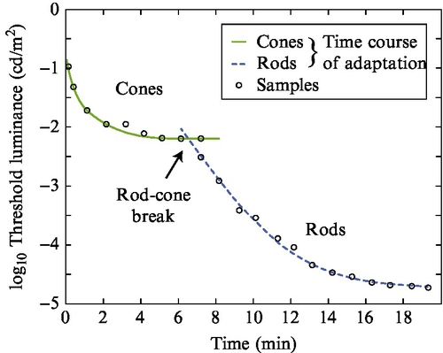
In consideration of the lower luminance end, there are no damage and likely no discomfort issues. However, the lower luminance threshold would be influenced by the noise floor of the cone photoreceptors when leaving the mesopic range due to dark adaptation or if the media content would facilitate adaptation to those lower luminance levels (eg, a longer very low key scene). Time required to adapt to those lower levels would actually occur in the media. The plot in Fig. 15.6 shows that around 6–8 min of dark adaptation is required to engage the rods, from a higher luminance starting point (Riggs, 1971).
15.2.3 Still Image Studies
The vast majority of studies to determine the needed, or appreciated, dynamic range have been for still images. A large body of work has studied viewer preferences for lightness and contrast that seem to be useful for assessment of the HDR parameters. The most recent of these studies (Choi et al., 2008; Shyu et al., 2008) are exemplary as they studied these parameters within a fixed dynamic range window. That is, they studied image-processing changes on fixed displays, not the actual display parameters. Unfortunately, these do not address the question of display range. Further, it is possible to study the dynamic range without invoking image contrast, which can be considered a side effect.
A key article worth mentioning is that by Kishimoto et al. (2010), who concluded there is lower quality with the increase of brightness, maximizing at around 250 cd/m2, thus concluding there was no need for HDR displays at all. The study carefully avoided the problems of studying brightness preferences within a fixed display dynamic range by using the then-new technique of global backlight modulation to shift the range further than previously possible. However, the native panel contrast in their study was around 1000:1 to 2000:1. Consequently, with increasing maximum luminance, the black level rose, so the study’s results are for neither brightness nor range, but are more for the maximum acceptable black level.
Another key study assessed both dynamic range for capture and display using synthetic psychophysical stimuli as opposed to natural imagery (McCann and Rizzi, 2011). Rather than a digital display, a light table and neutral density filters were used in that study to allow a wider dynamic range than the capability of the then-current displays. It used lightness estimates for wedges of different luminance levels arranged in a circle. These wedge-dissected circles were then presented at different luminance levels, and observer lightness8 estimates were used to determine the needed range for display, which was concluded to be surprisingly low at approximately 2.0 log10 luminance. These low ranges were attributed to the optical flare in the eye, and interesting concepts about the cube root behavior of L* as neural compensation for light flare were developed. However, the low number does not match practitioners’ experience, both for still images and especially for video. The most common explanation for their low dynamic range was that the area of the wedges, in particular the brightest ones, was much larger than the brightest regions in HDR display, and thus caused a much higher level of optical flare in the eye, reducing the visibility of dark detail much more than occurs in many types of practical imagery. Another explanation is that their use of lightness estimates did not allow the amplitude resolution needed to assess detectable differences in shadow detail. For video, it was clear their approach did not allow for scene-to-scene light adaptation changes.
In the first study to use an actual HDR display (Seetzen et al., 2006) to study the effects of varying dynamic range intervals (also called “contrast ratio,” CR), the interactions between maximum luminance and contrast were studied. This resulted in viewer estimates of image quality (in this case preference, as opposed to naturalness).
These data are important because they show the problem of black level rising with increases in brightness when the contrast is held constant. One can see this in Fig. 15.7 by comparing the curve for the 2500:1 contrast (black curve) with the curve for a 10,000:1 contrast. For the lower CR, quality is lost above 800 cd/m2, which is due to the black level visibly rising (becoming dark gray) with increasing maximum luminance. The black level rises because of the low CR. On the other hand, the results for the 10,000:1 CR show no loss of quality even up to the maximum luminance studied (6400 cd/m2). With this high contrast, the black level still rises, but it is one quarter the level of that for the 2500:1 CR, so it essentially remains black enough that it is not a limit to the quality.

Some other key studies for relevant HDR parameters are those focusing on black level (Eda et al., 2008, 2009; Murdoch and Heynderickx, 2012), on local backlight resolution (Lagendijk and Hammer, 2010), and on contrast and brightness preferences as a function of image and viewer preferences (Yoshida and Seidel, 2005). All of these studies have particular problems in determining the dynamic range for moving imagery. Simultaneous contrast has a strong effect on pushing a black level to appear perceptually black, but should not be relied on to occur in all content. For example, dark low-contrast scenes should still be perceived as achieving perceptual black, as opposed to just dark gray. Similar consequences should occur for low-contrast high-luminance scenes. To truly study the needed dynamic range for video, one needs to remove the side effects of image signal-to-noise ratio limits, display dynamic range limits, display and image bit-depth limits, and the perceptual side effects of the Stevens effect and the Hunt effect.
15.2.4 Dynamic Range Study Relevant for Moving Imagery
Extending still image studies to include motion and temporal components in general adds several new challenges for both experimental design and the analysis of the results. As with the design of any psychophysical study, it is important to reduce the degrees of freedom in the assessment to avoid the results being biased by effects other than the ones specified. Daly et al. (2013) listed design guidelines for psychophysical studies using moving imagery on HDR displays as follows:
• Try to remove all image signal limitations,
• Try to remove all display limitations,
• Try to remove perceptual side effects.
Examples of image signal limits include highlight clipping, black crushing, bit-depth constraints (eg, contouring), and noise. Those problems usually appear as a combination of each other potentially amplifying their impact. For example, the dynamic range reported as being preferred can be biased because of the impact of spatial or temporal noise. Increasing the dynamic range of a signal magnifies its noise, which otherwise would be below the perceptual threshold — for example, in standard dynamic range (SDR) content. Thus, the noise becomes the reason that further dynamic range increases are not preferred. To avoid this, the imagery used as test stimuli were essentially noise-free HDR captures created by the merging of a closely spaced series of exposures resulting in linear luminance, floating-point HDR images.
Examples of display limitations include the actual maximum luminance and minimum luminance of the test display, which should be out of the range of the expected preference. One way to achieve this is to allow the display to reach the levels of discomfort. Another example is the local contrast limits, such as when dual modulation with reduced backlight resolution is used. These were largely removed as explained in the articles.
The test images were specifically designed to assess the viewer preferences without the usual perceptual conflicts of simultaneous contrast, the Stevens effect, the Hunt effect, contrast/sharpness, and contrast/distortion interactions as well as common unintended signal distortions of clipping and tone scale shape changes. The Stevens effect and simultaneous contrast effects were ameliorated by use of low-contrast images. While simultaneous contrast is a useful perceptual effect that can be taken advantage of in the composition of an image/and or scene to create the perception of darker black levels and brighter white levels, you do not want to limit the creative process to require it to use this effect. That is, dark scenes of low contrast should also achieve a perceptual black level on the display, as well as scenes of high contrast, and likewise for bright low contrast appearing perceptually white. The images used were color images, to avoid unique preference possibilities with a black-and-white aesthetic, but the color saturation of the objects and the scene was extremely low, thus eliminating the Hunt effect, which could bias preferences at higher luminances as a result of increased colorfulness (which may or may not be preferred). As a result, the images are testing worst-case conditions for the display. Further, the parameters of black level and maximum diffuse white (sometimes called “reference white”) were dissected into separate tests. Contrast was not tested explicitly, as contrast involves content rendering design issues, not display range capability. Note that moving imagery has analogies to audio with its strong dependence on time. In audio, dynamic range is not assessed at a given instant; it is assessed across time (Huber and Runstein, 2009). The same concepts led to study of the maximum and minimum luminances separately, as opposed to contrast in an intraframe contrast framework. The images were dissected into diffuse reflective and highlight regions for the third stage of the experiment.
The dynamic of each tested reflectance image was approximately 1 OoM, as shown in Fig. 15.8. In the perceptual test the images were adjusted by their being shifted linearly on a log luminance axis. The viewer’s task was to pick which of two was preferred. The participants were asked for their own preferences, and not for an estimate of naturalness, even though some may have used those personal criteria. To avoid strong light adaptation shifting, the method of adjustment was avoided, which would result in light adaptation toward the values the viewer was adjusting. Instead, the two-alternative forced choice method was applied with interstimulus intervals having luminance levels and timing set to match known media image statistics, such as average scene cut durations.

For the upper bound of the dynamic range, the upper bounds of diffuse reflective objects and highlights were assessed independently. The motivations for this include perceptual issues to be discussed in Section 15.4 as well as typical hardware limitations, where the maximum luminance achievable for large area white is generally less than the maximum achievable for small regions (“large area white” vs “peak white” in display terminology). The connection between these image content aspects and the display limitations is that in most cases highlights are generally small regions, and only the diffuse reflective regions would fill the entire image frame.
Still images were used, but the study was designed to be video cognizant. That is, the timing of the stimuli and interstimuli intervals matches the 2–5 s shot-cut statistics typical of commercial video and movies. This aspect of media acts to put temporal dampening on the longer-term light adaptations as described previously. Also, keep in mind that video content may contain scenes that are essentially still images with little or no moving content.
The first stage of this experiment determined preferences for minimum and maximum luminance for the diffuse reflective region of images. The results were not fit well by parametric Gaussian statistics, so they were presented as cumulative distributions. The approximate mean value results of these two aspects of the dynamic range were used to set up the second stage of the experiment, which probed individual highlight luminance preferences. Here, the method of adjustment9 approach was applied on segmented highlights (with a blending function at the highlight boundary), while the rest of the image luminances were held fixed, as shown in Fig. 15.9. The adjustment increments were 0.33 OoM. Adaptation drift toward the adjustments would be minor because the highlights occupied a small image area.
The segmentation was done by hand, while a blending function was used at the highlight boundaries. The luminance profiles within the highlights were preserved but modulated through luminance domain multiplication, which is also shown in Fig. 15.9. For this stage of the study, images from scenes with full color were used, and the highlights were both specular and emissive. For the specular highlights, the color was generally white, although for metallic reflections, some of the object color is retained in the highlights. For the emissive highlights, various colors occurred in the test data set of approximately 24 images.
The study was done for a direct view display (small screen) and for a cinema display (big screen) (Farrell et al., 2014). In both cases, the dynamic range study was across the full range of spatial frequencies, as opposed to being restricted to the lower frequencies by use of a lower-resolution backlight modulation layer (Seetzen et al., 2006). The direct view display had a range of 0.0045– 20,000 cd/m2, while the cinema display had a range of 0.002–2000 cd/m2.
Fig. 15.10 shows the combined results for black level, maximum diffuse white, and highlight luminance levels for the smaller display and the cinema display. The smaller screen is represented by the dashed curve, while the cinema results are shown as the solid curve. Cumulative curves show how more and more viewers’ preferences can be met by a display’s range if this range is increased (going darker for the two black level curves on the left, and going lighter for the maximum diffuse white and highlights curves on the right). While both display types had the same field of view, there were differences in the preferences, where darker black levels were preferred for the cinema versus the small display. Differences between the small-screen and large-screen results for the maximum diffuse white and highlights were smaller.

Because the displays had different dynamic ranges, the images were allowed to be pushed to luminance ranges where some clipping would occur (eg, for a very small number of pixels) if the viewer chose to do so. These values are indicated by the inclusion of a double-dash segment in the curves, and via the shaded beige regions. While technically the display could not really display those values (eg, the highlights would be clipped after 2000 cd/m2 for the cinema case), the viewers adjusted the images to allow such clipping. This is likely because there was a perceived value in having the border regions of the highlights increase even though the central regions of the highlights were indeed clipped. For the most conservative use of these data, the results in the corresponding shaded regions (cinema, small display) should not be used.
Fig. 15.10 can be used to design a system with various criteria. While it is common to set design specifications around the mean viewer response, it is clear from Fig. 15.10 that the choice of such an approach leaves 50% of viewers satisfied with the display’s capability, but 50% of the viewers’ preferences could not be met. A basic consequence is that the dynamic range of a higher-capability display (ie, with a larger dynamic range) can be adjusted downward, but the dynamic range of a lower-capability display cannot be adjusted upward.
The results require far higher capability than can be achieved with today’s commercial displays. Nevertheless, they provide guidance when designing and manufacturing products that exceed the visual system’s capability and preferences. Some products can already achieve the lower luminances for black levels, even for the most demanding viewers (approximately 0.005 cd/m2) for the small screen, for example. Rather, it is the capability at the upper end that is difficult to achieve. To satisfy the preferences of 90% of the viewers, a maximum diffuse white of 4000 cd/m2 is needed, and an even higher luminance of approximately 20,000 cd/m2 is required for highlights. At the time of this writing, the higher-quality “HDR” consumer TVs are just exceeding the approximately 1000 cd/m2 level.
Despite the current limits of today’s displays, we can use the data now to design a new HDR signal format. Such a design could be future-proof toward new display advances. That is, if we design a signal format for the most critical viewers at the 90% distribution level, such a signal format would be impervious to new display technologies because the limits of the signal format are determined from the preferences. And those are limited solely by perception, and not display hardware limits. Such a signal format design would initially be overspecified for today’s technology, but would have the headroom to allow for display improvement over time. This is important, because it has already been shown that today’s signal format limits (SDR, 100 cd/m2, Rec. 709 gamut, 8 bits) prevents advancement in displays from being realized with existing signals. It is possible to create great demonstrations with new display technologies, but once they are connected to the existing SDR ecosystems, those advantages disappear for the signal formats that consumers can actually purchase. So with those issues in mind, the next section will address the design of a future-proof HDR signal format that takes into account the results in Fig. 15.10.
15.3 Quantization and Tone Curve Reproduction
In the imaging technology community, there is often a conflation of dynamic range and bit depth, which are not necessarily linked for the display as elucidated by McCann and Rizzi (2007). For example, it is possible to have an 8-bit 106:1 dynamic range display, or a 16-bit 10:1 display. Neither of these would be pragmatic, however. The low bit depth but HDR display would suffer from visible contour artifacts, and the high bit depth but low dynamic range display would not achieve the visibility of its lower-bit modulations. The former display wastes its dynamic range, and the latter display wastes its bits. It is thus clear that there needs to be a balance between dynamic range and bit depth. Increases in dynamic range should be accompanied by increases in bit depth to prevent the visibility of false contours and other quantization distortions. It is generally known that in order to achieve this balance a nonlinear quantization (with respect to luminance) is required.
In addition to identification of luminance extremes and consequently contrast, two additional important aspects for the efficiency of the HVS are quantization (JNDs) and the shape of this quantization (tone curve nonlinearity) over the full dynamic range of the image reproduction system. A simplified example comparing the nonlinearities of a the HVS with gamma encoding is illustrated in Fig. 15.11. The key is that the quantization steps should be matched to the visual system’s thresholds. With today’s SDR systems, the quantization to a gamma of approximately 2 is approximately matched to the visual system. However, this is only true for dynamic ranges up to 2.0 log10 luminance. When higher dynamic range levels are used, the traditional gamma values no longer match the JND distribution of the HVS. Fig. 15.11 shows uniform quantization in the visual system threshold space (Fig. 15.11A), and what kind of quantization results from the traditional gamma domain quantization (Fig. 15.11B). It has the general tendency to have too few intervals at the dark end and too many at the bright end. As a consequence, contour distortions are often noticed in the dark regions, especially with LCD dynamic ranges exceeding 1000:1 (3.0 log10). Further, in the light regions, interval steps are “wasted” as they cannot be distinguished by the HVS. The result is that the number of distinguishable gray steps (Ward, 2008; Kunkel et al., 2013) was reduced because of the nonlinearity mismatch, as shown in (Fig. 15.11C).

From these observations of the problems of gamma domain quantization, there is the motivation to derive a new nonlinearity that is more closely tuned to perception. To derive a more suited quantization nonlinearity, there are two methods. At this point it is best to shift the terminology to that used in vision science, and think in terms of sensitivity, which is the inverse of threshold, where threshold is defined in terms of Michelson contrast. Overall, what is needed is an understanding of how sensitivity varies with luminance level. If we assume worst-case engineering design principles, and knowing the crispening effect (Whittle, 1986), which describes that the sensitivity is maximized when the eye is adapted to the luminance level for which the sensitivity is needed, we can refine the question of sensitivity versus luminance level of the system’s dynamic range to sensitivity as a function of the light adaptation level, where that level is constrained by the system’s dynamic range.
Sensitivity, S, as a function of light adaptation can be determined from the following equation:
where L is luminance, R is the cone response or overall visual system response, and k is a units scaling constant (eg, to go from cone volts to threshold detection). The optical-to-electrical transfer function (the OETF) can be determined from a local cone model (physiology), or from light-adaptive contrast sensitivity function (CSF) behavior (psychophysics) (Miller et al., 2013). Both methods give similar results (Daly and Golestaneh, 2015), attesting to the robustness of the concept. The CSF-based approach will be discussed below in more detail.
Design of new quantization nonlinearities more accurate than gamma was explored by Lubin and Pica (1991) using edge-based psychophysics. In 1993, a new quantization nonlinearity based on the CSF sensitivity (Blume et al., 1993) was developed for medical use and used by the Digital Imaging and Communications in Medicine (DICOM) Standards Committee in the early 21st century (NEMA Standards Publication PS 3.14-2008-2008). This curve, known as the DICOM grayscale standard display function, is based on Barten’s model of contrast sensitivity of the human eye (Barten, 1996) and can reproduce an absolute luminance range from 0.05 cd/m2 to almost 4000 cd/m2 with a 10-bit encoded signal. This standard has been used very effectively for a wide variety of medical imaging devices ever since.
Because a wider range of luminance values was desired for the subset of physical HDR we refer to as “entertainment dynamic range” (EDR), a new nonlinearity was developed based on the same Barten model as the DICOM grayscale standard display function. The model parameters were adjusted for a larger field of view, which was more suitable for entertainment media, and the enhancement of CSF peak tracking (Cowan et al., 2004; Mantiuk et al., 2006) was added to the model calculations. The Barten model calculates an estimate of the CSF on the basis of both luminance and spatial frequency, but the spatial frequency that results in the largest CSF value varies with the luminance level. While DICOM maintained a constant frequency of four cycles per degree for all luminance levels, the new nonlinearity was calculated while allowing the spatial frequency value to always operate at the very peak of contrast sensitivity. The two concepts are illustrated in Figure 15.12.

The sum of the luminance values corresponding to the JNDs from 0 to ![]() (1/S(La)) gives an “OETF”10 which is that of the visual system transducers. But what is needed for display quantization is an EOTF, which can be determined from the inverse of the determined OETF. This result, built by iteration in the OETF space, is described below. First, the luminance range needs to be determined. Here we refer to the results from the viewer preference study of luminance dynamic range, shown in Fig. 15.10. To satisfy 90% of the viewers for the small screen display, a range of approximately 0.005 to 20,000 cd/m2 is needed as discussed in Section 15.2.4. Those wanting less dynamic range can easily turn down the range (eg, lower the maximum luminance) with no quantization distortion visibility occurring, because the contrast of each code value step is lowered by such an adjustment. On closer examination of the data, there was only one image out of 27 for which the preference was 20,000 cd/m2, being an outlier (an image with an extremely small specular highlight). There were several images for which the preferences were near 10,000 cd/m2, however, so this value was chosen as a design parameter for the maximum luminance. For the minimum luminance, the cinema case had a lower value than the small screen case, going down to 0.002 cd/m2. The signal format should be applicable to both small screen displays expected in the home and large screen displays in the cinema. Because 0.002 cd/m2 is an extremely low value, there is some rationale in simply selecting zero as the minimum luminance.11 So the new signal format was designed to range from 0 to 10,000 cd/m2, and after the design was complete, it was observed that very few code values were between 0 and 0.002 cd/m2, showing that the choice of zero as a minimum value was worthwhile because the cost was negligible. The curve in Fig. 15.13A was built to cover a range from 0 to 10,000 cd/m2 with a 12-bit encoded signal by summation of thresholds in the luminance domain.
(1/S(La)) gives an “OETF”10 which is that of the visual system transducers. But what is needed for display quantization is an EOTF, which can be determined from the inverse of the determined OETF. This result, built by iteration in the OETF space, is described below. First, the luminance range needs to be determined. Here we refer to the results from the viewer preference study of luminance dynamic range, shown in Fig. 15.10. To satisfy 90% of the viewers for the small screen display, a range of approximately 0.005 to 20,000 cd/m2 is needed as discussed in Section 15.2.4. Those wanting less dynamic range can easily turn down the range (eg, lower the maximum luminance) with no quantization distortion visibility occurring, because the contrast of each code value step is lowered by such an adjustment. On closer examination of the data, there was only one image out of 27 for which the preference was 20,000 cd/m2, being an outlier (an image with an extremely small specular highlight). There were several images for which the preferences were near 10,000 cd/m2, however, so this value was chosen as a design parameter for the maximum luminance. For the minimum luminance, the cinema case had a lower value than the small screen case, going down to 0.002 cd/m2. The signal format should be applicable to both small screen displays expected in the home and large screen displays in the cinema. Because 0.002 cd/m2 is an extremely low value, there is some rationale in simply selecting zero as the minimum luminance.11 So the new signal format was designed to range from 0 to 10,000 cd/m2, and after the design was complete, it was observed that very few code values were between 0 and 0.002 cd/m2, showing that the choice of zero as a minimum value was worthwhile because the cost was negligible. The curve in Fig. 15.13A was built to cover a range from 0 to 10,000 cd/m2 with a 12-bit encoded signal by summation of thresholds in the luminance domain.

Because the visual system can operate over very large luminance ranges, it is useful to plot the results in Fig. 15.13A in terms of log luminance (not to imply log luminance is a model of the visual system). This is shown in Fig. 15.13B.
Because a curve built by iteration is not convenient for compact specification or standardization purposes, it was desirable to create a closed-form model, which was a reasonable match to the iterative calculations. The equation (Nezamabadi et al., 2014) was a very close match to the original curve, and has now been documented by the Society of Motion Picture and Television Engineers (SMPTE) as SMPTE ST 2084, also known as the perceptual quantizer (PQ) curve:

where m1 = 0.1593017578125, m2 = 78.84375, c1 = 0.8359375, c2 = 18.8515625. and c3 = 18.6875.
A comparison of the results from the iterative summing of JNDs and from Eq. (15.1) is shown Fig. 15.14. Note that by virtue of our plotting the data in the log domain (Fig. 15.14A), the differences in the dark region are exaggerated. A better plotting approach would be to plot the vertical axis in the units of the modeled perceptual space (ie, a PQ axis) as shown in Fig. 15.14B to better show the visibility of any differences between the equation and the iteration.

15.3.1 Performance of the PQ EOTF
To assess the performance of this PQ EOTF, the JNDs are compared with other known methods in Fig. 15.15. One standardized threshold model is from Schreiber (1992), and is mentioned in an ITU-R report on ultra-high-definition TV (ITU-R Report BT.2246-4, 2015). It makes the simple assumption that the HVS is logarithmic (following Weber’s law) above 1 cd/m2, and has a gamma nonlinearity for luminance below that. The report also includes a threshold model based on the Barten CSF (referred to in Fig. 15.15 as “Barten (Ramp)”), which is similar to the iterative PQ curve but uses different Barten model parameters.
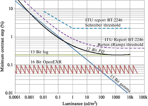
The remaining plotted curves are quantization approaches, in a format initially explored by Mantiuk et al. (2004). Shown as the black solid line is the PQ nonlinearity described previously, it is apparent that it lies below the Barten ramp and Schreiber thresholds from the ITU-R report. This means that if either of those is accepted, quantization according to the PQ nonlinearity will result in quantization that is below threshold. However, it might be suggested that the PQ nonlinearity is a better model of HVS thresholds. The vertical positions of the curves depend on the luminance range and the bit depth. For Fig. 15.15, the luminance range is 0–10,000 cd/m2. A quantization in the log domain would give a straight line here, and with such an approach, 13 bits are required to keep the quantization better than the 12-bit version of the PQ. For professional workflows, one format is OpenEXR, a floating-point format, which uses 16 bits. It stays below the threshold, but has the higher cost of 16 bits and mantissa management, which is strongly disfavored in application-specific integrated circuit designs. Another plotted curve is for gamma, for which 15 bits are required to keep the distortions mostly below threshold. For the very dark levels, it still results in quantization distortions above threshold.
As of this writing, the PQ nonlinearity has been independently tested in other laboratories (Hoffman et al., 2015) to see how well it characterizes thresholds for different dynamic ranges. The results are shown in Fig. 15.16, where it was compared for three dynamic ranges against a gamma of 2.2, the DICOM standard, and actual threshold data. Absolute luminance levels were also tested, and were preserved in the plotting (in Fig. 15.16 the plots on the left are for linear luminance and the plots on the right are for log luminance). For the lower dynamic range of 100:1, the DICOM standard and PQ nonlinearity are a good fit to the observer data, while gamma underestimates sensitivity throughout the range. For the middle dynamic range of 1000:1, the DICOM standard now underestimates sensitivity, while the PQ model and the threshold data are still in good agreement. Finally at a 10,000:1 dynamic range, the PQ nonlinearity very slightly underestimates the threshold data, but is a closer fit than the DICOM and gamma models for quantization.

Another recent study that compared the PQ nonlinearity with other visual models used for quantization is shown in Fig. 15.17 (Boitard et al., 2015). In the format of this plot, the best visual model has a slope of zero. This study looked at the luminance range through a small luminance window (0.05–150 cd/m2) but quantized according to the full range (0–10,000 cd/m2). While the curve for gamma-log lies below the PQ curve, and may therefore be considered a better design (resulting in a lower bit depth), it is easy to see that the bit-depth requirement starts to rise at the highest luminances tested, 150 cd/m2, and would be expected to rise for higher levels, such as needed for any substantial dynamic range, whether 10,000 cd/m2 in the PQ design or for more short-term maximum luminance levels, such as 1000 cd/m2.

15.4 Perception of Reflectances, Diffuse White, and Highlights
While several key quality dimensions and creative opportunities have been opened up by HDR (eg, shadow detail, handling indoor and outdoor scenes simultaneously, and color volume aspects), one of the key differentiators from SDR is the ability for more accurate rendering of highlights. These can be categorized as two major scene components: specular reflections12 and emissive regions (also referred to as “self-luminous”). They are best considered relative to the maximum diffuse white luminance in the image.
Most vision research has concentrated on understanding the perception of diffuse reflective objects, and the reasons are summarized well by DeValois and DeValois (1990):
For the purposes of vision it is important to distinguish between two different types of light entering the eye, self-luminous objects and reflecting objects…. Most objects of visual interest are not self-luminous objects but rather reflective objects…. Self-luminous objects emit an amount of light that is independent of the general illumination. To detect and characterize those objects, an ideal visual system would have the ability to code absolute light level. Reflecting objects, on the other hand, will transmit very different amounts of light depending on the illumination…. That which remains invariant about an object, and thus allows us to identify its lightness, is the amount of light coming from the object relative to that coming from other objects in the field of view.
In other words, to understand the objects we routinely interact with, humans have evolved very good visual mechanisms to discount the illumination from the actual reflectance of the object. The object’s reflectance is important to convey its shape by allowing for shading. Emissive regions, on the other hand, were limited in more ancient times to either objects we did not physically interact with (eg, the Sun, hot magma, lightning, forest fires) or those that were seldom encountered (eg, phosphorescent tides, ignis fatuus,13 cuttlefish, deep sea fishes). While specular highlights are also reflections, they have distinct properties that are very different from diffuse reflectance. Speculars were often encountered, such as with any wet surface, but their characteristics did not seem as essential to understanding the physical objects as their diffuse reflective components, which dominate most objects. Illustrations of emissive regions and specular highlights are shown in Fig. 15.18.

In traditional imaging on the display side, the range allocated to these highlights is fairly low and most of the image range is allocated to the diffuse reflective regions of objects. For example, in hardcopy print, the highlights will have 1.1 times higher luminance than the maximum diffuse white (Salvaggio, 2008). In traditional video, the highlights are generally set to have luminance no more than 1.25 times the diffuse white. In video terminology, the term “reference white” is often used instead of “diffuse white,” taken from the lightest white patch on a test target, and is often set at 80 out of a range of 0–100 (or 235 out of 255). The range 80–100 is reserved for the highlights, the maximum of which is referred to as “peak white,” and is set to the maximum capability of the display. Of the various display applications, cinema allocates the highest range to the highlights, up to 2.7 times the diffuse white. These are recommendations, of course, and any artist/craftsperson can set the diffuse white lower in the available range to allocate more range to the highlights if the resulting effect is desired.
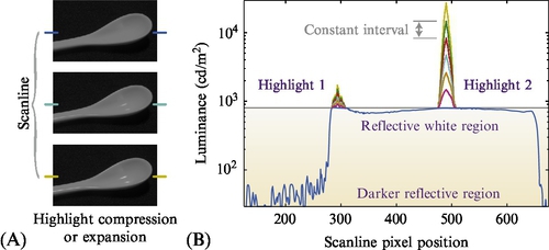
However, considering actual measurements shows how much higher the luminance levels of specular regions are compared with those of the underlying diffuse surface. For example, Wolff (1994) has shown that they can be more than 1000 times higher, as shown in Fig. 15.19. This means the physical dynamic range of the specular reflections vastly exceeds the range occupied by diffuse reflection. If a visual system did not have a way of handling the diffuse regions and illumination with specialized processing as previously described, and saw in proportion to luminance, most objects would look very dark, and most of the visible range would be dominated by the specular reflections.

Likewise, emissive objects and their resulting luminance levels can have magnitudes much higher than the diffuse range in a scene or image. As discussed in Section 15.2.1, the most common emissive object, the disk of the Sun, has a luminance so high (approximately 1.6 × 10⁹ cd/m2) it is damaging to the eye if it is looked at more than briefly. So, the emissive regions can indeed have ranges exceeding even those of the speculars. A more unique aspect of the emissive regions is that they can also be of very saturated color (sunsets, magma, neon lights, lasers, etc.). This is discussed in further detail in Section 15.3.
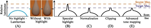
With traditional imaging, and its underrepresentation of highlight ranges, the following question arises: What happens to the luminances of highlights? Fig. 15.20 shows example scanlines of various distortions that are commonly encountered. The first scanline (Fig. 15.20A) is the luminance profile of a diffuse reflective object, in particular a curved surface, such as an unglazed porcelain spoon that exhibits Lambertian reflection properties (ie, ideally diffuse). In comparison with that, scanline B in Fig. 15.20 illustrates a specular highlight as it would appear on a porcelain spoon that is glazed and therefore glossy. It exceeds the maximum luminance of the display (or the signal), which is indicated as the lower dashed line titled “Target Max.” The middle illustration (Fig. 15.20C) shows one type of distortion that is seldom selected — that is, to renormalize the entire range so that the maximum luminance of the highlight just fits within the range. A side effect of this is that the luminances of the diffuse regions are strongly reduced. The fourth scanline (Fig. 15.20D) shows an approach where the diffuse luminances are preserved, or closely preserved, and the highlight is simply truncated, with all of its pixels ending up at the maximum luminance level. This leads to a distortion artifact called “highlight clipping” or sometimes “hard clipping.” Details and features within the highlight region are replaced with constant values, giving rise to flat regions in the image, and the resulting look can be quite artificial. The last illustration (Fig. 15.20E) shows typical best practices, and has been referred to as “soft clipping” or “shoulder tonescale.” Here the shape and internal details of the highlight are somewhat preserved, and there are no flattened regions in the image. Some of the highlight details are often lost to the quantization of the image or the threshold of the visual system, as the contrast of the details is reduced.
In the 20th century, there were distinct appearances for video and film systems, giving rise to the terms “video look” and “film look.” Originally there were numerous characteristics that accompanied each of these systems, and highlight distortions were one of the predominant artifacts: video tended to have hard clipping, whereas film systems had soft clipping, which was generally preferred in professional imaging because it looked less artificial. At this point in time, there are many digital capture systems that include the shoulder effect of film’s tonescale, so this particular distinction between digital and film has been largely eliminated. Nowadays, one of the few remaining distinctions between video (digital) and film is the frame rate (Daly et al., 2014).
In the context of HDR displays, the more accurate presentation of specular highlights (assuming the entire video pathway is also HDR) is one of the key distinctions of HDR. In this century, vision science has been less dominated by diffuse reflective surfaces, and a number of perceptual articles have looked closely at specular reflection. More accurate display of speculars reflections can result in better 3D shape perception, even with 2D imagery (Interrante et al., 1997; Blake et al., 1993), especially if it is in motion. Other studies have found specular highlights can aid in better understanding of surface materials (Dror et al., 2004). For stereo imaging, the specular reflections have very unique properties (Muryy et al., 2014). Further, in terms of human preference, there is a long list of objects that are considered to have high value and which have very salient specular reflections (gold, jewelry, diamonds, crystal glass chandeliers, automobile finishes, etc.) as well as low-cost objects that have appeal to the very young (sparkles). The emissive regions have a long history in entertainment (campfires, fireworks, stage lighting, lasers, etc.). There also appear to be physiologically calming effects of certain specular reflections, such as those on the surface of water as vacation destinations with large bodies of water significantly dominate other options. For those who like to entertain evolutionary psychology, all of this allure of specular reflections and highlights in general might derive from the fact that in most natural scenes, specular reflections only arise from what is one of land creatures’ most basic need: water.
15.5 Adding Color — Color Gamuts and Color Volumes
In the previous sections, we introduced the main concepts of HDR: contrast, quantization, and tone curves. So far, all those concepts were discussed from an achromatic point of view. However, our visual system perceives color, and therefore adding the chromatic component to HDR concepts is a natural consequence.
Of course, HDR imaging offered the capabilities to work with color images from the start. When one is working with real-world luminance levels, the colorimetric accuracy of HDR imaging can be high. However, if tone reproduction and tone mapping as well as efficient compression are taken into consideration, simple color mapping approaches can lead to large perceptual errors. For example, basic tone-mapping approaches (eg, Schlick, 1994; Reinhard et al., 2010) can lead to large variations regarding their output rendition and consequent appearance of a remapped HDR image. This makes the colorimetric and perceptual quantification as well as the consistency of such models challenging.
Therefore, similarly to the treatment of the intensity axis (as discussed in the previous section), it is beneficial to define the right color spaces and mapping approaches in order to alleviate unpredictable variations in rendering results. For this, it is necessary to understand both how the HVS perceives and processes color and how color-imaging systems such as displays can relate to it in the best possible way.
15.5.1 Visible Colors and Spectral Locus
This section about color spaces is added as context to the discussion of color volumes and therefore is not necessarily exhaustive. See the traditional color science literature (Fairchild, 2013; Wyszecki and Stiles, 2000) for a more thorough discussion of basic colorimetry.
Traditionally, the color components in imaging systems are described as coordinates in a 2D Cartesian coordinate system, which is called a chromaticity diagram. A common type is the CIE xy 1931 chromaticity diagram (Smith and Guild, 1931; Wyszecki and Stiles, 2000) shown in Fig. 15.21A. There, all chromaticity values visible to the HVS appear inside the horseshoe-shaped spectral locus, while colors outside this area are not visible to the HVS and can be called “imaginary colors” (nevertheless, they can be useful for color space transforms and computations).

Colors that lie on the boundary of the spectral locus are monochromatic (approximating a single wavelength as indicated). Typical representatives of such monochromatic colors are laser light sources, but they can also be created, for example, by diffraction or iridescence. Examples appearing in nature are the colors of rainbows, marine mollusks such as the p![]() ua (Haliotis iris), and the Giant Blue Morpho butterfly (Morpho didius). The straight line at the lower end of the “horseshoe,” connecting deep violet and deep red (at approximately 380 and 700 nm, respectively) is called the “line of purples” and is formed by a mixture of two colors, making it a special case as no single monochromatic light source is able to generate a purple color.
ua (Haliotis iris), and the Giant Blue Morpho butterfly (Morpho didius). The straight line at the lower end of the “horseshoe,” connecting deep violet and deep red (at approximately 380 and 700 nm, respectively) is called the “line of purples” and is formed by a mixture of two colors, making it a special case as no single monochromatic light source is able to generate a purple color.
15.5.2 Chromaticity and Color Spaces
A color space describes how physical responses relate to the HVS. It further allows the translation from one physical response to another (eg, from a camera via an intermediate color space and ultimately to the physical properties of a display system). Most color spaces used with the aim of additive14 image display have three color primaries.15 Those three primaries will map to three points in a 2D chromaticity diagram, thereby, when connected, spanning a triangle (as illustrated for several color spaces in Fig. 15.21B). This triangle contains all the colors that can be represented (or realized) by this color space and is called the 2D “color gamut”16 Further, colors that lie outside the triangle and thus are not representable are called “out-of-gamut colors” (Reinhard et al., 2010).
Typical additive display systems such as CRTs, LCDs, organic LED displays, and video projectors use phosphors, color filters, or lasers with a distinct wavelength combination, which define their primaries. However, these primaries differ from device to device, resulting in each of them having a different color gamut. Nevertheless, for accurate and perceptually correct rendering of imagery it is important to have color imagery displayed as intended (eg, a particular color shown on a display matches its chromaticity values sent to the display).
The conventional approach to alleviate this problem is to design an imaging system that closely matches an industry standard color space. For consumer devices, this industry standard is usually ITU-R Recommendation BT.709-6, 2015, whose primaries form a reasonable approximation to the capabilities of TVs and computer displays. The triangular area “spanned” by the Rec. 709 primaries is shown in Fig. 15.21B. Nevertheless, because of economic and design considerations as well as effects of aging, a match to one of the industry standards is not guaranteed, leading to an incorrect color rendition.17
To resolve this problem of inevitable differing primaries, new technologies have been developed that can match, for example, an HDR and wide gamut color signal to the actual physical properties of a particular display device (independently of the above-mentioned industry standards) (Brooks, 2015).
For professional use, where economic decisions are less restrictive and calibration can be tighter, the Digital Cinema Initiative (DCI) defined the P3 color gamut that is mainly intended for display systems such as reference monitors and cinema projectors (SMPTE RP 431-1:2006; SMPTE RP 431-2:2011) (also shown in Fig. 15.21B).
Recently, the ITU-R released a new recommendation with a wider color gamut whose color primaries lie on the spectral locus (ITU-R Recommendation BT.2020-1, 2014). Because of its large gamut, the latter color space is now considered for use in consumer and professional fields. Nevertheless, because of the triangular nature, those three color gamuts still do not completely cover the color gamut of the HVS.
The largest color spaces shown in Fig. 15.21B are ACES (SMPTE ST 2065-1:2012) and CIE XYZ (from which the actual xy chromaticity diagram is derived). Those two color gamuts are designed to cover all visible colors in the “horseshoe.” However, to achieve this with three primaries, many chromaticity values lie outside the visible gamut of the HVS.
15.5.3 Color Temperature and Correlated Color Temperature
Another important attribute to describe color is the white point, which can be precisely described by its tristimulus value (eg, in XYZ). However, a more usual way to do so is to provide its “correlated color temperature” (CCT). The CCT is related to the concept of color temperature, which is derived from a theoretical light source known as a blackbody radiator, whose spectral power distribution is a function of its temperature only (Planck, 1901). Thus, “color temperature” refers to the color associated with the temperature of such a blackbody radiator, which can be measured in Kelvins (K) (Fairchild, 2013; Hunt, 1995). For example, the lower the color temperature, the “redder” the appearance of the radiator (while still being in the visible wavelength range). Similarly, higher temperatures lead to a more bluish appearance. The colors of a blackbody radiator can be plotted as a curve (known as the “Planckian locus”) on a chromaticity diagram, which is shown in Fig. 15.21A. However, real light sources only approximate blackbody radiators. Therefore, of more practical use is the CCT. The CCT of a light source resembles the color temperature of a blackbody radiator that has approximately the same color as the light source.
White points are provided wither as a Kelvin value (eg, 9300 K, 12,000 K18 ) or as standardized representations of typical light sources. The CIE defined several standard illuminants (Fairchild, 2013; Reinhard, 2008) that are used in imaging applications.19 Commonly used white points in this field are the daylight illuminants, or D-illuminants (D50, D55, D65), of which D65 (CCT of 6504 K) is used by a large number of current color spaces (eg, in Rec. 709 and Rec. 2020). Another important white point is Illuminant E. It is the white point of XYZ and exhibits equal-energy emission throughout the visible spectrum (equal-energy spectrum) (Wyszecki and Stiles, 2000). Being a mononumeric value, the CCT does not describe white-point shifts that are perpendicular to the Planckian locus. This mathematical simplification is usually not apparent when one is working with traditional white points, as they are commonly lying on or close to the Planckian locus. However, if they lie further away from the Planckian locus, this will lead to green or magenta casts in images. The HVS can also adjust to white-point and illumination changes (Fairchild, 2013). This is facilitated by the chromatic adaptation process introduced earlier (see Fig. 15.2).
Now that we have discussed the properties of white points, note that a common omission is to ignore the color of the black point. Nevertheless, it should be taken into account to avoid potential colorcasts in the dark regions.
15.5.4 Colorimetric Color Volume
The chromaticity diagram shown in Fig. 15.22A discards luminance and shows only the maximum extent of the chromaticity of a particular 2D color space. In reality, color is 3D as presented in Fig. 15.22B, and is referred to as a color volume. When luminance is plotted on the vertical axis, it becomes apparent that, for a three primary color space, the chromaticity of colors that show a higher luminance level than the primaries (R, G, or B in Fig. 15.22) will collapse toward the white point (W in Fig. 15.22). A consequence is that although certain colors can be situated inside the 2D chromaticity diagram such as the example emissive color from the fire-breather in Fig. 15.22D, they can actually be too bright to still fit inside the smaller volume (Fig. 15.22C). However, it is possible to render the same color with a larger color volume (eg, with 1000 cd/m2), which is also illustrated in Fig. 15.22C. Therefore, a sufficiently large color volume is an important aspect when one is dealing with higher dynamic range and wide gamut imaging pipelines.

So far in this chapter we have defined the minimum and maximum luminance as well as their color (CCT or white point). With these and the primaries, we have described the extrema of a color volume. Now, quantization and nonlinear behavior inside a color volume need to be addressed in a similar way as introduced earlier with the achromatic tone curve.
An example is given by comparison of the plots in Fig. 15.23A and B.20 Both plots show the horseshoe of chromaticities visible to the HVS as well as the previously discussed industry standard color spaces. However, the two plots use different reference systems to compute the chromaticity values. Instead of CIE xy 1931 in Fig. 15.23A, the chromaticity coordinate system of Fig. 15.23B is CIE u′v′ 1976 (which is based on CIE LUV) (CIE Colorimetry, 2004).

The latter is widely used with movie and video engineering as CIE u′v′ is considered to be a more perceptually uniform chromaticity diagram. Perceptual uniformity is an important aspect of a color space for encoding efficiency and if any remapping operations have to be performed. It is also important if an assessment of the size of a color gamut or volume is desired. In the display community, color spaces are often compared by their coverage of all visible chromaticities in the xy or u′v′ diagram. Even though u′v′ is considered to be more perceptually uniform, it still has limitations in this regard. Therefore, the area of a color space computed in CIE xy or u′v′ does not exactly correlate with a perceptual measure. Table 15.3 provides a comparison of the chromaticity area of three industry standard color spaces. It is apparent that the values for CIE xy and u′v′ do not match. However, it is to be expected that the results from a more perceptually uniform color space are more meaningful.
Table 15.3
Relative Area of Three Common Color Gamuts When Plotted in CIE xy and CIE ![]() Coordinate Systems
Coordinate Systems
| CIE xy (Fig. 15.21A and B) | CIE | |
| Rec. 709/sRGB | 33.2% | 33.3% |
| DCI P3 | 45.5% | 41.7% |
| Rec. 2020 | 63.4% | 57.2% |
The percentage describes the coverage of the spectral locus (the “horseshoe”).
Similarly to luminance, perceptual uniformity in chromaticity is not automatically given by the sampling of physical quantities of light, even if they are weighted by the spectral response curve of the rods and cones. In the early 1940s Wright (1941) and MacAdam (1942) quantified the perceptual nonuniformity by JND ellipses as shown in Fig. 15.23A and B. Ultimately, their work led to more perceptually uniform chromaticity representations such as the one provided by CIE u′v′ 1976 as shown in Fig. 15.23B. As can be seen the perceptual uniformity for u′v′ performs better compared to CIE xy 1931, but the MacAdam JND ellipses are still not rendered perfectly circular, as would be the case for a perfect uniform color space. A further drawback when quantizing chromaticity in u![]() v
v![]() is the low resolution for yellows and skin tone areas.
is the low resolution for yellows and skin tone areas.
In addition to the remaining perceptual nonuniformity in the chromatic domain, chromatic JNDs are also dependent on adapting luminance (which is based on the state of light adaptation and with that on the level of ambient illumination as discussed in Section 15.2.1). Thus, when aiming for perceptual uniformity we cannot deal with luminance and chromaticity independently.
15.5.5 The Concept of Color Appearance Modeling
Further improvement of perceptual accuracy including uniformity requires that environment factors be taken into account. Besides the already introduced adapting luminance, there are several additional aspects that have an impact on how colors appear to the HVS, such as the background behind a color patch or directly neighboring colors or pixels (eg, causing the effect of simultaneous contrast; Fairchild, 2013). Further, the dominant color of the illumination influences our chromatic adaptation (see Section 15.2.1). Therefore, the impact of those aspects on colors, especially in the context of image display, needs to be taken into account when one is designing an advanced imaging system. Modeling and describing this are the domain of color appearance models (CAMs) or image appearance models (Fairchild, 2013).
CAMs are designed to be perceptually uniform throughout the whole color volume while taking into account aspects of the viewing environment to provide the perceptual correlates of lightness, chroma, and hue.21 The concept of those appearance correlates is illustrated in Fig. 15.24. There, very bright and very dark stimuli appear desaturated and thus having smaller radii — for example, because the limit of the SSDR has been reached (Section 15.2.2) with the reaching of the level of cone pigment bleaching and their noise floor, respectively. Maximum saturation can be reached for stimuli with average lightness.
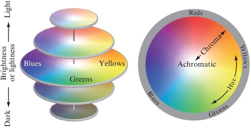
To use perceptually uniform and appearance-based color manipulation based on appearance correlates, input color values provided, for example, as RGB, XYZ, or LMS22 tristimulus values need to be decorrelated. The reasoning for this step is illustrated in Fig. 15.25. When the individual channels (here R, G, and B) from Fig. 15.25A are plotted against each other as shown in Fig. 15.25B, it is apparent that all three channels show a correlation between them (each channel contains information about both intensity and chromatic information). In Fig. 15.25C, the color channels Y, C1, and C2 are decorrelated from each other, (eg, by use of a principal component analysis, PCA). Now, the intensity information is mostly independent of the chromatic information.
Decorrelation with perceptually accurate principal component axes followed by a conversion of C1 and C2 from Cartesian to polar coordinates leads to correlates such as lightness, chroma, and hue as illustrated in Fig. 15.25.
The decorrelation of tristimulus values is also common with video compression approaches. In contrast to improving appearance accuracy, the foremost motivation with this use case is image compression efficiency such as chroma subsampling, which exploits the lower contrast sensitivity bandwidth of the HVS for high-frequency chroma details. One example is the YCbCr (Rec. 709/Rec. 2020) color difference model that is widely used with high-definition and ultra-high-definition broadcasts.
In addition to the decorrelation, a component of nonlinear compression is also added simulating that behavior of the HVS (eg, the sigmoidal behavior of the cone photoreceptors as introduced in Section 15.2.2).
CIE L*a*b* and CIECAM02 provide two commonly used CAMs23 and color appearance spaces that aim for perceptual uniformity. As an example, Fig. 15.26 shows the sRGB color volume projected into the CIECAM02 appearance space. Note the expanded areas for yellow (light gray in print versions) and brown (dark gray in print versions) tones (upper right corner of B) compared with u′v′.24

Although the design of CAMs is an improvement over non-appearance-based or perceptually uniform color spaces, these CAMs are both based on reflective colors, making them suitable only for SDR levels. Therefore, these existing CAMs still have limitations, especially when it comes to processing large color volumes as required with higher dynamic range and wide gamut imaging systems and displays.
The research community is actively working on improving CAMs. For example, Kunkel and Reinhard (2009) have presented progress with matching color appearance modeling closer to the expectations of the HVS. Further, Kim et al. (2009) studied perceptual color appearance under extended luminance levels.
Also, deriving the optimal color quantization needed for HDR and wide color gamut imaging systems is a challenge because input parameters for CAMs such as the adaptation field cannot be assumed as fixed for most HDR viewing scenarios as explained by the requirements of the EDR introduced in Section 15.2.2 and illustrated in Fig. 15.5. Another example is the impact of chromatic adaptation and the white point on both chromatic and luminance JND steps. Identifying those parameters can be useful to avoid or at least reduce contouring effects that otherwise can appear with changes in ambient illumination (eg, with mobile displays).
To approach this problem, Kunkel et al. (2013) proposed building a 3D color space based on the same principles as SMPTE ST 2084/PQ by freely parameterizing a CAM to find the smallest JND ellipsoids for any viewer adaptation in any viewing environment on any display. This approach extends the 1D JND approach to three dimensions, leading to JND “voxels.” As this approach is based on color appearance modeling, aspects such as the white point can easily be adjusted, which is illustrated in Fig. 15.27.

With this approach, it is further possible to count all those voxels leading to the number of distinguishable colors. This can potentially lead to more accurate assessments when one is quantifying the color volume of an imaging system or display compared with solely stating the image area in CIE xy or CIE u′v′ as shown in Table 15.3.
Recently, Froehlich et al. (2015) introduced a color space that they designed by finding the optimal parameters for a given color space model by minimizing cost functions such as the variance in size for a given JND-ellipsoid set for quantization visibility, hue linearity, and decorrelation to further increase perceptual accuracy. Further, Pytlarz et al. (2016) have introduced a new color space named ICtCp that improves perceptual uniformity for extended dynamic range and wide color gamut imaging pipelines while maintaining the simplicity of YCbCr. This approach can help facilitate the adoption of more accurate color processing in both existing and new imaging workflows.
More in-depth information regarding color appearance modeling is presented in Chapter 9. Further, a good reference is the book by Fairchild (2013).
15.5.6 Limitations of Perceptually Based Manipulation of Imagery
It is important to keep in mind that image processing based on perceptual principles is not universally the ideal approach. There are image manipulations that are best performed in different spaces. For example, image processing operations that simulate physical processes should be performed in linear light (eg, in RGB or a spectral representation). A good example for an image manipulation operation that simulates physical processes is accurate motion blur and defocus, which are frequently used in postproduction as well as in frame rate upconversion algorithms in consumer displays. An illustration of the differences when blur is applied is provided in Fig. 15.28. Here, the source image (Fig. 15.28A) is convolved both in linear light (Fig. 15.28B) and in SMPTE 2084/PQ (Fig. 15.28C), with only the linear light option rendering the bokeh of a lens as physically expected.

15.6 Summary
This chapter has covered key perceptual issues relating to the design of a color HDR signal format that also encompasses a wide color gamut. Experiments using specialized laboratory displays to determine the range were described, with full consideration of multiple viewers, wider field of view presentations, and creative intent for sequential imagery (video and movies). By means of psychophysical models, the design then explored how to best quantize that range, and how color gamut can impact that design. The range of the signal format was designed around perceptual needs, and avoided short-term constraints such as today’s display capabilities at consumer price levels. Thus, we have shown how a future-proof signal format can be designed, achieving the best possible quality with today’s displays, but also for displays that will have much higher capabilities. HDR imagery rendered and stored in this signal format will be robust against the legacy issues that have been plaguing imagery since the earliest days of film.