
Query-Driven Visualization and Analysis 127
bin, and rendering order takes into account region density so that important
regions are not hidden by occlusion. Different colors could be assigned to differ-
ent timesteps, producing a temporal parallel coordinates plot (see Fig. 7.3c).
This approach is useful in helping to reveal multivariate trends and outliers
across large, time-varying data sets.
7.3.2 Segmenting Query Results
A query describes a binary classification of the data, based on whether
a record satisfies the query condition(s). However, typically, the feature(s)
of interest to the end users are not individual data records, but regions of
space defined by connected components of a query—such as ignition kernels or
flame fronts. Besides physical components of a query, a feature of interest may
also be defined by groups of records (clusters) in high-dimensional variable
space. Combining QDV with methods for the segmentation and classification
of query results can facilitate the analysis of large data sets by supporting
the identification of subfeatures of a query, by suggesting strategies for the
refinement of queries, or by automating the definition of complex queries for
automatic feature detection.
A common approach for enhancing the QDV analysis process consists of
identifying spatially connected components in the query results. This has been
accomplished in the past using a technique known as connected component
labeling [35, 39]. Information from connected component labels provides the
means to enhance the visualization—as shown in Figure 7.4b—and enables
further quantitative analysis. For example, statistical analysis of the number
and distributions in size or volume of physical components of query results
can provide valuable information about the state and evolution of dynamic
physical processes, such as a flame [5].
Connected component analysis for QDV has a wide range of applications.
Stockinger et al. [31] applied this approach to combustion simulation data. In
this context, a researcher might be interested in finding ignition kernels, or
regions of extinction. On the other hand, when studying the stability of mag-
netic confinement for fusion, a researcher might be interested in regions with
high electric potential because of their association with zonal flows, critical to
the stability of the magnetic confinement—as shown in Figure 7.4a [41].
In practice, connected component analysis is mainly useful for data with
known topology, in particular, data defined on regular meshes. For scattered
data—such as particle data—where no connectivity is given, density-based
clustering approaches may provide a useful alternative to group selected par-
ticles based on their spatial distribution. One of the main limitations of a
connected component analysis, in the context of QDV, is that the labeling
of components by itself does not yield any direct feedback about possible
strategies for the refinement of data queries.
To address this problem, Gosink et al. [17] proposed the use of multivariate
statistics to support the exploration of the solution space of data queries. To

128 High Performance Visualization
(a) (b) (c)
FIGURE 7.4: Applications of segmentation of query results. Image (a) displays
the magnetic confinement fusion visualization showing regions of high mag-
netic potential colored by their connected component label. Image source: Wu
et. al, 2011 [41]. Image (b) shows the query selecting the eye of a hurricane.
Multivariate statistics-based segmentation reveals three distinct regions in
which the query’s joint distribution is dominated by the influence of pres-
sure (blue), velocity (green), and temperature (red). Image source: Gosink et.
al, 2011 [17]. Image (c) is the volume rendering of the plasma density (gray),
illustrating the wake of the laser in a plasma-based accelerator. The data set
contains ≈ 229 × 10
6
particles per timestep. The particles of the two main
beams, automatically detected by the query-based analysis, are shown colored
by their momentum in acceleration direction (px). Image source: R¨ubel et. el,
2009 [26].
analyze the structure of a query result, they used kernel density estimation to
compute the joint and univariate probability distributions for the multivariate
solution space of a query. Visual exploration of the joint density function—for
example, using isosurfaces in physical space—helps users with the visual iden-
tification of regions in which the combined behavior of the queried variables is
statistically more important to the inquiry. Based on the univariate distribu-
tion functions, the query solution is then segmented into different subregions
in which the distribution of different variables is more important in defining
the queries’ solution. Figure 7.4b shows an example of the segmentation of
a query defining the eye of a hurricane. Segmentation of the query solution
based on the univariate density functions reveals three regions in which the
query’s joint distribution is dominated by the influence of pressure (blue), ve-
locity (green), and temperature (red). The comparison of a query’s univariate
distributions to the corresponding distributions, restricted to the segmented
regions, can help identify parameters for further query-refinement.
As illustrated by the above example, understanding the structure of a
query defined by the trends and interactions of variables within the query’s
solution, can provide important insight to help with the refinement of queries.
To this end, Gosink et al. [15] proposed the use of univariate cumulative dis-
tribution functions restricted to the solution space of the query to identify
Query-Driven Visualization and Analysis 129
principle level sets for all variables that are deemed the most relevant to the
query’s solution. Additional derived scalar fields, describing the local pairwise
correlation between two variables in physical space are then used to iden-
tify a pairwise variable interactions. Visualization of these correlation fields,
in conjunction with principle isosurfaces, then enables the identification of
statistically important interactions and trends between any three variables.
The manual, query-driven exploration of extremely large data sets en-
ables the user to build and test new hypotheses. However, manual exploration
is often a time-consuming and complex process and is, therefore, not well-
suited for the processing of large collections of scientific data. Combining the
QDV concept with methods to automate the definition of advanced queries
to extract specific features of interest helps to support the analysis of large
data collection. For example, in the context of plasma-based particle accel-
erators, many analyses rely on the ability to accurately define the subset of
particles that form the main particle beams of interest. To this effect, 7.4.2
describes an efficient query-based algorithm for the automatic detection of par-
ticle beams [26]. Combining the automatic query-based beam analysis with
advanced visualization supports an efficient analysis of complex plasma-based
accelerator simulations, as shown in Figure 7.4c.
7.4 Applications of Query-Driven Visualization
QDV is among the small subset of techniques that can address both large
and highly complex data. QDV is an efficient, feature-focused analysis ap-
proach that has a wide range of applications. The case studies that follow
all make use of supercomputing platforms to perform QDV and analysis on
data sets of unprecedented size. One theme across all these studies is that
QDV reduces visualization and analysis processing time from hours or days,
to seconds or minutes.
The study results presented in 7.4.1 aim to accelerate analysis within the
context of forensic cybersecurity [3, 29]. Two high energy physics case studies
are presented in 7.4.2, both of which are computational experiments aimed at
designing next-generation particle accelerators, such as: a free-electron laser
(7.4.2.1) and a plasma-wakefield accelerator (7.4.2.2).
7.4.1 Applications in Forensic Cybersecurity
Modern forensic analytics applications, like network traffic analysis, consist
of hypothesis testing, knowledge discovery, and data mining on very large data
sets. One key strategy to reduce the time-to-solution is to be able to quickly
focus analysis on the subset of data relevant for a given analysis. This case
study, presented in earlier work [3, 29], uses a combination of supercomputing
platforms for parallel processing, high performance indexing for fast searches,
130 High Performance Visualization
and user interface technologies for specifying queries and examining query
results.
The problem here is to find and analyze a distributed network scan attack
buried in one year’s worth of network flow data, which consists of 2.5 billion
records. In a distributed scan, multiple distributed hosts systematically probe
for vulnerabilities on ports of a set of target hosts. The traditional approach,
consisting of command line scripts and using ASCII files, could have required
many weeks of processing time. The approach presented below reduces this
time to minutes.
Data: In this experiment, the data set consists of network connection data
for a period of 42 weeks—a total of 2.5 billion records—acquired from a Bro
system [23] running at a large supercomputing facility. The data set contains
for each record, the “standard” set of connection variables, such as source and
destination IP addresses, ports, connection duration, etc. The data is stored in
flat files, using an uncompressed binary format for a total size of about 281GB.
The IP addresses are split into four octets, A : B : C : D,toimprovequery
performance. For instance, IPS
A
refers to the class A octet of the source IP
address. The FastBit bitmap indices used to accelerate data queries require a
total of ≈ 78.6GB of space.
Interactive Query Interface: The study’s authors showed a histogram-
based visualization and query interface to facilitate the exploration of network
traffic data. After loading the metadata from a file, the system invokes Fast-
Bit to generate coarse temporal resolution histograms containing, for example,
counts of variables over the entire temporal range at a weekly resolution. The
user then refines the display by drilling into a narrower temporal range and at
a finer temporal resolution. The result of such a query is another histogram,
which is listed as a new variable in the user interface. A more complex query
may be formed by the “cross-product” of histograms of arbitrary numbers
of data variables, and may be further qualified with arbitrary, user-specified
conditions.
One advantage of such a histogram-centric approach is that it allows for
an effective iterative refinement of queries. This iterative, multiresolution ap-
proach, which consists of an analyst posing different filtering criteria to exam-
ine data at different temporal scales and resolutions, enables effective context
and focus changes. Rather than trying to visually analyze 42 weeks worth of
data at one-second resolution all at once, the user can identify higher-level
features first and then analyze those features and their subfeatures in greater
detail.
Another advantage is performance. The traditional methodology in net-
work traffic analysis consists of running command-line scripts on logfiles. Due
to the nature of how FastBit stores and operates on bitmap indices, it can
compute conditional histograms much more quickly than a traditional sequen-
tial scan. This idea was the subject of several different performance experi-
ments [3, 29].
Network Traffic Analysis: Theobjectiveofthisanalysisexampleistoex-
Query-Driven Visualization and Analysis 131
!
"
"
#
$
% &
!
"
"
#
$
D
E
F
!
"
"
#
$
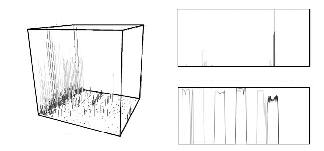
FIGURE 7.5: Histograms showing the number of unsuccessful connection at-
tempts (with radiation excluded): (a) on ports 2000 to 65535 over a 42-week
period, indicating high levels of activity on port 5554 during the 7th week; (b)
per source A octet during the 7th week on port 5554, indicating suspicious
activity from IPs with a 220 A octet; (c) per destination C octet scanned
by seven suspicious source hosts (color), indicating a clear scanning pattern.
Image source: Bethel et al., 2006 [3].
amine 42 weeks worth of network data to investigate an initial intrusion de-
tection system (IDS) alert indicating a large number of scanning attempts on
TCP port 5554, which is indicative of a so-called “Sasser worm.” The first step,
then, is to search the complete data set to identify the ports for which large
numbers of unsuccessful connection attempts have been recorded by the Bro
system. Figure 7.5a shows the counts of unsuccessful connection attempts on
all ports over the entire time range at weekly temporal resolution. The chart
reveals a high degree of suspicious activity in the seventh week, on destination
port 5554.
Now that the suspicious activity has been confirmed and localized, the next
goal is to identify the addresses of the host(s) responsible for the unsuccessful
connection attempts. The splitting of IP addresses into four octets (A : B : C :
D) enables an iterative search to determine the A,thenB, C, and finally, D
octet addresses of the attacking hosts. The first query then asks for the number
of unsuccessful connection attempts on port 5554 during the seventh week over
each address within the Class A octet. As can be seen in Figure 7.5b, the most
suspicious activity originates from host(s), having IP addresses with a 220 A
octet. Further refinements of the query, then reveal the B octet (IP=220 : 184 :
x : x)andalistofC octets (IPS
C
= {26, 31, 47, 74, 117, 220, 232})fromwhich
most of the suspicious activity originates, indicating that a series of hosts on
these seven IPS
C
network segments may be involved in a distributed scan.
..................Content has been hidden....................
You can't read the all page of ebook, please click here login for view all page.