LONDON, UNITED KINGDOM
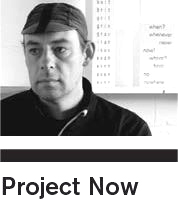
Holger Jacobs (Mind Design)
PROFESSIONAL YEARS
15
A VALUABLE QUALITY FOR A DESIGN STUDENT + A DESIGN PROFESSIONAL
Never, ever think it’s ‘cool’ being a designer + Willingness to take risks
FAVOURITE FOOD NOW
Anything Japanese, except for the crab brain that my wife’s relatives once invited me to taste
YOUR MOST VALUED POSSESSION NOW
Hand-built Italian racing bicycle
YEAR OF PROJECT
2008
PROFESSIONAL PROJECT BRIEF
Identity and signage for a club and restaurant occupying the top three floors of a London skyscraper
CLIENT
Paramount
COLLABORATOR(S)
My colleague Craig Sinnamon
TECHNOLOGY
Screenprinting on acrylic
TIME SPENT
About 3 months
TYPEFACE
Futura
WHY DO YOU LIKE THIS PROJECT?
It was a complex project (but had a simple meaning).
OUTCOMES
The design for Paramount was our first attempt to develop a visual identity that was not based on a singular logo. Instead we developed a flexible system of abstract patterns that express the height of the building.
FEEDBACK
The project was published in several books and magazines.
ANYTHING ELSE
As in college, I am still suspicious of the idea of a fixed ‘meaning’. Working mostly on identity projects, I often reject concepts that aim to be a visual translation of ‘brand values’ and look for a certain honesty and directness in form. The Paramount identity is a good example, as it relates to architecture and certain features of the building. It was difficult to explain this to the client, who originally wanted to put more emphasis on ‘exclusivity’ and communicate a certain ‘up-market feel’.
DO YOU TEACH?
Currently Visiting Professor for Typography at Fachhochschule Düsseldorf (Germany).
IS IT POSSIBLE TO TEACH DESIGN?
My college education was not very systematic. In Germany I started studying illustration because graphic design seemed very technical and boring to me at the time. It was only when I came to England that I became interested in typography, because it was taught in a more experimental way as a form of self-expression. Actually, it was not taught at all; our tutors just encouraged us to mess around with type on the photocopier. During my MA, I focused more on ideas than on style and used the time to teach myself the typographic basics I rejected so much in Germany. Looking back at my education, I think it is very important to teach the basics of typography and go through simple exercises of ‘form finding’. This might be boring and hard work, but many ideas develop through experimentation with form, not just through concept development and research.

