AMERICAN
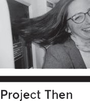
Kristine Matthews
STUDENT YEARS
6
A PIECE OF SOUND ADVICE + A SINGLE WARNING TO A DESIGN STUDENT
a: To American students in particular: Travel the world. Live in another country b: Take risks. Now is the time to do it + Don’t let your fears get in the way of admitting what you really want – then go after that thing
FAVOURITE FOOD THEN
Pasta
YOUR MOST VALUED POSSESSION THEN
My latest design project
YEAR OF PROJECT
1996
STUDENT PROJECT BRIEF
A self-initiated project. A brief to myself. Coming out of a more commercial design background and entering grad school, I was interested in the idea of introducing chance/ luck/randomness to my work. I wanted to create a project to let loose in the world and see what came back. (Also, other people have more interesting ideas than I do, so I thought I would ask lots of people to send me theirs.)
COLLEGE
Royal College of Art, London (United Kingdom)
TUTOR(S)
Siobhan Keaney, Margaret Calvert, Richard Bonner-Morgan, Russell Warren-Fisher (I can’t remember if one in particular was offering significant critique on this project…; they each tutored me at various times at the Royal College)
COLLABORATOR(S)
My collaborators were the 100 people I sent cards to (especially the ones who responded…)
TECHNOLOGY
Postcards printed letterpress. Book cover printed letterpress, inside pages printed offset (printing donated by the White Dove Press)
TIME SPENT
Oh goodness, I can’t remember. It lasted at least three or four months altogether, I think. (Long, pleasant hours in the letterpress studio making the cards and cover / Happy times at the postbox collecting replies as they trickled in / Forever trying to make the handwriting look good in the book before hitting on the idea of translating handwriting to its typeset equivalent.)
TYPEFACE
Helvetica Compressed (title), Bell Gothic (body)
WHY DO YOU LIKE THIS PROJECT?
I like that the book is now all around the world, tucked onto various people’s bookshelves. Even for non-designers, people tend to remember it, as the content is so personal.
WHAT DO YOU DISLIKE ABOUT IT?
I'd probably change the title of Now Here This. Then again… maybe not.
OUTCOMES
Good fodder for some handwriting analysis.
FEEDBACK
Positive: I think people were pleasantly surprised to find that if they made the effort to fill in and send back the card, they eventually got a book in return. Negative: Some friends of my parents accused me of incorrect spelling (in the title). It's supposed to be word-play, referring to where you are (not what you hear). Makes me wonder how many other people silently pity my spelling faux pas.
ANYTHING ELSE
Looking at Now Here This and the subsequent global onslaught of email, social media, blah blah, I lament the rapid decline of the postal service and the personal letter. The variety of stamps that I received on the replies to Now Here This could have merited their own project. Some students of mine recently did a project on this subject, which I love: www.positivepost.org Long live the stamp!
PROJECT SIMILARITIES THEN AND NOW
Both feature content collected from the audience of the project itself. Maybe it’s laziness, but I always find that if you ask the right question of your audience, you will get unexpected results that are much more interesting than what you would come up with yourself, even if you stared hard at a blank sheet of paper for days on end. Now Here This certainly proved that to me, and I have returned to the idea for various professional projects. There is nothing better than crafting the right question (and by that I mean, not too specific, but not too general), then waiting to see what people come up with. I never cease to be entertained and inspired.