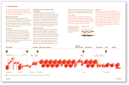
5 PRINTED MATTER CASE STUDIES
Whether you’re perusing a magazine, reading a manual for a new piece of equipment, or looking at product packaging in a store, words are ubiquitous. With so much printed matter around us, sometimes it’s difficult to separate the useful information from the extraneous. The most successful information design in print entices people to read and clearly communicates key messages.
→ Carbone Smolan Agency
→ Smart Design
→ Addison
→ Pentagram Design
→ And Partners
→ Simon & Goetz Design
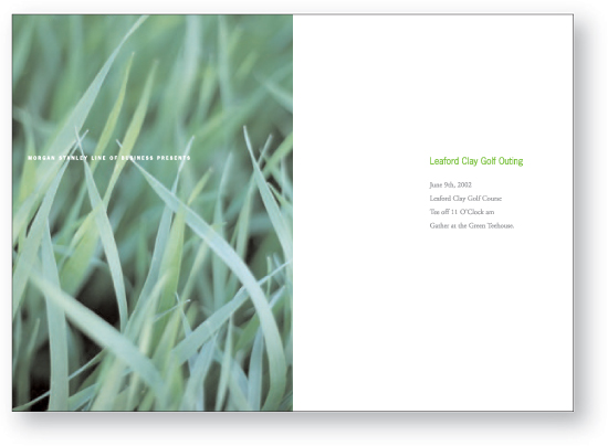
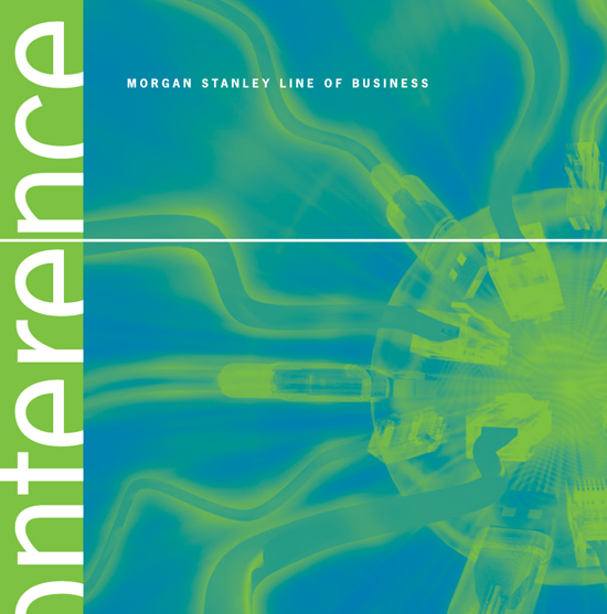
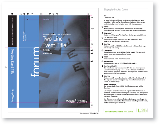
 Carbone Smolan created a comprehensive three-tiered system for all of Morgan Stanley’s corporate events.
Finding the Right Partner. Morgan Stanley understood it was in the business of financial services, not graphic design, so it engaged the New York City-based design firm Carbone Smolan Agency (CSA) as a strategic partner.
The Daily Bash. CSA was initially hired to address a couple of long-standing dilemmas. To share information with key clients around the world, Morgan Stanley produces at least 300 events a year. Noting a lack of consistency in its event materials and inefficiencies in the internal processes required to produce each event, Morgan Stanley asked CSA to develop a series of recommendations.
After carefully reviewing the challenges, CSA helped the company develop a three-tiered architecture for its calendar of events, with detailed graphic standards for each event type. Collaborating with Morgan Stanley’s writers, CSA developed clear informational hierarchies for everything from invitations to signage and programs, allowing Morgan Stanley to consistently convey key messages.
To streamline communication and create good internal ambassadors for the program, some of Morgan Stanley’s in-house design staff worked in CSA’s offices as the guidelines were in development. Once the guidelines were implemented globally, internal feedback was solicited from Morgan Stanley’s offices around the world and CSA made “tweaks” to the document. Cultures as diverse as Asia, Japan, Europe, and North America embraced the system with a 99 percent rate of adoption worldwide.
Unseemly Flood of Data. Morgan Stanley then asked CSA to attack a “whole other kettle of fish”—the process by which the company published its in-depth research reports. Written by research analysts worldwide and distributed to clients, these reports lacked consistency.
In its initial research for the project, it was discovered that typical users received these reports each morning via email. Because clients typically received 300–400 messages every morning—including reports from competitor firms—it was imperative to help the reader quickly sort through the deluge. In a “survival of the fittest” play, CSA recommended that something as simple as changing the email slug line could offer a strategic advantage.
But even if the message was opened, a 20- to -100 page attachment could cause the reader to close it—or worse, delete it— with nary a look back. The antidote? CSA developed a sophisticated information hierarchy for the first page of each report, with standards for how headlines and initial text needed to be written and typeset. Putting the analyst’s conclusions front and center allowed readers to “cut to the chase,” and then allowed readers, if so inclined, to drill down to more detail in subsequent pages. The template allowed the reader to quickly and consistently identify the most important information.
Based on this strategic approach to information design, CSA was subsequently asked to work on Morgan Stanley’s overall graphic standards, tackling enterprise-wide issues.
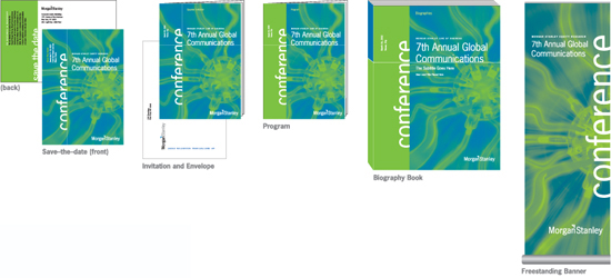
The materials for each event category were defined by a unified design approach.
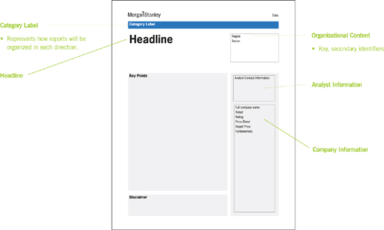
In order to help Morgan Stanley organize, categorize, and effectively deliver its Equity Research reports, CSA developed schematic layouts to test and analyze relevant content.
Detailed design standards reinforce a judicious use of copy editing to present pertinent information in a clear, concise fashion.
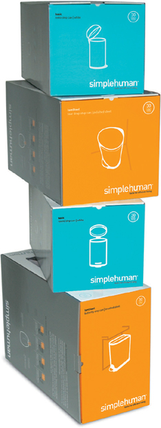
As a contrast to the clean white backgrounds and the neutral colors in the product photography, a clean, vibrant color palette was developed to attract attention.
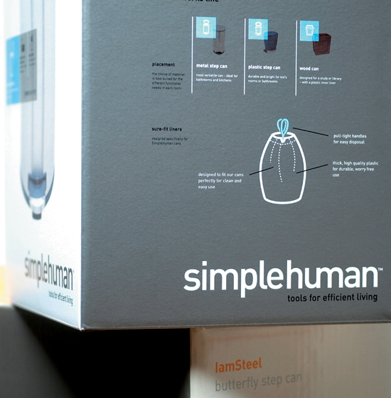
Performance Driven. With a focus on consumer products, Smart Design’s packaging and branding efforts are informed by years of design experience. The designers understand that, just like the product itself, packaging needs to meet performance objectives. With little control over how the product would be displayed in large retail environments chock-full of competing products, they needed to create packaging that would stand out from the clutter. As Smart Design cofounder Tom Dair says, “Most retail packaging is overly complex and gimmicky. We knew we could make the packaging stand out by paring back the imagery and text to the essential elements.”
Since most retail environments are self-serve, the packaging had to attract and educate. This was particularly important given that simplehuman didn’t have a big budget for print or broadcast advertising. The packaging was both the billboard and the sales representative.
Knowing consumers are time-stressed and hassled about making purchasing decisions, the goal was to have the package highlight the product’s areas of innovation. Smart Design was careful to use benefit statements rather than listing features. Dair says, “If you focus on product features, you’re leaving it up to the consumer to figure out how the features become beneficial.”
“Good design, good typography is a function of information and inspiration, of the conscious and unconscious, of yesterday and today, of fact and fantasy, work and play, craft and art.” —Paul Rand
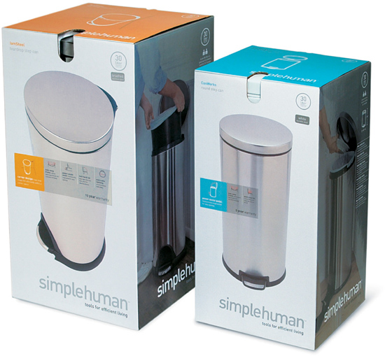
In order to convey a look that is sleek and modern but also simple and friendly, the front panel features a “hero shot” of the product with a simple overlay of elegant type. There was a heavy emphasis on white space to help it stand out in the cluttered retail environments.
Some products sold at higher price points, so it was important to differentiate the product from competitors to help the consumer clarify the different features/benefits in the simplehuman line.
Modular System. In addition to cartons, the designers developed a system for detailed but elegant labels attached to the product itself, so customers could get information even if retailers took the products out of the boxes to save display space.

In addition to boxes, Smart Design developed a system for detailed but elegant labeling for the product itself, so customers could get information even if retailers took the products out of the boxes to save display space.
Because simplehuman was committed to developing additional product lines, it was important to create a modular approach to the visual language. The design had to be unified but flexible, and work for accessories as well.
Success has meant that simplehuman’s in-house design department continues to implement the system. The product line looks cohesive, even with packaging that’s quite different in terms of size, shape, and materials.
As Dair says, “You’re helping to set the consumer’s expectation. Luckily, these are great products. We didn’t have to create a lot of vapor around them. We just needed to reflect the company’s commitment to creating tools for efficient living.”

Simple line drawings draw attention to bulleted lists so consumers can review product benefits at a glance.
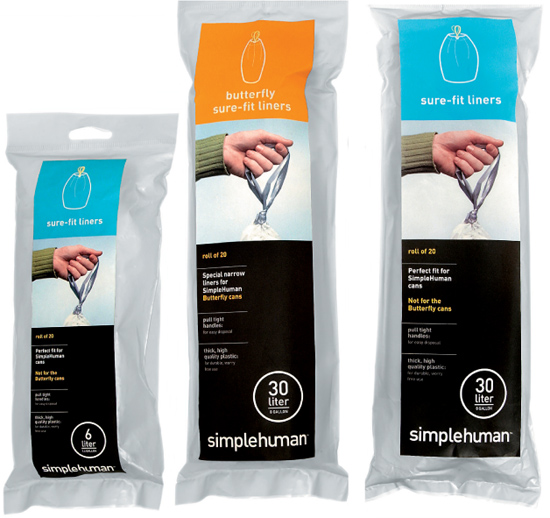
The product line looks cohesive —even with packaging that is quite different in terms of size, shape, and materials.
“It’s important to accept we don’t have all the right answers. In my view, the information designer is a facilitator. The key is to ask the right questions, observe, and process the cues.” —Gordon Akwera
The Right Time for Simplification. At Addison, the time was right for taking the simplification message to the corporate world. The Securities and Exchange Commission (SEC), which regulates all publicly traded companies in the U.S., was scrutinizing companies that weren’t adequately disclosing the details of their businesses to investors. Investing in better communications had become a hot button for Fortune 500 and midsize financial companies.
Systematic Approach. Since most business communications problems and deficiencies are mainly systematic, doing the job right entailed digging deep. In Akwera’s first client assignment with Addison, it became clear he needed to examine communications at every customer touch point.
Addison quickly realized it wasn’t enough to make recommendations about plain English writing and design. They needed to spend time with the internal departments to understand how the pieces were being produced. They had to look at each company’s communications ecology. “If the systems weren’t addressed, real change wouldn’t occur,” explains Akwera.
The Customer Really Matters. As time went on, Addison realized how critical it was to address these communications systems from a user-centric point of view.
Addison helped Merrill Lynch develop a modular content management system to streamline thousands of overlapping letters and notices. This program reduced operational burdens and costs, and enhanced customer satisfaction.
Dense text with long, complex sentences and a hard-to-read format made this financial report for Xerox difficult to understand.
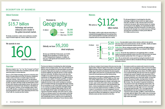
Addison created much more impact by highlighting key information with bold, clear graphics. Descriptions were all written in plain English and text was styled for easier reading.
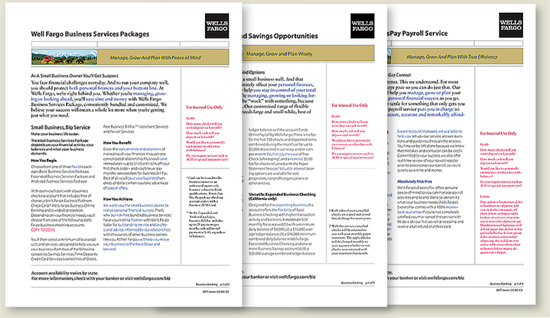
Addison worked with Wells Fargo to simplify its suite of materials targeted to consumers. Accessible online, these product fact sheets allow readers to very quickly find the information they need. Type styles and sidebars provide clear information hierarchies.
Many companies create communications based on their internal workings. “It’s product push. Come up with it, name it, make product collateral, and push your new product,” says Akwera.
In contrast, Addison developed a discovery process through which they began spending time interviewing and observing their clients’ customer interactions. They worked to identify the information customers required, and the types of problems customers really needed to solve. Addison now frequently conducts ethnographic research, spending time with customers in their day-to-day settings. They are able to observe differences between what people say they do and what actually takes place.
As a result of analyzing these interactions, Addison can point out where an organization’s existing information is redundant, insufficient, or confusing. Addison provides analysis with an “outside-in” perspective. “Customers are saying, ‘Give me the information I need, and in the most convenient way.’ We help clients visualize how this can be done,” says Akwera.
Fewer Trees, Happier Customers. The end result? In one case, over 5,000 communication pieces were effectively reduced to less than 100, resulting in significant cost savings and stakeholder satisfaction. Apart from elimination and consolidation, some of the information was moved to other channels such as online. Akwera says, “The money spent to give customers a better experience can result in years of return. After seeing metrics, companies come back and say, ‘What else can you do for us?’ ”
When asked what it takes to be a good information designer, Akwera has two answers: “Patience and humility will lead you to the heart of the matter. It’s important to accept that we don’t have all the right answers. In my view, the information designer is a facilitator. The key is to ask the right questions, observe, and process the cues,” he says.
“We’re trying to help meet end user needs. Understanding their ‘mental model’ is fundamental. Once you nail it, there’s always an ‘aha’ moment. Once you experience this insight, you realize you can apply research to every kind of communication challenge. It’s eye opening,” says Akwera.
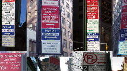
Extremely confusing parking signs posted throughout New York City result in millions of dollars in fines each year.
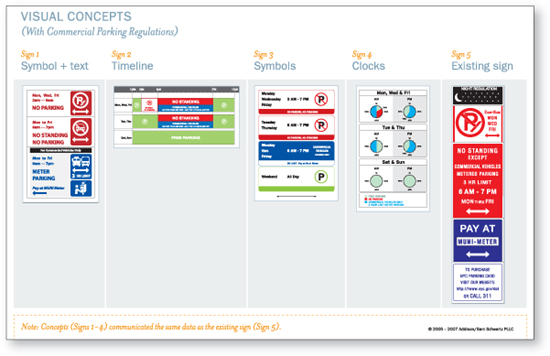
As part of a pro bono project, Addison explored four preliminary design concepts for new parking signage. Addison tested these prototypes against the existing signage in order to determine what would be the most effective approach.
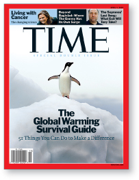
Even TIME’s venerable cover format was renewed. The logo was slightly reduced in scale, and a discreet set of typographic “billboards” was introduced to signal highlights for readers.
Addicted to Pubs? A transplanted Brit working in New York City, Hayman has spent more than 80 percent of his working life designing publications. “I keep trying to get out of it, but I keep getting sucked back in,” he says. “I enjoy working on a range of projects, and I particularly love designing books, but I do like the ephemeral quality of magazines. It allows you to continuously keep trying things.” Prior to the TIME assignment, Hayman had most recently been the art director at New York Magazine for almost three years.
The Grid Reigns Supreme. While Hayman is an avid experimenter, he’s also an adamant champion of a strong, grid-based approach to publication design. He strongly believes in using a limited palette of fonts and color. “Flyers for secondhand suit stores are now full of color,” he says, “so color doesn’t have as much value as it used to. While designers might feel that a restrained type and color palette is restrictive or even boring, a reader often has only minutes to scan a publication. Consistent formatting can guide them through it, and separate the editorial pages from all the ads.” He adds, “A pared-down palette allows the liveliness of the art to come through, so you can focus on great photo editing, illustration, and information graphics.”
“With a strong grid and a consistent and defined approach to all the type, you give up a bit of spontaneity, but the magazine feels unified. It has the feeling of a beautifully proportioned building that’s been built with a leveling tool.” —Arthur Hochstein
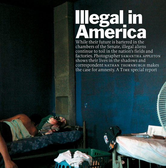
TIME’s new managing editor, Rick Stengel, felt traditional news photography had been commoditized, and wanted to provide images that took a less literal approach. The emphasis is on finding images that provide a sense of storytelling.
The new design emphasized multiple access points for readers who might spend only moments scanning a story and avoid reading type set in continuous paragraphs.
The visual solutions needed to reflect the substantial changes being made in the editorial approach, so everything was in a state of flux. As Hochstein says, “The last thing we wanted was just a cosmetic change.” Executing the project was so intensive that Hayman was “embedded” in TIME’s offices, working with the internal team for several months.
What Should Stay? What Should Go? Hayman feels strongly that every redesign needs to begin with an exploration into the heritage of the publication’s brand. “TIME is authoritative. It has decades of history to justify this positioning. We didn’t want to make something trendy and cool. It needed to project a distinct point of view. It needed to say: These are serious times. We’re smart. We’re the place to go.”
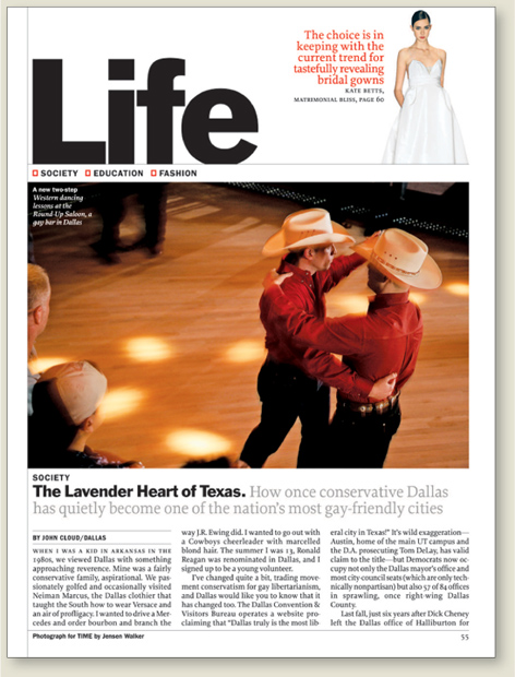
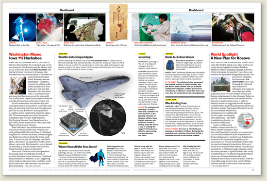
Instead of a continuous flow of stories, a three-part structure was developed for the reinvented magazine. Bold typography serves as a wayfinding and pacing device to signal the start of new sections, and provides a sense of rhythm. Each section has its own identity.
Early in the process Hayman recommended that TIME embrace Franklin Gothic as part of its design DNA. The typeface was a critical part of the redesign done in 1977 by renowned art director Walter Bernard. The bold setting provides a powerful punch—giving headlines additional “color,” in contrast to text type.
Simple, elegant, geometric illustrations on the covers branded the series.
It’s All About the User Experience. Mohawk commissioned the New York City– based firm And Partners to build a suite of timeless reference tools that would be pertinent to junior designers, as well as those with far more experience. Used as printed “ambassadors” by Mohawk’s sales reps, the brochures would encourage people to look for more detailed content on the Web.
Begin with Content. With this in mind, And Partners’ founder, David Schimmel, decided to build the system “from the ground level.” And Partners reviewed Mohawk’s white papers and topic wish list with a writer they knew well. Based on this review, the firm suggested a newly prioritized and logical structure for the series. The writer continued to work with Mohawk’s production and marketing teams to develop the content, and became a “focus group of one.” If she found something that was difficult to understand, this probably meant the text should be clarified. The team constantly asked, “How much information can we include to make the pieces useful but still accessible?” Schimmel says, “We didn’t start designing until the content was nailed. Designing is a lot easier to do when you know what you’re saying. And having a piece where the design and the writing are integrated is the best way to get good information design.”
Small illustrations were used for visual relief and to attract attention. Drawings and diagrams were consistently used to clarify content.
Elegant Primers. The design team began to work with sample sections to present design schemes. Because they wanted the pieces to feel practical but look beautiful, each piece was designed in two colors, within an overall series palette. This simple palette also helped to guarantee the pieces would be easy to reproduce by various printers across the U.S.
The designers also wanted to use design elements to reinforce a sense of information architecture, so readers wouldn’t be required to read any of the pieces from beginning to end. The design needed to function just as well for someone just flipping through.
To keep the pieces from feeling too technical, fields of color were used to “mix it up,” providing contrast to pages with a lot of detail. Small illustrations add visual relief and attract attention. Consistent drawings and diagrams clarify content.
As the designers proceeded, they developed the system with a solid grid as well as detailed style sheets so it could be implemented by other design firms down the road.
Sellout Crowd. The response from the marketplace was enthusiastic. One of the first pieces was immediately reprinted to meet demand. Specific feedback indicated that designers loved how the pieces were straightforward, practical, and easy to use. And they appreciated the simple, elegant, geometric illustrations on the covers that branded the series, making it easy to find the brochures on a crowded bookshelf.
In order for readers to feel that these pieces provide objective information, the designers have developed a color-coded system so that any text related to product advantages is highlighted in a second color. This helps readers identify the types of content they want to read.
The majority of paper promotions are extremely elaborate and color saturated. In order to put an emphasis on content, most of the Mohawk brochures were simply produced in two colors. This also helped to ensure the system would be easy to reproduce by printers across the U.S.

Graphic icons draw the eye to product benefit statements.
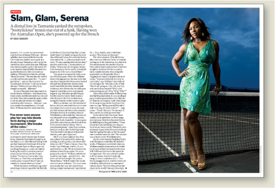
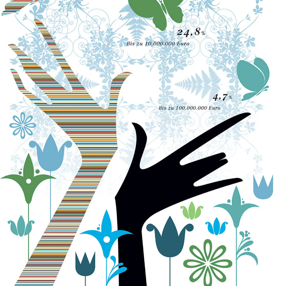
In order to illustrate a complex topic, Simon & Goetz created an unusual but successful solution where the illustrations act as stories in their own right, carrying the core messaging of the article in a visually striking way.
Art and Culture Has a Place in Business. Sal. Oppenheim’s philosophy includes open-minded concern for new industrial and economic developments, sensitivity toward sociopolitical issues, and a strong commitment to art and culture. The goal: Ensure that an innovative approach translates loud and clear in their public relations and communications tools.
A Groundbreaking Magazine. Seeking to enter into a regular dialog with its clients, Sal. Oppenheim engaged Simon & Goetz to create a standout publication for sophisticated readers. Not satisfied with self-promotion, the bank intended to inspire their audiences with unexpected content, and to expand awareness by looking at familiar topics through a different lens. Now in its fifth year of publication, the magazine continues to engage clients, potential clients, and bank employees with thought-provoking content and cutting-edge information design.
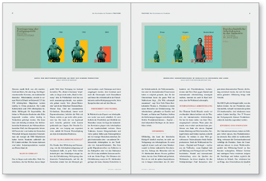
“The magazine’s design uses emotions to create reader enthusiasm for a topic or article,” says Vollmöller. “The idea is to feature emotionally engaging images within the articles alongside the standard facts, figures, and diagrams to create a kind of collage.” Each article features a design that is custom-tailored to the particular content. Design elements represent the core message of the article and provide information at the same time.
Provocative cover imagery helps distinguish the magazine from peer publications that take a more predictable approach.
Illustrated charts highlight issues of job loss and profit-ability when production jobs are moved out of Germany.
Why an Emotional Approach Works. “Information today is a commercial product,” says Vollmöller. “Nonetheless, the array of detailed yet redundant information from various sources prevents us from seeing the forest for the trees.”
The magazine’s distinctive look, combined with its wealth of information, has been a great success. “This approach to design has a very positive impact on a brand,” he says. “The magazine has received multiple awards, but more importantly, it is truly appreciated by readers.”
Great Relationships Yield Great Results. The goal of any collaboration between designer and client is the development of a relationship and trust. Vollmöller says, “Gaining the client’s trust that the content and goals of the magazine will continually be communicated in the most professional, brand-appropriate, and quality manner is the result of a continuous and collaborative development process.”