6 INFORMATION GRAPHICS CASE STUDIES
Humans show a remarkable need to visualize, understand, and catalog the world around them. We have been mapping geographic landscapes for centuries. We create charts and diagrams to analyze data and draw conclusions from it. Well-executed information graphics create a sense of context and reveal relationships between sets of information, allowing for new and more nuanced conclusions.
→ Alejandro Tumas
→ The New York Times
→ Funnel Incorporated
→ White Rhino
→ Nigel Holmes
→ The Wall Street Journal
“Interact as much as you can with your client. Create the feeling of ownership in the client, and make sure they stay as excited as you are during the process.” —Alejandro Tumas
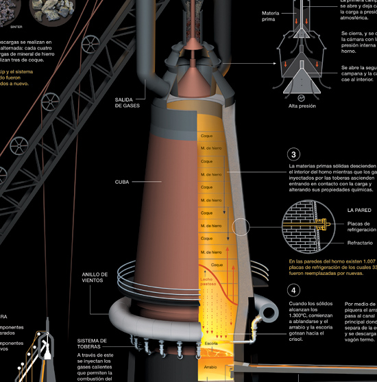
Technical Concepts for General Audiences. “The challenge in creating the blast furnace infographic,” explains Tumas, “was to turn something extremely complex into an understandable, attractive informative graphic, and to give a less sophisticated audience a better understanding of the technological innovations taking place within the company.”
Another challenge in the project was working with the engineers. “It was clear that the engineers were the ones with the knowledge. We were just there to communicate it in a more appropriate manner. Specialists, whether they’re doctors, physicians, or engineers, can be the most difficult clients. It is hard to make them understand that it is often necessary to omit many technical details. We weren’t creating a thesis, but a graphic for everyday people.”
The Road to Infographics. Tumas got his start working at Grupo Multimedios America in the design department on their newspaper, El Cronista. “The newspaper was my first encounter with the emerging discipline of infographics,” says Tumas. “These types of graphics—very primitive, but with great impact—fascinated me.”
He later became an infographics designer at the newspaper Clarin, where he eventually became department chief. “I created my first infographics prototypes at El Cronista, but it was at Clarin that I was able to develop this discipline.”
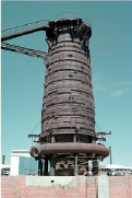
![]() The project began with gathering reference materials showing aspects of the furnace.
The project began with gathering reference materials showing aspects of the furnace.
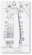
![]() This diagram of the production process was created as part of the research.
This diagram of the production process was created as part of the research.
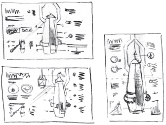
![]() The first sketch (top) was based on a two-page symmetrical layout and required printing over the centerfold. The second sketch (bottom), which was less successful, had the furnace located to the side to avoid the centerfold. Finally, a sketch was done of the double-page in a portrait format (above right). While the magazine hadn’t used this format before, it agreed that this was the best way to present the information.
The first sketch (top) was based on a two-page symmetrical layout and required printing over the centerfold. The second sketch (bottom), which was less successful, had the furnace located to the side to avoid the centerfold. Finally, a sketch was done of the double-page in a portrait format (above right). While the magazine hadn’t used this format before, it agreed that this was the best way to present the information.
Tips from the Infographic Design Trenches. Tumas has learned a few things since he started doing infographics in the early ’90s and has a few tips to share.
Learn Business Hierarchies. With complex projects, a designer often has more than one client contributing ideas. “With the blast furnace project there was a parade of engineers, each with their own agenda. It was hard to please all of them,” Tumas explains. “However, once we learned their hierarchies, it helped. If Juan was higher in the food chain, we would often defer to him in the process.”
Keep the Client Close. “Interact as much as you can with your client,” Tumas says. “Create the feeling of ownership in the client and make sure they stay as excited as you are during the process. The worst thing that can happen is a client becoming distanced from the project.”
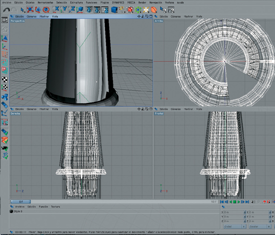
![]() A 3-D rendering was created using modeling software.
A 3-D rendering was created using modeling software.
Negotiate Text Length. What do you do when a client delivers too much text to fit the graphic? Tumas has a negotiation process he sometimes uses. “We would plan for five lines of text and then give them a mock-up with only three lines. ‘That’s too short!’ they would say and give us ten lines of text. We would show a final version with five lines of text and make the client believe we had compromised two more lines, even though we had planned five lines from the beginning,” Tumas says.
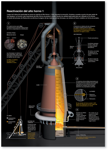
![]() Tumas’ final infographic illustrates how the furnace works, and highlights new or modified furnace parts. Yellow highlighting and text on the graphic describe what was done to put the furnace back in operation, while white text and graphic elements explain how the furnace works.
Tumas’ final infographic illustrates how the furnace works, and highlights new or modified furnace parts. Yellow highlighting and text on the graphic describe what was done to put the furnace back in operation, while white text and graphic elements explain how the furnace works.
“To really understand a data set, you need to process it yourself. Seventy-five percent of our time is spent reporting, gathering, and distilling information.” —Archie Tse
A Mindset for the Job. Tse says that many of the graphics editors at the Times have scientific or mathematical backgrounds. “To really understand a data set, you need to process it yourself. Seventy-five percent of our time is spent reporting, gathering, and distilling information,” Tse explains. “But we also need people who are experts in visualizing the information.”
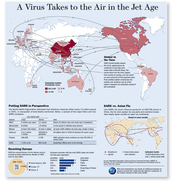
Tse recalls when one of the Times’ best investigative correspondents needed to file a sweeping overview of the war in Afghanistan. When it came time to think about an appropriate visual, it was clear photography wasn’t going to work. The visual had to communicate an overarching and historical perspective, so an information graphic was more appropriate. The graphic was designed to complement the reporting and provide the kind of information a written story couldn’t convey.
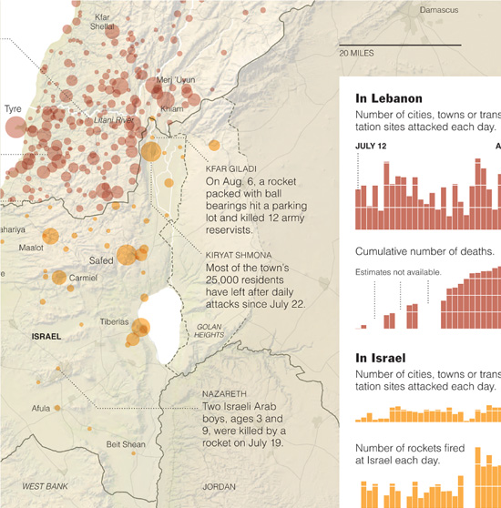
From the Field. “In order to create really good graphics, you have to have really good information. You have to immerse yourself in the subject and do your own reporting. It was hard to get good information secondhand, so the Times sent me to Iraq in 2003,” Tse recalls. He also traveled to Lebanon in 2006 to cover the war there. Tse filed video reports and worked with colleagues in Jerusalem and New York to produce graphics for the website. “Interactive graphics require a different visual tool set than print graphics,” he says. He also notes that the opportunity to learn new things is what he likes best about the job.
All for One. Graphics editors at the Times all have different strengths, be it reporting, working with databases, 3-D rendering, or Flash. “Our skill sets complement each other, so we will often bring two or three people together on a project.” As a department, he says, they are constantly searching for ways that graphics can support stories. “We want to help people understand what is going on. We know it’s a balancing act. We need to provide enough detail to illuminate the content, but showing too much complexity may alienate some readers,” Tse explains.
Tse and his team feel a tremendous responsibility to get it right. “You err on the side of showing less. You have to let the data speak for itself.” Tse feels best about the instances when they have worked hard on graphics to help people understand the nuances of data sets. He notes some of the map graphics they published to help readers understand aspects of the U.S. presidential elections, where things aren’t always as black and white, or in this case, red or blue, as they might seem.
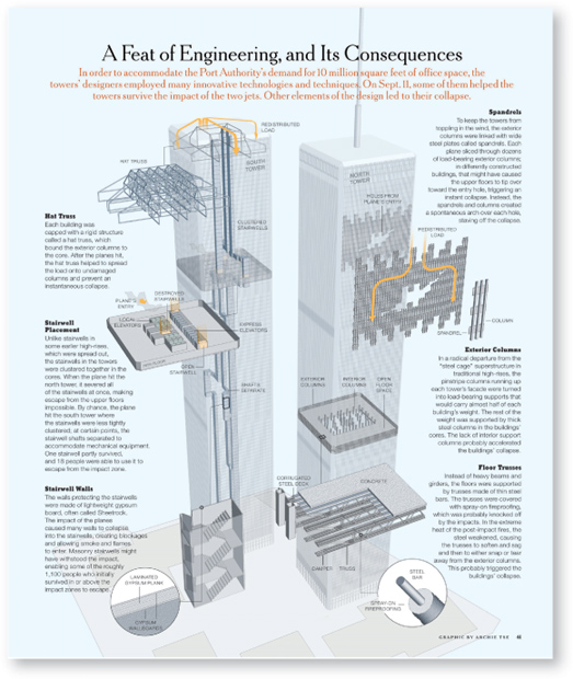
![]() This detailed rendering shows important aspects in the engineering of the World Trade Center buildings. The rendering’s “inside view” is clarified with callouts.
This detailed rendering shows important aspects in the engineering of the World Trade Center buildings. The rendering’s “inside view” is clarified with callouts.
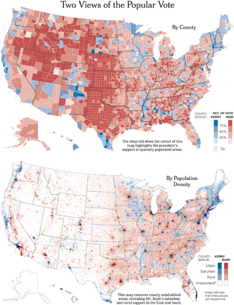
![]() “The 2000 presidential election in the U.S. was the first time we could take advantage of new computational software that would let us analyze voting by county, and still make our deadline. The maps we ran become rather iconic in the public discourse because they allowed people to understand the elections in a more nuanced, or shaded, way.”
“The 2000 presidential election in the U.S. was the first time we could take advantage of new computational software that would let us analyze voting by county, and still make our deadline. The maps we ran become rather iconic in the public discourse because they allowed people to understand the elections in a more nuanced, or shaded, way.”
![]() “Other publications had published maps that recorded the wins by state with solid colors, indicating only wins and losses. By using more subtle shading, people could visualize the dynamics, factoring for the ways population density affected the results. In the end, it showed the election had been won by a whisper in terms of total votes. It was all about the narrow margin,” says Tse.
“Other publications had published maps that recorded the wins by state with solid colors, indicating only wins and losses. By using more subtle shading, people could visualize the dynamics, factoring for the ways population density affected the results. In the end, it showed the election had been won by a whisper in terms of total votes. It was all about the narrow margin,” says Tse.
“I feel like I have permission to say, ‘I don’t know what that means,’ over and over again.”—Lin Wilson
Playing Dumb. “Our deliverable is understanding,” says Lin. “Clients usually call us because there’s something their customers can’t understand. We chase the most confusing parts of the client’s story first.”
“We work hard to make our clients understand that what we’re doing is clarifying and not dumbing down,” adds Lori. “We say we’re dumb, but really, we’re generalists and we use that to our advantage so that we can learn.”
Most of the folks at Funnel come from branding, marketing, public relations, and advertising backgrounds. “Our work is practical. All we do is information design. I’m perfecting my background of ‘whittling,’ so to speak. I used to whittle words, now I whittle information. But it’s the same process,” says Lori.
From Brain to Whiteboard. Gathering essential information is a process that can take different forms. “There are the ‘Give us everything you’ve got’ conference calls,” explains Lin. “Sometimes clients give us existing brochures or really awful PowerPoint presentations. Often, there are nuggets buried in bad design.”
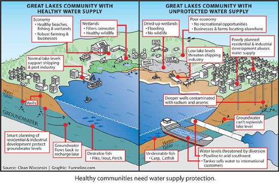
![]() Environmental advocacy client Clean Wisconsin needed to educate Wisconsin’s editors about the issues surrounding the Great Lakes water supply. The graphic was prominently featured in a comprehensive press kit, and was also included as part of the organization’s newsletter and on their website.
Environmental advocacy client Clean Wisconsin needed to educate Wisconsin’s editors about the issues surrounding the Great Lakes water supply. The graphic was prominently featured in a comprehensive press kit, and was also included as part of the organization’s newsletter and on their website.
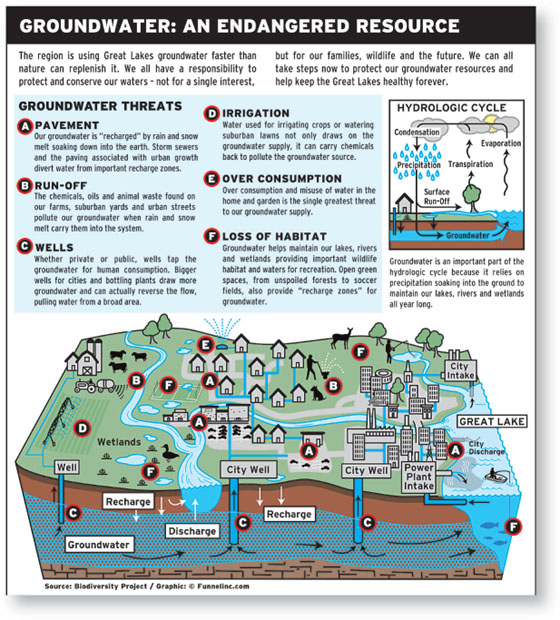
![]() Funnel Incorporated created this infographic for client Biodiversity Project’s press kit. The graphic helped the organization communicate the complex issue of Great Lakes polluted groundwater to editors. Many publications no longer have photographers or illustrators on staff, so infographics such as these help increase the odds of media placement and lend credibility to a story.
Funnel Incorporated created this infographic for client Biodiversity Project’s press kit. The graphic helped the organization communicate the complex issue of Great Lakes polluted groundwater to editors. Many publications no longer have photographers or illustrators on staff, so infographics such as these help increase the odds of media placement and lend credibility to a story.
“Whiteboard sessions get very interesting because they can include a lot of people on the client side who may be in disagreement,” says Lori. “What’s nice about the whiteboard and the sketches we do is that we’re providing a dartboard. Clients have something they can react to. It’s messy and it’s ugly, and it’s really fun because eventually everybody has to agree.”
During these sessions, Funnel blurs the territorial line between client and creative. “The client gets handed the pen too. The goal of everybody in the room is to get the story right. A whiteboard drawing session can almost be its own deliverable,” says Lin.
“Our deliverable is understanding. Clients usually call us because there’s something their customers can’t understand. We chase the most confusing parts of the client’s story first.” —Lin Wilson
Putting Infographics on the Map. How did infographics pick up steam in the world of designed communication? “As PowerPoint became much more widespread, we saw so many failed attempts at describing complex material,” says Lin. “Concurrently, Edward Tufte started presenting his information design seminars, helping to put information design in the budget pie chart of corporate America.”
Funnel often creates infographics for their clients to pitch to newspapers and magazines, and has a great success rate getting the attention of editors. “You have a time-pressed editor just as you have time-pressed readers. Editors are buried in press kits,” explains Lori. “If you’re trying to place a story with an editor, information graphics are a great way to cut through the clutter and ensure that he or she understands the potential story.”
Editors don’t have enough photographers or illustrators on staff anymore, so to provide a powerful graphic that they can just plug in can be incredibly helpful—and memorable. “Editors say, ‘Oh yeah, we remember you. You sent that really cool infographic!’ which can ultimately result in more story placements,” says Lori.
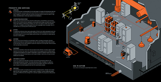
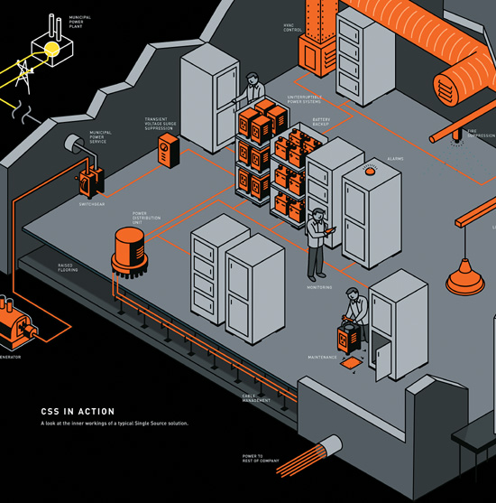
![]() Funnel Incorporated worked closely with the client’s design agency, Planet Propaganda, to craft an image telling the entire story of CSS Power’s backup power solutions.
Funnel Incorporated worked closely with the client’s design agency, Planet Propaganda, to craft an image telling the entire story of CSS Power’s backup power solutions.

![]() Icons are embedded into the CSS Power diagram to represent each component of the system. These icons work as an ensemble. Individually, the icons provide the client with a set of useful hieroglyphics symbolizing each product or service.
Icons are embedded into the CSS Power diagram to represent each component of the system. These icons work as an ensemble. Individually, the icons provide the client with a set of useful hieroglyphics symbolizing each product or service.
“We feel there’s always an ‘aha moment’ as we sift through the data, where we find the story to be told.” —Larry Gormley
Searching for the Aha Moment. After all the collecting, the two partners say the hardest task is “peeling away the density of data.” As they work, they write the words “What is the story?” in large letters at the top of their worksheets as a constant reminder to find the very essence of the narrative. “We feel there’s always an ‘aha moment’ as we sift through the data, where we find the story to be told,” says Gormley. After all the winnowing, it’s likely that only 25 percent of the total data will be used for any given subject. History Shots uses its website as a way to add value, publishing a lot of the information that would have been too overwhelming to incorporate into any one print.
An Iterative Process. Since the first print in 2004, History Shots has been collaborating with the graphic design firm White Rhino. The team has worked together long enough that roles are not hard and fast. Gormley and Yonker bring drafts and sketches. They rely on White Rhino to help them “kick the tires” and make suggestions for the best ways to depict and organize various aspects of the data/storytelling. As a team, they will often go through a dozen graphic scenarios before they feel they’ve found the right way to organize the data. It’s often the relationship between disparate types of data that creates the biggest revelations.
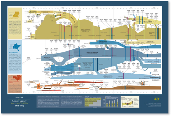
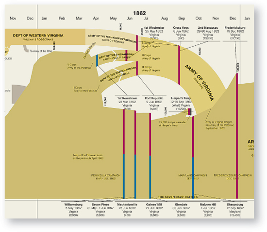
![]() This poster maps the history of the Union Army during the American Civil War. Divided vertically by date, and horizontally by the three major theaters of the war, many variables are charted, including the size, history, and commanding generals of the thirty-one Union armies. In addition, the name, location, date, and casualty figures are provided for the ninety-five most important battles.
This poster maps the history of the Union Army during the American Civil War. Divided vertically by date, and horizontally by the three major theaters of the war, many variables are charted, including the size, history, and commanding generals of the thirty-one Union armies. In addition, the name, location, date, and casualty figures are provided for the ninety-five most important battles.
![]() This detail from the map above shows the level of typographic complexity included in each of the posters.
This detail from the map above shows the level of typographic complexity included in each of the posters.
The goal is to tell the story with an economy of means, and with as little text as possible. “We try to get it to a place where there’s no need for explanation,” says Kimberly Cloutier, the designer at White Rhino. They informally test the graphics to make sure they “read.”
The Devil’s in the Details. White Rhino believes that using a more subdued color palette can sometimes make the information easier to absorb. They’ve found that too much color can be distracting with such density. Without relying on bright colors for information hierarchy at such a small scale, the attention to typography becomes even more critical. And the team is very diligent about specifying inks, papers, and even the kind of press that must be used because reproducing the fine detail is so critical.
Each of the prints is targeted to a specific audience. For instance, it might be a person deeply interested in the Civil War, or someone fascinated by the many attempts made to scale the top of Everest. On the other hand, the History Shots partners have found that there are many types of people attracted to their work. “There are so many people fascinated by mapping,” says Gormley.
The team says the collaboration between White Rhino and History Shots has been successful because it is based on a mutual obsession with the projects. They add, “We just never run out of steam.”
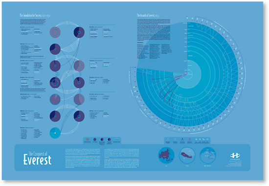
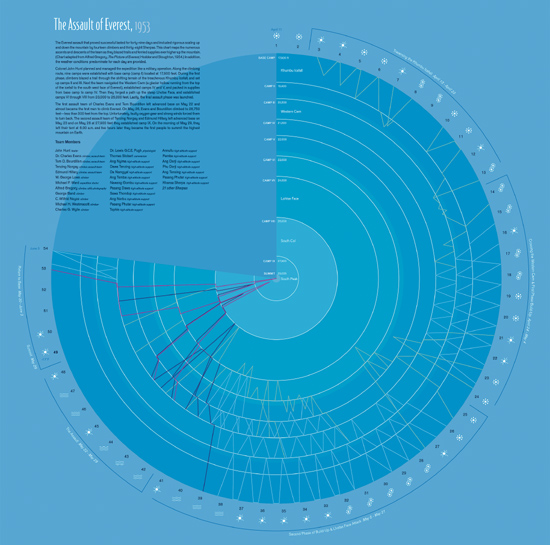
![]() This print maps the conquest of Mount Everest from 1921 to 1953. The information on the left shows the year, sponsor, duration, dates, height reached, and members of each of the major expeditions. The graphic also tracks the history of climbers who went on more than one expedition. On the right is a detailed graph of the numerous ascents and descents of the 1953 team as they blazed trails and ferried supplies up the mountain. Weather conditions for each day are also provided.
This print maps the conquest of Mount Everest from 1921 to 1953. The information on the left shows the year, sponsor, duration, dates, height reached, and members of each of the major expeditions. The graphic also tracks the history of climbers who went on more than one expedition. On the right is a detailed graph of the numerous ascents and descents of the 1953 team as they blazed trails and ferried supplies up the mountain. Weather conditions for each day are also provided.
“I always have to figure out which bits are better said in pictures and which are better said in words. And then I have to think about how to do both concisely.” —Nigel Holmes
The Human Face. Photographer Rick Smolan has a history of creating global photography projects that put a human face on geopolitical issues. These projects have collectively generated billions of media impressions worldwide, and four of his books have been New York Times bestsellers.
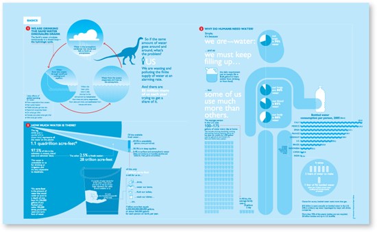
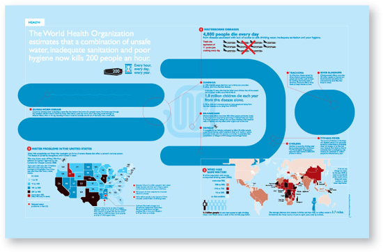
In planning the Blue Planet Run book, Smolan knew information graphics could help explain the complex issues in a way that readers would absorb. Smolan approached Nigel Holmes to create graphic spreads to introduce each of the book’s eight chapters. In a sense, these spreads served as visual summaries.
Explanation Graphics. As a young illustration intern at the London Sunday Times, Holmes was famously told by one of his bosses that he had a “knack for explaining things to people.” And, in fact, he has had a long history of explaining things. After a very long stint as the graphics director at TIME magazine, he created his own firm, Explanation Graphics, and the name tidily states exactly what he’s done for just about every major news publication in the world. Many of his peers credit him with transforming the way publications and corporations have come to use graphics to convey important information.
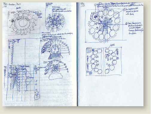
Holmes was drawn to working on the Blue Planet Run project. He threw himself into research, reading everything he could about the issue. He says that in order to create a good piece of work he will often start with four times more information than he’ll ultimately use. The editing is critical.
“The designer, Michael Rylander, and I decided very early in the process that a fairly minimal and monochromatic approach to the illustrations would work best in a richly photographic book. Blue was the obvious choice.” —Nigel Holmes
![]() Holmes says, “I like the physical act of drawing and I always come back to it.”
Holmes says, “I like the physical act of drawing and I always come back to it.”
![]() Holmes created a framing device to give the spreads a graphic consistency as they were scattered throughout the large-format book.
Holmes created a framing device to give the spreads a graphic consistency as they were scattered throughout the large-format book.
The Power of the Pictorial. Once Holmes was immersed in the data, he began to sketch. “I’m interested in pictures of information. You’ve got to get people interested, and people are intrigued by pictures,” he says. But writing has also become more and more important in his work. He says, “I’ve been making my work a lot simpler lately. It allows me to spend more time thinking and less time drawing. I’m trying to get better at integrating the words so you have to read both things. I always have to figure out which bits are better said in pictures and which are better said in words. And then I have to think about how to do both concisely.”
Graphic Narratives. Holmes talks about the passion he had for comics as a kid. His approach to the Blue Planet Run project clearly draws on that love for graphic narrative, as well as all the expertise Holmes has gained from years of wrestling with complex content. It’s all been in the service of getting something concise but fantastically informative.
He explains, “I’ve gotten to the stage now where I don’t want to waste time. I want to make everything count. I want to do projects that can make a difference.”
![]() “In a way, my drawings are becoming like pieces of type. Some are drawn for particular assignments. Some are taken from my files. I’ve been building a vocabulary I can use. They’re a shorthand I can use to replace words.” says Holmes.
“In a way, my drawings are becoming like pieces of type. Some are drawn for particular assignments. Some are taken from my files. I’ve been building a vocabulary I can use. They’re a shorthand I can use to replace words.” says Holmes.
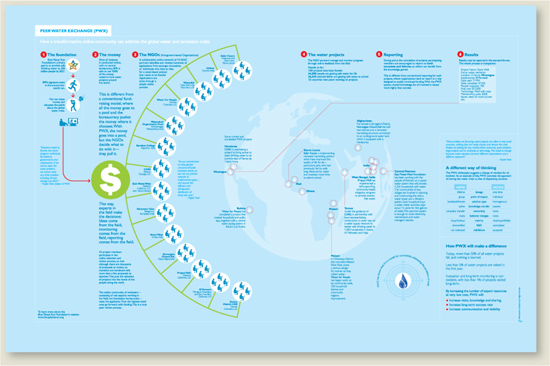
![]() Holmes knew the layout of each spread would need to be unique as he grouped the relevant pieces of information.
Holmes knew the layout of each spread would need to be unique as he grouped the relevant pieces of information.
“At the end of the day, a good information designer needs to know their subject, and have a passion for it.” —Dona Wong
The Fast Pace of a Newspaper. After her start in high finance, Wong’s design DNA came into play again when she went to work at the New York Times as a graphics editor for the business section.
Know It in Your Sleep. Now at the Wall Street Journal, Wong thinks of herself primarily as a reporter. She says things have changed since she first began working in the field. “At the beginning, information design was still considered rather cosmetic. But now, graphics editors know their content deeply. They are constantly poring over data.” At the Journal, the graphics editors are assigned to “beats,” so they can really develop an expertise. “You can’t know everything about everything, but if you’re in commodities, you know it in your sleep,” Wong notes.
The process of developing information graphics at the Journal is quite collaborative. Reporters, editors, and graphics editors come together to figure out the best way to tell a story. Often graphics editors will develop their own graphic stories. “You discover something you think the reader would want to know. You write a proposal. You may include a few bullet points or a sketch, and you pitch it to the editors just like any other reporter. At the end of the day, a good information designer needs to know their subject, and have a passion for it,” Wong explains.
Two Sides of the Same Brain. “You have to do your own research,” she says. “It’s when I pore over the data that I start to picture the presentation and know whether it will work or not. And sometimes the data may not tell the story. A good information designer also has to know when to walk away.”
The extremely complex world of finance makes it particularly difficult to find the right people for the job. The Journal often hires people with a background in finance, math, economics, or journalism, and trains them in the art of information design.
Wong says, “It really takes both sides of your brain. On one hand you have to think analytically, but you also have to find an inviting way to bring your viewer into the subject matter.”
Wong says she still loves the fast pace of working on a daily newspaper. “Stories may arrive as late as an hour before the deadline, so you learn to be quick on your feet. And even when you have the story and the data, the space that’s available is constantly changing.” She says this is where good graphics editing really comes to play. “At the Journal, if the information graphic needs to get larger, we add content. We don’t just increase the size to fill the space. At a design firm, you’re given the content,” Wong says. “Here you have to go find it.”
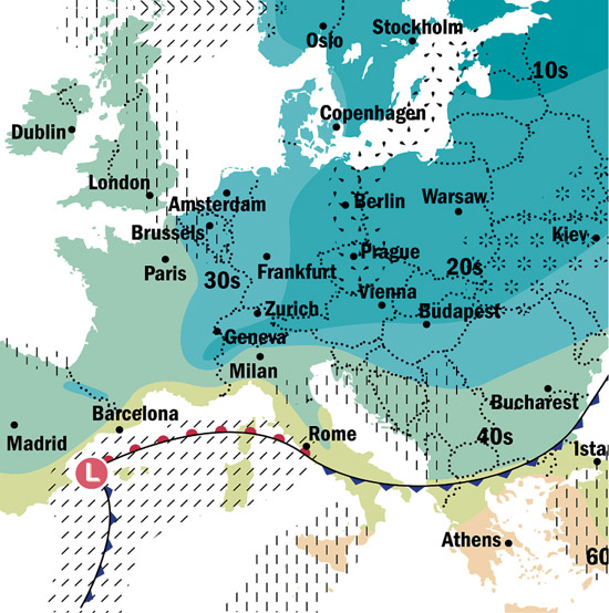
![]() Wong says, “On one hand you have to think analytically, but you also have to find an inviting way to bring your viewer into the subject matter.”
Wong says, “On one hand you have to think analytically, but you also have to find an inviting way to bring your viewer into the subject matter.”
![]() Reporters, editors, and graphics editors come together to figure out the best way to tell a story. Often, graphics editors will develop their own graphic stories.
Reporters, editors, and graphics editors come together to figure out the best way to tell a story. Often, graphics editors will develop their own graphic stories.