7 INTERACTIVE CASE STUDIES
Screen-based experiences give users multiple ways of exploring content. Sometimes it’s necessary to curate the experience and give people structured pathways. Other times the design needs to accommodate multiple entry points. Information design for interactive systems is a complex task and the field is in a constant and rapid state of evolution. Without a doubt, multilayered interactive systems demand well-conceived information design.
→ Hello Design
→ Sullivan
→ Second Story Interactive Studios/Ralph Appelbaum Associates
→ VSA Partners
→ Kahn + Associates
→ frog design
“Buried treasure has no value. There’s no success if you create great content and no one can find it.” —David Lai
Content Is King. Hello Design begins every project by defining what the team is trying to accomplish and identifying the challenges to be overcome. Originally conceived by the client as a short-lived virtual companion for the architectural tours, Hello Design worked with historians at the Conservancy to understand the value of the content and to explore what visitors would find most interesting. By asking questions, they hoped to make the website even more useful. The site needed to appeal to architectural enthusiasts, but also work for the general public, including teachers and their high school students. “It’s important to embrace the content, and ask questions about things the client might take for granted,” says Hello Design cofounder David Lai.
Lai and his cofounder, Hiro Niwa, came from large Web companies where the task and job description of information architecture was frequently its own “silo.” They try to avoid this approach. “We believe it’s crucial for designers to intimately understand information architecture. Otherwise, they rely on somebody else to think things through and lose huge opportunities to think innovatively about structure and navigation,” says Lai.
Buried Treasure Has No Value. Hello Design works with the philosophy that effective information graphics help users find information as quickly as possible, even if these users don’t know exactly what they’re looking for. “Search implies you know what you’re looking for, but browsing lets you explore what’s there. Good design needs to accommodate both. You won’t succeed if you’ve created great content but no one can find it,” Lai notes.
“We believe it’s crucial for designers to intimately understand information architecture. Otherwise they rely on somebody else to think things through and lose huge opportunities to think innovatively about structure and navigation.” —David Lai
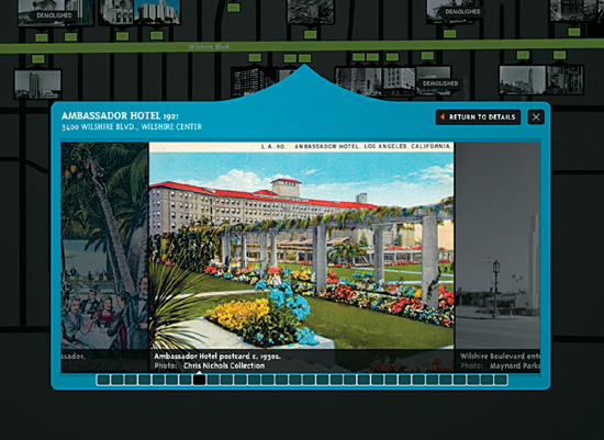
 Visitors can customize and print maps they can take along with them to use during an actual walking tour.
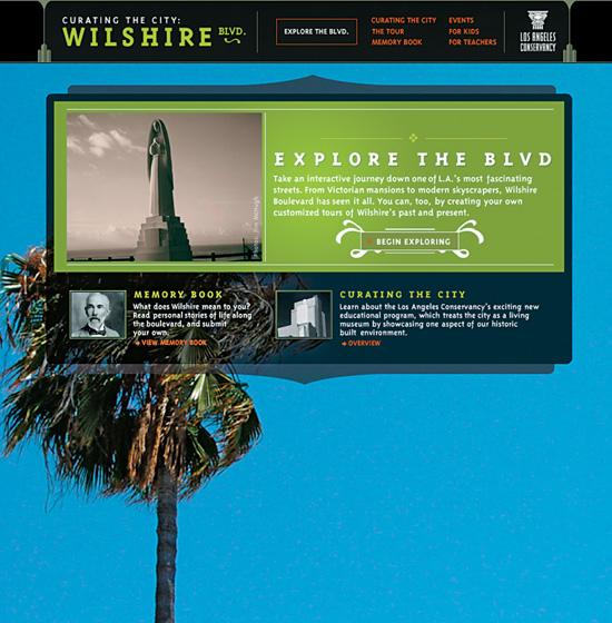
The site’s centerpiece is “Explore the Boulevard,” a richly detailed virtual tour. The interactive mapping allows users to explore neighborhoods in a general way, or drill down into details about specific buildings.
Hello Design talks to its clients about “information rationing”—using bite-sized pieces of information on site pages. They design sites so users can decide whether they want to dive deeper into the layers that interest them. Lai says, “It’s a lot easier to create something complex than something simple and intuitive. Editing is an important part of the process.”
In Search of Best Practices. When asked how the firm tests its navigation, the principals say they distrust the focus group approach, citing the Aeron chair and the Dyson vacuum as two examples of focus-group “failures” that went on to great success in the marketplace. They prefer testing with paper prototypes or creating quick Flash demos. They will test these with people who represent the target audience, and make revisions based on feedback. “When clients ask us about best practices in the Web space, I remind them that our medium is less than ten years old,” says Lai. “It’s too young for us to cite any standards. It would stifle innovation. What people find ‘intuitive’ is still constantly evolving.”
Lai goes on to add, “Good designers need to have an eye, not just visually, but for how things are experienced. We are continually investing in R&D. Good enough isn’t enough—you have to be willing to go the extra mile.”
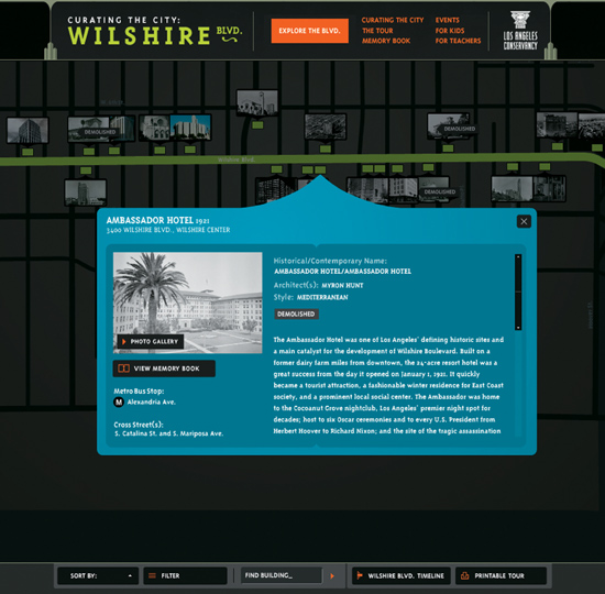
A menu bar at the bottom of the map provides a robust sorting functionality so users can “slice and dice” the detailed information according to their interests. You can look at buildings by date, function, style, architect, and preservation status.
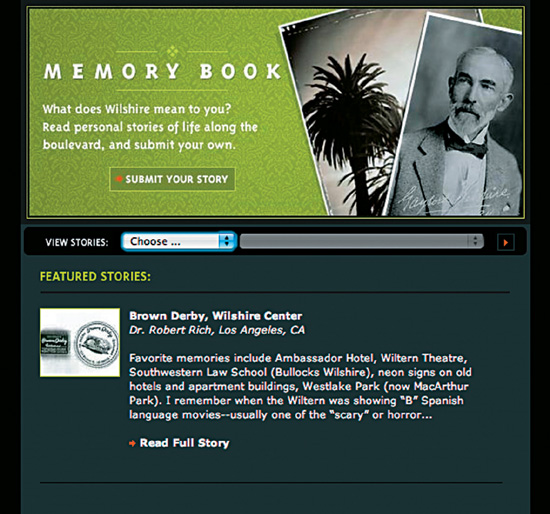
A “Memory Book” function allows visitors to contribute stories and photos about historic sites they’ve known and loved.
“We’ve learned how to help people find the information that’s valuable to them.” —John Paolini
Helping Visitors Make Decisions. Sullivan’s understanding of best practices from the for-profit world has been extremely helpful to NRDC. As John Paolini, Sullivan partner and executive creative director, points out, “With our work in the financial services sector, we’re helping customers make big life decisions. We’re helping them get a tangible picture of an invisible thing. So we’ve learned how to help people find the information that’s valuable to them.”
Targeted Approach. As NRDC’s site has evolved, Sullivan has helped the organization strategize unique microsites. Sullivan talks about “pulling the graphic language” through this suite of sites that are designed to address specific audiences and initiatives. Rather than a completely centralized Web model, NRDC specifically promotes its microsites in ads and newsletters, so diverse groups can quickly find the content they need.
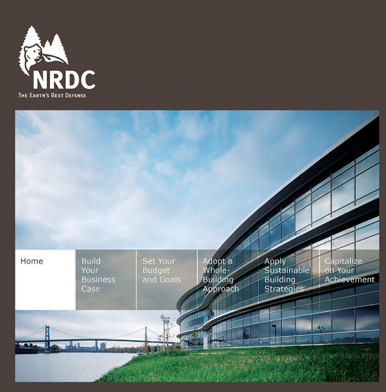
Most recently, Sullivan helped NRDC develop a microsite targeted to builders, planners, architects, and developers of large-scale commercial and residential properties. The goal was to create a site that was a go-to destination for information, resources, and helpful tips about building green. NRDC wanted to make the process appealing enough that the audience would be interested to learn even more. The desired outcome was to communicate that building green is achievable, relatively simple, and potentially profitable.
Michael McWatters, Sullivan’s creative director on the NRDC account, explains, “NRDC really wanted us to understand the needs and the dynamics of the builders and developers that would use the site.” The teams at Sullivan have always used audience research to inform their strategic thinking. They regularly conduct user interviews when starting a project. McWatters says, “Quantitative research works well for transactional sites, but with sites that have a more emotional component, it’s important to talk to people one-on-one.”
Sullivan prepares a discussion guide for each interview. “We might ask some fairly abstract questions such as, ‘If you’re looking for information, what sources do you go to?’ But we also drill down into specifics. You’d be amazed at how much you can tell about how a person likes to gather content when you can see how they organize their desks,” he explains.
Strategic Stretch. As a nonprofit, NRDC does many of its site iterations with an in-house team using a content management system. But they continue to come to Sullivan when they need to rethink the site, especially in light of best Web practices. Sullivan designer Andrea Stranger talks about how important it is to her to be able to work on nonprofit projects, especially with long-term clients: “The satisfaction of working with a nonprofit like NRDC is crucial to the whole Sullivan culture. It’s even become an important draw for recruiting talent.” She adds, “It’s an opportunity for everyone to stretch their strategic muscles. Bottom line, we believe in it.”
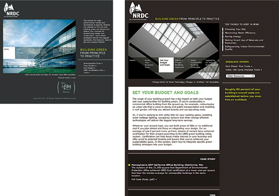
Sullivan helped NRDC develop a microsite targeted to builders, planners, architects, and developers of large-scale commercial and residential properties. The goal was to create a site that was an online, go-to destination for information, resources, and helpful tips about building green. Because the site’s navigation is organized around the phases of the construction process, it reflects the way its audience thinks.
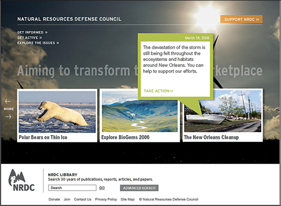
NRDC has struggled to showcase its many important initiatives and programs. An interactive scroll of graphic billboards provides display opportunities and allows users to access the issues they find particularly compelling. It also conveys a sense of vitality.
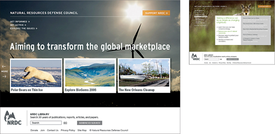
When Sullivan worked with NRDC on its most recent redesign, they learned in user interviews that there tended to be three types of visitors to the site: people in a learning mode (research), environmental news junkies, and those who wanted to take action. Based on this, the home page helps visitors navigate by way of three information “doorways.”
“For museums, maximizing limited physical display space is tricky. The Web is a new gallery to publish content. Museums are exploring new ways to keep content on display and up to date. Interactive presentations put the museum’s collection into greater context.” —Josh Dudley
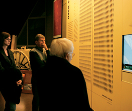
Interactive Tables. “Second Story excels at projects with deep content,” explains Jennifer Young, Second Story producer. “The museum’s two interactive tables weave together over 500 content elements showcasing deeper strategic and technical aspects of the war.”
“At the beginning of our collaboration, Second Story realized there were too many permutations in the interactive content. The content was simplified as a natural part of the design process,” says Josh Dudley, a designer at Ralph Appelbaum Associates.
The museum’s tables require interactive pens. The technology allows different people to interact with the screen at the same time. “You can’t do that with traditional touch screens,” he continues. “And the table experience doesn’t feel like an ATM machine.”
Brad Johnson, creative director at Second Story, agrees. “If you do what museums did originally and put a bunch of computers everywhere, it looks like work.”
Dudley notes, “Museums often rely on school groups. A table surface makes the activity social rather than a private act. You watch other people interact with available options, like being at a restaurant and seeing what they’re ordering at the next table.”
Creative Process and Collaboration. “Second Story cares about what we care about: graphic look and feel, structure, and especially content. Second Story even hired their own historian to dialog with the museum’s curator,” explains Dudley.
“Our process is highly collaborative. We involve designers, programmers, and content producers at the early stages so everyone understands the story,” Johnson says. “Collaborating with exhibit designers is exciting. We wanted to depart from a strictly screen-based experience to create unexpected environments that react to input from visitors.”
Exhibit Design’s Future. For museums, maximizing limited physical display space is tricky. The Web is a new gallery to publish content. Museums are exploring new ways to keep content on display and up to date.
“Interactive presentations put the museum’s collection into greater context. People still come to a museum to see artifacts,” says Young. “We integrate the best of both worlds. Visitors can view a single physical machine gun in the case and go to the interactive table to explore machine guns in greater detail.”
The palette of options for exhibit design is expanding both on the technical and materials sides. “We like novel technologies, despite their risks, because surprise is memorable—it can help ‘burn in’ new information for visitors,” says Dudley.
“These aren’t theme park rides,” he continues. “Museum visitors aren’t constrained to a single pathway. They move through complex layered environments where the experience changes as you move through the space. You come to a museum to become more aware, and to be a better human being. It’s best as a shared experience.”
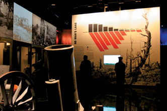
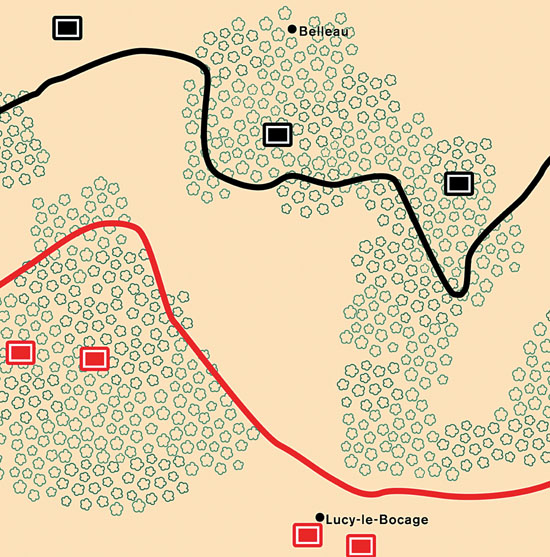
In conjunction with large graphic panel installations, Battlescape Maps presented on touch screen monitors display the complexity of specific WWI battles.
Visitors choose battles on a time-line and, through illustrations and accompanying narration, experience the distinctive and grueling nature of trench warfare as they watch battle lines shift and see territory lost and gained.
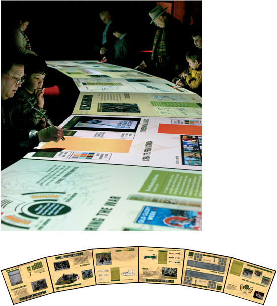
Second Story and Ralph Appelbaum Associates collaborated with Potion Design, the firm that created the technology for the tables. Visitors can experience the tables in two ways. In “individual mode,” viewers sit at or walk around the table and select things that interest them. They can learn about military technology, view archival footage and photography, and create propaganda posters and email them. At any time, museum staff can launch the tables into a group-based interactive experience with up to twenty-four visitors engaging in a series of six “challenges” that illustrate different aspects of the war. Interstitial videos recap the experience between challenge sections.
“There’s a balance between the experiential and the more performance-oriented technical aspects of the site.” —Pat Heick
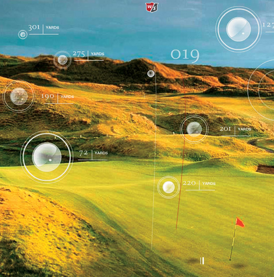
Integrated Look and Feel. The Wilson Staff brand has a rich visual legacy spanning over fifty years, including access to images of golf legends such as Sam Sneed and Gene Sarazen using their equipment. Like other brand materials, the website leverages this legacy to create a lifestyle experience of Wilson Staff while also satisfying a savvy golfer’s need for deeper information about the product.
The look of the website was influenced by all the other branding VSA was doing. The interactive team took cues from Walker’s designers across the aisle. “A lot of the website’s style came from the print catalog, especially the layers of description,” explains Pat Heick, VSA’s director of interactive.
VSA’s interactive team has eighteen members, including three information architects and usability experts. “We tried to take full advantage of the medium and make it very interactive,” Heick says. “There’s a balance between the experiential and the more performance-oriented technical aspects of the site.”
Implementation and Launch. VSA implemented a legacy content management system (CMS) called Blue Martini. The site was developed in a CMS environment with developers and content managers. “We delivered design elements in layered Photoshop format so that Wilson Staff can implement in-house updates that still look customized. Everything related to content management was very centralized for consistency,” notes Heick.
VSA developed a three-part launch strategy for the website that was a marriage of the strategic and the practical.
“We liked the idea of having teasers to set up the relaunch, but also everything wasn’t ready at once,” explains Walker.
With Phase One, no product was shown. VSA instead played up lifestyle aspects of the game and asked the simple question: “Why golf?” Phase Two gave people glimpses of the reintroduced brand palette. “We didn’t want to cannibalize the existing inventory, we just wanted to leak that new products were coming,” says Walker. Phase Three’s full launch showcased the print and PDF catalogs, and incorporated animations that spoke to the lifestyle, connectivity, and spirit of the game. When the full site went live, it also included a walk-through time-line depicting the history of the brand, deep product knowledge, and data sheets.
“What was great was that the plan we set out to execute was, in fact, the plan we did execute. We built momentum and Wilson really trusted us,” says Heick.
“It was an amazing team effort,” echoes Walker. “It was a fully integrated relaunch that worked well across every medium.”
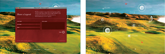
In Phase One of the site, VSA played up lifestyle aspects of the game of golf instead of featuring product information.
The strong grid of the home page helps to orient the viewer. Visitors can select the type of information they are most interested in.
The text on all the product pages is organized into brief paragraphs and broken up with subheads for easy scanning. The bottom of every product page includes a display of related products.
“Users stumbling across a particular topic of interest had no idea there was additional related content on the site and had no way to find it. Changing the architecture can fix that.” —Paul Kahn
New Intranet. The INRAP Intranet site needed improvement in order to gain greater user acceptance. “Our work with INRAP,” explains K + A principal Paul Kahn, “involved several aspects of information architecture: improving the naming, classification, and organization of both sites, integrating current and new resources into a scientific portal, and helping to define the tasks and schedule needed to attain these goals.”
Creating the Information Architecture. K + A began by analyzing the information architecture of the intranet and producing an isometric (dimensional) diagram of the existing site.
For the next stage of the project, K + A developed user scenarios to illustrate how information was presented and linked on the Internet and intranet sites. They reused the isometric diagrams created earlier, adding an overlay of information related to the scenario.
The new diagram showed how information related to a single subject (such as all the excavations in the city of Nîmes) was actually housed across several different sections of the Internet and intranet sites, and was often not accessible via navigation links on the site. “Users stumbling across a particular topic of interest had no idea there was additional related content on the site and had no way to find it,” explains Kahn. “Changing the architecture can fix that.”
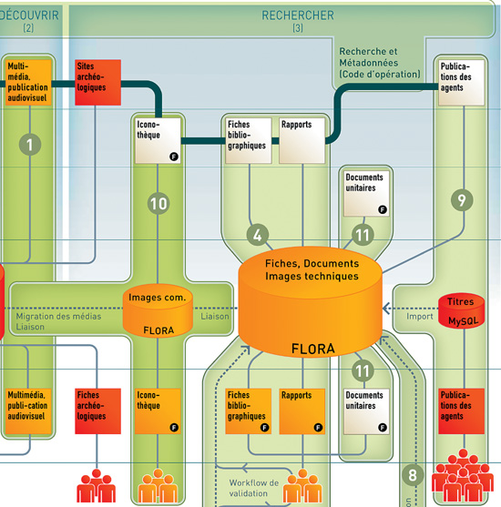
With this isometric (dimensional) diagram, designers Laurent Kling and Eva-Lotta Lamm of K + A described the current organization of the site content, then used color coding as visual cues for the redistribution of the content within a new naming structure.
“We finally recommended developing the scientific portal not as a separate site but as the professional view of the reorganized INRAP Internet site,” says Kahn. The site was organized around four sections: Inform, Discover, Search, and Participate. To illustrate this transformation, K + A developed a series of wireframes. (For further explanation about wireframes, see Chapter 3.)
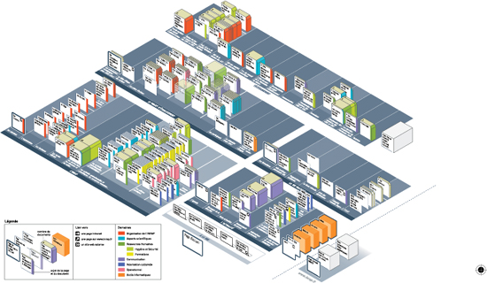
Dimensional Diagramming. An isometric map offers advantages for addressing two problems that information designers often face when mapping any network or large site: 1) minimizing the lines that represent links between pages and 2) representing large numbers of elements in a single map.
By using the z-dimension (depth) in combination with “floor” patterns and color, the arrangement of one page behind another implies a navigational connection, without turning the map into a wiring diagram. The position of the pages or boxes on the z-axis allows for overlap of many elements while still providing a surface for labeling the page. This allows for representation of many more elements on the diagram.
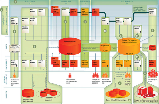
Designing around the Architecture. Once K + A’s information architecture recommendations were reviewed and accepted, they delivered a complete set of page-level wireframes to LM communiquer, the design agency responsible for INRAP’s visual identity. LM communiquer used the wireframes as a blueprint while they developed the look and feel for the site.
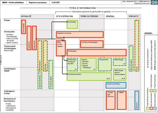
To facilitate discussion between the different stakeholders, K + A developed a summary diagram to show each of the information collections. Information is arranged according to audience type and information type. Color was added to differentiate between the existing Internet and intranet, and the proposed scientific portal.
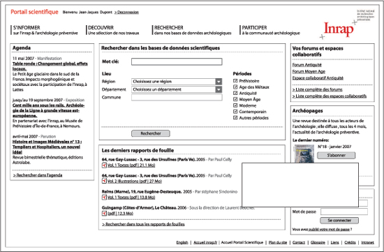
Like most wireframes, these made no reference to actual visual design, but instead showed the general positioning of information on the page. This wireframe shows the scientifically oriented content available to archaeologists who have logged onto the site.
The synoptic diagram presents K + A’s conclusions about the structure of the site. The horizontal axis of the diagram represents the four sections of the site. The vertical axis shows the depth of the project process, including editorial systems, database applications, personnel, and information sources.
“To emotionally engage users in the product, we needed to learn three levels of user needs: stated needs, observed needs, and latent (unstated) needs.” —Jennifer Kilian
Not Just an Oven. The Speedcook’s features include its cookwheel, an interactive touch screen with a cooking wizard, the ability to add meals to a favorites list, and more. “The biggest design challenge was shifting the user’s thinking process from a traditional time-and-temperature paradigm into something that uses algorithms and a wizard,” explains Kilian.
The screen-based wizard’s set of pathways guides users through a complex set of choices while allowing them to feel in control. There’s a vast food encyclopedia built into the software, which lets users turn the cookwheel knob to select a variety of functions and narrow down choices. If a user selects “roast,” the screen wizard prompts for more specifics, asking, “Poultry or beef?” If poultry is selected, the wizard asks, “Turkey or chicken?” then, “Whole or stuffed?” to complete the process and ensure the correct cooking time.
Emotional Approach. The frog team begins projects with solid research. Their unique approach focuses on the emotion of the experience. Kilian explains, “Our founder, Hartmut Esslinger, says, ‘Product sells, but emotion buys.’”
Baby boomers comprise a good portion of TurboChef’s target residential market. The frog team identified three specific user groups: “foodies” who love buying ovens; “wannabes” who like the idea of cooking but want to spend more time with family; and “homies” who spend lots of time at home but don’t spend as much on ovens or eating out.
The frog team spent hours hanging out in people’s kitchens. “To emotionally engage users in the product, we needed to learn three levels of user needs: stated needs, observed needs, and latent (unstated) needs,” Kilian continues. “Finding latent needs is like dusting for fingerprints—you know they’re there, but finding them is a challenge.”
They uncovered users’ feelings about the idea of such an oven. Would it make life easier? Did it harken back to simpler times? Would it inspire creativity? The frog team noted the objects in people’s kitchens. “We saw things like Grandma’s teapot, completely nostalgic, next to a laptop where the home chef was finding recipes online,” explains Kilian.
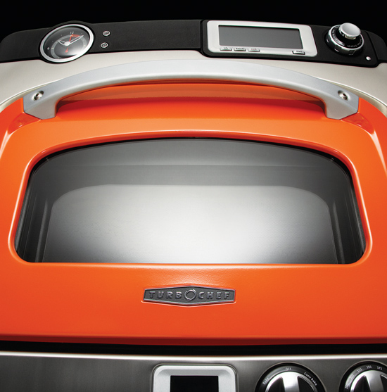
Design Approach: Hearth and Home. The designers wanted to emphasize the sense of nostalgia, heritage, and hearth they found in people’s kitchens. “Warm colors, especially on our ‘hero’ product design with the orange-brown oven door, recall a time when baby boomers were growing up,” explains Kilian.
There was strong interplay between the project’s physical design, information design, typography, color, and graphical look and feel. “We considered how a set of colors would influence emotion. Oranges and reds help users connect with appetite, home, and hearth, with blue as an accent color,” says Kilian.
“When we tested the product model/prototype in our studio, we asked users what they thought it was and what it might do,” notes Kilian. “People knew, at a glance, there was something different about the upper oven. Because of the extra curve, the beautiful handle, and the door color, they could tell it was something special.”
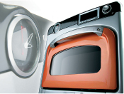
The physical product designers at frog debated on whether to use a digital or analog clock. Information and visual designers working on the settings prototypes had featured analog-feeling informational graphics in their screen designs, which helped drive the decision to use an analog clock on the oven.

The Speedcook oven has a vast food encyclopedia built into the software, which lets users turn the cookwheel knob to select a variety of functions and narrow down choices.
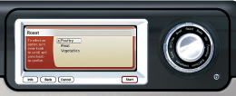
Designers wanted to ensure that the product was intuitive and that nontechnical users were confident enough to use it. “We asked product testers to pretend to roast a turkey. They’d turn the knob. By the second or third screen they figured it out and were thrilled,” says frog’s Jennifer Kilian.