
Chapter 10. SharePoint type definitions and templates
Microsoft SharePoint is a platform and can be customized in a lot of different ways. In this chapter we’ll look at how you can use type definitions and templates to customize SharePoint. The first section focuses on using custom field types. This development strategy offers the greatest level of control when you are initializing field values and performing data validation. By using custom field types, developers can customize the editing experience by extending it with a custom field control. We will also have a look at how to customize fields by using the new JSLink property.
The second section of the chapter focuses on developing custom site columns and content types. We will look at how to create site columns and content types by using Collaborative Application Markup Language (CAML) and by using the server-side object model. Although developing CAML-based definitions has a steep learning curve and poses more challenges with testing, debugging, and maintenance, it provides an alternative approach with certain advantages over using the server-side object model. Therefore, we will also discuss the advantages and disadvantages of using both approaches.
The last section of the chapter talks about how to create lists and list instances by using the SharePoint Developer Tools designers and CAML.
Custom field types
In Chapter 9, the basics about fields, site columns, and field types were introduced. You learned that every field and every site column is created in terms of an underlying field type. You also learned about the built-in field types in SharePoint, which include Text, Note, Boolean, Integer, Number, Decimal, Currency, DateTime, Choice, and Lookup. Now it’s time to discuss extending the set of built-in field types by developing custom field types. What’s important to understand is that when you develop a custom field type, you are really developing a field type definition.
A primary motivation for creating custom field types is that it provides the greatest level of flexibility when it comes to initializing and formatting field values. Custom field types are also commonly created to allow complex data validation on user input to prevent inconsistent field values from being saved into SharePoint.
A second motivation for developing a custom field type is that it can be extended with an associated user interface component known as a field control. A custom field control complements a custom field type because it allows you to create a rich user interface with an HTML layout, ASP.NET server controls, and code-behind that can be as simple or as complicated as the scenario calls for.
Before we begin, we must point out a few challenges that you might face when developing custom field types. First, custom field types can only be deployed by using a farm solution; they cannot be deployed in a sandbox solution or a SharePoint app. Second, custom field types work great when you are using the browser to look at the standard list view, but usually can’t be displayed by using the DataSheet view, and they often cause integration problems with Microsoft Office products such as Microsoft Word or Microsoft Excel. Programming against them can also prove to be challenging.
The area in which custom field types are most commonly used is when a custom solution is created for publishing sites. The publishing sites functionality is part of SharePoint Server 2013 Standard edition. The high-level design of a publishing site is based on a scheme in which content authors submit page content through browser-based input forms. The power of developing a custom field type along with a custom field control makes it possible to provide content authors with a very rich editing experience in the browser.
SharePoint 2013 also introduces a new JavaScript approach that allows you to customize the way fields are displayed on the page. You can do this by using the JSLink property of a field. Fields aren’t the only things that can use JSLink in SharePoint 2013; the property is also available for SPForm, SPView, Web Parts and SPContentType. You can use the JSLink property to specify a JavaScript file that contains client-side script to modify the behavior of the object (the field, Web Part, or form) and the way in which it is displayed.
Creating custom field types
When creating a custom field type in Microsoft Visual Studio 2012, you should start by creating a new SharePoint project based on the empty SharePoint Project template. Inside this project, you will have to add a new public class for each custom field type. You will also have to add a special XML definition file that is required to deploy the project’s custom field types.
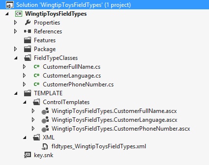
The downloadable .zip archive of companion code for this book contains a sample SharePoint project named WingtipToysFieldTypes. This project contains working samples of the custom field types and field controls that we are going to examine over the next few pages. You can tell that the project structure of WingtipToysFieldTypes in Figure 10-1 contains the source files for three custom field types named CustomerFullName, CustomerPhoneNumber and CustomerLanguage.
Creating classes for custom field types
For each custom field type, you must create a field type class that inherits from one of the built-in field type classes, such as SPFieldText, SPFieldNumber, or SPFieldMultiColumn. The following code snippet shows how each of the custom field type classes in the WingtipToysFieldTypes project inherits from one of these required base classes:
public class CustomerFullName : SPFieldMultiColumn {
  // custom field type implementation
}
public class CustomerPhoneNumber : SPFieldText {
  // custom field type implementation
}
public class CustomLanguage : SPFieldText {
  // custom field type implementation
}
The first step in implementing a custom field type class is to add two public constructors that are required by SharePoint. The reason why SharePoint requires these two specially parameterized constructors is that it uses them in various scenarios to create instances of the custom field type. When you add these constructors to your field type class, you don’t need to supply any actual code inside the curly braces. You just need to define the required parameter list and pass these parameters on to the base class constructor with a matching parameter list:
public class CustomerPhoneNumber : SPFieldText {

  public CustomerPhoneNumber(SPFieldCollection fields, string fieldName)
           : base(fields, fieldName) { }

  public CustomerPhoneNumber(SPFieldCollection fields,
                             string typeName, string displayName)
           : base(fields, typeName, displayName) { }

}
After you have added these two public constructors, the next step is to override whatever base class methods and properties make sense for your particular scenario. For instance, for the CustomerLanguage field type class, you might want to make sure that the default value is English and that the CustomerPhoneNumber should start with +[CountryCode]-(0). Let’s first look at the implementation of DefaultValue. Because most of Wingtip Toys customers live in the United States, the sales department has decided that the default value for customers’ language should be English:
public class CustomerLanguage : SPFieldText {
  // constructors omitted for brevity
  // add logic to make sure that English is the default language
  public override string DefaultValue {
    get {
      return "English";
    }
  }
}
Now let’s have a look at how we can make sure that a phone number is formatted correctly by validating the contents of a field. Field value validation is implemented by overriding a method named GetValidatedString, which is always executed prior to SharePoint saving an item that contains a field based on the field type. The GetValidatedString method passes a parameter named value that you can use to inspect the field value that the user is attempting to save to the content database. If the custom validation logic inside GetValidatedString determines that the user input for the field value is not valid, it should be written to throw an exception of type SPFieldValidationException. Here is the implementation of the GetValidatedString method in the CustomerPhoneNumber field type class, which validates that each field value starts with +[CountryCode]-(0):
public class CustomerPhoneNumber : SPFieldText {
// constructors omitted for brevity
// add validation to ensure proper formatting
public override string GetValidatedString(object value)
{
string input = value.ToString();
string PN_Regex = @"^+d{1,2}-(0)";
if ((this.Required || !string.IsNullOrEmpty(UserInput)) &
(!Regex.IsMatch(input, PN_Regex)))
{
throw new SPFieldValidationException
("Phone Number must be formatted like +[0-99]-(0)..");
}
return base.GetValidatedString(value);
}
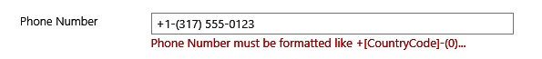
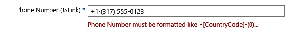
}Now let’s discuss what happens when this validation code is executed. Imagine a scenario with a list named WingtipToys Customers, which contains a field created from the CustomerPhoneNumber field type. What happens when a user attempts to save a customer with a phone number that is formatted in a different way? The GetValidatedString method executes and determines that the user input is invalid. At this point, the method throws an exception that cancels the user’s request to save the current item and displays an error message to the user, as shown in Figure 10-2.
Deploying custom field types
Now that you have created a custom field type class, the next step is to create an XML file containing a CAML-based definition for each custom field type that is required for deployment. When you create the XML file to deploy your custom field types, you must create it by using a naming pattern so that the file name starts with fldtypes and ends with an .xml extension. For example, the WingtipToysFieldTypes project contains the file fldtypes_WingtipToysFieldTypes.xml. In addition to giving this XML file a special name, you must deploy it to a specific directory inside the SharePoint root directory at the TEMPLATE/XML path.
Let’s look at how SharePoint initializes the available set of field types. When SharePoint initializes the worker process for an application pool, it queries the TEMPLATE/XML directory for files that match the of fldtypes*.xml pattern and scans through them to discover the field type definitions deployed within the local farm. From this, you can make two interesting observations about custom field type deployment. First, custom field types are not deployed by using features. Second, custom field types are deployed as an all-or-nothing proposition at farm-level scope. It is not possible to create a custom field type that is only available in a particular site collection or even web application. This also means that custom field types should not be used in a shared environment.
If you look at the TEMPLATE/XML directory on a server in a SharePoint 2013 farm, you will find a system file named fldtypes.xml that defines all the core field types supplied by SharePoint Foundation. The installation of SharePoint Server 2013 deploys several more of these XML files, including fldtypes_hold.xml, fldtypes_publishing.xml, fldtypes_SPRatings.xml, fldtypes_TargetTo.xml, and fldtypes_taxonomy.xml, to supply additional field type definitions. When you are learning how to develop custom field types, it can be very helpful to inspect these XML files to view how the SharePoint team has structured the CAML definitions for the built-in field types.
Each field type definition is created by using a FieldType element, which must reside inside a top-level FieldTypes element. The WingtipToysFieldType project deploys the definitions for all four custom field types in an XML file named fldtypes_WingtipToysFieldTypes.xml:
<FieldTypes>
  <FieldType> <!- CustomerFullName field type definition --> </FieldType>
  <FieldType> <!- CustomerPhoneNumber field type definition --> </FieldType>
  <FieldType> <!- CustomerLanguage field type definition --> </FieldType>
<FieldTypes>
When you create the FieldType element for a field type definition, you must add several Field elements with a Name attribute that defines the type of value inside. These Field elements are required to provide information about the custom field type, such as its name, its parent type, its display name, the field type class name, and the name of its assembly. The FieldType element for the custom field type named CustomerPhoneNumber is defined in the following code:
<FieldType>
  <Field Name="TypeName">CustomerPhoneNumber</Field>
  <Field Name="ParentType">Text</Field>
  <Field Name="TypeDisplayName">Customer Phone Number</Field>
  <Field Name="TypeShortDescription">Customer Phone Number</Field>
  <Field Name="UserCreatable">TRUE</Field>
  <Field Name="FieldTypeClass">
    WingtipToysFieldTypes.CustomerPhoneNumber,$SharePoint.Project.AssemblyFullName$
  </Field>
</FieldType>
Note that there are several more optional attributes that you can use when creating custom field type definitions. For example, you can add optional named attributes, such as ShowInListCreate, ShowInDocumentLibraryCreate, ShowInSurveyCreate, and ShowInColumnTemplateCreate, which allow you to define whether a custom field type should be displayed or hidden on the Create Column page for scenarios where users are adding new fields to a list or content type:
<FieldType>
  <Field Name="TypeName">CustomerLanguage</Field>
  <Field Name="ParentType">Text</Field>
  <Field Name="TypeDisplayName">Customer Language</Field>
  <Field Name="TypeShortDescription">Customer Preferred Language</Field>
  <Field Name="UserCreatable">TRUE</Field>
  <Field Name="ShowInListCreate">TRUE</Field>
  <Field Name="ShowInDocumentLibraryCreate">TRUE</Field>
  <Field Name="ShowInSurveyCreate">TRUE</Field>
  <Field Name="ShowInColumnTemplateCreate">TRUE</Field>
  <Field Name="FieldTypeClass">
    WingtipToysFieldTypes.CustomerLanguage,$SharePoint.Project.AssemblyFullName$
  </Field>
</FieldType>
Creating custom field controls
You have now learned the required steps to create and deploy a custom field type. The next step is to extend a custom field type with a custom field control to provide the user with a customized editing experience. You can also create a custom field type without a custom field control. Creating a custom field control is optional. If the editing experience of one of the out-of-the-box field types is sufficient for your custom field type, you will not have to create your own custom field control. For the CustomerPhoneNumber field type, the out-of-the-box editing experience that the field inherits from its parent Text is used. The custom editing experience of a custom field control is created by using a rendering template. To create a rendering template, you must create a new user control and add a control tag based on a special control type named RenderingTemplate:
<SharePoint:RenderingTemplate>
  <Template>
    <!-- your HTML layout and server controls go here -->
  </Template>
</SharePoint:RenderingTemplate>
The WingtipToysFieldTypes project contains a custom field control for all three custom field types that were created earlier in this chapter. The simplest one is the custom field control that extends the CustomerPhoneNumber custom field type. The rendering template for this custom field control is defined inside the user control file named WingtipToysFieldTypes.CustomerPhoneNumber.ascx. The rendering template definition has been created by using a RenderingTemplate control with an ID of CustomerPhoneNumberRenderingTemplate:
<SharePoint:RenderingTemplate ID="CustomerPhoneNumberRenderingTemplate"
    runat="server">
  <Template>
    <asp:TextBox ID="CustomerPhoneNrInput" runat="server"
                 MaxLength="25" CssClass="ms-long" />
  </Template>
</SharePoint:RenderingTemplate>
The RenderingTemplate control ID of CustomerPhoneNumberRenderingTemplate is used to determine what rendering template should be loaded and initialized. Inside the RenderingTemplate control, there is a Template element. This is where you add the HTML layout and ASP.NET controls to produce a custom editing experience. You have the flexibility to create the RenderingTemplate control by using a composite of ASP.NET controls and a rich HTML layout involving div elements or an HTML table. The CustomerPhoneNumberRenderingTemplate simply uses an ASP.NET TextBox control.
If you add an item to a Visual Studio project and you select User Control (Farm Solution Only) from the Office/SharePoint category, the user control will be added to a folder with the project name inside a folder called ControlTemplates. This means that the user control will be deployed to TEMPLATE/CONTROLTEMPLATES/[ProjectName]. Unfortunately, user control files that contain a RenderTemplate control tag can only be deployed to the TEMPLATE/CONTROLTEMPLATES folder, because SharePoint only inspects the root directory CONTROLTEMPLATES for user control files with rendering templates and not any of its child directories. Because of this, you will manually have to move your user controls from the ControlTemplates/WingTipToysFieldTypes folder to the TEMPLATE/CONTROLTEMPLATES folder.
As a general best practice when developing farm solutions, you should avoid deploying custom files from a SharePoint project directly inside one of the standard directories inside the SharePoint root directory, such as IMAGES, LAYOUTS, or CONTROLTEMPLATES. This is to avoid file name conflicts between the files that you deploy and the files that are already deployed by Microsoft and by other custom solutions. However, when developing custom field types, you cannot follow this practice because you must deploy the user control file directly inside the CONTROLTEMPLATES directory.
To increase your level of protection against file name conflicts, it is recommended that you add the project name to the beginning of the file name to make it more likely to be unique. For example, the user control files with rendering templates in the WingtipToysFieldTypes project have names such as WingtipToysFieldTypes.CustomerPhoneNumber.ascx instead of CustomerPhoneNumber.ascx.
After you have created the rendering template, the next step is to create a field control class. You can create the field control class in the CustomerPhoneNumber.cs file by inheriting from a base class named BaseFieldControl and overriding properties and methods such as DefaultTemplateName, CreateChildControls, and Value:
public class CustomerPhoneNumberFieldControl : BaseFieldControl {

  // used to pass the RenderTemplate ID to SharePoint Foundation
  protected override string DefaultTemplateName {}

  // used to obtain references to controls created by the rendering template
  protected override void CreateChildControls() {}

  // used to read and write values to and from the content database
  public override object Value {}
}
When you override the read-only property named DefaultTemplateName, your implementation simply needs to return the string-based ID of the rendering template:
protected override string DefaultTemplateName {
  get { return "CustomerPhoneNumberRenderingTemplate"; }
}
When you have implemented the DefaultTemplateName property, the next thing to do is to set up a way to access the controls defined in the rendering template programmatically. You can accomplish this by adding a protected field for each control and overriding CreateChildControls to initialize these fields properly. Here is an example of how this is done in the CustomerPhoneNumberFieldControl field control class, which has an associated rendering template that contains a single TextBox control named CustomerPhoneNrInput:
public class CustomerPhoneNumberFieldControl : BaseFieldControl {

  protected TextBox CustomerPhoneNrInput;

  protected override void CreateChildControls() {
    base.CreateChildControls();
    CustomerPhoneNrInput =
(TextBox)this.TemplateContainer.FindControl("CustomerPhoneNrInput");
  }
}
Note that you will not be instantiating control instances in the CreateChildControls method but rather going through a protected property of the base class named TemplateContainer, which exposes a FindControl method. This technique allows you to obtain references to existing control instances that are created by the control tags inside the rendering template rather than creating new control instances.
The next step is to add the logic to the field control class that is responsible for reading and writing the field’s value to and from the content database. You do this by overriding the Value property of the BaseFieldControl class. The Value property is based on the type System.Object, which gives you quite a bit of flexibility. You can work with any type of object you want, as long as it supports Microsoft .NET Framework serialization. Fortunately, most of the standard types, arrays, and collections in the base class libraries of the .NET Framework provide automatic support for .NET serialization. The CustomerPhoneNumberFieldControl class illustrates a simple example of implementing the Value property:
public class CustomerPhoneNumberFieldControl : BaseFieldControl {
  protected TextBox CustomerPhoneNrInput;

  public override object Value {
    get {
      this.EnsureChildControls();
      // return control Text property value, which is written to content DB
      return CustomerPhoneNrInput.Text;
    }
    set {
      this.EnsureChildControls();
      // initialize control with current field value retrieved from content DB
      CustomerPhoneNrInput.Text = (string)this.ItemFieldValue;
    }
  }
}
As you can tell, the get and set methods of the Value property both begin their implementation with a call to EnsureChildControls. The call to EnsureChildControls guarantees that the CreateChildControls method has already been executed. This is done to ensure that the CustomerPhoneNrInput field contains a valid reference so that you can program against the control without getting a null reference exception.
The get method of the Value property simply returns the string value from the TextBox control. The SharePoint runtime will call the get method when a user updates an item that contains a column based on this custom field type. SharePoint takes this return value and writes it directly to SharePoint.
SharePoint calls the set method when a user opens the item in edit view just before the controls created by your RenderingTemplate control are shown to the user. The key point to understand about implementing the set method is that the ItemFieldValue property provides you with access to the current field value as it is stored in SharePoint. This is what makes it possible for you to initialize the control (or controls) in your RenderingTemplate.
At this point, we have walked through the complete implementation of the rendering template and the custom field control class. The only step that remains is to update the custom field type class named CustomerPhoneNumber to use the custom field control. You do this by overriding a read-only property named FieldRenderingControl. When you override the get method of FieldRenderingControl in a custom field type class, you must create an instance of the field control class and initialize the FieldName property by using the InternalName property of the custom field type class. After you have created and initialized an instance of the field control class, you pass it back as the get method’s return value. This is how a custom field type class informs SharePoint that it wants to load its own custom field control. Example 10-1 shows the complete CustomerPhoneNumber and CustomerPhoneNumberFieldControl classes.
using Microsoft.SharePoint;
using Microsoft.SharePoint.WebControls;
using System.Text.RegularExpressions;
using System.Web.UI.WebControls;

namespace WingtipToysFieldTypes
{
    public class CustomerPhoneNumber : SPFieldText
    {
        public CustomerPhoneNumber(SPFieldCollection fields, string fieldName)
            : base(fields, fieldName) { }

        public CustomerPhoneNumber(SPFieldCollection fields,
          string typeName, string displayName)
            : base(fields, typeName, displayName) { }

        public override BaseFieldControl FieldRenderingControl
        {
            get
            {
                BaseFieldControl ctr = new CustomerPhoneNumberFieldControl();
                ctr.FieldName = this.InternalName;
                return ctr;
            }
        }


        // add validation to ensure proper formatting
        public override string GetValidatedString(object value)
        {
            string UserInput = value.ToString();
            string PN_RegularExpression = @"^+d{1,2}-(0)";
            if ((this.Required || !string.IsNullOrEmpty(UserInput)) &
                (!Regex.IsMatch(UserInput, PN_RegularExpression)))
            {
                throw new SPFieldValidationException
         ("Phone Number must be formatted like +[CountryCode]-(0)...");
            }
            return base.GetValidatedString(value);
        }
    }

    public class CustomerPhoneNumberFieldControl : BaseFieldControl
    {
        protected TextBox CustomerPhoneNrInput;
        protected override string DefaultTemplateName
        {
            get
            {
                return "CustomerPhoneNumberRenderingTemplate";
            }
        }
        protected override void CreateChildControls()
        {
            base.CreateChildControls();
            CustomerPhoneNrInput =
    (TextBox)this.TemplateContainer.FindControl("CustomerPhoneNrInput");
        }

        public override object Value
        {
            get
            {
                this.EnsureChildControls();
                return CustomerPhoneNrInput.Text;
            }
            set
            {
                this.EnsureChildControls();
                CustomerPhoneNrInput.Text = (string)this.ItemFieldValue;
            }
        }
    }
}
Custom field types with multicolumn values
The custom field type CustomerFullName is a field type with multicolumn values. In this case, you will be capturing a first name and a last name in two different text boxes, which are captured and validated as a single field. Multicolumn field types must inherit from SPFieldMultiColumn. In most cases, you will also have to specify a custom field control because there aren’t any SharePoint out-of-the-box field types that are built up out of several text boxes or other types of input controls. The field control will have to contain a custom RenderingTemplate designed to display multiple input controls to the user. Here is an example of the rendering template defined inside WingTipToysFieldTypes.CustomerFullName.ascx:
<SharePoint:RenderingTemplate ID="CustomerFullNameRenderingTemplate" runat="server">
  <Template>
    <table class="ms-authoringcontrols" >
      <tr>
        <td>First name:</td>
        <td><asp:TextBox ID="FirstNameInput" runat="server" Width="328px" /></td>
      </tr>
      <tr>
        <td>Last name:</td>
        <td><asp:TextBox ID="LastNameInput" runat="server" Width="328px" /></td>
      </tr>
    </table>
  </Template>
</SharePoint:RenderingTemplate>
Now that you have defined the rendering template, you will have to create the logic to move values from these controls back and forth to and from the SharePoint content database as a single multicolumn value. The server-side object model supplies the SPFieldMultiColumnValue class type, which makes this possible by using programming syntax similar to dealing with a string array. The CustomerFullNameFieldControl class in Example 10-2 shows how to override the Value property with an implementation that reads and writes multicolumn values to and from the content database.
public class CustomerFullNameFieldControl : BaseFieldControl
{
    protected override string DefaultTemplateName
    {
        get
        {
            return "CustomerFullNameRenderingTemplate";
        }
    }
    protected TextBox FirstNameInput;
    protected TextBox LastNameInput;

    protected override void CreateChildControls()
    {
        base.CreateChildControls();
        FirstNameInput =
          (TextBox)this.TemplateContainer.FindControl("FirstNameInput");
        LastNameInput =
          (TextBox)this.TemplateContainer.FindControl("LastNameInput");
    }

    public override object Value
    {
        get
        {
            this.EnsureChildControls();
            SPFieldMultiColumnValue mcv = new SPFieldMultiColumnValue(2);
            mcv[0] = FirstNameInput.Text;
            mcv[1] = LastNameInput.Text;
            return mcv;
        }
        set
        {
            this.EnsureChildControls();
            SPFieldMultiColumnValue mcv =
             (SPFieldMultiColumnValue)this.ItemFieldValue;
            FirstNameInput.Text = mcv[0];
            LastNameInput.Text = mcv[1];
        }
    }
}
It would be possible to extend this simple example further to exploit the potential of multicolumn field types. For example, if you were storing an address, you could call to a web service and pass a postal code that would return the associated city. That would allow you to add extra functionality to autopopulate the City text box and to perform validation to ensure that the address is correct.
Custom field types with custom properties
The custom field type named CustomerLanguage demonstrates how you can extend a custom field type with one or more custom properties. The main idea is that each field instance created from the custom field type gets its own independent property settings. You can create custom properties for a custom field type by adding a PropertySchema element to the bottom of the FieldType element for a custom field type. You create each custom property by adding Field elements inside the PropertySchema element. For example, the custom field type CustomerLanguage has been defined with five custom properties named English, Spanish, French, Dutch, and German of which Dutch and German aren’t always available:
<FieldType>
<Field Name="TypeName">CustomerLanguage</Field>
<Field Name="ParentType">Text</Field>
<Field Name="TypeDisplayName">Customer Language</Field>
<Field Name="TypeShortDescription">Customer Language</Field>
<Field Name="UserCreatable">TRUE</Field>
<Field Name="ShowInColumnTemplateCreate">TRUE</Field>
<Field Name="FieldTypeClass">
WingtipToysFieldTypes.CustomerLanguage,WingtipToysFieldTypes,
Version=1.0.0.0, Culture=neutral, PublicKeyToken=0720027336e99bd9
</Field>
<PropertySchema>
<Fields>
<Field Name="AvailableInDutch"
DisplayName="Available in Dutch"
Type="Boolean">
<Default>0</Default>
</Field>
<Field Name="AvailableInGerman"
DisplayName="Available in German"
Type="Boolean">
<Default>0</Default>
</Field>
</Fields>
</PropertySchema>
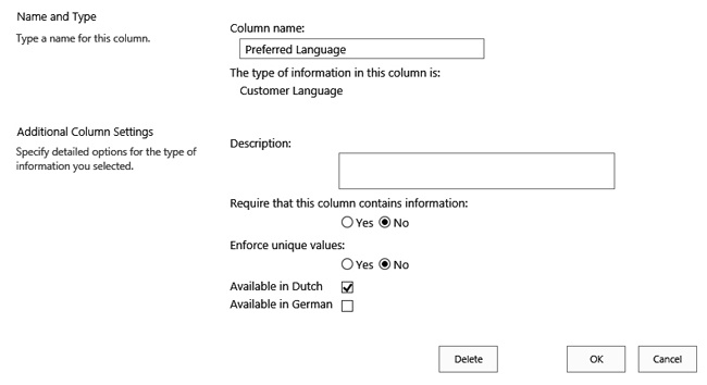
</FieldType>After you have added one or more custom properties to a custom field type, SharePoint will automatically add input controls to the page that allow a user to add or update columns based on your custom field type. Figure 10-3 shows what the user sees when adding or updating a field based on the CustomerLanguage custom field type. The user can decide whether content is available in Dutch and German.
After you have extended a custom field type with one or more custom properties, you then must write code to inspect what values the user has assigned to them. In the case of the custom field type named CustomerLanguage, there is code in the CreateChildControls method of the field control class that initializes a RadioButtonList control by adding items for English, Spanish, and French, and by using code to determine whether the options for Dutch and German should be added as well. If the user has set the value for AvailableInDutch and AvailableInGerman to true, the options will be added for the user to select them. Example 10-3 shows the implementation of the CustomerLanguage and CustomerLanguageFieldControl classes.
public class CustomerLanguage : SPFieldText
{
public CustomerLanguage(SPFieldCollection fields, string fieldName)
: base(fields, fieldName) { }
public CustomerLanguage
(SPFieldCollection fields, string typeName, string displayName)
: base(fields, typeName, displayName) { }
public override BaseFieldControl FieldRenderingControl
{
get
{
BaseFieldControl ctr = new CustomerLanguageFieldControl();
ctr.FieldName = this.InternalName;
return ctr;
}
public override string DefaultValue
{
get
{
return "English";
}
}
}
public class CustomerLanguageFieldControl : BaseFieldControl
{
protected RadioButtonList CustomerLanguageInput;
protected override string DefaultTemplateName
{
get
{
return "CustomerLanguageRenderingTemplate";
}
}
protected override void CreateChildControls()
{
base.CreateChildControls();
CustomerLanguageInput =
(RadioButtonList)TemplateContainer.FindControl("CustomerLanguageInput");
if (CustomerLanguageInput != null)
{
CustomerLanguageInput.Items.Clear();
CustomerLanguageInput.Items.Add("English");
CustomerLanguageInput.Items.Add("Spanish");
CustomerLanguageInput.Items.Add("French");
// check to see if Dutch is available
if (this.Field.GetCustomProperty("AvailableInDutch") != null)
{
bool availableInDutch =
(bool)this.Field.GetCustomProperty("availableInDutch");
if (availableInDutch)
{
CustomerLanguageInput.Items.Add("Dutch");
}
}
// check to see if German is available
if (this.Field.GetCustomProperty("AvailableInGerman") != null)
{
bool availableInGerman =
(bool)this.Field.GetCustomProperty("AvailableInGerman");
if (availableInGerman)
{
CustomerLanguageInput.Items.Add("German");
}
}
}
}
public override object Value
{
get
{
this.EnsureChildControls();
return CustomerLanguageInput.SelectedValue;
}
set
{
this.EnsureChildControls();
CustomerLanguageInput.Items.FindByValue
(ItemFieldValue.ToString()).Selected = true;
}
}
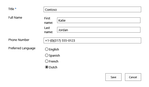
}Figure 10-4 shows what the end result looks like if you deploy the WingTipToysFieldTypes solution and configure a list to use the custom fields that you created, but you select the option to indicate that the content isn’t available in German.
JSLink
So far in this chapter we have looked at custom field types. Although custom field types provide an incredibly powerful mechanism for creating fields with a custom behavior and look and feel, they also have some significant downsides. The main drawback of custom field types is that they have to be installed by using a farm solution. This means that they can only be used in on-premises SharePoint environments. After they are installed, the custom field types are available throughout the entire environment, whereas you might want to create a custom field for a particular site collection or group of people.
In SharePoint 2013, Microsoft has introduced a new way to customize fields that can be used in both on-premises environments and cloud-based environments such as SharePoint Online 2013. The way fields can be customized by using a sandboxed solution or a SharePoint app is by using the new JSLink property that is available on SPField objects. It’s not just fields that can be adjusted by using JSLink. The following objects can use the JSLink property:
Fields
SPField
SPFieldAttachments
SPFieldBoolean
SPFieldCalculated
SPFieldChoice
SPFieldCurrency
SPFieldDateTime
SPFieldDecimal
SPFieldFile
SPFieldGeolocation
SPFieldLookup
SPFieldMultiChoice
SPFieldMultiLineText
SPFieldNumber
SPFieldText
SPFieldUrl
SPFieldUser
TaxonomyField
OutComeChoiceField
RelatedItemsField
Web Parts
Other
SPContentType
SPForm
SPView
As you can tell, the JSLink property can be used on a lot of objects. This means that it can help you customize all of these objects. The JSLink property itself doesn’t actually do that much—it points to a JavaScript file that contains part of the behavior and the look and feel of a particular object.
Because we are talking about modifying fields in this section, we will look at how you can recreate the functionality of the CustomerPhoneNumber field type that was created earlier using a custom field type, but now you will be using the JSLink property. The CustomerPhoneNumber field was a standard text field, but with custom validation rules. These rules apply to the New and the Edit form of the list, which means that you will have to adjust the JSLink properties for these two forms. Note that you will have to adjust both views in order to offer a consistent experience for users, because the JSLink property can only be applied to one form at a time.
The first thing you have to do is to create a custom site column whose behavior you will adjust. Start by creating a new Visual Studio project of the type SharePoint 2013 - Empty Project. The project will be called WingtipToysJSLink. Next, click Add and New Item, and then add a site column. In this example, name the site column CustomerPhoneNumber2. You will adjust the display name to Phone Number (JSLink), change the group the column is displayed in to WingtipToys Columns, and add the JSLink property, which you will use to point to the JavaScript file that you will create. The contents of the elements.xml file for the CustomerPhoneNumber2 column are shown in Example 10-4.
<?xml version="1.0" encoding="utf-8"?>
<Elements xmlns="http://schemas.microsoft.com/sharepoint/">
  <Field
       ID="{d0a018ff-e6f8-4484-a8e3-c0dd6e11b65b}"
       Name="CustomerPhoneNumber2"
       DisplayName="Phone Number (JSLink)"
       Type="Text"
       Required="FALSE"
       JSLink="~sitecollection/_catalogs/masterpage/scripts/PhoneNumberValidator.js"
       Group="WingtipToys Columns">
  </Field>
</Elements>
You will deploy the JavaScript file to the MasterPage gallery, to a folder that you will create called scripts. This is arbitrary; you can also choose to deploy the JavaScript file to a folder in the site, to a different library, or even to a location in the SharePoint root folder. Note that you can only deploy the JavaScript file to a location in the SharePoint root folder if you are creating a farm solution. You can’t deploy to the SharePoint root folder from a sandboxed solution or from a SharePoint app.
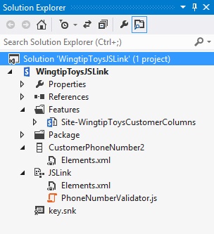
Both the CustomerPhoneNumber2 column and the module are deployed to a site collection by using a site collection–scoped feature called Site-WingtipToysCustomerColumns. Figure 10-5 shows the structure of the WingtipToysJSLink project.
Next you start by overriding the behavior of the EditForm and NewForm of the column. You do this by specifying a custom function that will be executed when the form is loaded, which you can use to apply your custom rendering and validation. You can also choose to override the behavior of the DisplayForm and the View of the list, but you don’t need this for the Customer Phone Number functionality, because the only customization is a custom validator. Note that the same method (SPFieldPhoneNumber_Edit) is used to override the behavior of the new form and the edit form; there is no need to create separate methods for both forms, because the intended behavior for both forms is the same. Also note that we explicitly state that the custom behavior should be applied to the CustomerPhoneNumber2 column. You can theoretically override the behavior of any column, as long as you know the internal name of the column:
function _registerCustomPhoneNumberFieldTemplate() {

    var phoneNrFieldContext = {};
    phoneNrFieldContext.Templates = {};
    phoneNrFieldContext.Templates.Fields = {

        'CustomerPhoneNumber2': {
            'EditForm': CustomPhoneNumberFieldTemplate.SPFieldPhoneNumber_Edit,
            'NewForm': CustomPhoneNumberFieldTemplate.SPFieldPhoneNumber_Edit
        }
    };
    SPClientTemplates.TemplateManager.RegisterTemplateOverrides(phoneNrFieldContext);
}
In the elements.xml file of the site column, you only specify a JavaScript file name and not the name of the function that should be called. In order to make sure that your code is executed when the column is loaded, you will use an Immediately Invoked Function Expression (IIFE). This is a function that is executed immediately when the file is loaded. The _registerCustomPhoneNumberFieldTemplate method will actually be part of the IIFE as well, as will the SPFieldPhoneNumber_Edit method that will contain the actual adjusted behavior of the column on the new form and the edit form. Example 10-5, shown a bit later in this section, contains the entire contents of the PhoneNumberValidator.js file. The file will be deployed by using a module that you add to the WingtipToysJSLink project. The module will be called JSLink and will contain nothing but the elements.xml file stating that the JavaScript file should be deployed to the scripts folder in the MasterPage gallery:
<?xml version="1.0" encoding="utf-8"?>
<Elements xmlns="http://schemas.microsoft.com/sharepoint/">
  <Module Name="JSLink" List="116" Url="_catalogs/masterpage/scripts">
    <File Path="JSLinkPhoneNumberValidator.js"
          Url="PhoneNumberValidator.js"
          Type="GhostableInLibrary"
          IgnoreIfAlreadyExists="FALSE" />
  </Module>
</Elements>
Example 10-5 shows that the SPClientTemplates.Utility.GetFormContextForCurrentField method is used in the SPFieldPhoneNumber_Edit method to get the context for the field for which you want to override the behavior. When you have the context of the field, you can retrieve its value, add the standard SharePoint validator in case the field is required, and add some callbacks. There are four callbacks:
registerInitCallback. Sets the initial value of the column. On the new form, there won’t be an initial value, so the text box will be left empty.
registerFocusCallback. Sets the focus back to the CustomerPhoneNumber2 column after a postback of the page.
registerValidationErrorCallback. Ensures that out-of-the-box SharePoint validation errors are correctly displayed.
registerGetValueCallback. Gets the value of the field when the form is submitted, to make sure that the value can be saved.
var _validationLabel = null;
var _phoneNrBox = null;

(function () {
    if (typeof CustomPhoneNumberFieldTemplate == "object") {
        return;
    }
    window.CustomPhoneNumberFieldTemplate = (function () {
        return {
            SPFieldPhoneNumber_Edit: function (rCtx) {
                if (rCtx == null)
                    return '';
                var _myData =
                  SPClientTemplates.Utility.GetFormContextForCurrentField(rCtx);

                if (_myData == null || _myData.fieldSchema == null) {
                    return '';
                }
                var _inputId_PhoneNr =
                 _myData.fieldName + '_' + _myData.fieldSchema.Id + '_$phoneNrField_
                    PhoneNr';
                var _inputId_Div =
                  _myData.fieldName + '_' + _myData.fieldSchema.Id + '_$phoneNrField_Div';
                var _inputId_ValidationLabel = _myData.fieldName + '_' +
                 _myData.fieldSchema.Id + '_$phoneNrField_ValidationError';

                var _value = _myData.fieldValue != null ? _myData.fieldValue : '';
                var listItem = rCtx['CurrentItem'];

                var validators = new SPClientForms.ClientValidation.ValidatorSet();
                if (_myData.fieldSchema.Required) {
                    validators.RegisterValidator
                        (new SPClientForms.ClientValidation.RequiredValidator());
                }
                _myData.registerClientValidator(_myData.fieldName, validators);

                // Post DOM initialization callback.
                _myData.registerInitCallback(_myData.fieldName, function () {

                    // Initialize the input control references.
                    _phoneNrBox = document.getElementById(_inputId_PhoneNr);
                    _validationLabel =
                        document.getElementById(_inputId_ValidationLabel);

                    // Set the initial values.
                    if (_phoneNrBox != null && _value != null) {
                        _phoneNrBox.value = _value;
                    }
                });
                // On focus call back
                _myData.registerFocusCallback(_myData.fieldName, function () {
                    if (_phoneNrBox != null)
                        _phoneNrBox.focus();
                });

                // Validation failure handler
                _myData.registerValidationErrorCallback
                    (_myData.fieldName, function (errorResult)
                {
                    SPFormControl_AppendValidationErrorMessage(_inputId_Div, errorResult);
                });


                // Register a callback just before submit.
                _myData.registerGetValueCallback(_myData.fieldName, function () {
                    if (_phoneNrBox == null)
                        return '';
                    else {
                        return _phoneNrBox.value;
                    }
                });

                _myData.updateControlValue(_myData.fieldName, _value);
                var result = '<div width="100%" id=' + STSHtmlEncode(_inputId_Div) + '>';
                result += '<div><input id=' + STSHtmlEncode(_inputId_PhoneNr) +
                          'type="text" name="PhoneNr" class="ms-long"
                          onchange="validatePhoneNumber()" /></div>';
                result += '<span class="ms-formvalidation ms-csrformvalidation" '
                          'id=' + STSHtmlEncode(_inputId_ValidationLabel) + ' '
                          'style="display: none;" ></span>'
                result += '</div>';
                return result;

            },
        };
    })();

    function _registerCustomPhoneNumberFieldTemplate() {

        var phoneNrFieldContext = {};
        phoneNrFieldContext.Templates = {};
        phoneNrFieldContext.Templates.Fields = {

            'CustomerPhoneNumber2': {
                'EditForm': CustomPhoneNumberFieldTemplate.SPFieldPhoneNumber_Edit,
                'NewForm': CustomPhoneNumberFieldTemplate.SPFieldPhoneNumber_Edit
            }
        };
        SPClientTemplates.TemplateManager.RegisterTemplateOverrides(phoneNrFieldContext);
    }
    ExecuteOrDelayUntilScriptLoaded
        (_registerCustomPhoneNumberFieldTemplate, 'clienttemplates.js'),
})();

function validatePhoneNumber() {
    var PN_RegularExpression = /^+d{1,2}-(0)/i;
    var result = PN_RegularExpression.exec(_phoneNrBox.value);

    if (result == null) {
        _validationLabel.style.display = "";
        _validationLabel.innerText =
            "Phone Number must be formatted like +[CountryCode]-(0)...";
    }
    else {
        _validationLabel.style.display = "none";
        _validationLabel.innerText = "";
    }

}
The next step is to create the actual rendering of the text box. In this case, you use a simple HTML input control of type text, displaying a text box. You add the SharePoint CSS class ms-long to the text box so that it gets rendered just like the other text boxes on the form. You will also add an onchange attribute that will provide you with client-side validation similar to the validation that you created earlier in this chapter for the custom field type created for CustomerPhoneNumber. You will also add an HTML span element that can be used to display a message if validation fails. You will make sure that the message is rendered just like the out-of-the-box validation errors by adding more out-of-the-box CSS classes.
The final part of the JavaScript file is the custom validation method that will fire when the contents of the text box are changed. The method uses the same regular expression that was used for the custom field type, making sure that the value starts with +[CountryCode]-(0). If it doesn’t, a message is displayed warning the user. If a user clicks the Save button directly after changing the field, the save action will be cancelled. This isn’t a completely foolproof method, though, because the user can click the Save button again, which will submit the form and save the value for CustomerPhoneNumber2, even if it is not formatted correctly. You can add more logic to the JavaScript file to prevent this if you need to.
Figure 10-6 shows the end result of the Phone Number (JSLink) site column with the JavaScript linked to it using the JSLink property.
Custom site columns and content types
In this section, we will look at different ways in which you can create custom site columns and content types in your SharePoint solutions. Site columns and content types can be created either by using Collaborative Application Markup Language (CAML) or by using the server-side object model.
If you had to write all the CAML yourself, it would be more tedious to write and test the functionality than if you were using the server-side object model. However, the SharePoint developer tools do most of the work for you, and for some tasks they even provide designers. There are pros and cons to using CAML compared to using server-side code. Reading CAML is generally easier than reading code, which means that it is easier for other developers to view what you have created. A downside of CAML is that it can be harder to maintain. Though modifying the XML and redeploying the solution is easy, it is not always supported. You have to know which changes are supported and which aren’t. If you use code, you have more flexibility and can make changes to the actual object—the column, content type, or list instance in the site—rather than to the template, as you would if you were using CAML.
Creating site columns and content types by using CAML
As you begin working with CAML, it can be very educational to dissect the CAML-based definitions for site columns, content types, and list types that ship with SharePoint 2013. For example, you can examine the standard site columns defined in the fields feature and the standard content types defined in the ctypes feature. When you examine the features and CAML definitions that ship with the product, be sure to look—but don’t touch. Modifying any of the built-in features or CAML definitions is not supported and can cause serious damage to the SharePoint farm.
In Chapter 3 section, you used CAML to create two custom site columns called AgeGroup and ToysPrice, and a content type called Toys. The companion code for this book contains the WingtipToysSandbox project, which contains the AgeGroup and ToysPrice site columns and the Toys content type. Although this project is set to be deployed as a sandboxed solution, it can also be deployed as a full-trust solution by changing the value of the Sandboxed Solution project property from True to False.
In this section, we will go over the CAML used in the WingtipToysSandbox project, in the next section you will rebuild the same functionality by using the server-side object model.
A site column definition is created by using a Field element. For example, the elements.xml file of the ToysPrice site column includes the following CAML definition. The ToysPrice site column definition also shows some attributes that you have to specify when creating a custom site column, such as ID, Name, DisplayName, Group, Required, and Type. You will need a new GUID each time you create a new site column definition. If you create the site column by using the SharePoint Developer Tools, the GUID will be generated for you. Also note that because the ToysPrice field is a Currency field, it also includes the attribute Decimals, which is set to 2. If you want to ensure that users can’t fill in a negative price, it would also be possible to use the Min attribute and set it to 0:
<Field>
        ID="{f75c27ba-e321-4bbe-a30b-be0e085a5517}"
        Name="ToysPrice"
        DisplayName="Price"
        Type="Currency"
        LCID="1033"
        Decimals="2"
        Required="TRUE"
        Group="WingtipToys Columns">
</Field>
The AgeGroup column is an example of a Choice field. By default, choice fields are formatted as drop-down menus. You can also specify that you want the field to be formatted as radio buttons or check boxes by adding the Format attribute and specifying its value as RadioButtons or Checkboxes. Check boxes should be used when the user should be able to select more than one value for the field:
<Field>
       ID="{742e3245-a013-4537-82d3-727ddbfb981a}"
       Name="AgeGroup"
       DisplayName="Age Group"
       Type="Choice"
       Required="TRUE"
       Group="WingtipToys Columns">
    <CHOICES>
      <CHOICE>0-1</CHOICE>
      <CHOICE>2-3</CHOICE>
      <CHOICE>4-6</CHOICE>
      <CHOICE>7-9</CHOICE>
      <CHOICE>10-12</CHOICE>
      <CHOICE>12+</CHOICE>
    </CHOICES>
  </Field>
The attributes used in the examples are only a small subset of the attributes that you can use when creating site column definitions. For more information, you can look at the MSDN documentation at http://msdn.microsoft.com/en-us/library/ms437580.aspx.
After you have created a couple of custom site columns, you can either add them to a list one at a time, or you can use a content type to group them together and add the content type to a list. A content type definition is created by using a ContentType element. The ContentType element must contain a set of required attributes and a collection of links to fields that are created by using FieldRef elements. Each FieldRef element references a specific site column definition, using both the identifying GUID and its string-based name. Each content type definition also requires an ID that begins with the content type ID of its parent. The content type in this example, Toys, inherits from the Item content type. The Item content type has an ID of 0x01. Note that the content type ID is not a GUID. If you use the SharePoint Developer Tools to create a content type, the ID will be generated for you. Depending on the exact definition of you content type, you don’t even have to worry about the XML, because the new SharePoint Developer Tools for Visual Studio 2012 contain a designer that you can use to create custom content types:
<?xml version="1.0" encoding="utf-8"?>
<Elements xmlns="http://schemas.microsoft.com/sharepoint/">
  <!-- Parent ContentType: Item (0x01) -->
  <ContentType ID="0x01007E6057B85C8A465D9A695CC2E60AB705"
               Name="Toys"
               Group="WingTipToys Content Types"
               Description="Content type used to store information about toys"
               Inherits="TRUE">
    <FieldRefs>
      <FieldRef ID="{742e3245-a013-4537-82d3-727ddbfb981a}"
                DisplayName="Age Group" Required="TRUE" Name="AgeGroup" />
      <FieldRef ID="{f75c27ba-e321-4bbe-a30b-be0e085a5517}"
                DisplayName="Price" Required="TRUE" Name="ToysPrice" />
    </FieldRefs>
  </ContentType>
</Elements>
Before you can create a content type definition, you must decide which base content type to inherit from. For example, you can inherit from a standard list content type such as Item, Contact, or Task. You can also elect to create a content type that inherits from Document, making it possible to add support for a document template and use it in a document library. In this example, we kept it simple and inherited the Toys content type from Item. When you use the SharePoint Developer Tools to create the content type, the wizard will prompt you to select a base content type. You can pick the base content type from a drop-down list that includes previously created custom content types. Do make sure, if you inherit your content type from another custom content type, that the other content type is deployed to all environments in which you want to deploy your content type; otherwise your content type will throw an error when it is deployed, and you won’t be able to use it.
For each field link that you want to add, you must create a FieldRef element that references a site column definition. You can include both out-of-the-box SharePoint site columns and custom site columns. If you are using the SharePoint Developer Tools and Visual Studio 2012, you can use the designer to add site columns to your content type.
Creating site columns and content types by using the server-side object model
We have looked at creating site columns and content types by using CAML, but you can achieve the same thing by using the server-side object model. There is even one type of site column that you should only create by using the server-side object model. Creating a managed metadata site column using CAML is not supported. In order to create a managed metadata site column, you must use the server-side object model.
To create the AgeGroup and ToysPrice site columns and the Toys content type by using the server-side object model, you first have to determine when or how you want to create the columns. You can add the code needed to create the site columns and content type to a Web Part, a custom application page, a custom action, or a feature receiver. In the example in this section, you will add the code to a feature receiver, so that the site columns and the content type are created when the feature is activated.
First create a SharePoint 2013 - Empty Project and call it WingtipToysColumnsContentTypes. You will deploy the project as a farm solution. Next, right-click the Features node in the Solution Explorer and click Add Feature. This will generate a feature called Feature1 that is web scoped. Call it Site-ColumnsContentTypes and change its scope to Site, because site columns and content types should be created at the rootweb of a site collection and not at every subsite. Now right-click the feature and select Add Event Receiver. Next, just uncomment the FeatureActivated event handler, and you are ready to add the code to create the actual site columns and content type.
Call the custom site columns that you create using the server-side object model ToysPrice2 and AgeGroup2, and the content type Toys2, to avoid conflicts if the columns and content type from Chapter 3 are deployed to the same site collection. To create the ToysPrice2 column, you will use the SPFieldCurrency object. You could also use the SPField object, but that won’t allow you to set values for attributes that are specific to the currency field, such as Decimals. When setting the number of decimals by using code, you use the SPNumberFormatTypes enumeration:
SPCurrencyField.DisplayFormat = SPNumberFormatTypes.TwoDecimals;
In order to make sure that you won’t cause any exceptions from trying to create duplicate site columns, you will test whether the column already exists by using the SPFieldCollection.ContainsField(SPField) method. To create the AgeGroup2 column, you use the SPFieldChoice object, which allows you to add choices to the field.
Before creating the content type, you again test whether it already exists. There is no graceful way to do this, so simply try to retrieve the content type and test whether it’s null. When you create the new content type, use SPContentTypeCollection[SPBuiltInContentTypeId.Item] to specify the parent content type. SharePoint will then generate the new content type ID for the content type that you are creating. The last step is to add the links to the ToysPrice2 and the AgeGroup2 fields to the content type. You do this by creating a SPFieldLink to both fields and adding those field links to the content type. Example 10-6 contains the complete FeatureActivated event handler that creates the site columns and the content types. You could have chosen to use the FeatureDeactivating event handler to remove the site columns and content type from the site, but removing site columns and content types is not always possible and might cause data loss, so you won’t remove the columns and the content types when the feature is deactivated.
public override void FeatureActivated(SPFeatureReceiverProperties properties)
{
    SPSite currentSite = properties.Feature.Parent as SPSite;

    SPWeb currentWeb = currentSite.OpenWeb();

    SPFieldCollection siteColumns = currentWeb.Fields;
    currentWeb.AllowUnsafeUpdates = true;

    if (!siteColumns.ContainsField("ToysPrice2"))
    {
        SPFieldCurrency toysPrice =
          siteColumns.CreateNewField("Currency", "ToysPrice2") as SPFieldCurrency;
        toysPrice.StaticName = "ToysPrice2";
        toysPrice.Title = "Price2";
        toysPrice.Group = "WingtipToys Columns";
        toysPrice.Required = true;
        toysPrice.DisplayFormat = SPNumberFormatTypes.TwoDecimals;
        currentWeb.Fields.Add(toysPrice);
    }

    if (!siteColumns.ContainsField("AgeGroup2"))
    {
        SPFieldChoice ageGroup =
          siteColumns.CreateNewField("Choice", "AgeGroup2") as SPFieldChoice;
        ageGroup.StaticName = "AgeGroup2";
        ageGroup.Title = "Age Group2";
        ageGroup.Group = "WingtipToys Columns";
        ageGroup.Required = true;
        ageGroup.Choices.Add("0-1");
        ageGroup.Choices.Add("2-3");
        ageGroup.Choices.Add("4-6");
        ageGroup.Choices.Add("7-9");
        ageGroup.Choices.Add("10-12");
        ageGroup.Choices.Add("12+");
        currentWeb.Fields.Add(ageGroup);
    }

    SPContentTypeCollection contentTypes = currentWeb.ContentTypes;
    if (contentTypes["Toys2"] == null)
    {
      SPContentType toys =
        new SPContentType(contentTypes[SPBuiltInContentTypeId.Item], contentTypes,
        "Toys2");
      toys.Group = "WingtipToys Content Types";
      toys.Description = "Content type used to store information about toys";
      SPField toysPrice = currentWeb.Fields.GetFieldByInternalName("ToysPrice2");
      SPField ageGroup = currentWeb.Fields.GetFieldByInternalName("AgeGroup2");
      SPFieldLink toysPriceLink = new SPFieldLink(toysPrice);
      SPFieldLink ageGroupLink = new SPFieldLink(ageGroup);
      toys.FieldLinks.Add(toysPriceLink);
      toys.FieldLinks.Add(ageGroupLink);

      contentTypes.Add(toys);
    }
    currentWeb.AllowUnsafeUpdates = false;
}
Custom list definitions
The SharePoint Developer Tools contain a project item template for creating custom lists. When the List template is selected, you get to choose whether to create a customizable or a non-customizable list. When you choose a customizable list, a list definition is created; choosing a non-customizable list creates a list instance. If you create a new project item by using the List project item template, the SharePoint Customization Wizard prompts you to choose the type of list that you want to create by selecting one of the built-in list definitions. When you are creating a customizable list, only the base types can be selected. When a list instance is created, any of the out-of-the-box list definitions can be chosen as a starting point. Creating non-customizable lists and list instances was discussed in more detail in Chapter 3, in the discussion about declarative elements. In this section, we will focus on creating customizable lists or list definitions.
For the purposes of this section, the.zip archive of companion code for this book contains a SharePoint project named WingtipToysLists. This project contains working samples of the custom list that we are going to examine over the next few pages. After the project is created as a farm solution, you can add the new list to it by clicking Add | New Item and choosing List. You will create a customizable list called WingtipToysProductsList and base it on Default (Custom List). The SharePoint Developer Tools will do a lot of the work for you by creating the list definition. To modify the definition, you can use the designer. The designer offers three different views: List, Views, and Columns views.
It is important to note that when you create a new list by using the SharePoint Developer Tools in Visual Studio 2012, the designer tools don’t just create a new list definition, they also create a new list instance. This means that when you activate the feature, a new list template will be made available in the site and a new list instance will be created based on that template. This can be a bit confusing, because some of the changes that you make in the designer are applied to both the list definition and the list instance, and others are only applied to the list instance. The list instance is generated as a subelement of the list template. The list template consists of an element.xml file and a schema.xml file. The list instance has its own elements.xml.
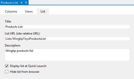
The List tab of the designer, shown in Figure 10-7, enables you to modify the metadata of the list instance, such as Title (Display Name), URL, and Description. You can also select whether the list instance should appear on the Quick Launch area on the left of the screen or whether it should be hidden from the browser completely.
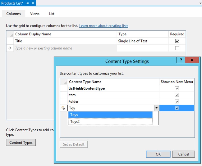
By using the Columns view, shown in Figure 10-8, you can add existing site columns to the list definition or create new columns specifically for use in this particular list. You can also add a content type, which will then automatically add all the columns from the content type to the list definition.
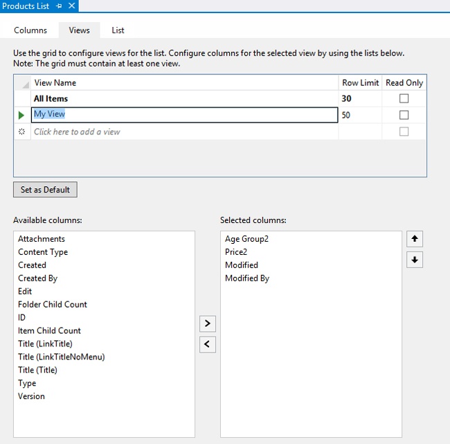
The Views tab of the designer is shown in Figure 10-9. This tab allows you to adjust an existing view or create a new one. By default, an All Items view is added that shows all items in the list and that pages the items to show only 30 at a time. You can add columns to, or remove columns from, the view. The views you create will be part of the list definition, which means that they will be available in all list instances that are created based on the new list template.
In a lot of cases, when you create a custom list definition, you will want to offer users the opportunity to create lists of the custom type in their sites. When you add a list instance, a list will be created automatically with the title and description that you specified. If this is not the behavior that you want when the feature containing your list is activated, you can simply delete the list instance from the list definition. Users will then be able create their own list instances based on the custom list template.
The behavior of the SharePoint Developer Tools when a list instance is deployed using Visual Studio is also worth noting. If a list instance already exists when the solution is redeployed, the Developer Tools will detect a conflict. The Tools will offer to resolve the conflict, or you can stop the deployment. If you let the Developer Tools resolve the conflict, the list instance in the site will be deleted and a new one will be created. Sometimes that is how you want the conflict to be resolved, but if you had added data (such as test data) to the list instance in the site, having it deleted with every deployment might not be the behavior you are looking for.
You don’t have to use the designer to work with lists in Visual Studio 2012. You can also open the generated XML files directly. When you create a new project item for a list definition, it contains two CAML-based files named elements.xml and schema.xml. Both of these files are required to create a list definition. We will begin by examining the elements.xml file that contains a ListTemplate element:
<Elements xmlns="http://schemas.microsoft.com/sharepoint/">
    <!-- Do not change the value of the Name attribute below.
         If it does not match the folder name of the List project item,
         an error will occur when the project is run. -->
    <ListTemplate
        Name="WingtipToysProductsList"
        Type="10000"
        BaseType="0"
        OnQuickLaunch="TRUE"
        SecurityBits="11"
        Sequence="410"
        DisplayName=" Products List"
        Description=" Wingtip Toys Products List"
        Image="/_layouts/15/images/itgen.png"/>
</Elements>
As you can tell, this ListTemplate element has a Name of WingtipToysProductsList. The value of the Name attribute is important within a ListTemplate element because SharePoint Foundation requires a child directory inside the root feature directory with the same name that will contain a file with the well-known name schema.xml. If you use the SharePoint Developer Tools to deploy or package your project, the required directory, named WingtipToysProductsList, will be created inside the root feature directory, and the schema.xml file will be placed inside.
The ListTemplate element defines a Type attribute with an integer value used to identify the creatable list type associated with the list definition. Microsoft uses lower-numbered identifiers for the built-in list types, such as 104 for Announcements and 105 for Contacts. When you use the SharePoint Developer Tools to create a list definition, a list type identifier of 10,000 or greater will be used. The tools will make sure that they don’t generate a duplicate type identifier if multiple custom list definitions exist in the environment.
Now that you have learned what’s required in the elements.xml file, let’s move on to discuss what’s inside the schema.xml file. The schema.xml file contains a top-level List element that contains several attributes and inner elements for content type, fields, views, and forms:
<List xmlns:ows="Microsoft SharePoint"
      Title="WingtipToysProductsList"
      FolderCreation="FALSE"
      Direction="$Resources:Direction;"
      Url="Lists/WingtipToysProductsList"
      BaseType="0"
      xmlns="http://schemas.microsoft.com/sharepoint/"
      EnableContentTypes="TRUE">
  <MetaData>
    <ContentTypes><!-- add content types here --></ContentTypes>
    <Fields><!-- add fields here --></Fields>
    <Views><!-- define views here --></Views>
    <Forms><!-- add support for forms here --></Forms>
  </MetaData>
</List>
Now we will take a little time to walk through the individual sections of the schema.xml file in more detail. We will begin with the ContentTypes element. The ContentTypes element can contain content type instances or content type references. The ContentTypes element in this example contains a ContentType element with an instance of the ListFieldsContentType. This content type was generated by the SharePoint Developer Tools. If you add your own content types to the list, you can choose to remove this one. The ContentTypes element also contains three content type references. The first one, with ID=“0x01”, references the out-of-the-box Item content type; the second, with ID=“0x0120”, references the out-of-the-box Folder content type; and the last one, with the long ID that is based on the Item ID, is a reference to the Toys2 content type that was created in the previous section:
<ContentTypes>
  <ContentType ID="0x0100b5555c921f27445b8b00e0033f43e08c"
                Name="ListFieldsContentType">
    <FieldRefs>
      <FieldRef ID="{fa564e0f-0c70-4ab9-b863-0177e6ddd247}" Name="Title" />
      <FieldRef ID="{26863001-b37d-487e-8438-cec08fb6b205}" Name="ToysPrice2" />
      <FieldRef ID="{5d7e9e45-0798-4788-9b47-9934c7973e52}" Name="AgeGroup2" />
    </FieldRefs>
  </ContentType>
  <ContentTypeRef ID="0x01">
    <Folder TargetName="Item" />
  </ContentTypeRef>
  <ContentTypeRef ID="0x0120" />
  <ContentTypeRef ID="0x01009CC2D513D1E6E848B3A68900C289057D" />
</ContentTypes>
Now we will now examine the Fields section. Dealing with the fields of a content type in the schema.xml file is more complicated than the example shown in the previous chapter, when we added a content type to a list through the server-side object model. When you add a content type to a list by using the server-side object model, SharePoint automatically adds the fields of the content type to the Fields collection of the list. However, when you add a content type to the ContentTypes section of the schema.xml file, the fields aren’t added automatically. If you modify the CAML of the schema.xml file directly, you have to add each field to the list’s field collection explicitly. If you use the list designer, the Developer Tools will add the fields to the schema.xml for you, so you don’t have to worry about adding them in properly. The requirement to add redundant field definitions into the schema.xml file doesn’t seem very intuitive. After all, you’ve already defined the fields once in the Toys2 content type, so why should you define them a second time in the schema.xml file? SharePoint, however, doesn’t supply any mechanism to copy the fields from content types that are added or referenced in the schema.xml file to the list. The following shows the CAML for adding the fields to the list as it is generated by the list designer:
<Fields>
  <Field ID="{fa564e0f-0c70-4ab9-b863-0177e6ddd247}"
          Type="Text"
          Name="Title"
          DisplayName="$Resources:core,Title;"
          Required="TRUE"
          SourceID="http://schemas.microsoft.com/sharepoint/v3"
          StaticName="Title" MaxLength="255" />
  <Field Type="Currency"
          DisplayName="Price2"
          StaticName="ToysPrice2"
          Group="WingtipToys Columns"
          Decimals="2"
          ID="{26863001-b37d-487e-8438-cec08fb6b205}"
          SourceID="{6ecd59dd-c430-4a2c-a7c5-4c633d0b086e}"
          Name="ToysPrice2" />
  <Field Type="Choice"
          DisplayName="Age Group2"
          StaticName="AgeGroup2"
          Group="WingtipToys Columns"
          ID="{5d7e9e45-0798-4788-9b47-9934c7973e52}"
          SourceID="{6ecd59dd-c430-4a2c-a7c5-4c633d0b086e}"
          Name="AgeGroup2">
    <CHOICES />
  </Field>
</Fields>
After adding fields to the list, you also will want to specify which fields are to be added to the various views supported by the list, such as the standard All Items view, or the custom My View that was added in the example. In order to do this, the Views element of the schema.xml file has to be modified. The following View element demonstrates adding FieldRef elements to the ViewFields node of the My View view so that it displays the fields that were added in the Fields section earlier:
<Views>
  <View BaseViewID="2" Name="b4ac1dc2-9066-451c-87bd-517b1dfd3302"
        DisplayName="My View" Type="HTML" WebPartZoneID="Main"
        SetupPath="pagesviewpage.aspx" Url="My View.aspx">
    <ViewFields>
      <FieldRef Name="AgeGroup2" />
      <FieldRef Name="ToysPrice2" />
      <FieldRef Name="Modified" />
      <FieldRef Name="Editor" />
    </ViewFields>
    <Query />
    <Toolbar Type="Standard" />
    <XslLink Default="TRUE">main.xsl</XslLink>
    <JSLink>clienttemplates.js</JSLink>
    <RowLimit>50</RowLimit>
  </View>
</Views>
The Forms element at the bottom of the schema.xml file is used to define the default forms for displaying, editing, and adding items. A schema.xml file can be written to use custom forms for viewing and editing content. However, you can also rely on a generic form named form.aspx, which is installed along with SharePoint Foundation and deployed inside the SharePoint root directory at TEMPLATEPages. When you create a new list definition by using the SharePoint Developer Tools, the schema.xml file is created to use the generic file form.aspx for each of its default forms:
<Forms>
  <Form Type="DisplayForm" Url="DispForm.aspx"
        SetupPath="pagesform.aspx" WebPartZoneID="Main" />
  <Form Type="EditForm" Url="EditForm.aspx"
        SetupPath="pagesform.aspx" WebPartZoneID="Main />
  <Form Type="NewForm" Url="NewForm.aspx"
        SetupPath="pagesform.aspx" WebPartZoneID="Main" />
</Forms>
Summary
This chapter started by examining custom field types. We looked at several different types of fields that you can create, which showed how powerful and flexible custom field types can be. We also established that deploying custom field types has an impact on your entire SharePoint environment and can only be done by using farm solutions. The new JSLink property can be used to customize the behavior of fields with JavaScript. The JavaScript files can be deployed without using a farm solution and have a much smaller impact on the environment.
We also looked at creating custom site columns and content types. We compared creating columns and content types using CAML and using the server-side object model. Both are valid approaches, and in most cases it is possible to create the same result by using either approach. Using CAML means that it is easier to “read” what site columns and content types have been created. Using the server-side object model means that the site columns and content types will be easier to maintain.
In the final section of this chapter, we used CAML and the SharePoint Developer Tools designers to create list definitions and list instances. We studied the differences between list definitions and list instances and looked into when you might need one or the other.