Although ASP.NET AJAX is a framework designed to bring more programming power to the Web client, it happens to be mostly used by server developers—for example, ASP.NET developers or, at least, Web developers with strong server-side skills. Unfortunately, for the time being, there’s no way to add rich capabilities and functionalities to the Web client other than by crafting good and tricky JavaScript code.
ASP.NET AJAX takes up the challenge and provides two ways for developers to build rich Web applications using a server-centric development approach. As we discussed in Chapter 4, “Partial Page Rendering,” developers can refresh specific regions of the page using partial rendering instead of normal ASP.NET postbacks. To create such regions, you just use a particular set of server controls—the most important of which is the UpdatePanel control.
In addition to partial rendering, developers can use control extenders to add a predefined client-side behavior to new and existing ASP.NET controls. A client-side behavior is a block of JavaScript code that adds a new capability to the markup generated by a given ASP.NET control. An extender is basically a server control that emits proper script code—the client behavior—to enhance how a given ASP.NET control behaves on the client. An extender is not simply a custom control derived from an existing control. Rather, it represents a general behavior—such as auto-completion, focus management, generation of popups, and draggability—that can be declaratively applied to various target control types. For example, a special behavior can be applied to any focused control—be it a TextBox, Button, or CheckBox control.
ASP.NET AJAX Extensions 1.0 simply delivers the base class for extender controls. No concrete extender controls are provided with the binaries. The online documentation provides some good tutorials on how to build extenders. You can find one at http://ajax.asp.net/docs/tutorials/ExtenderControlTutorial1.aspx. A fair number of sample extenders and additional rich client controls are provided through a separate download—the AJAX Control Toolkit (ACT).
In this chapter, I’ll first review the syntax and semantics of control extenders and then take you on a tour of the major components in the ACT.
ASP.NET pages are made of server controls. ASP.NET comes with a fairly rich collection of built-in controls. In addition, plenty of custom controls are available for developers from third-party vendors, from community projects, and even from contributions by volunteers. If you need a text box with a set of features that the ASP.NET control can’t provide (for example, a numeric text box), you typically write one yourself or buy a new specialized control that extends the original control and adds the desired behavior. Object orientation, of course, encourages this approach.
However, it’s rare that you need to write a completely new control yourself. More often, your control will derive from an existing ASP.NET control base class. Blindly using inheritance for building specialized versions of controls might not be a wise choice, though. Even in relatively small projects, in fact, it can lead straight to a proliferation of controls. For example, you can end up with a regular text box, plus a numeric text box, a filtered text box, a text box that changes its style when focused, a text box that displays a prompt when left empty, and so on. On the other hand, merging all these behaviors into a single super TextBox control might not be wise either. In this case, the resulting code will be literally full of branches, logical conditions, and properties to check. For just a simple extra feature, you would load a huge control. There has to be a different approach. Enter extender controls.
First and foremost, an extender control is a server control itself. It represents a logical behavior that can be attached to one or more control types to extend their base capabilities.
Imagine you want only the text boxes in a given input form to change their style when focused. If you create a new control, say FocusedTextBox, you’re fine. What if, instead, you want the same behavior from buttons, check boxes, and drop-down lists? You should create a bunch of new controls—all of which will extend the target controls with the same logical behavior. Extender controls are just a formal way to define such a behavior.
Note
Virtually all behaviors require the injection of some script code in the client page. For this reason, extenders are naturally associated with ASP.NET AJAX. From a technology standpoint, on the other hand, ASP.NET AJAX and extenders are independent concepts. You could develop extenders for ASP.NET 1.1 and ASP.NET 2.0 that work without ASP.NET AJAX Extensions. However, ASP.NET AJAX Extensions provides some interesting facilities for writers of extender controls—specifically, base classes and, more importantly, the Microsoft AJAX library for developing JavaScript functionalities more comfortably.
A typical extender control is made of a set of properties and one or more JavaScript files that, all together, define the expected behavior of the target control in the browser. The ASP.NET developer adds extenders declaratively to a server page and configures properties to obtain the desired behavior.
Next, when the extender renders out, it emits proper script code in the client page. This script code typically registers handlers for client-side events and modifies the Document Object Model (DOM) of the markup elements it is associated with. As a result, the original control looks and behaves in a slightly different manner while its programming interface remains intact.
To some extent, the concept of a “behavior” is similar to a theme. The theme is used to change the control’s look and feel. Where the behavior and theme differ, however, is that the behavior might change some visual aspects of the control, but it is not limited to graphical attributes. It can alter the structure of the control by accessing the client DOM, add event handlers, and even expose a true object model with properties and methods.
To better understand the goals and characteristics of AJAX extenders, let’s briefly consider the behavior encapsulated by one of the extenders contained in the ACT—the TextBoxWatermark extender.
A text box watermark is a string of text that is displayed in an empty text box as a guide to the user. This help text is stripped off when the text box is submitted and is automatically removed as the user starts typing in the field. Likewise, it is automatically re-inserted when the user wipes out any text in the text box.
The watermark behavior hooks up three HTML events: onfocus, onblur, and onkeypress. In its initialization stage, it also sets a new style and default text for the target text box if the body of the field is empty. When the text box gets the input focus, the event handler promptly removes the watermark text and restores the original style. As the user types, the handler for onkeypress ensures that the current text box is watermarked. Finally, when the input field loses the focus—the onblur event—the handler sets the watermark back if the content of the field is the empty string.
To associate this behavior with an ASP.NET TextBox, you use the extender. Alternatively, if you feel comfortable with ASP.NET control development and JavaScript, you can use a client-side code fragment to achieve the same results.
Note
The concept of AJAX extenders closely resembles Dynamic HTML (DHTML) behavior. Introduced with Internet Explorer 5.0, DHTML behaviors were nothing more than a script file (or a compiled COM object) that hooked up HTML events and modified the DOM of a given HTML tag to implement a given behavior. DHTML behaviors were used to extend the capabilities of individual HTML tags. ASP.NET AJAX behaviors are used to extend the capabilities of the markup block generated by individual ASP.NET controls.
Extender controls are characterized by a set of properties that determine the resulting behavior. The values of these properties are passed on to the client and incorporated in the client script.
Obviously, a made-to-measure framework is required both on the server and the client to make the implementation of behaviors effective and, more importantly, affordable. This framework is exactly the benefit that ASP.NET AJAX Extensions provides. We’ll examine the internals of extenders in a moment while going through some sample code. Meanwhile, let’s take a quick look at how you actually use extenders in ASP.NET pages.
In a page, you have one extender instance for each control you want to enhance. The extender is decorated with a set of properties, as shown here:
<act:TextBoxWatermarkExtender ID="Watermark1" runat="server"
     TargetControlID="TextBox1"
     WatermarkText=" ... "
     WatermarkCssClass=" ... " />
</act:TextBoxWatermarkExtender>
<act:TextBoxWatermarkExtender ID="Watermark2" runat="server"
     TargetControlID="TextBox2"
     WatermarkText=" ... "
     WatermarkCssClass=" ... " />
</act:TextBoxWatermarkExtender>
The TargetControlID property is common to all extenders and indicates the control in the page that is the target of the extender. Other properties specific to the extender tailor its individual behavior. The WatermarkText and WatermarkCssClass properties are implemented only by the Watermark Extender, for example, and serve to assign the text and style the watermarked text should exhibit.
Armed with this background information, let’s take the plunge into the programming interface of extender controls.
As mentioned, ASP.NET AJAX Extensions doesn’t include any concrete implementation of an extender. However, it defines the base class from which all custom extenders, as well as all extenders in the ACT, derive. This class is named ExtenderControl.
The ExtenderControl class derives from Control and implements the IExtenderControl interface. The class defines one specific property—TargetControlID. The property is a string and represents the ID of the server control being extended. The Visible property, common to all server controls is overridden and made virtually read-only. More precisely, you can’t override a read/write property to remove the set modifier, but you can just make it throw an exception if invoked. Here’s the pseudocode of the property:
public override bool Visible
{
      get { return base.Visible; }
      set { throw new NotImplementedException(); }
}
An extender requires a script manager control in the page, just as any ASP.NET AJAX server controls do. Note that extenders are mostly used declaratively and are never modified programmatically. For this reason, an extender doesn’t need (and doesn’t use) view state.
The IExtenderControl interface defines the contract of an extender control. It comprises two methods: GetScriptDescriptors and GetScriptReferences. Here’s the definition of the interface:
public interface IExtenderControl
{
   IEnumerable<ScriptDescriptor> GetScriptDescriptors(
        Control targetControl);
   IEnumerable<ScriptReference> GetScriptReferences();
}
Both methods return a collection of specific objects—script descriptors and script references, respectively.
A script descriptor is represented by an instance of the ScriptDescriptor class, whereas the ScriptReference class represents a linked script file. What is a script descriptor, anyway? It describes the JavaScript class that provides the expected client behavior. A script descriptor indicates the client type to create, the properties to set, and the client events for which handlers are required.
Actually, ScriptDescriptor is just a base class that you use only as a reference. The real class you work with is ScriptBehaviorDescriptor. Here’s some code that demonstrates the typical implementation of a GetScriptDescriptors method in a sample extender control:
protected IEnumerable<ScriptDescriptor> GetScriptDescriptors(
    Control targetControl)
{
    ScriptBehaviorDescriptor descriptor;
    descriptor = new ScriptBehaviorDescriptor(className, id);
    descriptor.AddProperty(propertyName1, value1);
   ...
    return new ScriptDescriptor[] { descriptor };
}
The ScriptBehaviorDescriptor class doesn’t feature public properties, but it does expose a cargo collection property that is filled with property descriptions—typically, name and value.
As discussed in Chapter 3, “The Pulsing Heart of ASP.NET AJAX,” a ScriptReference object describes a piece of JavaScript code. In particular, in this context it represents the client script included with the behavior. All referenced scripts define client types and any other auxiliary JavaScript code that is required. We’ll return to this method in a moment.
The ExtenderControl base class implements the IExtenderControl interface by falling back into internal members that are declared as protected and abstract (or as must-override in Microsoft Visual Basic .NET):
IEnumerable<ScriptDescriptor> IExtenderControl.GetScriptDescriptors(
      Control targetControl)
{
   return this.GetScriptDescriptors(targetControl);
}
IEnumerable<ScriptReference> IExtenderControl.GetScriptReferences()
{
   return this.GetScriptReferences();
}
The internal members must be overridden in any derived classes.
Let’s apply the previously exposed concepts to a practical scenario and create a sample extender control. The new extender adds a highlighting behavior that changes the appearance of the control when this gets focused. This extender, named FocusExtender, is not specific to just one control but can be applied to virtually any ASP.NET control.
The focus extender is implemented as a control type that derives from ExtenderControl and overrides the two abstract members on the base class:
[TargetControlType(typeof(Control))]
public class FocusExtender : ExtenderControl
{
    protected override IEnumerable<ScriptReference> GetScriptReferences()
    {
       ...
    }
    protected override IEnumerable<ScriptDescriptor> GetScriptDescriptors(
         Control targetControl)
    {
       ...
    }
    ...
}
The TargetControlType attribute defines the base class of controls that can be extended. In this case, all Web controls can be extended. As you can see, if multiple control types must be extended, it is required that they all derive from the same base class.
The skeleton of the extender is pretty much done. You only have to add some properties to make the extender configurable and flesh out the body of abstract methods.
The focus extender is designed to change the appearance of the target control when this gets the focus. At a minimum, you need two sets of visual properties: one for the highlighted state and one for the normal state. However, these attributes will be processed and applied on the client. On the client browser, though, there’s a better way to set the appearance of elements than by using individual properties—cascading styles. To assign these styles, the extender has two properties—HighlightCssClass and NormalCssClass:
public class FocusExtender : ExtenderControl
{
    private string _highlightCssClass;
    private string _normalCssClass;

    public string HighlightCssClass
    {
        get { return _highlightCssClass; }
        set { _highlightCssClass = value; }
    }

    public string NormalCssClass
    {
        get { return _normalCssClass; }
        set { _normalCssClass = value; }
    }
    ...
}
As mentioned, an extender class doesn’t need a view state and implements storage for properties through private fields. This requires that an extender be either used declaratively (and not modified programmatically during postbacks) or fully configured in the page initialization phase regardless of postbacks.
The GetScriptDescriptors method instantiates a descriptor class and it uses that class to bind the IntroAjax.FocusBehavior JavaScript class to the HTML subtree rooted in the client ID of the specified control. The descriptor registers bindings between properties on the JavaScript class and properties on the extender control. The AddProperty method is called upon to link, say, the highlightCssClass on the JavaScript’s FocusBehavior class and the HighlightCssClass on the extender.
protected override IEnumerable<ScriptDescriptor> GetScriptDescriptors(
       Control targetControl)
{
    ScriptBehaviorDescriptor descriptor;
    descriptor = new ScriptBehaviorDescriptor("IntroAjax.FocusBehavior",
          targetControl.ClientID);
    descriptor.AddProperty("highlightCssClass", this.HighlightCssClass);
    descriptor.AddProperty("normalCssClass", this.NormalCssClass);

    return new ScriptDescriptor[] { descriptor };
}
The binding between client and server properties serves to have the client property set with the value specified on the server. An extender should be seen as a pair of classes—one server control class, and a JavaScript class that exposes the extender’s object model on the client.
You save the JavaScript class in one or more .js files and then register all of them with the ASP.NET AJAX infrastructure through the ScriptReference class. Here’s a typical implementation of the GetScriptReferences method:
protected override IEnumerable<ScriptReference> GetScriptReferences()
{
    ScriptReference reference = new ScriptReference();
    reference.Path = ResolveClientUrl("FocusBehavior.js");

    return new ScriptReference[] { reference };
}
The ResolveClientUrl method is defined on the Control class, and it resolves a relative URL in the context of the application. Used as in the preceding code snippet, the method looks for a FocusBehavior.js file in the same folder as the host page. (However, that’s not the place where reasonably most developers would put it.)
The FocusBehavior.js file defines a behavior class with properties that reflect the properties of the server-side extender control—highlightCssClass and normalCssClass. In addition, the behavior registers a couple of handlers for blur and focus client events. When the focus event fires, the behavior sets the highlighted cascading style sheet (CSS) style. It sets the normal CSS style when the blur event occurs. Here’s the full source code:
Type.registerNamespace('IntroAjax'),

// Constructor
IntroAjax.FocusBehavior = function(element)
{
    IntroAjax.FocusBehavior.initializeBase(this, [element]);
    this._highlightCssClass = null;
    this._normalCssClass = null;
}

// Create the prototype for the behavior
IntroAjax.FocusBehavior.prototype =
{
    initialize : IntroAjax$FocusBehavior$initialize,
    dispose : IntroAjax$FocusBehavior$dispose,
    _onFocus : IntroAjax$FocusBehavior$_onFocus,
    _onBlur : IntroAjax$FocusBehavior$_onBlur,
    get_highlightCssClass : IntroAjax$FocusBehavior$get_highlightCssClass,
    set_highlightCssClass : IntroAjax$FocusBehavior$set_highlightCssClass,
    get_normalCssClass : IntroAjax$FocusBehavior$get_normalCssClass,
    set_normalCssClass : IntroAjax$FocusBehavior$set_normalCssClass
}

// Internal methods
function IntroAjax$FocusBehavior$initialize()
{
    IntroAjax.FocusBehavior.callBaseMethod(this, 'initialize'),

    this._onfocusHandler = Function.createDelegate(this, this._onFocus);
    this._onblurHandler = Function.createDelegate(this, this._onBlur);

    $addHandlers(this.get_element(),
                     { 'focus' : this._onFocus,
                       'blur' : this._onBlur },
                     this);

    this.get_element().className = this._normalCssClass;
}

function IntroAjax$FocusBehavior$dispose()
{
    $clearHandlers(this.get_element());
    IntroAjax.FocusBehavior.callBaseMethod(this, 'dispose'),
}

function IntroAjax$FocusBehavior$_onFocus(e)
{
    if (this.get_element() && !this.get_element().disabled)
        this.get_element().className = this._highlightCssClass;
}

function IntroAjax$FocusBehavior$_onBlur(e)
{
    if (this.get_element() && !this.get_element().disabled)
        this.get_element().className = this._normalCssClass;
}

function IntroAjax$FocusBehavior$get_highlightCssClass()
{
    return this._highlightCssClass;
}

function IntroAjax$FocusBehavior$set_highlightCssClass(value)
{
    if (this._highlightCssClass !== value)
    {
        this._highlightCssClass = value;
        this.raisePropertyChanged('highlightCssClass'),
    }
}

function IntroAjax$FocusBehavior$get_normalCssClass()
{
    return this._normalCssClass;
}

function IntroAjax$FocusBehavior$set_normalCssClass(value)
{
    if (this._normalCssClass !== value)
    {
        this._normalCssClass = value;
        this.raisePropertyChanged('normalCssClass'),
    }
}

// Register the class
IntroAjax.FocusBehavior.registerClass('IntroAjax.FocusBehavior',
       Sys.UI.Behavior);

Sys.Application.notifyScriptLoaded();
The IntroAjax.FocusBehavior class derives from Sys.UI.Behavior—a Microsoft AJAX library provided class that sets the baseline for behaviors. Note the final call to the notifyScriptLoaded method on the Sys.Application class. It serves to notify the ASP.NET AJAX client infrastructure that a required script has been loaded.
Note
When writing a JavaScript class, you can optionally define a JSON serializer to be used when an instance of the class is serialized—for example, if the instance of the class is used as an argument to a remote method call. (We’ll cover remote scripting in Chapter 7, “Remote Method Calls with ASP.NET AJAX.”)
IntroAjax.FocusBehavior.descriptor = {
    properties: [   {name: 'highlightCssClass', type: String},
                    {name: 'normalCssClass', type: String} ]
To support JSON serialization, you add a descriptor member defined as in the preceding code snippet. The properties member refers to an array of pairs made by property name and type.
To use the sample extender in an ASP.NET page, you first register the control using the @Register directive:
<%@ Register Namespace="IntroAjax.Controls" TagPrefix="x" %>
The host page must also have a script manager just as any other ASP.NET AJAX page. Imagine a sample page with three text boxes and a button that you want to change style when focused. Here is what the code looks like:
<asp:ScriptManager ID="ScriptManager1" runat="server" />
<table>
   <tr>
      <td><asp:Label runat="server" ID="Label1">Name</asp:Label></td>
      <td><asp:TextBox ID="TextBox1" runat="server" /></td>
    </tr>
    <tr>
       <td><asp:Label runat="server" ID="Label2">Phone</asp:Label></td>
       <td><asp:TextBox ID="TextBox2" runat="server" /></td>
    </tr>
    <tr>
       <td><asp:Label runat="server" ID="Label3">E-mail</asp:Label></td>
       <td><asp:TextBox ID="TextBox3" runat="server" /></td>
    </tr>
</table>
<asp:Button runat="server" ID="Button1" Text="Submit Form" />
You extend these controls through the focus extender using the following ASP.NET markup:
<x:FocusExtender ID="FocusExtender1" runat="server"
          NormalCssClass="Normal"
          HighlightCssClass="HighLight"
          TargetControlID="TextBox1" />
<x:FocusExtender ID="FocusExtender2" runat="server"
          NormalCssClass="Normal"
          HighlightCssClass="HighLight"
          TargetControlID="TextBox2" />
<x:FocusExtender ID="FocusExtender3" runat="server"
          NormalCssClass="Normal"
          HighlightCssClass="HighLight"
          TargetControlID="TextBox3" />
<x:FocusExtender ID="FocusExtender4" runat="server"
          NormalCssClass="NormalButton"
          HighlightCssClass="HighLightButton"
          TargetControlID="Button1" />
As you can see, each instance of the extender is bound to a particular target control and sets properties. In particular, all text boxes share the same normal and highlighted CSS styles. Figure 5-1 shows the sample page in action.
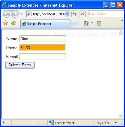
In the code snippet, Normal and HighLight are just CSS classes. Here’s a possible definition:
<style type="text/css">
.Normal {
    background-color:#FFFFEE;
}
.HighLight {
    background-color:Orange;
}
.NormalButton {
    font-weight:normal;
    width:100px;
}
.HighLightButton {
    font-weight:bold;
    width:100px;
}
</style>
CSS classes are the preferred way to define visual properties for behaviors and client controls because they let you group multiple visual attributes in a single object and, subsequently, a single class property of type string.
As mentioned, currently the vast majority of control extenders are compiled into an assembly known as the AJAX Control Toolkit. This assembly is a separate download and must be registered with any applications in which you plan to use it. The ACT project is an open-source project that results from a joint effort of Microsoft and the ASP.NET community. You can learn more about the project by visiting the home page of the project on the CodePlex Web site. The exact URL is http://www.codeplex.com/AtlasControlToolkit.
If interested, you can become a contributor to the project and have your work highlighted. The main purpose of the ACT is to provide a collection of controls and extenders that fully benefit from the ASP.NET AJAX programming model and provide free and effective Web components to developers. The ACT is expected to remain and evolve separately from ASP.NET AJAX. However, chances are that, in the future, part of the contents of the ACT assembly will be merged with the ASP.NET core binaries. Time will tell.
As of today, you have two main options for using ACT controls. You can link the full assembly to your application, or you can incorporate some of the controls as source code in your project. Before you do this, though, make sure you read the license page at http://www.codeplex.com/AtlasControlToolkit/Project/License.aspx.
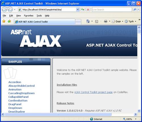
To download the latest bits of the ACT, visit the project’s home page on CodePlex: http://www.codeplex.com/AtlasControlToolkit. Once it is downloaded, the Toolkit looks like a ZIP file that you click to unpack and install any contained files.
At the end of the setup, you have a Microsoft Visual Studio 2005 ASP.NET project on your hard disk. If you run the project, you should see something like the screen shown in Figure 5-2.
If you take a tour of the project files, you’ll see that the ACT is a collection of ASP.NET AJAX controls and extenders plus many examples that illustrate their functionality and tests. In addition, the ACT contains a development kit to simplify the creation and re-use of your own custom controls and extenders. The development kit includes Visual Studio 2005 templates for Visual Basic and Visual C# to let developers write their own controls and extenders. In addition, it features a library of helper classes to speed up the creation of controls and extenders.
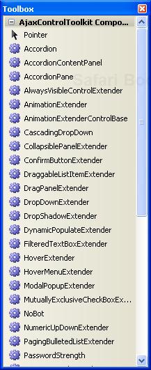
So the ACT contains a number of controls and extenders that you might want to compose and combine in your ASP.NET pages. The Visual Studio 2005 toolbox appears to be the perfect place to list all these components so that developers can pick up exactly the one they need and paste it to the current page. To add ACT components to the toolbox, you first create a new tab in the toolbox. You right-click on the toolbox surface and select Add Tab from the context menu. Once the new tab is added, you can give it any name you want—for example, AJAX Control Toolkit.
Next, you populate the tab with all components in the ACT assembly. To do this, you right-click the toolbox area below the newly added tab and select Choose Items. The standard dialog box that lists .NET assemblies and COM components will show up. Browse to the location where you installed the ACT, and select the AjaxControlToolkit assembly from the Bin folder of the SampleWebsite folder. That’s all there is to it. When you’re done, your toolbox will magically look like the one shown in Figure 5-3.
Note
In the ACT, you find a few server controls (such as TabContainer) and many more extenders (such as RoundedCorners, DropShadow, and TextBoxWatermark). What’s the difference between controls and extenders? A control provides a closed set of functionalities and a well-known, fixed behavior that you can rule only through properties and events. An extender is a (mostly) client-side behavior that can be attached to a variety of controls. For example, you can attach the DropShadow extender to a TextBox as well as to a Panel and, in both cases, the target control renders out with a shadow. In spite of such logical differences, both server controls and extenders are implemented in the same way—both are, in the end, ASP.NET server controls.
Although the ACT is a native part of the ASP.NET AJAX framework and a constituent part of the next ASP.NET platform, as of today it is simply an external library. For this reason, you need to explicitly register the ACT with each and every page where you happen to use any of its controls or extenders. You use the @Register directive, as shown here:
<%@ Register Assembly="AjaxControlToolkit"
             Namespace="AjaxControlToolkit"
             TagPrefix="act" %>
If you don’t like the idea of repeating the same code for all the pages of a given application, you can take the same shortcut that the ASP.NET team took for avoiding the same burden with ASP.NET AJAX controls.
In fact, the same ASP.NET AJAX core library discussed here is also an external library to the ASP.NET platform and would need explicit registration with each page. In ASP.NET 2.0, you can use the following configuration script to enable a @Register directive for all pages of the application:
<pages>
   <controls>
      <add tagPrefix="asp"
           namespace="System.Web.UI"
           assembly="System.Web.Extensions, ..." />
   </controls>
</pages>
For example, all controls in the System.Web.UI namespace are associated with the asp tag prefix and don’t need an explicit @Register directive in the pages where they’re used. You can add a similar block to the web.config file for ACT controls as well:
<pages>
   <controls>
      <add namespace="AjaxControlToolkit"
           assembly="AjaxControlToolkit, ..."
           tagPrefix="act" />
      ...
   </controls>
</pages>
As you may already know, the string you choose as the tag prefix is arbitrary. For the sake of clarity, though, it is not recommended that you choose the asp prefix as well. The asp prefix should be reserved for system controls.
The ACT is a library designed to extend the capabilities of the ASP.NET AJAX framework. Its control set might change in the future and could be further extended or cut down. You can check the progress of the project from the aforementioned CodePlex site. At the time of this writing, the ACT contains a fair number of extenders and controls, but they certainly don’t address every possible development scenario.
Table 5-1 lists the components currently available in the ACT. Note that the full name of the extender class contains an “Extender” suffix that I omitted in the table for brevity. So, for example, there will be no CollapsiblePanel component in the ACT assembly, but you will find a CollapsiblePanelExtender control instead.
Table 5-1. Extenders in the ACT
Component | Description |
|---|---|
AlwaysVisibleControl | Pins a control to a corner of the page, and keeps it floating over the page background as the user scrolls or resizes the page. You use this extender to make sure that, say, a given panel shows up at the top-left corner of the page regardless of the scroll position or the size of the browser window. |
Animation | Provides a specialized framework for adding animation effects to controls hosted in ASP.NET pages. You associate client-side events of the target control with one or more of the predefined animation effects. |
AutoComplete | Associated with a text box, provides a list of suggestions for the text to type in the field. |
Calendar | Attached to a text box, the extender provides client-side date-picking functionality with customizable date format and pop-up control. |
CascadingDropDown | Associated with a DropDownList control. This extender automatically populates the list with data retrieved from a Web service method. The nice thing about this extender is that you can create a hierarchy of drop-down lists and have the extender automatically populate child drop-down lists based on the current selections in any of the previous lists in the heirarchy, if any. |
CollapsiblePanel | Adds collapsible sections to a Web page. This extender can be used only with panel controls—that is, with the ASP.NET Panel control or any class derived from it. You let the extender know which panel in the page acts as the header and which panel provides the contents that collapse and expand. |
Associated with a button control. This extender adds a confirmation JavaScript dialog box to the click event of the button. The extender is supported on any class that implements the IButtonControl interface, including Button, LinkButton, and ImageButton. | |
DragPanel | Associated with panel controls. This extender adds drag-and-drop capabilities so that you can move the panel around the page. You can specify the contents to move as well as the handle that, if pressed, triggers the dragging operation. |
DropDown | The extender provides a mouse-over link to open a drop-down panel. |
DropShadow | Adds drop shadows to any control available on the page. With this extender, you can specify the opacity and width of the shadow. |
DynamicPopulate | Updates the contents of a control with the result of a Web service or page method call. |
FilteredTextBox | Lets users enter text in a TextBox control that matches a given set of valid characters. |
HoverMenu | Displays the contents of an associated panel control when the mouse hovers next to a given control. You can associate this extender with any ASP.NET control. The extender works as a kind of specialized and extremely flexible ToolTip. |
MaskedEdit | Lets users enter text in a TextBox control according to a given input layout. |
ModalPopup | Associated with a control that can fire a client-side onclick event (typically, buttons and hyperlinks), this extender implements a classic modal dialog box without using HTML dialog boxes. Basically, it displays the contents of a given panel and prevents the user from interacting with the rest of the page. |
MutuallyExclusiveCheckBox | Associated with CheckBox controls, this extender lets you define logical groups of check boxes so that users can check only one in each group. |
NoBot | Applies some anti-bot techniques to input forms. Bots, or robot applications, are software applications that run automated tasks over the Internet. For example, bots are used to fill input forms and submit ad hoc values. |
NumericUpDown | Associated with text box controls, this extender allows you to click automatically displayed buttons to enter the next/previous value in the field. It works with numbers, custom lists, and Web service methods. |
PagingBulletedList | Associated with BulletedList controls, this extender groups all items bound to the list and organizes them in client-side sorted pages. |
PasswordStrength | Associated with text box controls used to type a password, this extender provides visual feedback on the strength of the password being typed. |
PopupControl | Transforms the contents of a given panel into a pop-up window without using HTML dialog boxes. You can associate this extender with any control that can fire any of the following client-side events: onfocus, onclick, and onkeydown. |
ResizableControl | Attaches to any page element, and allows the user to resize the element using a handle placed at the lower-right corner of the control. |
RoundedCorners | Adds a background panel to any ASP.NET control so that the control appears with rounded corners. The overall height of the original control changes slightly. |
Slider | Extends a TextBox control with a slider user interface. |
TextBoxWatermark | Associated with TextBox controls. This extender adds sample or prompt text, called a “watermark,” that illustrates the type of text the user is expected to enter in the field. For example, the watermark might say, “Type your name here.” The watermark text disappears as soon as the user starts typing and reappears as the text box becomes empty. |
ToggleButton | Associated with CheckBox controls. This extender enables you to use custom images to render the check buttons. You can use different images to indicate the selected and cleared states. |
UpdatePanelAnimation | Plays animations during key steps of a partial update. You can use the extender to animate the page both while the panel is being updating and when the update has completed. |
ValidatorCallout | Works on top of ASP.NET validators, and improves their user interface. In particular, the extender displays a yellow callout with the error message. |
As you can probably guess, some extenders listed in the table require rich browser capabilities, whereas others are just a smart piece of JavaScript code attached to a block of markup elements. Note that all these features work in a cross-browser way. I’ll return to each of the aforementioned extenders with code samples and more details in a moment.
Along with all the extenders listed in Table 5-1, the ACT also supplies a few traditional server controls with rich capabilities: the Accordion, Rating, ReorderList and TabContainer controls.
The Accordion control allows you to provide multiple collapsible panes and display only one at a time. When the user clicks a new pane, the currently displayed pane is collapsed to leave room for the new one.
The Rating control provides an intuitive user interface to let users select the number of stars that represents their rating of a given subject. The control is the wrapped-up version of the user interface that several Web sites provide to let users rate published items.
A data-bound control, ReorderList, allows its child elements to be reordered on the client using drag-and-drop functionality. To move an item in the list, the user drags the item’s handle up to its new position. At the end of the operation, the control posts back so that the new status of the data source can be recorded.
Finally, the TabContainer control is a purely client-side container of tabbed forms.
Let’s first get to know more about these controls and then move on to discuss extenders.
Collapsible panels are a frequent feature in modern and cutting-edge Web sites. They allow you to display a short highlight—the header—and keep more text hidden and available on demand. The CollapsiblePanel extender (discussed later) allows you to hide and display any block of markup. But what if you need to build a sort of hierarchy of panels?
The Accordion control allows you to group multiple collapsible panels in a single control, and it manages the collapsed/expanded state of each panel so that only one can be expanded at a time.
The Accordion control contains a collection of child AccordionPane controls, each of which features a template property to define header and content. Each pane can include any HTML, ASP.NET, or ASP.NET AJAX markup you want.
Table 5-2 lists the key properties of the Accordion control.
Table 5-2. Properties of the Accordion Control
Property | Description |
|---|---|
AutoSize | The value assigned to this property indicates how the control will determine its actual size. |
ContentCssClass | Gets and sets the CSS class used to style the content of child panes. |
FadeTransitions | Indicates whether to use a fade-out transition effect while hiding the current pane. This property is set to false by default. |
FramesPerSecond | Gets and sets the number of frames per second used in the transition animation for the newly selected pane. This property is set to 30 frames by default. |
HeaderCssClass | Gets and sets the CSS class used to style the header of child panes. |
Panes | Returns the collection of child panes. |
SelectedIndex | Gets and sets the currently expanded pane. |
TransitionDuration | Gets and sets the number of milliseconds to animate the transition. This property is set to 250 by default. |
As you can see, the control has no visual properties except for the ASP.NET base properties defined on the parent WebControl class (such as BackColor, ForeColor, and so on). In particular, there’s no style property for child panes. To style the header and content of child panes, you use CSS classes. Note that if the control worked through regular postbacks, you would probably have had Style objects instead of CSS class properties, as in many other classic ASP.NET controls.
The Accordion control supports animation in two different contexts. First, it might optionally fade out the content of the current pane when a new one is selected. This effect is controlled by the FadeTransitions Boolean property. The effect is not very visible on small-sized content panes. Note also that the fade animation is tightly coupled with the transition animation that slowly rolls down the content of the new pane.
This second form of animation is controlled by the TransitionDuration and FramesPerSecond properties. If this latter effect is disabled, you won’t see any fade-out effect regardless of the setting of the FadeTransitions property.
To skip transition animation completely and obtain a quick swap of panes, you set both FramesPerSecond and TransitionDuration to 0. If you do so, also set FadeTransitions to false to save the control unnecessary tasks that will produce no observable effects.
The size of the Accordion control is clearly determined by any container element as well as the content of the various panes. This means that the overall size of the accordion might vary with the selected pane. In this case, other elements in the page might be pushed up or down. The AutoSize property helps to keep the overall size of accordion under control.
The AutoSize property takes its values from the AutoSize enumeration, whose values are None (default), Limit, and Fill. When the AutoSize property is set to None, the accordion modifies its size freely following the size of the selected pane.
When you set AutoSize to Limit, the accordion never grows larger than the value specified by its Width and Height properties. The Accordion control inherits these properties from its base class. The Height and Width properties are both ignored if None is set. If the content to display is larger than the designated size of the accordion, scrollbars are employed to let users see all of it.
With the Fill value set, the accordion stays exactly within the bounding box delimited by the Width and Height properties. In this case, the content will be expanded or made scrollable if it isn’t the right size. Expanding the contents just means making the pane larger.
The accordion consists of a number of child panes, each of which is an instance of the AccordionPane class. You add panes using markup and retrieve the collection of panes programmatically using the Panes collection property.
The following code demonstrates the usage of the Accordion control:
<div style="width:300px;">
   <act:Accordion ID="Accordion1" runat="server" Height="400px"
        SelectedIndex="0"
        ContentCssClass="accordionContent"
        HeaderCssClass="accordionHeader"
        FadeTransitions="true"
        AutoSize="Fill">
      <Panes>
         <act:AccordionPane ID="AccordionPane1" runat="server">
            <Header>One</Header>
            <Content>This is the first pane</Content>
         </act:AccordionPane>
         <act:AccordionPane ID="AccordionPane2" runat="server">
            <Header>Two</Header>
            <Content>
               <div style="height:400px">
               This is the second pane</div>
            </Content>
         </act:AccordionPane>
         <act:AccordionPane ID="AccordionPane3" runat="server">
            <Header>Three</Header>
            <Content>This is the third pane</Content>
         </act:AccordionPane>
         <act:AccordionPane ID="AccordionPane4" runat="server">
            <Header>Four</Header>
            <Content>This is the fourth pane</Content>
         </act:AccordionPane>
      </Panes>
   </act:Accordion>
</div>
You add an <act:AccordionPane> element for each collapsible panel you want to display. Each pane consists of a <header> and <content> template.
The sample accordion is embedded in a fixed-width <div> tag. The outermost container determines the width and height of the accordion. The AutoSize property set to Fill forces the accordion to cover and fill the whole bounding box. Figure 5-4 shows the results.
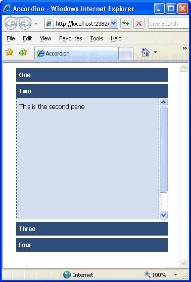
Note that the content of the second pane is set to a height of 400 pixels; the accordion itself, though, can’t be taller than 400 pixels and can’t grow uncontrolled because of the AutoSize setting. As a result, the second pane displays a scrollbar to let you see the content that exceeds that limit.
An accordion pane is a simple Web control named AccordionPane. It has a Header template property that you use to define the highlighting of the panel—that is, the portion of the panel that is visible also when it is collapsed. You can style the header using the settings in the CSS class defined by the HeaderCssClass property.
Likewise, the content of the pane is defined by the Content template property and styled using the settings in the CSS class referenced by the ContentCssClass property.
The satisfaction of users is one of the key metrics used to determine the success of a Web site. And how do you recognize the satisfaction level of a user? Many Web sites kindly ask users to provide their feedback through ad hoc panels scattered through the pages. The most common user-interface pattern for user feedback is a ratings system. The Web site shows a fixed number of stars and lets users click those stars to rate a given feature (usually, more stars clicked indicates a higher level of satisfaction).
Most ASP.NET developers can easily arrange a rating mechanism that works through classic postbacks. The ACT Rating control, on the other hand, provides a standard rating mechanism that works over callbacks.
The output of the control consists of a repeated <span> tag that is decorated through a set of CSS classes. Each <span> tag represents a “star” in the rating system and is styled according to the status it represents. Figure 5-5 gives you an idea of the Rating control.
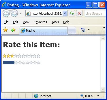
Table 5-3 lists the key properties of the Rating control.
Table 5-3. Properties of the Rating Control
Property | Description |
|---|---|
AutoPostBack | Indicates whether the control will post back whenever the user rates a given associated content. |
CurrentRating | Gets and sets the current value rendered by the control. The default value is 3. |
EmptyStarCssClass | Gets and sets the CSS class to render an unselected star. |
FilledStarCssClass | Gets and sets the CSS class to render a selected star. |
MaxRating | Gets and sets the maximum value that can be rated through the control. The default value is 5. |
RatingAlign | Indicates the alignment of the stars. The default is horizontal. |
RatingDirection | Indicates the orientation of the stars. The default is left to right if the RatingAlign value is horizontal and top to bottom if RatingAlign is vertical. |
ReadOnly | Indicates whether the control accepts user input. |
StarCssClass | Gets and sets the CSS class to style the whole control. |
Tag | A string to pass to the server-side code that handles the user’s click. |
WaitingStarCssClass | Gets and sets the CSS class to render selected stars during a server postback following a user update. |
The markup generated by the Rating control looks like the following code:
<div id="Rating1" style="float: left;">
<span id="Rating1_Star_1" class="ratingStar filledRatingStar"
style="float:left;"> </span>
<span id="Rating1_Star_2" class="ratingStar filledRatingStar"
style="float:left;"> </span>
...
</div>As you can see, each “star” is characterized by a unique ID and is represented with a <span> tag set to the empty string. In Figure 5-5, though, each star is clearly an image. How is that possible?
The Rating control supports four different CSS classes. StarCssClass defines the style for the entire control. WaitingStarCssClass defines the style to be used when the control is posting back. EmptyStarCssClass and FilledStarCssClass define the style for the <span> tag. You can use either an image to fill the tag or a contrasting background color. Let’s consider the following CSS classes:
.filledRatingStar
{
    background-color: #2E4d7B;
}
.emptyRatingStar
{
    background-image: url(images/NotSelected.png);
}
These classes produce an effect like the second rating object shown in Figure 5-5. The selected part is rendered as a gauge bar; the unselected part is rendered using empty stars. By editing the CSS classes, you can choose the “star” images to meet the expectations of the users of your application.
The Rating control is relatively simple to use. It only requires you to set a few properties—the CSS classes—and it has no child elements or templates.
The following code demonstrates the usage of the Rating control:
<h2>Rate this item:</h2>
<div>
    <act:Rating ID="Rating1" runat="server"
         CurrentRating="3"
         MaxRating="10"
         StarCssClass="ratingStar"
         WaitingStarCssClass="savedRatingStar"
         FilledStarCssClass="filledRatingStar"
         EmptyStarCssClass="emptyRatingStar"
         OnChanged="Rating_Changed" />
</div>
The MaxRating property determines the number of stars to render. Of these, the first stars (or the last ones, depending on the direction) up to the value specified by CurrentRating are styled using the class name specified by FilledStarCssClass. The remaining stars are styled using the attributes set by EmptyStarCssClass.
Specifying valid CSS class names is key. If you omit, say, the empty-star style, the corresponding <span> tag will be rendered as is, without any graphical adjustments. Because the <span> tag is set to the empty string, no visible output will be generated.
The Rating control injects into the client browser a piece of script code that does two main things. First, it captures mouse movements over the bounding box of the control. Second, it handles the user’s clicking.
As the user moves the mouse over the unselected stars, the script code automatically toggles the class name of the underlying <span> tag to give you an idea of the interface if you select the given number of stars.
To change the current value, you just click on the star that represents the new value. For example, in an rating system with five stars, you click on the fourth star to set a rating of 4. When this happens, the Rating control makes an out-of-band call to the server and raises the Changed event:
protected void Rating_Changed(object sender, RatingEventArgs e)
{
    // Perform any significant server-side action
    // such as storing the new value to a database
}
The RatingEventArgs class contains three main properties: Tag, Value, and CallbackResult. Tag is a cargo property used to carry any custom string from the client to the server. Value indicates the currently selected value in the control. CallbackResult, on the other hand, is a string property you can set on the server with any information you want to bring back to the client. For example, you can use the Changed event to store the rating value to a database and use the CallbackResult string to return an error message if the operation fails.
Data-bound lists of data are commonly displayed to Web users and, most of the time, are read-only, immutable lists. There might be situations, though, in which the end user might want to reorder a displayed list of items. A good example is a page on which the user can select multiple cities in the world to be informed about the current weather. The cities appear in a given order on the page, but the user might want to change the order at some point.
As a developer, you can add a Move Up button to the page and have the user click three times to bring the last city to the top of a list with four cities. Although this approach is functionally effective, it is certainly not very user friendly. A more natural approach would be to enable the user to simply select the item of a given city and drop it to the desired new location.
This is exactly what the ReorderList control allows you to do. Let’s learn more about this new ASP.NET AJAX control.
The contents of the ReorderList control are expressed through a series of templates that you use to indicate the structure of each data-bound item, the user interface for the drag handle, and the user interface for the insertion point where the dragged item is being moved. More properties and events, though, interact to form the programming interface of the control.
Table 5-4 lists the key properties of the ReorderList control. In particular, the list describes the properties that can be set through attributes in an ASP.NET Web page. The control, in fact, derives from DataBoundControl and implements the IRepeatInfoUser interface—the typical interface for controls that support a variety of alignments and layouts, such as CheckBoxList. The base class and the interface include a bunch of additional properties that relate to data binding and control layout.
Table 5-4. Properties of the ReorderList Control
Property | Description |
|---|---|
AllowReorder | Indicates whether the control supports drag-and-drop reordering. This property is automatically set to true if a reorder template is specified. |
DataKeyField | Indicates the name of the data-bound source that operates as the primary key field. |
DataSourceID | Indicates the ID of the data source control used to populate the control. |
DragHandleAlignment | Indicates the position of the drag handle with respect to the item to drag. It can have any of the following values: Top, Left, Bottom, or Right. |
DragHandleTemplate | The template for the drag handle that the user clicks to drag and reorder items. |
EditItemTemplate | The template used to show that a row is in edit mode. |
EmptyListTemplate | The template used to show that the list has no data. This item is not data bindable. |
InsertItemTemplate | The template used to add new items to the list. |
ItemInsertLocation | When the InsertItemTemplate property is used to add a new item to the displayed list, this property indicates where the item has to be inserted. Feasible values are Beginning and End. |
ItemTemplate | The template for any items in the list. |
PostBackOnReorder | Indicates whether the control has to post back at the end of a reorder operation. |
ReorderTemplate | The template used to show the drop location during a reorder operation. This template is not data bindable. |
SortOrderField | The field, if any, that represents the sort order of the items. |
The key properties are ItemTemplate, DragHandleTemplate, and ReorderTemplate. ItemTemplate allows you to populate the list control with any information and layout you need. DragHandleTemplate defines the graphical elements that users need to identify when they want to reorder the list. Finally, the ReorderTemplate defines the template of the visual feedback that is shown to the user while the operation is occurring.
The ReorderList control is primarily a data-bound control with a rich user interface largely made up of templates. This means that the control can include a number of child controls that might trigger postbacks and cause the contents of the control to change.
It is not surprising, then, to find a long list of events associated with this control. These events are detailed in Table 5-5.
Table 5-5. Events of the ReorderList Control
Event | Description |
|---|---|
CancelCommand | Occurs when a button with the CommandName of “Cancel” is clicked from within the control. |
DeleteCommand | Occurs when a button with the CommandName of “Delete” is clicked from within the control. |
EditCommand | Occurs when a button with the CommandName of “Edit” is clicked from within the control. |
InsertCommand | Occurs when a button with the CommandName of “Insert” is clicked from within the control. |
ItemCommand | Occurs when a button is clicked from within the item template of a row. |
ItemCreated | Occurs when an item row is created. |
ItemDataBound | Occurs when an item row is bound to its data. |
ItemReorder | Occurs when an item row is moved to a new location at the end of a reorder operation. |
UpdateCommand | Occurs when a button with the CommandName of “Update” is clicked from within the control. |
Most command events are related to the capabilities of the bound data source. For example, the InsertCommand event occurs if the control features a proper template with controls to capture data and invoke an Insert command on the bound data source control. Here’s a quick example:
<act:ReorderList ...>
    ...
    <InsertItemTemplate>
        <div>
            <asp:TextBox ID="TextBox1" runat="server"
                Text='<%# Bind("Title") %>'></asp:TextBox>
            <asp:LinkButton ID="LinkButton1" runat="server"
                CommandName="Insert">Add</asp:LinkButton>
        </div>
    </InsertItemTemplate>
</act:ReorderList>
By clicking on the link button, you cause the ReorderList control to invoke the Insert command on the bound data source, if there is any. The new item, which will have a Title property, is added at the top or bottom of the data source based on the value of the ItemInsertLocation property.
The ItemReorder event is fired on the server before the new control is rendered back to the client with the new order of items. The event carries a ReorderListItemReorderEventArgs object with the following structure:
public class ReorderListItemReorderEventArgs : EventArgs
{
      public ReorderListItem Item { get; set; }
      public int NewIndex { get; set; }
      public int OldIndex { get; set; }
}
The Item property indicates the item being moved, whereas NewIndex and OldIndex specify the new and old positions (a 0-based index), respectively.
Let’s consider a sample page that makes use of the ReorderList control. As you’ll see in a moment, the ReorderList control must be bound to a data source and embedded in an UpdatePanel control.
The following code snippet demonstrates a sample reorder list control bound to an ObjectDataSource control:
<act:ReorderList runat="server" ID="list"
    DataSourceID="ObjectDataSource1">
    <ItemTemplate>
        <asp:Label ID="Label1" runat="server"
            Text='<%# Eval("lastname") %>' />
    </ItemTemplate>
    <ReorderTemplate>
        <asp:Panel ID="Panel2" runat="server" CssClass="reorderCue" />
    </ReorderTemplate>
</act:ReorderList>
<asp:ObjectDataSource ID="ObjectDataSource1" runat="server"
    TypeName="IntroAtlas.EmployeeManager"
    SelectMethod="LoadAll">
</asp:ObjectDataSource>
The sample control has no DragHandleTemplate set, which means that its user interface has no visible element to start dragging. In this case, the output looks like a bulleted list, and to start reordering you simply click and drag the text beside the bullet point, as shown in Figure 5-6.
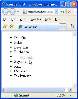
Generally, the item being moved is rendered through a template that you specify via the ReorderTemplate property. In this case, the reorder template consists of the sole text of the item plus a cascading style. If you omit the template but still enable reordering through the AllowReorder Boolean property, the text of the item, rendered with a gray color, is used to give feedback to users about the ongoing operation.
Building a reorder list that allows items to be moved around is a breeze. However, a couple of essential issues still need to be properly addressed.
The ReorderList control can be configurated to post back at the end of each drag-and-drop operation. To avoid a full page refresh, you need to wrap the ReorderList control in an UpdatePanel control. As explained in Chapter 4, in this way you guarantee that only the user interface of the list control is refreshed rather than the entire page being updated with a complete postback. The following few lines of markup can accomplish this for us:
<asp:UpdatePanel runat="server" ID="UpdatePanel1">
    <ContentTemplate>
        ...
        <!-- ReorderList goes here -->
        ...
    </ContentTemplate>
</asp:UpdatePanel>
Why does the control do a postback of its own? The ReorderList control attempts to persist the changes the user made so that if any postback occurs from within the page—say, a postback caused by the user clicking on another button in the page—the contents of the ReorderList, as modified via a drag-and-drop operation, are maintained. Note, in fact, that any changes made on the client should be persisted on the server; otherwise, they will be lost in the first subsequent page postback.
If you run a page that contains a ReorderList control, you notice that invariably after a postback, any moved element is restored to its original location. Why is that so? At the end of the drop operation, the ReorderList control posts back, fires the ItemReorder event on the server, and rebuilds the list. The list is data bound, so unless you change something in the binding process, the list will be bound back to the same record set in the same old order.
Subsequently, a page that hosts a ReorderList control should wire up the ItemReorder event and make sure that the data source bound to the control properly reflects the changes generated on the client. The ItemReorder event has the following signature:
void OnItemReorder(object sender, ReorderListItemReorderEventArgs e)
In this event handler, you should do the real work of the reorder—that is, move the item from the old position to the new position in the data source used to populate the list. How you do this depends on the binding mechanism. If you opted for a data source control (for example, ObjectDataSource), you can try sorting on a given field, if any, that reflects the new order. If you set the data source assigning an IEnumerable object to the DataSource property, you can retrieve and modify this object to reflect the new order. For a DataTable, for example, this means swapping two rows.
Multiple views are a common feature in most pages. They group information in tabs and let users click to display only a portion of the information available. In ASP.NET 2.0, the MultiView control provides an effective shortcut to this feature. But it requires a postback to update the page when the user selects a new tab. In the ACT, the TabContainer control provides an AJAX version of the multiview control.
The TabContainer control is made of a collection of tabs, each of which is represented by an instance of the TabPanel class. You can add and remove panels programmatically, as well as define them declaratively.
Table 5-6 lists the properties supported by the control.
Table 5-6. Properties of the TabContainer Control
Property | Description |
|---|---|
ActiveTab | Returns a reference to the currently selected tab. |
ActiveTabIndex | Gets and sets the 0-based index of the selected tab. |
CssClass | Gets and sets the CSS class to use to style the control. |
Height | Gets and sets the height of the tabs. The value of the property is expressed as a Unit value. This value doesn’t include headers. |
OnClientActiveTabChanged | Gets and sets the JavaScript code to be executed on the client when the user changes the selection. |
Scrollbars | Gets and sets the desired support for scrollbars. This property is set to Auto by default. Feasible values come from the ASP.NET 2.0 Scrollbars type. |
Tabs | Returns the collection of TabPanel objects that defines the user interface of the control. |
Width | Gets and sets the width of the tabs. The value of the property is expressed as a Unit value. |
In addition, the control fires the ActiveTabChanged event when the selected tab changes. The event is a mere notification, and the required delegate is EventHandler. No additional information is passed along with the event.
The TabPanel class represents an individual tab in the container. Each tab defines its header either as plain text or as a template. Likewise, a tab features a template to let developers specify its content. The most recent tab should remain selected after a postback. Table 5-7 lists the properties of the TabPanel class.
Table 5-7. Properties of the TabPanel Class
Property | Description |
|---|---|
ContentTemplate | Sets the contents of the tab. |
Enabled | Indicates whether the tab should be displayed. The value of the property can be changed on the client. |
HeaderTemplate | Gets and sets the template to use to define the header of the tab. |
HeaderText | Gets and sets the text to display in the tab’s header. |
OnClientClick | JavaScript code to attach to the client-side click event of the tab. |
OnClientPopulated | JavaScript code to run on the client when the tab has been fully populated. |
OnClientPopulating | JavaScript code to run on the client when the tab is going to be populated. |
Scrollbars | Gets and sets the desired support for scrollbars. This property is set to Auto by default. Feasible values come from the ASP.NET 2.0 Scrollbars type. |
The JavaScript code you can attach to some client events can be either the name of function embedded in the host page or a string of JavaScript executable code.
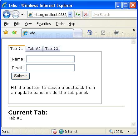
Let’s consider a sample page that makes use of the TabContainer control. As you’ll see in a moment, the markup required for a tab container is straightforward.
The TabContainer tag maps its child tags to the Tabs collection of TabPanel objects. You add one <TabPanel> tag for each desired tab and configure it at will. Here’s an example:
<act:TabContainer runat="server" ID="TabContainer1">
    <act:TabPanel runat="server" ID="TabPanel1" HeaderText="Your Tab">
        <ContentTemplate>
            <h3>Some text here</h3>
        </ContentTemplate>
    </act:TabPanel>
    ...
</act:TabContainer>
All tabs are given the same size, and you can control the size designation through the Width and Height properties of the container. The height you set refers to the body of tags and doesn’t include the header.
You can add some script code to run when the user selects a new tab. You can wrap up all the code in a page-level JavaScript function and bind the name of the function to the OnClientActiveTabChanged property of the tab container. The following code writes the name of the currently selected tab to a page element (originally, an ASP.NET Label control) named CurrentTab:
<script type="text/javascript">
    function ActiveTabChanged(sender, e)
    {
        var tab = $get('<%=CurrentTab.ClientID%>'),
        tab.innerHTML = sender.get_activeTab().get_headerText();
    }
</script>
Note the usage of code blocks in JavaScript. In this way, the client ID of the label is merged in the script regardless of whether the page is a regular page or a content page (with a hierarchy of parent controls and naming containers). Figure 5-7 shows the control in action.
As a full-fledged ASP.NET AJAX control, the TabContainer control exposes a client-side object model. In particular, there’s a set of properties that represents the programming interface of the container and another set of properties for each tab panel.
The container features read/write properties—such as activeTabIndex, activeTab, tabs, and scrollBars—plus the activeTabChanged event.
The tab panel exposes read/write properties such as enabled, headerText, and scrollBars along with a read-only tabIndex property and a few events—click, populating, and populated.
In addition to finding full-fledged server controls such as ReorderList and Accordion in the ACT, you find a bunch of other server controls designed to extend existing controls on the page and provide them with new and additional behaviors. Existing extenders can be categorized into a few groups: panel, input, popup, user interface, animation, and button. Let’s dig deeper into these groupings.
ASP.NET pages are full of blocks of markup that, ideally, users would love to move around, collapse if too large, and expand on demand. The perfect panel control in ASP.NET is, therefore, both draggable and expandable. Purposely, ASP.NET AJAX defines a few server-side behaviors that allow you to easily create collapsible sections and drag panels around the page.
The extender builds up a collapsible section in your pages by combining two panels—one acting as the content panel, and one being the expand/collapse controller. In its simplest form, the CollapsiblePanel extender looks like the following code sample:
<act:CollapsiblePanelExtender ID="CollPanel" runat="server"
        TargetControlID="ContentPanel"
        ExpandControlID="HeaderPanel"
        CollapseControlID="HeaderPanel" />
As usual, the TargetControlID property sets the target panel to expand or collapse. ExpandControlID and CollapseControlID indicate the panel to use to expand and collapse the content panel. Note the extreme flexibility of the component design—it might not make sense in all cases, but you can use different panels to control the expansion and collapsing of the content panel. In most cases, though, you’ll be using the same header panel with an image button that changes according to the state of the content panel. The following code snippet shows a more complete usage for the extender:
<act:CollapsiblePanelExtender ID="cpe" runat="server"
TargetControlID="CollapsibleCustomersPanelContent"
ExpandControlID="CollapsibleCustomersPanel"
CollapseControlID="CollapsibleCustomersPanel"
Collapsed="true"
ExpandDirection="Vertical"
ImageControlID="ToggleImage"
ExpandedImage="~/images/collapse.jpg"
ExpandedText="Collapse"
CollapsedImage="~/images/expand.jpg"
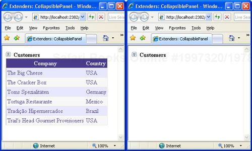
CollapsedText="Expand" />The ImageControlID indicates the Image control, if any, that if clicked causes the panel to expand or collapse. The ExpandedImage and CollapsedImage properties set the URL of the images to use to expand and collapse. Likewise, CollapsedText and ExpandedText set the ToolTip text for the image. Collapsed sets the state of the panel, whereas ExpandDirection indicates whether the panel expands horizontally or vertically. Figure 5-8 provides a view of the control in action.
The following code demonstrates a typical pair of Panel controls used with the extender:
<asp:Panel ID="CollapsibleCustomersPanel" runat="server">
    <asp:Image ID="ToggleImage" runat="server"
               ImageUrl="~/images/collapse.jpg" />
    <b>Customers</b>
</asp:Panel>
<asp:Panel ID="CollapsibleCustomersPanelContent" runat="server"
     Height="0" CssClass="collapsePanel">
    ...
</asp:Panel>
Unlike draggable panels, the header and content panels are distinct and are typically placed one after the next in the page layout. The extender panel is also postback aware, meaning that, on a client postback, it automatically records and restores its collapsed/expanded client state.
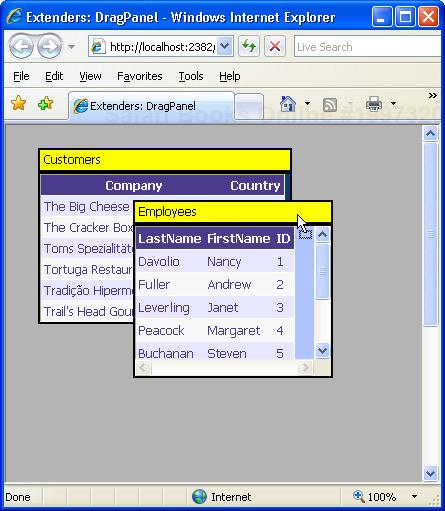
The DragPanel extender is one of the simplest extenders in the ACT. It has only two properties—one to indicate the panel to drag, and one to indicate the panel to use as the drag handle:
<act:DragPanelExtender ID="DragPanelExtender1" runat="server"
         TargetControlID="CustomerPanel"
         DragHandleID="CustomersDragHandle" />
As the name suggests, the TargetControlID property refers to the ID of the panel control in the page that is going to be moved. The DragHandleID, on the other hand, indicates the ID of the panel control that is used as the handle of the drag. In other words, to drag the target panel users drag and drop the handle panel. Although functionally distinct, the two panels are, in effect, logically correlated and rendered through nested tags:
<asp:Panel ID="CustomersPanel" runat="server" >
    <asp:Panel ID="CustomersDragHandle" runat="server">
        <div style="background-color:yellow">Customers</div>
    </asp:Panel>
    <asp:Panel runat="server">
        <asp:gridview runat="server" DataSourceID="ObjectDataSource1">
            <Columns>
                ...
            </Columns>
        </asp:gridview>
        <asp:ObjectDataSource ID="ObjectDataSource2" runat="server"
            TypeName="IntroAjax.CustomerManager"
            SelectMethod="LoadAll">
         </asp:ObjectDataSource>
    </asp:Panel>
</asp:Panel>
The target panel usually contains as a child the drag handle panel. In this way, you obtain the effect of moving the whole panel as if it were a Microsoft Windows window. (See Figure 5-9.)
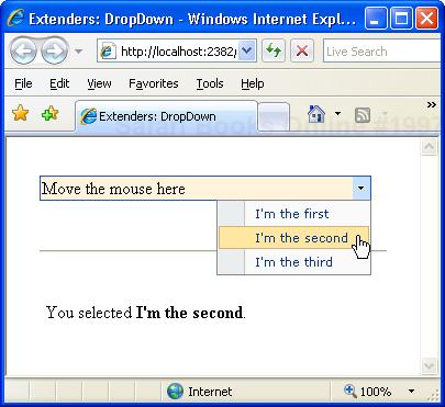
The DropDown extender can be attached to virtually any ASP.NET control. Once attached to a control, the extender provides a mouse-over link to open a drop-down panel. The contents of the panel are entirely up to you—typically, arranged as a menu. The drop-down is activated by clicking the extended control with any mouse buttons.
<asp:Label ID="Label1" runat="server" Text="Move the mouse here" />
<asp:Panel ID="Panel1" runat="server" CssClass="ContextMenuPanel"
     Style="display:none;visibility:hidden;">
    <asp:LinkButton runat="server" ID="Option1" Text="I'm the first"
         CssClass="ContextMenuItem" OnClick="LinkButton1_Click" />
    <asp:LinkButton runat="server" ID="Option2" Text="I'm the second"
         CssClass="ContextMenuItem" OnClick="LinkButton1_Click" />
    <asp:LinkButton runat="server" ID="Option3" Text="I'm the third"
         CssClass="ContextMenuItem" OnClick="LinkButton1_Click" />
</asp:Panel>

<act:DropDownExtender runat="server" ID="DropDownExtender1"
     TargetControlID="Label1" DropDownControlID="Panel1" />
In the sample just shown, the drop-down user interface is a Panel that contains a list of link buttons. Link buttons are styled to look like menu items. Link and push buttons, and indeed embedded controls in general, operate normally. (See Figure 5-10.)
Buttons are by far one of the most common elements in ASP.NET pages. However, as pages become functionally richer, additional features are required for buttons to stay in sync with users’ expectations. ASP.NET AJAX provides a few extenders that apply to submit buttons and to the pseudo-buttons that form a CheckBox element.
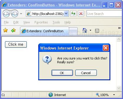
Many times, a safe approach to responding to a user clicking a button is to ask the user for a confirmation for the operation she’s going to start. A common solution for implementing this behavior entails that the ASP.NET page attach some script code to the button to pop up a JavaScript message box with a confirmation message. The ConfirmButton extender greatly simplifies this common task by making it declarative:
<asp:Button runat="server" ID="Button1" Text="Click me" />

<act:ConfirmButtonExtender ID="ConfirmButtonExtender1" runat="server"
        TargetControlID="Button1"
        ConfirmText="Are you sure you want to click this?
Really sure?" />
The ConfirmText property specifies the text of the message box being displayed as the user clicks the button. Note that HTML entities can be used in the text, but by design no HTML formatting, such as <b> or <i>, can be used. You can, however, use entitized special characters. For example, you can use to break the line and continue the text on the next line. The reason for this lies in the JavaScript code for the ConfirmButton—it’s using JavaScript’s window.confirm. Providing HTML formatting makes no sense because the confirmation dialog box is basically a non-HTML Windows MessageBox call.
Internally, the ConfirmButton extender sets a handler for the onsubmit event of the form and swallows the event if the user doesn’t confirm the operation. Only controls that implement the IButtonControl interface can be used with the extender, including LinkButton and ImageButton controls. (See Figure 5-11.)
The MutuallyExclusiveCheckBox extender can be attached to any ASP.NET CheckBox control to make it part of a group of logically related options. The extender implements a behavior that looks a lot like a list of radio buttons—multiple options are available but only one can be chosen. So what’s the point of having a mutually exclusive set of check boxes rather than a radio button list?
A list of radio buttons can be initially unselected, but once one option has been selected there’s no way for the user to return to the initial state of having all options unselected. Returning to the original, completely unselected state is possible with the MutuallyExclusiveCheckBox extender.
The idea is that you group a number of check boxes under the same key. The extender then ensures that only one check box with the specified key can be selected at a time:
<h2>What Kind of Experience Do You Have with ASP.NET?</h2>
<asp:CheckBox runat="server" ID="chkBeginner" Text="Beginner" />
<asp:CheckBox runat="server" ID="chkIntermediate" Text="Intermediate" />
<asp:CheckBox runat="server" ID="chkExpert" Text="Expert" />

<act:MutuallyExclusiveCheckBoxExtender runat="server" ID="Mutual1"
    TargetControlID="chkBeginner"
    Key="AspNetExpertise" />
<act:MutuallyExclusiveCheckBoxExtender runat="server" ID="Mutual2"
    TargetControlID="chkIntermediate"
    Key="AspNetExpertise" />
<act:MutuallyExclusiveCheckBoxExtender runat="server" ID="Mutual3"
    TargetControlID="chkExpert"
    Key="AspNetExpertise" />
It can be argued that the same functionality could have been applied to radio buttons instead of check boxes. Using check boxes was the choice of developers, and it also provides a more consistent and expected user interface. However, you can re-implement the behavior to use JavaScript to allow the deselection of a radio button item.
Check boxes are graphical HTML elements visually represented by a pair of little bitmaps (selected and unselected) plus companion text. Each browser can use its own pair of bitmaps, thus resulting in the check boxes having a slightly different look and feel. Most browsers, though, tend to represent check-box buttons as square embossed buttons.
The ToggleButton extender provides a way to simulate a check-box element that uses custom bitmaps. The extender is applied to a CheckBox control, and it replaces the control with a completely new markup block that uses custom images and provides the same behavior as a standard check box:
<act:ToggleButtonExtender ID="ToggleButtonExtender1" runat="server"
        TargetControlID="CheckBox1"
        ImageWidth="19"
        ImageHeight="19"
        UncheckedImageUrl="DontLike.gif"
        CheckedImageUrl="Like.gif" />
ImageWidth and ImageHeight properties indicate the desired size of the images. Note that these attributes are required. UncheckedImageUrl and CheckedImageUrl specify the images to use when the check box is selected or not selected.
Virtually every Web developer has a sort of love/hate relationship with pop-up windows. As a matter of fact, pop-up windows often greatly simplify a number of tasks—especially modal dialog boxes. One of the nasty things about HTML pop-up windows is that they are browser windows and require a page to navigate. The pop-up extenders that ASP.NET AJAX Extensions has to offer, on the other hand, do not require a new browser instance. Instead, they are limited to popping up the content of any panel you indicate, with or without modality.
The HoverMenu extender is similar to the PopupControl extender and can be associated with any ASP.NET control. Both extenders display a pop-up panel to display additional content, but they do it for different events. The HoverMenu, in particular, pops up its panel when the user moves the mouse cursor over the target control. The panel can be displayed at a position specified by the developer. It can be at the left, right, top, or bottom of the target control. In addition, the control can be given an optional CSS style so that it looks like it is in a highlighted state. (See Figure 5-12.)
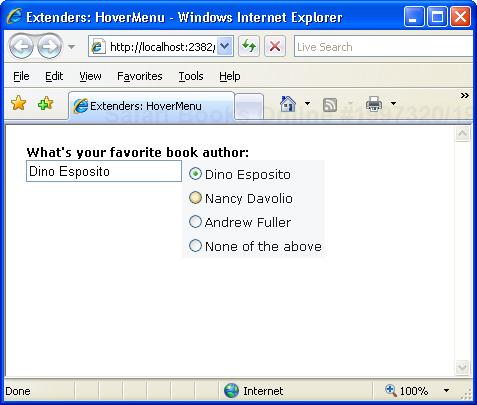
The HoverMenu extender is good for implementing an auto-display context menu for virtually every ASP.NET control instance and for providing tips to fill in some input fields. In Figure 5-12, for example, when the user hovers the cursor over the text box, a list of suggestions appears to simplify the work.
<asp:TextBox ID="TextBox1" runat="server" />

<asp:Panel ID="Panel1" runat="server" CssClass="popupMenu">
    <asp:RadioButtonList ID="RadioButtonList1" runat="server"
        AutoPostBack="true"
        OnSelectedIndexChanged="RadioButtonList1_SelectedIndexChanged">
        <asp:ListItem Text="Dino Esposito"></asp:ListItem>
        <asp:ListItem Text="Nancy Davolio"></asp:ListItem>
        <asp:ListItem Text="Andrew Fuller"></asp:ListItem>
        <asp:ListItem Value="" Text="None of the above"></asp:ListItem>
    </asp:RadioButtonList>
</asp:Panel>

<act:HoverMenuExtender ID="HoverMenu1" runat="server"
     TargetControlID="TextBox1"
     HoverCssClass="hoverPopupMenu"
     PopupControlID="Panel1"
     PopupPosition="Right" />
The Panel1 control defines a list of radio buttons, each containing a suggestion for filling the text box. The HoverMenu extender targets the text box control and defines Panel1 as its dynamic pop-up panel. The PopupPosition property indicates the position of the panel with respect to the target control. Likewise, other properties not shown in the previous example code, such as OffsetX and OffsetY, define the desired offset of the panel. The PopDelay sets the time (in milliseconds) to pass between the mouse movement and the display of the panel. The HoverCssClass can optionally be used to give the text box a different style when the hover menu is on. It is interesting to look at the CSS class associated with the panel:
.popupMenu
{
    position:absolute;
    visibility:hidden;
    background-color:#F5F7F8;
}
.hoverPopupMenu
{
    background-color:yellow;
}
It is key that the visibility attribute of the panel is set to hidden just as with CollapsiblePanel control; otherwise, the panel will display upon page loading and hidden immediately afterwards.
Just as for the PopupControl extender, to take full advantage of the HoverMenu extender you need to place extended controls inside of an UpdatePanel control. In this way, whenever the user clicks a radio button, the panel posts back asynchronously and fires the SelectedIndexChanged event on the server.
void RadioButtonList1_SelectedIndexChanged(object sender, EventArgs e)
{
    TextBox1.Text = RadioButtonList1.SelectedValue;
}
The server-side event handler will then just update the text in the text box., as shown in Figure 5-12.
The ModalPopup extender displays in a modal way any content associated with the control identified by the PopupControlID property. The TargetControlID property in this case refers to a clickable control:
<act:ModalPopupExtender ID="ModalPopupExtender1" runat="server"
        TargetControlID="LinkButton1"
        PopupControlID="PopupContent"
        OkControlID="Button1"
        CancelControlID="Button2">
Notice that the ModalPopup extender is fired by the onclick event on the target control. It turns out, therefore, that the target control can only be a control that supports clicking. The pop-up control doesn’t have to be a Panel control; generally, it can be any control. However, it will normally be a control that contains a bunch of other controls—typically, a Panel.
In the pop-up panel you can optionally identify an OK control and a Cancel control. You set the ID of such controls (commonly, buttons) through the OkControlID and CancelControlID properties. The pop-up behavior is clearly a client-side action, so some JavaScript code might be required in response to the user’s clicking the OK or Cancel control. You use the OnOkScript property to specify the JavaScript function to run in case the user clicks the OK button; you use OnCancelScript otherwise.
The following markup shows the content of a sample modal panel. Note that the Panel control should set its CSS display attribute to none to make any contents invisible at first.
<asp:LinkButton ID="LinkButton1" runat="server" text="Click me" />
<asp:Panel runat="server" ID="PopupContent" BackColor="Yellow">
        <div style="margin:10px">
        Take note of this message and tell us if you strongly agree.
        <br /><br />
        <asp:Button ID="Button1" runat="server" Text="Yes" width="40px"  />
        <asp:Button ID="Button2" runat="server" Text="No"  width="40px" />
        </div>
</asp:Panel>
Figure 5-13 shows the modal dialog box in action.

A couple of graphical properties—DropShadow and BackgroundCssClass—complete the extender. A Boolean property, DropShadow indicates whether a drop shadow—as shown in Figure 5-13—should be rendered. BackgroundCssClass, on the other hand, determines the style that is temporarily applied to the underlying page:
modalBackground {
    background-color:Gray;
    filter:alpha(opacity=70);
    opacity:0.7;
}
The preceding style grays out the page and makes it partially opaque for a nicer effect.
The PopupControl extender can be attached to any HTML element that fires the onclick, onfocus, or onkeydown events. The ultimate goal of the extender is to display a pop-up window that shows additional content, such as a calendar on a text box in which the user is expected to enter a date. The contents of the pop-up panel are expressed through a Panel control, and they can contain ASP.NET server controls as well as static text and HTML elements:
<asp:textbox runat="server" ID="InvoiceDateTextBox" />
<asp:panel runat="server" ID="Panel1">
    ...
</asp:panel>

<act:PopupControlExtender ID="PopupExtender1" runat="server"
        TargetControlID="InvoiceDateTextBox"
        PopupControlID="Panel1"
        Position="Bottom" />
The TargetControlID property points to the control that triggers the popup, whereas PopupControlID indicates the panel to display. The Position property sets the position of the panel—either at the top, left, right, or bottom of the parent control. (See Figure 5-14.)
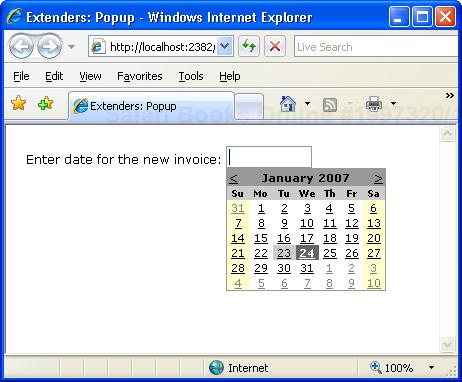
Additional properties are OffsetX and OffsetY, which indicate the number of pixels to offset the popup from its position, as well as CommitProperty and CommitScript, which can be used to assign values to the target control.
The pop-up window will probably contain some interactive controls and post back. For this reason, you might want to insert it within an UpdatePanel control so that it can perform server-side tasks without refreshing the whole page. Typically, the popup will be dismissed after a postback—for example, the popup shown in Figure 5-14 is configured to be dismissed after the user has selected a date. The calendar in this case fires the SelectionChanged event on the server:
protected void Calendar1_SelectionChanged(object sender, EventArgs e)
{
    PopupExtender1.Commit(
           Calendar1.SelectedDate.ToShortDateString());
}
The Commit method sets the default property of the associated control to the specified value. If you want to control which (nondefault) property is set on the target when the popup is dismissed, use the CommitProperty property. Likewise, you use the CommitScript property to indicate the Javascript function to execute on the client after setting the result of the popup.
In the family of ASP.NET AJAX extenders, the biggest group is user-interface extenders—that is, special components that help in the implementation of rich and user-friendly features.
The AlwaysVisibleControl extender allows you to pin a given control, or panel of controls, to one of the page corners so that it appears to float over the background body as the page is scrolled or resized. You can use the extender with virtually any ASP.NET control.
<span style="background-color:yellow;" runat="server" id="Msg">
    Need a bit of dummy text? Look at
    <b>http://www.loremipsum.net</b></span>

<act:AlwaysVisibleControlExtender ID="av1" runat="server"
     TargetControlID="Msg"
     HorizontalSide="Left"
     VerticalSide="Top" />
You set the target position for the bound control using the HorizontalSide and VerticalSide properties to define the corner of the page where the content should be docked. The HorizontalSide property accepts Left and Right as values, whereas Top and Bottom are feasible values for the VerticalSide property. You can also control the offset from each border using the VerticalOffset and HorizontalOffset properties. Finally, ScrollEffectDuration indicates how many seconds the scrolling effect will last when the target control is repositioned. (See Figure 5-15.)
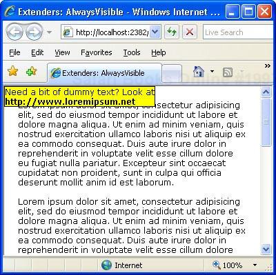
Note that you can’t add the extender to a plain HTML element. If you have an HTML block to keep always visible (for example, the <span> tag in the previous example), add the runat=server attribute and give it a unique ID.
The CascadingDropDown extender can be attached to a DropDownList control to automatically populate it based on the current selection of one or more parent DropDownList controls.
The CascadingDropDown extender is designed to fit in a relatively common scenario in which the contents of one drop-down list depend on the selection of another list. With this arrangement, you don’t need to transfer to the client the entire data set from which a child list can select a subset of items to display in accordance with the selection on its parent. For example, suppose you want the user to select a country and a city in that country. To minimize data transfer and provide a friendlier user interface, you might want to keep the city list empty until a selection is made on the country list. When a country is selected, you get back to the server to download the list of cities available for that country. The CascadingDropDown extender simplifies this scenario by injecting some glue code into the client page and also making some assumptions on the structure of your page code.
All the logic about the contents of the set of DropDownList controls is expected to reside on a Web service. The Web service, in turn, can use any suitable method for storing and looking up any relevant data. The Web service, though, is somewhat forced to use a contracted schema. In particular, it needs to have a method with the following signature:
[WebMethod]
public CascadingDropDownNameValue[] GetDropDownContents(
    string knownCategoryValues, string category)
{
    ...
}
The name of the method can vary, of course. The CascadingDropDownNameValue type is an internal collection type that is designed to contain the name/value items to show in the drop-down list. Each drop-down list bound to the extender belongs to a category:
<act:CascadingDropDown ID="CascadingDropDown1" runat="server"
     TargetControlID="DropDownList1"
     Category="Country"
     PromptText="Please select a country"
     ServiceMethod="GetDropDownContentsPageMethod" />
<act:CascadingDropDown ID="CascadingDropDown2" runat="server"
     TargetControlID="DropDownList2"
     Category="City"
     PromptText="Please select a city"
     LoadingText="Please, wait ..."
     ServicePath="CityFinderService.asmx"
     ServiceMethod="GetDropDownContents"
     ParentControlID="DropDownList1" />
The content of the Category property is any name that helps the Web service method to understand what kind of data should be retrieved and the meaning of the input arguments. The PromptText property sets any text that you want to display in the drop-down list when no selection is currently made and the control is typically disabled. The LoadingText property indicates any text that has to be displayed while the drop-down list is being populated. The ServiceMethod property indicates the method to call to fill in the list control. If no ServicePath is specified, the method is assumed to be a page method. Finally, ParentControlID creates a hierarchy and designates a list to be the child of another list.
Each time the selection changes in a parent DropDownList control, the extender makes a call to the Web service and retrieves the list of values for the next DropDownList in the hierarchy. If no selection is currently made, the extender automatically disables the control. (See Figure 5-16.)
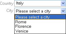
The DropShadow extender is designed to add a drop shadow to panel controls to make them look more professional. You can also set the opacity and width of the shadow:
<asp:Panel runat="server" ID="Panel1">
    <div style="padding:8px">
        <asp:TextBox ID="TextBox1" runat="server" />
    </div>
</asp:Panel>

<act:DropShadowExtender ID="DropShadowExtender1" runat="server"
     TargetControlID="Panel1" Opacity=".65" Width="5" Rounded="true" />
The TargetControlID property sets the control that will be rendered with a drop shadow. This control should generally be a Panel; however, as long as you don’t set rounded corners, it can also be any other ASP.NET control, such as a TextBox. You control the opacity of the shadow through the Opacity property. Values for the property range from 0.0 to 1.0, where 0 (or 0.0) means total transparency. Hence, the closer the value is to 1 (or 1.0) the darker the shadow will be.
The Rounded Boolean property indicates whether the surrounding panel and the shadow should have rounded corners. The default is false. Figure 5-17 shows the extender in action.
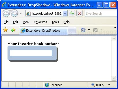
The DynamicPopulate extender is a sort of binder component that replaces the markup of a given control with the markup returned by a Web service method call. The extender can be seen as a shrink-wrapped and simplified version of the UpdatePanel control that we discussed in Chapter 4. It captures a client event and fires a remote call. The returned string is inserted in the page DOM as the child of the target element. Here’s an example:
<input type="button" id="Button1" runat="server" value="Refresh ..." />
<hr />
<b>Last updated: </b>
<asp:Panel runat="server" ID="Msg" Style="padding:2px;height:2em;" />
<act:DynamicPopulateExtender ID="DynamicPopulateExtender1" runat="server"
TargetControlID="Msg"
ClearContentsDuringUpdate="true"
PopulateTriggerControlID="Button1"
ServiceMethod="GetTimeOnServer"
UpdatingCssClass="updating" />When the user clicks on the specified item—in this case, the button named Button1—the extender starts working. It invokes the method GetTimeOnServer and replaces the subtree rooted in the Msg control with its output. The method GetTimeOnServer is a Web service method. You specify the URL to the service using the ServicePath property. If this property is not set, the method is assumed to be a page method defined either in the code file of the page or inline through a server <script> tag:
[WebMethod]
public string GetTimeOnServer(string contextKey)
{
    // Use contextKey to receive data from the client
    // Get the output—it can be HTML markup
    return DateTime.UtcNow.ToString();
}
ClearContentsDuringUpdate is a Boolean property that clears the contents of the target control during the update. If you want to display a special style or a bitmap during the operation, you set a CSS style through the UpdatingCssClass property. When creating such a CSS class, bear in mind that you should ensure the target control has a minimum height. (It must be explicitly set on panels.) You use the background-image CSS attribute to set the image to display.
Note that you can use any HTML element to trigger the dynamic population of the target control. It doesn’t have to be a button control; and it doesn’t have to be a submit button such as LinkButton or Button. In this case, in fact, the page will post back and you’ll lose the benefit of the ASP.NET AJAX platform.
Note
You can also use a piece of JavaScript code to dynamically populate a given DOM element. In this case, you set the CustomScript property to the name of a JavaScript global function. Whether you use a custom script or a server method, you can use the ContextKey property of the extender to pass an arbitrary string to the code.
Imagine a page that has to present a long list of items to users—say, a list of customers. A common solution entails using a pageable grid control. ASP.NET grids do a postback for each new page, but by wrapping the grid in an UpdatePanel control you can brilliantly fix the issue. What if you figure that a grid is far too heavy a control and that you need to list items using a bullet-list control?
The ASP.NET BulletedList control lists the contents of a data source using a variety of bullet-point user interfaces. It doesn’t provide paging, though. The PagingBulletedList extender is a surprisingly simple and effective extender to page through the contents of a BulletedList control. Let’s consider the following code that populates a bulleted list with no paging:
<asp:BulletedList ID="BulletedList1" runat="server" DisplayMode="Text"
     DataSourceID="ObjectDataSource1" DataTextField="CompanyName" />

<asp:ObjectDataSource ID="ObjectDataSource1" runat="server"
         TypeName="IntroAjax.CustomerManager"
         SelectMethod="LoadAll">
</asp:ObjectDataSource>
Such a page will generate more than 80 bullet-point items—one for each customer in the Northwind database. By extending the BulletedList control with the extender, you get output like that shown in Figure 5-18.
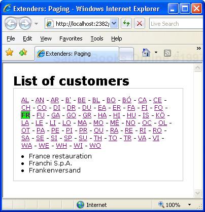
But then add the code for the extender:
<act:PagingBulletedListExtender ID="PagingBulletedList1" runat="server"
     TargetControlID="BulletedList1"
     ClientSort="true"
     IndexSize="2"
     Separator=" - "
     SelectIndexCssClass="selectIndex" />
The extender organizes all bound items in pages and displays links to each of them. Pages can contain a fixed number of items or all the items that match an initial string. The IndexSize property indicates how many letters in the displayed text should be used to create a page. If you set it to 1, you will have a pure alphabetical menu. If you set it to 2, you obtain a more granular view, as each page contains only the items whose name matches the two-letter initial. As an alternative to using IndexSize, you can use MaxItemsPerPage. In this case, each page (except perhaps the last one) will have exactly the specified number of items.
The Separator property indicates the character used to separate menu items. SelectIndexCssClass and UnselectIndexCssClass set the CSS classes for selected and unselected menu items. Finally, if ClientSort is set to true, items are alphabetically sorted on the client before display.
Most users would welcome pages where they can dynamically resize certain HTML elements, such as panels of text or images. The ResizableControl extender attaches to an element of a Web page and provides a graphical handle for users to resize that element. Placed at the lower-right corner of the element, the handle lets the user resize the element as if it were a window. Let’s consider the following markup:
<asp:Panel ID="Panel1" runat="server" Style="overflow:hidden"
           Width="130px" Height="65px">
    <asp:Image ID="Image1" runat="server" ImageUrl="~/images/ajax.gif"
           Style="width:100%; height:100%;" />
</asp:Panel>

<asp:Panel ID="Panel2" runat="server" Style="overflow:auto"
           Width="130px" height="100px">
    This text resizes itself to be as large as possible
    within its container.
</asp:Panel>
As you can see, the first panel contains an image; the second includes plain text. Some CSS attributes are necessary for the extender to work properly. In particular, you might want to set the overflow attribute to hidden for images and to auto for text. The overflow attribute controls the appearance of scrollbars when the contents of the element exceeds the reserved space. In the example, I stretch or shrink the image and scroll the text.
It is important to give panels an initial correct size. In particular, for images you should give the surrounding panel the same size of the image. Panels surrounding a block of text should be given an explicit size too.
<act:ResizableControlExtender ID="Resizable1" runat="server"
     TargetControlID="Panel1"
     ResizableCssClass="resizingStyle"
     HandleCssClass="handleStyle" />
<act:ResizableControlExtender ID="Resizable2" runat="server"
     TargetControlID="Panel2"
     ResizableCssClass="resizingStyle"
     HandleCssClass="handleStyle" />
The ResizableControl extender features two mandatory properties: TargetControlID and HandleCssClass. The former indicates the control to resize; the latter sets the name of the CSS class to apply to the resize handle. In addition, ResizableCssClass is the CSS class to apply to the element when resizing. You might want to use this class to change or thicken the color of the border to emphasize the operation. Here’s a typical handle CSS class:
. handleStyle
{
    width:16px;
    height:16px;
    background-image:url(~/images/HandleGrip.gif);
    overflow:hidden;
    cursor:se-resize;
}
Figure 5-19 shows the extender in action.
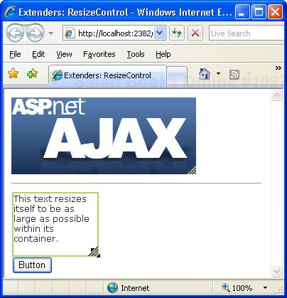
The ResizableControl extender also features two client events (onresizing and onresize) that can trigger some JavaScript code to do more complex things, such as increasing the font size to fit a larger area. The extender allows you to define a minimum and maximum size for the elements being resized. Any changes resulting from control resizing are automatically persisted across postbacks.
The RoundedCorners extender is a subset of the DropShadow extender, as it is limited to rounding the corners of child panels:
<asp:Panel runat="server" ID="Panel1" BackColor="LightBlue" Width="170px">
    <div style="margin-left:2px">
        <asp:TextBox ID="TextBox1" runat="server"
                  BackColor="LightBlue"
                  BorderWidth="0px" />
    </div>
</asp:Panel>

<act:RoundedCornersExtender ID="RoundedCornerExtender1" runat="server"
     TargetControlID="Panel1" Radius="6" Color="LightBlue" />
The extender accepts arguments to set the target control and define the desired radius of the rounded corner and the color of the surrounding border. The rounded corner, in fact, is obtained by rendering an additional border all around the target control. By removing all borders around the text box and using the same background color for the panel and the text box, you can obtain the nice effect shown in Figure 5-20—a rounded text box control.
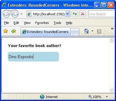
Web pages still rely on the facilities built into the HTML markup language to let users enter data into forms and input fields. But HTML input elements are sometimes too limited and simple for today’s applications and users. For this reason, the plain old <input type=“text”> element, and its TextBox ASP.NET counterpart, need some extra features. The ACT supplies a couple of extenders that transform the classic input field into a more interactive and user-friendly text box.
Typing data into a text box might be boring at times, and even more so when you type the same chunk of text over and over again. For this reason, Web browsers began supporting auto-completion features a while ago. A Web browser’s auto-completion feature consists of the code’s ability to track any URL that the user ever types in. In this way, the browser can quickly prompt you with a suggestion when you’re typing a possibly long and hard-to-remember URL.
Auto-completion is also a feature that some browsers, such as Internet Explorer 5 and newer versions, support for any custom text box you use in HTML forms. The browser saves on the local machine any data ever typed into an input field with a given name, and it makes that information available to all pages in the site that feature an HTML element with the same name. The feature is integrated with the browser and is transparent to users and developers. The list of suggestions builds up incrementally and is entirely beyond the control of page authors.
The AutoComplete extender extends the auto-completion to any ASP.NET TextBox control; more importantly, it gives page authors the means to define programmatically the list of suggestions (as retrieved via a Web Service).
<asp:TextBox ID="CustomerName" runat="server" />

<act:AutoCompleteExtender runat="server" ID="AutoCompleteExtender1"
     TargetControlID="CustomerName"
     Enabled="true"
     MinimumPrefixLength="1"
     ServicePath="Suggestions.asmx"
     ServiceMethod="GetSuggestions" />
In the code snippet, the text box is auto-completed using the data returned by the GetSuggestions method of the specified Web service. The ServicePath and ServiceMethod extender properties identify the service to provide auto-completion data; the MinimumPrefixLength property sets how many characters the user has to type to trigger the auto-completion feature. In the preceding code, auto-completion begins with the first typed character.
Note
The Web service has to be a local Web service that is installed on the same server machine and application as the page that is using it. Note that this consideration holds true for all Web services used by ASP.NET AJAX extenders.
The Web service method you use to provide suggestions must have a known signature:
[WebMethod]
public string[] GetSuggestions(string prefixText, int count)
{
    ...
}
The prefixText argument indicates the text the user has typed so far; the count argument sets the desired number of suggestions. The result is displayed in a drop-down panel underneath the text box. The user can use either the mouse or the keyboard to select one of the suggested items. The following code shows a Web service method that returns a subset of customer names that match the provided prefix. (See Figure 5-21.)
public class SuggestionService : System.Web.Services.WebService
{
    [WebMethod]
    public string[] GetSuggestions(string prefixText, int count)
    {
        int i=0;
        DataView data = GetData();
        data = FilterData(data, prefixText);
        string [] suggestions = new string[data.Count];

        foreach (DataRowView row in data)
            suggestions[i++] = row["companyname"].ToString();

        return suggestions;
    }

    private DataView GetData()
    {
        DataView view = (DataView)HttpContext.Current.Cache["Suggestions"];
        if (view == null)
        {
            SqlDataAdapter adapter = new SqlDataAdapter(
                "SELECT * FROM customers", "...");
            DataTable table = new DataTable();
            adapter.Fill(table);
            view = table.DefaultView;

            // Store the entire data set to the ASP.NET Cache for
            // further reuse
            HttpContext.Current.Cache["Suggestions"] = view;
        }

        return view;
    }

    private DataView FilterData(DataView view, string prefix)
    {
        // Filter out undesired strings
        view.RowFilter = String.Format("companyname LIKE '{0}%'", prefix);
        return view;
    }
}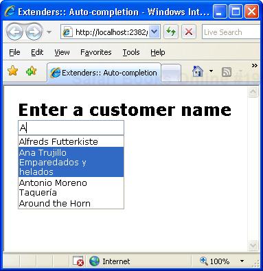
Plenty of input forms require users to specify a date. As an ASP.NET developer, you know how frustrating it can be for a user to cope with separators, formats, cultures, and all sorts of things that affect the representation of a date. The most natural way of choosing a date in an input form is through a calendar; and ASP.NET 2.0 does indeed provide such a control. The original ASP.NET 2.0 Calendar control requires full-page postbacks, although you can find a number of good workarounds for it—from wrapping it up in an updatable panel to using the hovermenu extender we considered earlier.
The Calendar extender is the ultimate and, I believe, definitive solution. Attached to a text box, it provides client-side date-picking functionality with customizable date format and pop-up control. You can interact with the calendar by clicking on a day, navigating to a month, or selecting a particular link to set the current date. (See Figure 5-22.)
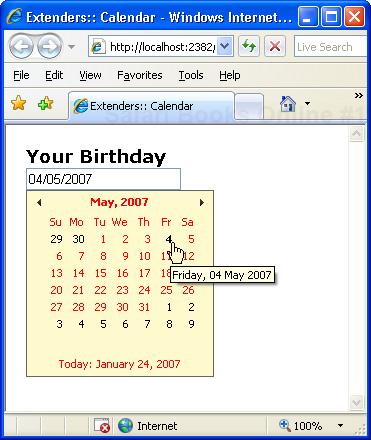
<asp:TextBox runat="server" ID="TextBox1" />

<act:CalendarExtender runat="server" ID="CalendarExtender1"
    TargetControlID="TextBox1"
    CssClass="MyCalendar"
    Format="dd/MM/yyyy" />
By clicking on the title of the calendar, you can change the view from days-per-month to months-per-year, and even years-per-decade. The Format property allows you to select the final format of the date, which will be inserted in the bound text box. Normally, the calendar pops up when the companion text box gets the input focus. However, you can associate the display of the calendar with the clicking of an element—for example, an image. The PopupButtonID property gets and sets the ID of a control to show the calendar popup when clicked.
The FilteredTextBox extender filters out some characters from the buffer of a given text box control. It differs from a validation control in that it just prevents users from entering invalid characters, whereas a validation control operates at a later time when the user tabs out of the input field.
<strong>How old are you?</strong>
<asp:TextBox ID="TextBox1" runat="server" />

<act:FilteredTextBoxExtender ID="Filtered1" runat="server"
     TargetControlID="TextBox1"
     FilterType="Numbers" />
The preceding text box is expected to accept a number indicating the age of the user. Clearly, it can accept only numbers. The extender ensures that only numbers can be typed in the input field. It does that by adding a piece of JavaScript code to the text box to filter out undesired characters.
The extender supports a few properties, including FilterType, which determine the filter applied to the input. The property can take any of the following values: Numbers, UppercaseLetters, LowercaseLetters, and Custom. The effect of the filter is obvious for the first three cases. When Custom is specified, though, you also set the ValidChars property to a comma-separated string where each item denotes a valid character. For example, the following code allows users to enter only A and B characters regardless of the case:
<act:FilteredTextBoxExtender ID="Filtered1" runat="server"
     TargetControlID="TextBox1"
     FilterType="Custom"
     ValidChars="A,a,B,b" />
You can’t combine multiple filters on the same text box. If you want to filter all but letters, you can’t add two FilteredTextBox extenders to the same control. Instead, you resort to a custom filter where you specify in the ValidChars property all acceptable characters.
Important
Client-side filtering, as well as validation, is subject to the action of some JavaScript code. This means that by deactivating JavaScript on the client browser, any filtering or validation is subsequently disabled. In any case, you should not blindly trust what’s typed by a user in a text box and, instead, apply proper filtering and validation on the server before you use that data for critical operations.
Added to a TextBox control, the MaskedEdit extender forces users to enter input according to the specified mask. In addition, data is validated on the client according to the data type chosen. To achieve the validation, a new validator control is introduced—MaskedEditValidator—that verifies the input. The masked edit validator is, in turn, associated with an instance of the masked edit extender:
<asp:TextBox runat="server" ID="TextBox1" />

<act:MaskedEditValidator ID="MaskedEditValidator1" runat="server"
    ControlExtender="MaskedEditExtender1"
    ControlToValidate="TextBox1"
    IsValidEmpty="False"
    EmptyValueMessage="Date is required"
    InvalidValueMessage="Date is invalid"
    TooltipMessage="Input a Date" />
<act:MaskedEditExtender runat="server" ID="MaskedEditExtender1"
    TargetControlID="TextBox1"
    Mask="99/99/9999"
    MessageValidatorTip="true"
    OnFocusCssClass="MaskedEditFocus"
    OnInvalidCssClass="MaskedEditError"
    MaskType="Date" />
Figure 5-23 shows the extender at work with date and monetary values.
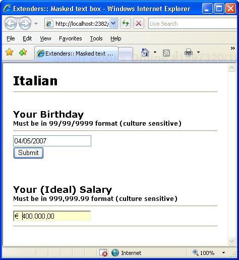
The extender supports three different masks for most common and specialized types: date, number, and time. The MaskType property sets the type of the final data; the Mask property defines the required input mask.
Web applications such as blogs, forums, and portals are subject to having their input forms automatically filled by robot applications (also known as bots). For example, a bot can register as a user of the mail service and use the portal to send spam. The techniques employed to ensure that humans are filling an input form instead of a piece of smart software go under the name of CAPTCHA, an acronym for Completely Automated Public Turing test to tell Computers and Humans Apart. In practice, CAPTCHA is a challenge-response test that requires the provision of additional information that must be figured out on the fly. Figuring this out is nothing special for humans, but virtually impossible for automated programs. The most popular example of CAPTCHA technique is a distorted image that represents a number. In a variety of blog systems, users encounter an additional input field to specify a number depicted within a figure before their posts will be accepted.
The NoBot extender is a control that attempts to apply anti-bot techniques to input forms. The extender might not be as powerful as a distorted image with a number inside, but it has the advantage of being completely invisible and hard to detect. All in all, the NoBot extender’s usefulness is probably limited to sites with low traffic where the main goal is stopping spam, and where it’s not a big deal if it doesn’t achieve 100-percent effectiveness.
Added to a TextBox control, the NumericUpDown extender adds a couple of arrow buttons next to the control to let users increment and decrement the displayed value. Note that increment and decrement apply to numeric input as well as any user-defined enumeration.
<strong>How old are you?</strong>
<asp:TextBox ID="TextBox1" runat="server" Width="100px" />

<act:NumericUpDownExtender ID="UpDown1" runat="server"
     Width="100"
     TargetControlID="TextBox1" />
You should set the Width property on both the text box and the extender to control the size of the input field. Note that the Width property on the extender indicates the total width of the control including the arrow buttons. (See Figure 5-24.)
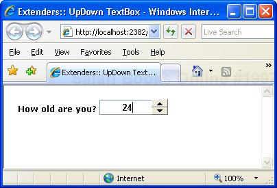
The default increment is a numeric +1 or -1. However, the RefValues property lets you define a sequence of values to cycle through. The property accepts a string where each value is separated by a semicolon (;) symbol.
<act:NumericUpDownExtender ID="UpDown1" runat="server"
    Width="100"
    RefValues="Sun;Mon;Tue;Wed;Thu;Fri;Sat"
    TargetControlID="TextBox1"  />
The extender can also use a Web service to calculate the next or the previous value. In this case, you use ServiceUpPath and ServiceUpMethod to locate the service and method for the up operation. Likewise, you use ServiceDownPath and ServiceDownMethod for the down operation. The service methods can receive an arbitrary value from the client through the Tag property.
Note
The sole use of the up-down extender is usually not enough to guarantee a pleasant experience. The up-down extender, in fact, doesn’t force the text box to accept “only” the values generated by the up-down process. So you could type words in a numeric text box with an associated up-down extender. To avoid that, you might want to combine the up-down extender with a filter extender and use the TextBox’s MaxLength property to set the maximum number of characters.
Even the most secure system can’t do much to protect your server if authorized users employ weak and easy-to-guess passwords. A number of best practices have been developed lately that characterize a strong password. The PasswordStrength extender attaches to a TextBox control and measures the strength of the current text if it’s being used as a password.
From a syntax point of view, the extender can be attached to any TextBox control; from a semantic perspective instead, it makes sense only if applied to a TextBox control that is used for the entry of a password. The scenario in which the PasswordStrength extender proves useful is not a login page where the user enters his password to access a given functionality. Rather, it is helpful in forms where users registers their credentials to access a system feature.
<h2>Choose your password</h2>
<asp:TextBox ID="TextBox1" runat="server" />
<act:PasswordStrength runat="server" TargetControlID="TextBox1" />
The extender validates the current text against a set of requirements set by the page author. The result of the validation process is output through either a text message or a bar indicator to let users know about the level of complexity of the chosen password. With all default settings, the extender works as shown in Figure 5-25.
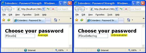
The feedback is displayed as plain text and dynamically as the user types in the buffer. The properties of the extender can be divided into two groups: appearance and behavior.
Appearance properties include DisplayPosition to set the position of the feedback text (above, below, left side, or right side), and StrengthIndicatorType to choose the type of visual feedback. It can be Text or BarIndicator. When the indicator type is Text, the PrefixText property sets some text to use in the composition of the feedback message. The TextCssClass defines the CSS class to style the feedback message.
When the indicator type is BarIndicator, the feedback appears as a gauge bar in a framed area. BarBorderCssClass and BarIndicatorCssClass properties let you style the bar.
The following properties allow you to set the password requirements to check: RequiresUpperAndLowerCaseCharacters, PreferredPasswordLength, MinimumNumericCharacters, and MinimumSymbolCharacters. By default, the password length is set to 10 and no other check is enabled on the contents.
The extender ranks the password text based on the requirements set. The score is rendered as a gauge bar or through a text message, as you saw in Figure 5-25. Text messages can be customized by assigning a list of semicolon-separated descriptions to the TextStrengthDescriptions property. You can specify a minimum of 2 and a maximum of 10 strings ordered from the weakest to the strongest.
The feedback you get from the extender is split in two parts: score and status message. The score is used to update the indicator or display a strength description. The status message is a help message displayed on a companion control identified by the HelpStatusLabelID property:
<asp:TextBox ID="TextBox1" runat="server" /> <br />
<asp:Label runat="server" ID="Label1" />

<act:PasswordStrength runat="server"
     TargetControlID="TextBox1"
     DisplayPosition="RightSide"
     PreferredPasswordLength="12"
     HelpStatusLabelID="Label1" />
</act:PasswordStrength>
The Label1 control receives a message that suggests what to do to meet password requirements. You can also keep this message hidden all the time and display it on demand by clicking a button. In this case, you set two new properties: HelpHandlePosition and HelpHandleCssClass. The former sets the display position for the help icon; the latter styles the icon.
<act:PasswordStrength runat="server">
     <act:PasswordStrengthExtenderProperties TargetControlID="TextBox1"
          DisplayPosition="BelowRight"
          PreferredPasswordLength="12"
          HelpHandlePosition="RightSide"
          HelpHandleCssClass="helpHandle" />
</act:PasswordStrength>
To be precise, you set the icon to display using the CSS style:
.helpHandle
{
    width:16px;
    height:14px;
    background-image:url(images/Question.png);
    overflow:hidden;
    cursor:help;
}
Figure 5-26 shows the final page.
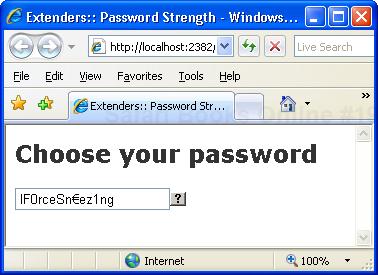
The Slider extender allows you to morph a classic TextBox into a graphical slider so that users can pick up a numeric value from a finite range. You can set the orientation of the slider (horizontal or vertical) and also make it accept a discrete interval of values—that is, only a specified number of values within a given range. By default, the slider accepts values in the 0 through 100 range.
<h2>Your age</h2>
<asp:TextBox ID="TextBox1" runat="server" />
<hr />
<asp:Label runat="server" ID="Label1" />
<act:SliderExtender runat="server" ID="SliderExtender1"
     TargetControlID="TextBox1"
     BoundControlID="Label1" />
A value chosen using the slider is automatically persisted via a full or partial postback. You can reference the value using the TextBox programming interface. (See Figure 5-27.)
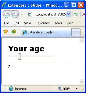
The TextBoxWatermark extender allows you to define default text to display when the text box is empty. The extender takes care of showing and hiding the text as required.
<h2>Watermark</h2>
<br/>
<asp:TextBox ID="TextBox1" runat="server" />
<asp:TextBox ID="TextBox2" runat="server" />
<act:TextBoxWatermarkExtender runat="server" ID="TextBoxWatermark1"
TargetControlID="TextBox1"
WatermarkText="Type First Name Here"
WatermarkCssClass="watermarked" />
<act:TextBoxWatermarkExtender runat="server" ID="TextBoxWatermark2"
TargetControlID="TextBox2"
WatermarkText="Type Last Name Here"
WatermarkCssClass="watermarked" />The extender uses the TargetControlID property to designate the target text box. The WatermarkText property defines the text to display, whereas WatermarkCssClass indicates the CSS style to apply to the watermark text. (See Figure 5-28.)
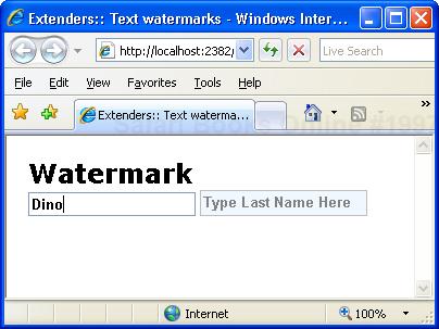
The ValidatorCallout extender enhances the graphical capabilities of existing ASP.NET validators. It displays the error message of a validator using the balloon-style ToolTips of Windows XP. (See Figure 5-29.)
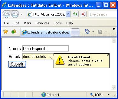
Here’s how to use the extender:
<table>
<tr>
   <td>Name:</td>
   <td><asp:TextBox runat="server" ID="txtName" /></td>
</tr>
<tr>
   <td>Email:</td>
   <td><asp:TextBox runat="server" ID="txtEmail" /></td>
</tr>
</table>
<asp:Button runat="server" ID="Button1" Text="Submit" />
<asp:RequiredFieldValidator runat="server" ID="requiredName"
     ControlToValidate="txtName"
     Display="None"
     ErrorMessage="Required Field Missing<br />A name is required." />
<asp:RequiredFieldValidator runat="server" ID="requiredEmail"
     ControlToValidate="txtEmail"
     Display="None"
     ErrorMessage="Required Field Missing<br />Email address required." />
<asp:RegularExpressionValidator runat="server" ID="regularEmail"
     ControlToValidate="txtEmail"
     Display="None"
     ValidationExpression="[a-zA-Z_0-9.-]+@[a-zA-Z_0-9.-]+.w+"
     ErrorMessage="<b>Invalid Email</b><br />Please, enter a valid email
                   address" />
<act:ValidatorCalloutExtender runat="server" ID="CalloutExtender1"
     TargetControlID="requiredName" HighlightCssClass="highlight" />
<act:ValidatorCalloutExtender runat="server" ID="CalloutExtender2"
     TargetControlID="requiredEmail" HighlightCssClass="highlight" />
<act:ValidatorCalloutExtender runat="server" ID="CalloutExtender3"
TargetControlID="regularEmail" HighlightCssClass="highlight" />The ACT comes with a full-fledged framework for building animations over the Web, leveraging the capabilities of rich browsers. The idea is to have an extensible set of animation blocks that can be composed together and run either in sequence or in parallel. The animations to be played are declaratively specified using XML.
The Animation extender allows you to use the built-in animation framework in a mostly declarative and codeless fashion. The extender plays specified animations whenever a client event occurs on the target control. Supported events include load, click, mouseover, and mouseout. Here’s an example:
<act:AnimationExtender ID="AnimationExtender1" runat="server"
     TargetControlID="Panel1">
   <Animations>
      <OnLoad>
         <OpacityAction Opacity=".2" />
      </OnLoad>
      <OnHoverOver>
         <FadeIn Duration=".25" Fps="20"
                 MinimumOpacity=".2" MaximumOpacity=".8" />
      </OnHoverOver>
      <OnHoverOut>
         <FadeOut Duration=".25" Fps="20"
                  MinimumOpacity=".2" MaximumOpacity=".8" />
      </OnHoverOut>
   </Animations>
</act:AnimationExtender>
The Animations tag fully describes the animation. It is made up of a list of actions bound to specific events. In the above preceding example, the events are load, hover, and mouseout. The tag OnLoad describes the animation performed when the extended control is loaded. Tags OnHoverOver and OnHoverOut describe what happens when the hover effect is to take place, which is typically delayed from the actual mouseover and mouseout events. To describe an animation, you use a combination of existing animation blocks: fade-in, fade-out, opacity, pulse, move, resize, color interpolation, and scaling. You can also specify actions using custom script. The sample code just shown applies a slight opacity filter to the extended control upon loading and then fades its area in when the mouse hovers over it and out of it. For more information on built-in animation blocks, take a look at http://ajax.asp.net/ajaxtoolkit/Walkthrough/AnimationReference.aspx.
The UpdatePanelAnimation extender applies animation to a very specific situation where custom events need to be handled—before and after an updatable region is refreshed. Using the extender is as simple as defining an updatable panel in the page and adding the following code for the extender:
<act:UpdatePanelAnimationExtender runat="server" ID="UpdatePanelAnimation1"
    TargetControlID="UpdatePanel1">
    <Animations>
        <OnUpdating>
            <Sequence>
                <EnableAction AnimationTarget="Button1" Enabled="false" />
                <FadeOut AnimationTarget="Panel1" minimumOpacity=".3" />
            </Sequence>
        </OnUpdating>
        <OnUpdated>
            <Sequence>
                <FadeIn AnimationTarget="Panel1" minimumOpacity=".3" />
                <EnableAction AnimationTarget="Button1" Enabled="true" />
            </Sequence>
        </OnUpdated>
    </Animations>
</act:UpdatePanelAnimationExtender>
As you can see, it is nothing more than an animation applied to panel-specific events such as OnUpdating and OnUpdated. Before the update begins, the area that contains the sensitive contents to update is faded out and a control, Button1, is disabled. You use the FadeOut animation block for this purpose. In the preceding example, Panel1 is merely the HTML block that contains the UpdatePanel control.
<div ID="Panel1">
    <asp:UpdatePanel ID="UpdatePanel1" runat="server" ...>
        ...
    </asp:UpdatePanel>
</div>
The EnableAction animation block declaratively disables the specified control during the update. In Chapter 4, you learned how to accomplish the same thing programmatically—the extender now provides a declarative approach.
Once the region has been updated, you run a FadeIn animation to bring the panel content back to its full colors and re-enable previously disabled controls using the EnableAction. The Resize animation can also be used to implement a sort of collapse/expand effect during the update: the panel closes, gets updated, and then unfolds to show its new contents. Imagination is your only limit. (See Figure 5-30.)
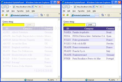
No matter how many controls you have in your arsenal, you’ll likely be always lacking just the one that is crucial for your current work. That’s why the extensibility model of ASP.NET has been so successful over the years, and that’s why so many component vendors crowd the market with excellent product offerings.
Anyway, always deriving new controls from existing ones might not necessarily be a wise strategy. A new control is required for a significant piece of server and client code that can be used to back up a good chunk of user interface. If you only need to filter the values in a text box, a custom text box control is hardly the best option. But until the arrival of ASP.NET AJAX and the AJAX Control Toolkit, there was no other way out.
With control extenders, you define the concept of a “behavior” and work with it as a distinct entity set apart from classic server controls. Extenders are server controls, but they work on top of bound controls and improve their overall capabilities by adding a new behavior.
An extender doesn’t necessarily have to be an AJAX control. However, in the implementation of the AJAX Control Toolkit all extenders require a script manager, inject a good quantity of script code into the client pages, and take advantage of the client JavaScript library.
To take advantage of extenders and controls in the ACT, you don’t have to import the binaries into your application. The ACT is an open-source project and, according to the license agreement you accept when you download the assembly, it can be incorporated piecemeal in your applications. This means, for example, that you can import only a few components through their source code and perhaps even adapt the code to your specific needs.
With this overview of controls and extenders, and armed with a strong knowledge of partial rendering, we’re now ready to tackle an alternative programming model in ASP.NET AJAX—making remote procedure calls over the Web.