
CHAPTER 5
Analyzing Security Metrics Data
As you implement the Security Process Management (SPM) Framework, selecting metrics and launching security measurement projects, you will accumulate data—the raw material of the framework. It may come from familiar sources and repositories that are regular sources of security data, or it may come from new sources as different data are needed to answer emergent questions that have developed in support of your goals. In many cases, it will be a combination of data sources as you start to use existing data in innovative ways, mapping it to and correlating it with new sources that allow you to explore your security program in more detail or in different directions. Whatever the means by which you collect it, your data will require analysis. This chapter explores several techniques and considerations for that analysis.
The Most Important Step
I have had many interactions with security practitioners who collect metrics data on their operations. Modern security systems offer a variety of ways to generate data in the form of logs, reports, and summaries of system activities. The data is usually saved or archived somewhere, for some period of time, and pulled into regular reports, presentations, and various other articulations by which the security team can demonstrate what occurred during some previous time period. Although I see plenty of security organizations that collect and store operational data, many of these teams do not analyze their data thoroughly or by means of a formal process. Analysis typically involves the development of general charts that show the values of particular metrics for some recent time period but offer little additional insight. Are security incidents up or down this month? How many exceptions to the security policy were requested through the change management system in the last quarter? Did our penetration test consultants detect fewer problems this year than when they did their assessment last year? This data may certainly prove valuable in a specific context, but it really only allows you to describe specific current events. Without more sophisticated analyses, you are unlikely to develop the kinds of insights that allow you to transform security into a more effective business process and to build a program that has continual growth and improvement built into that process. As you begin to develop more mature and process-oriented security capabilities, you will find that effective analysis will be a key to continued success and management of your security program over time.
Analysis is also important because, as I discussed earlier in the book, the simple act of collecting security data carries risk. If you collect data, then, as an organization, you know something. Even if you don’t know you know something, that data becomes a record of events that took place and actions undertaken to monitor those events. If those events are bad, such as security breaches, the loss of personal data, or evidence of fraud or harassment, the organization may have incurred an ethical or legal responsibility to take action. If that action is neglected, the firm can put itself at risk from legal discovery or regulatory scrutiny.
The point is not simply to collect data, but to ensure that data collection includes a plan for analysis and a commitment to addressing any problems or risks that may result from the data. Given two bad options, I would rather be viewed as foolish because I didn’t collect the data that showed I had a security problem than to be viewed as negligent and liable because I did collect the data, had evidence that I had a security problem, but took no action because I did no analysis. Of course the best choice would be to avoid both of these situations by collecting data, analyzing it, and making informed decisions based upon the results.
Reasons for Analysis
Data associated with security metrics can be analyzed in many ways, but before we can explore specific techniques, I need to talk about two basic reasons for analyzing data that you should consider.
Applied Analysis
When your security metrics data analysis is designed to answer a known, specific question about an aspect of the security program, this is applied analysis. Examples include analyses such as those mentioned in the preceding section, in which statistics on events or security operations are needed for reporting or compliance purposes. In applied analysis, you often already know what you want to know and probably have some insight about the answer.
Consider a situation in which a firewall administrator must report monthly on the number of accepted and rejected connections through the corporate perimeter. Table 5-1 shows a simplified breakdown of such data collected from the firewall logs.
In this case, analysis may be as simple as counting the number of accepted or rejected connections, the most common IP addresses or services, and the averages for a given time period. Other analyses may be more involved—for instance, tracking the weekly hours spent by the security staff against particular projects for purposes of internal billing to departments and general resource allocation, as in Table 5-2. In this case, the data may be used to calculate follow-on metrics such as overall utilization of staff members, how well time budgets are met for particular projects, or compliance against contractual or regulatory requirements for employment.
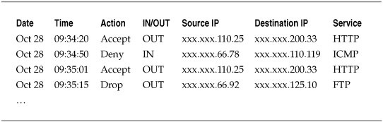
Table 5-1. Firewall Log Data
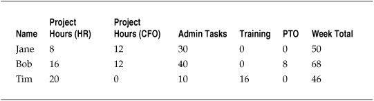
Table 5-2. Employee Time Tracking
Applied analysis implies that the end result of the analysis is already understood, and all that is required is that the analysis “fill in the blanks” with the information necessary to complete the task.
Exploratory Analysis
When you analyze data for the purposes of answering new questions, or even for developing those new questions on the basis of existing information or knowledge, you begin to move from applied analysis to exploratory analysis. Exploratory analysis does not mean that your research and analysis activities have no practical application. The difference between applied and exploratory analysis is that in the case of the former you are typically dealing with known and well-understood questions and answers, whereas the latter is focused on adding to or expanding upon existing knowledge.
Revisiting the firewall example of the preceding section, perhaps the CIO wants to review and update the organization’s policy regarding acceptable use of the Internet during work hours. She asks the security staff to generate a report of the web sites most commonly visited by employees during the workday and gets the information shown in Figure 5-1. The results of the analysis allow the CIO to make more informed decisions regarding how to update the use policy. In this case, even if personal use of the Internet is permitted, the CIO is likely to update the policy and impose severe penalties on those who use corporate resources to access adult-oriented material, which amounted to 5 percent of employee web use.
In the case of time tracking for the security staff, the data can be used to produce reports on overall utilization of employees assigned to projects, how well projects are meeting time budgets, and general levels of work effort. For organizations with formal project management programs, these metrics may represent cases of applied analysis, as the organization already tracks such figures. For those organizations that do not have such programs, the analyses could be used as an exploration to gain greater insight into time management and efficiency. And for both types of organization, exploratory analysis will develop as efforts are made to determine why projects are not being completed within scope or why some personnel have higher utilization rates for their projects.
Most analysis of qualitative metrics data is exploratory in nature as well, because these techniques tend to explore more complex characteristics of security that are subject to interpretation and are designed to reveal abstract relationships and characteristics of people and organizations. Qualitative metrics will often be explorations into characteristics of a security program that cannot be measured in a way that provides one “answer” to a question. Instead, they are exercises not only in pattern recognition, but in pattern development, including the construction of new concepts that can support different ways of looking at security. Lots of experienced security experts already do this sort of inductive analysis, even if they do not call it qualitative or even measurement. The changing nature of security threats and vulnerabilities, as well as shifting organizational and political priorities, means that success depends on reading the patterns before they become a problem. Exploratory and qualitative techniques are simply formally structured methods for doing what many of us undertake naturally as we navigate our environments.
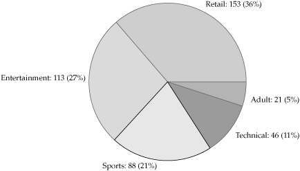
Figure 5-1. Most commonly accessed web sites
The differences between applied and exploratory analysis are dependent upon the needs and routine metrics used by various people and groups. When the data is being analyzed to support requirements or decisions that are already well established, with little new information needed beyond what is expected, then you are dealing with applied analysis. When the data analysis is designed to develop new insights, add new information to an existing process or decision, or help in the development of new questions and analytical requirements, then the data can be seen as exploratory in nature. It is useful to be able to understand and articulate the differences between applied and exploratory analyses so that you can better market and promote particular measurement projects and metrics efforts to various stakeholders that need to understand the reasons for and the potential benefits from any particular metrics effort.
What Do You Want to Accomplish?
I have made the point several times in this book that metrics programs are most effective when they are considered in the context of goals and objectives for the development and use of those metrics over time. This holds true in terms of data analysis as well. As you prepare to develop analysis strategies for your metrics data, you should be considering what it is that you hope to accomplish at the end of the analysis process. Is your analysis in support of a specific decision or a requirement, or are you looking for new knowledge and insight? Is your goal simply to understand and describe the data you have collected, or do you want to use your data to predict things about your security program?
Before beginning to analyze your data, you should revisit how you developed the metrics and data that you are using and how you intend to fit them into your activities once analysis is completed. For the first task, revisiting the GQM process that you used to align your metrics with specific goals and questions can help you ensure that your analyses will also contribute to your original intents and objectives. Similarly, you should review your analytical strategies in the context of the security measurement project in which they will take place. Are your resources sufficient for the analysis that you are undertaking? Are there any risks involved with that analysis? And have you fully articulated and gained buy-in from the various stakeholders that will be the beneficiaries of the results?
It is worth taking some time to revisit your previous steps and strategies before the heavy lifting of analysis begins. By doing so, you allow yourself some flexibility to revisit your metrics goals and designs, to incorporate any new issues or considerations, and to ensure that as you begin analyzing the data you can continue to be comfortable that you are achieving the outcomes you want. This is an important intermediary step because you will find that your data is usually going to require some expenditure of effort to get it in a form that is ready for analyzing.
Preparing for Data Analysis
Most people getting into data analysis for the first time underestimate the amount of time and effort that is necessary to prepare data before you are even ready to begin analyzing it. Preparing and cleaning your data so that your analyses are functional and reliable can add quite a bit of time even to a straightforward analysis, and this process should not be underestimated or taken lightly. There is no point going to the trouble of building insights out of your security metrics data if those insights are faulty because the data was messy or incomplete going into the analysis. You should take several issues into consideration as you pull together the data from the metrics you collect.
What Is the Source of the Data?
Even in situations involving very basic analysis, it is important that you understand and keep track of where your data is coming from. There are many potential sources of security-related data, including the following:
![]() System logs
System logs
![]() Security event and incident management (SEIM) systems
Security event and incident management (SEIM) systems
![]() Audit reports
Audit reports
![]() User surveys
User surveys
![]() Company databases (operational and historical)
Company databases (operational and historical)
![]() Policies and other records and documents
Policies and other records and documents
In some cases, you may be pulling data from one source that has been collected or aggregated from another source. As you begin preparing for the analysis phase of the project, keep a log or other record of where each type of data you will be using originated. If the origin is not the same as the source from which you pulled the data (for instance, if you are pulling aggregated data from an SEIM tool), you should note the difference between these secondary and primary sources. Some tools for aggregating or analyzing security information, and certainly reports and historical records that already contain a degree of analysis, may alter or transform data to provide unified presentation, and you will want to understand how, if at all, such data normalization affects the original sources.
The key point for data sourcing is that, as the analyst responsible for turning metrics data into security knowledge that supports decisions, you must be able to trace any finding or conclusion based on your data back to original sources and observations. The most effective metrics are empirical, developed from direct observations of some activity or characteristic that can be explained, articulated, and repeated. When you are asked to justify a particular recommendation (especially when what you recommend may involve spending more money or changing the way things are done), you should be ready and able to “show your work” by following the data trail back to the original observations on which you based your conclusions. If you cannot ground the advice you offer empirically, your analysis can face a serious loss of credibility. In many cases, the analyst will not own or control the data sources, which will change and even vanish over time. So documentation of data as well as analysis is important. Replicating every bit of data analyzed, especially in the case of very large repositories, can become impractical and may even violate backup and retention policies. But just using the data is not sufficient. You should be documenting sources of the data, the times of access, owners of the data, and the data types used in any analysis as part of the project. This is a very important element of data sourcing activities.
What Is the Scale of the Data?
In Chapter 3, I described the different scales of measurement that can be applied to security metrics:
![]() Nominal Names or labels only, with no quantitative meaning involved even if numbers are used; “bucket” categories.
Nominal Names or labels only, with no quantitative meaning involved even if numbers are used; “bucket” categories.
![]() Ordinal Indicates ranking order, but with no insight into the differences between rankings; first, second, and third place race results.
Ordinal Indicates ranking order, but with no insight into the differences between rankings; first, second, and third place race results.
![]() Interval The distance between measurements does have quantitative meaning, but there is no zero point to compare with; temperature on the Fahrenheit or Celsius scales.
Interval The distance between measurements does have quantitative meaning, but there is no zero point to compare with; temperature on the Fahrenheit or Celsius scales.
![]() Ratio The distance between measurements has quantitative meaning, and there is a zero point, so the distances between measurements can be compared as well; length, weight, money, temperature on the Kelvin scale, and so on.
Ratio The distance between measurements has quantitative meaning, and there is a zero point, so the distances between measurements can be compared as well; length, weight, money, temperature on the Kelvin scale, and so on.
It is likely that your collection efforts will produce data sets that are measured on different scales. Some analytical techniques can be conducted only using data from certain scales, so it is important that you know what scales you are dealing with in your data and what scales you must be using to conduct the analyses you want to complete. It may be necessary for you to change data from one scale to another before you can use it.
We have already seen examples of changing scales in the case of qualitative risk assessments where nominal scores such as high, medium, or low are changed to an ordinal scale using a set of numbers. If you want to understand the average scores provided for the risks assessed, this becomes a necessary transformation. But changing scales should always be handled with care and should be well documented prior to the analysis. Changing scales involves potentially changing the amount and quality of information you are getting from the metric, and the decision to do so should always be driven by the goals and questions of the metric rather than from an effort to “fit” the measurement to a desired outcome. In the case of the risk assessment example, it is acceptable to change scales if you want to understand what people generally had to say about risk, but if you change the scale in an attempt to compute the average risk to the organization, you have engaged in statistical alchemy and turned the data into something that it is not.
Does the Data Require Cleaning or Normalizing?
When your security data comes from different sources, you will want to make sure that any comparisons you make regarding the data are valid. Data may have been coded or collected differently across multiple systems, and any discrepancies between measurements of criteria from one source to another can introduce errors into your analysis. It may also be necessary to remove or transform data that is missing, inconsistently coded, or superfluous to the analysis at hand and that can add error or impact the general analysis. This step can take up significant data preparation time, but it’s important to complete to be sure that you are making apples-to-apples comparisons across data sets or drawing proper conclusions from the metrics you have employed.
Consistency and Accuracy One of the first steps in preparing your data is to ensure that the data is accurate and consistent, particularly across different sources. Let’s say you are analyzing vulnerability assessments conducted across your company during the course of several years. As you examine the assessment reports, you notice the following descriptions of operating systems assessed:
![]() Windows
Windows
![]() Windows 2000
Windows 2000
![]() Win2k3
Win2k3
![]() XPsp2
XPsp2
![]() WinXP
WinXP
![]() Windows XP
Windows XP
These seven data entries may refer to a few or to many different operating systems, and they should be standardized before you begin data analysis. It may be necessary in such situations to approach the original owner of the data or others who are closer to the data sources for clarification and assistance in identifying what these data labels mean. It is unclear which systems may be running server versions, and there is ambiguity between which service pack levels the different XP machines were running at the time of analysis. The goal of the exercise is to maximize the accuracy and insight of the analysis; it’s important that you understand what is being measured in detail.
Missing Data and Outliers You may find that your data contains values that are missing from the set or values that fall far outside the normal ranges occupied by most of the data. In such cases, you need to make decisions about how you will handle these situations, beginning with trying to understand why the values appear in the data to begin with. Missing data can occur due to errors, processing failures, or coding conventions (for instance, when a blank or “N/A” value is automatically converted to or interpreted as “missing”). Outliers can also result from mistakes in collecting or measuring data, but they can also be accurate and indicate one or more values that are simply outside of the normal range.
Table 5-3 shows an example of missing data in a subset of simplified vulnerability scanning results. You can see that some data is not applicable or has not been entered. If values are missing from the data, it might be necessary to create a special variable as a placeholder (for instance “000” to reflect a missing value), or it might be possible to remove missing values altogether.
Figure 5-2 illustrates outlier examples for vulnerability scan data and shows the number of systems with particular maximum Common Vulnerability Scoring System (CVSS) scores. While most of the systems scored in the 3–8 range, one system had a maximum CVSS score of 1, while a couple of systems scored near 10. It might be necessary to revisit the data to determine whether or not the outliers represent errors or real data. You can also decide, based on the judgment of those knowledgeable about the systems or on the reasons for the assessment, whether you want to eliminate any of the observed systems from the analysis. You might, for example, decide that the CVSS score of 1 was too low and is a potential error, while the higher scores are legitimate based on what you know about the systems in question.
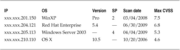
Table 5-3. Missing Values for Vulnerability Scan Results
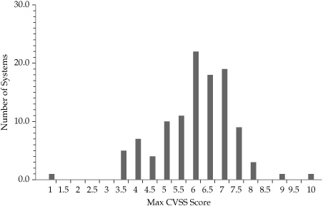
Figure 5-2. Outlier CVSS scores in vulnerability assessment data
When faced with missing data or outliers, you will often need to make judgment calls on whether to explore further, remove problematic data, or attempt other analyses to incorporate what you have measured. Knowing why you included or excluded certain data, observations, or values is critical to being able to explain and defend the conclusions and recommendations that you generate from your analysis. As you become more comfortable with your data and your metrics and security process management programs improve and mature, you will find that few arguments are more convincing than knowing your stuff and having the data to back up your claims. Credibility becomes even more of an issue as you begin to explore qualitative and interpretive security metrics that may not have the luxury of falling back on numbers system data. But if you have ever followed opinion polls during an election or watched economic reporting on the state of the economy, you will quickly understand that even supposedly “hard” quantitative data is interpreted, argued over, and requires that those making claims be able to articulate how they got their numbers. The best defense for your security metrics data is to understand your data in minute detail and to be able to deflect any criticisms or answer any questions because you have already applied those critiques and asked those questions of the data yourself.
Transforming Data Sometimes it is necessary to change data from one scale or format to another to accomplish the analysis you require. This can happen because data values are measured on different scales or have confusing or incompatible ranges that could influence the analysis. In some cases, transforming data may make the results easier to understand than using the original data, while in other cases the analysis techniques you choose may dictate that the data conform to certain characteristics or be measured on a certain scale before the analysis will work.
You can use numerous techniques for normalizing, cleaning, smoothing, and otherwise transforming data to aid analysis, and I will cover some of these techniques in later chapters and examples. Here are some examples:
![]() Changing data values to decimals or percentages for ease of comparison
Changing data values to decimals or percentages for ease of comparison
![]() Grouping and aggregating raw data into categories or bins to facilitate analysis
Grouping and aggregating raw data into categories or bins to facilitate analysis
![]() Reversing value orders or standardizing value scores for data sets that use different coding structures
Reversing value orders or standardizing value scores for data sets that use different coding structures
![]() Employing descriptive statistics such as mean, median, mode, or z-scores to compare values
Employing descriptive statistics such as mean, median, mode, or z-scores to compare values
![]() Techniques such as min-max transformation, which fits all observed values into a new range of predefined minimum and maximum values
Techniques such as min-max transformation, which fits all observed values into a new range of predefined minimum and maximum values
It’s difficult to understate the value you derive from properly understanding and preparing your data prior to analysis. Effective data preparation does not necessarily mean that you have to invest large amounts of time into sophisticated data transformation techniques when they are unnecessary. But keeping with a central theme of the book, you need to understand what you hope to achieve and to accomplish with any security metrics efforts, and these requirements will in turn drive the level of depth and complexity that you should be considering for how you look at your data. Trending monthly reports from your SEIM system over the past five years to establish a baseline is likely more straightforward than embarking on a large data mining project to build a security data warehouse that the organization can use to build predictive models of emerging risks or threats. The purpose of using methodologies such as GQM and the SPM Framework to build a structured metrics program is that these tools can help you assess and choose the best metrics, data, and analysis strategies for what you want to achieve with your security program. Having talked a lot about what you will do before you analyze your data, I can now turn to some techniques for performing an analysis.
Analysis Tools and Techniques
I discussed two reasons for conducting data analysis, including applying analysis to a particular problem or decision and using analysis to explore the functions and characteristics of your security program. In addition, you might choose several types of analyses when conducting applied or exploratory security metrics research. These include analyses to describe data, analyses to infer or predict from data, and analyses to make sense of qualitative data or to combine quantitative data with other analyses to create models or to correlate data and identify patterns that can reveal more insights than is apparent in the raw data.
As a general analogy, analysis can be seen as exploring data in two ways. In the first direction, analysis moves from simply describing the data, showing only what is present in the actual data collected, to providing some level of predictive capability based on the data. Predictive analyses, sometimes referred to as inferential statistics, seek to use a sample set of data to infer things about the larger population from which the sample is drawn. Predictive analyses can also be used to develop patterns and models that may allow an analyst to draw conclusions about some future state of the object under analysis, such as in data mining techniques.
In the second direction, data analysis moves from working with raw data toward the identification and development of patterns within the data that provide analytical value. Pattern recognition may be accomplished through mechanisms such as summarizing raw data into tables of sums, totals, or cross-tabulations. Techniques also exist for categorizing and grouping data to reveal hidden relationships, as well as for mapping data into process flows or relationship networks. In the case of qualitative analysis, where grouping and pattern development is a central analytical process, there are tools and techniques for structuring interpretive pattern generation from data that is not quantitative at all and may be highly subjective and personal, such as field notes or interview responses. Figure 5-3 provides a basic visual illustration of the directions of analysis.
Descriptive Statistics
At a basic level, data analysis involves summarizing and describing the results of observations and measurements that you have undertaken. But descriptive statistics are by no means less valuable for being foundational. If you have a security metrics program in place or are seeking to build one, descriptive statistics will likely represent the lion’s share of the analysis you will conduct. One reason for this is the currently nascent state of security metrics generally within the industry. Most security organizations, if they are measuring their security programs at all, are not using the full toolbox of descriptive statistics against their data. In my experience, security metrics tend to focus on totals and frequency distributions across categories. Measures of central tendency or dispersion are not used with much sophistication. This is okay, because it represents a great opportunity to improve our security metrics analysis without even getting into the more problematic world of inferential statistics or predictive models.
Distribution
As the name implies, the distribution of data involves where and how particular observations and measurements fall along some scale in the overall data set. Distribution does not involve much more sophisticated statistical processing than counting, but figuring out how data is distributed creates an important foundation for further analysis of the data. Some measures of distribution apply to all data scales, meaning that they can be used to analyze categorical as well as numerical data, which makes sense given that the primary means of analysis is to count occurrences of any particular value or observation.
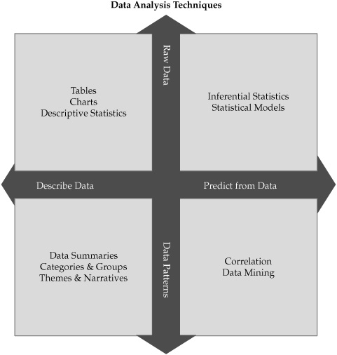
Figure 5-3. Analysis techniques may involve moving from description to prediction, from raw data to patterns, or a combination of both.
Data analysis begins by counting the individual observations or values contained in the measurement data. The most common result of such counting is a frequency distribution in which all the values are tallied and presented. Consider a data set containing a number of different operating systems installed within a business location. Table 5-4 shows one way of presenting the frequency distribution of the OSs.
Another way of showing frequency distribution is through the use of a bar chart, also known as a histogram, which shows the same data graphically, as shown in Figure 5-4. Whether presented textually or graphically, the data analysis is a straightforward count by category. Depending on the purpose of the analysis, the data could have also been expressed as a percentage of installed total systems.
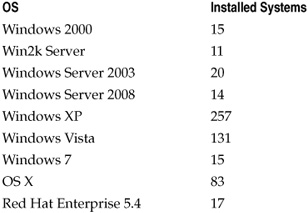
Table 5-4. Frequency Distribution for Installed Operating Systems
My experiences have shown me that identifying and charting distributions are the primary means by which most security groups analyze their metrics. Sometimes the analysis may involve more than just adding up the totals, but usually it’s not much more than that. Security metrics reports tend to involve questions of counting incidents, changes, vulnerabilities, and other observations and then presenting summarized data on a periodic basis. If more sophisticated analysis occurs, it is usually just to state whether those totals went up or down over some period of time (usually since the last time the report was given) and may involve a graph to show trending as well as a histogram.
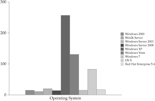
Figure 5-4. Histogram showing frequency distribution of installed operating systems
These analyses can be useful in helping to prioritize immediate efforts and to meet the needs of quarterly ops reviews, but they don’t generate the comprehensive understanding of security operations that we need to establish going forward. From an analytical perspective, the industry’s practice of security metrics is on the ground floor and can only go up in terms of sophistication and effectiveness.
Central Tendency
As you consider the distribution of your data, it is often valuable to understand what values in that data are most representative, most average, or most expected for the overall data set. Statistics that allow you to describe these qualities in your data are referred to as “measures of central tendency” because they help you identify values that tend to fall in the middle of the data. These characteristics of quantitative data are at the heart of most statistical analyses, particularly those that involve “normal” distributions (those that take the shape of a bell curve), and it is useful for you to understand some basic concepts around these measures.
You are probably already familiar with the mean, or average. But the mean is not the only measure of central tendency. To explore these statistical tools, let’s look at a sample set of data based on change requests submitted to a firewall administration team each week over the course of six months. Table 5-5 lists the weekly number of requests submitted to the administrators.
Mode The mode is the most commonly reported value for the data under analysis. In the case of the firewall change requests, if you put all the data values into order, you get the following sequence:
19, 20, 21, 21, 22, 22, 22, 26, 27, 27, 27, 27, 28, 28, 29, 31, 34, 35, 35, 37, 41, 46, 61, 65
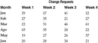
Table 5-5. Example Firewall Change Request Data for Analysis of Central Tendency
Looking at the sequence, we can simply count the most commonly occurring number of change requests, which is 27 and occurs 4 times. This means that the mode of the firewall data is 27:
19, 20, 21, 21, 22, 22, 22, 26, 27, 27, 27, 27, 28, 28, 29, 31, 34, 35, 35, 37, 41, 46, 61, 65
In some cases, multiple values are tied for the most frequent occurrence; in these cases, the data is said to be multimodal and the mode is shared among all the highest frequency values. With a multimodal data set, the mode would include all of the most frequently occurring numbers—you would not take an average of the numbers and call that number the mode. The mode is particularly useful for analyzing central tendency involving data on the nominal scale (categorical data), since this scale is non-numerical (even when numbers are used as the category labels) and cannot legitimately be analyzed using the median or the mean.
Median The median represents the middle of the data distribution, where half of the observed values fall above the median and half fall below it. For the sequenced firewall data, you would identify the median by finding the number in the exact middle of the data set. Averaging does apply with the median, and since you have an even number of values the point in the exact middle is halfway between (or the mean of) the twelfth and thirteenth observations, or 27.5. Had the data been an odd number of values, the median would be the middle number of the set. So the median number of firewall change requests is 27.5.
19, 20, 21, 21, 22, 22, 22, 26, 27, 27, 27, 27, 28, 28, 29, 31, 34, 35, 35, 37, 41, 46, 61, 65
Median values can be calculated for data on the ordinal, interval, or ratio scales. One advantage of the median comes when your data has outliers or skewed data that might affect the mean (discussed next). The median can provide an alternative measure of central tendency that is not as affected by these values and provides a more accurate picture of central tendency. This is why data reports such as household income often rely on the median rather than the mean. If large discrepancies exist between household incomes (to use this example), then mean household income could be misleadingly inflated or depressed, whereas the mean would better reflect the center of the distribution. In the case of the firewall data, suppose you had a couple of very anomalous months, one in which no change requests occurred and one in which 200 occurred. The median for the data set would not change, even with these outliers present.
Mean Most of us are more familiar with the common term “average” than “mean,” and the terms are often used interchangeably. For clarity, I will use mean when I refer to the statistic and I’ll use average in the more colloquial sense of common expectations of something.
The mean is one of the most commonly applied statistical techniques, even when people don’t think about using statistics. The mean is the sum of all the values in a set divided by the number of values in the set. For the example data, the mean number of weekly firewall change requests over the time period observed is the total number of requests divided by the number of weeks: 751 / 16 = 31.3. So over the time period observed, mean change requests were a little more than 31 per week. You can see an example of differences between median and mean scores in these results, as the mean weekly number of change requests is somewhat higher than the median weekly value of 27.5. Adding in the outliers from the median example makes the difference even starker. The median did not change with the addition of the outliers because the middle number remained in the same position in the sequence. The mean, however, is now 951 / 18 = 52.8, which is a significant increase as a result of the two extreme months.
The measures of central tendency I’ve outlined can help you understand where to find the middle of your data set, those observations that are most common or most typical. You can also continue to build upon these analyses to tell yourself more about the security metrics data you collect.
Dispersion
While measures of central tendency focus on the middle of your data, measures of dispersion explore how the data is distributed across observations. Dispersion is as important, if not more important, than central tendency in understanding your data, particularly as the questions you ask and the insights you seek to develop become more sophisticated. Means and medians do not help you understand how your data varies across observations or, more importantly, why they may vary. To understand these questions, you have to dig deeper into the data. Dispersion also applies most to data on interval and ratio scales, which deal with continuous variables. While statistical techniques for measuring dispersion for nominal and ordinal scale metrics are available, the differences and variations in these measurements are best handled in other ways.
Range The range measures the dispersion of data by calculating the difference between the highest and lowest observed values in your data set. In the firewall change data, the range of change control requests is expressed as the highest value minus the lowest value, or 65 – 19 = 46.
19, 20, 21, 21, 22, 22, 22, 26, 27, 27, 27, 27, 28, 28, 29, 31, 34, 35, 35, 37, 41, 46, 61, 65
Quartiles and Interquartile Range Quartiles involve dividing your data into four sections, each containing 25 percent of the observed values for the data. An easy way to calculate the quartile ranges is to use the same technique you used in defining the median for the data. In fact, the median and quartile 2 will be the same value (27.5):
19, 20, 21, 21, 22, 22, 22, 26, 27, 27, 27, 27, 28, 28, 29, 31, 34, 35, 35, 37, 41, 46, 61, 65
To identify quartile 1, you would find the middle value for the first half of the data values, or 22:
19, 20, 21, 21, 22, 22, 22, 26, 27, 27, 27, 27, 28, 28, 29, 31, 34, 35, 35, 37, 41, 46, 61, 65
For quartile 3, the quartile measurement would be the middle value for the second half of the data values, or 35:
19, 20, 21, 21, 22, 22, 22, 26, 27, 27, 27, 27, 28, 28, 29, 31, 34, 35, 35, 37, 41, 46, 61, 65
We now have quartiles 1, 2, and 3 equaling 22, 27.5, and 35, respectively. Quartile ranges can be used as basic descriptors, buckets that allow us to identify low ranges and high ranges quickly in our data. If we want to get more statistical, we can use quartiles to calculate the interquartile range, which is the difference between the first and third quartiles. For the preceding data, the interquartile range is calculated as 35 – 22 = 13.
Variance When you determine variance of data, you are describing how variable, or spread out, the data is compared to the mean of the data. Another way of looking at variance is how far from the center of the data (the mean is a measure of central tendency) you may observe values. At this point, we begin to get into issues of whether we are talking about samples of data versus the entire population from which a sample was taken. In our firewall change request data, for instance, we are looking at a sample of the request data over a period of six months as opposed to the population of all firewall change requests. I will talk about samples and populations later in the section “Inferential Statistics.” For now, I will use variance and standard deviation to refer to samples only.
In discussing variance, we also move out of relatively simple formulas for calculation of these statistics and into more complex mathematical functions. For example, variance can be defined as “the mean of the sum of squared deviations from the mean for a sample” and is described with a rather impressive looking statistical formula. This book is a primer on security metrics and not a textbook on statistics (of which there are many excellent examples that I have to refer to often). And, as one of my statistics professors told me, not even statistics professors worry about formulas when actually conducting research—that’s what statistical analysis software is for. It may be that variance and the following techniques may prove quite useful to your security metrics program, but if you use them, you will not be calculating these measures by hand. I’ll discuss tools shortly in the section “Tools for Descriptive Statistics,” after I finish describing descriptive statistics.
Standard Deviation Variance ultimately leads us to the most common measure of variability and dispersion in a data sample: the standard deviation. While many people may not be familiar with variance as a concept, most of us have heard of standard deviation as a measure of how likely or unlikely is the occurrence of a particular observation or value. The formula for the standard deviation is to take the square root of the variance. Increases in the standard deviation of a data set indicate increases in the spread of values around the mean of the data sample. The frequency distribution of data around the mean also takes particular shapes. The most familiar shape, the one that many common statistical methods assume in their calculations, is the normal distribution or the bell curve. In a normal distribution, approximately 68 percent of all observed values will be found within one standard deviation of the mean (half on each side), and approximately 95 percent of all observed values will fall within two standard deviations of the mean (half on each side). By the time you reach three standard deviations from the mean, less than one-half of one percent of observed values remains unaccounted for. Figure 5-5 shows standard deviations for a normal distribution, with the mean at 0 standard deviations and the number of observed values (expressed as a percentage) that are included as standard deviation increases.
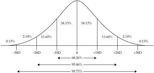
Figure 5-5. Standard deviations in a normal distribution of data
The statistical methods I’ve described can help you get more value out of your metrics analysis than just counting up totals. Using the right measures of central tendency such as the median instead of the mean can help you reduce the uncertainty introduced by outliers and extreme variations in your data. Measures of dispersion can help you understand just what constitutes extreme values in the first place, and it can tell you whether a certain observation is seriously at odds with the general shape of your overall security data. You may not use these techniques every time you analyze your metrics data, but they represent the basic statistical tools upon which analysts in every field and industry rely to make sense of their numbers.
Tools for Descriptive Statistics
Many tools are available for describing security metrics data, and most security professionals are familiar with at least a few of them. Reporting and analysis features are built into various security products and are capable of providing statistics regarding incidents, events, and other metrics. If you are working with metrics data that you have collected and need to analyze yourself, you can choose from among several options.
Spreadsheets Most of us are accustomed to running spreadsheets, and many spreadsheet applications are available. Some, such as Microsoft Excel, are proprietary, but open source and free spreadsheet tools are available as well, including Calc (part of the OpenOffice application suite), Gnumeric, and the spreadsheet program available as part of Google docs. Spreadsheets allow you to create data tables and summarize data, and they provide capabilities for charting and graphing of the results. Most of the quantitative analysis I see conducted around security metrics heavily leverages spreadsheet applications.
Some spreadsheet applications also let you conduct statistical analysis that goes beyond basic mathematical functions, with capabilities for calculating statistics such as variance and standard deviation. Excel and Gnumeric have built-in capabilities for advanced statistical functions, including analyses that go far beyond descriptive statistics. As of this writing, I am not aware that Calc provides native support for statistical analysis, but extensions are available that allow Calc users to leverage the open source statistical package R, discussed in the next section. To my knowledge, the spreadsheet included in Google docs does not support advanced statistical functionality at this time. If you use a different spreadsheet application than I have discussed here, you should check to determine which statistical analyses it supports before attempting to use it for advanced analysis in your metrics program.
Statistical Software For more advanced statistical analysis, a variety of applications go beyond the capabilities of ordinary spreadsheets, and they are designed to be easier and more intuitive to use while you’re conducting statistical research. As with spreadsheets, both commercial and open source programs are available. I have experience with the commercial program Minitab® Statistical Software, which is commonly found in business and academic environments and has been developed to be relatively easy to use and to provide advanced analytical capabilities. Minitab is not the only product for statistical analysis, but I find it quite usable.
A well-regarded open source statistical analysis package, R, is extremely powerful and as capable as any commercial package. R, however, is not as intuitive as most commercial packages and requires a longer learning curve, especially for users who are accustomed to graphical interfaces and point/click/drag/drop workflows (R functions primarily at a command line interface). R is typically found more often in academia and scientific research institutions than in the average corporate business unit. Users of the commercial packages such as Minitab will notice the similarities to spreadsheet interfaces, with the familiar cell format. But statistics programs allow a user to access many more analytical functions and visualization techniques easily just by accessing a menu. Figure 5-6 shows a graphical display of various descriptive statistics produced in Minitab for the weekly firewall data we have been exploring throughout this section.
Inferential Statistics
You can bring an extraordinary level of improvement and sophistication to your security metrics program by using the full toolbox of descriptive statistics available to you. I described basic statistical techniques in the preceding section, and I would encourage you to explore these tools. But descriptive statistics address only the immediate data with which you are working. You cannot assume that your descriptive findings automatically apply to other areas that you have not observed, or to the same areas you have observed under different circumstances. You cannot automatically generalize or predict based on a single data point or data set, although many people often do for a variety of reasons (just look at politicians, for example).
To use data to generalize findings into areas for which there is no data, or to predict an outcome based on a limited data set, requires different techniques and analytical methods. These methods are referred to as inferential statistics, because they involve drawing conclusions or making inferences about something you have not observed on the basis of those things that you have observed.
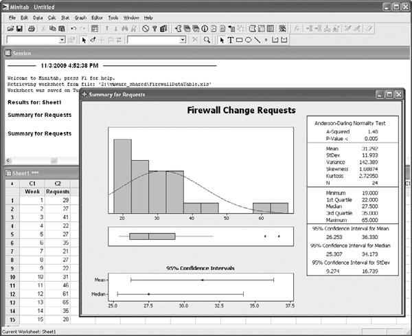
Figure 5-6. Descriptive statistical summary in Minitab
At this stage, I want to provide more context to the discussion of techniques and tools provided in this chapter. I am not a statistician (I just played one in grad school), a fact that will be obvious to any real statisticians reading this book. I am a security professional with some analytical training (both quantitative and qualitative). As I learned to apply these techniques during my doctoral studies, I came to realize the value that they could bring to measuring and analyzing IT security programs. Inferential analysis is already used in a variety of industries for process and quality control, and there are definite applications for these techniques in IT security. Some techniques are more applicable than others to security challenges in general, and to your security challenges in particular. As I describe these statistics, I will take a more general approach, since it is difficult to apply specifics to each of these techniques without describing an entire security metrics project. I will reserve detailed explanations of these techniques until the chapter examples.
My second, related, point is that as we move from descriptive statistics into other techniques, it will become increasingly critical that you understand what you are trying to do with any particular analysis. Descriptive statistics are easy, frankly, because we are already accustomed to counting things, summarizing them, and charting them up for the next management review. The techniques in the preceding section help you to do that with more methodological rigor and in more sophisticated formulations. Inferential statistics (and the techniques in later sections) require that you start out by knowing more about what you want to know. And they require that you be more self-critical and thoughtful in your analysis, because you will have to decide how sure of something you want to be and how much risk you are willing to accept that you may be wrong.
Inference, Prediction, and Simulation
I have always had a difficult time understanding the nuances between inferential statistics, predictive models, and simulations. All three types of analysis can use statistical techniques and have similar aims of getting at insights that are greater than the sum of the data producing them. But they are not quite interchangeable, and I have not found a good explanation that clearly shows how they are delineated. So I am forced to take my own crack at separating them, because techniques for all three goals might prove useful to your security metrics program:
![]() Inference The most easily described from a statistical perspective, because inferential statistics involve commonly used ways of generalizing from a sample to a population from which the sample was taken.
Inference The most easily described from a statistical perspective, because inferential statistics involve commonly used ways of generalizing from a sample to a population from which the sample was taken.
![]() Prediction A bit more difficult to describe, as predictive techniques can include anything that gives you insight into what might happen based on what has happened. Inferential statistics are somewhat predictive in that they extend existing observations out to that which has not yet been observed, but prediction can also involve findings patterns and themes in your data, or even be used to forecast future events or phenomenon in ways that are different from the sample/population analogy.
Prediction A bit more difficult to describe, as predictive techniques can include anything that gives you insight into what might happen based on what has happened. Inferential statistics are somewhat predictive in that they extend existing observations out to that which has not yet been observed, but prediction can also involve findings patterns and themes in your data, or even be used to forecast future events or phenomenon in ways that are different from the sample/population analogy.
![]() Simulation This is also a bit difficult to describe because both inference and prediction involve elements of similarity between the data and the insight produced through the data. But simulation, for my purposes, involves the mapping of things that are difficult to observe or understand into things that are easier to observe and understand—for instance, simulating future risk through Monte Carlo techniques.
Simulation This is also a bit difficult to describe because both inference and prediction involve elements of similarity between the data and the insight produced through the data. But simulation, for my purposes, involves the mapping of things that are difficult to observe or understand into things that are easier to observe and understand—for instance, simulating future risk through Monte Carlo techniques.
In this section, I focus specifically on inferential statistical analysis. I will discuss techniques for prediction and simulation in subsequent sections.
Samples and Populations
We are all familiar with the polling that occurs around political elections. The media and political groups conduct polls that tell us what voters are thinking, how they will vote, who is likely to win or lose. Obviously, these polls do not question everyone eligible to vote before making their determinations, but instead rely on more or less random samples of voters and statistical analysis to provide the results (usually with some margin of error regarding the poll). Manufacturing uses the same techniques to assess standardization and quality of products. If a factory is producing widgets, for example, and each widget is designed to weigh one pound, a manufacturer can sample widgets from the assembly line and determine how well the factory is meeting the weight criteria for the widgets. The factory does not have to weigh every widget, which could be quite costly. These processes work because we understand relationships between samples and between samples and the population of all voters or all widgets. For instance, if we sample properly, we have to sample only a few dozen values for our frequency distribution to be normal, or bell-curve shaped. As I described earlier in the chapter, if we know we are dealing with a normal curve, then we know a lot about how observed values will fall within our data and we can begin to make inferences about the larger population.
IT security has its own populations. We have populations of users, populations of systems, and populations of vulnerabilities, attackers, and threats that we hope to understand. Inferential statistical analysis can help get at these populations—but we rarely use them properly, if at all, in my experience. I have witnessed generalized security decisions made on the basis of horrific sampling strategies. Almost as often, I hear arguments that these kind of insights can’t be developed in security because organizations don’t have access to or share security information. This is often the argument used for why security is uninsurable. That jury is still out, but if you look back on the history and origins of insurance and risk management, you might be surprised at the quality of data available to early actuaries. The fact is that a population is what you make it, literally. If you decide you want to know about all the desktop systems in your organization, you have just defined the population. You don’t have to know or care about all desktops everywhere—that would be a different population. You have to determine how to draw inferences regarding only your own population.
Hypothesis Testing
Central to the concept of inferential statistics is testing hypotheses regarding a population based on sample data collected from that population. A hypothesis is a fancy term for an explanation. More specifically, a hypothesis is an explanation that may or may not be true. To determine whether the hypothesis under consideration is the correct explanation for whatever needs explaining, you must test the hypothesis. One way to test a hypothesis is to use statistics to determine how likely it is that the hypothesis is true or false, whether it should be accepted as truth or rejected.
The basic method for hypothesis testing can be described in four steps:
1. Create two related hypotheses, the null hypothesis and an alternate hypothesis. The null hypothesis is sort of a statement of the status quo, a nonexplanation as it were, for example, stating that all observed values you are trying to explain are the results of random chance. You may believe, for instance, that security incidents among business units in your company are a matter of chance and do not mean that security is different among the BUs. Competing with the null hypothesis is your alternate hypothesis, an explanation that you want to put forward to challenge the null hypothesis that there is nothing special about your data. In response to the security null hypothesis, you might formulate an alternate hypothesis that security is managed differently between BUs, thus resulting in more or fewer incidents. The goal of the test is to reject one of the hypotheses and to accept the other. If you accept the null hypothesis, you reject your own alternate explanation.
2. Build your test method. The test method will depend on the type of data and your analysis goals, and it includes the details of your analysis, including which test statistic you will use and the level of significance necessary to reject the null hypothesis (in other words, the degree to which you are willing to be wrong). The test method should always be completed before analysis, to avoid the temptation to retrofit your method to the end results (in other words, to cheat).
3. Conduct your analysis, using sample data. The test is used to produce a P-value, a statistical term of art that represents the probability that you would obtain an observed value were the null hypothesis true. Smaller P-values indicate smaller chances that you would get such an observation, and thus a smaller likelihood that the null hypothesis is true.
4. Draw conclusions from the test. If the probability of occurrence of a value is less than that of your predetermined level of significance, you have statistically significant findings, and you may reject the null hypothesis, thus accepting your own alternate explanation. If the probability of occurrence of a value is greater than the significance level, you cannot show significant difference between your data and the status quo, and you must accept the null hypothesis and reject your alternate explanation.
From a security perspective, there is nothing magical about hypothesis testing—it is simply a question that is answered. But the formalized and logical structure of the question is specific and inflexible, which can take some getting used to. Many statistics can be used for hypothesis testing. Two very common ones are a t-test and a chi-square test, both of which have potentially useful applications to security metrics analysis.
T-test Simply put, a t-test compares the mean of a data sample against the mean of the population, or it compares the means of two sets of data to determine whether they are significantly different. Applications for security metrics could include observing a random sample of endpoint systems for instances of malware, and then using a t-test to infer from the sample the mean instances of malware across all endpoint systems in the company. Another use of the t-test statistic could be to compare the results of an experiment that compared the effects of a new security procedure in one random sample of systems against a control sample in which no new procedures were implemented.
Chi-Square Test If the data being analyzed is categorical (on either a nominal or ordinal scale), a chi-square test can be used to determine whether a relationship exists between data variables. The chi-square test is sometimes referred to as a goodness of fit test when it compares an observed frequency distribution with an expected frequency distribution to see how well they match up. Another use of the chi-square test is as a test of independence, where variables in a contingency table are analyzed to determine whether they are independent of one another. An example of this use of a chi-square test could be our preceding example, in which security incidents are compared across several different business units. The null hypothesis might be that differences between types of security incidents across BUs are the result of chance. The alternate hypothesis is that observations are independent of one another, indicating that a relationship exists between types of security incidents and the BU in which they occur. A chi-square test can be used to reject or accept the null hypothesis in this case.
Tools for Inferential Statistics
The tools available for analysis of inferential statistics are much the same as the tools for descriptive statistics. Both Excel and Gnumeric can conduct inferential analysis and hypothesis testing, including t-tests and chi-square tests. Statistical programs such as Minitab and R also have these abilities, along with the extra bells and whistles such as charting and reporting features that are common to dedicated statistical software.
Other Statistical Techniques
Inferential techniques add a lot of flexibility to your security metrics analysis toolbox, but other techniques that don’t fall neatly into either category can be used to leverage the statistical concepts we have discussed in the last two sections. Once again, these are just a sampling of the techniques that are available to extend traditional metrics analysis into new areas of sophistication. The only real limits are your imagination and the resources you can bring to bear.
Confidence Intervals and Decision Making One of the issues I discussed regarding traditional, matrix-based risk assessments was that instead of measuring risk, they measured people’s thoughts about risk. This is problematic for two reasons. First, results in these assessments are often used as if they measured something more tangible than opinions. Second, the development and articulation of those opinions are imprecise and usually do not equate to more than a basic “high, medium, low” rating that is, at best, ordinal (despite all sort of gimmicks to replace the words with numbers, weights, multiples, and other alchemist tricks). It is almost as if, because the assessment deals with subjective opinions, there is no need (or way) to try to be exact.
Opinions can be made more precise, just as can any other measurement, as we experience every day. Suppose I were to ask you the exact amount in your savings account at this moment. Chances are you don’t have that information immediately at hand. But you could certainly give me a rough estimate, based on your opinion. Now suppose I were to ask you the same question about my savings account. You could still express an opinion, but you are likely to be much less confident about that opinion. Now suppose I asked you to give me, instead, a range of amounts for each account that you would be 90 percent certain contained the correct figure. You know about how much you have in your own account, so that range might only be a few (or a few hundred) dollars in order to give you 90 percent confidence in your opinion. For my account, you would have to come up with a much broader range, perhaps in the thousands or even millions of dollars to be 90 percent sure that you were right.
These associated estimates and ranges form the basis of what is called a “confidence interval,” which is a statistical term for a range that has some specified chance of containing a certain value. Confidence intervals are at the heart of many statistical analyses, such as hypothesis testing, where we determine a level of significance that allows us to be confident that a particular value does or does not allow us to reject the null hypothesis. The use of confidence intervals in decision-making comes out of the fields of psychology and decision science and can be used to improve the kinds of assessments that traditional security risk analyses are supposed to provide.
Imagine replacing high, medium, and low threats in a risk assessment with confidence intervals for actual losses based on the experience and expertise of the IT staff involved in the assessment. The outcomes have the potential to be far more precise expressions of risk, with more rigorous supporting evidence, than the overused red-yellow-green heat maps security professionals are accustomed to using. Of course, like any other statistical analysis, these assessments must be conducted properly. One of the critical factors in these sorts of judgment exercises is the calibration of experts who will provide the opinions. Calibration is the process by which experts are trained to express their opinions in terms of confidence intervals and to select appropriate confidence intervals so that they are being neither too conservative nor too broad in measuring their own opinions.
Inter-rater Reliability Another problem associated with opinions, expert or otherwise, is how to determine the extent to which people agree, or the amount of consensus on a given question or challenge. Think about a situation for which system criticality is being measured, perhaps as part of the risk assessment example used previously. All the experts involved in the assessment are given a list of corporate IT assets and asked to categorize them along some scale of business impact should the system be compromised or inaccessible. Odds are that not everyone is going to rate every system identically, but the question becomes one of how much general consensus (or lack of such consensus) exists? If everyone generally rates systems the same way, the assessment shows a higher level of agreement between raters and the rating scale is valid. If there is low agreement between raters, something is wrong either with the scale or with the raters. Note that neither result means that the scale is accurate or inaccurate in terms of business impact! It is very possible that everyone will rate that impact as low when it is in fact very high. The test measures only whether the scale is or is not understood in the same way by everyone using it. Everyone can be in complete agreement and still be wrong. Inter-rater reliability is useful in reducing uncertainty by ensuring that at least everyone is on the same sheet of music in understanding how they have agreed to evaluate something.
Numerous statistical tests of inter-rater reliability can be used, with cool-sounding names such as Fleiss’s kappa and Krippendorf’s alpha. They are often used in academic research to assess whether researchers assigning codes to data are using codes and categories in the same way, or if there are differences in the way they are assigning them that could negatively impact the research findings. But inter-rater reliability tests can support security metrics programs as well, particularly in measurement projects that involve groups collaborating to measure or otherwise attempt to answer questions about various aspects of the security program.
Correlation Analysis Correlation refers to the presence of relationships between things— for instance, there may be a correlation (I haven’t tested it scientifically) between the number of cups of coffee I have had and the number of pages of this book I can produce in an hour (as well as the number of fat-fingered typos that exist on each page). Correlation is measured by calculating a correlation coefficient, which describes the relationship between two variables in a data set on a scale of –1.0 to +1.0. A correlation coefficient of 0 indicates that no relationship exists between the variables.
Correlation is often best described visually, using scatterplots that show whether correlation is positive or negative and how strong or weak the correlation may be. Suppose, for example, that I decided to test the correlation between my coffee consumption and three other variables: the number of pages I produce in the hour after I drink each successive cup, the number of typo-free paragraphs I produce in the hour after each cup, and the number of e-mails I receive in the hour after each successive cup. For simplicity’s sake, assume that I drink about one cup per hour during the course of a half-day of writing and checking e-mail. Figure 5-7 shows scatterplots for the results, with the correlation coefficient of each test. The results are apparent visually as well as mathematically. As I drink more coffee, my productivity increases almost linearly, while my accuracy decreases just as dramatically. The e-mails I receive seem to have little to do with how much coffee I’ve drunk, as one might expect.
Correlation is a technique that is already widely adopted in IT security, particularly among SEIM and log analysis vendors who seek to understand relationships between security events and other variables, such as sources and destinations, categories of attack, and risk or severity scores.
I would caution you against blind acceptance or dependence on these features for a couple reasons, however. As I’ve said, security metrics analysis must be goal-driven. Correlation data as a bell and/or whistle, with no understanding of why you are correlating or what you will do with the results, is not a recipe for good security. Correlation data may be an excellent source for exploratory analysis, so don’t think you have to know what you are looking for before you go looking. But you should have some idea of why you are doing it. And you should always keep in mind a famous dictum in statistics: correlation is not causality. This means that just because something correlates with something else, you cannot simply assume one thing causes the other. In my coffee example, it may be that some force other than coffee is at work, affecting my productivity and accuracy. Perhaps I take time to establish a groove in my writing, and my speed increases as the day progresses along with my typos because I am writing faster for longer periods. Correlation can provide valuable insight, but you should always stand ready to question your assumptions.
Longitudinal Analysis Think about the way your organization collects, analyzes, and uses security data today. In many, if not most, cases, I would be willing to bet that data is collected for a particular set of systems or criteria for a particular time period—perhaps all the firewall or IDS events over the last month. This data is used to produce reports or charts, perhaps for the monthly CISO staff meeting, and then everyone moves on. In some cases, trending or baselines may be associated with the data, but this usually involves simple calculations of whether things are going up or down, or otherwise meeting a pre-established threshold. And even these trending exercises are usually conducted as snapshots taken at the same time as other analyses. One area that I have a lot of experience in this regard is in vulnerability assessments conducted for clients, which are often taken as point-in-time analyses of a security posture and provided very little context or follow-up, sometimes not even holding the client’s attention long enough to develop a proper remediation plan.
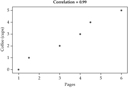
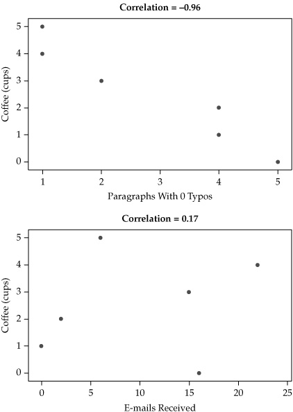
Figure 5-7. Correlation coefficients for three data sets
Longitudinal analysis is about moving from snapshots to motion pictures, if I may borrow another metaphor. Longitudinal studies include such things as security baselines and trending over time, but true longitudinal analysis involves setting up measurement projects that are designed to be conducted over months or years from the beginning of the project. This requires understanding goals and metrics in the context of time, which usually means more forethought (and sometimes foresight) must be applied. Longitudinal study does not lend itself easily to corporate environments, where short-term focus on cyclical requirements often drives activities, or where personnel and management turnover can make taking a long view difficult or even politically dangerous. But one of the major problems with IT security today is that we are often so busy managing the pressures of the moment that we have no time or motivation to develop greater situational awareness or strategic planning.
Adding longitudinal components to your security metrics program can be a game changer, when done correctly. And as with other techniques I’ve covered, fairly simple methods for such analysis as well as complex techniques for collecting and testing data over time are both available. But the main takeaway from longitudinal capabilities is to move your security metrics program into a real, applied research program that is not only concerned with what is happening now, but with how security current state is connected with past and future states.
Tools for Other Techniques
As with the previous statistical analysis methods, the techniques described in this section will benefit from analytical software, including spreadsheets and dedicated statistics applications. For some techniques such as correlation and longitudinal analysis, it may also be desirable or necessary to incorporate databases or to use features built into existing security vendor tools designed to detect relationships or to store and analyze data from archival or historical sources. If your data is coming from several sources, or your security measurement project demands it, you may have to create the database yourself.
The main point to remember is that as you move further away from relatively straightforward counting exercises, the success of your analyses will depend more and more on your ability to articulate and manage your goals and objectives, preferably from some point before the project even starts. At the point at which these techniques become valuable in your metrics program, you should come to realize that you are no longer counting security beans but have become a full-blown security researcher. Whether you choose to share that fact with anyone else is up to you.
Qualitative and Mixed Method Analysis
As we move further away from traditional approaches to analyzing security activities and metrics data, we eventually move into territories that are completely unfamiliar to most security professionals. I have described the reasons for implementing true qualitative metrics and the benefits to be gained from their analysis as I’ve led up to this chapter, and now I will discuss these techniques and tools in more detail.
I should first reiterate that these approaches are not widely adopted in the security industry, although they are used very successfully in other industries, including advertising and design. They are also not widely accepted by security practitioners, partly because they are poorly understood and because they often seem to violate the sensibilities of security pros with backgrounds in engineering, finance, or the hard sciences. People who discount qualitative measures tend to want to rely on “facts” and “objective data” rather than on opinions and fuzzy data such as people’s personal descriptions, activities, and stories. I won’t get into any epistemological arguments about the merits of one set of methods over the other. But as I’ve expressed several times, I strongly believe that some security challenges cannot be addressed by quantitative analysis. And to argue that a security question that cannot be answered with numbers is not even a real question to begin with is to be willfully ignorant both of the history of science and the daily realities of life. So stepping once again off my philosophical soap box, let’s talk a bit about qualitative techniques.
Coding and Interpreting Data
The general purposes of both quantitative and qualitative data analysis are similar: to identify patterns and make conclusions regarding a set of observations. Where they differ is in how they go about the identification and what conclusions can be drawn. Table 5-6 breaks down some basic differences between the approaches.
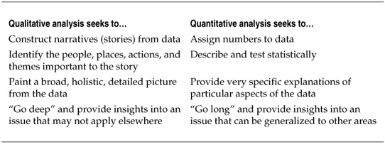
Table 5-6. Differences in Qualitative and Quantitative Goals
In qualitative analysis, it becomes the role of the analyst to identify themes and build the case for findings and conclusions based on the analysis. The process is naturally and explicitly interpretive, which means that it not only involves the opinions of the people providing the data but also the opinions of those collecting and analyzing the data. All these layers of opinion can breed skepticism in people who like their facts to feel more raw and rational. But skepticism is itself an opinion and an interpretation, one that is difficult to express quantitatively. The only way to express disdain for qualitative analysis is to build a believable story around why it doesn’t work, and the better constructed and explained the components of that story are, the more likely people are to accept its conclusions. Ironically, this is exactly the way that qualitative analysts approach their data. The goal is to make reasonable, well-considered arguments about the data and to be able to show how and why those arguments were developed. If most people agree that they are reasonable, they gain credibility and acceptance. You may never be able to “prove” something is true, but proof is not really the end goal.
The heart of qualitative analytical techniques is the concept of coding, or assigning themes and categories to the data and increasingly specific levels of analysis. For instance, if you are coding interview transcripts from a security measurement project involving users’ online habits, you might start assigning themes such as “personal” or “job related” to categorize different user activities or responses. Later, the coding might become more specific with other subcategories and themes added. Qualitative coding can be applied to any text, from interview transcripts to source code, and is used to identify themes that can be interpreted as existing in the data. As the codebook grows, relationships and patterns between coded themes and categories grow more rich and sophisticated, allowing for higher order conclusions to be reached about the narratives contained in the data.
Mixing Qualitative and Quantitative Techniques
Using purely qualitative approaches to security metrics analysis will be appropriate in some measurement projects, but often the best approach may be a blended analysis that includes both qualitative and quantitative techniques. As I have shown, a lot of security data lends itself to quantitative analysis both generally and as a way to develop bigger questions. Qualitative methods can be added to these quantitative techniques to gain understanding of security practices and results that may not be readily apparent from the numbers. Likewise, some qualitative metrics can be greatly enhanced by adding quantitative elements and criteria based on other data sources.
Process Mapping and Analysis I have stated that security should be treated and analyzed as a business process. One of the most common means of process analysis is to develop a process map, which is a flowchart diagram that shows each activity and the relationships between activities for a given process, as illustrated in the simple diagram in Figure 5-8. Process mapping is widely employed by many organizations, including security programs, but those who use it do not tend to think of it as the exercise in qualitative data analysis that it represents. Process maps are generated by gathering input from people who describe their thoughts and opinions regarding the process, and this data is then coded visually into specific shapes and symbols that are interpreted by the process analyst. The final result is a representation of an intangible thing that can be more easily understood and that can drive decisions.
Figure 5-8. Simple process map with activities and relationships
Process mapping becomes more powerful when combined with quantitative data regarding the stages and steps included in the process. As metrics such as time to complete a process, delays between steps, or the costs associated with each step are added to the process map, the potential for statistical analysis grows. Descriptive statistics can help you understand where bottlenecks or inefficiencies may occur in the qualitative process map, and inferential statistics can be employed as part of experiments or hypothesis tests to determine whether changing parts of the process will improve the results for a given metric. In many industries, the practice of statistical process control is one of the key metrics-based analyses used to improve the business. The Six Sigma methodology, for instance, is designed to facilitate statistical process control and well-known in IT, although it is used less in security. Business process analysis, whether qualitative or quantitative, represents a metrics practice that can be immediately and fruitfully deployed as part of a security program.
Surveys and Interviews Another excellent source of qualitative security metrics data are people, including the users, technologists, managers, partners, and customers who drive and influence our security programs. Far too often, particularly in vendor marketing, users and other people are described as a big part of the “problem” that security needs to address. I often see headlines in trade news articles and vendor advertisements that state flat out the threats that people pose to the organization, as if the organization were somehow separate from and exclusive of those same people. Of course, people can be and often are security risks, but in the techno-romantic world that some security pros seem to live in, the organization’s employees and clients are just more components of a larger system that can be manipulated and managed through product. Even if that were true (and it is definitely not), one of the quickest ways to find out something about a person is simply to ask them questions. You may not get a correct answer, or even an honest one, but you can use the responses as part of a larger data set to get more accurate and valuable knowledge.
Everyone is familiar with doing this sort of work in support of metrics such as customer satisfaction, product marketing, and even performance reviews. It is also a technique that should be considered for security metrics. Survey work, interview analysis, and focus groups can be expedient ways to get a lot of information quickly. And some analytical techniques combine qualitative coding and quantitative analysis to identify patterns and themes in the resulting data. I like to think of this sort of data analysis in terms of usability testing, except instead of asking individuals and groups about how easy a particular technical product is to use, I am considering aspects of the security program as the product. A great example is the security policy—is it usable? Can you read the policies and understand them? Can you follow them easily without making your life miserable? If the answer to these questions is no, then the security program has produced a poor product and you shouldn’t be surprised when that product fails in the marketplace.
Content and Text Analysis Text is central to the security process. The term text can refer to writing (digital or otherwise), but the term texts also refers generally to the artifacts produced through writing, from documents, to records, to books. Security texts that can be analyzed include our policies and procedures, our budgets and reports, and even our source code and configuration files. Analysis can be purely quantitative, purely qualitative, or a combination of both techniques.
Textual analysis can include cataloging word frequencies and assessing grammatical structures, techniques that are often employed in the publishing industry to determine how complex or readable books and articles may be. These techniques are also applied to documents such as technical manuals, particularly those by the military, where the ability of readers to comprehend the text is critical. I have used these measures in conducting security policy analyses, sometimes demonstrating to a client that the reason no one follows the security policy is not because users don’t care, but because the policy is so difficult to read that it requires an advanced degree to understand it.
Content analysis can also be used to identify themes and positions in texts, and content analysis studies have explored everything from how the use of metaphors in speeches makes politicians seem more credible to the analysis of how language in company annual reports give clues that the company is failing over time. Some of these themes can be assessed automatically using certain algorithms and statistical approaches, while others require manual coding on the part of an analyst. But whether you are interested in how friendly your security policy is or how much independent expressions of style exist in your source code, textual analysis provides useful tools for exploring these metrics.
Ethnography and Fieldwork Some of the most pure qualitative analysis comes from in-depth studies of individuals, organizations, and communities. These techniques involve an analyst working in close quarters with the participants in the study, carefully documenting everything that occurs in the environment. The term for this sort of data collection and analysis is ethnography, and fieldwork refers to the methodologies used for collecting the data in ways that will be structured, rigorous, and credible when it comes time to present findings. Another term often used for this sort of study is participant observation— the analyst will both participate in and observe the environment.
Ethnographic analysis can be resource-intensive. To conduct fieldwork successfully, the analyst must have time to devote to observation (one day of watching is unlikely to paint a full picture; participant observation studies can take anywhere from a few weeks to several years), and he or she must have access to the environment to observe. Once the data is collected, he or she then must properly code and interpret what was observed, identifying themes and building interpretations and conclusions from the results. If the data set includes video or audio data (and many do), this data must be specially annotated, coded, and analyzed.
So if ethnography is that much work, and if the results are so broad and interpretive, why would anyone outside of academia even think about doing it? Ethnography seems more suited to anthropologists who study isolated indigenous villages in the rainforest than to security practitioners. But think about the similarities between that isolated village—complete with its own culture, language, and seemingly strange daily practices—and what it is like for most members of an organization to visit the security operations center (SOC)—that strange, isolated compound with big screens and odd people that have their own culture, language, and daily practices. You don’t have to go outside the country to find different cultures; sometimes you don’t even have to leave the company.
Consider the questions that you (or your CEO) might be asking about the SOC: What do those folks do every day? Now try to answer that question with a set of descriptive statistics and inferential hypotheses. It is like building a picture from scratch out of pixels rather than taking a photograph and looking for the details that interest you in the whole. Building this kind of knowledge from quantitative metrics, if it is even possible, will prove far more costly in terms of time and resources than a six-week security measurement project in the form of a participant observation exercise.
Companies, including technology companies, use this technique quite a bit. Many design companies rely on ethnography to understand how creations, from web pages to consumer products, are used in daily practice, rather than just in the designers’ predictions. Product manufacturers use ethnography to improve their bottom line and conceptualize new offerings. Whether a consumer products company makes razors and wants to understand how the average person shaves, or a high-tech company analyzes how people use their kitchens so that they can create better smart appliances, ethnographic research is an important metrics tool that IT security operations should consider exploring.
Tools for Qualitative and Mixed Analysis
Quantitative analysis tools are often variations on a theme, primarily in the form of spreadsheets and statistical software. The question is not so much functionality, but which product is the most powerful, most specialized, least expensive, or easiest to use for a particular purpose. Qualitative tools are much more diverse, although some of the same criteria apply. Some good commercial packages and good free (not always open source, and vice versa) tools are available. Your choice of tool will depend on your choice of analysis, which of course depends on your choice of metrics, and by extension your goals and objectives—and so the cycle of analysis within the SPM Framework continues.
Academics Before I get into specific tools, I want to mention a resource that often goes untapped when it comes to more sophisticated analysis. Nearly every major company, and a good portion of small to medium-sized companies, operate within 50 miles of some sort of academic institution—be it a private university, a state college, or a community college. These institutions are filled with specialists who know a lot about conducting well-designed, innovative research on any number of mainstream as well as fringe topics and questions. These researchers have access to literatures, tools, and cheap labor in the form of graduate students and research assistants. What they often lack, however, is data. Access to quality data sources to observe and study is one of the most challenging parts of scholarly research. Most researchers I know would be ecstatic if a company came to them and asked if they were interested in helping conduct research on various aspects of the organization.
Companies are often reluctant to engage academia in research, however, because they fear the loss of intellectual property or confidential information, but this fear is often misplaced. Academic researchers want two things (other than access to data): publications and money to continue their research. Unlike consultants, academics do not usually care about posting the trophy names of the companies they have worked for and should have no problem agreeing to restrictions on the level of detail they can reveal, through non-disclosure agreements (NDAs) or other means, so long as they can use the general results to get published. And the publications themselves are typically in scholarly peer-reviewed journals or at academic conferences rather than industry trade publications. As for money, the costs of conducting an academic study will often pale in comparison to what a consulting firm would charge for the same sort of work (and often the consulting company may contract out to an academic if specialized skills are required). It may not even be necessary to pay for the study, particularly if working with the company might help the academic secure a grant or funding from elsewhere.
If you are thinking about this sort of analysis for your metrics program, consider visiting the nearest university’s web site and exploring the fields and disciplines represented. You may find that you have an opportunity to leverage such research without having to build an entire analytical capability.
As I have indicated, far too many tools are available for qualitative and mixed method analysis to catalog them all properly here. Instead, I will present an overview of some of the tools available for various types of analysis, including open source options when they are available.
Computer Assisted Qualitative Data Analysis Software (CAQDAS) Before computers, qualitative analysis often involved intensely manual exercises in which notes and observations would be recorded on index cards and manually organized, coded, and arranged into patterns. Sometimes it still happens this way. I’ve seen pictures of entire walls or floors devoted to some poor graduate student’s qualitative methods dissertation, and heaven help the small child or pet that comes running through the room and scatters the cards! Today a variety of software tools allow for the effective coding of texts as well as audio and visual data. These tools not only allow the analyst or researcher to mark up the data with codes and tags in the text, but the researcher can also run sophisticated analyses to look for patterns and develop themes from the data.
![]() ATLAS.ti A commercial qualitative analysis package with a rich set of features for coding, annotating, and analyzing a variety of data; includes sophisticated features and is used by industry as well as academia.
ATLAS.ti A commercial qualitative analysis package with a rich set of features for coding, annotating, and analyzing a variety of data; includes sophisticated features and is used by industry as well as academia.
![]() NVivo Sold by QSR International, this is a sophisticated and feature-rich commercial CAQDAS product that is used in companies, universities, and research institutions.
NVivo Sold by QSR International, this is a sophisticated and feature-rich commercial CAQDAS product that is used in companies, universities, and research institutions.
![]() TAMS Analyzer An open source qualitative analysis tool with many of the same capabilities as the commercial tools; TAMS is not as sophisticated as the big vendor products and the interface isn’t as pretty, but for basic qualitative analysis, you cannot beat the price.
TAMS Analyzer An open source qualitative analysis tool with many of the same capabilities as the commercial tools; TAMS is not as sophisticated as the big vendor products and the interface isn’t as pretty, but for basic qualitative analysis, you cannot beat the price.
![]() Weft QDA Another open source qualitative tool; easy to use but with fewer features than TAMS.
Weft QDA Another open source qualitative tool; easy to use but with fewer features than TAMS.
![]() Transana An open source tool (but not free in current version) specifically designed for coding and analyzing video and audio data.
Transana An open source tool (but not free in current version) specifically designed for coding and analyzing video and audio data.
Process Mapping and Analysis Tools A variety of tools can help you map, chart, and analyze business processes and workflows, although, in my experience, most of these tools are commercial with fewer high-quality open source options, particularly at the level of stand-alone desktop tools. This limitation is somewhat tempered, however, by the fact that a number of standard office productivity suite applications include tools that can be more or less effectively applied to business process mapping.
![]() Office suites including Microsoft Office and OpenOffice both offer graphics and presentation tools that can be used to create flowcharts and business process maps.
Office suites including Microsoft Office and OpenOffice both offer graphics and presentation tools that can be used to create flowcharts and business process maps.
![]() Specialty diagramming and drawing programs such as Microsoft Visio, Smart-Draw, and OmniGraffle provide advanced flowcharting and process-mapping capabilities.
Specialty diagramming and drawing programs such as Microsoft Visio, Smart-Draw, and OmniGraffle provide advanced flowcharting and process-mapping capabilities.
![]() Some vendors have developed specialized applications for mapping and analyzing business processes. These tools permit an analyst to model rather than simply map or chart business processes, adding other data and allowing the analyst to simulate the process from beginning to end.
Some vendors have developed specialized applications for mapping and analyzing business processes. These tools permit an analyst to model rather than simply map or chart business processes, adding other data and allowing the analyst to simulate the process from beginning to end.
Content and Text Analysis Tools If you are analyzing text or document content for themes and patterns, you can choose from among the major CAQDAS tools listed in the preceding section; most of them offer advanced capabilities for coding and analysis. Other available tools are more linguistically focused and offer tests and measurements around the structural, lexical, and grammatical elements of textual data. Some of these tools, such as WordStat and WordSmith are commercial products, but Yoshikoder, an open source content analysis application, is also available.
These tools can provide word frequency counts, advanced dictionary and pattern matching features, and they can be used to create keyword in context (KWIC) concordances that will take a target word or phrase and arrange all instances of the phrase into a column with the text that precedes and follows it. KWIC concordances provide a quick and visual way to identify themes and patterns of use around specific words or phrases.
Summary
Analysis of the security metrics data that you will produce as you create measurement projects will be a critical component of your success. Your analysis may be applied in support of particular problems or questions, or it may be exploratory and intended to provide further insight into new questions and new areas of security measurement. Whatever your reason for analysis, it is vital that you consider what you want to accomplish with your metrics, leveraging methods, and frameworks such as GQM and SPM to guide and organize your program.
As you prepare for analysis, you will likely be working with data drawn from different sources, measured along different scales, and collected for different purposes. Cleaning and normalizing data so that it can be analyzed appropriately is a necessary, if sometimes time-consuming, phase of the analytical process and cannot be ignored if you hope to get good insights from your observations and measurements. Many methods can be used for cleaning data and mapping different data sources to one another to ensure “apples-to-apples” comparisons.
Analysis techniques for security metrics data include statistical methods, qualitative methods, and combinations of both. When considering statistical analysis, the measurement scale becomes very important, because some statistics will apply only to interval and ratio data. You should be very clear when considering your statistical tests whether you are dealing with real numbers or with categories. Statistical analysis can also be subdivided into descriptive and inferential techniques. Descriptive statistics apply only to the immediate data at hand and provide analysis of patterns and characteristics of that data, including calculations of the mode, median, and mean, as well as variance and standard deviation. Inferential statistics attempt to compare sample data to a population from which the sample is drawn, the goal being to make generalizations about factors that have not been directly observed. Related to inferential statistics are techniques for hypothesis testing, in which specific explanations are tested against one another to see which may or may not be accepted or must be rejected.
Qualitative analysis involves nonquantitative data, including texts, human responses, and the behavior of people in particular contexts. Qualitative analysis uses methods for structured interpretive coding by a trained analyst or researcher to build patterns and themes from large, broad data sets; it provide insights that are extremely rich but apply only to the phenomenon under observation (that is, they cannot be generalized). Qualitative and quantitative analyses seek to understand data in different ways and for different purposes, so it is often useful to combine them.
The analysis of business processes, documents such as policies and corporate records, and organizational behaviors and practices are all examples of attempts to gain insight into areas where quantitative analysis cannot provide much benefit. But quantitative techniques can be used to supplement and extend qualitative analysis, and the reverse holds true as well, such as when business process mapping includes quantitative measures allowing for experiments and hypothesis testing to determine whether changes to processes actually improve those processes.
Tools for both quantitative and qualitative analysis are widely available, both commercially and through open source projects. The availability of these tools and of techniques for such analysis make it fairly easy to add a great deal of sophistication to existing security metrics initiatives.
This chapter has covered a lot of ground quickly. Entire textbooks have been written about data analysis techniques to which I have been able to dedicate only a few paragraphs; my treatment has been necessarily light. But the purpose of the chapter was not to teach you to be a seasoned ethnographer or statistician. These tools are just that—tools—and as when using any tool, you must consider its merits in the context of your own needs and then learn what you need to learn to apply them skillfully.
I would restate my case that anyone seeking to improve or extend their security metrics program into truly sophisticated analysis could do worse than to partner with local academic institutions, where these sorts of skills are common. But these tools and techniques are available to anyone, and the availability and strength of the open source solutions available for analysis make it that much easier to get started incorporating advanced analytical practices into your security metrics initiatives and projects.
Further Reading
Dalgaard, P. Introductory Statistics with R. Springer, 2008.
Graham, B. Detail Process Charting: Speaking the Language of Process. Wiley, 2004.
Hubbard, D. How to Measure Anything: Finding the Value of “Intangibles” in Business. Wiley, 2007.
Kahneman, D., et al., eds. Judgment Under Uncertainty: Heuristics and Biases. Cambridge University Press, 1982.
Minitab, Inc. Meet Minitab 15. 2007.
Myatt, G. Making Sense of Data: A Practical Guide to Exploratory Data Analysis and Data Mining. Wiley, 2007.
Saldaña, J. The Coding Manual for Qualitative Researchers. SAGE, 2009.
Smith, R. Cumulative Social Inquiry: Transforming Novelty into Innovation. The Guilford Press, 2008.
VanderStoep, S., and D. Johnston. Research Methods for Everyday Life: Blending Qualitative and Quantitative Approaches. Jossey-Bass, 2009.
Winston, W. Excel 2007: Data Analysis and Business Modeling. Microsoft Press, 2007.