
 2
2
Overview
This chapter is for those who are new to JMP software. It discusses the general approach to analyzing data using JMP platforms. A step-by-step example takes you through a simple JMP session. You see how to start JMP, open a table, perform an exploratory analysis, and end the session.
If you have used JMP previously and feel familiar with it, use this chapter as review and proceed to Chapter 4, “Exploring Data with the Distribution Platform,” which begins with statistical explanations and examples.
JMP Starter Window (Macintosh)
The JMP Approach to Statistics
Open and Examine a JMP Data Table
Generate a Scatterplot and Label Points
Start the JMP Application
There are several ways to start the JMP application:
- Double-click on the JMP application icon.
- Click on the JMP application icon to highlight it, and select Open from the File menu.
- Double-click on an existing JMP table or script.
The active JMP application displays several items by default. You can use general JMP preferences to show only what you want to see when starting JMP.
Tip of the Day
Both the Macintosh and Windows environments begin by showing ‘The Tip of the Day.’ There are many of these handy tips, but as a rule they are most useful when you become an experienced user. If you are just starting or are not interested in the tips, clear the ‘Show tips at startup’ check box in the lower-left corner of the tip to prevent them from showing again. Select Help > Tip of the Day to see the tips at any time.
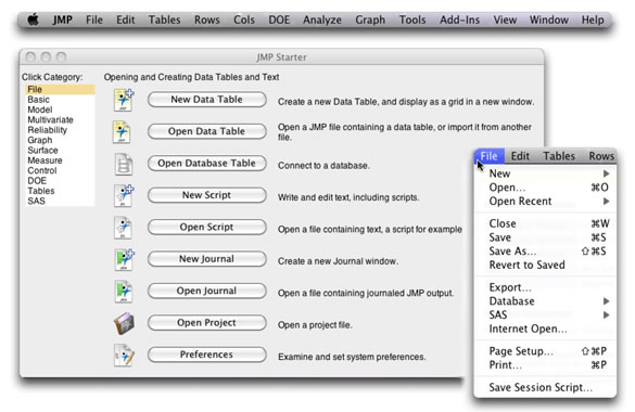
JMP Starter Window (Macintosh)
When the application begins, in addition to the Tip of the Day, the Macintosh environment shows the JMP menu bar and the JMP Starter Window. If you open a table to start, then that data table is also displayed.
Figure 2.1 shows the first tab page of the JMP Starter Window. Buttons on the tab pages access commands on the main menu bar. You can close the JMP Starter Window and use menu bar commands, but the starter tabs provide brief descriptions of many commands and are a good way to start learning how to use JMP. Figure 2.1 also shows the main menu bar and the File menu. Note that all buttons on the File tab page on the JMP Starter Window can be found on the File menu.
Figure 2.1: The JMP Starter Window, Main Menu Bar, and File Menu
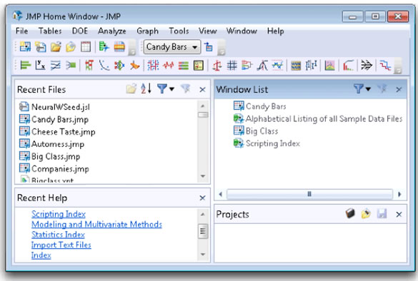
JMP Home Window (Windows)
When you start JMP on Windows, the JMP Home Window (Figure 2.2) displays. It might show behind the Tip of the Day; you can either close the Tip of the Day window or click the JMP Home Window to bring the JMP Home Window to the front.
The JMP Home Window is completely customizable. You can resize any of its panes or choose which panes to keep open. Once you begin using JMP, importing, opening, or creating tables and doing analyses, the JMP Home Window becomes and invaluable desk organizer. However, closing the JMP Home Window when nothing else is open automatically closes the JMP session after asking you if you are ready to exit JMP.
You can always close JMP by using File > Exit JMP on Windows or JMP > Quit on the Macintosh.
Figure 2.2: The JMP Home Window (Windows)
The JMP Approach to Statistics
Before any analysis work can be done, data must be in the form of a JMP data table. Chapter 3, “Working with JMP Data,” talks about creating new tables; this chapter assumes you already have a JMP table. To open an existing table, double-click on the JMP table icon, or use the Open command in the File menu (File > Open) and navigate to the table you want to open.
After data is in a JMP table, data exploration and analyses are available that range from simple histograms, a broad selection of plots and graphs, univariate and multivariate modeling, specialized techniques needed for time series analysis, survival analysis, quality control, multivariate methods that include correlations, clustering, and exploratory modeling tools.
When you select an Analyze or Graph menu command, a launch dialog prompts you to specify variable roles such as Y (response, dependent, or criterion variable) and X (factor, independent, or predictor variable). Most platforms also let you choose a grouping variable (or BY-variable), which results in a separate analysis for each level of that variable. The type of analysis is a function of the modeling type (continuous, nominal, or ordinal) of each variable specified for analysis in the launch dialog. Modeling types are discussed further Chapter 3, “Working with JMP Data.”
Most JMP platforms begin with plots or graphs and a preliminary data analysis when appropriate. The analysis platforms have options and commands to request additional information pertinent to the analysis. These options let you see as much or as little detail as you want. The results are presented in an outline form that lets you open or close whole sections of an analysis.
The analysis results are highly interactive. When you click on points in plots, the corresponding rows are highlighted in the data table and in all other plots and graphs. You have control of the axes specification in plots, color and marker representation of points, what information to include in tables of statistical information, how many decimal places to display, and so forth.
There is also a scripting language in JMP (JSL) that lets you program an analysis and rerun it at any time. You can add JSL commands to a completed analysis to tailor the graphical results. Also, platform commands can save the JSL commands for a completed analysis and store the JSL script with the data table.
Other main menu commands let you save results in a journal or create an editable layout of results, suitable for organizing information into a presentation report.
The step-by-step example in the next section shows how to do simple data exploration in JMP. You can follow each mouse step (![]() ) to familiarize yourself with the JMP approach. This short example illustrates the basic features that make exploration and analysis of data fast, flexible, informative, and intuitive.
) to familiarize yourself with the JMP approach. This short example illustrates the basic features that make exploration and analysis of data fast, flexible, informative, and intuitive.
A Step-by-Step JMP Example
So let’s begin by opening a JMP table and doing a simple analysis. The purpose of the following example is to show you how to get started in JMP and use basic JMP features available in most analyses, simple or complex. This example uses a sample data table called colleges.jmp, which can be found on the companion web site for this book (go to support.sas.com/lehman, look for this book, and click Example Code and Data). The data were compiled by a prospective college student, and no guarantee is made that the data are accurate or current. It is for example purposes only.
The data list 39 colleges and has 7 columns (variables) with values available at the time the data were collected:
- college names the college and is used as a label column.
- size is the size of the college measured by number of students.
- tuition is the yearly tuition in dollars.
- accept rate is the proportion of applications accepted into the college.
- mean SAT is the mean SAT score of students enrolled at the college.
- > 500 freshmen is a categorical variable with values “yes” and “no” that classifies the school according to the number of freshmen students enrolled (greater than 500, or less than or equal to 500).
- grad program is a categorical variable with values “yes” and “no” that classifies the school according to whether or not it has a graduate program.
You can use interactive histograms to identify relationships between these variables and identify schools with certain characteristics. For example, suppose you are looking for a large school, with the lowest tuition possible, and available graduate classes. The size, tuition, and grad school variables can identify such schools. On the other hand, you might just be concerned about getting in somewhere and are looking for the highest acceptance rate and lowest SAT scores, so you look at the accept rate and mean SAT variables.
Mouse steps (![]() ) lead you through the example, and explanations follow each mouse step, as needed.
) lead you through the example, and explanations follow each mouse step, as needed.
Open and Examine a JMP Data Table
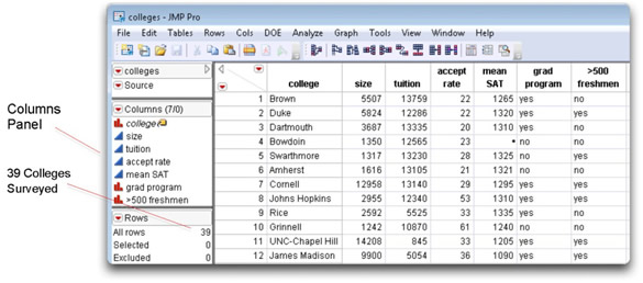
![]() Use File > Open to open the colleges.jmp table. Figure 2.3 shows a partial listing of the colleges data table. Alternatively, double-click on the data table file icon to open it. There is information for 39 colleges, so there are 39 rows in the table.
Use File > Open to open the colleges.jmp table. Figure 2.3 shows a partial listing of the colleges data table. Alternatively, double-click on the data table file icon to open it. There is information for 39 colleges, so there are 39 rows in the table.
You can see in the Columns panel that the college (college name) variable, listed in the Columns panel, is designated as a label column—the label icon (the little yellow label tag) shows to the right of the variable name. When you generate a plot and pause the cursor over a data point, the label value for that data point appears until you move the cursor. Or, if you highlight data points and select Rows > Label/Unlabel, the label values persist on the plot.
Figure 2.3: Partial Listing of the Colleges Data Table
Generate Histograms
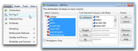
![]() On the main menu bar, select Distribution from the Analyze menu (Figure 2.4).
On the main menu bar, select Distribution from the Analyze menu (Figure 2.4).
![]() When the Distribution launch dialog appears, select all columns in the column selector list on the left of the dialog (except college) and click Y, Columns. You should see the completed dialog shown on the right in Figure 2.4.
When the Distribution launch dialog appears, select all columns in the column selector list on the left of the dialog (except college) and click Y, Columns. You should see the completed dialog shown on the right in Figure 2.4.
![]() Also, select the Histograms Only check box in the lower-left corner of the dialog.
Also, select the Histograms Only check box in the lower-left corner of the dialog.
Important: In the Windows environments, all windows have a JMP menu and tool bar. These may be hidden depending on the size of the window. To view a hidden menu, either click Alt, or move your mouse above the gray space over the window’s title bar, as shown here.
Figure 2.4: Distribution Launch Dialog
![]() Click OK on the launch dialog to see the initial results of a distribution analysis for all the columns assigned as Y variables.
Click OK on the launch dialog to see the initial results of a distribution analysis for all the columns assigned as Y variables.
The usual default settings for the Distribution platform include plots and report tables in addition to histograms. The type of results depends on the modeling type of the analysis variables.
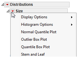
This example only looks at histograms. Options accessed by the red triangle icon on the histogram title bar, as shown here, can display or suppress any part of the distribution analysis. All results other than the histograms are suppressed in the following graphics. Later chapters discuss the Distribution platform in more detail.
Highlight Histogram Bars
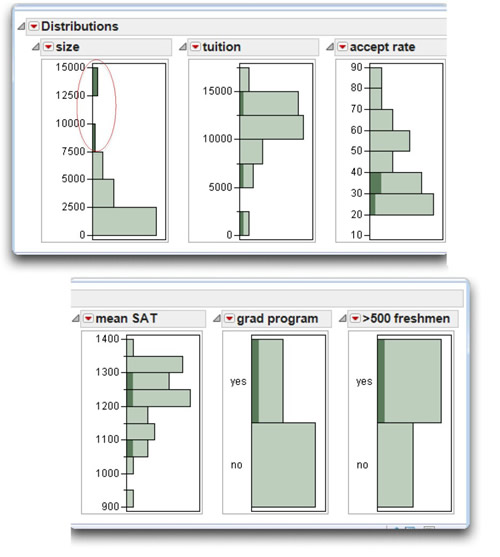
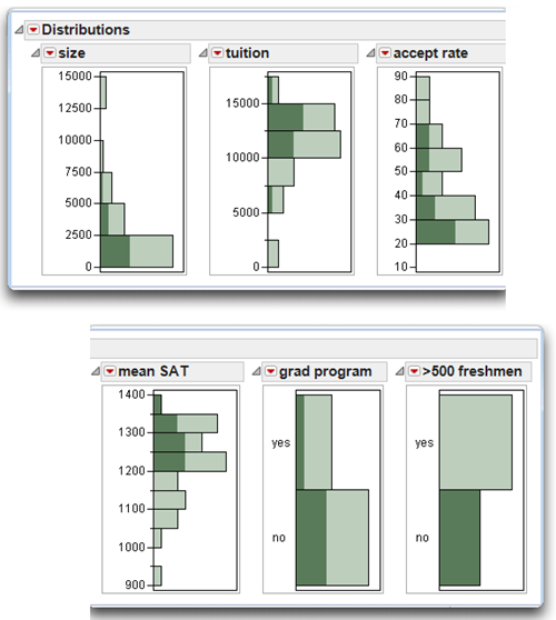
![]() When the histograms appear, use shift-click to highlight the bars for the three highest values of size, as shown next in Figure 2.5.
When the histograms appear, use shift-click to highlight the bars for the three highest values of size, as shown next in Figure 2.5.
When you highlight a histogram bar, the corresponding portions of bars in all other histograms are highlighted, and the observations (rows) corresponding to these bars are selected in the data table.
Highlighting shows relationships between large schools and the other factors of interest:
- As expected, the larger schools have greater numbers (> 500) of freshmen and have graduate programs.
- However, the acceptance rate in larger schools seems to be lower.
- There appears to be little relationship between larger schools and tuition or mean SAT score.
Figure 2.5: Histograms with Larger Colleges Selected
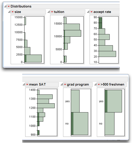
![]() Next, click on the highest accept rate bar and shift-click on the second highest bar to see the results shown next in Figure 2.6. Schools with the highest acceptance rate also have large numbers of freshmen but no graduate program (in this sample of schools).
Next, click on the highest accept rate bar and shift-click on the second highest bar to see the results shown next in Figure 2.6. Schools with the highest acceptance rate also have large numbers of freshmen but no graduate program (in this sample of schools).
- As expected from the previous histograms, these schools are smaller.
- You can quickly hypothesize that the schools in this sample that have higher acceptance rates have the lowest mean SAT, lower tuition, and are generally smaller in size.
Figure 2.6: Histograms with Highest Acceptance Rate Selected
![]() Finally, click on the ‘no’ bar for > 500 freshmen (shown next in Figure 2.7) to see several clear relationships. Schools with fewer freshmen have
Finally, click on the ‘no’ bar for > 500 freshmen (shown next in Figure 2.7) to see several clear relationships. Schools with fewer freshmen have
- smaller numbers of students (size) in general
- mostly higher tuition
- medium to low acceptance rates (accept rate)
- higher mean SAT scores
Figure 2.7: Histograms with Small Number of Freshmen Highlighted
Generate a Scatterplot and Label Points
Given the information in the previous histograms, which schools best fit the school you are looking for? If just getting in is the most important consideration, then Figure 2.6 clearly identifies the schools you want to know more about. There are several ways to find out which schools are selected in Figure 2.6 and how they relate to other schools.
![]() Re-create the highlighted bars in Figure 2.6 That is, shift-click the two highest bars for accept rate.
Re-create the highlighted bars in Figure 2.6 That is, shift-click the two highest bars for accept rate.
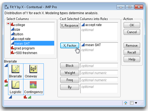
![]() Choose Fit Y by X from the Analyze menu.
Choose Fit Y by X from the Analyze menu.
![]() When the launch dialog appears, select accept rate in the column selector list on the left of the dialog and click Y, Response.
When the launch dialog appears, select accept rate in the column selector list on the left of the dialog and click Y, Response.
![]() Select mean SAT and click X,Factor. Figure 2.8 shows the completed Fit Y by X launch dialog.
Select mean SAT and click X,Factor. Figure 2.8 shows the completed Fit Y by X launch dialog.
Figure 2.8: Completed Launch Dialog to Produce Scatterplot
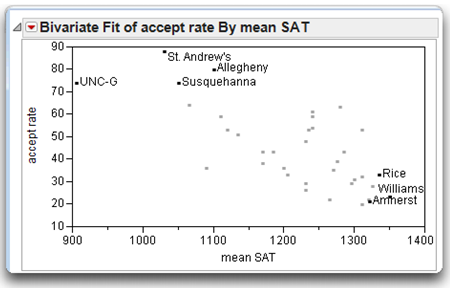
![]() Click OK to see the scatterplot results at the top in Figure 2.9.
Click OK to see the scatterplot results at the top in Figure 2.9.
Notice that the points corresponding to the highlighted histogram bars are also highlighted in the scatterplot. You can see a distinct trend in the data—as the mean SAT score increases, the acceptance rate decreases. Let’s identify the highlighted points. Recall that the college variable is a Label variable (see Figure 2.3).
![]() With the points of interest highlighted, choose the Label/Unlabel command from the Rows menu. This command displays the value of one or more label columns to highlighted points.
With the points of interest highlighted, choose the Label/Unlabel command from the Rows menu. This command displays the value of one or more label columns to highlighted points.
![]() It is often interesting to compare extreme points. To look at points with the highest mean SAT scores and lowest acceptance rate, shift-click any points at the lower right of the plot to highlight them and again choose Rows > Label/Unlabel.
It is often interesting to compare extreme points. To look at points with the highest mean SAT scores and lowest acceptance rate, shift-click any points at the lower right of the plot to highlight them and again choose Rows > Label/Unlabel.
The scatterplot in Figure 2.9 shows the names of colleges at the extremes of the distribution of accept rate and mean SAT scores.
Figure 2.9: Scatterplot with Label
Experiment on Your Own
Using dynamically linked data, histograms, and scatterplots, colleges that fall into any category of interest are easily identified. At this point there are a variety of simple things to do within JMP to experiment on your own:
- Continue to investigate the data by clicking on any histogram bar. Shift-click to extend the selection over multiple bars or points.
- Use the Journal or Layout commands in the Edit menu to save any windows and edit them for presentation purposes.
- Use Save > Save Script to Data Table, which is available in the menu on the title bar, to save the JSL commands with the data table. The script then shows in the Table panel at the left of the data grid, and you can rerun the analysis at a later time.
- Access JMP Help from the Help main menu to investigate any aspect of the JMP product.
When you are finished, close the analysis windows and the data table, and then quit JMP.
Summary
The purpose of this chapter is to give a jump start to the new JMP user with a brief description of the JMP statistical software product:
- The general approach to analyzing data uses modeling types assigned to variables. Variables are cast into Y (response) and X (factor) roles. JMP statistical platforms use these modeling types and roles to determine appropriate plots, graphs, and supporting tables.
- A step-by-step example of a simple exploratory data analysis helps the new user learn the ‘look and feel’ of interactive data analysis using JMP.
References
SAS Institute Inc. 2011. Discovering JMP. Cary, NC: SAS Institute Inc.
SAS Institute Inc. 2012. Using JMP. Cary, NC: SAS Institute Inc.
Note: Both references are available from the Help > Books on your JMP main menu.