
 4
4
Exploring Data with the Distribution Platform
Overview
This chapter illustrates the use of the JMP Distribution platform, which can be used to calculate means, standard deviations, and other descriptive statistics for quantitative variables; and construct frequency distributions for categorical variables. The Distribution platform can also be used to test for normality and produce stem-and-leaf plots. Once data are entered into a JMP data table, features of the Distribution platform can be used to screen for errors, test statistical assumptions, and obtain simple descriptive statistics.
Why Perform Simple Descriptive Analyses?
Example: The Helpfulness Social Survey
Testing for Normality from the Distribution Platform
Understanding the Outlier Box Plot
Understanding the Stem-and-Leaf Plot
A Step-by-Step Distribution Analysis Example
Why Perform Simple Descriptive Analyses?
This chapter focuses on the Distribution platform in JMP. Looking at distributions is useful for (at least) three important purposes:
- The first purpose involves the concept of data screening. Data screening is the process of carefully reviewing the data to ensure that they were entered correctly and are being read by the computer as you intended. Before conducting any of the more sophisticated analyses to be described in this book, you should carefully screen your data to make sure that you are not analyzing garbage—numbers that were accidentally entered incorrectly, impossible values on variables such as negative ages, and so forth. The process of data screening does not guarantee that your data are correct, but it does increase the likelihood.
- Second, a distribution analysis is useful because it lets you to explore the shape of your data. Among other things, understanding the shape of data helps you choose the appropriate measure of central tendency—the mean versus the median, for example. In addition, some statistical procedures require that sample data be drawn from a normally distributed population, or at least that the sample data do not display a marked departure from normality. You can use the procedures discussed in this chapter to produce graphic plots of the data, as well as test the null hypothesis that the data are from a normal population.
- The nature of an investigator’s research question itself might require the use of the Distribution platform in JMP to obtain a desired statistic. For example, if your research question is, “What is the average age of marriage for women living in the United States in 2013?” You can obtain data from a representative sample of women living in the United States who married in that year, analyze their ages with the Distribution platform, and review the results to determine the mean age.
Similarly, in almost any research article it is desirable to report demographic information about the sample. For example, if a study is performed on a sample that includes subjects from a variety of demographic groups, it is desirable to report the percent of subjects of each gender, the percent of subjects by race, the mean age, and so forth. You can use the Distribution platform to obtain this information.
Example: The Helpfulness Social Survey
To help illustrate these procedures, assume that you conduct a social survey on helpfulness. You construct a questionnaire, like the one in Figure 4.1, that asks just one question related to helping behavior. The questionnaire also contains an item that identifies the subject’s gender, and another that determines the subject’s class in college (freshman, sophomore, etc.). A reproduction of the questionnaire follows.
Figure 4.1: Social Survey Questionnaire
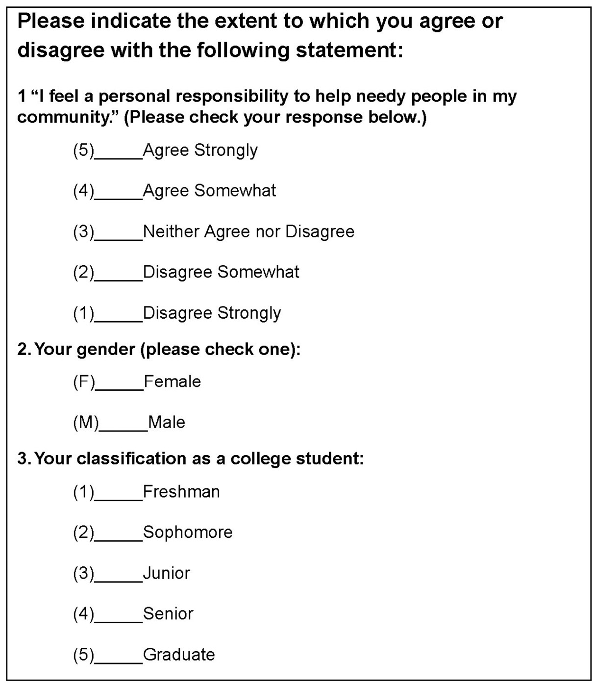
Notice that this instrument is designed so that entering the data is relatively simple. For each variable, the value to be entered appears to the left of the corresponding subject response. For example, with question 1 the value “5” appears to the left of “Strongly Agree.” This means that the number “5” is to be entered for any subject checking that response. For subjects checking “Strongly Disagree,” a “1” will be entered. Similarly, notice that for question 2 the letter “F” appears to the left of “Female,” so an “F” is to be entered for subjects checking this response.
Suppose you administer the questionnaire to 14 students and enter the results into a JMP table. To do this:
![]() Start JMP and select File > New to see a new Untitled table, like the one shown on the top left in Figure 4.2.
Start JMP and select File > New to see a new Untitled table, like the one shown on the top left in Figure 4.2.
![]() Double-click in the Table panel title bar to change the table name. Change it to Social Survey, as shown.
Double-click in the Table panel title bar to change the table name. Change it to Social Survey, as shown.
![]() Double-click anywhere in the empty area above the data grid to form new columns. Alternatively, you can use the Add Columns command in the Cols menu to add new columns to a table.
Double-click anywhere in the empty area above the data grid to form new columns. Alternatively, you can use the Add Columns command in the Cols menu to add new columns to a table.
![]() Click in the column name area to highlight it, and type the column names, helpfulness, gender, and class. You should see the table on the right in Figure 4.2.
Click in the column name area to highlight it, and type the column names, helpfulness, gender, and class. You should see the table on the right in Figure 4.2.
![]() Be sure to assign the gender column and the class column a data type of character instead of the default numeric. For each column, choose Cols > Column Info, and select Character from the Data Type menu on the Column Info dialog.
Be sure to assign the gender column and the class column a data type of character instead of the default numeric. For each column, choose Cols > Column Info, and select Character from the Data Type menu on the Column Info dialog.
![]() Click in a data grid cell to begin entering data. Use the mouse to click in any data cell, or tab to automatically move from cell to cell. Enter the data as shown in the completed table at the bottom in Figure 4.2.
Click in a data grid cell to begin entering data. Use the mouse to click in any data cell, or tab to automatically move from cell to cell. Enter the data as shown in the completed table at the bottom in Figure 4.2.
The data obtained from the first subject has a value of “F” for the gender variable (a female), shows a value of “5” for the helpfulness variable (indicating that she checked “Agree Strongly”), and a value of “freshman” for class. Your completed table should look like the one in Figure 4.2.
Notice that there are some missing data in this data set. On row 4 in the table, you can see that this subject indicated she was a female freshman, but did not answer question 1. That is why the corresponding cell in the helpfulness column is left blank. Subject 10 gave no answers for either helpfulness or class, and subject 13 gave no answer for the class variable. Questionnaire data often has missing data.
Figure 4.2: Enter the Social Survey Data into a JMP Table
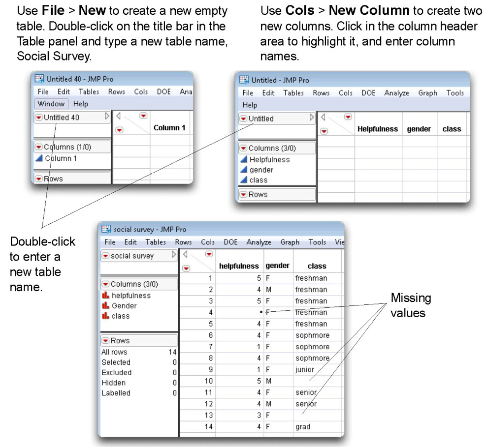
This Social Survey.jmp table is available from the author page for this book.
Computing Summary Statistics
You can use the Distribution platform to analyze both quantitative (numeric) variables and qualitative (character) variables.
When the Distribution platform analyzes the numeric variable, helpfulness, it displays a table of selected quantiles with the following information:
- mean
- standard deviation (Std Dev)
- standard error of the mean (Std Err Mean)
- upper 95% confidence level (upper 95% mean)
- lower 95% confidence level (lower 95% mean)
- The number of useful cases on which calculations were performed (N)
Optionally, more moments can be displayed, and are discussed later in this chapter.
There is a frequency table for each character variable (such as gender) that shows the number of rows that have each value (level) of the character variable, and the total number of levels.
The Distribution Platform
To use the Distribution platform:
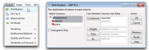
![]() Select Analyze > Distribution as illustrated in Figure The Distribution command displays the launch dialog that has a variable selection list of all the variables in the active table, as shown on the right in Figure
Select Analyze > Distribution as illustrated in Figure The Distribution command displays the launch dialog that has a variable selection list of all the variables in the active table, as shown on the right in Figure
![]() Select the helpfulness and gender variables in the selection list and click Y, Columns to see them in the analysis variables list on the right in the dialog. Note that the icons to the left of the variable names tell you the modeling type, continuous (
Select the helpfulness and gender variables in the selection list and click Y, Columns to see them in the analysis variables list on the right in the dialog. Note that the icons to the left of the variable names tell you the modeling type, continuous (![]() ) or nominal (
) or nominal (![]() ).
).
Figure 4.3: Launch the Distribution Platform and Select Analysis Variables
![]() When you click OK, the results of the distribution analysis appear in a new window.
When you click OK, the results of the distribution analysis appear in a new window.
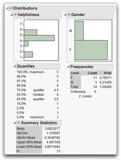
The distribution of each analysis variable you selected in the launch dialog initially shows as a histogram. Tables appropriate for the data type of each analysis variable follow the histograms. Figure 4.4 shows the analysis for the questionnaire variables, helpfulness and gender. The next section describes these results.
Figure 4.3: Launch the Distribution Platform and Select Analysis Variables
Reviewing the Distribution Results for Continuous Numeric Variables
Figure 4.4 shows some of the results created by the Distribution platform. Before doing any more sophisticated analyses, it is usually helpful to look at simple distributions of the variables and carefully review them to ensure that everything looks reasonable.
The analysis window has a report for each variable being analyzed. The histograms give you a quick feel for the shape of the distributions. The statistics for each variable appear beneath its histogram. Quantitative (numeric) variables have a table of selected quantiles and a Summary Statistics table. Character variables have a Frequencies table.
First, note the item called N at the bottom of the Summary Statistics table. N is the number of valid or nonmissing cases on which calculations are performed. In this instance, calculations are performed on only 13 cases for helpfulness. This might come as a surprise, because the data set contains 14 cases. However, recall that one subject did not respond to the helpfulness question so N is equal to 13 instead of 14 for helpfulness in these analyses.
Next, you should review the mean for the helpfulness variable, to verify that it is a reasonable number. The mean is the sum of the responses for a variable divided by the number of nonmissing responses for that variable. Remember that the values for helpfulness range from 1 (disagree strongly) to 5 (agree strongly). Therefore, the mean response should be somewhere between 1.00 and 5.00 for the helpfulness variable. If the mean is outside of this range, you know there is some type of error. In the present case the mean for helpfulness is 3.692 (between 1.00 and 5.00)—everything looks correct so far.
Use the same reasoning and check the Quantiles table. The value next to the item called Minimum is the lowest value on helpfulness that appeared in the data table. If this is less than 1, you know there is some type of error, because 1 is the lowest value that could have been assigned to a subject. In the analysis report, the minimum value is 1, which indicates no problems. The largest value observed for that variable shows next to the item called Maximum. The maximum should not exceed 5, because that is the largest helpfulness score a subject can have. The reported maximum value is 5, so again there appears to be no obvious errors in the data.
Reviewing the Distribution Results for Character Variables
The analysis results on the right in Figure 4.4 show the histogram for gender, followed by a Frequencies table. In this report, the report column called Level lists the possible values (“F” and “M”) for the gender variable. When reviewing a frequency distribution, it is useful to think of these different values as representing categories to which a subject can belong.
The column called Count shows that 11 subjects were female and 3 were male. The column called Prob lists the proportion (probability) of the count in each level of the categorical variable. The table shows that 0.78571 (78.57%) of the subjects are female and 0.21429 (21.4%) are male.
Changing the Modeling Type
Recall that all JMP variables have both a data type (numeric or character) and a modeling type (continuous, nominal, or ordinal). A character variable, such as gender and class in this example, whose values are alphabetic characters, must have a data type of character and a modeling type of either nominal or ordinal. But the variable helpfulness has numeric values. It was assigned a numeric data type when it was created. Numeric variables can be analyzed using any modeling type.
The previous example treats the helpfulness variable as continuous with a modeling type of numeric and gives summary statistics (mean, standard deviation, and so forth) for the responses. However, you can use the Distribution platform to determine the proportion of subjects who “Agreed Strongly” with a statement on a questionnaire, the proportion who “Agreed Somewhat,” and so on. In other words, you might want to analyze the helpfulness variable using a nominal modeling type.
To change the modeling type of helpfulness, click on the modeling type icon next to its name in the Columns Panel to the left of the data grid. Then select Nominal from the menu that appears, as shown here.
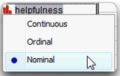
For analysis purposes, this variable is now treated as categorical. You can change modeling types in the data table at any time.
![]() Again select Analyze > Distribution and complete the launch dialog by selecting helpfulness and class as the analysis variables. Then click OK to see the results in Figure 4.5.
Again select Analyze > Distribution and complete the launch dialog by selecting helpfulness and class as the analysis variables. Then click OK to see the results in Figure 4.5.
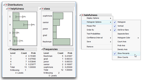
The results for helpfulness, the on the left in Figure 4.5, treat the values as categories instead of continuous numeric values. If no subject appears in a given category, the value representing that category does not appear in the frequency distribution. For example, you see only the values “1,” “3,” “4,” and “5.” The value “2” does not appear because none of the subjects checked “Disagree Somewhat” for question 1.
The distribution on the right in Figure 4.5 is for the class variable. Notice there are only 12 total responses even though there are 14 observations in the data table. This is because two respondents did not provide a value for class. The existence of two missing values means that there are only 12 valid cases for the class variable.
The menu accessed by the icon on the response variable title bar (shown on the right in Figure 4.5) gives options to modify the appearance of results. In this example, the helpfulness histogram options selected show the standard error bars and counts. The class variable analysis only uses the default options.
Figure 4.5: Distribution Results for Categorical Variables
Order the Histogram Bars
By default, the order of histograms bars for categorical values begins at the bottom of the chart with the lowest sort-order (alphabetic) value, and each bar continues in sort order. Often, this is not the arrangement you want. The histogram for class in Figure 4.5 is an example of a histogram presented in sorted order, but you would like to see the bars in order of class level starting at the top of the histogram; that is, “freshman,” “sophomore,” “junior,” “senior,” and “grad.” Another common example occurs when month of the year is a table column and a histogram displays bars in alphabetic order.
One way to tell the Distribution platform how you want bars ordered is to use the Column Info dialog and assign a special property called List Check to the column. To do this,
![]() Right-click in the class column name area and select Column Info from the menu that appears. Or, click in the class column name area to highlight it and select Column Info from the Cols dialog on the main menu.
Right-click in the class column name area and select Column Info from the menu that appears. Or, click in the class column name area to highlight it and select Column Info from the Cols dialog on the main menu.
When the Column Info dialog appears, select List Check from the New Property menu, as shown in Figure 4.6. Notice that the list of values is in the default (alphabetic) order.
Figure 4.6: Column Info Dialog and Using List Check Dialog
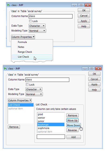
![]() Highlight values in the List Check list and use the Move Up or Move Down buttons to rearrange the values in the list.
Highlight values in the List Check list and use the Move Up or Move Down buttons to rearrange the values in the list.
![]() Click Apply, then OK in the List Check dialog.
Click Apply, then OK in the List Check dialog.
Note: The List Check column property prevents you from entering any value into the column other than those listed. However, you can add or remove values at any time.
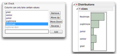
Figure 4.7 shows the list check values ordered the way you want them, and the new histogram that results from a distribution analysis of the class variable.
Figure 4.7: Values Ordered as List Check Items and Resulting Histogram
Missing Data
When a respondent doesn’t provide information for a variable, the result is a missing value. For a categorical variable or a numeric variable analyzed as a categorical variable (such as helpfulness in Figure 4.5), the last line in the Frequency table shows the number of missing values for that distribution.
For continuous variables, you can modify the Summary Statistics table to include the N Missing statistic. Select Customize Summary Statistics from the red triangle menu on the Summary Statistics title bar (see Figure 4.4). You can then choose any of the optional statistics from a palette to be displayed in the Summary Statistics table.
Testing for Normality
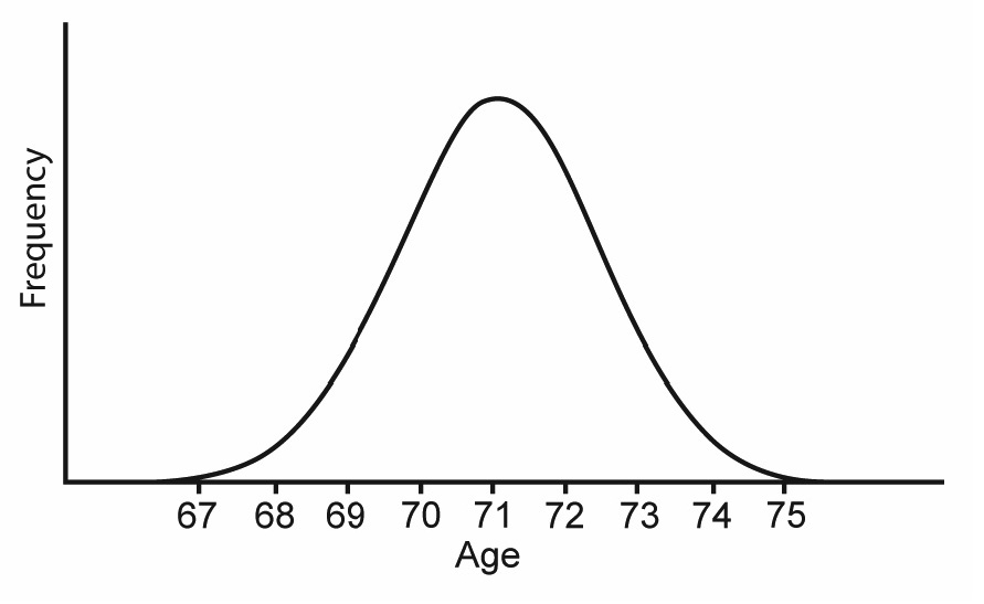
The normal distribution is a symmetrical, bell-shaped distribution of values, as illustrated in Figure 4.8.
To understand the distribution, assume that you are interested in conducting research on people who live in retirement communities. Imagine that you know the age of every person in this population. To summarize this distribution, you prepare a figure similar to Figure 4.8. The variable, Age, is plotted on the horizontal axis, and the frequency of persons at each age is plotted on the vertical axis. Figure 4.8 shows that many of the subjects are around 71 years of age because the distribution of ages peaks near the age of 71. This suggests that the mean of this distribution will likely be close to 71. Notice also that most of the subjects’ ages are between 67 (near the lower end of the distribution) and 75 (near the upper end of the distribution). This is the approximate range of ages that you expect for persons living in a retirement community.
Figure 4.8: The Normal Distribution
Why Test for Normality?
Normality is an important concept in data analysis because there are at least two problems that can result when data are not normally distributed.
The first problem is that markedly non-normal data might lead to incorrect conclusions in inferential statistical analyses. Many inferential procedures are based on the assumption that the sample of observations was drawn from a normally distributed population. If this assumption is violated, the statistic can give misleading findings. For example, the independent group’s t-test assumes that both samples in the study were drawn from normally distributed populations. If this assumption is violated, then performing the analysis might cause you to incorrectly reject the null hypothesis (or incorrectly fail to reject the null hypothesis). Under these circumstances, you should analyze the data using a procedure that does not assume normality (perhaps some nonparametric procedure).
The second problem is that markedly non-normal data can have a biasing effect on correlation coefficients, as well as more sophisticated procedures that are based on correlation coefficients. For example, assume that you compute the Pearson correlation between two variables. When one or both of these variables are markedly non-normal, the correlation coefficient between them could be much larger or much smaller than the actual correlation between these variables in the population. In addition, many sophisticated data analysis procedures (such as principal component analysis) are performed on a matrix of correlation coefficients. If some or all of these correlations are distorted due to departures from normality, then the results of the analyses can again be misleading. For this reason, many experts recommend that researchers routinely check their data for major departures from normality prior to performing sophisticated analyses such as principal component analysis (Rummel, 1970).
Departures from Normality
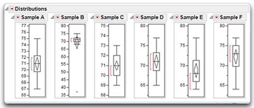
Assume that you draw a random sample of 18 subjects from the population of persons living in retirement communities. There are a variety of ways that the data can display a departure from normality. Data for a variety of age samples, called Sample A, Sample B, and so on, are used for the following examples and are in the data table called ages.jmp, shown in Figure 4.9.
Figure 4.9: Data Table with Six Samples of Age Distributions
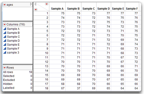
Figure 4.10 shows the distribution of ages in two samples of subjects drawn from the population of retirees. This figure is somewhat different from the normal distribution shown previously in Figure 4.8 because the Distribution platform in JMP displays distribution bars horizontally so that age is plotted on the vertical axis rather than on the horizontal axis. This arrangement is similar to the stem-and-leaf plots discussed in a later section.
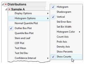
The red triangle menu on each response title bar gives a menu or display options to show the histogram with either a vertical or a horizontal layout. There are also options to suppress the outlier box plot that often displays by default, and to display the number of observations in each bar, as shown in this example.
Each bar in a histogram distribution represents the number of subjects in an age category. For example, in the distribution for Sample A, you can see that there is one subject at age 75, one subject at age 74, two subjects at age 73, three subjects at age 72, and so forth. The ages of the 18 subjects in Sample A range from a low of 67 to a high of 75.
Figure 4.10: Sample with Normal Distribution and Sample with an Outlier
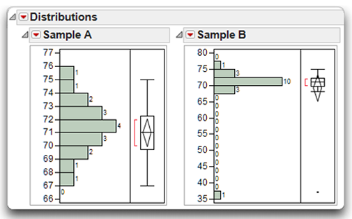
The data in Sample A form an approximately normal distribution. The distribution is called approximately normal because it is difficult to form a perfectly normal distribution using a small sample of just 18 cases. An inferential test (discussed later) will show that Sample A does not demonstrate a significant departure from normality. Therefore, it would be appropriate to include the data in Sample A in an independent sample t-test.
In contrast, there are problems with the data in Sample B. Notice that its distribution is similar to that of Sample A, except that there is an outlier at the lower end of the distribution. An outlier is an extreme value that differs substantially from the other values in the distribution. In this case, the outlier represents a subject whose age is only 37. This person’s age is markedly different from that of the other subjects in your study. Later, you will see that this outlier causes the data to demonstrate a significant departure from normality, making the data inappropriate for some statistical procedures. When you observe an outlier such as this, it is important to determine if an error was made when the data were entered and correct the error whenever possible. It is not usually considered statistically sound to simply delete perceived outliers from a set of data. If the data cannot be corrected, it is preferable to use some method of imputation that preserves the integrity of the data rather than delete the data.
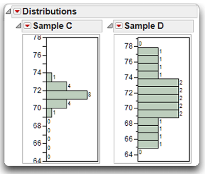
A sample can also depart from normality because it displays kurtosis. Kurtosis refers to the peakedness of the distribution. The two samples displayed in Figure 4.11 demonstrate different levels of kurtosis.
Sample C in Figure 4.11 displays positive kurtosis, which means that the distribution is relatively peaked (tall and skinny) rather than flat. Notice that with Sample C, there are a relatively large number of subjects that cluster around the central part of the distribution (around age 71). This is what makes the distribution peaked (relative to Sample A, for example). Distributions with positive kurtosis are also called leptokurtic.
In contrast, Sample D in Figure 4.11 displays negative kurtosis, which means that the distribution is relatively flat. Flat distributions are also described as being platykurtic.
Figure 4.11: Samples Displaying Positive and Negative Kurtosis
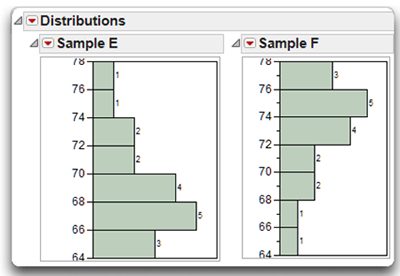
In addition to kurtosis, distributions can also demonstrate varying degrees of skewness, or sidedness. A distribution is skewed if the tail on one side of the distribution is longer than the tail on the other side. The distributions in Figure 4.12 show two different types of skewness.
Consider Sample E in Figure 4.12. Notice that the largest number of subjects in this distribution tends to cluster around the age of 66. The tail of the distribution that stretches above 66 (from 67 to 77) is relatively long, while the tail of the distribution that stretches below 66 (from 65 to 64) is relatively short. Clearly, this distribution is skewed. A distribution is said be positive skewed if the longer tail of a distribution points in the direction of higher values. You can see that Sample E displays positive skewness, because its longer tail points toward larger numbers such as 75, 77, and so forth.
On the other hand, if the longer tail of a distribution points in the direction of lower values, the distribution is said to be negative skewed. You can see that Sample F in Figure 4.12 displays negative Skewness, because in that sample the longer tail points downward in the direction of lower values (such as 66 and 64).
Figure 4.12: Samples Displaying Positive and Negative Skewness
Testing for Normality from the Distribution Platform
For purposes of illustration, assume that you wish to analyze the data that are illustrated as Sample A of Figure 4.10 (the approximately normal distribution). The following sections show how to see and interpret summary statistics, produce and interpret a stem-and-leaf plot, and how to test for normality.
With the ages data table active (see Figure 4.9),
![]() Choose Analyze > Distribution, and select Sample A as the analysis variable in the launch dialog.
Choose Analyze > Distribution, and select Sample A as the analysis variable in the launch dialog.
![]() Choose Display Option > Horizontal Layout from the Histogram title bar.
Choose Display Option > Horizontal Layout from the Histogram title bar.
![]() By default, the results include the Histogram, Outlier Box Plot, Summary Statistics table, and Quantiles table.
By default, the results include the Histogram, Outlier Box Plot, Summary Statistics table, and Quantiles table.
Request More Summary Statistics
The Summary Statistics table initially shows the Mean, Standard Deviation, Standard Error of the Mean, upper and lower confidence interval for the mean, and N, the number of nonmissing observations used to compute statistics for the response variable. You can see that the analysis is based on 18 observations. The Mean and Std Dev of the age values in Sample A are 71 and 2.058, respectively.
To see additional statistics,
![]() Select Customize Summary Statistics from the red triangle menu on the Summary Statistics title bar (not the Histogram title bar).
Select Customize Summary Statistics from the red triangle menu on the Summary Statistics title bar (not the Histogram title bar).
This command displays a large palette of additional univariate summary statistics. Take a moment and look at the options available for the distribution analysis output.
For this example,
![]() Check Sum Weight, Sum, Skewness, Kurtosis, CV, and N Missing. Then click OK on the Summary Statistics Options palette to see the results in Figure 4.13.
Check Sum Weight, Sum, Skewness, Kurtosis, CV, and N Missing. Then click OK on the Summary Statistics Options palette to see the results in Figure 4.13.
Note that the skewness statistic for the Sample A age values is zero. When interpreting the skewness statistic, keep in mind the following:
- A skewness value of zero means that the distribution is not skewed. In other words, the distribution is symmetrical so neither tail is longer than the other.
- A positive skewness value means that the distribution is positively skewed. The longer tail points toward higher values in the distribution (as seen previously with Sample E of Figure 4.12).
- A negative skewness value means that the distribution is negatively skewed. The longer tail points toward lower values in the distribution (as with Sample F of Figure 4.12).
The skewness value of zero indicates a symmetric distribution.
Figure 4.13: Distribution Analysis of Sample A with Additional Statistics
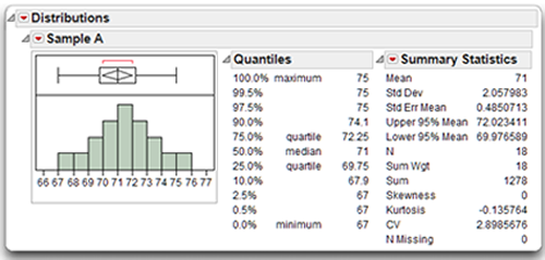
Figure 4.13 shows the kurtosis statistic for the Sample A age values is –0.135764. When interpreting this kurtosis statistic, keep in mind the following:
- A kurtosis value of zero means that the distribution displays no kurtosis; in other words, the distribution is neither relatively peaked nor is it relatively flat, compared to the normal distribution.
- A positive kurtosis value means that the distribution is relatively peaked, or leptokurtic.
- A negative kurtosis value means that the distribution is relatively flat, or platykurtic.
The small negative kurtosis value, approximately −0.14, indicates that Sample A is slightly flat, or platykurtic.
Fit and Test a Normal Distribution to the Sample (Sample A)
The Distribution platform has options that let you compare and test the shape of a distribution to known distributions. For example, suppose that you want to know if the age samples, Sample A and Sample B, are approximately normal (see Figure 4.10).
Use the red triangle menu on the Histogram title bar and choose Continuous Fit > Normal, as illustrated in Figure 4.14.
The Distribution platform then displays a fitted normal curve on the histogram and shows the estimated mean and standard deviation on the histogram and in the Parameter Estimates table. In this example the Outlier Box Plot, which is often displayed by default, is hidden.
![]() Use the red triangle menu on the Fitted Normal title bar to request the Goodness-of-Fit test or other additional information about the fitted distribution as illustrated at the bottom in Figure 4.14.
Use the red triangle menu on the Fitted Normal title bar to request the Goodness-of-Fit test or other additional information about the fitted distribution as illustrated at the bottom in Figure 4.14.
Figure 4.14: Distribution Analysis for Sample A
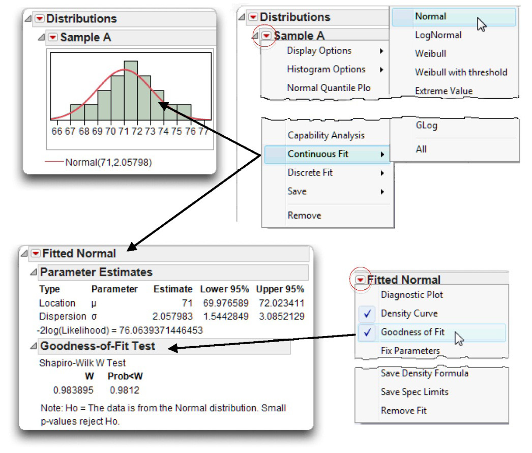
The Goodness-of-Fit option gives a significance test for the null hypothesis that the sample data are from a normally distributed population. The results show the Shapiro-Wilk (W) statistic for samples of 2000 or less. For larger samples, the Kolmogorov-Smirnov-Lillefor’s (KSL) statistic is shown.
In this example, the W statistic is 0.984 with a p-value of 0.9812. Remember that this statistic tests the null hypothesis that the sample data are normally distributed. This p-value is very large at 0.9812, meaning that there are approximately 9,812 chances in 10.000 that you would obtain the present results if the data were drawn from a normal population. In other words, it is likely that you would obtain the present results if the sample really was from a normal population. Because this statistic gives so little evidence to reject the null hypothesis, you can tentatively assume that the sample was drawn from a normally distributed population. This makes sense when you review the shape of the distribution of Sample A. The sample data clearly appear to be approximately normal. In general, you should reject the null hypothesis of normality only when the p-value is less than 0.05. For more details, see Chapter 2, “Performing Univariate Analysis,” in Basic Analysis and Graphing (2012), found on the Help menu of JMP.
Results for a Distribution with an Outlier (Sample B)
For purposes of contrast, now use the Distribution platform to look at the Sample B age data. Follow the same steps as for Sample A.
With the ages data table active (see Figure 4.9)
Choose Analyze > Distribution and select Sample B as the analysis variable in the launch dialog.
![]() Choose Display Option > Horizontal Layout from the Histogram title bar.
Choose Display Option > Horizontal Layout from the Histogram title bar.
![]() Select Customize Summary Statistics from the red triangle menu on the Summary Statistics title bar.
Select Customize Summary Statistics from the red triangle menu on the Summary Statistics title bar.
![]() From the palette of options that appears, check Sum Weight, Sum, Skewness, Kurtosis, CV, and N Missing. Then click OK on the Summary Statistics Options palette.
From the palette of options that appears, check Sum Weight, Sum, Skewness, Kurtosis, CV, and N Missing. Then click OK on the Summary Statistics Options palette.
![]() Use the red triangle menu on the Histogram title bar, and choose Continuous Fit > Normal.
Use the red triangle menu on the Histogram title bar, and choose Continuous Fit > Normal.
![]() Use the red triangle menu on the Fitted Normal title bar to request the Goodness-of-Fit test or other additional information about the fitted distribution to see the final distribution analysis in Figure 4.15.
Use the red triangle menu on the Fitted Normal title bar to request the Goodness-of-Fit test or other additional information about the fitted distribution to see the final distribution analysis in Figure 4.15.
Remember that Sample B (see Figure 4.10) was similar in shape to Sample A except for an outlier. In fact, the data for Sample B are identical to those of Sample A except for subject 18. In Sample A, subject 18’s age is 67 but in Sample B it is 37, which is extremely low compared to the other age values in the sample. You can look at the data table in Figure 4.9 to verify this.
Figure 4.15: Distribution Analysis for Sample B with Fitted Normal
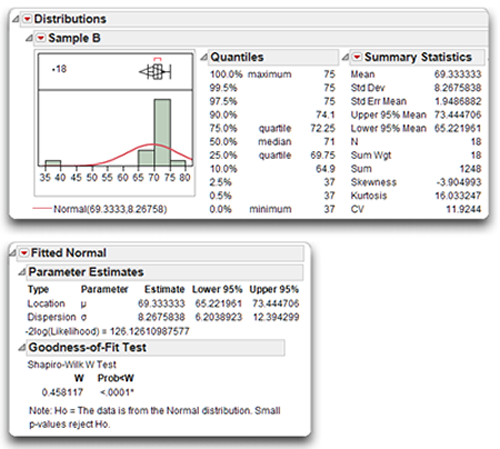
By comparing the Summary Statistics table of Figure 4.15 (Sample B) to that of Figure 4.14 (Sample A), you can see the outlier has a considerable effect on some of the descriptive statistics for age. The mean of Sample B is now 69.33, down from the mean of 71 found for Sample A. The outlier has an even more dramatic effect on the standard deviation. With the approximately normal distribution, the standard deviation was only 2.05, but with the outlier included, the standard deviation is 8.27.
The skewness index for Sample B is −3.90. A negative skewness index such as this is what you expect because the outlier created a long tail that points toward the lower values in the Sample B age distribution.
The normality test (Goodness-of-Fit test) for Sample B gives a Shapiro-Wilk statistic of 0.458 with corresponding p value less than 0.0001. Because this p value is below 0.05, you reject the null hypothesis, and tentatively conclude that Sample B is not normally distributed. In other words, you can conclude that Sample B displays a statistically significant departure from normality (due to a single outlier, observation 18).
In Figure 4.15, the outlier box plot is displayed above the histogram, and the Quantiles table gives details about the skewness of the distribution. The Quantiles table shows the Maximum value of age was 75, and the minimum was 37. You can quickly identify this outlier in the outlier box plot. Hover over the point to see that observation 18 has the minimum value (the outlier value). Choose Rows > Label/Unlabel to add the label to the plot.
Using the outlier box plot or histogram to identify outliers might be unnecessary when working with a small data set (as in the present situation), but it can be invaluable when dealing with a large data set. For example, if there are possible outliers in a large data set, click on the outlier points to highlight them in the histogram and in the data table. You can then easily identify the observations that have outlying values and avoid the tedious chore of examining each observation in a data table.
Understanding the Outlier Box Plot
Figure 4.16 shows outlier box plots for Sample A through Sample F, which are discussed in the previous sections. Outlier box plots are often set as the default in the preferences whenever you generate a histogram for a numeric continuous variable. All plots can be shown or hidden using the menu found on the histogram title bar.
Figure 4.16: Outlier Box Plots for Six Distributions
Outlier box plots are a compact display of many distribution characteristics.
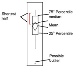
- The box identifies the interquartile range. The ends of the box are at the 25th and 75th quantiles (also called quartiles).
- The means diamond inside the box represents the mean and 95% confidence interval. The left and right diamond points are situated at the mean of the distribution, and the top and bottom points show the confidence interval.
- The line across the box indicates the median of the sample, where half the sample points are greater and half are less than that value.
- The dashed lines on the ends of the box, called whiskers, extend from the distances computed as follows:
(upper quartile) + 1.5 * (interquartile range)
(lower quartile) – 1.5 * (interquartile range)
- Points falling outside this range are possible outliers.
- The bracket along the edge of the box identifies the shortest half. This is the most dense 50% of the sample points.
The quantile box plots in Figure 4.16 show at a glance that Sample A comes from a normally distributed sample and Sample B has a possible outlier. The box and the shortest half for Sample A are in the middle of the range of values, the mean and median are the same, and the whiskers are symmetrical. However, the outlying value in Sample B causes the distribution to be compressed at the upper end of the scale.
Sample C and Sample D were normally shaped but peaked and flat. For these kinds of distribution, the quantile box plot only shows that the shortest half (most dense) points are more confined for Sample D and more spread out for Sample E.
The positive and negative skewness in Sample E and Sample F show clearly. The box, the shortest half, and the median are visibly shifted in the direction of the skewness.
Understanding the Stem-and-Leaf Plot
The stem-and-leaf plot is another visual representation of data, similar to histograms. To see the stem-and-leaf example,
![]() Run the Distribution platform again for both Sample A and Sample B.
Run the Distribution platform again for both Sample A and Sample B.
![]() Use options in the red triangle menu on the Histogram title bar to hide the Moments and Quantiles tables that usually show by default.
Use options in the red triangle menu on the Histogram title bar to hide the Moments and Quantiles tables that usually show by default.
![]() Then select the Stem and Leaf option from that menu to see the results in Figure 4.17.
Then select the Stem and Leaf option from that menu to see the results in Figure 4.17.
Note: To apply any option to all response variables in an analysis window at the same time, control-click (command-click on the Macintosh) and select an option from the menu on the title bar of any response variable. You only need to do this once to affect all variables.
Figure 4.17: Stem and Leaf from Distribution Platform for Sample A and Sample B
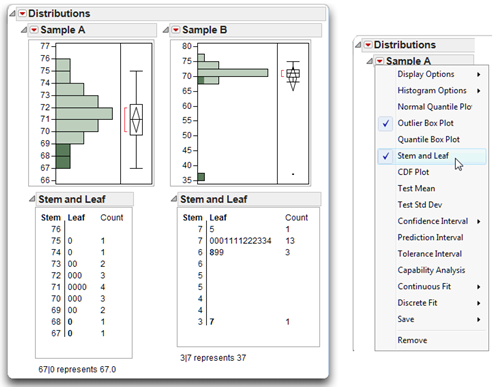
Stem and Leaf for Sample A
To understand a stem-and-leaf plot the age data, it is necessary to think of a given subject’s age score as consisting of a stem and a leaf. The vertical line in the stem-and-leaf plot separates the stem from the leaf. The stem is that part of the value that appears to the left of the line, and the leaf is the part that appears to the right.
You reconstruct the data values by joining the stem values and leaf values according to the legend at the bottom of the plot. For example, subject 18 in Sample A has a value of 67. In Figure 4.17, the stem for this subject is 67 and appears to the left of the vertical line. The leaf is 0 and appears to the right of the vertical line. Subject 12 has a stem value of 68 and leaf value of 0, which represents the data value of 68.0.
In the stem-and-leaf plot for Sample A, the numbers on the vertical axis plot the various values that could be encountered in the data table. These appear under the heading Stem. Reading from the top down, the stems are 75, 74, 73, and so forth. Notice that the values 67 and 68 have a single leaf (a single 0). This means that there is only one subject in Sample A with a stem-and-leaf value of 67.0 (an age value of 67) and one with 68.0 (an age value of 68.0). Move up an additional line, and you see the stem 69. To the right of this, two leaves appear (that is, two zeros appear). This means that there are two subjects with a stem-and-leaf value of 69.0 (two subjects with age values of 69.0). Continuing up the plot in this fashion, you can see that there are three subjects at age 70, four subjects at age 71, three subjects at age 72, two subjects at age 73, one subject at age 74, and one subject at age 75.
On the right side of the stem-and-leaf plot, the column named Count shows the number of observations that appear at each stem. Reading from the bottom up, this column again confirms that there was one subject with a score of age 67, one subject with a score of age 68, two subjects with a score of age 69, and so forth.
The stem-and-leaf plot actively responds to clicking and to the brush tool. Clicking on the two lowest values in the stem-and-leaf plot for Sample A produces the highlighting shown in Figure 4.17, and also highlights the corresponding rows in the data table. This interactive graphic feature provides another way to quickly identify specific observations of interest.
Reviewing the stem-and-leaf plot of Figure 4.17 shows that its shape is similar to the histogram shape portrayed for Sample A. This is to be expected because both figures use similar conventions and both figures describe the data of Sample A. Notice in Figure 4.17 that the shape of the distribution is symmetrical without a tail in either direction. This, too, is to be expected because Sample A demonstrated zero skewness.
Stem and Leaf for Sample B
Often, the stem-and-leaf plot is more complex than that for Sample A. For example, the chart on the right in Figure 4.17 is the stem-and-leaf plot produced by Sample B (the distribution with an outlier). Consider the stem-and-leaf plot at the bottom of this plot. The stem for this entry is 3, and the leaf is 7. Notice the legend at the bottom of this plot, which says “3|7 represents 37.”
Note: It is always important to read the explanation at the bottom of the stem-and-leaf plot that explains how to translate the stem-and-leaf representation into the data values they represent.
Move up one line in the plot, and you see the stem “4.” However, there are no leaves for this stem, which means that there were no subjects with a stem of 4|0 (40). Reading up the plot, no leaves appear until you reach the stem “6.” The leaves on this line suggest that there was one subject with a stem-and-leaf of 6|8, and two subjects with a stem-and-leaf of 6|9, which translate to age values of 68 and 69.
Move up an additional line, and note that there are two stems for the value 7. The first stem (moving up the plot) includes stem-and-leaf values from 7|0 through 7|4, while the next stem includes stem-and-leaf values from 7|5 through 7|9. Reviewing values in these rows, you can see that there are three subjects with a stem-and-leaf of 7|0 (70), four with a stem-and-leaf of 7|1 (71), and so forth.
Results for Distributions with Positive Skewness and Negative Skewness
Figure 4.18 shows additional statistics and a stem-and-leaf plot for Sample E, which was shown previously in Figure 4.12. Recall that Sample E demonstrates a positive skew and Sample F demonstrates a negative skew.
Remember that the approximately normal distribution has a skewness index of zero. In contrast, note that the skewness index for Sample E in Figure 4.18 is about 0.87. This positive skewness index is what you expect given the positive skew of the data. The skew is also reflected in the stem-and-leaf plot that appears with its histogram. Notice that the relatively long tail points in the direction of higher values for age (such as 74 and 76).
Although Sample E displays positive skewness, it does not display a significant departure from normality. In the goodness-of-fit test you can see that the Shapiro-Wilk W statistic is 0.93, with a corresponding p-value of 0.1909. Because this p-value is greater than 0.05, you cannot reject the null hypothesis that the data were drawn from a normal population. With small samples such as this one, the test for normality is not very powerful (that is, not very sensitive). This lack of power is why the sample was not found to display a significant departure from normality, even though it is clearly skewed.
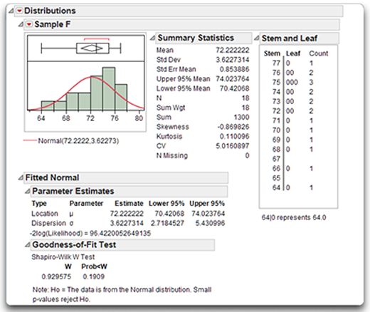
For purposes of contrast, the results in Figure 4.19 are the same analysis of Sample F, which has a negative skewness index of –0.87, shown in the Summary Statistics table. However, once again the Shapiro-Wilk test shows that the sample does not demonstrate a significant departure from normality. The stem-and-leaf plot reveals a long tail pointing in the direction of lower age values for Sample F (such as 64 and 66), which is what you expect for a negatively skewed distribution. Again, the Shapiro-Wilk test for normality does not produce a significant result, even though Sample F is clearly skewed toward lower values.
The next section is a step-by-step description of how to produce the results shown in Figure 4.18 and Figure 4.19.
Figure 4.18: Sample E (Positive Skewness)
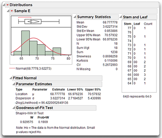
Figure 4.19: Sample F (Negative Skewness)
A Step-by-Step Distribution Analysis Example
To see the results shown in the previous two figures, perform a distribution analysis on Sample E and Sample F in the ages data table, and arrange the graphs and tables in a JMP layout window:
![]() Do a distribution analysis on Sample E and Sample F. That is, with the ages data table active, choose Analyze > Distribution, and select Sample E and Sample F as response variables, then click OK in the launch dialog.
Do a distribution analysis on Sample E and Sample F. That is, with the ages data table active, choose Analyze > Distribution, and select Sample E and Sample F as response variables, then click OK in the launch dialog.
![]() Use the menu found on the title bar of the response variables to suppress the Quantiles table for both response variables (uncheck Display Options > Quantiles).
Use the menu found on the title bar of the response variables to suppress the Quantiles table for both response variables (uncheck Display Options > Quantiles).
![]() Select Stem and Leaf from the menu on the title bar of the response variables.
Select Stem and Leaf from the menu on the title bar of the response variables.
![]() Select Fit Distributions > Normal from the menu bar for both response variables. This command overlays a fitted normal curve on the histogram, shows the estimated mean and standard deviation for the fitted normal distributions, and appends the Parameter Estimates table to the bottom of the results.
Select Fit Distributions > Normal from the menu bar for both response variables. This command overlays a fitted normal curve on the histogram, shows the estimated mean and standard deviation for the fitted normal distributions, and appends the Parameter Estimates table to the bottom of the results.
![]() For both response variables, use the menu found on the Fitted Normal title bar at the bottom of the results and select Goodness of Fit. This command appends the Goodness-of-Fit table for the fitted normal distribution to the distribution analysis.
For both response variables, use the menu found on the Fitted Normal title bar at the bottom of the results and select Goodness of Fit. This command appends the Goodness-of-Fit table for the fitted normal distribution to the distribution analysis.
![]() Finally, use the main menu bar and select Edit > Layout. All the results appear in a new layout window. Click anywhere in the background area to select all the results, and use Layout > Ungroup as many times as needed to separate (ungroup) the tables. Then move the tables around on the layout surface to form any arrangement you want.
Finally, use the main menu bar and select Edit > Layout. All the results appear in a new layout window. Click anywhere in the background area to select all the results, and use Layout > Ungroup as many times as needed to separate (ungroup) the tables. Then move the tables around on the layout surface to form any arrangement you want.
Summary
Regardless of what other statistical procedures you use in an investigation, always begin the data analysis process by performing the kinds of simple analyses described in this chapter. These descriptive analyses help ensure that the data do not contain any errors that could lead to incorrect conclusions, and even to ultimate retractions of published findings. Once the data undergo this initial screening, you can move forward to the more sophisticated procedures described in the remainder of this book.
References
Rummel, R. J. 1970. Applied Factor Analysis. Evanston, IL: Northwestern University Press.
SAS Institute Inc. 2012. Basic Analysis and Graphing. Cary, NC: SAS Institute Inc.