
 9
9
Factorial ANOVA with Two Between-Subjects Factors
Overview
This chapter shows how to use JMP to perform a two-way analysis of variance. The focus is on factorial designs with two between-subjects factors, meaning that each subject is exposed to only one condition under each independent variable. Guidelines are provided for interpreting results that do not display a significant interaction, and separate guidelines are provided for interpreting results that do display a significant interaction. For significant interactions, you see how to graphically display the interaction and how to perform tests for simple effects.
Introduction to Factorial Designs
Some Possible Results from a Factorial ANOVA
Example with Nonsignificant Interaction
Ordering Values in Analysis Results
Examine the Whole Model Reports
How to Interpret a Model with No Significant Interaction
Summarize the Analysis Results
Formal Description of Results for a Paper
Example with a Significant Interaction
How to Interpret a Model with Significant Interaction
Formal Description of Results for a Paper
Appendix: Assumptions for Factorial ANOVA with Two Between-Subjects Factors
Introduction to Factorial Designs
The preceding chapter described a simple experiment in which you manipulated a single independent variable, Type of Rewards. Because there was a single independent variable in that study, it was analyzed using a one-way analysis of variance.
But imagine that there are actually two independent variables that you want to manipulate. You might think that it is necessary to conduct two separate experiments, one for each independent variable, but in many cases it is possible to manipulate both independent variables in a single study.
The research design used in these studies is called a factorial design. In a factorial design, two or more independent variables are manipulated in a single study so that the treatment conditions represent all possible combinations of the various levels of the independent variables.
In theory, a factorial design can include any number of independent variables. This chapter illustrates factorial designs that include just two independent variables, and thus can be analyzed using a two-way analysis of variance (ANOVA). More specifically, this chapter deals with studies that include two predictor variables, both categorical variables with nominal modeling types, and a single numeric continuous dependent variable.
The Aggression Study
To illustrate the concept of factorial design, imagine that you are interested in conducting a study that investigates aggression in eight-year-old children. Here, aggression is defined as any verbal or behavioral act performed with the intention of harm. You want to test the following two hypotheses:
- Boys display higher levels of aggression than girls.
- The amount of sugar consumed has a positive effect on levels of aggression.
You perform a single investigation to test these two hypotheses. The hypothesis of most interest is that consuming sugar causes children to behave more aggressively. You will test this hypothesis by actually manipulating the amount of sugar that a group of school children consumes at lunch. Each day for two weeks, one group of children will receive a lunch that contains no sugar at all (this is the 0 grams of sugar group). A second group will receive a lunch that contains a moderate amount of sugar (20 grams), and a third group will receive a lunch that contains a large amount of sugar (40 grams). Each child will then be observed after lunch, and a pair of judges will tabulate the number of aggressive acts that the child commits. The total number of aggressive acts committed by each child over the two-week period will result in the dependent variable in the study.
You begin with a sample of 60 children, 30 boys and 30 girls. The children are randomly assigned to treatment conditions in the following way:
- 20 children are assigned to the 0 grams of sugar treatment condition.
- 20 children are assigned to the 20 grams of sugar treatment condition.
- 20 children are assigned to the 40 grams of sugar treatment condition.
In making these assignments, you make sure that there are equal numbers of boys and girls in each treatment condition. For example, you verify that of the 20 children in the 0 grams group 10 are boys and 10 are girls.
The Factorial Design Matrix
The factorial design of this study is illustrated in Table 9.1. You can see that this design is represented by a matrix of two rows and three columns.
Table 9.1: Experimental Design Used in Aggression Study
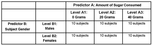
When an experimental design is represented in a matrix such as this, it is easiest to understand if you focus on one aspect of the matrix at a time. For example, consider only the three vertical columns in Table 9.1. These columns are labeled Predictor A: Amount of Sugar Consumed to represent the three levels of the sugar consumption (the independent variable). The first column represents the 20 participants in Level A1: 0 Grams (the participants who receive 0 grams of sugar), the second column represents the 20 participants in Level A2: 20 Grams (the participants who receive 20 grams of sugar), and the last column represents the 20 participants in Level A3: 40 Grams (the participants who receive 40 grams of sugar).
Now consider just the two horizontal rows in Table 9.1. These rows are labeled Predictor B: Subject Gender. The first row is Level B1: Males for the 30 male participants. The second row is Level B2: Females for the 30 female participants.
It is common to refer to a factorial design as an r by c design, where r represents the number of rows in the matrix, and c represents the number of columns. The present study is an example of a 2 by 3 factorial design, because it has two rows and three columns. If it included four levels of sugar consumption rather than three, it would be referred to as a 2 by 4 factorial design.
You can see that this matrix consists of six different cells. A cell is the location in the matrix where the row for one independent variable intersects with the column for a second independent variable. For example, look at the cell where the row named B1 (males) intersects with the column heading A1 (0 grams). The entry “10 subjects” appears in this cell, which means that there were 10 participants who experienced this particular combination of “treatments” under the two independent variables. More specifically, it means that there were 10 participants who were both (a) male and (b) given 0 grams of sugar (“treatments” appears in quotation marks in the preceding sentence because subject gender is not a true independent variable that is manipulated by the researcher—it is merely a predictor variable).
Now look at the cell where the row labeled B2 (females) intersects with the column heading A2 (20 grams). Again, the cell contains the entry “10 subjects,” which means that there was a different group of 10 children who experienced the treatments of (a) being female and (b) receiving 20 grams of sugar. You can see that there was a separate group of 10 children assigned to each of the six cells of the matrix.
Earlier, it was said that a factorial design involves two or more independent variables being manipulated so that the treatment conditions represent all possible combinations of the various levels of the independent variables, and Table 9.1 illustrates this concept. You can see that the six cells represent every possible combination of gender and amount of sugar consumed—both males and females are observed under every level of sugar consumption.
Some Possible Results from a Factorial ANOVA
Factorial designs are popular in social science research for a variety of reasons. One reason is that they allow you to test for several different types of effects in a single investigation. The nature of these effects is discussed later in this chapter.
First, however, it is important to note one drawback that is associated with factorial designs. Sometimes factorial designs produce results that can be difficult to interpret compared to the results produced in a one-way ANOVA. Fortunately, the task of interpretation is easier if you first prepare a figure that plots the results of the factorial study. This first section shows how to construct such a plot.
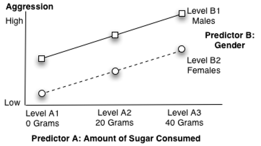
Figure 9.1 is a schematic that is often used to illustrate the results of a factorial study. Notice that scores on the dependent variable (or response) level of aggression displayed by the children are plotted on the vertical axis. Remember, groups that appear higher on this vertical axis display higher mean levels of aggression.
Figure 9.1: A Significant Main Effect for Predictor A Only
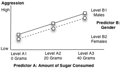
The three levels of predictor variable A (amount of sugar consumed) are plotted on the horizontal axis (the axis that runs left to right). The point at the left represents group A1 (who received 0 grams of sugar), the middle point represents group A2 (the 20-gram group), and the point at the right represents group A3 (the 40-gram group).
The two lines in the body of the figure identify the two levels of predictor variable B (subject gender). Specifically, the small squares connected by a solid line identify the mean scores on aggression displayed by the males (level B1), and the small circles connected by a dashed line show the aggression scores for the females (level B2).
In summary, the important points to remember when interpreting the figures in this chapter are as follows.
- The possible scores on the dependent variable (response) are shown on the vertical axis.
- The levels of predictor A are represented as points on the horizontal axis.
- The levels of predictor B are represented as different lines in the figure.
With this foundation, you are now ready to learn about the different types of effects that are observed in a factorial design and how these effects appear when they are plotted in this type of figure.
Significant Main Effects
When a predictor variable (or independent variable) in a factorial design displays a significant main effect, it means that in the population there is a difference between at least two levels of that predictor variable with respect to mean scores on the dependent (response) variable. In a oneway analysis of variance there is one main effect—the main effect for the study’s independent variable. In a factorial design, however, there is one main effect possible for each predictor variable examined in the study.
For example, the preceding study on aggression includes two predictor variables: amount of sugar consumed and subject gender. This means that, in analyzing data from this investigation, it is possible to obtain any of the following outcomes related to main effects.
- a significant main effect only for predictor A (amount of sugar consumed)
- a significant main effect only for just predictor B (subject gender)
- a significant main effect for both predictor A and predictor B
- no significant main effects for either predictor A or predictor B
The next section describes these effects, and shows what they look like when plotted.
A Significant Main Effect for Predictor A
Figure 9.1, which was shown previously, illustrates a possible main effect for predictor A (call it the sugar consumption variable). Notice that the participants in the 0-gram condition of the sugar consumption predictor variable display a relatively low mean level of aggression. When you look above the heading Level A1, you can see that both the males (represented by a square) and the females (represented by a circle) display relatively low aggression scores. However, participants in the 20-gram condition show a higher level of aggression. When you look above the heading Level A2, you can see that both boys and girls display a somewhat higher level of aggression. Finally, participants in the 40-gram condition show an even higher level of aggression. When you look above the heading Level A3, you can see that both boys and girls in this group display fairly high levels of aggression. In short, this trend shows that there is a main effect for the sugar consumption variable.
This leads to an important point. When a figure representing the results of a factorial study displays a significant main effect for predictor variable A, it demonstrates both of the following characteristics.
- The lines for the various groups are parallel.
- At least one line segment displays a relatively steep angle.
The first of the two conditions—that the lines are parallel—ensures the two predictor variables are not involved in an interaction. This is important, because you normally do not interpret a significant main effect for a predictor variable if that predictor variable is involved in an interaction. In Figure 9.1, you can see that the lines for the two groups in the present study (the solid line for the boys and the dashed line for the girls) are parallel to one another. This suggests that there probably is not an interaction between gender and sugar consumption in the present study (the concept of interaction will be explained in greater detail later in the “A Significant Interaction” section.
The second condition—that at least one line segment should display a relatively steep angle—can be understood by again referring to Figure 9.1. Notice that the line segment that begins at level A1 (the 0-gram condition) and extends to level A2 (the 20-gram condition) displays an upward angle (is not horizontal) because the aggression scores for the 20-gram group are higher than the aggression scores for the 0-gram group. When you obtain a significant effect for the predictor A variable, you expect to see this type of angle. Similarly, you can see that the line segment that begins at A2 and continues to A3 also displays an upward angle, which is consistent with a significant effect for the sugar consumption variable.
Note: The lines do not have to be straight to indicate a significant main effect. The line segments that represent groups can be parallel but at different steep angles, as in the example shown here.
Remember that these guidelines are intended to help you understand what a main effect looks like when it is plotted in a figure such as Figure 9.1. To determine whether this main effect is statistically significant, it is necessary to review the results of the analysis of variance, which will be discussed later.
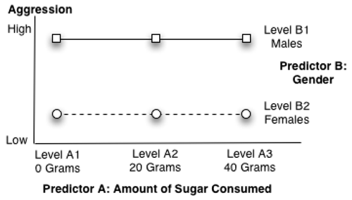
A Significant Main Effect for Predictor B
You expect to see a different pattern if the main effect for the other predictor variable (predictor B) is significant. Earlier, you saw that predictor A was represented in a figure by plotting three points on the horizontal axis. In contrast, predictor B was represented by drawing different lines within the body of the figure itself—one line for each level of predictor B. In the present study, predictor B is the subject gender variable, so a solid line was used to represent mean scores for the male participants, and a dashed line was used to represent mean scores for the female participants.
When predictor B is represented in a figure by plotting separate lines for its various levels, a significant main effect for that variable is evident when the figure displays both of the following.
- The lines for the various groups are parallel, which indicates no interaction.
- At least two of the lines are relatively separated from each other.
For example, Figure 9.2 shows a main effect for predictor B (gender) in the current study. Consistent with the two preceding points, the lines in Figure 9.2 are parallel to one another and separated from one another. Notice that, in general, the males tend to score higher on the measure of aggression compared to the females. Furthermore, this tends to be true regardless of how much sugar the participants consume. Figure 9.2 shows the general trend that you expect when there is a main effect for predictor B (gender) only.
Figure 9.2: A Significant Main Effect for Predictor B Only
A Significant Main Effect for Both Predictor Variables
It is possible to obtain significant effects for both predictor A (sugar consumed) and predictor B (gender) in the same investigation. When there is a significant effect for both predictor variables, you should see all of the following:
- The line segments for the groups are parallel, which indicates no interaction.
- At least one line segment displays a relatively steep angle (indicating a main effect for predictor A).
- At least two of the lines are relatively separated from each other (indicating a main effect for predictor B).
Figure 9.3 shows what the figure might look like under these circumstances.
Figure 9.3: Significant Main Effects for Both Predictor A and Predictor B
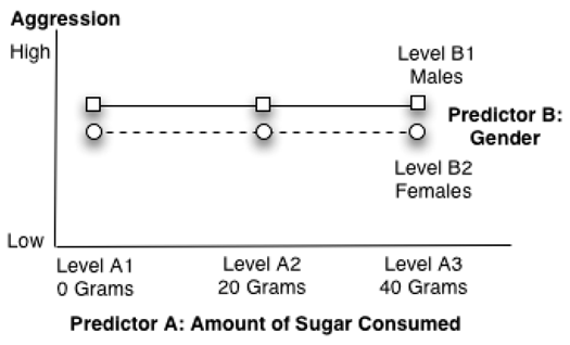
No Significant Main Effects
Figure 9.4 shows what a figure might look like if there were main effects for neither predictor A nor predictor B. Notice that the lines are parallel (indicating no interaction), none of the line segments displays a relatively steep angle (indicating no main effect for predictor A), and the lines are not separated (indicating no main effect for predictor B).
Figure 9.4: A Nonsignificant Interaction and Nonsignificant Main Effects
A Significant Interaction
The concept of an interaction can be defined in a number of ways. For example, with respect to experimental research, in which you are actually manipulating independent variables, the following definition can be used:
“An interaction is a condition in which the effect of one independent variable on the dependent variable is different at different levels of the second independent variable.”
On the other hand, when conducting nonexperimental research, in which you are simply measuring naturally occurring variables rather than manipulating independent variables, it can be defined in this way:
“An interaction is a condition in which the relationship between one predictor variable and the criterion (response) is different at different levels of the second predictor variable.”
These definitions might appear somewhat abstract at first glance, but the concept of interaction is much easier to grasp with a visual display. For example, Figure 9.5 illustrates a significant interaction between sugar consumption and subject gender in the present study. Notice that the lines for the two groups are no longer parallel: the line for the male participants now displays a somewhat steeper angle, compared to the line for the females. This is the key characteristic of a figure that displays a significant interaction: lines that are not parallel.
Figure 9.5: Significant Interaction between Predictor A and Predictor B
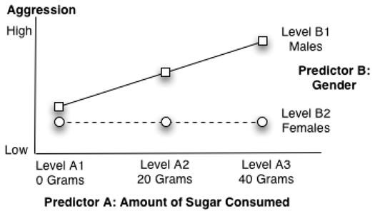
Notice how the relationships shown in Figure 9.5 are consistent with the definition for interaction—the relationship between one predictor variable (sugar consumption) and the response variable (aggression) is different at different levels of the second predictor variable (gender). More specifically, the figure shows that the relationship between sugar consumption and aggression is relatively strong for the male participants. Consuming larger quantities of sugar results in a dramatic increase in aggression among the male participants. Notice that the boys who consumed 40 grams of sugar displayed much higher levels of aggression than the boys who consumed 0 or 20 grams of sugar. In contrast, the relationship between sugar consumption and aggression is relatively weak among the female participants. The line for the females is fairly flat—there is little difference in aggression among the girls who consumed 0 grams of sugar versus 20 grams of sugar versus 40 grams of sugar.
Figure 9.5 shows why you don’t normally interpret main effects when an interaction is significant. It is clear that sugar consumption does seem to have an effect on aggression among boys, but the figure suggests that sugar consumption probably does not have any meaningful effect on aggression among girls. To say that there is a main effect for sugar consumption might mislead readers into believing that sugar fosters aggression in all children in much the same way (which it apparently does not). It appears that whether or not sugar fosters aggression depends on the child’s gender.
In this situation, it makes more sense to do the following:
- Note that there was a significant interaction between sugar consumption and subject gender.
- Prepare a figure (like Figure 9.5) that illustrates the nature of the interaction.
- Test for simple effects.
Testing for simple effects is similar to testing for main effects, but is done one group at a time. For example, in the preceding analysis, you would test for simple effects by first dividing your data into two groups—separate data from the male and female participants. You then perform an analysis to determine whether sugar consumption has a simple effect on aggression among just the male participants. Then, perform a separate test to determine whether sugar consumption has a simple effect on aggression among just the female participants. The lines for gender in Figure 9.5 suggest the simple effect of sugar consumption on males is probably significant, but its effect on females is not significant. A later section shows you how JMP can perform these tests for simple effects.
To summarize, an interaction means that the relationship between one predictor variable and the criterion is different at different levels of the second predictor variable. When an interaction is significant, you should interpret your results in terms of simple effects, instead of main effects.
Example with Nonsignificant Interaction
To illustrate how to do a two-way analysis of variance, let’s modify the earlier study that examined the effect of rewards on commitment in romantic relationships. That study, which was presented in Chapter 8, “One-Way ANOVA with One Between-Subjects Factor,” had only one independent variable, called Reward Group. This chapter uses the same scenario, but with two independent variables, Reward Group and Cost Group.
In Chapter 8, participants read descriptions of a fictitious “partner 10” and rated how committed they would be to a relationship with that person. One independent variable, Reward Group, was manipulated to give three experimental conditions. Participants were assigned to either the low-reward, mixed-reward, or high-reward condition.
The following descriptions of partner 10 were provided to the participants.
- Participants in the low-reward condition were told to assume that this partner “...does not enjoy the same recreational activities that you enjoy, and is not very good looking.”
- Participants in the mixed-reward condition were told to assume that “…sometimes this person seems to enjoy the same recreational activities that you enjoy, and sometimes does not. Sometimes partner 10 seems to be very good looking, and sometimes does not appear good looking.”
- Participants in the high-reward condition were told that this partner “...enjoys the same recreational activities that you enjoy, and is very good looking.”
These same manipulations are used in the present study. In a sample of 30 participants, one-third is assigned to a low-reward condition, one-third to a mixed-reward condition, and one-third to a high-reward condition. This Reward Group factor serves as independent variable A.
However, in this study, you will also manipulate a second predictor variable (independent variable B) at the same time. The second independent variable will be called Cost Group, and will consist of two experimental conditions. Half of the participants (the “less” cost group) will be told to assume that they are in a relationship that does not create significant personal hardships. Specifically, when a subject reads the description of partner 10, it will say, “Partner 10 lives in the same neighborhood as you so it is easy to get together as often as you like.” The other half of the participants (the “more” cost group) will be told to imagine that they are in a relationship that does create significant personal hardships. When they read the description of partner 10, it will say, “Partner 10 lives in a distant city, so it is difficult and expensive to get together.”
Your study now has two independent variables. Independent variable A is type of rewards with three levels (or conditions). Independent variable B is type of costs, with two levels. The factorial design used in the study is illustrated in Table 9.2.
Table 9.2: Experimental Design Used in Investment Model Study with Two Predictors
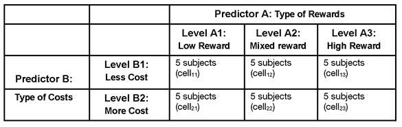
The preceding 2 by 3 matrix shows that there are two independent predictor variables. One independent variable has two levels and the other has three levels. There are a total of 30 participants divided into 6 cells, or subgroups. Each cell contains 5 participants. Each horizontal row in the figure (running from left to right) represents a different level of the type of costs independent variable. There are 15 participants in the less-cost condition, and 15 participants in the more-cost condition. Each vertical column in the figure (running from top to bottom) represents a different level of the type of rewards independent predictor variable. There are 10 participants in the low-reward condition, 10 participants in the mixed-reward condition, and 10 participants in the high-reward condition.
It is strongly advised that you prepare a similar figure whenever you conduct a factorial study, which makes it easier to enter data and reduces the likelihood of input errors.
Notice that the cell subscript numbers (cell11, cell23, and so forth) indicate which experimental condition a given subject experiences under each of the two independent variables. The first number in the subscript indicates the level of costs, and the second number indicates the level of rewards. This type of notation is often used to express statistical models in mathematical terms.
In subscripted notation, cell11 represents the less-cost level and lowreward level. Participants in this cell experienced the low-cost condition and the low-reward condition. Cell23 represents more-cost level and mixed reward, which means that the 5 participants in this subgroup read that partner 10 lives in a distant city (more cost) and is good looking ((high reward). You interpret each design cell in this way. When working with cell notation, remember that the subscript number for the row always precedes the number for the column. That is, cell12 is not interpreted the same as cell21.
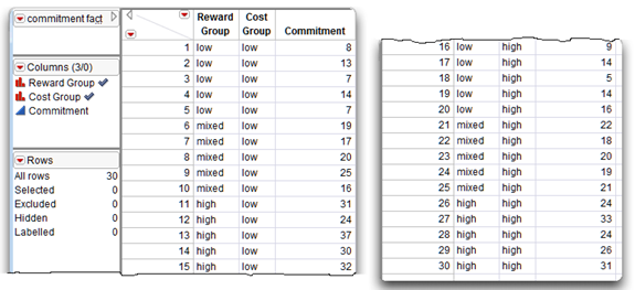
![]() To see the data used in the following examples, open the JMP table called commitment factorial.jmp, which is available from the author page for this book.
To see the data used in the following examples, open the JMP table called commitment factorial.jmp, which is available from the author page for this book.
The JMP table uses the actual names of the levels instead of the cell subscripts. This is a useful way to enter data for a two-way ANOVA because it provides a quick way of see the treatment combination for any given subject. The JMP data table in Figure 9.6 is a listing of the data for this factorial example. The first two columns of data for the subject from line 1 provide the values “low” and “less,” which tells you that this subject is in cell11 of the factorial design matrix. Similarly, the values subject 16 has values “low” and “more,” which tells you that this subject is in cell21. The data do not have to be sorted by any variable to be analyzed with JMP.
Factorial Data in a JMP Table
There are two predictor variables in this study (Reward Group and Cost Group) and one response variable (Commitment). This means each subject has a score for three variables.
- First, the Reward Group variable indicates which experimental condition a subject experienced under the type of rewards independent variable. Each subject is assigned to the “low,” “mixed,” or “high” reward group.
- Second, the variable called Cost Group indicates which condition the subject experienced under the type of costs independent variable, with values “less” and “more.” Each subject is assigned to only one cost condition and one reward condition (a subject cannot be in more than one treatment group).
- Finally, the variable Commitment has the subject’s rated commitment to the relationship with partner 10.
Figure 9.6 shows the data entered into a JMP table called commitment factorial.jmp.
Figure 9.6: JMP Data Table with Factorial Data
Ordering Values in Analysis Results
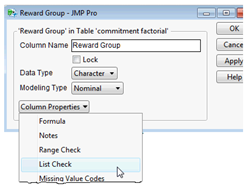
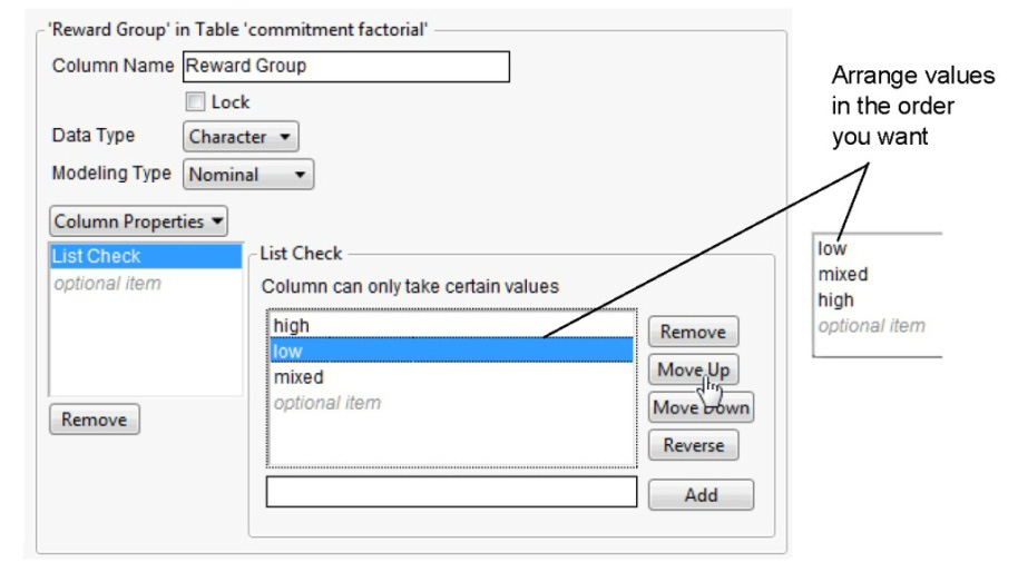
In Figure 9.6, the check mark icon to the right of the Reward Group and Cost Group names in the Columns panel indicates it has the List Check column property. The List Check column property lets you specify the order you want variable values to appear in analysis results. For example, you want to see the Reward Group values listed in the order, “low,” “mixed,” and “high.” Unless otherwise specified, values in reports appear in alphabetic order.
One way to order values in analysis results is to use the Column Info dialog and assign a special property to the column called List Check.
To do this,
![]() Right-click in the Reward Group column name area or on the column name in the Columns panel, and select Column Info from the menu that appears.
Right-click in the Reward Group column name area or on the column name in the Columns panel, and select Column Info from the menu that appears.
![]() When the Column Info dialog appears, select List Check from the New Property menu, as shown here.
When the Column Info dialog appears, select List Check from the New Property menu, as shown here.
![]() Notice that the list of values first show in the default (alphabetic) order. Highlight values in the List Check list and use the Move Up or Move Down buttons to rearrange the values in the list, as shown in Figure 9.7.
Notice that the list of values first show in the default (alphabetic) order. Highlight values in the List Check list and use the Move Up or Move Down buttons to rearrange the values in the list, as shown in Figure 9.7.
![]() Click Apply, and then click OK.
Click Apply, and then click OK.
Figure 9.7: Column Info Dialog with List Check Column Property
Using the Fit Model Platform
Analyzing data with more than one independent predictor variable requires the Fit Model platform. The following steps lead you through a factorial analysis of the commitment data, and describe the results.
![]() Open the commitment factorial.jmp table.
Open the commitment factorial.jmp table.
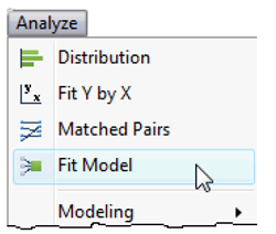
![]() Choose the Fit Model command from the Analyze menu.
Choose the Fit Model command from the Analyze menu.
![]() When the Fit Model launch dialog appears, select Commitment from the variable list on the left, and then click Y on the dialog to assign it as the independent response variable for the analysis.
When the Fit Model launch dialog appears, select Commitment from the variable list on the left, and then click Y on the dialog to assign it as the independent response variable for the analysis.
![]() Next, select both Reward Group and Cost Group from the variable list.
Next, select both Reward Group and Cost Group from the variable list.
![]() With these two factors selected, choose Full Factorial from the list of options in the Macros menu to enter the main effects and interaction into the model for analysis. Figure 9.8 shows the completed Fit Model dialog.
With these two factors selected, choose Full Factorial from the list of options in the Macros menu to enter the main effects and interaction into the model for analysis. Figure 9.8 shows the completed Fit Model dialog.
![]() Click Run in the launch dialog to see the factorial analysis.
Click Run in the launch dialog to see the factorial analysis.
Figure 9.8: Fit Model Dialog Completed for Factorial Analysis
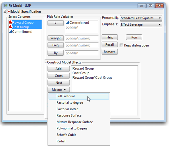
Note the items in the upper right of the dialog called Personality and Emphasis. The default commands showing are correct for this analysis. The method of analysis is denoted as the analysis personality in JMP. The personality you choose depends on the modeling type of the response variable. The most common method is the Standard Least Squares, used when there is a single continuous response variable as in this example. The Emphasis options tailor the results to show more or fewer details, The Effect Leverage option is useful here because you want to examine the interaction effect, Cost Group*Reward Group, in detail. The next section describes Leverage plots.
Verify the Results
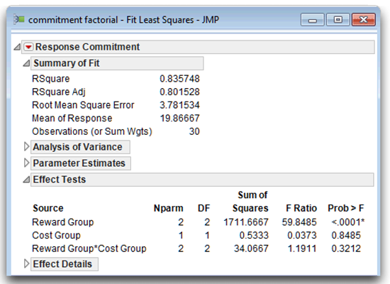
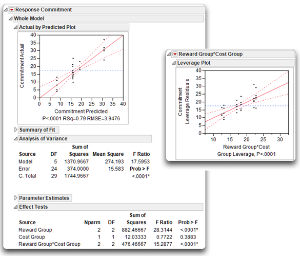
Interpreting the results of a two-factor ANOVA is similar to interpreting the results of a one-factor ANOVA. In any analysis, you should always follow sound basic procedures. With the Effect Leverage emphasis in effect, the ANOVA analysis report shows the analysis of the whole model on the left, and the analysis of each factor (the main effects and the interaction) arranged to the right. First look at the portions of the whole model analysis shown in Figure 9.9 to verify that you did the analysis as intended. The analysis window title bar states the data table name (commitment factorial) and the type of analysis performed (Fit Least Squares). The Summary of Fit table shows that there were 30 observations. The Effect Tests table lists each term in the model, Reward Group, Cost Group, and the interaction term Reward Group* Cost Group.
If you want to look more closely at the analysis structure, the Parameter Estimates table (not open) lists the levels of each effect and is discussed later.
Note: All parts of a JMP analysis can be opened or closed using the icon next to each title. When the statistical results first appeared, all tables were open by default. In Figure 9.9, only the Summary of Fit and the Effect Tests tables are shown open—all other parts of the analysis were manually closed.
Figure 9.9: Verification of the Analysis
Examine the Whole Model Reports
Like most JMP analyses, the analysis of variance results begin with a graphical display. The whole model and each effect have a leverage plot (Sall, 1990) that graphically shows whether the whole model or an effect is significant.
Actual by Predicted Leverage Plot
The whole model Actual by Predicted leverage plot shows the data values on the y-axis and the values predicted by the factorial model on the x-axis. The plot shows the line of fit with 95% confidence lines. You want to compare the line of fit with the horizontal reference line, which represents the null hypothesis. A leverage plot has the following properties, as illustrated in Figure 9.10:
- The distance from each point to the line of fit is the error (or residual) for that point. These distances represent the amount of variation not explained by fitting the model to the data.
- The distances from each point to the horizontal line (the mean of the data) is the total variation, or what the error would be if you took the effects out of the model and used the mean as the line of fit.
- In a leverage plot, the line of fit and its confidence curves quickly reveal whether the model explains enough of the variation in the data to fit significantly well. If the 95% curves cross the horizontal mean reference line, then the model fits well. If the curves do not cross the mean line—if they include or encompass the mean line—the model line fits the data no better than the mean line itself.
Figure 9.10: Leverage Plots
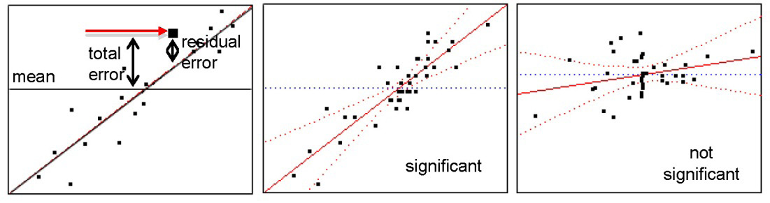
This plot is called a leverage plot because it shows the “leverage” or influence exerted by each data point in the analysis. A point has more influence on the fit if it is farther away from the middle of the plot in the horizontal direction. Further, if the points cluster in the middle of the plot, the line is not well balanced through the points and the confidence curves become wide as they extend out.
The leverage plot shown on the left in Figure 9.11 indicates that the factorial model for the commitment data appears to fit very well. This graphic is verified by the information given beneath the plot, by summary statistics, and the analysis of variance statistics.
Figure 9.11: Whole Model Leverage Plot and ANOVA Report
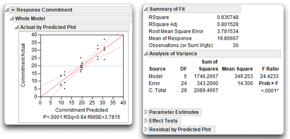
Summary of Fit Table
The Summary of Fit table for the response variable, Commitment, summarizes the basic model fit with these quantities:
- The Rsquare statistic is 0.8357, so the factorial model explains 85.57% of the total variation in the sample. It is the ratio of the model sum of squares to the total sum of squares, found in the Analysis of Variance table. The R2 in this example is high, and is supported by the significant F statistic in the Analysis of Variance table.
- The Rsquare Adj is the R2 statistic adjusted to make it more comparable over different models (different analyses). It is based on the ratio of mean squares instead of the ratio of sums of squares.
- The Root Mean Square Error (RSME) is the square root of the error mean square in the Analysis of Variance table.
- The Mean of Response (the overall mean of the response variable) is 19.867, and shows as the horizontal line on the leverage plot in Figure 9.9.
- The Observations (or Sum Wts) is the number of participants, 30, used in the analysis.
Analysis of Variance Table
You use the Analysis of Variance table to review the F statistic produced by the analysis and its associated p-value. As with the one-way ANOVA, look at the F statistic to see if you can reject the null hypothesis for the whole model (Figure 9.11). There is no difference between the mean commitment score and the commitment score predicted by the statistical model that include the main effects, Reward Group and Cost Group, and their interaction.
Or, looking back at Table 9.2, the null hypotheses states,
“In the population there is no difference in mean commitment scores between any of the groups of people identified by the cells (categories) in the factorial design.”
Symbolically, you can represent the null hypothesis this way:
µ11 = µ12 = µ13= µ21= µ22= µ23
where µ 11 is the mean commitment score for the population of people in the less-cost, low-reward condition; µ 12 is the mean commitment score for the population of people in the less-cost, mixed-reward condition; and so forth.
How to Interpret a Model with No Significant Interaction
The fictitious data set analyzed in this section was designed so that the interaction term would not be significant. The next sections focus on some issues that are relevant to a two-factor ANOVA.
This two-factor analysis of variance allows you to test for three types of effects:
- the main effect of predictor A (Reward Group)
- the main effect of predictor B (Cost Group)
- the interaction of predictor A and predictor B (Reward Group* Cost Group)
Remember that you can interpret a main effect only if the interaction is not significant.
Verify That the Interaction Is Not Significant
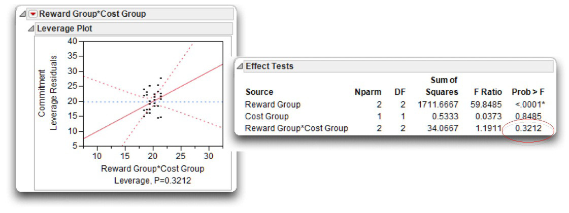
The interaction leverage plot shows to the far right of the JMP analysis of variance results. The Reward Group* Cost Group effect is summarized with a leverage plot (see Figure 9.12) that gives the same kind information for the interaction effect as for the whole model and other effects. You can quickly assess the interaction effect as not significant because the confidence curves in the leverage plot do not cross the horizontal reference line. Said another way, the reference line (which represents the null hypothesis) falls within the confidence curves of the line of fit. The p-value for the significance test, p = 0.3212, shows beneath the plot.
To see the details of the test for the interaction, look again at the Effect Tests table, showing with the whole table results and in Figure 9.12. The last entry, Reward Group*Cost Group, gives the supporting statistics. When an interaction is significant, it suggests that the relationship between one predictor and the response variable is different at different levels of the second predictor. In this case, the interaction is associated with 2 degrees of freedom, has a value approximately 34.07 for the sum of squares, an F value of 1.19, and a corresponding p-value of 0.3212. Remember that when you choose α = 0.05, you view a result as being statistically significant only if the p-value is less than 0.05.
This p-value of 0.3212 is larger than 0.05, so you conclude that there is no interaction between the two independent predictor variables. You can therefore proceed with your review of the two main effects.
Figure 9.12: Interaction Leverage Plot and Statistics
Determine Whether the Main Effects Are Statistically Significant
A two-way ANOVA tests two null hypotheses concerning main effects. The null hypothesis for the type of rewards predictor may be stated as follows:
“In the population, there is no difference between the high-reward group, the mixed reward-group, and the low-reward group with respect to scores on the commitment variable.”
The F statistic to test this null hypothesis is also found in the Effect Tests table (see Figure 9.12). To the right of the heading Reward Group, you see that this effect has 2 degrees of freedom, a sum of squares value of 1711.667, an F value of 59.85, and a p-value of 0.0001. With such a small pvalue, you can reject the null hypothesis of no main effect for type of rewards, and conclude that at least one pair of reward groups are different. Later, you will review the results of the Tukey test to see which reward groups significantly differ.
The null hypothesis for the type of costs independent variable may be stated in a similar fashion:
“In the population, there is no difference between the more-cost group and the less-cost group with respect to scores on the commitment variable.”
The Effect Tests table shows the F statistic for Cost Group to be 0.04, with an associated p-value of 0.849. This p-value is greater than 0.05 so you do not reject the null hypothesis and conclude that there is no significant main effect for type of costs.
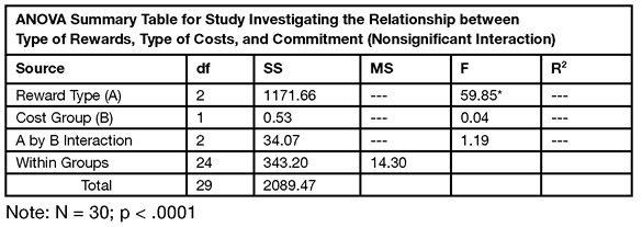
Design Your Own Version of the ANOVA Summary Table
Although many journals accept tables and graphs from JMP and other statistical software packages, you can extract information from the JMP analysis and create an alternate form of the Analysis of Variance table, similar to the one shown in Table 9.3. The information in Table 9.3 uses combined items from the Summary Table, the Analysis of Variance table, and the Effect Tests table in JMP.
The first three lines of Table 9.3 are the items in the Effect Tests table. However, note that the Mean Square (MS) included in the alternative table does not show (by default) in the JMP Effect Tests table, and that the R2 is not computed for the effects.
The next section shows how to include additional information in JMP tables and compute the quantities to complete the alternative ANOVA summary table.
Table 9.3: An Alternative ANOVA Summary Table with Some Results Missing
Display Optional Information in a JMP Results Table
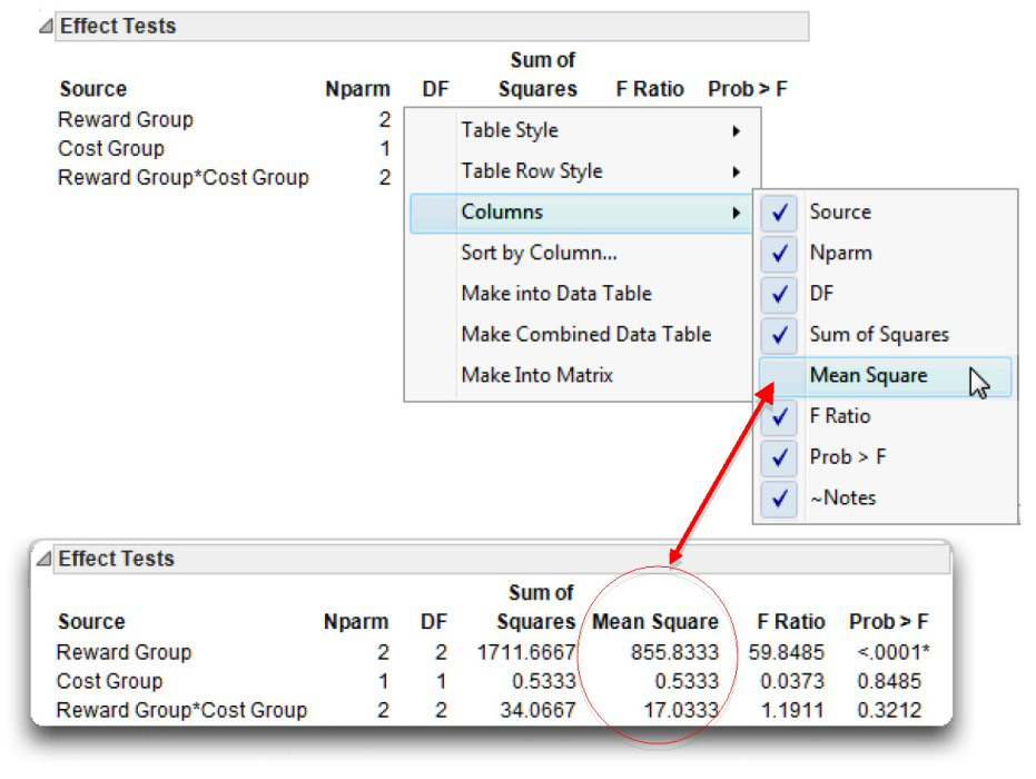
Many JMP results tables have optional columns that aren’t shown by default. To see what is available in any table, right-click on the surface of the table, and select the Columns command from the menu that appears. For example, when you right-click on the Effects Tests table and look at the available columns, Mean Square is not checked. Select Mean Square and add it to the Effect Tests table, as shown in Figure 9.13. The Means Square values for the first three lines in the alternative table are now available in the JMP Effect Tests table. The Mean square is 855.833 for Reward Group, 0.533 for Cost Group, and 17.033 for the Reward Type*Cost group interaction.
Figure 9.13: Show Additional Information in a JMP Results Table
Compute Additional Statistics
In the preceding chapter, you learned that R2 is a measure of the strength of the relationship between a predictor variable and a response variable. In a one-way ANOVA, R2 tells you what percent of variance in the response is accounted for (explained) by the study’s predictor variable. In a two-way ANOVA, R2 indicates what percent of variance is accounted for by each predictor variable, as well as by their interaction term.
JMP does not compute the R2 for each effect, but you can perform a few simple hand calculations to compute these values. To calculate R2 for a given effect, divide the sum of squares associated with that effect by the corrected total sum of squares. For example, to calculate the R2 value for the type of rewards main effect (Reward Group), divide the sum of squares for Reward Group found in the Effect Tests table (1711.6667) by the corrected total sum of squares (C. Total) found in the Analysis of Variance table. That is,
Type of Reward R2 = SSReward Group ÷ SSC. Total = 1711.6667 ÷ 2089.4667 = 0.819
Likewise,
Type of Cost R2 = SSCost Group ÷ SSC. Total = 0.5333 ÷ 2089.4667 = 0.0002
Interaction R2 = SSInteraction ÷ SSC. Total = 34.0667 ÷ 2089.4667 = 0.0163
Complete the Alternative ANOVA Summary Table
Table 9.3 shows the completed alternative ANOVA summary table. Using the mean square quantities now showing in the Effect Tests table, and the computed R2 values, you can complete the first three lines of the alternative ANOVA summary table. The Within Groups and Total quantities are the Error and the C. Total values from the Analysis of Variance table. Beneath Table 9.3, N is taken from the Summary of Fit table and the p-value for Reward Type is in the Effect Tests table.
Table 9.3: Completed Alternative ANOVA Summary Table
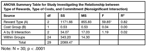
You can construct an alternative table for any type of analysis by using quantities from JMP results, or computing additional quantities from table results.
Sample Means and Multiple Comparisons
If a given main effect is statistically significant, then review the Least Squares means plot and Tukey’s HSD multiple comparison test for that main effect to see which levels are different. Tukey’s test does not show automatically because it is not needed if an effect is not significant, or might not be relevant if there is a significant interaction.
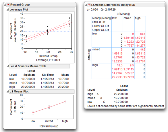
Tukey’s multiple comparison is available for each effect in a model using the LSmeans Tukey HSD Test, found on the menu on the title bar for the effect. In this example, Reward Group is the only significant effect, so look at its Tukey’s multiple comparison test results in Figure 9.14.
![]() Select LSMeans Plot from the menu on the Reward Group title bar.
Select LSMeans Plot from the menu on the Reward Group title bar.
![]() Select LSMeans Tukey’s HSD from the menu on the Reward Group title bar.
Select LSMeans Tukey’s HSD from the menu on the Reward Group title bar.
The results show a significant difference between the group means for each pair of Reward Group levels.
- The leverage plot for Reward Group shows narrow confidence curves that cross the horizontal reference line, which indicates a significant effect.
- The LSMeans Plot shows the high-reward group with the highest commitment scores, the mixed-reward group with the next highest commitment scores, and the low-reward group is the lowest commitment scores.
- The LSMeans Differences Tukey HSD report presents a crosstabs table with cells that list the difference between each pair of group means, the standard error of the difference, and confidence limits for the difference.
- The letter report beneath the crosstabs lists the means from high to low. Means not connected by the same letter are significantly different for the alpha level given at the top of the report (α = 0.05). This multiple comparison statistical test is adjusted for all differences among the least squares means (Tukey, 1953; Kramer, 1956). This is an exact alpha-level test if the sample sizes are the same (as in this example) and conservative if the sample sizes are different (Hayter, 1984).
Figure 9.14: Effect Leverage and Multiple Comparison Test for Reward Group
Summarize the Analysis Results
In performing a two-way ANOVA, use the same statistical format as was used when summarizing a t-test analysis and a one-way ANOVA. However, with two-way ANOVA, it is possible to test three null hypotheses in this study:
- The hypothesis of no interaction, stated as “In the population, there is no interaction between type of rewards and type of costs in the prediction of commitment scores”
- The hypothesis of no main effect for predictor A (type of rewards)
- The hypothesis of no main effect for predictor B (type of costs)
The list below, shown in previous chapters, is used in each case when results of a study need to be summarized and prepared for publication.
A. Statement of the problem
B. Nature of the variables
C. Statistical test
D. Null hypothesis (H0)
E. Alternative hypothesis (H1)
F. Obtained statistic
G. Obtained probability (p) value
H. Conclusion regarding the null hypothesis
I. Figure representing the results
J. Formal description of results for a paper
Formal Description of Results for a Paper
Below is one approach that could be used to summarize the results of the preceding analysis in a scholarly paper.
Results were analyzed using two-way ANOVA, with two between-subjects factors. This analysis revealed a significant main effect for type of rewards, F(2, 24) = 59.85; p < 0.001; large treatment effect, R2=0.8190; MSE = 14.3 .The sample means are displayed in Figure 9.14. Tukey’s HSD test showed that participants in the high-reward condition scored significantly higher on commitment than participants in the mixed-reward condition, who, in turn, scored significantly higher than participants in the low-reward condition (p < 0.05). The main effect for type of costs was not significant, F(1, 24) = 0.04; p = 0.849. The interaction between type of rewards and type of costs was also not significant, F(2, 24) = 1.19; p = 0.321.
Example with a Significant Interaction
When the interaction term is statistically significant, it is necessary to follow a different procedure when interpreting the results. In most cases, this will consist of plotting the interaction in a figure, and determining which of the simple effects are significant. This section shows how to interpret results when there is a significant interaction.
For example, assume that the preceding study with 30 participants is repeated, but that this time the analysis is performed on the following data set. The Reward Group and the Cost Group values are the same, but the Commitment values have been changed to produce a significant interaction (see Figure 9.15). The name of the data table is commitment interaction.jmp.
Figure 9.15: Commitment Data with Significant Interaction
To analyze the commitment interaction JMP table, use the same steps as shown previously. Complete the Fit Model dialog the same as the one in Figure 9.8. When you click Run, the same type of information appears. Figure 9.16 shows portions of the results. As in the previous example, the whole model is significant in the Analysis of Variance table. The Effect Tests table shows that Reward Group is a significant effect, Cost Group is not significant, but the interaction between Reward Group and Cost Group is significant. Before you can make a statement about the significant Reward Group effect, you must look closer at the interaction effect.
Notice that the Leverage Plot for the interaction has confidence curves that cross the horizontal reference line, which gives a visualization of the significant interaction effect. (The confidence curves do not enclose the horizontal reference line of no effect.)
Figure 9.16: Interaction Effect Shown in Effect Tests Table and Leverage Plot
How to Interpret a Model with Significant Interaction
This commitment interaction.jmp data table was constructed to produce a significant interaction between type of rewards and type of costs. The steps to follow when interpreting this interaction are different than when there is no significant interaction.
Determine If the Interaction Term Is Statistically Significant
The F ratio for Reward Group*Cost Group effect in the Effect Test table is 15.287 and its associated p-value is less than 0.0001. Because of this significant interaction, you want to plot the interaction and look at the main effect levels.
Notes on Computation: The numerator of the F ratio for an effect is the sum of squares for that effect divided by its corresponding degrees of freedom. For the Reward Group*Cost Group interaction effect, the numerator of the F ratio is 476.46667 ÷ 2 = 238.2333. The denominator is the error sum of divided by its degrees of freedom (the mean square found in the Analysis of Variance table), and is 374 ÷ 24 = 15.5833. The notation for an F ratio in often includes its degrees of freedom, and is denoted F(dfnumerator, dfdenominator). In this case the F ratio for the interaction is F(2, 24) = 238.2333 ÷ 15.5833 = 15.28773. Compute the R2 for the interaction as SSinteraction ÷ SStotal= 476.467 ÷ 1744.967 = 0.27.
Plot the Interaction
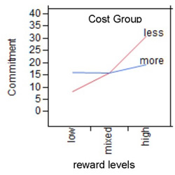
Interactions are easiest to understand with a plot of the means for each of the cells that appear in the study’s factorial design. The factorial design used in the current study involved a total of six cells (see Table 9.2). To see a plot of the mean commitment scores for these six cells, choose the Factor Profiling command from the menu on the Whole Model title bar, and select Interaction Plots from its submenu (see Figure 9.17).
Figure 9.17: Plot of Interaction Effect
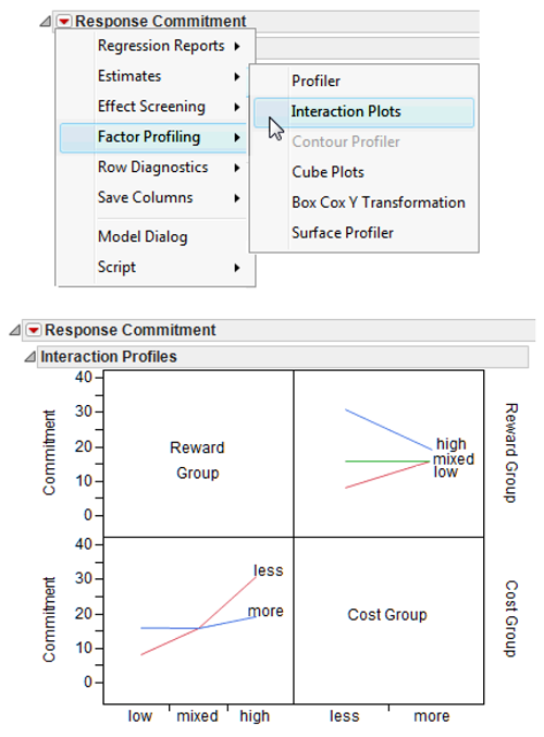
The y-axis for the plots is mean commitment score. The two interaction plots show the mean commitment score for one main effect plotted at each level of the other main effect—the lines in the body of the plots represent the conditions of one of the independent variables across the levels of the other independent variable.
When there is an interaction between two variables, it means that at least two of the lines in the interaction profile plot are not parallel to each other. Notice that none of the three lines for the Reward Group levels are parallel across cost levels, and the lines for the Cost Group across reward levels actually intersect. When there is a significant interaction, the next step is to look at simple effects.
When a two-factor interaction is significant, you can always view it from two different perspectives. In some cases you should test for simple effects from both perspectives before interpreting results. However, often, the interaction is more interpretable (makes more sense) from one perspective than from the other. In the example, the reward effect is the only significant main effect so a logical start is to look at the effect of cost type on the levels of the reward effect. In Figure 9.17, you can see that the effect of the rewards independent variable on commitment varies more for the less-cost group than for the more-cost group.
The interaction plots in this example suggest that the relationship between reward level and commitment values depends on the level of the cost group. Said another way, the type of costs moderates the relationship between type of rewards and commitment.
Testing Slices (Simple Effects)
When there is a simple effect for independent variable A (Reward Group in this example) at a given level of independent variable B (Cost Group), it means that there is a significant relationship between independent variable A and the dependent variable (commitment) at that level of independent variable B. As was stated earlier, the concept of a simple effect is easiest to understand by again looking at Figure 9.17.
First, consider the line that represents the more-cost group in Figure 9.17 (also shown here). This line has only a slight slope, which indicates the reward level has little effect on commitment in the more-cost group. However, the line for the less-cost group varies greatly over the reward levels, suggesting that there may be a significant relationship between cost and commitment for the participants in the high-reward group. In other words, there may be a significant relationship between Reward Group and Commitment at the less-cost level of the Cost Group variable.
In JMP, testing for simple effects is done by the Test Slices command found on the menu on the interaction title bar. In fact, this command tests the simple effect of each cell in the factorial design table. You can easily look at the interaction from the perspective of either main effect. Figure 9.18 shows the Test Slices report for this example.
Figure 9.18: Test Simple Effects with Test Slices Command
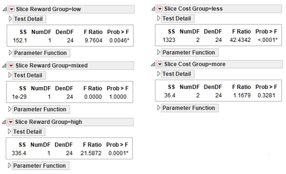
The two tables on the right in Figure 9.18 show the effect of reward on each of the cost groups. The computed F ratio for the less-cost group is 42.43, with corresponding p-value close to zero. The reward level has a significant effect on the less-cost group. However, the F ratio for the more-cost group is only 1.16 with the insignificant p-value of 0.328. Therefore, you fail to reject the null hypothesis for the more-cost group, and conclude that there is not a significant simple effect for the reward-level factor at the more-cost group.
Note: The computation of the F ratio for testing slices uses the error mean square generated by the two-factor analysis of variance with interaction (15.583 in Figure 9.16), with 24 degrees of freedom in the denominator. When testing slices, this whole model can be referred to as the Omnibus model because the analysis includes all the participants. The numerator for each slice is obtained by analyzing each factor separately in a one-way analysis of variance, not shown in this example, but computed automatically by the Test Slices analysis.
You can verify the F statistic given by the Test Slices report by taking a subset of each cost-factor level and using the Fit Y by X platform to see a one-way ANOVA. For example, if you analyze the subset of the participants in the less-cost group, the one-way Analysis of Variance table gives a Mean Square for Reward Group of 661.267. Using this Mean Square as the numerator for the simple effect (test slices) test, and the error Mean Square, 15.583, from the factorial (omnibus) analysis shown in this example as the denominator, gives
F = (661.27) ÷ (15.58) = 42.44
This is the significant F value for testing the reward effect in the less-cost group.
A one-way ANOVA on the more-cost group gives an error mean square of 18.20 and the resulting simple effect test is
F = (18.20) ÷ (15.58) = 1.17
with nonsignificant F statistic, as shown in the Slice Cost Group=more table in Figure 9.18.
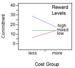
The three tables on the left in Figure 9.18 let you investigate the interaction from the perspective of possible simple effects for the type of costs at three different levels of the type of rewards factor. The interaction plot for that perspective is shown to the right. The horizontal axis represents the type of costs factor and has a midpoint for the less-cost group and one for the more-cost group. Within the body of the figure itself, there are lines representing the low-reward, mixed-reward, and high-reward groups. The plot and slice tests indicate that cost has a significant simple effect for the high- and the low-reward groups, but no effect for the mixed-reward group.
When a two-factor interaction is significant, you can always view it from two different perspectives. Furthermore, the interaction is often more interpretable (makes more sense) from one perspective than from the other.
Formal Description of Results for a Paper
Results from this analysis could be summarized in the following way for a published paper:
Results were analyzed using two-way analysis of variance, with two between-subject factors. This revealed a significant Type of Rewards by Type of Costs interaction, F(2, 24) = 15.29, p < 0.0001, MSE = 15/563, and R2 = 0.273. The nature of this interaction is displayed in Figure 9.17.
Subsequent analyses demonstrated that there was a simple effect for type of rewards at the less-cost level of the type of costs factor, F(2, 24) = 42.44, p < 0.00001. As Figure 9.17 shows, the high-reward group displayed higher commitment scores than the mixed-reward group, which, in turn, demonstrated higher commitment scores than the low-reward group. The simple effect for type of rewards at the more-cost level of the type of costs factor was nonsignificant F(2, 24) = 1.17, p > 0.05.
Summary
This chapter, as well as the preceding chapter, dealt with between-subjects investigations in which scores were obtained on only one response variable. However, researchers in the social sciences as well as other scientific disciplines often conduct studies that involve multiple response variables. For example, imagine that you are an industrial psychologist with the hypothesis that some organization-development intervention positively affects several different aspects of job satisfaction:
- satisfaction with the work itself
- satisfaction with supervision
- satisfaction with pay
When analyzing data from a field experiment that tests this hypothesis, it would be advantageous to use a multivariate statistic that can test the effect of manipulating predictor variables on all three responses variables simultaneously. One statistic that allows this type of test is the multivariate analysis of variance (Manova), which is introduced in the following chapter.
Appendix: Assumptions for Factorial ANOVA with Two Between-Subjects Factors
Modeling type
The response variable should be assessed on an interval or ratio level of measurement. Both predictor variables should be nominal-level variables (categorical variables).
Independent observations
A given observation should not be dependent on any other observation in another cell (for a more detailed explanation of this assumption, see Chapter 7, “t Tests: Independent-Samples and Paired-Samples”).
Random sampling
Scores on the response variable should represent a random sample drawn from the populations of interest.
Normal distributions
Each cell should be drawn from a normally distributed population. If each cell contains more than 30 participants, the test is robust against moderate departures from normality.
Homogeneity of variance
The populations represented by the various cells should have equal variances on the response. If the number of participants in the largest cell is no more than 1.5 times greater than the number of participants in the smallest cell, the test is robust against violations of the homogeneity assumption.
References
Hayter, A. J. 1984. “A Proof of the Conjecture That the Tukey-Kramer Multiple Comparisons Procedure Is Conservative.” Annals of Mathematical Statistics, 12, 61– 75.
Kramer, C.Y. 1956. “Extension of Multiple Range Tests to Group Means with Unequal Numbers of Replications,” Biometrics, 12, 309–310.
Sall, J. P. 1990. “Leverage Plots for General Linear Hypotheses.” American Statistician, 44 (4), 303–315.
SAS Institute Inc. 2012. Modeling and Multivariate Methods. Cary, NC: SAS Institute Inc.
Tukey, J. 1953. “Problems of Multiple Comparison.” Manuscript of 396 pages, Princeton University.