You will often need to display your report data in the form of a graph or a chart. JasperReports allows you to use graphs and charts in your report.
In this recipe, you will learn how to present a summary of your data as a graph.
Refer to the installPostgreSQL.txt file included in the source code download for this chapter to install and run PostgreSQL, which should be up and running before you proceed.
The source code for this chapter also includes a file named copyFeederDataIntoPGS.txt, which helps you to create a database named jasperdb8 and two tables named Feeder and Transformer. The text file will also tell you how to copy sample data for this recipe into the tables.
The following steps will help you learn how to present data trends by using a graph at the end of your report:
- Open the
Feeder_Trend.jrxmlfile from theTask4folder of the source code for this chapter. The Designer tab of iReport shows that the report contains two groups named Feeder and Month. You will find a set of four components in the Feeder Group Header 1 and Month Group Header 1 sections. These four components together form a two-column table, as shown in the following screenshot: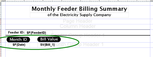
- Switch to the Preview tab and click the last page button, as shown in the following screenshot:

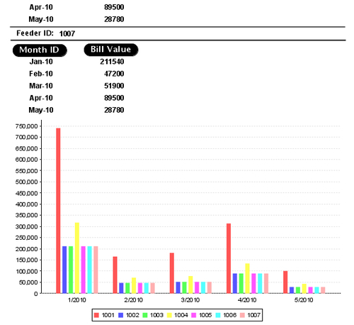
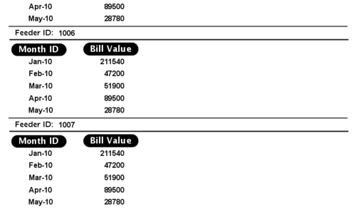
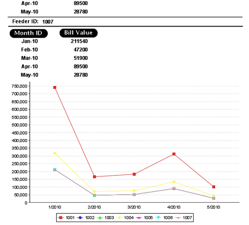
- You will see that the last page of your report shows the monthly bills of different feeders of the electricity supply company.
- Switch back to the Designer tab. Drag-and-drop a Chart component from the Palette into the Summary section of your report. A chart-type selection dialog will appear. Select Line as chart-type and click the OK button, as shown in the following screenshot:
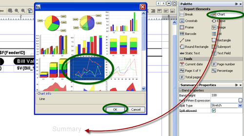
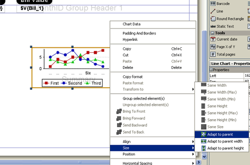
- The chart-type selection dialog will disappear and a Chart component will appear in the Summary section of your report. The Chart component looks like a graph. Right-click on this component, a pop-up menu will appear. Select the Size option from the pop-up menu, and a sub pop-up menu will appear. Select the Adapt to parent option from the sub pop-up menu, as shown next. The Chart component will expand to occupy all the available space in the Summary section.
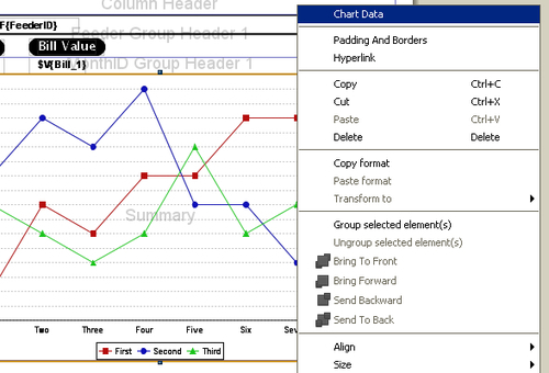
- Right-click on the Chart component again, and a pop-up menu will appear. Select the Chart Data option from the pop-up menu. A Chart details dialog will appear, which contains Dataset and Details tabs.
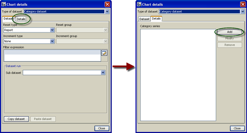
- Switch to the Details tab in the Chart details dialog and click the Add button, as shown in the following screenshot:
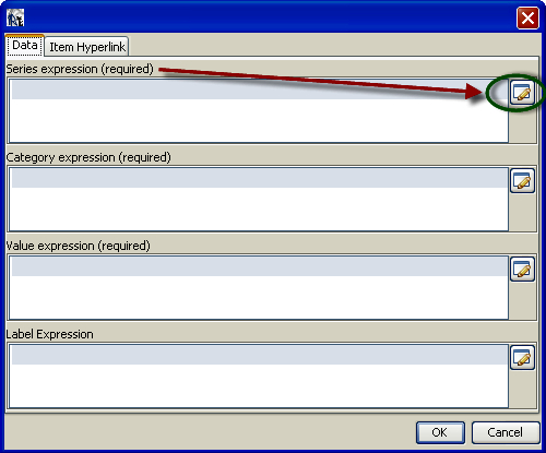
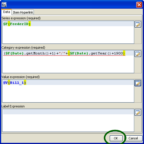
- A dialog will appear, which allows you to enter various expressions (Series expression, Category expression, Value expression, and Label Expression). In order to add a Series expression, click the button beside it, as shown. An Expression editor dialog will appear.
- Click on the Fields option in the first column of the Expression editor and double-click on FeederID Field in the second column; a
$F{FeederID}expression will appear in the upper portion of the dialog, as shown. Click the Apply button, and the Expression editor dialog will disappear.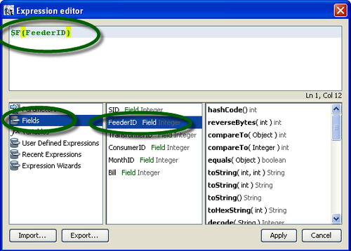
- Notice that the
$F{FeederID}expression will appear under Series expression. Now click the button beside Category expression, as shown next. Another Expression editor dialog will appear.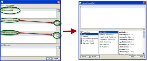
- Type a
($F{Date}.getMonth()+1)+"/"+($F{Date}.getYear()+1900)expression in the upper portion of the Expression editor dialog. Click the Apply button; the Expression editor dialog will disappear and you will be back to the previous dialog. You will notice the$F{Date}.getMonth()+"/"+$F{Date}.getYear()expression appearing under Category expression.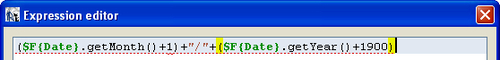
- Now click the button beside the Value expression. Another Expression editor dialog will appear. Click on the Variables option in the first column of the Expression editor and double-click on Bill_1 Variable in the second column. The
$V{Bill_1}expression will appear in the upper portion of the dialog. Click the Apply button; the Expression editor dialog will disappear and you will be back to the previous dialog.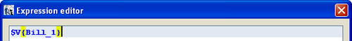
- Now this dialog will look as shown in the following screenshot. Click the OK button, and the dialog will disappear. Now you will be back to the Chart details dialog of step 6.
- Click the Close button at the bottom of Chart details dialog. This dialog will disappear.
- Switch to the Preview tab and click the last-page button, as shown in the following screenshot:

- You will see the last page of your report as shown next. You will notice that there is a graph that uses colored lines to show the trends of monthly bills for individual feeders.
In this recipe, you have designed a graph to summarize and show trends in the data of your report. In order to draw this graph, you have done the following four tasks:
- In step 4 of the recipe, you dragged-and-dropped a Chart component into your report.
- In steps 8 and 9 of the recipe, you provided a Series expression to the Chart component. Recall from the Expression editor of step 9 that you used
$F{FeederID}as your Series expression. This specifies that you want to use FeederID to draw one complete trend (each feeder with a different colored line). JasperReports automatically included a legend to describe which color corresponds to which feeder. The legend is shown in the following screenshot: - In steps 10 and 11 of the recipe, you provided a Category expression to the Chart component. Recall the Expression editor of step 11 where you used
($F{Date}.getMonth()+1)+"/"+($F{Date}.getYear()+1900)as Category expression. This specifies what should be displayed along the x-axis of the graph. In your case, month/year are shown along the x-axis of the graph. - In step 12 of the recipe, you provided a Value expression to the Chart component. Recall from the Expression editor of this step that you provided
$V{Bill_1}as Value expression. The Bill_1 variable stores the sum of monthly bills of all transformers connected to a feeder. JasperReports automatically displays a scale for values along the y-axis of the graph.
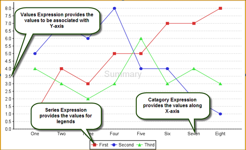
The following figure shows all components of the graph mapped to their respective expressions:
JasperReports allows you to use different types of charts. In this recipe, you have designed a line graph using the Chart component of JasperReports. You can use the same Chart component in a very similar fashion to build a bar graph. You just have to select a bar graph (as shown encircled next) instead of the line chart in step 4 of the recipe.

All the other steps of the recipe will be the same, and you will end up with the following preview in the last step: