You can use the flexibility of JasperReports graphs in many creative ways. This recipe teaches you a very interesting application, in which you can show colored bars of scaled size within a table. The size of each bar will represent a numeric value.
Refer to the installPostgreSQL.txt file included in the source code download for this chapter to install and run PostgreSQL, which should be up and running before you proceed.
The source code for this chapter also includes a file named copyFeederDataIntoPGS.txt, which helps you to create a database named jasperdb8 and two tables named Feeder and Transformer. The text file will also tell you how to copy sample data for this recipe into the tables.
The following steps demonstrate how to display a scaled bar beside each record in a table.
- Open the
Feeder_BarChart.jrxmlfile from theTask5folder of the source code for this chapter. The Designer tab of iReport shows that the report contains two groups, named Feeder and Month. You will find a set of four components in the Feeder Group Header 1 and Month Group Header 1 sections. These four components together form a two-column table, as shown in the following screenshot: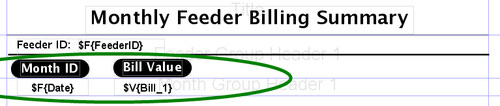
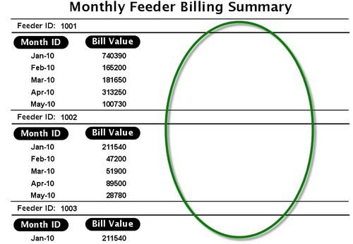
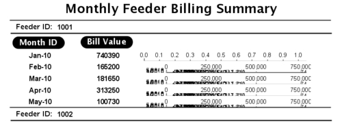
- Switch to the Preview tab. The preview of your report shows the monthly bills for different feeders of the electricity supply company. Notice that the right half of the report area is unused, as shown encircled in the following screenshot:
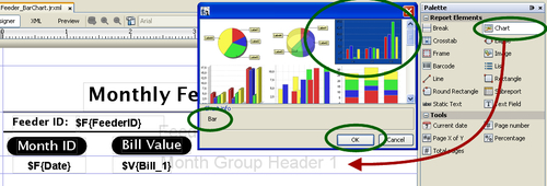
- Switch back to the Designer tab. Drag-and-drop a Chart component from the Palette into the Month Group Header 1 section of your report. A chart type selection dialog will appear. Select Bar as chart type and click the OK button, as shown in the following screenshot:
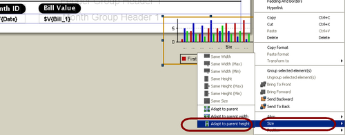
- The chart-type selection dialog will disappear and a large Chart component will appear in the Month Group Header 1 section of your report. You will observe that the chart component is larger in height than the Month Group Header 1 section. In order to match the height of this component with the height of the Month Group Header 1 section, right-click on this component; a pop-up menu will appear. Select the Size option from the pop-up menu; a sub pop-up menu will appear. Select the Adapt to parent height option from the sub pop-up menu, as shown next. The Chart component will shrink vertically to adjust itself within the Month Group Header 1 section.
- While the Chart component is selected, its properties will appear in the Properties window below the Palette. Find the Left property and set
220as its value. Find the Width property and set300as its value. The220value for the left property will position the chart correctly and the300value for the width property will size it appropriately in the Month Group Header 1 section. The Chart component will expand and position itself horizontally, as shown in the following screenshot. Similarly, find the Orientation property and set Horizontal as its value.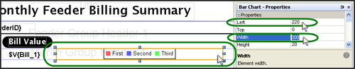
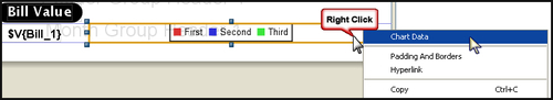
- Right-click on the Chart component again; a pop-up menu will appear. Select the Chart Data option from the pop-up menu, as shown in the following screenshot:
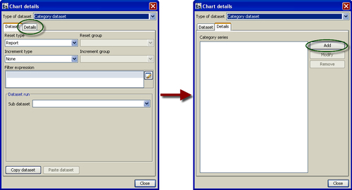
- A Chart details dialog will appear, containing Dataset and Details tabs. Switch to the Details tab in the Chart details dialog and click the Add button, as shown in the following screenshot:
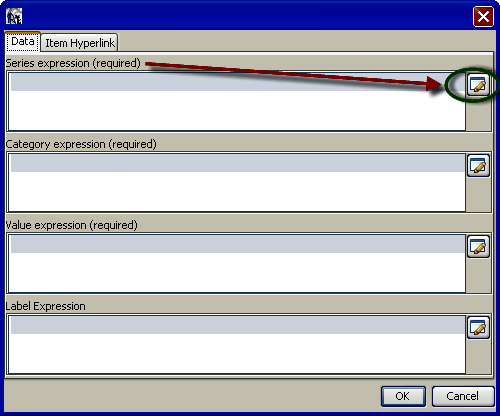
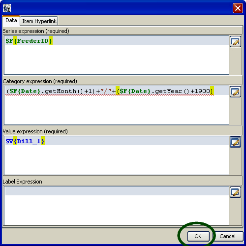
- A dialog will appear, which will allow you to enter various expressions (Series expression, Category expression, Value expression, and Label Expression). In order to add a Series expression, click the button beside it, as shown in the following screenshot:
- An Expression editor dialog will appear. Click on the Fields option in the first column of the Expression editor and double-click on FeederID Field in the second column. A
$F{FeederID}expression will appear in the upper portion of the dialog, as shown next. Click the Apply button, and the Expression editor dialog will disappear.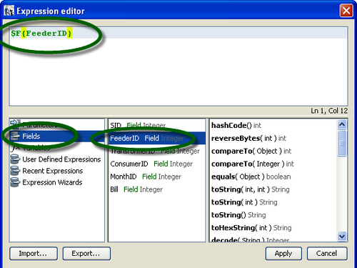
- Notice that the
$F{FeederID}expression will appear under Series expression. Now click the button beside Category expression, as shown next. Another Expression editor dialog will appear.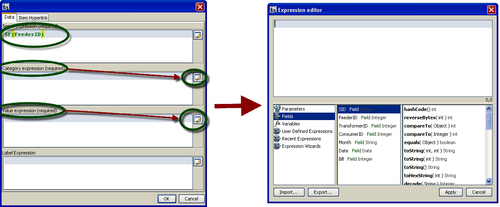
- Type a
($F{Date}.getMonth()+1)+"/"+($F{Date}.getYear()+1900)expression in the upper portion of the Expression editor dialog, as shown below. Click the Apply button; the Expression editor dialog will disappear and you will be back to the previous dialog. You will notice the$F{Date}.getMonth()+"/"+$F{Date}.getYear()expression appearing under Category expression.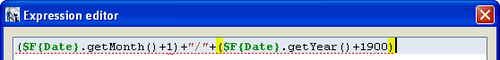
- Now click the button beside Value expression. Another Expression editor dialog will appear. Click on the Variables option in the first column of the Expression editor and double-click on Bill_1 Variable in the second column. The
$V{Bill_1}expression will appear in the upper portion of the dialog, as shown below. Click the Apply button, the Expression editor dialog will disappear and you will be back to the previous dialog.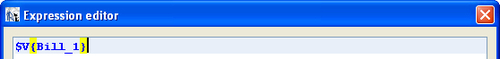
- Now this dialog will look as shown next. Click the OK button; the dialog will disappear. Now you will be back to the Chart details dialog of step 6.
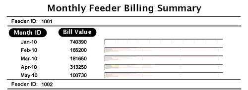
- Click the Close button at the bottom of the Chart details dialog. This dialog will disappear. Switch to the Preview tab. You will see a preview of your report as shown below. You will notice that instead of a bar graph, only legends are appearing against each record. The legends are quite meaningless.
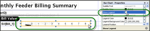
- Switch back to the Designer tab. While the Chart component is selected, switch to the Properties window below the Palette. Find the Show Legend property and uncheck the checkbox corresponding to it, as shown next.
- Switch to the Preview tab. You will notice that the legends have gone but the bar graph is not yet appearing in the preview. Although, some odd data is appearing against each record.
- Switch back to the Designer tab. While the Chart component is selected, switch to the Properties window below the Palette. Find the Show Labels, the Show Tick Marks, and the Show Tick Labels properties and uncheck the checkbox corresponding to them.
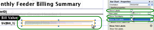
- Switch to the Preview tab. You will notice this time that a horizontal graph is appearing against each record. However, instead of representing a single value, the graph consists of many colored lines whose meaning is difficult to understand.
- Switch back to the Designer tab. While the Chart component is selected, switch to the Properties window below the Palette. Find the Evaluation Time property and set
Groupas its value. Find the Evaluation group property and setMonthas its value, as shown in the following screenshot: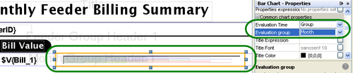
- Right-click on the Chart component; a pop-up menu will appear. Select the Chart Data option from the pop-up menu, as shown next. A Chart details dialog will appear, containing Dataset and Details tabs. Expand the Reset type combo box from the Dataset tab and select the
Groupoption. Similarly, expand the Reset group combo box and select theMonthoption. Then click the Close button, as shown next. The Chart details dialog will disappear.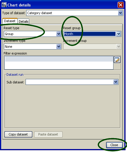
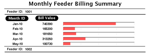
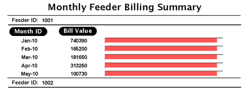
- Switch to the Preview tab. You will notice that a colored horizontal bar is appearing against each record. However, all the bars are of the same length and, therefore, do not tell anything about bill values.
- Switch back to the Designer tab. While the Chart component is selected, switch to the Properties window below the Palette. Find the Range Axis Max Value Expression property and set
1000000as its value, as shown in the following screenshot: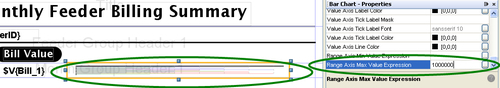
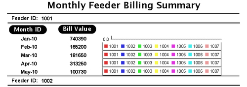
- Switch to the Preview tab. You will notice this time that a horizontal bar of scaled length is appearing against each record. The length of each bar is now representing the bill value of each record.