CHAPTER
33 Introducing Swing Menus
This chapter introduces another fundamental aspect of the Swing GUI environment: the menu. Menus form an integral part of many applications because they present the program’s functionality to the user. Because of their importance, Swing provides extensive support for menus. They are an area in which Swing’s power is readily apparent.
The Swing menu system supports several key elements, including
• The menu bar, which is the main menu for an application.
• The standard menu, which can contain either items to be selected or other menus (submenus).
• The popup menu, which is usually activated by right-clicking the mouse.
• The toolbar, which provides rapid access to program functionality, often paralleling menu items.
• The action, which enables two or more different components to be managed by a single object. Actions are commonly used with menus and toolbars.
Swing menus also support accelerator keys, which enable menu items to be selected without having to activate the menu, and mnemonics, which allow a menu item to be selected by the keyboard once the menu options are displayed.
Menu Basics
The Swing menu system is supported by a group of related classes. The ones used in this chapter are shown in Table 33-1, and they represent the core of the menu system. Although they may seem a bit confusing at first, Swing menus are quite easy to use. Swing allows a high degree of customization, if desired; however, you will normally use the menu classes as-is because they support all of the most needed options. For example, you can easily add images and keyboard shortcuts to a menu.

Table 33-1 The Core Swing Menu Classes
Here is a brief overview of how the classes fit together. To create the top-level menu for an application, you first create a JMenuBar object. This class is, loosely speaking, a container for menus. To the JMenuBar instance, you will add instances of JMenu. Each JMenu object defines a menu. That is, each JMenu object contains one or more selectable items. The items displayed by a JMenu are objects of JMenuItem. Thus, a JMenuItem defines a selection that can be chosen by the user.
As an alternative or adjunct to menus that descend from the menu bar, you can also create stand-alone, popup menus. To create a popup menu, first create an object of type JPopupMenu. Then, add JMenuItems to it. A popup menu is normally activated by clicking the right mouse button when the mouse is over a component for which a popup menu has been defined.
In addition to “standard” menu items, you can also include check boxes and radio buttons in a menu. A check box menu item is created by JCheckBoxMenuItem. A radio button menu item is created by JRadioButtonMenuItem. Both of these classes extend JMenuItem. They can be used in standard menus and popup menus.
JToolBar creates a stand-alone component that is related to the menu. It is often used to provide fast access to functionality contained within the menus of the application. For example, a toolbar might provide fast access to the formatting commands supported by a word processor.
JSeparator is a convenience class that creates a separator line in a menu.
One key point to understand about Swing menus is that each menu item extends AbstractButton. Recall that AbstractButton is also the superclass of all of Swing’s button components, such as JButton. Thus, all menu items are, essentially, buttons. Obviously, they won’t actually look like buttons when used in a menu, but they will, in many ways, act like buttons. For example, selecting a menu item generates an action event in the same way that pressing a button does.
Another key point is that JMenuItem is a superclass of JMenu. This allows the creation of submenus, which are, essentially, menus within menus. To create a submenu, you first create and populate a JMenu object and then add it to another JMenu object. You will see this process in action in the following section.
As mentioned in passing previously, when a menu item is selected, an action event is generated. The action command string associated with that action event will, by default, be the name of the selection. Thus, you can determine which item was selected by examining the action command. Of course, you can also use separate anonymous inner classes or lambda expressions to handle each menu item’s action events. In this case, the menu selection is already known, and there is no need to examine the action command string to determine which item was selected.
Menus can also generate other types of events. For example, each time that a menu is activated, selected, or canceled, a MenuEvent is generated that can be listened for via a MenuListener. Other menu-related events include MenuKeyEvent, MenuDragMouseEvent, and PopupMenuEvent. In many cases, however, you need only watch for action events, and in this chapter, we will use only action events.
An Overview of JMenuBar, JMenu, and JMenuItem
Before you can create a menu, you need to know something about the three core menu classes: JMenuBar, JMenu, and JMenuItem. These form the minimum set of classes needed to construct a main menu for an application. JMenu and JMenuItem are also used by popup menus. Thus, these classes form the foundation of the menu system.
JMenuBar
As mentioned, JMenuBar is essentially a container for menus. Like all components, it inherits JComponent (which inherits Container and Component). It has only one constructor, which is the default constructor. Therefore, initially the menu bar will be empty, and you will need to populate it with menus prior to use. Each application has one and only one menu bar.
JMenuBar defines several methods, but often you will only need to use one: add( ). The add( ) method adds a JMenu to the menu bar. It is shown here:
JMenu add(JMenu menu)
Here, menu is a JMenu instance that is added to the menu bar. A reference to the menu is returned. Menus are positioned in the bar from left to right, in the order in which they are added. If you want to add a menu at a specific location, then use this version of add( ), which is inherited from Container:
Component add(Component menu, int idx)
Here, menu is added at the index specified by idx. Indexing begins at 0, with 0 being the left-most menu.
In some cases, you might want to remove a menu that is no longer needed. You can do this by calling remove( ), which is inherited from Container. It has these two forms:
void remove(Component menu)
void remove(int idx)
Here, menu is a reference to the menu to remove, and idx is the index of the menu to remove. Indexing begins at zero.
Another method that is sometimes useful is getMenuCount( ), shown here:
int getMenuCount( )
It returns the number of elements contained within the menu bar.
JMenuBar defines some other methods that you might find helpful in specialized applications. For example, you can obtain an array of references to the menus in the bar by calling getSubElements( ). You can determine if a menu is selected by calling isSelected( ).
Once a menu bar has been created and populated, it is added to a JFrame by calling setJMenuBar( ) on the JFrame instance. (Menu bars are not added to the content pane.) The setJMenuBar( ) method is shown here:
void setJMenuBar(JMenuBar mb)
Here, mb is a reference to the menu bar. The menu bar will be displayed in a position determined by the look and feel. Usually, this is at the top of the window.
JMenu
JMenu encapsulates a menu, which is populated with JMenuItems. As mentioned, it is derived from JMenuItem. This means that one JMenu can be a selection in another JMenu. This enables one menu to be a submenu of another. JMenu defines a number of constructors. For example, here is the one used in the examples in this chapter:
JMenu(String name)
This constructor creates a menu that has the title specified by name. Of course, you don’t have to give a menu a name. To create an unnamed menu, you can use the default constructor:
JMenu( )
Other constructors are also supported. In each case, the menu is empty until menu items are added to it.
JMenu defines many methods. Here is a brief description of some commonly used ones. To add an item to the menu, use the add( ) method, which has a number of forms, including the two shown here:
JMenuItem add(JMenuItem item)
Component add(Component item, int idx)
Here, item is the menu item to add. The first form adds the item to the end of the menu. The second form adds the item at the index specified by idx. As expected, indexing starts at zero. Both forms return a reference to the item added. As a point of interest, you can also use insert( ) to add menu items to a menu.
You can add a separator (an object of type JSeparator) to a menu by calling addSeparator( ), shown here:
void addSeparator( )
The separator is added onto the end of the menu. You can insert a separator into a menu by calling insertSeparator( ), shown next:
void insertSeparator(int idx)
Here, idx specifies the zero-based index at which the separator will be added.
You can remove an item from a menu by calling remove( ). Two of its forms are shown here:
void remove(JMenuItem menu)
void remove(int idx)
In this case, menu is a reference to the item to remove and idx is the index of the item to remove.
You can obtain the number of items in the menu by calling getMenuComponentCount( ), shown here:
int getMenuComponentCount( )
You can get an array of the items in the menu by calling getMenuComponents( ), shown next:
Component[ ] getMenuComponents( )
An array containing the components is returned.
JMenuItem
JMenuItem encapsulates an element in a menu. This element can be a selection linked to some program action, such as Save or Close, or it can cause a submenu to be displayed. As mentioned, JMenuItem is derived from AbstractButton, and every item in a menu can be thought of as a special kind of button. Therefore, when a menu item is selected, an action event is generated. (This is similar to the way a JButton fires an action event when it is pressed.) JMenuItem defines many constructors. The ones used in this chapter are shown here:
JMenuItem(String name)
JMenuItem(Icon image)
JMenuItem(String name, Icon image)
JMenuItem(String name, int mnem)
JMenuItem(Action action)
The first constructor creates a menu item with the name specified by name. The second creates a menu item that displays the image specified by image. The third creates a menu item with the name specified by name and the image specified by image. The fourth creates a menu item with the name specified by name and uses the keyboard mnemonic specified by mnem. This mnemonic enables you to select an item from the menu by pressing the specified key. The last constructor creates a menu item using the information specified in action. A default constructor is also supported.
Because menu items inherit AbstractButton, you have access to the functionality provided by AbstractButton. One such method that is often useful with menus is setEnabled( ), which you can use to enable or disable a menu item. It is shown here:
void setEnabled(boolean enable)
If enable is true, the menu item is enabled. If enable is false, the item is disabled and cannot be selected.
Create a Main Menu
Traditionally, the most commonly used menu is the main menu. This is the menu defined by the menu bar, and it is the menu that defines all (or nearly all) of the functionality of an application. Fortunately, Swing makes creating and managing the main menu easy. This section shows you how to construct a basic main menu. Subsequent sections will show you how to add options to it.
Constructing the main menu requires several steps. First, create the JMenuBar object that will hold the menus. Next, construct each menu that will be in the menu bar. In general, a menu is constructed by first creating a JMenu object and then adding JMenuItems to it. After the menus have been created, add them to the menu bar. The menu bar, itself, must then be added to the frame by calling setJMenuBar( ). Finally, for each menu item, you must add an action listener that handles the action event fired when the menu item is selected.
A good way to understand the process of creating and managing menus is to work through an example. Here is a program that creates a simple menu bar that contains three menus. The first is a standard File menu that contains Open, Close, Save, and Exit selections. The second menu is called Options, and it contains two submenus called Colors and Priority. The third menu is called Help, and it has one item: About. When a menu item is selected, the name of the selection is displayed in a label in the content pane. Sample output is shown in Figure 33-1.
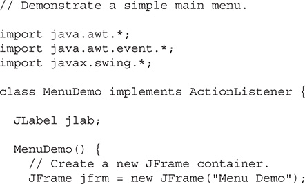


Figure 33-1 Sample output from the MenuDemo program
Let’s examine, in detail, how the menus in this program are created, beginning with the MenuDemo constructor. It starts by creating a JFrame and setting its layout manager, size, and default close operation. (These operations are described in Chapter 31.) A JLabel is then constructed. It will be used to display a menu selection. Next, the menu bar is constructed and a reference to it is assigned to jmb by this statement:
Then, the File menu jmFile and its menu entries are created by this sequence:

The names Open, Close, Save, and Exit will be shown as selections in the menu. Next, the menu entries are added to the file menu by this sequence:

Finally, the File menu is added to the menu bar with this line:
Once the preceding code sequence completes, the menu bar will contain one entry: File. The File menu will contain four selections in this order: Open, Close, Save, and Exit. However, notice that a separator has been added before Exit. This visually separates Exit from the preceding three selections.
The Options menu is constructed using the same basic process as the File menu. However, the Options menu consists of two submenus, Colors and Priority, and a Reset entry. The submenus are first constructed individually and then added to the Options menu. The Reset item is added last. Then, the Options menu is added to the menu bar. The Help menu is constructed using the same process.
Notice that MenuDemo implements the ActionListener interface and action events generated by a menu selection are handled by the actionPerformed( ) method defined by MenuDemo. Therefore, the program adds this as the action listener for the menu items. Notice that no listeners are added to the Colors or Priority items because they are not actually selections. They simply activate submenus.
Finally, the menu bar is added to the frame by the following line:
As mentioned, menu bars are not added to the content pane. They are added directly to the JFrame.
The actionPerformed( ) method handles the action events generated by the menu. It obtains the action command string associated with the selection by calling getActionCommand( ) on the event. It stores a reference to this string in comStr. Then, it tests the action command against "Exit", as shown here:
If the action command is "Exit", then the program terminates by calling System.exit( ). This method causes the immediate termination of a program and passes its argument as a status code to the calling process, which is usually the operating system. By convention, a status code of zero means normal termination. Anything else indicates that the program terminated abnormally. For all other menu selections, the choice is displayed.
At this point, you might want to experiment a bit with the MenuDemo program. Try adding another menu or adding additional items to an existing menu. It is important that you understand the basic menu concepts before moving on because this program will evolve throughout the course of this chapter.
Add Mnemonics and Accelerators to Menu Items
The menu created in the preceding example is functional, but it is possible to make it better. In real applications, a menu usually includes support for keyboard shortcuts because they give an experienced user the ability to select menu items rapidly. Keyboard shortcuts come in two forms: mnemonics and accelerators. As it applies to menus, a mnemonic defines a key that lets you select an item from an active menu by typing the key. Thus, a mnemonic allows you to use the keyboard to select an item from a menu that is already being displayed. An accelerator is a key that lets you select a menu item without having to first activate the menu.
A mnemonic can be specified for both JMenuItem and JMenu objects. There are two ways to set the mnemonic for JMenuItem. First, it can be specified when an object is constructed using this constructor:
JMenuItem(String name, int mnem)
In this case, the name is passed in name and the mnemonic is passed in mnen. Second, you can set the mnemonic by calling setMnemonic( ). To specify a mnemonic for JMenu, you must call setMnemonic( ). This method is inherited by both classes from AbstractButton and is shown next:
void setMnemonic(int mnem)
Here, mnem specifies the mnemonic. It should be one of the constants defined in java.awt.event.KeyEvent, such as KeyEvent.VK_F or KeyEvent.VK_Z. (There is another version of setMnemonic( ) that takes a char argument, but it is considered obsolete.) Mnemonics are not case sensitive, so in the case of VK_A, typing either a or A will work.
By default, the first matching letter in the menu item will be underscored. In cases in which you want to underscore a letter other than the first match, specify the index of the letter as an argument to setDisplayedMnemonicIndex( ), which is inherited by both JMenu and JMenuItem from AbstractButton. It is shown here:
void setDisplayedMnemonicIndex(int idx)
The index of the letter to underscore is specified by idx.
An accelerator can be associated with a JMenuItem object. It is specified by calling setAccelerator( ), shown next:
void setAccelerator(KeyStroke ks)
Here, ks is the key combination that is pressed to select the menu item. KeyStroke is a class that contains several factory methods that construct various types of keystroke accelerators. The following are three examples:
static KeyStroke getKeyStroke(char ch)
static KeyStroke getKeyStroke(Character ch, int modifier)
static KeyStroke getKeyStroke(int ch, int modifier)
Here, ch specifies the accelerator character. In the first version, the character is specified as a char value. In the second, it is specified as an object of type Character. In the third, it is a value of type KeyEvent, previously described. The value of modifier must be one or more of the following constants, defined in the java.awt.event.InputEvent class:

Therefore, if you pass VK_A for the key character and InputEvent.CTRL_DOWN_MASK for the modifier, the accelerator key combination is ctrl-a.
The following sequence adds both mnemonics and accelerators to the File menu created by the MenuDemo program in the previous section. After making this change, you can select the File menu by typing alt-f. Then, you can use the mnemonics o, c, s, or e to select an option. Alternatively, you can directly select a File menu option by pressing ctrl-o, ctrl-c, ctrl-s, or ctrl-e. Figure 33-2 shows how this menu looks when activated.


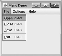
Figure 33-2 The File menu after adding mnemonics and accelerators
Add Images and Tooltips to Menu Items
You can add images to menu items or use images instead of text. The easiest way to add an image is to specify it when the menu item is being constructed using one of these constructors:
JMenuItem(Icon image)
JMenuItem(String name, Icon image)
The first creates a menu item that displays the image specified by image. The second creates a menu item with the name specified by name and the image specified by image. For example, here the About menu item is associated with an image when it is created:
After this addition, the icon specified by icon will be displayed next to the text "About" when the Help menu is displayed. This is shown in Figure 33-3. You can also add an icon to a menu item after the item has been created by calling setIcon( ), which is inherited from AbstractButton. You can specify the horizontal alignment of the image relative to the text by calling setHorizontalTextPosition( ).

Figure 33-3 The About item with the addition of an icon
You can specify a disabled icon, which is shown when the menu item is disabled, by calling setDisabledIcon( ). Normally, when a menu item is disabled, the default icon is shown in gray. If a disabled icon is specified, then that icon is displayed when the menu item is disabled.
A tooltip is a small message that describes an item. It is automatically displayed if the mouse remains over the item for a moment. You can add a tooltip to a menu item by calling setToolTipText( ) on the item, specifying the text you want displayed. It is shown here:
void setToolTipText(String msg)
In this case, msg is the string that will be displayed when the tooltip is activated. For example, this creates a tooltip for the About item:
As a point of interest, setToolTipText( ) is inherited by JMenuItem from JComponent. This means you can add a tooltip to other types of components, such as a push button. You might want to try this on your own.
Use JRadioButtonMenuItem and JCheckBoxMenuItem
Although the type of menu items used by the preceding examples are, as a general rule, the most commonly used, Swing defines two others: check boxes and radio buttons. These items can streamline a GUI by allowing a menu to provide functionality that would otherwise require additional, stand-alone components. Also, sometimes, including check boxes or radio buttons in a menu simply seems the most natural place for a specific set of features. Whatever your reason, Swing makes it easy to use check boxes and radio buttons in menus, and both are examined here.
To add a check box to a menu, create a JCheckBoxMenuItem. It defines several constructors. This is the one used in this chapter:
JCheckBoxMenuItem(String name)
Here, name specifies the name of the item. The initial state of the check box is unchecked. If you want to specify the initial state, you can use this constructor:
JCheckBoxMenuItem(String name, boolean state)
In this case, if state is true, the box is initially checked. Otherwise, it is cleared. JCheckBoxMenuItem also provides constructors that let you specify an icon. Here is one example:
JCheckBoxMenuItem(String name, Icon icon)
In this case, name specifies the name of the item and the image associated with the item is passed in icon. The item is initially unchecked. Other constructors are also supported.
Check boxes in menus work like stand-alone check boxes. For example, they generate action events and item events when their state changes. Check boxes are especially useful in menus when you have options that can be selected and you want to display their selected/deselected status.
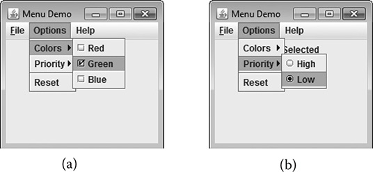
Figure 33-4 The effects of check box (a) and radio button (b) menu items
A radio button can be added to a menu by creating an object of type JRadioButtonMenuItem. JRadioButtonMenuItem inherits JMenuItem. It provides a rich assortment of constructors. The ones used in this chapter are shown here:
JRadioButtonMenuItem(String name)
JRadioButtonMenuItem(String name, boolean state)
The first constructor creates an unselected radio button menu item that is associated with the name passed in name. The second lets you specify the initial state of the button. If state is true, the button is initially selected. Otherwise, it is deselected. Other constructors let you specify an icon. Here is one example:
JRadioButtonMenuItem(String name, Icon icon, boolean state)
This creates a radio button menu item that is associated with the name passed in name and the image passed in icon. If state is true, the button is initially selected. Otherwise, it is deselected. Several other constructors are supported.
A JRadioButtonMenuItem works like a stand-alone radio button, generating item and action events. Like stand-alone radio buttons, menu-based radio buttons must be put into a button group in order for them to exhibit mutually exclusive selection behavior.
Because both JCheckBoxMenuItem and JRadioButtonMenuItem inherit JMenuItem, each has all of the functionality provided by JMenuItem. Aside from having the extra capabilities of check boxes and radio buttons, they act like and are used like other menu items.
To try check box and radio button menu items, first remove the code that creates the Options menu in the MenuDemo example program. Then substitute the following code sequence, which uses check boxes for the Colors submenu and radio buttons for the Priority submenu. After making the substitution, the Options menu will look like those shown in Figure 33-4.

Create a Popup Menu
A popular alternative or addition to the menu bar is the popup menu. Typically, a popup menu is activated by clicking the right mouse button when over a component. Popup menus are supported in Swing by the JPopupMenu class. JPopupMenu has two constructors. In this chapter, only the default constructor is used:
JPopupMenu( )
It creates a default popup menu. The other constructor lets you specify a title for the menu. Whether this title is displayed is subject to the look and feel.
In general, popup menus are constructed like regular menus. First, create a JPopupMenu object, and then add menu items to it. Menu item selections are also handled in the same way: by listening for action events. The main difference between a popup menu and regular menu is the activation process.
Activating a popup menu requires three steps:
1. You must register a listener for mouse events.
2. Inside the mouse event handler, you must watch for the popup trigger.
3. When a popup trigger is received, you must show the popup menu by calling show( ).
Let’s examine each of these steps closely.
A popup menu is normally activated by clicking the right mouse button when the mouse pointer is over a component for which a popup menu is defined. Thus, the popup trigger is usually caused by right-clicking the mouse on a popup menu–enabled component. To listen for the popup trigger, implement the MouseListener interface and then register the listener by calling the addMouseListener( ) method. As described in Chapter 24, MouseListener defines the methods shown here:
void mouseClicked(MouseEvent me)
void mouseEntered(MouseEvent me)
void mouseExited(MouseEvent me)
void mousePressed(MouseEvent me)
void mouseReleased(MouseEvent me)
Of these, two are very important relative to the popup menu: mousePressed( ) and mouseReleased( ). Depending on the installed look and feel, either of these two events can trigger a popup menu. For this reason, it is often easier to use a MouseAdapter to implement the MouseListener interface and simply override mousePressed( ) and mouseReleased( ).
The MouseEvent class defines several methods, but only four are commonly needed when activating a popup menu. They are shown here:
int getX( )
int getY( )
boolean isPopupTrigger( )
Component getComponent( )
The current X,Y location of the mouse relative to the source of the event is found by calling getX( ) and getY( ). These are used to specify the upper-left corner of the popup menu when it is displayed. The isPopupTrigger( ) method returns true if the mouse event represents a popup trigger and false otherwise. You will use this method to determine when to pop up the menu. To obtain a reference to the component that generated the mouse event, call getComponent( ).
To actually display the popup menu, call the show( ) method defined by JPopupMenu, shown next:
void show(Component invoker, int upperX, int upperY)
Here, invoker is the component relative to which the menu will be displayed. The values of upperX and upperY define the X,Y location of the upper-left corner of the menu, relative to invoker. A common way to obtain the invoker is to call getComponent( ) on the event object passed to the mouse event handler.
The preceding theory can be put into practice by adding a popup Edit menu to the MenuDemo program shown at the start of this chapter. This menu will have three items called Cut, Copy, and Paste. Begin by adding the following instance variable to MenuDemo:
The jpu variable will hold a reference to the popup menu.
Next, add the following code sequence to the MenuDemo constructor:

This sequence begins by constructing an instance of JPopupMenu and storing it in jpu. Then, it creates the three menu items, Cut, Copy, and Paste, in the usual way, and adds them to jpu. This finishes the construction of the popup Edit menu. Popup menus are not added to the menu bar or any other object.
Next, a MouseListener is added by creating an anonymous inner class. This class is based on the MouseAdapter class, which means that the listener need only override those methods that are relevant to the popup menu: mousePressed( ) and mouseReleased( ). The adapter provides default implementations of the other MouseListener methods. Notice that the mouse listener is added to jfrm. This means that a right-button click inside any part of the content pane will trigger the popup menu.
The mousePressed( ) and mouseReleased( ) methods call isPopupTrigger( ) to determine if the mouse event is a popup trigger event. If it is, the popup menu is displayed by calling show( ). The invoker is obtained by calling getComponent( ) on the mouse event. In this case, the invoker will be the content pane. The X,Y coordinates of the upper-left corner are obtained by calling getX( ) and getY( ). This makes the menu pop up with its upper-left corner directly under the mouse pointer.
Finally, you also need to add these action listeners to the program. They handle the action events fired when the user selects an item from the popup menu.

After you have made these additions, the popup menu can be activated by clicking the right mouse button anywhere inside the content pane of the application. Figure 33-5 shows the result.
One other point about the preceding example. Because the invoker of the popup menu is always jfrm, in this case, you could pass it explicitly rather than calling getComponent( ). To do so, you must make jfrm into an instance variable of the MenuDemo class (rather than a local variable) so that it is accessible to the inner class. Then you can use this call to show( ) to display the popup menu:
Although this works in this example, the advantage of using getComponent( ) is that the popup menu will automatically pop up relative to the invoking component. Thus, the same code could be used to display any popup menu relative to its invoking object.
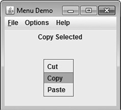
Figure 33-5 A popup Edit menu
Create a Toolbar
A toolbar is a component that can serve as both an alternative and as an adjunct to a menu. A toolbar contains a list of buttons (or other components) that give the user immediate access to various program options. For example, a toolbar might contain buttons that select various font options, such as bold, italics, highlight, or underline. These options can be selected without needing to drop through a menu. Typically, toolbar buttons show icons rather than text, although either or both are allowed. Furthermore, tooltips are often associated with icon-based toolbar buttons. Toolbars can be positioned on any side of a window by dragging the toolbar, or they can be dragged out of the window entirely, in which case they become free floating.
In Swing, toolbars are instances of the JToolBar class. Its constructors enable you to create a toolbar with or without a title. You can also specify the layout of the toolbar, which will be either horizontal or vertical. The JToolBar constructors are shown here:
JToolBar( )
JToolBar(String title)
JToolBar(int how)
JToolBar(String title, int how)
The first constructor creates a horizontal toolbar with no title. The second creates a horizontal toolbar with the title specified by title. The title will show only when the toolbar is dragged out of its window. The third creates a toolbar that is oriented as specified by how. The value of how must be either JToolBar.VERTICAL or JToolBar.HORIZONTAL. The fourth constructor creates a toolbar that has the title specified by title and is oriented as specified by how.
A toolbar is typically used with a window that uses a border layout. There are two reasons for this. First, it allows the toolbar to be initially positioned along one of the four border positions. Frequently, the top position is used. Second, it allows the toolbar to be dragged to any side of the window.
In addition to dragging the toolbar to different locations within a window, you can also drag it out of the window. Doing so creates an undocked toolbar. If you specify a title when you create the toolbar, then that title will be shown when the toolbar is undocked.
You add buttons (or other components) to a toolbar in much the same way that you add them to a menu bar. Simply call add( ). The components are shown in the toolbar in the order in which they are added.
Once you have created a toolbar, you do not add it to the menu bar (if one exists). Instead, you add it to the window container. As mentioned, typically you will add a toolbar to the top (that is, north) position of a border layout, using a horizontal orientation. The component that will be affected is added to the center of the border layout. Using this approach causes the program to begin running with the toolbar in the expected location. However, you can drag the toolbar to any of the other positions. Of course, you can also drag the toolbar out of the window.
To illustrate the toolbar, we will add one to the MenuDemo program. The toolbar will present three debugging options: set a breakpoint, clear a breakpoint, and resume program execution. Three steps are needed to add the toolbar.
First, remove this line from the program:
By removing this line, the JFrame automatically uses a border layout.
Second, because BorderLayout is being used, change the line that adds the label jlab to the frame, as shown next:
This line explicitly adds jlab to the center of the border layout. (Explicitly specifying the center position is technically not necessary because, by default, components are added to the center when a border layout is used. However, explicitly specifying the center makes it clear to anyone reading the code that a border layout is being used and that jlab goes in the center.)
Next, add the following code, which creates the Debug toolbar:

Let’s look at this code closely. First, a JToolBar is created and given the title "Debug". Then, a set of ImageIcon objects are created that hold the images for the toolbar buttons. Next, three toolbar buttons are created. Notice that each has an image, but no text. Also, each is explicitly given an action command and a tooltip. The action commands are set because the buttons are not given names when they are constructed. Tooltips are especially useful when applied to icon-based toolbar components because sometimes it’s hard to design images that are intuitive to all users. The buttons are then added to the toolbar, and the toolbar is added to the north side of the border layout of the frame.
Finally, add the action listeners for the toolbar, as shown here:

Each time the user presses a toolbar button, an action event is fired, and it is handled in the same way as the other menu-related events. Figure 33-6 shows the toolbar in action.
Use Actions
Often, a toolbar and a menu item contain items in common. For example, the same functions provided by the Debug toolbar in the preceding example might also be offered through a menu selection. In such a case, selecting an option (such as setting a breakpoint) causes the same action to occur, independently of whether the menu or the toolbar was used. Also, both the toolbar button and the menu item would (most likely) use the same icon. Furthermore, when a toolbar button is disabled, the corresponding menu item would also need to be disabled. Such a situation would normally lead to a fair amount of duplicated, interdependent code, which is less than optimal. Fortunately, Swing provides a solution: the action.
An action is an instance of the Action interface. Action extends the ActionListener interface and provides a means of combining state information with the actionPerformed( ) event handler. This combination allows one action to manage two or more components. For example, an action lets you centralize the control and handling of a toolbar button and a menu item. Instead of having to duplicate code, your program need only create an action that automatically handles both components.
Because Action extends ActionListener, an action must provide an implementation of the actionPerformed( ) method. This handler will process the action events generated by the objects linked to the action.

Figure 33-6 The Debug toolbar in action
In addition to the inherited actionPerformed( ) method, Action defines several methods of its own. One of particular interest is putValue( ). It sets the value of the various properties associated with an action and is shown here:
void putValue(String key, Object val)
It assigns val to the property specified by key that represents the desired property. Although not used by the example that follows, it is helpful to note that Action also supplies the getValue( ) method that obtains a specified property. It is shown here:
Object getValue(String key)
It returns a reference to the property specified by key.
The key values used by putValue( ) and getValue( ) include those shown here:

For example, to set the mnemonic to the letter X, use this call to putValue( ):
One Action property that is not accessible through putValue( ) and getValue( ) is the enabled/disabled status. For this, you use the setEnabled( ) and isEnabled( ) methods. They are shown here:
void setEnabled(boolean enabled)
boolean isEnabled( )
For setEnabled( ), if enabled is true, the action is enabled. Otherwise, it is disabled. If the action is enabled, isEnabled( ) returns true. Otherwise, it returns false.
Although you can implement all of the Action interface yourself, you won’t usually need to. Instead, Swing provides a partial implementation called AbstractAction that you can extend. By extending AbstractAction, you need implement only one method: actionPerformed( ). The other Action methods are provided for you. AbstractAction provides three constructors. The one used in this chapter is shown here:
AbstractAction(String name, Icon image)
It constructs an AbstractAction that has the name specified by name and the icon specified by image.
Once you have created an action, it can be added to a JToolBar and used to construct a JMenuItem. To add an action to a JToolBar, use this version of add( ):
JButton add(Action actObj)
Here, actObj is the action that is being added to the toolbar. The properties defined by actObj are used to create a toolbar button. To create a menu item from an action, use this JMenuItem constructor:
JMenuItem(Action actObj)
Here, actObj is the action used to construct a menu item according to its properties.
NOTE In addition to JToolBar and JMenuItem, actions are also supported by several other Swing components, such as JPopupMenu, JButton, JRadioButton, and JCheckBox. JRadioButtonMenuItem and JCheckBoxMenuItem also support actions.
To illustrate the benefit of actions, we will use them to manage the Debug toolbar created in the previous section. We will also add a Debug submenu under the Options main menu. The Debug submenu will contain the same selections as the Debug toolbar: Set Breakpoint, Clear Breakpoint, and Resume. The same actions that support these items in the toolbar will also support these items in the menu. Therefore, instead of having to create duplicate code to handle both the toolbar and menu, both are handled by the actions.
Begin by creating an inner class called DebugAction that extends AbstractAction, as shown here:

DebugAction extends AbstractAction. It creates an action class that will be used to define the properties associated with the Debug menu and toolbar. Its constructor has five parameters that let you specify the following items:
• Name
• Icon
• Mnemonic
• Accelerator
• Tooltip
The first two are passed to AbstractAction’s constructor via super. The other three properties are set through calls to putValue( ).
The actionPerformed( ) method of DebugAction handles events for the action. This means that when an instance of DebugAction is used to create a toolbar button and a menu item, events generated by either of those components are handled by the actionPerformed( ) method in DebugAction. Notice that this handler displays the selection in jlab. In addition, if the Set Breakpoint option is selected, then the Clear Breakpoint option is enabled and the Set Breakpoint option is disabled. If the Clear Breakpoint option is selected, then the Set Breakpoint option is enabled and the Clear Breakpoint option is disabled. This illustrates how an action can be used to enable or disable a component. When an action is disabled, it is disabled for all uses of that action. In this case, if Set Breakpoint is disabled, then it is disabled both in the toolbar and in the menu.
Next, add these DebugAction instance variables to MenuDemo:

Next, create three ImageIcons that represent the Debug options, as shown here:

Now, create the actions that manage the Debug options, as shown here:

Notice that the accelerator for Set Breakpoint is B and the accelerator for Clear Breakpoint is L. The reason these keys are used rather than S and C is that these keys are already allocated by the File menu for Save and Close. However, they can still be used as mnemonics because each mnemonic is localized to its own menu. Also notice that the action that represents Clear Breakpoint is initially disabled. It will be enabled only after a breakpoint has been set.
Next, use the actions to create buttons for the toolbar and then add those buttons to the toolbar, as shown here:

Finally, create the Debug menu, as shown next:

After making these changes and additions, the actions that you created will be used to manage both the Debug menu and the toolbar. Thus, changing a property in the action (such as disabling it) will affect all uses of that action. The program will now look as shown in Figure 33-7.

Figure 33-7 Using actions to manage the Debug toolbar and menu
Put the Entire MenuDemo Program Together
Throughout the course of this discussion, many changes and additions have been made to the MenuDemo program shown at the start of the chapter. Before concluding, it will be helpful to assemble all the pieces. Doing so not only eliminates any ambiguity about the way the pieces fit together, but it also gives you a complete menu demonstration program that you can experiment with.
The following version of MenuDemo includes all of the additions and enhancements described in this chapter. For clarity, the program has been reorganized, with separate methods being used to construct the various menus and toolbar. Notice that several of the menu-related variables, such as jmb, jmFile, and jtb, have been made into instance variables.


Continuing Your Exploration of Swing
Swing defines a very large GUI toolkit. It has many more features that you will want to explore on your own. For example, it supplies dialog classes, such as JOptionPane and JDialog, that you can use to streamline the construction of dialog windows. It also provides additional controls beyond those introduced in Chapter 31. Two you will want to explore are JSpinner (which creates a spin control) and JFormattedTextField (which supports formatted text). You will also want to experiment with defining your own models for the various components. Frankly, the best way to become familiar with Swing’s capabilities is to experiment with it.