
7. Basic User Interface
BUILDING a user interface in MIDP is entirely different from desktop or server application development. The MIDP user interface APIs, known as LCDUI, were designed for the unique constraints of a small environment:
Screen sizes vary among devices. The screens you get with MIDP adjust smoothly to any screen size.
Input methods vary among devices. LCDUI offers the abstraction of commands, which can adapt to the specific controls of a device.
This chapter and Chapter 8, “More User Interface,” discuss the screens that LCDUI supplies and their supporting baggage. If you want more control or are trying to do something fancy, you can do all the drawing yourself using Canvas or GameCanvas, which are covered in Chapter 9, “Creating Custom Screens,” and Chapter 11, “Using the Game API,” respectively. Another approach is to build an SVG Tiny user interface for your application. See Chapter 12, “Scalable Vector Graphics,” for information about using the JSR 226 SVG API to interact with the user.
LCDUI offers four ready-made screens, all descendants of javax.microedition.lcdui.Displayable:
TextBoxhas a title and a text area that fills the whole screen.Alertis suitable for showing short messages to the user. In addition to text, it can show an icon and make an appropriate sound.Listshows a list of items that can have associated icons.Listcan be used as a menu.Formcan contain a combination of items, like checkboxes, text fields, images, and others.
This chapter introduces the fundamentals of LCDUI and its two simplest screens, TextBox and Alert. It also describes commands in full detail. The next chapter explores the more complex and useful screens, List and Form.
7.1. How to Show Screens
The device’s display is represented by an instance of javax.microedition. lcdui.Display. You’ve already seen this class. To use it, pass your MIDlet object to the static getDisplay() method. Usually, you do this in the MIDlet’s constructor or startApp(), something like this:
To show one of the four screen types, use one of Display’s setCurrent() methods. You’ve seen this kind of thing already:
This snippet is how it works for TextBox, List, and Form. You just create the screen and put it up.
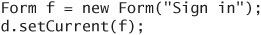
Alert is different. Alert is supposed to show a message to the user, but it is a temporary notice on the way to another screen. To show an Alert, you have to also tell Display about the next screen by using a different form of setCurrent():
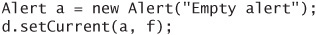
This code tells Display to show the Alert a first. When the Alert is finished, the Form f will become the current screen.
Keep in mind that setCurrent() does not immediately change what the user sees. It merely queues a request to the device to change the current screen next time it gets a chance. Suppose you call setCurrent() during the startApp() method of your application. The screen update might not happen until startApp() returns and relinquishes control of the system thread.
Even when you show screens on the display, you will not get to cover the whole display. Usually, devices reserve a status bar of themselves, something that shows battery life, signal strength, and other information. Even the emulator in your development tool will show this behavior. If you really want the whole display, use setFullScreenMode() in Canvas (see Chapter 9).
7.2. TextBox, the Runt of the Litter
TextBox is one of those things that sounds good on paper but isn’t of much practical use, like some of those kitchen tools that are collecting dust in the back corners of your cabinets. Did you really think you would ever want to make your own beef jerky?
TextBox uses the entire screen to display text or allow the user to input text. This capability might have made sense a few years ago when many mobile phones had tiny displays, but nowadays displays are quite a bit larger. While it’s possible you could use TextBox to display a lot of text (instructions, perhaps), you’d be better off using a Form instead, because you’ll have more control over the text and be able to include images. On the flip side, you could use TextBox to allow the user to input a lot of text, but that’s a bad idea too. Inputting text is painful on mobile devices. If your application calls for extensive text input on a mobile device, you should modify your application design. For text input, use a TextField in a Form instead. You’ll find out all about these classes in the next chapter.
TextBox has a title and a large text area that usually takes up the rest of the screen. The actual appearance of TextBox is determined by the device.
Create a TextBox by specifying the title, the text, the maximum length, and constraints. The constraints are defined by constants in the TextField class, which is part of the Form family and are described in the next chapter. The constraints are as follows:
TextField.ANYallows any type of input.TextField.DECIMALallows numbers with decimal points.TextField.EMAILADDRlimits input to valid characters in an e-mail address.TextField.NUMERICis for numbers without decimal points.TextField.PHONENUMBERallows telephone numbers.TextField.URLis for entering URLs.
As if that weren’t enough, you can make a constraint more specific by adding a modifier to it. Here are the modifiers:
INITIAL_CAPS_SENTENCEmakes the first letter a capital letter.INITIAL_CAPS_WORDmakes the first letter of each word a capital letter.NON_PREDICTIVEis used to suppress whatever fancy text input guessing your device might be doing. Many phones let you tap away on the numeric keyboard and make educated guesses about the words you might be trying to form. Using theNON_PREDICTIVEmodifier should turn off this behavior.PASSWORDusually shows characters as asterisks so that anyone looking over your shoulder won’t be able to see your password. Sometimes password fields show you the last character that you’re typing so you can make sure it’s correct.SENSITIVEis for information that shouldn’t be stored in a predictive input dictionary or cached in any other way.UNEDITABLEis for text that cannot be edited.
The constraints and modifiers are really only suggestions to the implementation. It’s a lot like when you ask the plumber to take his muddy boots off before walking across your carpet. You can ask, but it doesn’t mean anything is going to happen. The Sun Java Wireless Toolkit emulator is good about honoring constraints and modifiers, but my Motorola V3 doesn’t seem to understand INITIAL_CAPS_WORD or NON_PREDICTIVE.
Some combinations do not work. If you try to create a TextBox with the constraint NUMERIC and initial text “Aardvark,” the TextBox constructor throws IllegalArgumentException.
7.3. Input Modes
The constraints apply to the content of the TextBox, but you can also request an input mode to assist your users. You don’t actually request the input mode, you just ask the device to make it easy to enter a certain set of characters. The device should select whatever input mode it has that corresponds.
You can request a Unicode character block or an input subset. The names are defined in the Java SE classes java.lang.Character.UnicodeBlock and java.awt.im.InputSubset respectively. Finally, MIDP defines the subsets MIDP_UPPERCASE_LATIN and MIDP_LOWERCASE_LATIN for the entry of uppercase and lowercase Latin letters. To request an appropriate input mode, pass the string name of the corresponding constant to TextBox’s setInitialInputMode() method.
The following example requests an input mode appropriate for entering Hebrew characters:
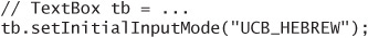
7.4. Using Alerts for Notifications
Alerts are good for displaying a message to the user. They have four attributes that control how they are presented:
The title and text have the same meaning as
TextBox, although the presentation is likely to be a little different.You can supply an image to be displayed in the
Alert. PassnulltoAlert’s constructor to show no image.An alert type is a hint. If you tell the device that the
Alertyou want to show is an informational alert, the device might try to display it using a standard image and might even play a sound.
The alert types are defined as static constants in AlertType and have the self-explanatory names ALARM, CONFIRMATION, ERROR, INFO, and WARNING.
Alerts have a timeout that determines how long the alert is shown on the display before the next screen is shown. The timeout has a default value, which is returned from getDefaultTimeout(). You can set a new timeout value (in milliseconds) with setTimeout(). If you prefer that your users have to explicitly dismiss an alert, you call setTimeout(Alert.FOREVER). The system will provide some way to dismiss the alert (probably a Done or OK command).
You can add commands to an alert, just as you can to any other screen, but the rules about commands and command listeners are a little funky. Check the Alert API documentation for details. If you find yourself wanting to add commands to an alert, consider using a different type of screen.
Each device has some freedom in deciding how to show an alert. Some have icon images and sounds for the alert types. Some show the image you’ve supplied and some do not. The arguments you are passing to the Alert constructor are requests, not orders, although you can be sure that the title and message text will show up on the display.
7.5. A Very Quick Introduction to Images
You won’t learn the whole story about images until Chapter 9, but for now just know that you can load an image from a resource file using this kind of code:
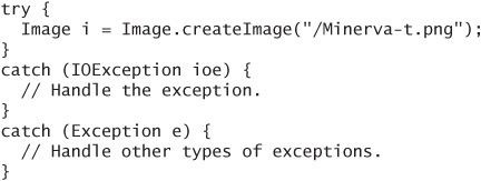
This code does not load an image from a file system. It looks for the resource file Minerva-t.png inside the MIDlet suite JAR file. If you place resource files in the right place in your development project, your development tool will package them into the MIDlet suite JAR file. In the Sun Java Wireless Toolkit, the correct place for resource files is the res directory of your project.
It’s a good idea to catch Exception in addition to IOException. Errors in the image bits might cause IllegalArgumentExceptions. It’s much better for you to catch these and handle them properly than to have your application fail unexpectedly in the field.
Depending on the device, an alert might have a preferred size for images, such that if you supply an image of the right size, it will display particularly well. You can ask Display for this size by passing Display.ALERT to getBestImageWidth() and getBestImageHeight().
7.6. Putting It Together
This example shows how to use TextBox and Alert.
On the Sun Java Wireless Toolkit emulator, the alert looks like Figure 7.1.
Figure 7.1. An alert in the toolkit emulator
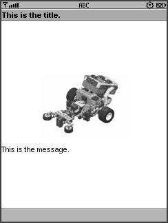
As you can see, it is very easy to create and display an alert. Play around with the parameters in Alert’s constructor to see the effects. In the Sun Java Wireless Toolkit emulator, AlertType.ALARM and AlertType.CONFIRMATION have associated sounds. Also try the FOREVER timeout to see how it behaves.
7.7. Good for the Old Ticker
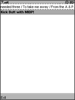
All of MIDP’s screens can display a ticker, which is text that scrolls across the screen, just like that famous sign in Times Square in New York City. For example,
In the Sun Java Wireless Toolkit emulator, it looks like the example in Figure 7.2.
7.8. The Whole Story on Commands
You already learned a little about commands in Chapter 3, “Quick Start.” Now you’ll get the whole story.
A command represents an action that a user can perform in your application. The device decides how the command is shown to the user, and the device figures out how the user invokes the command. Your application provides a listener object that is notified when a command is invoked.
Commands have a short label, a long label, a type, and a priority. The device decides which label to show. One possibility is that the short label is displayed on the screen next to a soft button and the long label is displayed in a menu of commands. The long label is used only if it is available; it’s possible to create a Command with only a short label.
The command type helps the device figure out how to show the command. Command types are defined by constants in Command. The types for common commands are BACK, CANCEL, EXIT, HELP, OK, and STOP. Application-specific commands use the type SCREEN. Finally, the type ITEM is used for commands that are applied to Form items, but you won’t learn about that until the next chapter.
A device is allowed to use a label other than the one you’ve specified, depending on the command type. For example, if you create a command using new Command(“Ooga booga”, Command.EXIT, 0), the device could decide to use a label of “Exit” or “Quit” instead of the one you supplied, resulting in a more consistent user experience.
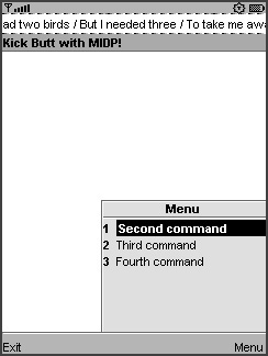
If there are more commands than space on the screen, some of the commands might be hidden in a menu. The Sun Java Wireless Toolkit emulator has space for two commands, one for each of its soft buttons. If you add more commands to a screen, one soft button still invokes a command, while the other soft button brings up a menu of all the others. Figure 7.3 shows a screen with four commands, with the menu of additional commands showing.
Figure 7.3. Commands that won’t fit are stuck in a menu.
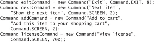
The command priority tells the device how important a command is relative to the other commands in a screen. Lower priorities are more important. Assuming you cared more about letting users spend money than viewing a license agreement, you might create command priorities like this:
Each screen has one command listener that is notified when a command is invoked. The command listener can be any object, but it is often convenient to make the MIDlet a command listener. The CommandListener interface has one method:
The Displayable is the screen whose command has just been invoked. You can register a single listener with multiple screens, in which case it is useful to know to which screen’s command you are responding. The Command parameter is, of course, the command that the user has invoked.
Remember that the system thread that calls your commandAction() method does not belong to you. Be quick about your work in commandAction(), or create your own thread if you must do something that takes a long time.
7.9. Command Placement
The placement of commands is, in some cases, inscrutable. Even the simplest use of commands sometimes leads to an uneven user experience across a variety of devices.
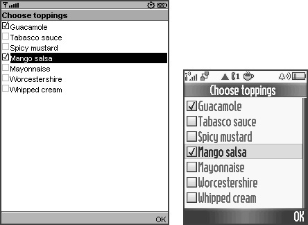
One surprising example is a List (from the next chapter) that has a single command, OK (Figure 7.4). My Motorola V3 and Sun’s emulator behave as you would expect, although it’s probably just lucky that the OK command is on the right side in both of them.
Figure 7.4. No surprises here.
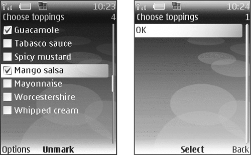
Now try this on a Nokia Series 40 handset (Figure 7.5). Nokia adds its own Mark or Unmark command to this type of list, mapped to the center select button. The left and right soft buttons are both available, but for some reason the OK command gets stuck inside an Options menu. When you choose Options, you’re taken to another screen with the OK command, a Select command, and a Back command. Yuck!
Figure 7.5. The OK command is hidden in an Options menu.
If you need to provide a user experience with more consistency across platforms, you’ll have to build your own solution using Canvas, which is described in Chapter 9.
7.10. Summary
In this chapter, you got an introduction to MIDP’s user interface APIs. You learned about the simplest screens, TextBox and Alert, and how to show them on a device’s display. All Displayables can show a ticker, which is scrolling text. The user performs actions in an application by using commands. The device determines how commands look and how the user invokes them. A command listener object, which is often a MIDlet, responds to commands.