
Let's now implement the absolute price oscillator, with the faster EMA using a period of 10 days and a slower EMA using a period of 40 days, and default smoothing factors being 2/11 and 2/41, respectively, for the two EMAs:
num_periods_fast = 10 # time period for the fast EMA
K_fast = 2 / (num_periods_fast + 1) # smoothing factor for fast EMA
ema_fast = 0

num_periods_slow = 40 # time period for slow EMA
K_slow = 2 / (num_periods_slow + 1) # smoothing factor for slow EMA
ema_slow = 0

ema_fast_values = [] # we will hold fast EMA values for visualization purposes
ema_slow_values = [] # we will hold slow EMA values for visualization purposes
apo_values = [] # track computed absolute price oscillator values

for close_price in close:
 if (ema_fast == 0): # first observation
   ema_fast = close_price
   ema_slow = close_price
 else:
   ema_fast = (close_price - ema_fast) * K_fast + ema_fast
   ema_slow = (close_price - ema_slow) * K_slow + ema_slow

 ema_fast_values.append(ema_fast)
 ema_slow_values.append(ema_slow)
 apo_values.append(ema_fast - ema_slow)
The preceding code generates APO values that have higher positive and negative values when the prices are moving away from long-term EMA very quickly (breaking out), which can have a trend-starting interpretation or an overbought/sold interpretation. Now, let's visualize the fast and slow EMAs and visualize the APO values generated:
goog_data = goog_data.assign(ClosePrice=pd.Series(close, index=goog_data.index))
goog_data = goog_data.assign(FastExponential10DayMovingAverage=pd.Series(ema_fast_values, index=goog_data.index))
goog_data = goog_data.assign(SlowExponential40DayMovingAverage=pd.Series(ema_slow_values, index=goog_data.index))
goog_data = goog_data.assign(AbsolutePriceOscillator=pd.Series(apo_values, index=goog_data.index))
close_price = goog_data['ClosePrice']
ema_f = goog_data['FastExponential10DayMovingAverage']
ema_s = goog_data['SlowExponential40DayMovingAverage']
apo = goog_data['AbsolutePriceOscillator']

import matplotlib.pyplot as plt

fig = plt.figure()
ax1 = fig.add_subplot(211, ylabel='Google price in $')
close_price.plot(ax=ax1, color='g', lw=2., legend=True)
ema_f.plot(ax=ax1, color='b', lw=2., legend=True)
ema_s.plot(ax=ax1, color='r', lw=2., legend=True)
ax2 = fig.add_subplot(212, ylabel='APO')
apo.plot(ax=ax2, color='black', lw=2., legend=True)
plt.show()
The preceding code will return the following output. Let's have a look at the plot:
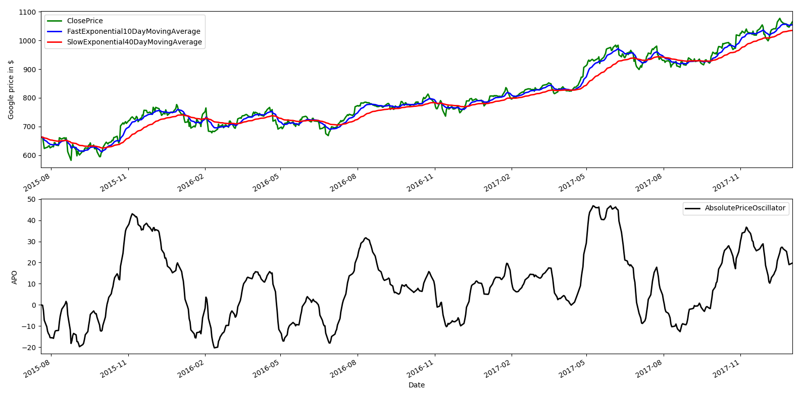
One observation here is the difference in behavior between fast and slow EMAs. The faster one is more reactive to new price observations, and the slower one is less reactive to new price observations and decays slower. The APO values are positive when prices are breaking out to the upside, and the magnitude of the APO values captures the magnitude of the breakout. The APO values are negative when prices are breaking out to the downside, and the magnitude of the APO values captures the magnitude of the breakout. In a later chapter in this book, we will use this signal in a realistic trading strategy.