In this section, we are going to look into the configuration of axes in Highcharts in terms of their functional area. We will start off with a plain line graph and gradually apply more options to the chart to demonstrate the effects.
There are two ways to specify data for a chart: categories and series data. For displaying intervals with specific names, we should use the categories field that expects an array of strings. Each entry in the categories array is then associated with the series data array. Alternatively, the axis interval values are embedded inside the series data array. Then, Highcharts extracts the series data for both axes, interprets the data type, and formats and labels the values appropriately.
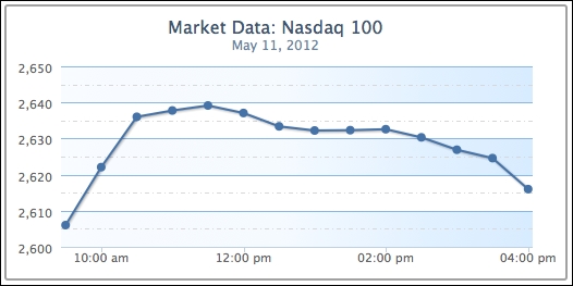
The following is a straightforward example showing the use of categories:
    chart: {
        renderTo: 'container',
        height: 250,
        spacingRight: 20
    },
    title: {
        text: 'Market Data: Nasdaq 100'
    },
    subtitle: {
        text: 'May 11, 2012'
    },
    xAxis: {
        categories: [ '9:30 am', '10:00 am', '10:30 am',
                      '11:00 am', '11:30 am', '12:00 pm',
                      '12:30 pm', '1:00 pm', '1:30 pm',
                      '2:00 pm', '2:30 pm', '3:00 pm',
                      '3:30 pm', '4:00 pm' ],
        labels: {
            step: 3
        }
    },
    yAxis: {
        title: {
            text: null
        }
    },
    legend: {
        enabled: false
    },
    credits: {
        enabled: false
    },
    series: [{
        name: 'Nasdaq',
        color: '#4572A7',
        data: [ 2606.01, 2622.08, 2636.03, 2637.78, 2639.15,
                2637.09, 2633.38, 2632.23, 2632.33, 2632.59,
                2630.34, 2626.89, 2624.59, 2615.98 ]
    }]
The preceding code snippet produces a graph that looks like the following screenshot:
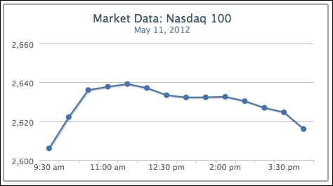
The first name in the categories field corresponds to the first value, 9:30 am, 2606.01, in the series data array, and so on.
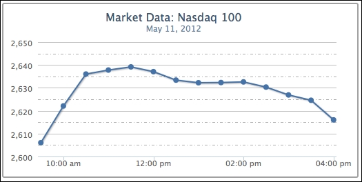
Alternatively, we can specify the time values inside the series data and use the type property of the x axis to format the time. The type property supports 'linear' (default), 'logarithmic', or 'datetime'. The 'datetime' setting automatically interprets the time in the series data into human-readable form. Moreover, we can use the dateTimeLabelFormats property to predefine the custom format for the time unit. The option can also accept multiple time unit formats. This is for when we don't know in advance how long the time span is in the series data, so each unit in the resulting graph can be per hour, per day, and so on. The following example shows how the graph is specified with predefined hourly and minute formats. The syntax of the format string is based on the PHP strftime function:
    xAxis: {
        type: 'datetime',
         // Format 24 hour time to AM/PM
         dateTimeLabelFormats: {

             hour: '%I:%M %P',
             minute: '%I %M'
         }
    },
    series: [{
        name: 'Nasdaq',
        color: '#4572A7',
        data: [ [ Date.UTC(2012, 4, 11, 9, 30), 2606.01 ],
                 [ Date.UTC(2012, 4, 11, 10), 2622.08 ],
                 [ Date.UTC(2012, 4, 11, 10, 30), 2636.03 ],
                 .....
               ]
    }]
Note that the x axis is in the 12-hour time format, as shown in the following screenshot:
Instead, we can define the format handler for the xAxis.labels.formatter property to achieve a similar effect. Highcharts provides a utility routine, Highcharts.dateFormat, that converts the timestamp in milliseconds to a readable format. In the following code snippet, we define the formatter function using dateFormat and this.value. The keyword this is the axis's interval object, whereas this.value is the UTC time value for the instance of the interval:
    xAxis: {
        type: 'datetime',
        labels: {
            formatter: function() {
                return Highcharts.dateFormat('%I:%M %P', this.value);
            }
        }
    },
Since the time values of our data points are in fixed intervals, they can also be arranged in a cut-down version. All we need is to define the starting point of time, pointStart, and the regular interval between them, pointInterval, in milliseconds:
series: [{
    name: 'Nasdaq',
    color: '#4572A7',
    pointStart: Date.UTC(2012, 4, 11, 9, 30),
    pointInterval: 30 * 60 * 1000,
    data: [ 2606.01, 2622.08, 2636.03, 2637.78,
            2639.15, 2637.09, 2633.38, 2632.23,
            2632.33, 2632.59, 2630.34, 2626.89,
            2624.59, 2615.98 ]
}] We have learned how to use axis categories and series data arrays in the last section. In this section, we will see how to format interval lines and the background style to produce a graph with more clarity.
We will continue from the previous example. First, let's create some interval lines along the y axis. In the chart, the interval is automatically set to 20. However, it would be clearer to double the number of interval lines. To do that, simply assign the tickInterval value to 10. Then, we use minorTickInterval to put another line in between the intervals to indicate a semi-interval. In order to distinguish between interval and semi-interval lines, we set the semi-interval lines, minorGridLineDashStyle, to a dashed and dotted style.
The following is the first step to create the new settings:
            yAxis: {
                title: {
                    text: null
                },
                tickInterval: 10,
                minorTickInterval: 5,
                minorGridLineColor: '#ADADAD',
                minorGridLineDashStyle: 'dashdot'
           }
The interval lines should look like the following screenshot:
To make the graph even more presentable, we add a striping effect with shading using alternateGridColor. Then, we change the interval line color, gridLineColor, to a similar range with the stripes. The following code snippet is added into the yAxis configuration:
                gridLineColor: '#8AB8E6',
                alternateGridColor: {
                    linearGradient: {
                        x1: 0, y1: 1,
                        x2: 1, y2: 1
                    },
                    stops: [ [0, '#FAFCFF' ],
                             [0.5, '#F5FAFF'] ,
                             [0.8, '#E0F0FF'] ,
                             [1, '#D6EBFF'] ]
                  }
We will discuss the color gradient later in this chapter. The following is the graph with the new shading background:
The next step is to apply a more professional look to the y axis line. We are going to draw a line on the y axis with the lineWidth property, and add some measurement marks along the interval lines with the following code snippet:
                 lineWidth: 2,
                 lineColor: '#92A8CD',
                 tickWidth: 3,
                 tickLength: 6,
                 tickColor: '#92A8CD',
                 minorTickLength: 3,
                 minorTickWidth: 1,
                 minorTickColor: '#D8D8D8'
The tickWidth and tickLength properties add the effect of little marks at the start of each interval line. We apply the same color on both the interval mark and the axis line. Then we add the ticks minorTickLength and minorTickWidth into the semi-interval lines in a smaller size. This gives a nice measurement mark effect along the axis, as shown in the following screenshot:
Now, we apply a similar polish to the xAxis configuration, as follows:
           xAxis: {
               type: 'datetime',
               labels: {
                   formatter: function() {
                       return Highcharts.dateFormat('%I:%M %P', this.value);
                   },
               },
               gridLineDashStyle: 'dot',
               gridLineWidth: 1,
               tickInterval: 60 * 60 * 1000,
               lineWidth: 2,
               lineColor: '#92A8CD',
               tickWidth: 3,
               tickLength: 6,
               tickColor: '#92A8CD',
           },
We set the x axis interval lines to the hourly format and switch the line style to a dotted line. Then, we apply the same color, thickness, and interval ticks as on the y axis. The following is the resulting screenshot:
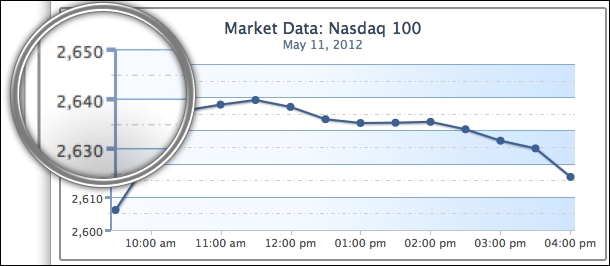
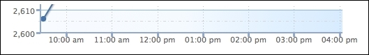
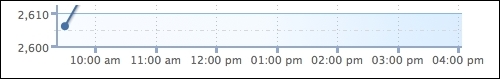
However, there are some defects along the x axis line. To begin with, the meeting point between the x axis and y axis lines does not align properly. Secondly, the interval labels at the x axis are touching the interval ticks. Finally, part of the first data point is covered by the y-axis line. The following is an enlarged screenshot showing the issues:
There are two ways to resolve the axis line alignment problem, as follows:
- Shift the plot area 1 pixel away from the x axis. This can be achieved by setting the
offsetproperty ofxAxisto1. - Increase the x-axis line width to 3 pixels, which is the same width as the y-axis tick interval.
As for the x-axis label, we can simply solve the problem by introducing the y offset value into the labels setting.
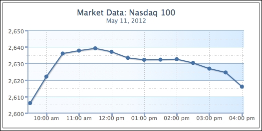
Finally, to avoid the first data point touching the y-axis line, we can impose minPadding on the x axis. What this does is to add padding space at the minimum value of the axis, the first point. The minPadding value is based on the ratio of the graph width. In this case, setting the property to 0.02 is equivalent to shifting along the x axis 5 pixels to the right (250 px * 0.02). The following are the additional settings to improve the chart:
    xAxis: {
        ....
        labels: {
               formatter: ...,
               y: 17
        },
        .....
        minPadding: 0.02,
        offset: 1
    }
The following screenshot shows that the issues have been addressed:
As we can see, Highcharts has a comprehensive set of configurable variables with great flexibility.
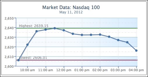
In this section, we are going to see how we can use Highcharts to place lines or bands along the axis. We will continue with the example from the previous section. Let's draw a couple of lines to indicate the day's highest and lowest index points on the y axis. The plotLines field accepts an array of object configurations for each plot line. There are no width and color default values for plotLines, so we need to specify them explicitly in order to see the line. The following is the code snippet for the plot lines:
      yAxis: {
              ... ,
              plotLines: [{
                   value: 2606.01,
                   width: 2,
                   color: '#821740',
                   label: {
                       text: 'Lowest: 2606.01',
                       style: {
                           color: '#898989'
                       }
                   }
              }, {
                   value: 2639.15,
                   width: 2,
                   color: '#4A9338',
                   label: {
                       text: 'Highest: 2639.15',
                       style: {
                           color: '#898989'
                       }
                   }
              }]
        }
The following screenshot shows what it should look like:
We can improve the look of the chart slightly. First, the text label for the top plot line should not be next to the highest point. Second, the label for the bottom line should be remotely covered by the series and interval lines, as follows:
To resolve these issues, we can assign the plot line's zIndex to 1, which brings the text label above the interval lines. We also set the x position of the label to shift the text next to the point. The following are the new changes:
             plotLines: [{
                   ... ,
                   label: {
                       ... ,
                       x: 25
                   },
                   zIndex: 1
                   }, {
                   ... ,
                   label: {
                       ... ,
                       x: 130
                   },
                   zIndex: 1
              }]
The following graph shows the label has been moved away from the plot line and over the interval line:
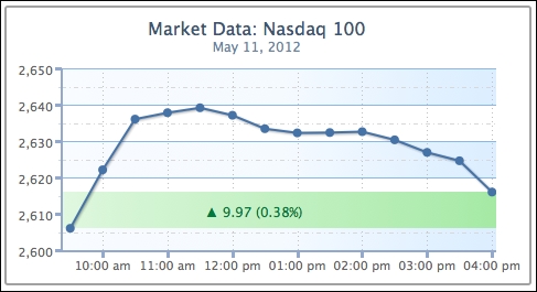
Now, we are going to change the preceding example with a plot band area that shows the index change between the market's opening and closing values. The plot band configuration is very similar to plot lines, except that it uses the to and from properties, and the color property accepts gradient settings or color code. We create a plot band with a triangle text symbol and values to signify a positive close. Instead of using the x and y properties to fine-tune label position, we use the align option to adjust the text to the center of the plot area (replace the plotLines setting from the above example):
              plotBands: [{
                   from: 2606.01,
                   to: 2615.98,
                   label: {
                       text: '▲ 9.97 (0.38%)',
                       align: 'center',
                       style: {
                           color: '#007A3D'
                       }
                   },
                   zIndex: 1,
                   color: {
                       linearGradient: {
                           x1: 0, y1: 1,
                           x2: 1, y2: 1
                       },
                       stops: [ [0, '#EBFAEB' ],
                                [0.5, '#C2F0C2'] ,
                                [0.8, '#ADEBAD'] ,
                                [1, '#99E699']
                       ]
                   }
              }]
Note
The triangle is an alt-code character; hold down the left Alt key and enter 30 in the number keypad. See http://www.alt-codes.net for more details.
This produces a chart with a green plot band highlighting a positive close in the market, as shown in the following screenshot:
Previously, we ran through most of the axis configurations. Here, we explore how we can use multiple axes, which are just an array of objects containing axis configurations.
Continuing from the previous stock market example, suppose we now want to include another market index, Dow Jones, along with Nasdaq. However, both indices are different in nature, so their value ranges are vastly different. First, let's examine the outcome by displaying both indices with the common y axis. We change the title, remove the fixed interval setting on the y axis, and include data for another series:
            chart: ... ,
            title: {
                text: 'Market Data: Nasdaq & Dow Jones'
            },
            subtitle: ... ,
            xAxis: ... ,
            credits: ... ,
            yAxis: {
                title: {
                    text: null
                },
                minorGridLineColor: '#D8D8D8',
                minorGridLineDashStyle: 'dashdot',
                gridLineColor: '#8AB8E6',
                alternateGridColor: {
                    linearGradient: {
                        x1: 0, y1: 1,
                        x2: 1, y2: 1
                    },
                    stops: [ [0, '#FAFCFF' ],
                             [0.5, '#F5FAFF'] ,
                             [0.8, '#E0F0FF'] ,
                             [1, '#D6EBFF'] ]
                },
                lineWidth: 2,
                lineColor: '#92A8CD',
                tickWidth: 3,
                tickLength: 6,
                tickColor: '#92A8CD',
                minorTickLength: 3,
                minorTickWidth: 1,
                minorTickColor: '#D8D8D8'
            },
            series: [{
              name: 'Nasdaq',
              color: '#4572A7',
              data: [ [ Date.UTC(2012, 4, 11, 9, 30), 2606.01 ],
                         [ Date.UTC(2012, 4, 11, 10), 2622.08 ],
                         [ Date.UTC(2012, 4, 11, 10, 30), 2636.03 ],
                         ...
                       ]
            }, {
              name: 'Dow Jones',
              color: '#AA4643',
              data: [ [ Date.UTC(2012, 4, 11, 9, 30), 12598.32 ],
                         [ Date.UTC(2012, 4, 11, 10), 12538.61 ],
                         [ Date.UTC(2012, 4, 11, 10, 30), 12549.89 ],
                         ...
                       ]
            }]
The following is the chart showing both market indices:
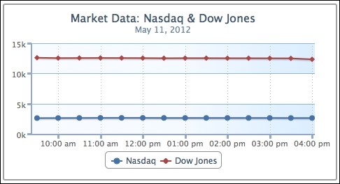
As expected, the index changes that occur during the day have been normalized by the vast differences in value. Both lines look roughly straight, which falsely implies that the indices have hardly changed.
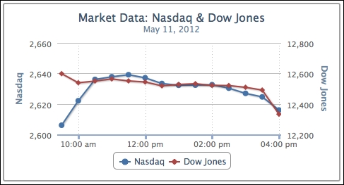
Let us now explore putting both indices onto separate y axes. We should remove any background decoration on the y axis, because we now have a different range of data shared on the same background.
The following is the new setup for yAxis:
           yAxis: [{
                title: {
                    text: 'Nasdaq'
                },
              }, {
                title: {
                    text: 'Dow Jones'
                },
                opposite: true
            }],
Now yAxis is an array of axis configurations. The first entry in the array is for Nasdaq and the second is for Dow Jones. This time, we display the axis title to distinguish between them. The opposite property is to put the Dow Jones y axis onto the other side of the graph for clarity. Otherwise, both y axes appear on the left-hand side.
The next step is to align indices from the y-axis array to the series data array, as follows:
            series: [{
                name: 'Nasdaq',
                color: '#4572A7',
                yAxis: 0,
                data: [ ... ]
            }, {
                name: 'Dow Jones',
                color: '#AA4643',
                yAxis: 1,
                data: [ ... ]
            }]
We can clearly see the movement of the indices in the new graph, as follows:
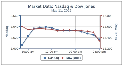
Moreover, we can improve the final view by color-matching the series to the axis lines. The Highcharts.getOptions().colors property contains a list of default colors for the series, so we use the first two entries for our indices. Another improvement is to set maxPadding for the x axis, because the new y-axis line covers parts of the data points at the high end of the x axis:
            xAxis: {
                ... ,
                minPadding: 0.02,
                maxPadding: 0.02
                },
            yAxis: [{
                title: {
                    text: 'Nasdaq'
                },
                lineWidth: 2,
                lineColor: '#4572A7',
                tickWidth: 3,
                tickLength: 6,
                tickColor: '#4572A7'
            }, {
                title: {
                    text: 'Dow Jones'
                },
                opposite: true,
                lineWidth: 2,
                lineColor: '#AA4643',
                tickWidth: 3,
                tickLength: 6,
                tickColor: '#AA4643'
            }],
The following screenshot shows the improved look of the chart:
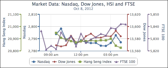
We can extend the preceding example and have more than a couple of axes, simply by adding entries into the yAxis and series arrays, and mapping both together. The following screenshot shows a 4-axis line graph: