Highcharts provides an easy way to zoom data interactively between two series of data. This feature is implemented as a separate module. To use the feature, users need to include the following JavaScript:
<script type="text/javascript"
 src="http://code.highcharts.com/modules/drilldown.js"></script>
There are two ways to build an interactive drilldown chart: synchronous and asynchronous. The former method requires users to supply both top and detail levels of data in advance, and arrange both levels of data inside the configuration. Both levels of data are specified as standard Highcharts series configs, except that the zoom-in series is located inside the drilldown property. To join both levels, the top-level series must provide the option series.data[x].drilldown, with a matching name to the option drilldown.series.[y].id in the detail level.
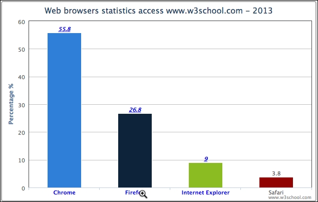
Let's revisit the web browser statistic example and plot the data in a column chart. We will go through column series in more detail later in the book. The following is the series config for the top-level data:
      series: [{
          type: 'column',
          name: 'Web browsers',
          colorByPoint: true,
          data: [{
              name: 'Chrome', y: 55.8, drilldown: 'chrome'
          }, {
              name: 'Firefox', y: 26.8, drilldown: 'firefox',
          }, {
              name: 'Internet Explorer', y: 9, drilldown: 'ie'
          }, {
              name: 'Safari', y: 3.8
          }]
      }],
Each column is defined with a drilldown option and assigned a specific name. Note that it is not mandatory to make all the data points zoomable. The preceding example demonstrates the Safari column without the drilldown property.
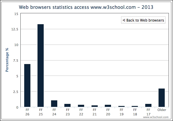
To correspond to each of the drilldown assignments, an array of series data (detail level) is configured to match against the values. The following shows the setup of the drilldown data:
            drilldown: {
               series: [{
                    id: 'chrome',
                    name: 'Chrome',
                    data: [{
                        name: 'C 32', y: 1
                    }, {
                        name: 'C 31', y: 49
                    }, {
                                           T.
                    }]
               }, {
                    id: 'firefox',
                    name: 'Firfox',
                    data: [{
                        name: 'FF 26', y: 6.9
                    }, {
                        name: 'FF 25', y: 13.3
                    }, {
                                                    w.
                    }]
                                       ….
               }]
            }
This produces the following screenshot:
As we can see, the category labels along the x-axis are decorated in a dark color and underlined (the default style). They are clickable, and appear different when compared to the non-drilldown column, Safari. When we click on the Firefox column, or the label, the column animates and zooms into multiple columns along with a back button at the top right corner, as shown in the following screenshot:
Let's modify the chart with more styles. There are properties within the drilldown option for smartening the data labels such as activeAxisLabelStyle and activeDataLabelStyle that take a configuration object of CSS styles. In the following code, we polish the category labels with features such as hyperlinks, blue color, and underlines. Additionally, we change the cursor style into the browser-specific zoom-in icon:
            plotOptions: {
                column: {
                    dataLabels: {
                        enabled: true
                     }
                }
            },
            drilldown: {
                activeAxisLabelStyle: {
                    textDecoration: 'none',
                    cursor: '-webkit-zoom-in',
                    color: 'blue'
                },
                activeDataLabelStyle: {
                    cursor: '-webkit-zoom-in',
                    color: 'blue',
                    fontStyle: 'italic'
                },
                series: [{
                    ....
                }]
            }
The following screenshot shows the new text label style as well as the new cursor icon over the category label:
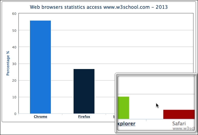
Another great flexibility in Highcharts is that the top and detail level charts are not limited to the same type of series. The drilldown series can be any series best suited for presenting the detail data. This can be accomplished by assigning a different series type in the detail level. The following is the further code update for the example, in which the Internet Explorer column is zoomed in and presented in a donut (or ring) chart. We also set the data labels for the pie chart to show both the version name and percentage value:
plotOptions: {
column: {
....
},
pie: {
dataLabels: {
enabled: true,
format: '{point.name} - {y}%'
}
}
},
drilldown: {
activeAxisLabelStyle: {
....
},
activeDataLabelStyle: {
....
},
series: [{
id: 'ie',
name: 'Internet Explorer',
type: 'pie',
innerSize: '30%',
data: [{
....
}],
}, {
....
}]
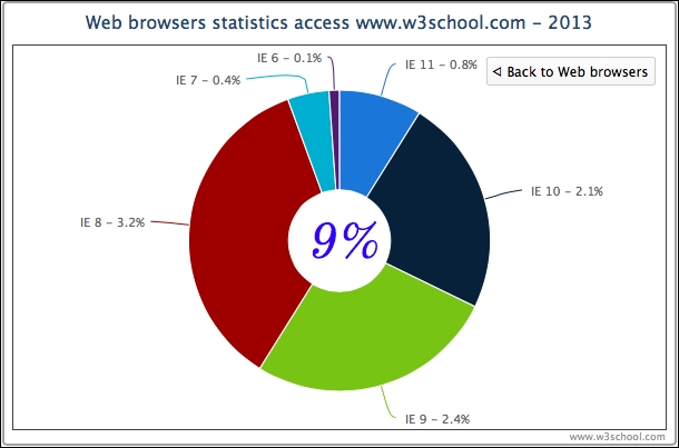
}The following is the screenshot of the donut chart:
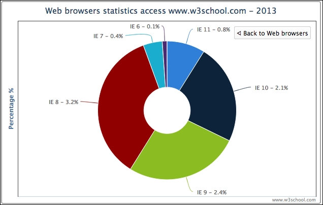
The preceding donut chart is slightly misleading because the total value of all the data labels is 9 percent, but the presentation of the donut chart gives the impression of 100 percent in total. In order to clarify that 9 percent is the total value, we can take advantage of the Highcharts Renderer engine (we will explore this further in Chapter 5, Pie Charts) to display an SVG text box in the middle of the ring. However, the drilldown option only allows us to declare series-specific options. Moreover, we would like the 9 percent text box to appear only when clicking on the 'Internet Explorer' column.
One trick to achieve that is to use Highcharts events, which will be examined further in Chapter 11, Highcharts Events. Here, we use the events specific to the drilldown action. The basic idea is that, when the drilldown event is triggered, we check the data point being clicked is Internet Explorer. If so, then we create a textbox using the chart's renderer engine. In the drillup event (triggered when the Back to … button is clicked), we remove the text box if it exists:
    chart = new Highcharts.Chart({
        chart: {
            renderTo: 'container',
            events: {
                drilldown: function(event) {
                    // According to Highcharts documentation,
                    // the clicked data point is embedded inside
                    // the event object
                    var point = event.point;
                    var chart = point.series.chart;
                    var renderer = chart.renderer;
                    if (point.name == 'Internet Explorer') {
                        // Create SVG text box from
                        // Highcharts Renderer
                        // chart center position based on
                        // it's dimension
                        pTxt = renderer.text('9%',
                                 (chart.plotWidth / 2) +
                                 chart.plotLeft - 43,
                                 (chart.plotHeight / 2) +
                                 chart.plotTop + 25)
                               .css({
                                   fontSize: '45px',
                                   // Google Font
                                   fontFamily: 'Old Standard TT',
                                   fontStyle: 'italic',
                                   color: 'blue'
                               }).add();
                    }
                },  // drilldown
                drillup: function() {
                    pTxt && (pTxt = pTxt.destroy());
                }
           }
Here is the refined chart with the textbox centered in the chart: