In this chapter, we will learn about line, area, and scatter charts and explore their plotting options in more details. We will also learn how to create a stacked area chart and projection charts. Then, we will attempt to plot the charts in a slightly more artistic style. The reason for that is to provide us with an opportunity to utilize various plotting options. In this chapter, we will cover the following:
- Introducing line charts
- Sketching an area chart
- Highlighting and raising the base level
- Mixing line and area series
- Combining scatter and area series
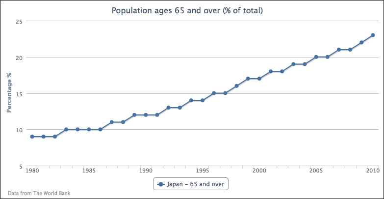
First let's start with a single-series line chart. We will use one of the many data sets provided by The World Bank organization at www.worldbank.org. The following is the code snippet to create a simple line chart that shows the percentage of population aged 65 and above in Japan for the past three decades:
        var chart = new Highcharts.Chart({
            chart: {
                renderTo: 'container'
            },
            title: {
                text: 'Population ages 65 and over (% of total)'
            },
            credits: {
                         position: {
                         align: 'left',
                         x: 20
                     },
                     text: 'Data from The World Bank'
            },
            yAxis: {
                       title: {
                       text: 'Percentage %'
                   }
            },
            xAxis: {
                categories: ['1980', '1981', '1982', ... ],
                labels: {
                            step: 5
                        }
                   },
            series: [{
                         name: 'Japan - 65 and over',
                         data: [  9, 9, 9, 10, 10, 10, 10 ... ]
                    }]
});
The following is the display of the simple chart:
Instead of specifying the year number manually as strings in categories, we can use the pointStart option in the series config to initiate the x axis value for the first point. So we have an empty xAxis config and series config, as follows:
            xAxis: {
            },
            series: [{
                pointStart: 1980,
                name: 'Japan - 65 and over',
                data: [  9, 9, 9, 10, 10, 10, 10 ... ]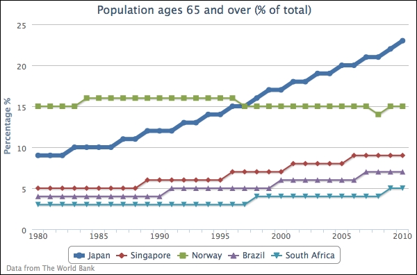
}]We can include several more line series and emphasize the Japan series by increasing the line width to be 6-pixels wide, as follows:
            series: [{
                lineWidth: 6,
                name: 'Japan',
                data: [  9, 9, 9, 10, 10, 10, 10 ... ]
            }, {
                Name: 'Singapore',
                data: [ 5, 5, 5, 5, ... ]
            }, {
                   // Norway, Brazil, and South Africa series data...
                                ...
            }]
By making that line thicker, the line series for the Japanese population becomes the focus in the chart, as shown in the following screenshot:
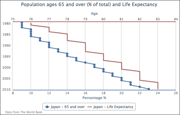
Let's move on to a more complicated line graph. For the sake of demonstrating inverted line graphs, we use the chart.inverted option to flip the y and x axes to opposite orientations. Then, we change the line colors of the axes to match the same series colors as in the previous chapter. We also disable data point markers for all the series, and finally align the second series to the second entry on the y-axis array, as follows:
            chart: {
                renderTo: 'container',
                inverted: true
            },
            yAxis: [{
                title: {
                    text: 'Percentage %'
                },
                lineWidth: 2,
                lineColor: '#4572A7'
            }, {
                title: {
                    text: 'Age'
                },
                opposite: true,
                lineWidth: 2,
                lineColor: '#AA4643'
            }],
            plotOptions: {
                series: {
                    marker: {
                        enabled: false
                    }
                }
            },
            xAxis: {
               categories: [ '1980', '1981', '1982', ...,
                             '2009', '2010' ],
               labels: {
                   step: 5
               }
            },
            series: [{
                name: 'Japan - 65 and over',
                type: 'spline',
                data: [ 9, 9, 9, ... ]
            }, {
                name: 'Japan - Life Expectancy',
                yAxis: 1,
                data: [ 76, 76, 77, ... ]
            }]
The following is the inverted graph with double y axes:
The data representation of the chart may look slightly odd as the usual time labels are swapped to the y axis and the data trend is difficult to comprehend. The inverted option is normally used for showing data in a non-continuous form and in a bar format. If we interpret the data from the graph, 12 percent of the population is 65 or over in 1990, and the life expectancy is 79.
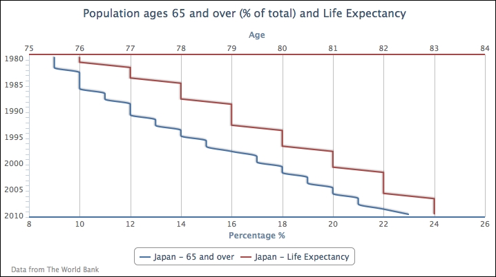
Setting plotOptions.series.marker.enabled to false switches off all the data point markers. If we want to display a point marker for a particular series, we can either switch off the marker globally and then turn the marker on for individual series, or the other way round:
            plotOptions: {
                series: {
                    marker: {
                        enabled: false
                    }
                }
            },
            series: [{
                marker: {
                    enabled: true
                },
                name: 'Japan - 65 and over',
                type: 'spline',
                data: [ 9, 9, 9, ... ]
            }, {
The following graph demonstrates that only the 65-and-over series has point markers: