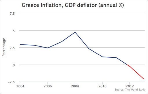
Sometimes, we may want to highlight both positive and negative regions in different colors. In such cases, we can specify the series color for negative values with the series option, negativeColor. Let's create a simple example with inflation data, containing both positive and negative data. Here is the series configuration:
    plotOptions: {
        line: {
            negativeColor: 'red'
        }
    },
    series: [{
        type: 'line',
        color: '#0D3377',
        marker: {
             enabled: false
        },
        pointStart: 2004,
        data:[ 2.9, 2.8, 2.4, 3.3, 4.7,
               2.3, 1.1, 1.0, -0.3, -2.1
        ]
    }]
We assign the color red for negative inflation values and disable the markers in the line series. The line series color is defined by another color, blue, which is used for positive values. The following is the graph showing the series in separate colors:
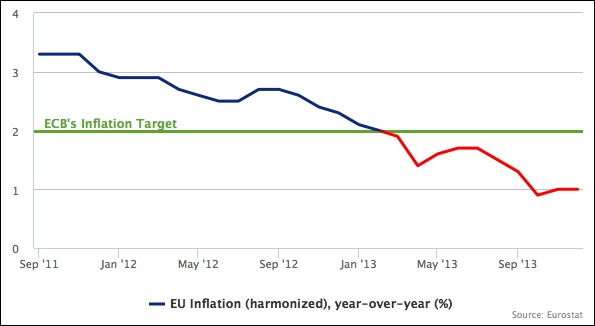
Let's create another slightly more advanced example, in which we define the negative territory in terms of the subject. We plot another inflation chart, but based on the European Central Bank (ECB) definition of healthy inflation that is 2 percent. Anything below that level is regarded as unhealthy for the economy, so we set the color below that threshold to red. Beside the color threshold, we also set up a plotline on the y-axis to indicate the cut-off level. The following is our first try to set up the chart:
         yAxis: {
             title: { text: null },
             min: 0,
             max: 4,
             plotLines: [{
                 value: 2,
                 width: 3,
                 color: '#6FA031',
                 zIndex: 1,
                 label: {
                     text: 'ECB....',
                     ....
                 }
             }]
         },
         xAxis: { type: 'datetime' },
         plotOptions: {
             line: { lineWidth: 3 }
         },
         series: [{
             type: 'line',
             name: 'EU Inflation (harmonized), year-over-year (%)',
             color: '#0D3377',
             marker: { enabled: false },
             data:[
                 [ Date.UTC(2011, 8, 1), 3.3 ],
                 [ Date.UTC(2011, 9, 1), 3.3 ],
                 [ Date.UTC(2011, 10, 1), 3.3 ],
                 ....
We set up a green plotline along the y-axis at the value 2, 3 pixels wide. The zIndex option is to avoid the interval line appearing on top of the plot line. With the inflation line series, we disable the markers and also set the line width to 3 pixels wide. The following is the initial attempt without thresholding:
Let's apply the threshold level to the lines series. The default negative color on the y-axis level is at 0 value. As for this particular example, the base level for a negative color would be 2. To raise the base level to 2, we set the threshold property along with the negativeColor option:
    plotOptions: {
        line: {
            lineWidth: 3,
            negativeColor: 'red',
            threshold: 2
        }
    },
The preceding modification turns part of the line series red to indicate an alert: