
In this section, we are going to explore different plots including line and area series together, as follows:
- Creating a projection chart, where a single trend line is joined with two series in different line styles
- Plotting an area spline chart with another step line series
- Exploring a stacked area spline chart, where two area spline series are stacked on top of each other
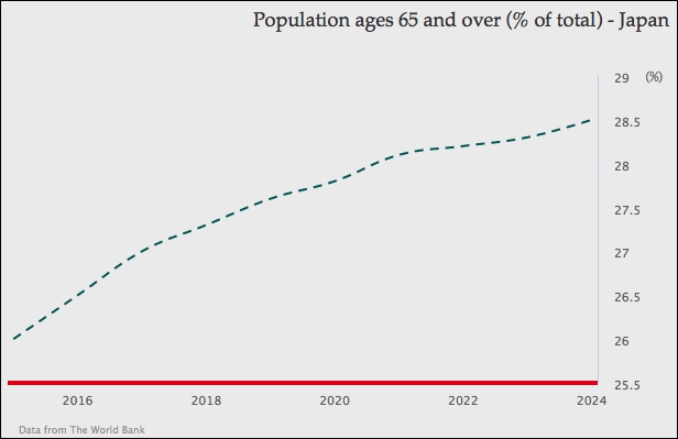
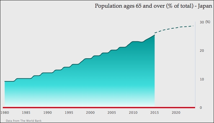
The projection chart has a spline area with the section of real data, and continues in a dashed line with the projection data. To do that we separate the data into two series, one for real data and the other for projection data. The following is the series configuration code for the data from the year 2015 to 2024. This data is based on the National Institute of Population and Social Security Research report (http://www.ipss.go.jp/pp-newest/e/ppfj02/ppfj02.pdf):
            series: [{
                name: 'project data',
                type: 'spline',
                showInLegend: false,
                lineColor: '#145252',
                dashStyle: 'Dash',
                data: [ [ 2015, 26 ], [ 2016, 26.5 ],
                          ... [ 2024, 28.5 ] ]
            }]
The future series is configured as a spline in a dashed line style and the legend box is disabled, because we want to show both series as being part of the same series. Then we set the future (second) series color the same as the first series. The final part is to construct the series data. As we specify the x-axis time data with the pointStart property, we need to align the projection data after 2014. There are two approaches that we can use to specify the time data in a continuous form, as follows:
- Insert null values into the second series data array for padding, to align with the real data series
- Specify the second series data in
tuples, an array with both time and projection data
Here we are going to use the second approach because the series presentation is simpler. The following is the screenshot for the future data series only:
The real data series is exactly the same as the graph in the screenshot at the start of the Sketching an area chart section, except without the point markers and data labels decorations. The next step is to join both series together, as follows:
            series: [{
                name: 'real data',
                type: 'areaspline',
                ....
            }, {
                name: 'project data',
                type: 'spline',
                ....
            }]
Since there is no overlap between both series data, they produce a smooth projection graph:
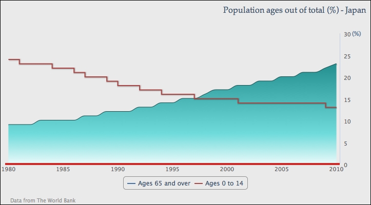
In this section, we are going to plot an area spline series with another line series, but in step presentation. The step line transverses vertically and horizontally according to changes in series data only. It is generally used for presenting discrete data: data without continuous/gradual movement.
For the purpose of showing a step line, we will continue from the first area spline example. First of all, we need to enable the legend by removing the disabled showInLegend setting and also remove dataLabels in the series data.
Next is to include a new series—Ages 0 to 14—in the chart with the default line type. Then, we change the line style slightly into different steps. The following is the configuration for both series:
            series: [{
                name: 'Ages 65 and over',
                type: 'areaspline',
                lineColor: '#145252',
                pointStart: 1980,
                fillColor: {
                    ....
                },
                data: [ 9, 9, 9, 10, ...., 23 ]
            }, {
              name: 'Ages 0 to 14',
              // default type is line series
              step: true,
              pointStart: 1980,
              data: [ 24, 23, 23, 23, 22, 22, 21,
                      20, 20, 19, 18, 18, 17, 17, 16, 16, 16,
                      15, 15, 15, 15, 14, 14, 14, 14, 14, 14,
                      14, 14, 13, 13 ]
            }]
The following screenshot shows the second series in line step style:
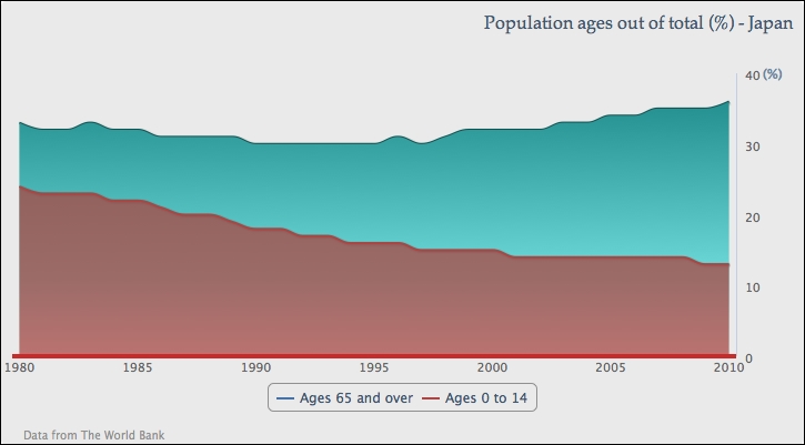
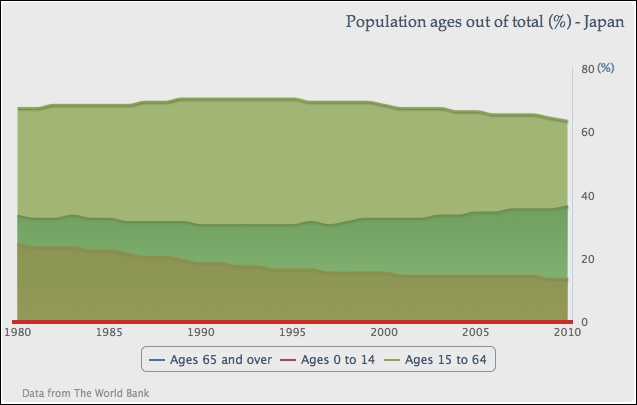
In this section, we are going to turn both series into area splines and stack them on top of each other to create a stacked area chart. As the data series are stacked together, we can observe the series quantities as individual, proportional, and total amounts.
Let's change the second series into another 'areaspline' type:
              name: 'Ages 0 to 14',
              type: 'areaspline',
              pointStart: 1980,
              data: [ 24, 23, 23, ... ]
Set the stacking option to 'normal' as a default setting for areaspline, as follows:
           plotOptions: {
                areaspline: {
                  stacking: 'normal'
                }
           }
This sets both area graphs stacked on top of each other. By doing so, we can observe from the data that both age groups roughly compensate for each other to make up a total of around 33 percent of the overall population, and the Ages 65 and over group is increasingly outpaced in the later stage:
Suppose we have three area spline series and we only want to stack two of them (although it is clearer to do that in a column chart rather than in an area spline chart). As described in the Exploring PlotOptions section in Chapter 2, Highcharts Configurations, we can set the stacking option in plotOptions.series to 'normal', and manually turn off stacking in the third series configuration. The following is the series configuration with another series:
            plotOptions: {
                series: {
                  marker: {
                     enabled: false
                  },
                  stacking: 'normal'
                }
            },
            series: [{
                name: 'Ages 65 and over',
                ....
            }, {
                name: 'Ages 0 to 14',
                ....
            }, {
                name: 'Ages 15 to 64',
                type: 'areaspline',
                pointStart: 1980,
                stacking: null,
                data: [ 67, 67, 68, 68, .... ]
            }]
This creates an area spline graph with the third series Ages 15 to 64 covering the other two stacked series, as shown in the following screenshot:
If a series has missing data, then the default action of Highcharts is to display the series as a broken line. There is an option—connectNulls—that allows a series line to continue even if there is missing data. The default value for this option is false. Let's examine the default behavior by setting two spline series with null data points. We also enable the point markers, so that we can clearly view the missing data points:
            series: [{
                name: 'Ages 65 and over',
                connectNulls: true,
                ....,
                // Missing data from 2004 - 2009
                data: [ 9, 9, 9, ..., null, null, null, 22, 23 ]

            }, {
                name: 'Ages 0 to 14',
                ....,
                // Missing data from 1989 - 1994
                data: [ 24, 23, 23, ..., 19, null, null, ..., 13 ]
            }]
The following is a chart with the spline series presenting missing points in different styles:
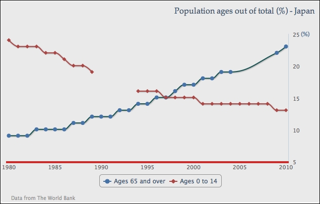
As we can see, the Ages 0 to 14 series has a clear broken line, whereas Ages 65 and over is configured by setting connectNulls to true, which joins the missing points with a spline curve. If the point marker is not enabled, we wouldn't be able to notice the difference.
However, we should use this option with caution and it should certainly never be enabled with the stacking option. Suppose we have a stacked area chart with both series and there is missing data only in the Ages 0 to 14 series, which is the bottom series. The default action for the missing data will make the graph look like the following screenshot:
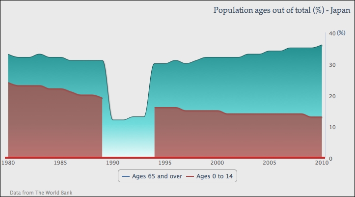
Although the bottom series does show the broken part, the stack graph overall still remains correct. The same area of the top series drops back to single-series values and the overall percentage is still intact.
The problem arises when we set the connectNulls option to true and do not realize that there is missing data in the series. This results in an inconsistent graph, as follows:
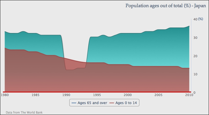
The bottom series covers a hole left from the top series that contradicts the stack graph's overall percentage.