Highcharts offers another type of pie chart, a donut chart. It has the effect of drilling down on a category to create subcategories, and is a convenient way of viewing data in greater detail. This drill-down effect can be applied on multiple levels. In this section, we will create a simple donut chart that has an outer ring of subcategories (game titles) that align with the inner categories (publishers).
For the sake of simplicity, we will only use the top three games publishers for the inner pie chart. The following is the series array configuration for the donut chart:
      series: [{
        name: 'Publishers',
        dataLabels : {
          distance: -70,
          color: 'white',
          formatter: function() {
             return this.point.name + ':<br/> ' +
 Highcharts.numberFormat(this.y / 1000000, 2);
          },
          style: {
             fontWeight: 'bold'
          }
        },
        data: [ [ 'Nintendo', 54030288 ],
                [ 'Electronic Arts', 31367739 ],
                [ 'Activision', 30230170 ] ]
      }, {
        name: 'Titles',
        innerSize: '60%',
        dataLabels: {
          formatter: function() {
            var str = '<b>' + this.point.name + '</b>: ' +
                 Highcharts.numberFormat(this.y / 1000000, 2);
            return str;
          }
        },
        data: [ // Nintendo
            { name: 'Pokemon B&W', y: 8541422,
             color: colorBrightness("#4572A7",
                        0.05) },
            { name: 'Mario Kart', y: 5349103,
             color: colorBrightness('#4572A7',
                        0.1) },
            ....

            // EA
            { name: 'Battlefield 3', y: 11178806,
             color: colorBrightness('#AA4643',
                        0.05) },
            ....

            // Activision
            { name: 'COD: Modern Warfare 3',
             y: 23981182,
             color: colorBrightness('#89A54E',
                        0.1) },
            ....
        }]
      }]
First, we have two series—the inner pie series, or the Publishers, and the outer ring series, or the Titles. The Titles series has all the data for the subcategories together, and it aligns with the Publisher series. The order is such that the values of the subcategories for the Nintendo category are before the subcategory data for Electronic Arts, and so on (see the order of data arrays in the Title series).
Each data point in the subcategories series is declared as a data point object for assigning the color in a similar range to their main category. This can be achieved by following the Highcharts demo to fiddle with the color brightness:
color: Highcharts.Color(color).brighten(brightness).get()
Basically, what this does is to use the main category color value to create a Color object and then adjust the color code with the brightness parameter. This parameter is derived from the ratio of the subcategory value. We rewrite this example into a function known as colorBrightness, and call it in the chart configuration:
 function colorBrightness(color, brightness) {
   return
     Highcharts.Color(color).brighten(brightness).get();
 }
The next part is to specify which series goes to the inner pie and which goes to the outer ring. The innerSize option is used by the outer series, Title, to create an inner circle. As a result, the Title series forms a donut/concentric ring. The value for the innerSize option can be either in pixels or percentage values of the plot area size.
The final part is to decorate the chart with data labels. Obviously, we want to position the data labels of the inner charts to be over the inner pie, so we assign a negative value to the dataLabels.distance option. Instead of printing long values, we define formatter to convert them into units of millions.
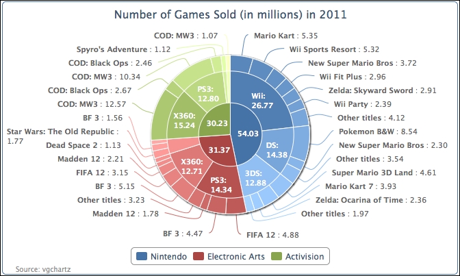
The following is the display of the donut chart:
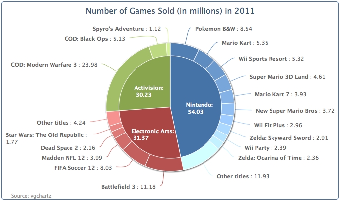
Note that it is not mandatory to put a pie chart in the center of a donut chart. It is just the presentation style of this example. We can have multiple concentric rings instead. The following chart is exactly the same example as mentioned earlier, with the addition of the innerSize option to the inner series of Publishers:
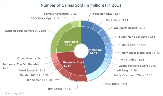
We can even further complicate the donut chart by introducing a third series. We plot the following chart in three layers. The code is simply extended from the example with another series and includes more data. The source code and the demo are available at http://joekuan.org/Learning_Highcharts/. The two outer series use the innerSize option. As the inner pie will become even smaller and will not have enough space for the labels, we therefore enable the legend box for the innermost series with the showInLegend option.